Showing 2053 items
matching colour and design
-
 National Wool Museum
Sample Book
Donated by the Gordon Institute of Tafe, Wool Departmenttextile fibres textile design textile industry - education, cowey, mr gordon - gordon institute of tafe, wool department, colour blending, textile fibres, textile design, textile industry - education -
 National Wool Museum
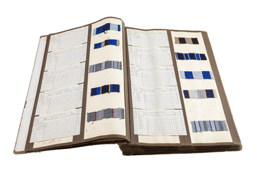
Sample Book, Patterns, c. 1930
Fabric sample book produced by Ernest Waddington with specifications circa 1930. Such a book would work as a catalogue of a designer’s previous Mastercards. Mastercards are specification sheets that are sent to mills in order to produce commercial amounts of fabrics for tailoring into final products, such as suits. Keeping a catalogue of previous designs is useful for designers to take inspiration from in future designs and for re-releases of iconic designs. This sample book is also notable because of its period of creation. It was created in the Great Depression. Despite societies psyche at this time, there is a surprising amount of colour and what may be viewed as daring designs. Fabric sample book produced by E Waddington with specifications.E. Waddingtonweaving textile design textile mills textile mills, waddington, mr ernest, weaving, textile design, textile mills -
 National Wool Museum
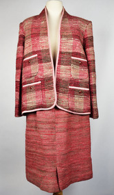
Clothing - Suit, 1987
Hand spun, hand dyed, hand woven and hand sewn suit which won best garment in the 1987 Geelong show. Size 12 in a design by Chanel. It was spun with variegated natural greys on a Sheridan horizontal spinning wheel. It was then dyed pink using natural dyes. The jacket had commercially brought warp and hand spun weft in twill on a 24” loom. All spinning, dyeing and weaving was by Jean Inglis of Geelong. The suit was sewn by Caroline Mogic of Geelong, with iron on interfacing, commercially brought trim. It was worn only once in the parade at the Geelong show. The pink suit jacket has four pockets with gold buttons on front, size 12. The jacket has a checker-plate pattern in which the predominate pink is always present and is accompanied in areas which have grey or white showing through the pink. This checker plate pattern continues down the sleeves of the jacket. The edge of the jacket has a lighter pink trim. A pink skirt accompanies the suit jacket. It has horizontal lines with pink as the predominate colour and areas of grey and white showing through in sections. geelong show, hand spun, hand dyed, hand woven, hand sewn, channel -
 National Wool Museum
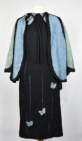
Clothing - Dress, 1993
This dress was made for the Melbourne Show in 1993 and won 3rd prize. It was designed by Jean Inglis who was inspired by the Blue Triangle Butterfly (Scientific name: Graphium sarpedon choredon). The Warp was 2/24 commercially brought black wool with a “tie down” thread of black polyester and Weft of the same 2/24 wool 2 ply. Jean utilised a twill technique devised by Theo Morgan in creating the dress. The dress was handwoven by Jean Inglis with the help of Ruth Rondell with some of the pattern and final sewing. Black dress stretching from below the knees, reaching up to the neckline and down to the hands in the sleeve. The dress has three butterflies attached to the front approximately 50mm in diameter going from right knee to left hip in a nonvisible diagonal line. Lower half of dress has ten thin blue & green lines of varying lengths, reaching a max height of the hip. The neck of dress has four frills of blue and green colour. The longest two frills are in the centre pointing diagonally outwards towards the hands. The second layer of frills is shorter and further around the neckline towards the shoulders. The dress is completed with a cape of blue and green colour with a thick black seam separating each segment of colour. The cape sits on the shoulders and droops to a height of the hips. At the rear, the cape reaches the height of the rump. The cape has two draw strings for tying to the shoulders. wool, butterflies, melbourne show, butterfly -
 National Wool Museum
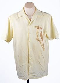
Clothing - 1984 Los Angeles Olympics Men's Opening Ceremony Shirt, c. 1984
On the 1984 Los Angeles Olympic Uniforms donator Doug wrote- During the 1980s the Australian wool industry was at its most prosperous times with record numbers of sheep producing wool receiving ever increasing values due to the success of the Reserve Price Scheme, and the overall guidance of the Australian Wool Corporation (AWC). As a humble technician, my role was a low profile newly created position of “Controller, Technical Marketing” where wool was to be marketed on its technical properties, as distinct from the “Product Marketing Group” which exploited trhe traditional high profile approach of marketing wool;s superior fashion attributes. The Woolmark was the tool central to this approach. When the forthcoming Los Angeles Olympic Games was announced, the Product Marketing Group seized upon the chance to show the world that we could make top fashion garments and display them on our elite athletes on the world stage. A concept was launched using a contemporary top designer, Adel Weiss, with the most exclusive fabrics and knits available, and all with a lot of hype. This launch failed dismally for the following reasons- - The designer did a wonderful job presenting an excellent fashion range on perfect skinny models. The AOC however wanted a uniform which had an obvious Australian appearance when fitted to elite, and frequently muscular, athletes. - The fabrics chosen did not reflect the performance required by travelling athletes, there was no recognition of the need for ‘easy care.’ - There was no recognition given to the problem of measuring, manufacturing and distribution of a range of articles when the selected athlete could be domiciled anywhere in Australia. - There was no appreciation of such historical facts as Fletcher Jones, who had been unofficial suppliers dating back to the 1954 Olympics in Melbourne, and the Fletcher Jones board member, who was also an AWC board member, and was not in favour of the change. The project passed from Product Marketing to Public Relations, a big spending off-shoot of the AWC Chairman David Asimus, and due to the day to day operations of the project was passed to me and PR took care of the financial matters. The first task was to meet with the AOC and find out exactly their requirements. This lead to the production of a design and manufacturing brief, cointaining exact time lines for each event required to ensure an appropriate uniform on every athlete chosen to represent his/her country on the date given for the Opening Ceremony in Los Angeles. Working backwards the timeline becomes- 1. Noted the exact date of the Opening Ceremony. 2. Estimated the date for distributing completed garments to each athlete. 3. Estimated the time span available for measuring each athlete and commence making each component of the ensemble to the individual measurements of each athlete. 4. Decided the date for making the final choice of uniform design concept. 5. Decided the date for distribution of the design brief to selected designers. These five steps were spread out over a two year period. The Commonwealth Games occur midway between each Olympic Games, work on the Olympic uniform commences the week after the Commonwealth Games closing ceremony and MUST be ready by the prescribed day two years hence. The project also had to remain cognisant of trade politics existing within the span of the task, as well as the temperament of designers in general. It is no overstatement to say that in the past every designer in Australia believed they could, and should, be chosen to design the Australian Uniform. The final choice of designer almost always faced criticism from the fashion press and any designer who had been overlooked. However, with the contenders receiving an exacting brief the numbers of serious contenders greatly reduced. The Los Angeles Olympic Uniforms. A further reason for the AWC bid failure to design the LA uniform was that the AOC had already chosen Prue Acton to design it. This was based on her proven performance during previous games as she had a talent for creating good taste Australiana. Her design concepts also considered the effect when they were viewed on a single athlete as well as the impact when viewed on a 400 strong team coming on to the arena. A blazer trouser/skirt uniform in bright gold was chosen for the formal uniform. It was my task to select a pure wool faille fabric from Foster Valley weaving mill and have sufficient woven and ready within the prescribed timeline. The trouser/skirt fabric selected was a 60/40 wool polyester plain weave fabric from Macquarie Worsted. This fabric had a small effect thread of linen that was most attractive when dyed to match some eucalyptus bark Prue had brought back from central Australia. For the Opening Ceremony uniform, Prue designed a series of native fauna, a kookaburra for the men’s shirt and a pleated skirt with a rural scene of kangaroos, hills and plants. This presented an insurmountable printing challenge to the local printing industry as it had an unacceptably large repeat size and the number required (50) was also commercially unacceptable. The solution was a DIY mock up at RMIT and the employment of four student designers. The fabric selected for this garment was a light weight 19 micron, pure wool with a very high twist yarn in alternating S and Z twist, warp and weft. This fabric proved to be the solution to a very difficult problem, finding a wool product which is universally acceptable when worn next to the sin by young athletes competing in the heat of a Los Angeles summer. Modifications to this fabric were developed to exploit its success when facing the same problem in future games. Garment Making- The most exacting garment in the ensemble is the tailored blazer, plus the related trouser/skirt. Unfortunately tailoring athletes that come in various shapes and sizes such as; - Weight lifters develop an enormous chest, arms and neck size. A shirt made to a neck size of 52 would produce a shirt with cuffs extending well beyond the wearer’s hands. - Basketball players are up to 7 feet tall and garments relying ona chest measurement grading would produce a shirt with cuffs extending only to elbow length. - Swimmers develop enormous shoulders and slim hips, cyclists by contrast develop thighs I liken to tree trunks and a uniform featuring tight trousers must be avoided at all cost. Suffice to say many ensembles require specialist ‘one off’ treatment for many athletes. Meanwhile there is a comfortable in between group who can accept regular sizes so you can cater for these by having back up stock with plenty of built in contingencies. Athletes may be domiciled anywhere in Australia, this creates a fundamental problem of taking their measurements. The Fletcher Jones organisation was key to answering this problem due to their presence in every capital city, as well as many provincial towns around Australia. Each athlete on being selected for the Olympic Team was simultaneously requested to visit their nearest Fletcher Jones shop. The standardised measurement data collected was shared with the other manufacturers, e.g. Pelaco Shirts, Holeproof Socks and Knitwear, Maddison Belts, and even Hush Puppy Shoes. As the time for the Games approached the AOC made arrangements for combining meeting of all. Selected available athletes at the Australian Institute of Sport, Canberra, where, among other things, they were fitted and supplied with their uniform. The method evolved as follows.Men’s cream coloured button up, collared shirt. Images of a kookaburra have been printed onto the shirt, a single kookaburra on the left breast and a pair of kookaburras on the reverse of the shirt. The kookaburras are printed in a brown tone to complement the cream colour of the fabric.On tag - FMaustralian wool corporation, 1984 los angeles olympics, olympic uniforms, men's uniforms, sport, athletes -
 National Wool Museum
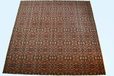
Rug, Tascot Templeton Carpet (TTC), c.1990
This rug was woven in the mid-1990s at the Tascot Templeton Carpet (TTC) mills in Devonport, Tasmania. It was an in-house design. The rug was woven as a one-off design exercise and was given a Golden Thread Award by the Australian Wool Corporation. The design never went into standard stock production and was never released for public sale. This rug has been woven with 100% wool on a 1 metre wide loom. The loom was purchased by TTC from United Carpet Mills of Preston and the rug was woven to demonstrate the capabilities of these looms. This rug is an example of Wilton weaving. Wilton differs from Axminster in that it is usually Loop Pile and 100% wool whereas Axminster is Plush (cut) pile and normally 80/20 wool nylon blend. TTC manufactured primarily high-quality narrow and broad loom, Axminster and Wilton carpets for the domestic and commercial market. They operated from the early 1960s until their closure in 2011. This rug was also on display in the Tascot Templeton head offices before being donated to the National Wool Museum in 2021 by Roger Warn. 3 x 3-meter carpet rug woven in 1-meter wide sections. The pattern repeats 3 times both in the width and the length. Starting from the bottom left corner, a square can be seen within a larger circular shape. These circular shapes connect end on end across the width and length of the rug. 5 Circles make up the length of the rug while 6 circles make up the width. Numerous small shapes encompass the entirety of the rug. These small shapes work together to form many interconnected repeating forms that draw your eye in a new direction every time you look at the rug. The predominant colour of the rug is a purple background with blue, cream and orange colours making up the foreground colours.carpet rugs, woollen rugs, tascot templeton carpets, axminster carpet loom -
 National Wool Museum
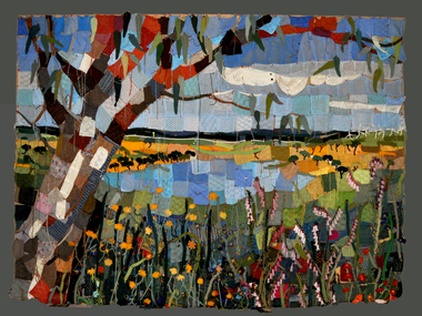
Textile - Community Textile Tapestry, Lisa Kendal et al, WARM, 2016
WARM was a community textile art project that saw over 250 knitters come together to create a beautiful collage tapestry. Made entirely from wool, the artwork contains more than 1000 individual hand knitted sections. The project takes aim at global warming, it highlights both the causes and solutions for us to create a sustainable and safe climate for future generations. Lisa Kendal, the co-creator of the project, said “One of the problems in the world is that we have forgotten how to warm ourselves with wool. We have become too dependent on fossil fuels (for heating)”. This is the key idea surrounding the project. WARM began as two large scale images created by Lars Stenberg. The first image is a landscape scarred by coal mining. The second image is the same landscape only many decades later. Regeneration and regrowth have taken over the landscape and hidden the past coal mine completely. In its place is a beautiful landscape including trees, native flowers, a lake, lots of greenery and wind turbines. From March to the end of August in 2016, knitters worked hard to create the over one thousand pieces that came together to form the final tapestry. The pieces were all designed by Fibre Artist Georgie Nicolson of Tikki Knitting Designs, who converted the second image of the healed landscape into patterns for the 250 plus knitters to follow. These patterns included unusual designs such as gum leaves, trees, native flowers and even the wind turbines. During several days of installation, the knitted pieces were stitched together by Lars Stenberg over a picture of the first image of the operational coal mine. They worked to create the second image of the renewed landscape; like an enormous collage. The WARM project was donated to the National Wool Museum in 2021. It was a much-loved hanging within the Ballarat Hospital for many years before coming to the museum. More information about the project can be found on the following website. http://www.seam.org.au/warm The tapestry is made from 1000+ hand knitted sections stitched together to make an image. In the foreground of this image is a large gum tree that stretches from the bottom left to the top right corner. The trunk of this tree follows the left edge of the tapestry, with foliage from the gum tree spanning its top border. The bottom third of the tapestry is predominantly green grass with yellow, pink and red flowers providing sporadic colour. The middle third encompasses a lake, with orange colours surrounding the banks of the water as opposed to the green grasses of the bottom third. To the right of the lake are wind turbines. The top third of the tapestry is blue sky with white clouds. It also contains the previously described gum tree leaves. Each piece of the tapestry is 100% wool and was hand knitted and stitched together. The Tapestry is accompanied by an oil painting on canvas. It is a painting that matches the tapestry and served as a template for the final tapestry. Finally, the tapestry is accompanied by another pointing on wood board. This final panting is of a coal mine. This is the setting before regeneration and regrowth have reclaimed this site, which is the theme captured in the final tapestry. In the foreground of the coal mine painting is the same gum tree described in the tapestry; however, it is grey and sickle with only 4 leaves visible at the top border, compared to the numerous leaves in the tapestry. Also in the foreground is a broken barb wire fence adding to the unwelcoming nature of the site. The colour scheme of this image is of dark greys and browns. A coal fired power plant can be seen in the final third of the image with four chimneys emitting plumes of smoke into the sky. In front of this power plant is the spiral shape of a coal mine, burrowing deep into the earth’s crust. Inside of the coal mine 3 yellow trucks are seen mining and transporting coal to the top of the mine.warm, community textile tapestry, knitting, community artwork, global warming -
 National Wool Museum
Album - Photo Album, Grazcos, c.1999
Photo album detailing the process involved in the Jumbo Wool Auction Service. This process was developed by Grazcos, a company who advanced innovations for shearers and wool farmers before amalgamating with Dalgety in the early 1990s. Grazcos was a well-known name to source a competent shearing team, or as a destination for wool in need of bulk classing. The Jumbo Wool Auction service was designed to process wool more efficiently through volume. 63 traditionally dumped farm bales of wool would fill a typical shipping container. The Jumbo Wool Auction Service enabled 108 farm bales to fit into the same container. This brought reductions in the costs of handling, selling, storing, and shipping of wool. This photo album details this process; from classing to shipping. This photo album was a draft copy produced for review before the production of mass-produced advertising flyers. 12-page hard cover photo album. Internally colour images and printed text have been stuck behind a protective plastic onto paper. The backing paper has many distinctive orange and grey horizontal lines. Printed text is in black ink. Colour images are 2 x 3 inches with rounded corners. Images and text are numbered 1 to 16 detailing the process of the Jumbo Wool Auction Service developed by Grazcos.wool auction, wool processing, grazcos -
 National Wool Museum
Book, A Material World: fibre, colour and pattern
"A Material World: fibre, colour and pattern" - Powerhouse Museum, Sydney, 1990. Catalogue from an exhibition of the same name held at the Powerhouse. Primarily an overview of the main aspects of the Powerhouse textile collection.fashion weaving embroidery textile design textile fibres, dyeing, printing, fashion, weaving, embroidery, textile design, textile fibres -
 Koorie Heritage Trust
Booklet, Public Record Office Victoria, Walata tyamateetji - a guide to government records about Aboriginal people in Victoria, 2014
This guide is designed to help researchers find records about Aboriginal people in Victoria in both the Public Reccords and Nationl Archives. It focuses on records that are specifically about Aboriginal people and issues, and inclues records created by the various government agencises overseeing the administration of Aboriginal affairs in Victoria. Public Record Office Victoria and the National Archives of Australia hold many government records about Aboriginal people in Victoria. This guide is designed to help Victorian Aboriginal people find records about their family and country. It will also assist anyone researching the history and administration of Aboriginal affairs in Victoria to find relevant records.87 pages : illustrations (some colour), maps, facsimiles ; 30 cm.This guide is designed to help researchers find records about Aboriginal people in Victoria in both the Public Reccords and Nationl Archives. It focuses on records that are specifically about Aboriginal people and issues, and inclues records created by the various government agencises overseeing the administration of Aboriginal affairs in Victoria. Public Record Office Victoria and the National Archives of Australia hold many government records about Aboriginal people in Victoria. This guide is designed to help Victorian Aboriginal people find records about their family and country. It will also assist anyone researching the history and administration of Aboriginal affairs in Victoria to find relevant records.aboriginal australians -- victoria -- history -- sources -- bibliography. | public records -- victoria -- bibliography. | aboriginal australians -- victoria -- archives. | archives -- victoria -- catalogs. | aboriginal australians -- victoria -- government relations -- history. | archives and archiving - manuscripts and records. | libraries - reference materials - bibliographies australian -
 Whitehorse Historical Society Inc.
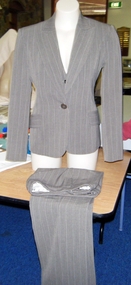
Clothing - Womens Suit, 1980's
Attached George Gross Biography. Vogue Australia|With more than 40 years in the industry,- George Gross is one of Australia's best known fashion designers. Designing his own. label for the last 35 years, Gross is renowned for his glamorous evening wear, corporate and race wear ranges. Embodying style and sophistication, Gross has dressed celebrities the world over in his eponymous label.|With his first creation - a sequined shift, at the tender age of 16 George still believes 'every collection starts with the fabric and is all about the cut and proper finishing. The looks and silhouettes change every season but not dramatically, it is more that they evolve from season to season.'|The George Gross label was first conceived in Adelaide by Gross and his business partner Harry Watt. As designer, both were working for other fashion houses and saw a gap In the market for elegant evening wear, suiting and separates. Joining with his twin sister Kathy, the three began with a small Adelaide store and expanded to include more than 500 retailers worldwide at the height of their business.|Inspired by real women, Gross showcases his love of colour, cut and quality with each collection. His aim is to create sensuous clothing that women of any age, shape or taste look fabulous wearing. Attributing his longevity to a desire for experimentation while also listening to his customers' needs, Gross designs the fabric prints and only uses the best quality natural fibres from Europe.|Gross and Watt have won 13 Australian fashion design awards between them and both work closely with charities throughout Australia. Working primarily with Breast and Prostate Cancer Research, George organises parades around Australia, especially in their home town of Adelaide.|Gross now has seven stand alone stores, nine concession areas in David Jones department stores and numerous wholesale clients Australia wide. Having finished summer 2009, George is now working on winter 2010, his 73rd collection with many more to come.Three piece Grey - brown pin stripe pants suit. Fully lined pants, shaped waist band. Zip front & turned up cuffs. Jacket fully lined, wide reveres, single breasted, one button. Two pockets. Tailored waistcoat, 5 buttons. Two imitation pockets. Stretched lace backGeorge Grosscostume, female -
 Whitehorse Historical Society Inc.
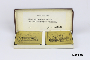
Domestic object - Coasters, c1986
Coaster showing 'Pannam's Store 1900' is historically incorrect as Pannam did not come to Vermont until c1934. It appears that it was known as 'Vermont Store' in 1900.Boxed set of six square coasters with rounded edges. Gilded alloy surface etched with black line graphics featuring scenes of early of the former municipality of Nunawading. Each coaster is backed with blue foam/felt. Rectangular presentation box with maroon colour lid - label inside.On each coaster-:|Pannam's Store, Vermont 1900|First Nunawading Council Chambers 1925|Backhouse's Dairy 1920|Nunawading Coat of Arms 1872|Blackburn Railway Crossing 1882|Schwerkolt Cottage Pump 1864|On label is typed 'Collector's Item. This is one of only 100 sets of coasters showing early Nunawading, designed by Jean Abbott, for Nunawading Arts Council to celebrate Victoria's 150 anniversary'|Written in ink '75'. Signature in ink 'jean Abbott'.civic mementoes, souvenirs, domestic items, table setting -
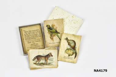 Whitehorse Historical Society Inc.
Memorabilia - Box - Cigarette silks, 1911 - 1917
These type of cigarette silks were included in WD & HO Wills cigarette packets to induce women in particular to take up smoking.|The Word 'Cartophilic?|It is believed that this unusual word was coined in the 1920s by Col. Bagnall, an Englishman, who was the father of the hobby of cigarette card and trade card collecting. It is thought to be a combination of a Latin word, 'carto' meaning 'card and the Greek word 'philic', meaning 'love'.- lover of cards. The term originally related to the collection of the two types mentioned, however, our Society has included postcards in the range of items collected by our members.|The Cigarette Card|The cigarette card began its evolution in the United States of America, in the early 1880s as a plain piece of cardboard used by tobacconists to protect the cigarettes which were sold in that era, not in packets, but loosely. A purchaser would buy his cigarettes then wrap them in paper around the small piece of cardboard, which acted as a stiffener. In fact, for many decades, cigarette cards were known as 'stiffeners' in the USA.|The card depicting 'The Marquis of Lome' is reputed to be the first known cigarette card issued. This is thought to have been in 1879. It did not take long for an enterprising entrepreneur to recognise the advertising potential of the cigarette card, and, very soon, the cards began displaying popular images, often in sets. This had the effect of youngsters, wishing to complete their sets, harassing their fathers to buy a specific brand of cigarettes. The kids who collected cards in the days when they were being issued in the cigarette packets, would hang around outside the local tobacconist's shop, pestering the men who had just bought a packet of cigarette, with the cry: 'can I have the cig can mister?'|It is a proven fact that, here in Australia during the 1930s, at least one set had one card deliberately withheld and issued very sparingly. This card is No. 86 (Mrs Jack Crawford) in the Carreras 'Turf Personality Series'. Thus, in a set of reasonably easy cards to get, this one card is a constant source of frustration for the collector, and as such, commands a premium when it comes to price. It is not hard to imagine the young collector nagging his to Dad to keep buying 'Turf' cigarettes to enable him to finish the set.|From small beginnings the cigarette card soon gave rise to a booming industry in itself. Artists and writers were|employed to produce the cards, which were miniature works of art and served as little encyclopaedia's for the children of the day. By the 1930s cards were being issued in the countless millions. It has been stated, in one book on the history of cards; that 450 million sets of a series produced and issued by the prolific issuer of cards in the United Kingdom, WD & HO Wills. As each set contained 50 cards you would need a calculator with a very long result window to see the answer to how many cards of that series were in circulation.|Australia's involvement would appear to have its beginnings with the English and American firms who shipped their tobacco products here and the cards of American Tobacco Company (ATC) are found in great numbers in early Australian collections; many featuring Australian subjects, e.g. 'Australian Parliament a 1901 issue. Earlier U.S. sets depicting Australians included Goodwin & Co's, so called. 'Australian Series' with cricketers and Australian Rules footballers who were on the sporting scene during the 1880s. The caption of one of theses cards reads:|'W.Hannysee. Captain Port Melbourne Football Club' which enables us to pinpoint the year of issue to either 1889 or 1890.|On the Australian scene the first local manufacturer who issued cards seems to have been The National Cigarette Company of Australia Proprietary Limited, whose 'Tally Ho' packets contained cards from a series of thirteen featuring the touring 'English Cricket Team 1897-8' Of the few Australian manufacturers who issued cards, only two companies issued more the two sets.|Undoubtedly the cards issued by the Melbourne firm Sniders & Abrahams (later Sniders & Abrahams Pty Ltd) are the 'jewels in the crown' of Australian card issues. They issued some thirty-three series, with numerous sub-series and allied issues such as metal badges, metal football shields, celluloid flags etc., which ensured that the hobbyist had a vast range from which to collect. Sporting themes – football, cricket, horse racing – dominate, indicating the Australians' love of sport and the outdoors was as strong in those earlier times as it is today. Military, animals and birds themes were also to the fore, with a touch of culture being provided by 'Shakespeare', 'Dickens', actresses and even classical 'Statuary'. Humour was not forgotten with 'Cartoons and Caricatures', 'Naval and Cricket (double meaning) Terms' and the 'Jokes' series. Art and history were covered by the artist, S.T. Gill's 'Views of Victoria in 1857' while the stereoscopic 'Views of the World' expanded the collectors' knowledge of the world as a whole.|The Sniders & Abrahams series began in 1904 and by 1919 the company was in decline and was eventually taken over by G.G. Goode & Co. Ltd. This company produced one set only, the highly collectable 'Prominent Cricketer Series' issued in 1924. During the early to mid-1920s, J.J. Schuh Tobacco Pty Ltd issued eight series, again containing the popular subjects of sport and war. At least two provincial tobacconists, Lentens of Bendigo and Baillies of Warrnambool, issued private football series. The last series of cards issued by a truly Australian firm was Dudgeon & Arnell's '1934 Australian Cricket Team'.|The Australian market was not neglected by the English companies with WD & HO Wills, Godfrey Phillips and Ogdens all making their contributions. By far the most active issuer was the long-established company Wills, whose 'Cricketers' of 1901 heralded the flood of Australian series, which continued into the mid-thirties.|The onset of the 1939-45 World War sounded the death knell of the cigarette card and very few post-war issues were made, certainly not here in Australia.|The Trade Card|The Trade Card is a non-tobacco item used by manufacturers to promote and advertise their products, in the same way that cigarette cards were. It is uncertain exactly when they were first produced, but in the USA, non-collectable cards were issued by firms in the early 1800s. These were more akin to a latter day 'business card'. It was not until the 1850s, when coloured and pictorial cards were issued to advertise and promote products that the Trade Card|became a collectable item. Many beautiful lithographic cards were produced in this early era and they are very mu sought after by collectors. By the 1870s the issues of Trade Cards became more prolific and it is from this era that more cards are seen.|Again, it is difficult to pinpoint the exact date of the first Australian Trade Card and it may be that the highly collectable and extremely rare 'American Candy Co's' - 'Pure Caramels' Australian Rules football card, issued i 1891, is the earliest series. This confectionery firm was located in Fitzroy, a Melbourne suburb. To date only two subjects have been seen.|Another early set was 'Flags', issued by F.H.Fauldings & Co. It featured testimonials of seven English cricketers who toured Australia with the 1894/5 Test team. Fauldings was an Adelaide based firm which manufactured medicinal toiletries, soaps and oils, using the distinctly Australian eucalyptus oil. During the 20th century a multitude of Australian businesses issued trade cards, with confectionery manufacturers such as Hoadleys, Allens, Sweetacres and Australian Licorice producing the majority of them. Again sporting themes dominated with the ever popular Aussie Rules football cards being the most numerous. Cricket issues ran a close second.|Apart from sporting cards, almost every subject imaginable was covered by the Trade Card, making it the most diverse and interesting branch of cartophilly. In contrast to the Cigarette Card, which had its demise prior to the Second World War, the Trade Card is still alive and well.|We all are aware of the long running 'Birds of Australasia' series put out by Tuck-fields Tea and 1 doubt if there is a kitchen drawer in Australia that has not got one or two of these informative and attractive cards floating about in it. These cards were first produced in the early 1960s and are still being inserted in that company's packets of tea. Such is also the case with Sanitarium Health Foods, manufacturers of the well known Weetbix, who began issuing cards, with a wide range of subjects, in the early 1940s and continue to do so.|The 1940s and 1950s saw the two breakfast food giants, Kornies and Weeties dominating the card scene. Kornies footballers were in production fora decade from 1948 to 1959. Four years later in 1963, we saw the start of four decades of Scanlens bubble-gum card issues, both football and cricket. In the mid 1990s, with the end of the Scanlens/Stimorol cards, the Trading Card came on the scene. These cards do not fit under the umbrella of the Trade Card, having been produced and marketed purely as a 'collectable' with no connection whatsoever to any product, which of course is necessary for an item to be classified as a Trade Card.|The earliest British postcard was issued in 1870 and was designed to send short messages; the stamp was printed on the card, therefore it did not require an envelope. It was considered by many to be lowering the postal standards because the texts were no longer private. However the cards were a great success as on the first day of issue in 1870, half a million passed through the London postal centre.|The first illustrated postcards are said to be those introduced by a French stationer in 1870. He realized that French troops fighting in the Franco-Prussian War needed to be able to send short messages to their families and designed a 'postcard' to suit the purpose. As many of the soldiers were illiterate they decorated their cards with sketches of their many activities at the front rather than writing; thus creating a picture postcard. Private enterprise soon saw the great financial possibilities of this new easy and attractive way of communication by post; also sending a postcard cost less than postage for letters. It was correctly assumed that postcards were likely to overtake letter writing in many instances.|Between 1875 and 1882 every state in Australia introduced official postcards, N.S.W. first and Tasmania last. Each state produced a simple type of postcard with a pre printed stamp allied to that state. The stamp side stated 'The Address Only To Be Written On This Side'; the reverse side sometimes carried a simple illustration or decoration with space fora short message, each state extolling their own state's virtues. In 1901, with the advent of Federation, the new Government became responsible for all postal services in Australia and produced postcards for sale in every state. With several mail deliveries each day in most towns, postcards were used for many purposes. One 1906 postcard, with an illustration of fruit, was sent from Mrs X in the morning to her greengrocer ordering her fruit and vegetables to be delivered that afternoon. Another lady asks her charlady to 'come this afternoon'.|Australian private enterprise also began selling pictorial postcards, most companies using the very experienced German printing works who were the worlds best in the field of lithography and fine detailed colour-printing. Many of these beautiful German cards still exist today, 100 years later. Australia did have a few fine printers but they were in the minority. Black and white postcards printed in Australia in the early 1900s were often of good quality e.g. postcards printed by 'The Bulletin', illustrating the works of 'The Bulletins' top artists.|Between c1903-09 The Melbourne company Osboldstone and Atkins etc. printed coloured reproductions of 46 J.A. Turner bush/rural life paintings, which were generally of good quality and became hugely popular and still sought after today. Like thousands of homes in Europe, Britain and U.S.A., many Australia homes had albums of cherished postcards, which were given pride of place for visitors to see and enjoy.|Postcard collecting remained popular but was changing with the times. About 1912 the Australian photographer George Rose of Melbourne began to produce topographical B/W real photographic postcards covering most of Australia and other photographers began to do likewise. These cards soon found their way into collections as well.|WWI and the horrors of war suddenly changed the world; postcards were still in great demand but the subject matter was far more serious. Thousands of postcards from the trenches in European war zones arrived in Australia to be included in family albums. Propaganda and recruitment messages were produced to encourage enlistment. Australian postcard producers began to create cards decorated with gum leaves, boomerangs, wattle etc., which were designed for sending to Australian troops serving overseas. Very few 'pretty' cards were available, as access to the Gentian printing works was no longer possible and exporting of postcards from Britain was very limited. By the end of WWI people had other more serious problems to contend with and the avid postcard collecting hobby declined, fold greetings took over and topographical photographic postcards became a small but steady income for the producers and newsagents etc. in every town.|Fortunately many of these old postcards still exist and are avidly collected by a new generation or postcard collectors. The Australian Cartophilic Society Inc. is one of four postcard/cigarette card organizations in Australia. They are, N.S.W. Post Card Collectors Society; Queensland Card Collectors' Society Inc. and West Australian Card Collectors|Society, and across the Tasman there is a New Zealand Postcard Society.|References:|Picture Postcards of the Golden Age A Collector's Guide by Toni & Valmai Holt. Picture Postcards in Australia 1898 - 1920 by David CookBox of Cigarette Silks ( 10 ) depicting animal motifs, which were placed in cigarette packets as an incentive for women in particular to smoke.|WD & HO Wills|Produced 1911 - 1917personal effects, smoking accessories, recreations, collections -
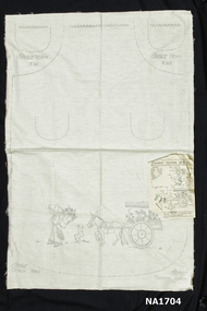 Whitehorse Historical Society Inc.
Craft - Apron pattern
Calico sheet with stencil for making apron. Shape of apron in broken line with stencil pattern for embroidery of mexican donkey pulling flower cart. Attached is a sheet with colour references for embroidery.Semco Fashion Pattern Semco Design K912handcrafts, needlework -
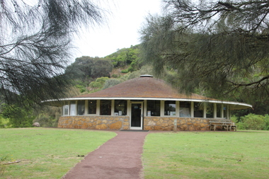 Ballarat Heritage Services
Photograph - Colour, Clare Gervasoni, Interpretation Centre at Tower Hill and Emus, 2016, 31/12/2016
The interpretation centre at Tower Hill was designed by Robin Boyd. A number of colour photographs showing the Interpretation Centre at Tower Hill, and an number of emus.tower hill, volcano, robin boyd, emu -
 Ballarat Heritage Services
Photograph - Photograph - Colour, Clare Gervasoni, Nimon's Bridge, 1999, 04/10/1999
Nimons Bridge was built in 1890, as part of the then Ballarat-Linton railway. The bridge is 17 spans with tall timber piers of four driven piles each, with triple sets of diagonal cross-bracing and walers and a single row of longitudinal horizontal bracing between piers. The spans are of a uniform twenty feet (6.1 metres), originally supported by four 21-inch x 9-inch (535 mm x 230 mm) Kauri timber beams per span, following the standard V.R. design of the period. When the superstructure was rebuilt after the 1953 fire, the timber beams were replaced with two 24-inch (610mm) deep rolled-steel-joists on each span. These are marked 'Lancashire Steel Co., Scotland' and are believed to have been second-hand. The deck of transverse-timber planks is 103.6 metres in length. Overall the bridge has an impressive appearance with its exceptionally tall triple-cross-braced piers creating a 'three-tiered' effect, with the deck 19.2 metres above the Woady Yaloak River. The Ballarat-Skipton line closed in 1985. Nimons Bridge has been recently restored, as part of the Ballarat-Skipton Rail Trail. How is it significant? Nimons Bridge is significant for technical, historic and aesthetic reasons at a State level. Why is it significant? Nimons Bridge is technically significant as Victoria's fourth-tallest timber trestle bridge when built, and as the third-tallest surviving example. It is also the second-largest composite bridge combining traditional timber piers with RSJ spans and a timber deck and falls within a select group of fewer than ten timber railway bridges with horizontal longitudinal bracing between the piers and three sets of double cross-bracing on its tallest piers, creating a visually striking 'three tiered' effect that enhances its viaduct form. Nimons Bridge is historically significant as having served initially the mining community at Linton, then the Western District agricultural area and in later years a kaolin quarry at Pittong. Nimons Bridge is historically significant as a representative of the 'light' branch line methodology that stimulated the explosion of railway construction in Victoria during the 1880s, and provides an interesting contrast with the more solid and vastly more expensive railway viaducts built in similar terrain on Victorian main lines, at Moorabool and Taradale, in the late 1850s. Approached by a deep cutting and high embankment at either end, the bridge represents a very cost-effective late 19th century engineering solution to the characteristic physiography of western Victoria with flat basalt plains intersected by deep wide valleys occasionally subject to severe flooding. Nimons Bridge is aesthetically significant for its visually impressive viaduct form, crossing a deep and steep-sided valley that is part of a rich cultural landscape. Within close proximity of the bridge are mullock dumps, tailings, shaft sites and other relics of the deep-lead alluvial mining era. The bridge is the most visually spectacular timber-trestle rail bridge in Western Victoria and is among the most spectacular timber-trestle rail bridges surviving anywhere in Victoria. It is part of the Ballarat-Skipton Rail Trail. Classified by the National Trust :02/10/2000 (http://vhd.heritagecouncil.vic.gov.au/places/67986)Colour photograph of a log bridge known as Nimon's Bridge.ballarat-linton, nimons bridge, nimon's bridge, log bridge, viaduct, timber-trestle rail bridge -
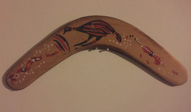 Ballarat Heritage Services
Photograph - Colour, Boomerang, Probably by Bill Onus, c1960s, 1960s
William (Bill) ONUS (15 November 1906-1968) Born Cummeragunja Aboriginal Reserve, Murray River, New South Wales Clan: Wiradjuri William Townsend (Bill) Onus was a shearer, actor and activist who revived the Australian Aboriginese League in Melbourne in 1946. He retired from politics in to start the Aboriginal Enterprises workship in Belgrave with his brother Eric. They produced boomerangs, woomeras, fabrics and greeting cards imprinted with Aboriginal motifs. He ran the business from his small factory and shop at Belgrave in the Dandenong Ranges. To promote his wares Bill Onus toured widely in Victoria and beyond as a travelling showman, giving demonstrations of boomerang-throwing, which he advocated as a national sport. (ADB) Bill Onus adopted similar imagery to that which appeared in mass-produced indigenised design; however, he used such works to draw attention to his political work with the ‘Committee for Aboriginal Citizen Rights’ and the ‘Australian Aborigines League.’ William McLintock (Lin) Onus is the son of Bill Onus. Painted boomerang thought to be decorated by Bill Onus.boomerang, aboriginal, bill onus, aboriginal enterprise novelties -
 Ballarat Heritage Services
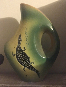
Ceramic - Photograph - Colour, Ceramics Decorated by Bill Onus, c1955
William (Bill) ONUS (15 November 1906-1968) Born Cummeragunja Aboriginal Reserve, Murray River, New South Wales Clan: Wiradjuri William Townsend (Bill) Onus was a shearer, actor and activist who revived the Australian Aboriginese League in Melbourne in 1946. He retired from politics in to start the Aboriginal Enterprises workship in Belgrave with his brother Eric. They produced boomerangs, woomeras, fabrics and greeting cards imprinted with Aboriginal motifs. He ran the business from his small factory and shop at Belgrave in the Dandenong Ranges. To promote his wares Bill Onus toured widely in Victoria and beyond as a travelling showman, giving demonstrations of boomerang-throwing, which he advocated as a national sport. (ADB) Bill Onus adopted similar imagery to that which appeared in mass-produced indigenised design; however, he used such works to draw attention to his political work with the ‘Committee for Aboriginal Citizen Rights’ and the ‘Australian Aborigines League.’ William McLintock (Lin) Onus is the son of Bill Onus. Ceramic form decorated with Aboriginal design by Bill Onus.aboriginal, bill onus, aboriginal enterprise novelties, ceramics -
 Ballarat Heritage Services
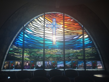
Photograph - Photograph - Colour, Bruce Hutton (Almond Glass Works), Stained Glass at the St John of God Hospital Chapel by Bruce Hutton, 2017, 2017
Bruce Hutton of Almond Glass Works designed the stained glass window and did the hand painting for the Chapel in St John of God, Ballarat. Almond Glassworks was responsible for the overall construction and installation of the window. The concept was developed with the then head of mission, Maureen Waddington. The window was installed on the 30th of October 2019. Almond Glassworks was founded by Bruce Hutton in 1994. He completed a Fine Arts Degree (Chisholm Institute of Technology) majoring in stained glass in 1988, he then went on to work in the industry both in Australia, England and South Africa. He completed a Postgraduate (Monash University) in 1996, focusing on the conservation and restoration techniques of stained glass. Colour photograph of stained glass feature wall at the chapel in St John of God Hospital, Ballarat.stained glass, st john of god hospital, ballarat, bruce hutton, almond glass works -
![Photograph - Photograph - Colour, Stained Glass at the St John of God Hospital Chapel [detail], 2017, 2017](/media/collectors/57a00a4fd0cdd1210422a51e/items/59c8f5c221ea680ef8f42962/item-media/59c8f5de21ea680ef8f43582/item-fit-380x285.jpg) Ballarat Heritage Services
Ballarat Heritage ServicesPhotograph - Photograph - Colour, Stained Glass at the St John of God Hospital Chapel [detail], 2017, 2017
Bruce Hutton of Almond Glass Works designed the stained glass window and did the hand painting for the Chapel in St John of God, Ballarat. Almond Glassworks was responsible for the overall construction and installation of the window. The concept was developed with the then head of mission, Maureen Waddington. The window was installed on the 30th of October 2019. Almond Glassworks was founded by Bruce Hutton in 1994. He completed a Fine Arts Degree (Chisholm Institute of Technology) majoring in stained glass in 1988, he then went on to work in the industry both in Australia, England and South Africa. He completed a Postgraduate (Monash University) in 1996, focusing on the conservation and restoration techniques of stained glass. stained glass, st john of god hospital, ballarat -
![Photograph - Photograph - Colour, Stained Glass at the St John of God Hospital Chapel [detail], 2017, 2017](/media/collectors/57a00a4fd0cdd1210422a51e/items/59c8f5ed21ea680ef8f43e52/item-media/59c8f5fb21ea680ef8f44848/item-fit-380x285.jpg) Ballarat Heritage Services
Ballarat Heritage ServicesPhotograph - Photograph - Colour, Stained Glass at the St John of God Hospital Chapel [detail], 2017, 2017
Bruce Hutton of Almond Glass Works designed the stained glass window and did the hand painting for the Chapel in St John of God, Ballarat. Almond Glassworks was responsible for the overall construction and installation of the window. The concept was developed with the then head of mission, Maureen Waddington. The window was installed on the 30th of October 2019. Almond Glassworks was founded by Bruce Hutton in 1994. He completed a Fine Arts Degree (Chisholm Institute of Technology) majoring in stained glass in 1988, he then went on to work in the industry both in Australia, England and South Africa. He completed a Postgraduate (Monash University) in 1996, focusing on the conservation and restoration techniques of stained glass. stained glass, st john of god hospital, ballarat, bishop, pectoral cross -
![Photograph - Photograph - Colour, Stained Glass at the St John of God Hospital Chapel [detail], 2017, 2017](/media/collectors/57a00a4fd0cdd1210422a51e/items/59c8f62421ea680ef8f4678d/item-media/59c8f63821ea680ef8f46d71/item-fit-380x285.jpg) Ballarat Heritage Services
Ballarat Heritage ServicesPhotograph - Photograph - Colour, Stained Glass at the St John of God Hospital Chapel [detail], 2017, 2017
Bruce Hutton of Almond Glass Works designed the stained glass window and did the hand painting for the Chapel in St John of God, Ballarat. Almond Glassworks was responsible for the overall construction and installation of the window. The concept was developed with the then head of mission, Maureen Waddington. The window was installed on the 30th of October 2019. Almond Glassworks was founded by Bruce Hutton in 1994. He completed a Fine Arts Degree (Chisholm Institute of Technology) majoring in stained glass in 1988, he then went on to work in the industry both in Australia, England and South Africa. He completed a Postgraduate (Monash University) in 1996, focusing on the conservation and restoration techniques of stained glass. Detail of a nun in stained glass window at St John of God Hospital, Ballarat.stained glass, st john of god hospital, ballarat, nun -
![Photograph - Photograph - Colour, Stained Glass at the St John of God Hospital Chapel [detail], 2017, 2017](/media/collectors/57a00a4fd0cdd1210422a51e/items/59c8f68721ea680ef8f48ddf/item-media/59c8f69b21ea680ef8f49be3/item-fit-380x285.jpg) Ballarat Heritage Services
Ballarat Heritage ServicesPhotograph - Photograph - Colour, Stained Glass at the St John of God Hospital Chapel [detail], 2017, 2017
The five stained glass windows were made by Rosemary Spencer. to the design of Bruce Hutton. The stained glass depicts the story of St John of God in Ballarat. Bruce Hutton of Almond Glass Works designed the stained glass window and did the hand painting for the Chapel in St John of God, Ballarat. Almond Glassworks was responsible for the overall construction and installation of the window. The concept was developed with the then head of mission, Maureen Waddington. The window was installed on the 30th of October 2019. Almond Glassworks was founded by Bruce Hutton in 1994. He completed a Fine Arts Degree (Chisholm Institute of Technology) majoring in stained glass in 1988, he then went on to work in the industry both in Australia, England and South Africa. He completed a Postgraduate (Monash University) in 1996, focusing on the conservation and restoration techniques of stained glass. Colour photograph of a detail of stained glass windows at the Chapel of the Visitation at St John of God Hospital, Ballarat.stained glass, st john of god hospital, ballarat, ship, immigration -
![Photograph - Photograph - Colour, Stained Glass at the St John of God Hospital Chapel [detail], 2017, 2017](/media/collectors/57a00a4fd0cdd1210422a51e/items/59c8f6da21ea680ef8f4bc78/item-media/59c8f6ec21ea680ef8f4c5be/item-fit-380x285.jpg) Ballarat Heritage Services
Ballarat Heritage ServicesPhotograph - Photograph - Colour, Stained Glass at the St John of God Hospital Chapel [detail], 2017, 2017
Bruce Hutton of Almond Glass Works designed the stained glass window and did the hand painting for the Chapel in St John of God, Ballarat. Almond Glassworks was responsible for the overall construction and installation of the window. The concept was developed with the then head of mission, Maureen Waddington. The window was installed on the 30th of October 2019. Almond Glassworks was founded by Bruce Hutton in 1994. He completed a Fine Arts Degree (Chisholm Institute of Technology) majoring in stained glass in 1988, he then went on to work in the industry both in Australia, England and South Africa. He completed a Postgraduate (Monash University) in 1996, focusing on the conservation and restoration techniques of stained glass. Stained glass panel of 'Weeping Bailey's' house, now part of St John Of God Hospitalstained glass, st john of god hospital, ballarat, bailey's mansion, weeping bailey, architecture -
 Ballarat Heritage Services
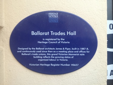
Photograph - Colour, Ballarat Trades Hall Plaque, 2016, 30/07/2016
Ballarat Trades Hall is registered by the Heritage Council of Victoria Designed by the Ballarat architects James and Piper, built in 1887-8, and continuously used since then as a meeting place and offices for Ballarat's trade unios, this grand Victorian Mannerist style bilding reflects the rowing status of organised labour in Victoria Victorian Heritage Register Number H0657ballarat trades hall, camp street, unions, foundation stone, plaque, brett edgington, paul clempson -
 Ballarat Heritage Services
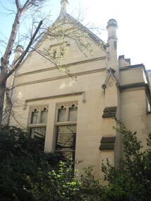
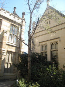
Photograph - Colour, Clare Gervasoni, University of Melbourne Old Physics Building, 2010, 29/09/2010
Melbourne University Old Physics Building (1889) was designed by Reed, Henderson and Smart. It later house the Univesity's Centre for Indigenous Education and a conference centre (2010).Colour photograph of the Melbourne University Old Physics Building.university of melbourne, old physics building -
 Ballarat Heritage Services
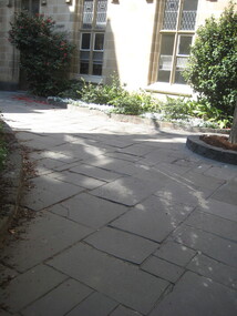
Photograph - Colour, Clare Gervasoni, Flagstones at the University of Melbourne Old Physics Building, 2010, 29/09/2010
Melbourne University Old Physics Building (1889) was designed by Reed, Henderson and Smart. It later house the Univesity's Centre for Indigenous Education and a conference centre (2010).Colour photograph of the flagstones at the Melbourne University Old Physics Building.university of melbourne, old physics building, flagstones -
 Ballarat Heritage Services
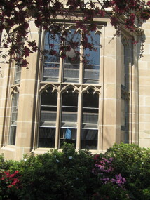
Photograph - Colour, Clare Gervasoni, University of Melbourne Old Physics Building, 2010, 29/09/2010
Melbourne University Old Physics Building (1889) was designed by Reed, Henderson and Smart. It later house the Univesity's Centre for Indigenous Education and a conference centre (2010).Colour photograph of the Melbourne University Old Physics Building.university of melbourne, old physics building -
 Ballarat Heritage Services
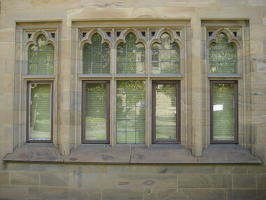
Photograph - Colour, Clare Gervasoni, University of Melbourne Old Physics Building, 2010, 29/09/2010
Melbourne University Old Physics Building (1889) was designed by Reed, Henderson and Smart. It later house the Univesity's Centre for Indigenous Education and a conference centre (2010).Colour photograph of the windows of the Melbourne University Old Physics Building.university of melbourne, old physics building
