Showing 166 items matching "prompts"
-
 Phillip Island and District Historical Society Inc.
Framed Certificate, 27-02-1921
As written on CertificateFramed Bravery Award to Arnie Brown from grateful recipients he'd saved from drowning. Illuminated hand painted in water colours and gold. Signed by Robert Anderson and James Douglas.Presented to Mr Arnie Brown as a token of grateful thankfulness and appreciation of his prompt action in rescuing us from drowning when the dinghy was upset at Cowes, Phillip Island, Western Port Bay, 27th February, 1921. Mr. James Douglas. Mr. Robert Anderson. [signed] Robert Anderson J. Douglaslocal history, documents, certificates, certificate, bravery award -
 Ballarat and District Irish Association
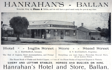
Image, Ballarat Courier, Hanrahan's Hotel, Ballan, 1916, 1916
D.J. Hanrahan was the Licensee of Hanrahan's Hotel and E.T. Hanrahan was the proprieter of Hanrahan's Store. The hotel supplied the best of liquors, good accommodation and prompt attention. It offered livery and letting stables, and horses and buggies on hire. According to the advertisement Hanrahan's had one of the finest stocks of imported liquors in Victoria. Hanrahan's Store offered "everything you want from a first-class General Store, all at lowest prices."Advertisement for Hanrahan's Hotel at Ballan. The advertisement features a photograph of a weatherboard building on the corner of Inglis Street and Stead Street in Ballan. The lamp legally required at the front of licensed premises is present.ballarat irish, hanrahan, hanrahan's hotel, hanrahan's store, ballan, stables, horses, buggies -
 Wodonga & District Historical Society Inc
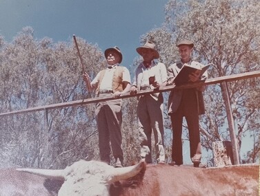
Album - Ringer's River by Des Martin - Plate 6 - O'Day succeeds at the cattle auction
Big Gun auctioneer Bernard Price makes the mistake of his life when he knocks the first pen of Boondangies down to O'Day at a minimal price, thinking him to be a kid "buying a few for mother". O'Day promptly takes up the option of the whole draft of 4000 head of top class stores. His telegram to this effect leads MacLough to believe his new manager will ruin him.The album and images are significant because they document literature written by a prominent member of the Wodonga community. The presentation of this precis was supported by several significant district families and individuals.Ringer's River Album Coloured photo Plate 6des martin, many a mile, ringer's river, northeast victoria stories -
 Mission to Seafarers Victoria
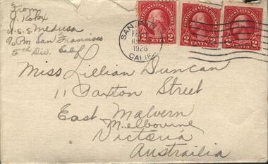
Letter - Correspondence, Julius Kokx, Letter to Lillie from Julius Kokx, 14 June 1926
The "letters to Lillie" show the international nature of the Mission to Seafarers. They are an important display of the handwriting style of the time, revealing courting attempts and give us an insight into life in 1925.Lillie Duncan was a member of the Harbour Lights Guild and this letter forms part of a collection of letters sent to her by different seafarers.Letter addressed to Miss Lillie Duncan, 11 Paxton St, East Malvern, Melbourne, Australia from J. Kokx M.S.S. Medusa c/o PM San Francisco 5th Div Cal. in two parts: Part 0098.1 Envelope Part 0098.2 Letter Both the envelope and the letter are creamy yellow in colour with black curly writing on one side of the envelope and both sides of the letter. The letter begins with "Dear Miss Duncan. I am very..." and concludes with "I will answer your letter most promptly I swear I will, Lovingly Julius Kokx"The envelope is torn across the top for access to its contents. It has three 2 cent stamp with the text "United States Postage" across the top and "Washington" underneath.handwriting, correspondence, melbourne, lillie duncan, julius kokx, san pedro, california, uss medusa, lhlg -
 National Trust of Australia (Victoria)
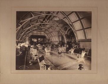
Photograph - Photograph, Black + White, c1903
This photograph informs the viewer of the grand ballroom at Rippon Lea homestead in Elsternwick in the late 1800s. One of 33 rooms in this mansion, built for Fredrick Sargood in 1868, the ballroom stood where the swimming pool is currently located. Louisa Jones’ (nee Nathan) love of the 1930s Hollywood style prompted her to demolish the old ballroom and replace it with the swimming pool. She converted Sargood’s billiard room into a ballroom during the late 1930s. Large black and white photograph (now sepia with age) in a ' landscape format' mounted on cardboard. The room featured in the image has an arched dome-shaped roof, a floor adorned with rugs, a vast and heavily ornate space and approximately 12 wicker chairs in the foreground.Written on verso of mount: 'Ballroom & organ at Rippon Lea' Stamped onto front left bottom corner of photograph: 'Johnstone & O'Shannessy/ & Co./ Propy. Ltd/ Collins St. Melb.' rippon lea, 1890s, ballroom, architecture, decorative arts, sargood family -
 Warrnambool and District Historical Society Inc.
Clothing, Warrnambool Urban Fire Brigade, Mid 20th century
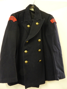
This jacket was part of the working uniform of the Warrnambool Urban Fire Brigade in the mid 20th century. It belonged to John (Jack) Sizeland, a member of the Fire Brigade for over 37 years. He retired in 1977. Prompted by a fire at the Flying Buck Hotel in Liebig Street the Warrnambool Fire Brigade was established in the mid 1860s. It has been successful in Victorian Fire Brigade Championships over the years, especially in the 19th century. It is currently situated in Mortlake Road. This jacket is of interest as an example of the clothing worn by firefighters in Victoria in the mid 20th century. It is also of interest because it was worn by Jack Sizeland, a local firefighter for over 37 years. This is a black double-breasted cloth jacket with six brass buttons down the front and two brass buttons on the lapels. The buttons are impressed with a shield and the words ‘Country Fire Authority Victoria’. There are two brass clips on the side to hold a belt. There are two black and red cloth attachments at the top of each sleeve (‘Warrnambool Urban Fire Brigade’). There is some black cloth lining inside the garment across the shoulders. The maker’s label, ‘David Lack Pty Ltd, Melbourne’ is on the inside collar. ‘David Lack Pty Ltd Melbourne’ ‘Warrnambool Urban Fire Brigade’ warrnambool fire brigade, jack sizeland, history of warrnambool -
 Warrnambool and District Historical Society Inc.
Uniform, Warrnambool Fire Brigade, Mid 20th century
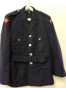
This is a complete uniform of the Warrnambool Urban Fire Brigade in the mid 20th century. The Warrnambool Fire Brigade, located today in Mortlake Road, Warrnambool, was established in 1863. The formation was prompted by a fire at the Flying Buck Hotel in Liebig Street. The Warrnambool Fire Brigade has a long proud history of service to the people of Warrnambool and district for over 150 years. The uniform belonged to John (Jack) Sizeland, a firefighter for over 37 years. He retired in 1977. This uniform is of some significance as it shows the type of uniform worn by Warrnambool firefighters in the mid 20th century. It is also of importance because it belonged to a local firefighter, Jack Sizeland. This is a Warrnambool Fire Brigade uniform consisting of:- .1 A black cloth single-breasted jacket lined with black and white material. It has four silver metal buttons down the front and two on the top pocket lapels. The buttons have the inscription ‘Country Fire Authority Victoria’. There are two red and black cloth tabs stitched on the top of the sleeves (‘Warrnambool Urban Fire Brigade’). The belt is stitched at the back and loose at the front. .2 Black cloth trousers with a red braid stripe down each leg. .3 Black leather belt with a silver-coloured buckle. .4 Black officer-type hat with red plastic lining, a plastic peaked front with a green backing, a red and black braid around the rim with two metal buttons and a silver-coloured metal badge of the Country Fire Authority. .5 Black cloth (polyester) tie with orange lining. Trousers: ‘C.F.A., I. L. Wise’ Tie: ‘Mark Andrew Made in Australia’ Hat: ‘Emerco, Melbourne, Registered Trademark, This is Your Guarantee for Quality, Made in Australia’ warrnambool fire brigade, jack sizeland, history of warrnambool -
 Greensborough Historical Society
CD-ROM, Ted Baillieu speaking on researching World War 1 veterans, 04/03/2014
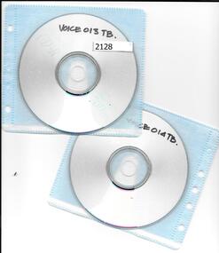
Ted Baillieu speaking on researching World War 1 veterans. The Hon Hugh Delahunty MP, Minister of Veterans Affairs opened the seminar and Chair of Victorian ANZAC Centenary Committee, The Hon Ted Baillieu MLA, updated attendees on plans. His theme was "Connections" prompting the need for people of the day, through family research, local people, churches and honour boards etc., to make 'Connections' to the World War 1 event of 100 years ago.Two Cd-Roms in plactic envelopes Disc a: 49 min. Disc b: 17 min.Ted Baillieu speaking on researching World War 1 veteransworld war i, ted baillieu -
 Federation University Art Collection
Printmaking - etching, 'Kangaroo Bones, Broken Crockery, Drought' by Anne McMaster, 2008
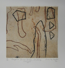
Anne McMaster (1959- ) Born Melbourne Artists' Statement: In the thick of drought kangaroos perish and farmers walk off the land. All that is left are bones and broken crockery. Overlaid images prompt the observer to question the Anglo-Saxon relationship to country, to that of indigenous tribes. Foul biting and earthy colours bring attention to the weathered landscape of Australia. This item is part of the Federation University Art Collection. The Art Collection features over 2000 works and was listed as a 'Ballarat Treasure' in 2007.Framed limited edition print.art, artwork, anne mcmaster, print council of australia, kangaroo, bones -
 City of Moorabbin Historical Society (Operating the Box Cottage Museum)
Document - Receipt, c1900
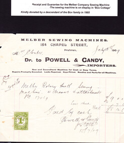
Mrs Martha Closter ( Kloster), of Oakleigh purchased the Melber Sewing Machine in 1909 and gave it to her daughter Mary when she and Alonzo Box married in 1918 and settled in Moorabbin Shire. This document was donated by a descendant of the Box family in 1985.William and Elizabeth Box purchased 'Box Cottage' in 1865 from a pioneer settler who had bought part of the land noted in Dendy's Special Survey 1841 Brighton. They raised their family there and established a market garden to supply produce to the population of Melbourne. Their nephew Alonzo married Mary Kloster/ Closter in 1918 and she brought with her the 'Melber' sewing machine that she used to provide clothing for the familyThe original paper Receipt of the Melber Company Sewing Machine, 154 Chapel Street Prahran on July 15th 1909. Mrs Closter purchased a ‘Melber Rotary Hook Sewing Machine , 4 drawers and attachment. No. 17469 costing 9 pounds, less due 7 shillings and 6 pence leaving the sum of 8 pounds 12 shillings and 6 pence Paid by Cash to Powell & Candy per ……… on 15/7/09 ( hand written ) MELBER SEWING MACHINES / 154 CHAPEL STREET, / Prahran / Mrs Closter July 15th 1909 ( handwritten) / Dr. to POWELL & CANDY, / IMPORTERS / New and Secondhand Machines for Cash and Easy Terms. / Repairs promptly executed Locks repaired. Keys fitted. Needles and Parts for all Machines. A stamp 25mm x 30mm is on left corner of document ‘ VICTORIA STAMP DUTY ‘ -at top and base - ‘1d ‘ - centrally victoria, melbourne, clothing, brighton, moorabbin, pioneers, sewing, box elizabeth, box alonzo, closter mary, kentucky, early settlers, america, craftwork, sewing machines, melber company, u s a, prahran, kloster martha -
 Warrnambool and District Historical Society Inc.
Clothing, Warrnambool Urban Fire Brigade Belt, Mid 20th century
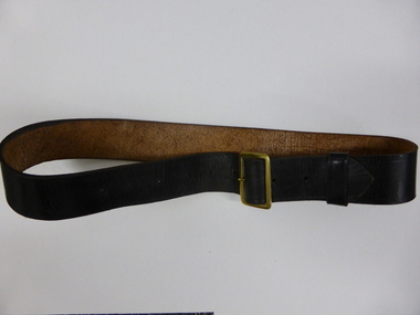
This belt was worn with the jacket issued to members of the Warrnambool Fire Brigade in the mid 20th century. The jacket was part of the uniform that served both as a dress uniform and a work uniform. The Warrnambool Fire Brigade was formed in 1863 following unsuccessful attempts to establish a permanent fire service in the town. It was prompted by a fire at the Flying Buck Hotel in Liebig Street. The Warrnambool Fire Brigade, now located on the Mortlake Road, has been successful in Victorian Fire Brigade competitions and demonstrations, particularly in the 19th century. The owner of the belt and uniform was John (Jack) Sizeland, a member of the Warrnambool Fire Brigade for over 37 years. This belt is of interest as it was part of a Warrnambool Fire Brigade uniform during the second half of the 20th century. It also has individual local provenance as it belonged to Jack Sizeland, a member of the Warrnambool Fire Brigade who retired in 1977 after 37 years of service. This is a brown leather belt with a gold metal buckle and nine punched holes on the buckle, two of them hand-punched. It has a leather attachment to keep the belt end in place. It has the name of the owner, John Sizeland, written in biro on the inside of the belt. This belt is meant to be worn with the Warrnambool Fire Brigade jacket with the brass buttons. ‘J. Sizeland, W’bool’warrnambool fire brigade, jack sizeland, history of warrnambool -
 Bendigo Historical Society Inc.
Book - ALEC H CHISHOLM COLLECTION: BOOK ''THE ADVENTURES OF SHERLOCK HOLMES'' BY A.CONAN DOYLE
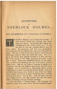
Book. ALEC H CHISHOLM COLLECTION. 293 page hardcover book of 12 stories of Sherlock Holmes by Arthur Conan Doyle. Published in 1920 by John Murray, London and printed by Wyman & Sons Ltd, London and Reading. Catalogue sticker ''2147 DOY'' on spine. Handwritten in ink on the title page ''With all pleasant remembrances of Brisbane - in spite of the mosquitos (one or two of which were human) A. Conan Doyle'' Also handwritten in ink inside front cover ''This book (now rebound) was given to me by its author - Sir A.Conan Doyle - in Brisbane in Jan.1921. The reference to human 'mosquitos' on the title page is prompted by the fact that some of the interjectors or questioners at Doyle's spiritualistic lectures were inclined to be scurrilous. A.H.Chisholm''Arthur Conan Doylebooks, collections, short stories, alec h chisholm collection, arthur conan doyle, sherlock holmes -
 Warrnambool and District Historical Society Inc.
Clothing, Jacket Warrnambool Fire Brigade, Mid 20th century Place Made
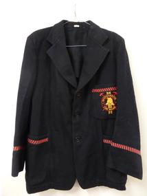
This blazer was worn by a Warrnambool Fire Brigade member (Jack Sizeland). It was part of the dress uniform for fire brigade members in the 1960s and 70s. The Warrnambool Fire Brigade was established in the early 1860s after a fire at the Flying Buck Hotel in Liebig Street prompted a public meeting to establish a permanent fire authority in the town. There had been a couple of attempts previously to set up a local fire brigade. The Warrnambool Fire Brigade actively participates in Country Fire Authority Championships and competitions and has been very successful, particularly in the 19th century. John (Jack) Sizeland retired when he was 65 in 1977 (37 years of service).This blazer is of interest as it shows us what fire fighters in Warrnambool were wearing in the mid 20th century (dress uniform). It is also a memento of one long-serving firefighter, Jack SizelandThis is a man’s black blazer with three large black buttons. The sleeve ends and the three pockets have a diagonal red and black patterned braid stitched on. The upper portion of the blazer and the sleeves are lined with black material. The top pocket has the badge of the Warrnambool Fire Brigade in red and yellow stitched on. The badge features a Fire Brigade helmet, a ladder and two axes set in two concentric circles. A printed label with the owner’s name (Sizeland) is stitched inside the collar areaName ‘Sizeland’ stitched inside collar areawarrnambool fire brigade, country fire authority, john sizeland, history of warrnambool -
 Ringwood and District Historical Society
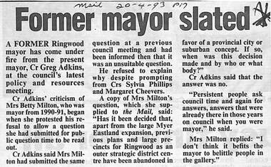
Newspaper, Scrapbook Clipping, Library Collection, Ringwood, Victoria
Newspaper Clipping from "The Mail", 20 April 1993, Page17, "Former Mayor Slated"'.A former Ringwood mayor has come under fire from tyhe present Mayor, Cr Greg Adkins, at the council's latest policy and resources meeting. Cr Adkin's criticism of Mrs Betty Milton, who was mayor from 1990-91, began when she protested his refusal to allow a question she had submitted for mpublic question time to be read out. He refused to explain why, despite prompting from Crs Sylvia Phillips and Margaret Cheevers. -
 Peterborough History Group
Newspaper articles pertaining to Peterborough from 1990 to 1999
Various newspaper articles kept by Mrs Dawn Irvine, all pertaining to Peterborough - river flooding and quality, concerns over council boundary realignment. Article titles: 6/10/1992 Flooding at Peterborough 28/6/1994 Residents undecided over River 4/7/1994 Letter from Warren Moore. Peterborough is alive, the way residents like it. 26/12/1994 Letter from R. Irvine. Apprehension over changes 17/6/1998 Algae fear prompts call to open Curdies River 13/4/1999 Battlelines on the Curdies 14/4/1999 Peterborough residents urge BHP to find alternative waste disposal optionHistoric overview of the towns' concerns at that time. Seven newspaper cuttings of various sizes all regarding aspects of Peterborough. Includes objection to BHP discharging waste into the Curdies River and flooding. warren moore, ronald irvine, curdies river, moyne council, council boundary realignment, curdies river flooding, floods, peterborough, blue green algae, river quality, bhp waste management, bhp -
 Wyndham Art Gallery (Wyndham City Council)
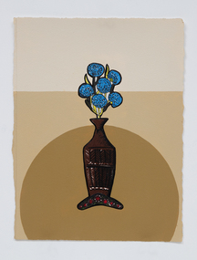
Painting, Tony Albert, Interior Composition (with Appropriated Aboriginal Design Vase) IX, 2022
Tony Albert’s 2022 solo exhibition at Sullivan+Strumpf, Remark, continues the artist’s investigation into the imagery and identification of appropriated Indigenous Australian iconography in domestic decoration and design. Incorporating fabric from his extensive collection of ‘Aboriginalia’, Remark sees Albert expand on his acclaimed Conversations with Margaret Preston series dimensionality, critically engaging with the fabric in his own right. Like the fabric of Australian society, the appropriated Indigenous imagery printed on souvenir tea towels intertwines in a complicated web of national identity. These are not images by Aboriginal people and our voices and autonomy continued to be silenced through the object’s inauthenticity. As a country we must reconcile with these objects’ very existence. They are painful reiterations of a violent and oppressive history, but we also cannot hide or destroy them because they are an important societal record that should not be forgotten. As an artist this juxtaposition and tension fascinates me. Tony Albert’s multidisciplinary practice investigates contemporary legacies of colonialism, prompting audiences to contemplate the human condition. Drawing on both personal and collective histories, Albert explores the ways in which optimism can be utilised to overcome adversity. His work poses important questions such as how do we remember, give justice to, and rewrite complex and traumatic histories. Albert’s technique and imagery are distinctly contemporary, displacing traditional Australian Aboriginal aesthetics with an urban conceptuality. Appropriating textual references from sources as diverse as popular music, film, fiction, and art history, Albert plays with the tension arising from the visibility, and in-turn, the invisibility of Aboriginal People across the news media, literature, and the visual world. australian first nations art, colonialisation -
 Wyndham Art Gallery (Wyndham City Council)
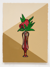
Painting, Tony Albert, Interior Composition (with Appropriated Aboriginal Design Vase) VII, 2022
Tony Albert’s 2022 solo exhibition at Sullivan+Strumpf, Remark, continues the artist’s investigation into the imagery and identification of appropriated Indigenous Australian iconography in domestic decoration and design. Incorporating fabric from his extensive collection of ‘Aboriginalia’, Remark sees Albert expand on his acclaimed Conversations with Margaret Preston series dimensionality, critically engaging with the fabric in his own right. Like the fabric of Australian society, the appropriated Indigenous imagery printed on souvenir tea towels intertwines in a complicated web of national identity. These are not images by Aboriginal people and our voices and autonomy continued to be silenced through the object’s inauthenticity. As a country we must reconcile with these objects’ very existence. They are painful reiterations of a violent and oppressive history, but we also cannot hide or destroy them because they are an important societal record that should not be forgotten. As an artist this juxtaposition and tension fascinates me. Tony Albert’s multidisciplinary practice investigates contemporary legacies of colonialism, prompting audiences to contemplate the human condition. Drawing on both personal and collective histories, Albert explores the ways in which optimism can be utilised to overcome adversity. His work poses important questions such as how do we remember, give justice to, and rewrite complex and traumatic histories. Albert’s technique and imagery are distinctly contemporary, displacing traditional Australian Aboriginal aesthetics with an urban conceptuality. Appropriating textual references from sources as diverse as popular music, film, fiction, and art history, Albert plays with the tension arising from the visibility, and in-turn, the invisibility of Aboriginal People across the news media, literature, and the visual world. australian first nations art, colonialisation -
 Wyndham Art Gallery (Wyndham City Council)
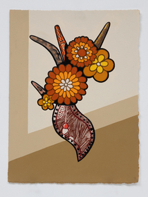
Painting, Tony Albert, Interior Composition (with Appropriated Aboriginal Design Vase) X, 2022
Tony Albert’s 2022 solo exhibition at Sullivan+Strumpf, Remark, continues the artist’s investigation into the imagery and identification of appropriated Indigenous Australian iconography in domestic decoration and design. Incorporating fabric from his extensive collection of ‘Aboriginalia’, Remark sees Albert expand on his acclaimed Conversations with Margaret Preston series dimensionality, critically engaging with the fabric in his own right. Like the fabric of Australian society, the appropriated Indigenous imagery printed on souvenir tea towels intertwines in a complicated web of national identity. These are not images by Aboriginal people and our voices and autonomy continued to be silenced through the object’s inauthenticity. As a country we must reconcile with these objects’ very existence. They are painful reiterations of a violent and oppressive history, but we also cannot hide or destroy them because they are an important societal record that should not be forgotten. As an artist this juxtaposition and tension fascinates me. Tony Albert’s multidisciplinary practice investigates contemporary legacies of colonialism, prompting audiences to contemplate the human condition. Drawing on both personal and collective histories, Albert explores the ways in which optimism can be utilised to overcome adversity. His work poses important questions such as how do we remember, give justice to, and rewrite complex and traumatic histories. Albert’s technique and imagery are distinctly contemporary, displacing traditional Australian Aboriginal aesthetics with an urban conceptuality. Appropriating textual references from sources as diverse as popular music, film, fiction, and art history, Albert plays with the tension arising from the visibility, and in-turn, the invisibility of Aboriginal People across the news media, literature, and the visual world. australian first nations art, colonialisation -
 Merri-bek City Council
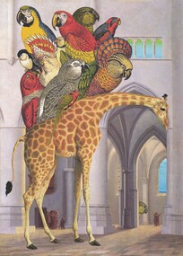
Four-colour lithographic offset print on Fabriano Artistico 300gsm traditional white hot-press paper, Gracia Haby et al, And Zarafa Kept Walking, 2013
And Zarafa Kept Walking features an image of Zarafa, the first giraffe to be seen in France in the year 1826. She arrived as an exotic gift and political ploy from Muhammad Ali of Egypt to King Charles X. To the delight of many onlookers, she walked from Marseilles to Paris carrying with her perhaps a few feathered friends. She inspired tall hairstyles à la girafe, and prompted Honoré de Balzac to write a story about her. Gracia Haby and Louise Jennison have collaborated as ‘Gracia and Louise’ since 2002, exploring their mutual fascination with the adaptable possibilities of paper and creating works from found images to produce artists' books, prints, zines, drawings, and collages. -
 Bendigo Historical Society Inc.
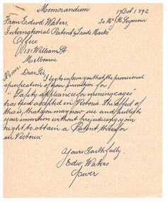
Document - MEMORANDUM - SAFETY CAGE, 17/10/1892
Hand written data on the safety cage. The first page is a memorandum to Mr J H Seymour from the International patent & Trade Marks Office informing Mr Seymour that the Provisional Specification of his invention has been accepted in Victoria, dated 17 Oct 1892. The second page is a copy of a card from John H Seymour, City Foundry, Wattle St. Sandhurst outlining the safety cage, the lives it has saved and orders will receive prompt attention and further information may be had from the above address. W. Holmes, Printer. The third page is to Miss Kingerlee from Allan Llewellyn with reference to the memorandum and card dated Sept 1, 1972. He says he copied the memorandum and card for her and Mr F Fitzpatrick has the originals. The fourth page is a typed copy of Claim Holders and expenses.document, gold, safety cage, memorandum - safety cage, edwd waters, j h seymour, international patent & trade marks, city foundry, w holmes, miss kingerlee, mr frank fitzpatrick, allan llewellyn, jno t caldwell, geo staley, neil walker, a n hamilton, william holland, j w weddle, jas lawes, wm hopwood, jas lawes, wm parker, r w pollard, wm nan & co, hope & co, mrs morgan, j w & g williams -
 Unions Ballarat
Framework of flesh : Builders' Labourers battle for health and safety, McQueen, Humphrey, 2009
An oral history. "McQueen uses labourers' own words to retell their battles around scaffolding and shithouses, for the safe removal of asbestos, prompt and adequate compensation, and a decent burial. The stories start in convict times and cover the six states and the ACT. The labourers' struggle for health and safety is followed into their dismantling of the framework of fear erected by the Building and Construction Commission. By tracking on-the-job experiences of demolishers, dog-men, hod-carriers and navvies, McQueen confirms the conviction of an early official of the BLF, Ben Mulvogue: "A union constitutes a school for the working class, wherein they learn self-reliance, learn their rights, privileges, opportunities, as well as their possibilities. Every new demand for better physical protection of the workers ensures a great ideal development for a future generation.'"--Publisher's website. Relevant to the history of health and safety in the building industry and the building unions.Paper; book.Front cover: author's name and title.btlc, ballarat trades hall, ballarat trades and labour council, oh&s, occupational health and safety, workers health, building workers, unions, history, oral history -
 Vision Australia
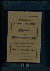
Administrative record - Text, Twentieth Annual Report of the Association for the Advancement of the Blind 1915, 1915
Annual report of the Association for the Advancement of the Blind outlined activities and events over the year, including the continued success of country concert tours in providing both an income for performers and raising awareness of the Association, return of wounded soldiers has prompted the need for support for those who have been blinded and the Minister of Defence has been approached to provide a list of those such affected so that the Association can provide assistance, advice and possible accommodation at Mair St, a sub-committee has been established to determine if massage training could be provided as an employment option, passing of active members Miss Faulkner and Rose Josephs, and the Honorary physician to the Adult Home for the blind (Dr Gray) has departed his position for overseas war service.1 volume of printed material with some illustrationsassociation for the advancement of the blind, annual reports -
 Heidelberg Theatre Company Inc..
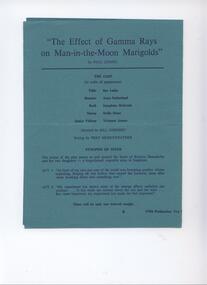
Memorabilia - Program, Photos, Reviews, Newsletter, The Effects of Gamma Rays on Man-in-the-Moon Marigolds by Paul Zindel directed by Bill Cherrey
Stella Dunn played Nanny, a senile old woman, in 'Gamma Rays' in April 1976 when she was a sprightly 82 year old.1. - Program - Jade coloured card with dark blue typeface, 2. - Photos -photographic paper. 3. - Review - photocopy paper. 4. - Roneod duplicate on foolscap paper.2. - Typed information on Stella Dunn glued onto the back of the photo, reverse side of photo has typed paper glued on as well as remnants of masking tape 3. - Photocopy of a review of The Effects of Gamma Rays on Man-in-the-Moon Marigolds on page 6 of the VDL (Victorian Drama League) newsletter 'Theatrecraft' April 1976. Includes photo of Sue Lukis as Tillie. 4. - Prompts Newsletter No 2 19th March, 1976. – Typed. Includes information on next production, reminders of happenings and forthcoming events and the Moomba Drama Festival results 1976, 170, bill cherrey - director, fred merryweather - set construction, michael bond - lighting, george bugge - sound, max brooks - photography, cast - stella dunn -
 Kiewa Valley Historical Society
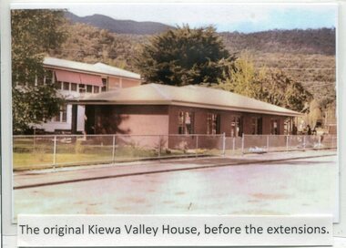
Photographs- Kiewa Valley House (before and after extensions) & Tawonga District General Hospital- Set of 6 colour photographs
The establishment of Kiewa Valley House, was a significant victory for residents and senior citizens in the Kiewa Valley district. Plans were laid in the mid 1970’s and a proposal was formulated for a 12 bed unit nursing home to be attached to the Tawonga District General Hospital. The need for an aged care facility in Mount Beauty was prompted by recognition of the high ratio of senior citizens residing in the area. At the time residents had to travel to Beechworth, Wangaratta or Wodonga for care. On June 6th, 1980, an appeal to finance a 12 bed nursing wing was launched at a public meeting in Mount Beauty The Hospital and Charities Commission’s development board finally approved the application for government funds to build the 12 bed nursing home in early 1981. The official opening of the nursing home was on March 6th, 1985. Opening of the lounge extensions occurred in May, 1993 Many local residents have taken advantage of facilities at Kiewa Valley House when they became unable to manage independently in their own homes. This has meant they did not have to face the stress of leaving the area and being separated from their local family and friends. Many SEC workers and their families have been residents of Kiewa Valley House over the years.Set of 6 colour photographs of Kiewa Valley House and original Tawonga District General Hospital in Mt Beauty 1 Kiewa Valley House, before extensions, with old weatherboard hospital in background 2 & 3 Official opening of Kiewa Valley House. 4 & 5 Gardens between Kiewa Valley House and Hospital 5. Kiewa Valley lounge extension 1. The original Kiewa Valley House, before extensions 2. No markings 3. No markings 4. View of the gardens between the weatherboard hospital and Kiewa Valley House 5. Walkway between Hospital & Kiewa Valley House 6. Kiewa Valley House Lounge Room extension tawonga district hospital, kiewa valley house, mt beauty district hospital -
 Bendigo Military Museum
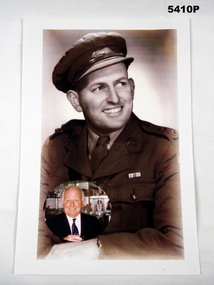
Photograph - PHOTOGRAPH WW2, Post 9.11.1942
John Eric Wiles VX16067 enlisted on 26.2.1940 age 24 years in the 2/7th Bn, embark for Eygpt 15.4.1940, disembark 17.5.1940, embark for Greece 30.3.1941, reported missing then as located, disembark Eygpt (no date but appears to be June). Hospital 10.6.1941 with Gastritis, rejoin unit 13.7.1941, promoted Cpl 6.12.1941, Sgt 12.1.1942, embark for Australia 12.7.1942, disembark 4.8.1942, embark for New Guinea 13.10.1942, appointed Lieutenant 9.11.1942, during period hospital with Malaria, disembark Australia 3.8.1943, hospital again with Malaria then Debility. Embark 11.11.1944 for Aitape, WIA remains on duty, prompted T/Capt 4.8.1945, disembark Australia 28.9.1945, appointment terminated in the 2nd AIF. Post war he became very involved in his Unit Association and the RSL and became in time a Life Member of both. He was also a President of Mitchum RSL.Photo copy of original on A4 size paper showing a portrait colour enhanced of an Officer wearing a peak cap and has one ribbon on jacket, there is an oval shape colour photo inserted at the bottom LH side of the Person in later life. The rear has a typed stuck on label with details.On rear typed, “Jack Wiles 2/7th INF BN VX16067 20.03.15 - 19.07.2005”photograph, ww2, wiles -
 Ballarat Heritage Services
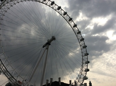
Digital photograph, Dorothy Wickham, The London Eye, 2016, 19/09/2016
At 135m, Coca-Cola London Eye is the world’s largest cantilevered observation wheel. It was conceived and designed by Marks Barfield Architects and was launched in 2000. It has won over 85 awards for national and international tourism, outstanding architectural quality and engineering achievement. In fact, it has become the UK’s most popular paid for visitor attraction. A remarkable feat of design and engineering, the London Eye gave London’s skyline a dramatic new addition and has been offering guests a new perspective on London ever since. Originally, it was intended as a temporary structure, able to be dismantled and transported to a new location, and had planning permission for just five years. But with millions boarding it every year, its popularity has prompted its lease to be extended. Today it is a permanent fixture on the London skyline and a beautiful symbol of modern London. (https://www.londoneye.com/about-us/#sthash.Xxd6iuOj.dpuf)london eye, ferris wheel -
 Vision Australia
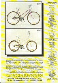
Pamphlet - Text, Mitchell cycles advertising leaflets
In 1974, the Royal Blind Society established within it's manufacturing division a facility to build high quality tandems for blind and partially sighted members of its sports club. By the end of 1978, the manufacturing division expanded and a new series of high quality, hand built racing cycles were developed to suit the individuals needs of the cycling enthusiast. A demand in the bicycle hire industry prompted the development of a strong universal bicycle and the new 24" Mixti family cycle was born. By 1979 the Royal Blind Society was manufacturing both family bicycles and tandems for the bicycle hire industry in N.S.W., Victoria and the A.C.T. Both cycles received an enthusiastic reception, so much so, that in 1982 they were the first bicycle manufacturer to win an Australian Design Award. In these two advertising leaflets, the specifications for the Ladies, Family and Gents bicycles are supplied along with images of each bicycle.2 x A4 col. pages of advertising materialroyal blind society of new south wales, mitchell manufacturing -
 Department of Energy, Environment and Climate Action
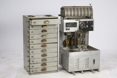
CSIRO Incendiary Machine
Alan McArthur from the CSIRO began his experimental burning program in the late 1950s near Canberra and published his landmark paper in 1962, “Controlled burning in eucalypt forests”. Leaflet No. 80, as it was known, proved a turning point for forest and fire managers across Australia. It led to the McArthur Forest Fire Danger Meter (FFDM) which first appeared in operational use in 1967 as the Mk 4. The CSIRO had developed its semi-automatic aerial incendiary machine dropping small capsules, with the first trial from a fixed-wing Cessna 337 at Manjimup in December 1965. In April 1969, the Forests Commission borrowed the second prototype of the CSIRO machine to carry out fuel reduction burning at Orbost. The success prompted the purchase of their own machine in 1970, which now sits in the Altona Museum. Pioneering machine in the development of aerial ignition in AustraliaAerial Incendiary Machineforests commission victoria (fcv), planned burning, bushfire aviation, bushfire -
 Merri-bek City Council
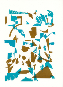
Work on paper - letterpress print, Commoners Press, As Sorted, 2022
Time is an abstraction, a filing system used to arrange events and memories into a logical system of cause and effect. This new print was created with images arranged from drawings made while sitting by paths near nature, creeks and overlapping streets. I am a local artist and illustrator with a history of drawing, painting and printmaking.10Press brings together a diverse group of creatives who were invited to make a new artwork inspired by the theme of ‘Moreland: its creative future, its past or other hidden stories’. Artists were invited to respond to the prompt ‘Moreland’, using only one or two colours. This body of work was created in 2022 during a significant time in local history, which saw Council’s name change from ‘Moreland’ to ‘Merri-bek’. The printed bellyband of the folio highlights this transition, with the word ‘Moreland’ crossed out and replaced with Woiwurrung language name ‘Merri-bek’. Commoners Press is a Coburg-based print studio that works with artists and designers in Australia and abroad on short run projects. Established by Jan Brueggemeier, Rob Eales and Neal Haslem in 2017, Commoners Press focus on projects that are community-centred, experimental and sustainable. Donated by Commoners Press Letterpress print -
 Merri-bek City Council
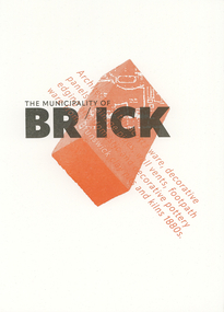
Work on paper - letterpress print, Commoners Press, Clay Pits of Brunswick, 2022
When I visit Merri-bek I wonder, when I step on the tarmac of the Barkly Square carpark, what was here before? In fact, at this spot and across Brunswick there were clay pits, which would feed the pottery workshops in Brunswick that produced the pottery, gargoyles and decorative items for Marvellous Melbourne homes and suburbs. Marvellous for those who had profited from gold, property and finance, not so for those working in the clay pits. My print is a contemplation on what is beneath our feet and our relationship to the ground. I am a design academic working at RMIT University and began my print and design practice on a Golding foot-treadle Letterpress machine.10Press brings together a diverse group of creatives who were invited to make a new artwork inspired by the theme of ‘Moreland: its creative future, its past or other hidden stories’. Artists were invited to respond to the prompt ‘Moreland’, using only one or two colours. This body of work was created in 2022 during a significant time in local history, which saw Council’s name change from ‘Moreland’ to ‘Merri-bek’. The printed bellyband of the folio highlights this transition, with the word ‘Moreland’ crossed out and replaced with Woiwurrung language name ‘Merri-bek’. Commoners Press is a Coburg-based print studio that works with artists and designers in Australia and abroad on short run projects. Established by Jan Brueggemeier, Rob Eales and Neal Haslem in 2017, Commoners Press focus on projects that are community-centred, experimental and sustainable. Donated by Commoners Press Letterpress print
