Showing 7929 items matching "styles"
-
 Glen Eira Historical Society
Document - St. Georges Road, 10, Elsternwick
A typed research report dated to 25/11/1987 by H. Bullock and R. Landells discussing the history of the ownership and occupancy of Kent at 10 St. Georges Road, Elsternwick and briefly the history of the street’s subdivision.kent, st. georges road, elsternwick, davis p., duffy road, george street, copland oeric rev., eberach louis, lynch james, white charles j., white a. a. miss, smith h. w., sherlock j. mrs, sharp frederick j., ripponlea, elsternwick railway station, bullock h., landells r., land subdivision, victorian style, house names -
Glen Eira Historical Society
Document - ‘KENLY’, Gladstone Parade, 34, Elsternwick
This file contains two items about this property: 1/Photocopy of Caulfield conservation study on ‘Kenly’ (1899) completed by Andrew Ward in October 1994. Includes a brief history of owners and tenants from 1888 to 1941 and a description of its architectural features as well as a black and white exterior photograph. 2/Two colour exterior photographs dated 13/10/2011gladstone parade, elsternwick, ‘kenly’, house names, 21-aug-18, mansions, hume c., kooyong park estate, clarence street, jackson thomas b., shoobra road, wells andrew, ford grylls, langwill p., henriques fred, pearson alfred, edmends james, williamson alfred, caulfield, ward andrew, architectural styles, victorian style, verandahs, brick houses, windows -
Glen Eira Historical Society
Article - Shoobra Road, 3, Elsternwick
Advertising article from elsternwick, buxton, shoobra road, real estate agents, spanish mission, stefanis angelos, architectural styles, victorian style, architectural features -
Glen Eira Historical Society
Document - Shoobra Road, 20, Elsternwick
This file contains three articles about this property: Shoobra Road, 20, Elsternwick. 1/Advertising article from unknown source, dated April 2002, by Buxton. Gives brief interior feature details. Includes 3 coloured photographs. 2/Handwritten research on former occupiers of 20 Shoobra Road, taken from Sands and MacDougalls, by Claire Barton 19/06/2012. 3/Advertising feature article in Domain 11-12/11/2016. Article gives details of home renovations update since being bought in 2002. Article details across 3 columns the community values of Elsternwick area and surrounds, and includes a further three properties in the area, also up for auction. It includes a long column titled 'My Patch' from the current owner Amanda Ruben.elsternwick, stavrakis bill, architectural features, shoobra road, buxton, architectural features, real estate agents, bay windows, phelan john., lead lights, phelan f., glenhuntly road glen eira road, marleston park, ruben amanda, gardy mark, gardy cooper, gardy milla, edwardian style, 'miss ruben', restaurants, ripponlea, st. george's road, bertram street, orrong road -
Glen Eira Historical Society
Document - Shoobra Road, 27, Elsternwick
Three items on this property: 1&2/Two unattributed advertising items on forthcoming sale of 27 Shoobra Road. The two articles from Biggin and Scott Real Estate, are dated 30/04/03 and 21/04/03 and include three coloured photographs. 3/Research by Claire Barton taken from Sands and MacDougalls editions 1910, 1913, 1923, 1942, 1948 and 1960.shoobra road, stavrakis bill, lee side, sant. a.l., elsternwick, biggin & scott, webster fredk w., victorian style, real estate agents, olney hy, architectural features, hawkins edwd r, stefanis angelos, house names, walsh vincent -
Glen Eira Historical Society
Article - Shoobra Road, 75, Elsternwick
Two documents about this property: Advertising article from Property Review Weekly dated 04/02/2005 and (2) 11/02/2005. Notes architectural features and the value of updating property in already good location; by estate agent Hocking Stuart.edwardian style, hocking stuart, leadlights, shoobra road, real estate agents, windows, elsternwick, newton todd, fireplaces, architectural features, rushford marshall, garage (private), glenhuntly road, caulfield -
 Glen Eira Historical Society
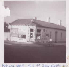
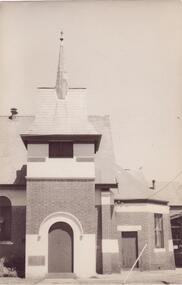
Photograph - ST. GEORGES ROAD, 52, ELSTERNWICK
Four items about this property: 1/Two typed research reports, dated 10/07/1987 and 12/03/1995, by Hilary Bullock and Rosalind Landells, regarding the history of ownership and occupancy of 52 St. Georges Road, Elsternwick and a description of the development of the building. Includes handwritten working notes, undated, for the 12/03/1995 report. 2/Handwritten file note from Sands and McDougalls from 1903 to 1948, giving occupiers' names and occupations. 3/A black and white photograph of the building as a milkbar plus a colour photograph dated 1982 of the milkbar. 4/Three photos and brief notes for auction of property in 2006 by Hocking Stuart. Dates for these advertisements are 08/11/2006 for one and 10/11/2006 for the other two.st. georges road, photographs, elsternwick, land subdivision, federation style, architectural styles, corner stores, drew alexander, shops, tennis courts, drew a., general stores, righetti mrs, grocers, righetti n, businesses, hodges edward, milkbars, flats, woodrow r miss, houses, geddings p., geddings w., business people, ogden s., brighton historical society, ogden a, landells rosalind, bright j.a., dowsing i, batagnol i., arnold h.t., batarol l., noel jones real estate agency, turner r., rand real estate pty ltd, nemeth f., noel jones real estate agency, serginis c., sergianis c., bullock hilary, timber houses, greengrocers, victorian style, stained glass -
Glen Eira Historical Society
Article - Shoobra Road, 80, Elsternwick, Karinya
Two items about 80 Shoobra Road. 1/ An advertising article dated 16/02/2011 from the Melbourne Weekly Bayside magazine; includes coloured photographs of property and selling features including renovation features. 2/ Research notes from Sands and MacDougalls on tenants and house name by Claire Barton.elsternwick, biggin & scott, fricker geo, shoobra road, estate agents, southern chas w.h., karinya, edwardian style, southern alb.c., leadlights, crowe amy, house names, architectural features, stavrakis bill, ivanhoe -
Glen Eira Historical Society
Newspaper - Rydale, Wyuna Road, 20, Caulfield North
Newspaper article, undated, possibly 2001 about the forthcoming auction of Rydale. Include details of the house, interior and exterior, inspection and auction information and two colour photographs, one interior and on exterior.caulfield north, wyuna road, rydale, mansions, edwardian style, hyman paul, brukarz jack, ray white real estate, auctions, architectural features, brick houses -
Glen Eira Historical Society
Document - Swibiton, Gladstone Parade, 28, Elsternwick
Caulfield Conservation Study by Andrew Ward dated October 1994 on Swibiton, 28 Gladstone Parade Elsternwick. Detailed description of house exterior and brief history of owners and, or, tenants who lived there from 1889 to 1941.gladstone parade, swibiton, elsternwick, architectural features, kirkham emma, pye w., kooyong park estate, land subdivision, victorian style, gladstone road, carlingford street, ward andrew, clarence street, eagerty edward, allen samuel, white william, byham j.m., mcdougall chas. -
 Glen Eira Historical Society
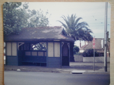
Article - Tram Shelter, Balaclava Road
Caulfield Conservation study by Andrew Ward dated October 1994 on Tram Shelter, corner of Balaclava Road and Orrong Road with a brief history and a statement of significance from the National Trust of Australia. Four black and white photos of Balaclava Road tram shelter. National Trust classification report giving detail of shelter and others on the tramway routes of Melbourne. Includes history of cable car system and reasons for tramways amalgamations. It includes architectural features. Article from the Trust News, June 2000 on history of Melbourne Tram shelters, various architectural design and features and where they were built and who designed thembalaclava road, orrong road, tram shelters, street furniture, cast iron work, verandahs, edwardian style, the prahran and malvern tramways trust, ward andrew, historic buildings, dandenong road, caulfield north, glenhuntly road, green robert -
 Glen Eira Historical Society
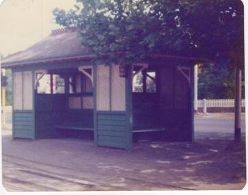
Article - Tram Shelter, Dandenong Road
National Trust of Australia, Victoria, report giving details of tram shelters on the tramways routes of Melbourne; history of cable car system and reasons for tramways amalgamations, includes architectural plan, map and photocopies of two photographs before restoration 1994. Includes bibliography. Two coloured photographs of tram shelter Dandenong Road opposite Hawthorn Road taken in 1978. Detailed history from the Trust News 2000 on history of Melbourne Tram Shelters, various architectural design features, where erected and who design by.dandenong road, hawthorn road, north caulfield, glen eira, flannagan l.s., prahran and malvern tramways trust, street furniture, tram shelters, edwardian style, architectural features, glenhuntly road, caulfield, orrong road, balaclava road, watson stephen, storey rohan, ward andrew -
Glen Eira Historical Society
Document - Tudor Court, Kooyong Road, 141, Caulfield North
Photocopy of a conservation study of Tudor Court by Andrew Ward dated January 1995. Includes description of architectural features, brief history and photograph of exterior of the house.caulfield, kooyong road, tudor court, knowsley, airdrie, holt frederick, ward andrew, holt annie, hope george, duffield lancelot, rippin john, mansions, architectural features, federation style, towers, chimneys, stairs, glen eira road, balaclava road, fairholme, fairhaven -
 Glen Eira Historical Society
Plan - Tudor Court, Kooyong Road, 141, Caulfield North
Six page colour pamphlet of Tudor Court with interior and exterior photographs. Includes menu for functions, pamphlet describing mid week wedding specials with photos of interior, photocopy of part of Ground Floor floor plans, circa 1985, and colour photograph. All undated except floor plan in 1983.caulfield, kooyong road, tudor court, mansions, weddings, reception rooms, orlane institut de beaute, menus, architectural features, federation style, towers, chimneys, floor plans -
Glen Eira Historical Society
Letter - Vadlure
Photocopy of a letter dated January 09, 1891 to J.A. Wallace from W.A. Zeal giving valuation of property Vadlure with a description of the house, outbuildings and gardens. Includes two copies of same site plan.vadlure, mansions, peterson john s, dandenong road, caulfield north, queen anne style, towers, art buildings, vegetable gardens, kooyong road, alma road, seal w.a., land values, engineers, surveyors -
Glen Eira Historical Society
Article - Villiers Street, 2, Elsternwick
Coloured advertising photograph of 2 Villiers Street Elsternwick from Biggin and Scott dated 09/07/2003, source unknown. Brief home features included.victorian style, architectural features, villiers street, elsternwick, biggin and scott, stavrakis bill, altman romana -
Glen Eira Historical Society
Article - Villiers Street, 15, Elsternwick
Unattributed advertising article dated 28/09/01 by Carmichael and Weber for forthcoming auction of 15 Villiers Street, Elsternwick.elsternwick, villiers street, st. georges road, architectural styles, carmichael and weber, waterton danielle, carmichael iain -
Glen Eira Historical Society
Document - Westbank, Neerim Road, 37, Caulfield
Photocopy of 37 Neerim Road Caulfield Property Conservation Study by Andrew Ward 1995, giving a brief description of the house with photo and details of owners and residents from 1889 to 1927.neerim road, edenkillie, westbank, jowett frederick, house names, caulfield, brick houses, black elizabeth, verandahs, cast iron work, glen huntly, solomon g., victorian style -
Glen Eira Historical Society
Document - Wisteria, Normanby Road, 135, Caulfield North
Caulfield Conservation study by Andrew Ward on the residence Wisteria. Includes history of the property, the owners from 1897 to 1905, and a description of the architectural features.caulfield north, normanby road, wisteria, architectural features, weatherboard buildings, house names, mayfield grove, blake a.h., luke ida mrs., luke edmund, artists, queen anne style, ward andrew, e.s.a. bank -
Glen Eira Historical Society
Drawing - Woodbine
Real Estate flyer dated 21/11/1991 from Templeton’s Pty Ltd. On Woodbine, 18 Adelaide Street Murrumbeena giving detailed description of house features including sketch of property.murrumbeena, adelaide street, woodbine, house names, victorian style, sholl denis, templeton’s pty ltd., real estate agents, mantle pieces, lead lights, ceiling roses, cast iron work, verandahs, brick houses, fireplaces -
 Glen Eira Historical Society
Letter - Carnegie Methodist Church, Neerim Rd, 252- 254, Carnegie
Caulfield Conservation Study – Andrew Ward 1995 with photos. Photocopy of extract from the study. Two Black and White photographs of the Carnegie Methodist Church 1) 90mm x 135mm 2) 80mm x 115mm. Sats unknown. Handwritten research note on the Carnegie Methodist Church. Undated and unacknowledged. Letter, National Trust of Australia (Victoria) notifying inclusion of the Carnegie Methodist on the Register – 25/09/1990carnegie, rosstown state school, rosstown, neerim road, carnegie state school, coles a. phipps, schools, oakleigh circuit, ward andrew, toolambool road, methodist circuit, carnegie methodist church, broadbent l. c., snell j. f., reid g., rosstown theatrical company, methodist church, uniting church, architectural styles, architectural features, frederick h. w. rev., californian bungalow, sunday schools, towers. -
Glen Eira Historical Society
Document - Brighton Cemetery, North Road, Caulfield South
Photocopy of the entry in the Caulfield Conservation Study by Andrew Ward dated 01/1995, for the Brighton Cemetery, former sexton’s quarters and offices. The study includes a description of the architectural features and a brief history of the building and two photographs of the building exterior.brighton cemetery, north road, ward andrew, cemeteries, graveyards, brighton cemetery trust, architectural styles, architectural features, roofs, brick houses, official buildings, caulfield south -
Glen Eira Historical Society
Document - Brighton Cemetery, North Road, Caulfield South
Photocopy of the entry in the Caulfield Conservation Study, dated 01/1995, by Andrew Ward for the Miller Mausoleum at Brighton Cemetery. The study includes a description of the tomb’s architectural features, a brief history and a photograph of the tomb.miller mausoleum, brighton cemetery, caulfield south, north road, ward andrew, miller septimus, miller clara johnstone, miller gwendoline stewart, cantala, dandenong road, cemeteries, graves, tombstones, gravestones, monuments and memorials, architectural styles, gothic (revival) architecture, architectural features, gables, roofs, windows -
Glen Eira Historical Society
Article - Regent Street, 38, Elsternwick
Five newspaper advertisements for the sale of townhouses located at 38 Regent Street. The articles give details on the townhouses for sale; 1/38, 2/38 and 7/38, and are dated 04/08/2000, 04/05/2002, 01/09/2000 and 07/09/2001. The articles include coloured photographs of the house interiors and exteriors.regent street, elsternwick, townhouses, caulfield, spicer stanley, darvell tania, persichetti leonard, real estate agents, stefanis angelos, stavrakis bill, st kilda, glen huntly, talbot birner morley, victorian style, architectural features -
Glen Eira Historical Society
Document - Regent Street, 45, Elsternwick
Two items about this property: 1/Newspaper advertisement in the Bayside Weekly, dated 08/2009, advertising the forthcoming sale of 45 Regent Street, Elsternwick. The article gives details on renovations and interior and exterior features. 2/Research note by Claire Barton, dated 08/06/2012, referencing Sands and McDougall editions 1948, 1960 and 1970 giving names of previous tenants at 45 Regent Street.regent street, elsternwick, victorian style, glenhuntly road, cast ironwork, stefanis angelos, stavrakis bill, smith arthur r, johnson b mrs, bungalows -
Glen Eira Historical Society
Document - REGENT STREET, 54, ELSTERNWICK
Two items about this property: 1/Advertisement in the Bayside Weekly, 27/10/2010, for the forthcoming auction of 54 Regent Street, Elsternwick. Gives brief details of the house interior and exterior. 2/Research note dated 06/06/2012 by Claire Barton, referencing Sands and McDougall editions 1911, 1913, 1923, 1948, 1960 and 1970 giving names of previous tenants at 54 Regent Street.regent street, elsternwick, cottages, victorian style, biggin scott, real estate agents, johnson william, port howard, edwards minnie, walker f j, gill k j -
Glen Eira Historical Society
Article - Regent Street, 57, Elsternwick
Three items about this property: 1/Feature article from a newspaper with date noted as 16/03/2001 detailing the period features and other property information. One exterior and one interior black and white photos. 2/One newspaper advertisement dated 16/03/2001, source unknown, advertising the forthcoming auction on 24/03/2001 of 57 Regent Street, Elsternwick. Gives details of house interior and exterior. Includes photograph of the house exterior. Also an advertising postcard with the same details. 3/Research note by Claire Barton, dated 12/06/2012, referencing Sands and McDougall editions, 1923, 1948, 1960 and 1970, giving names of previous tenants at 57 Regent Street.peer gary, elsternwick, regent street, verandahs, cast iron work, plaster moulds, ceiling roses, real estate agents, victorian style, boyd k, williamson chas g, lalas x mrs, prividenic a -
Glen Eira Historical Society
Document - Regent Street, 84, Elsternwick
Two documents about this property: 1/Newspaper advertisement, source unknown, dated 04/05/2002, for the auction of 84 Regent Street. Gives brief details of interior and exterior features. Includes one colour photograph of the house and two colour photographs of the house exterior. Research note by Claire Barton, dated 06/06/2012, referencing Sands and McDougall editions 1923, 1948, 1960 and 1970, giving names of previous occupants of 84 Regent Street.elsternwick, regent street, buxton real estate, real estate agents, victorian style, altman romana, stavrakis bill, cast iron work, cottages, rohrs cath mrs, richardson eric h, richardson l m mrs, verandahs -
Glen Eira Historical Society
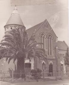
Article - Elsternwick Congregational Church – Caulfield Union Church
A two page article Elsternwick Congregational Church by J. O’Donnell, No. 12 October 1974 describing the church’s history. Includes references and exterior photograph. Undated typed Short History of Elsternwick Congregational Church by Jim McLoghlin. Brief handwritten note dated August 1984 by Jim McLoghlin about the church’s history. Brief typed, undated, unattributed not about the church’s early history. Brief undated, handwritten note by Jim McLoghlin about the church’s history in the 1970s and 1980s. Photocopy of a page from A Coming Together, entitled Elsternwick Congregational Church: Some Memories by Jim McLoghlin dated 01/01/1989. Two pages of undated typed and handwritten notes by Trevor Hart concerning the early history of the church including The Fincham Organ. Printout of brief biographical details of Rev. William Poole, first resident pastor at Caulfield Union Church, from a website. URL is included. Photocopy of brief article from The Southern Baptist of 26/01/1911 describing the life of Rev. John Reid, an early pastor at Caulfield Union Church after his recent death. Undated, unattributed handwritten brief note of rate book entries from 1879 and 1888 for the Caulfield Union Church site.elsternwick congregational church, o’donnell j., caulfield union church, watts thomas, black chapel, hawthorn road, balaclava road, glen eira road, orrong road, fulton thomas, rolfe g., jordan w.f., macartney h.b. rev., st. mary’s church of england, elsternwick, korong street, king street, de lacy evans g., mcmurtie mcnaughton and stewart, copland osric rev., day edwin rev., day louisa, day annie, day jeanie, cromarty school for girls, sandham street, presentation convent, pedler b.r., st. john’s uniting church, clarke g., clarke graham, mcloghlin jim, prahran grove, garden street, poole j.l. rev., poole william, old grammar school, regent street, little kids contact, st. john’s presbyterian church, pedler b.r., mills miss, shaw mary, mcloghlin mrs., martin les, riddle rev., cromarty girls school, gregson w. rev., mcnaughton mcmurtie and stewart, de lacy evans g., fincham geo., fletcher rich rev., reid john, beauchamp mr., jubilee hall st. mary’s anglican church, architectural styles, architectural features, gothic revival architecture, fonts, clergy, religious groups, sunday schools, congregational church, religious structures and establishments -
 Glen Eira Historical Society
Document - Elsternwick Congregational Church – Caulfield Union Church
Photocopy of extract of Caulfield Conservation Study by Andrew Ward dated September 1994. Includes brief history and description of Elsternwick Congregational Church and black and white exterior photograph and references. Printed page, dated and source unknown, with sketch of the church and a brief history. Five colour, one black and white exterior, photographs date and photographer unknown.elsternwick congregational church, caulfield union church, orrong road, architectural features, architectural styles, gothic revival architecture, elsternwick, towers, korong street, glen eira road, king street, de lacy evans g., mcmurtie mcnaughton and stewart, copland osric rev., uniting church, congregational church, corrong street, religious structures and establishments