Showing 1373 items matching " colour in art"
-
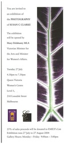 Queen Victoria Women's Centre
Invitation, Photography of Susan C Clarke, c. July 2004
Double sided flyer as an invitation to attend the opening of an art exhibition in the QVWC building. Colour example of artwork on front of item, a biography of the artist on the back. art exhibitions, events and activities, invitations -
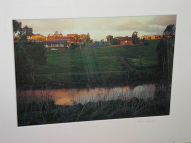
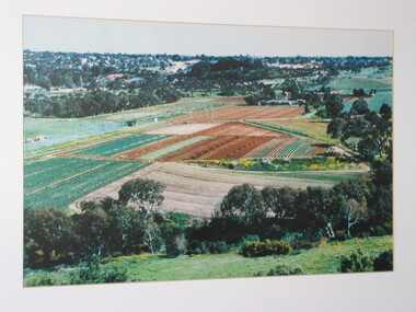
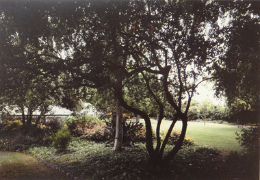 Brimbank City Council Art Collection
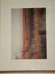
Photograph, Robert Pointon, McKay Gardens, 1993
Mckay Gardens - links to H V McKayLocal SceneMcKay Gardens, colour photograph - AR--22 -
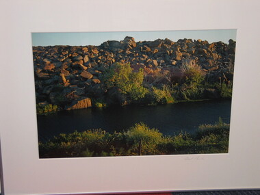
 Brimbank City Council Art Collection
Photograph, Robert Pointon, John's Knife, 1988
Local SceneJohn's Knife - West bank of the Maribyrnong River facing south, colour photograph, -
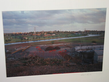
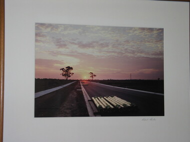 Brimbank City Council Art Collection
Photograph, Robert Pointon, Industrial Drive Facing West in South Sunshine, 1990
Local sceneLocal sceneColour Photograph - looking down a road at sunset - stacked pipes in foreground. Made as a series of three plates - AR0009 -
 Brimbank City Council Art Collection
Photograph, Robert Pointon, West of Fitzgerald Road, 1990
Local SceneRobert Pointon. West of Fitzgerald Road. Colour photograph, 34 x 49cm -
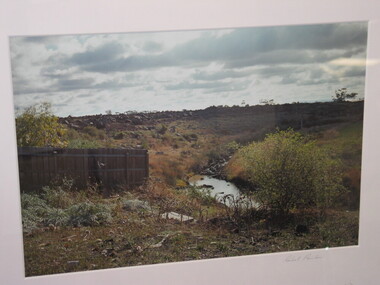
 Brimbank City Council Art Collection
Photograph, Robert Pointon, East of Fairbaine Road, 1988
Local SceneRobert Pointon. East of Fairbaine Road. Colour photograph, 34 x 49cm -
 Brimbank City Council Art Collection
Photograph, Robert Pointon, South Sunshine looking North, 1989
Local SceneRobert Pointon. South Sunshine looking North. Colour photograph, 34 x 49cm -
 Brimbank City Council Art Collection
Colour Photograph, Buckingham Crescent, Sunshine, 1994
Local SceneColour photograph -
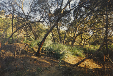
 Brimbank City Council Art Collection
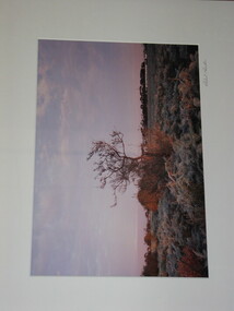
Colour Photograph, Robert Pointon, Autumnal landscape, circa 1994
Local SceneColour photograph -
 Brimbank City Council Art Collection
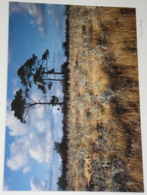
Colour Photograph, Robert Pointon, Storm Brewing
Local SceneColour Photograph -
 Brimbank City Council Art Collection
Photograph - Colour Photograph, Landscape, Unknown
UnknownPointon, Robert, Landscape, n.d, Colour Photograph, Brimbank City Council Art Collection, BrimbankColour Photographlandscape -
 Brimbank City Council Art Collection
Colour Photograph, Robert Pointon, Landscape
Local scene (?)Colour Photograph -
 Brimbank City Council Art Collection
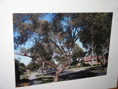
Photograph, Market Garden, Keilor
Colour photograph -
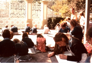 Williamstown Botanic Gardens- Hobsons Bay City Council
Photograph - Williamstown Botanic Garden, Late 1970s
Images collected by donor for Williamstown High School archives and scanned by Lindy Wallace for Botanic Gardens archiveThe images demonstrate the social value of the Gardens to the local community and how they used as a place for meeting, playing and celebrating with friends and family. Image 2014.007c also demonstrates the changes over time to the Gardens structures: for example when the gates and fence was painted white. Colour image of approximately 18 children sitting in front of and drawing dates of the Gardens. Most have blue jumpers on over the top of their light blue school uniforms. The gates, posts and picket fence are painted white. They are students of Williamstown High School Art Class. The name of the teacher is unknown. williamstown botanic gardens, hobsons bay city council, williamstown high school -
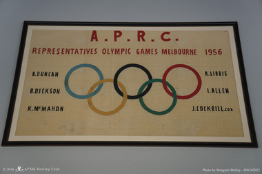 Albert Park-South Melbourne Rowing Club
APRC 1956 Olympic Banner, 1957
"The banner has been with the Club since it was created in 1957. Recent research has confirmed that it was made by Joan Eddy, the wife of club member Kevin Eddy and a professional seamstress. Grace Blake’s interview notes record her conversation with Mr Eddy on 24 October 2014: Kevin confirmed that the banner was made by his wife, Joan Eddy, in time for the opening of the new shed after the Olympics (1957). Kevin was the Social Secretary at the time, and co-opted his wife, who had worked as a machinist for Harford Clothing in Carlton before they married. Her mother had also worked there as a sewing hand (hand sewing the linings for jackets). The company was later taken over by Sires. ... It was made at home (Joan had ‘retired’ from work by then)." Excerpt from the 2014 Significance Assessment, p32.Banner Celebrating Albert Park Rowing Club Olympic Representatives, 1956 Statement of significance by Margaret Birtley, October 2014 Harry Gordon, the distinguished Australian sports historian, wrote of the 1956 Melbourne Olympic Games: "When the Olympic Games moved into Melbourne ... it was as if the city had been brushed by a certain magic. Nothing before or since ... has ever evoked such sheer emotional involvement from the whole community." Gordon refers to the large crowds that massed in Melbourne with anticipation and exhilaration on the day before the official opening, ‘with little apparent motive other than just to be there, and be happy’. The hand-crafted banner celebrating Albert Park Rowing Club’s representatives at those Olympic Games seems to exude that same sense of joy and exhilaration. Made by the wife of the club’s social secretary, it testifies to the admiration felt by individuals and organisations for the success of their own on a world stage. The banner has historic significance for its accurate documentation of the great achievement of a single rowing club in contributing six outstanding athletes to the relatively small Australian rowing team. Additional historic significance derives from the fact that this is an unofficial expression of tribute and pride. The banner’s incorporation of the Olympic rings would now be likely to require licensing by the Australian Olympic Committee, a process that can dampen social engagement. While definitely a hand-made item, there is some aesthetic significance in the design and execution of the banner. Good judgement has been demonstrated in the selection of fabrics and the choice of colours. The workmanship is quite skilful. The vertical symmetry and the horizontal balance of the design are pleasing to the eye. The use of red for the heading lines and black for the Olympians names is well-chosen and aesthetically pleasing. The collection holds black and white photographs of the same oarsmen at the Olympic regatta. This banner complements their role in the collection by providing colour and a sense of connection with an affectionate and supportive community. Its social significance transcends the local context for which it was created and used, to become part of the large body of art, craft and memorabilia that are associated with the Olympic movement worldwide. A handmade embroidered banner to commemorate the Albert Park members who were part of the 1956 Olympic Rowing team.A.P.R.C. / REPRESENTATIVES OLYMPIC GAMES MELBOURNE 1956 / R. DUNCAN / R. DICKSON / K. McMAHON / R. LIBBIS / I. ALLEN / J COCKBILL coxrowing, apsm rowing club, olympic games, albert park rowing club, albert park lake, duncan, robert, dickson, bruce, allen, ian, libbis, reg, mcmahon, kevin, cockbill, john -
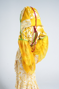 National Wool Museum
Clothing - 35 Life, Canwen Zhao, 2022
Canwen Zhao was awarded the $10,000 We The Makers Acquisitive Prize for '35 Life' in 2023. Artist Statement: "35life" is a sustainable fashion project that transforms second-hand clothing materials into urban street outdoor-style products. Highlighting prominent Chinese classic red and green colours not only conveys eastern aesthetics but also adds a sense of unity to the clothing collection. The high-saturation and high-brightness full-colour palette keeps the clothing consistently "fresh," allowing any trendy colours to seamlessly integrate into the project's designs, thus extending the lifespan of the garments. Additionally, all clothing items can quickly transform into a stylish bag for convenient daily carrying and home storage. These bags are made from leftover fabric generated during the production process and serve as original packaging for sale. This approach not only reduces excessive packaging but also enhances the chances of resale in the second-hand market. The project draws inspiration from the traditional Chinese cultural concept of "huo feng ding," meaning "exchange the old for the new." it's also influenced by the designer's personal experience with health issues, making the designs suitable for individuals who can't be exposed to sunlight for extended periods, adapting to the changing urban lifestyle. 35life aims to provide visually pleasing and comfortable dressing experiences for urban dwellers who are busy with work and experience high levels of stress. Unlike traditional design patterns, this project adopts a unique design approach. It selects 3-5 pieces of raw materials based on their colours, and then disassembles them through structural lines. While retaining most of their functionality, these materials are rearranged and assembled on a flat surface before being shaped on a dress form. Subsequently, various ways of creating storage bags are derived from the initial clothing prototypes. After refining the designs, the final products are developed, and similar materials are used to create samples. Therefore, under this design methodology, even for the same garment, it is impossible to produce two identical pieces of clothing. Each garment is truly one-of-a-kind, which enhances its rarity and contributes to the longevity of the fashion pieces. The project includes various types of clothing, each with unique storage methods. This yellow look, named "elegant beach sunscreen monarch," draws its fashion inspiration from traditional Han Chinese attire and its storage concept from the Chinese cultural concept of "jiu jiu gui yi." the design employs flat pattern cutting, utilizing materials from the second-hand market such as beach towels, children's waterproof clothing, and women's dresses. Similar colours and patterns are reassembled through cutting and combining. For the sleeves, quick-drying, sun-protective sport fabric forms the base, overlaid with discarded silk fabric dyed with turmeric and plant dyes. This not only ensures functionality but also adds a sense of elegance. The length can be adjusted using drawstrings. Artist Bio: Zhao Canwen is a multidisciplinary fashion designer with a strong passion for integrating art, history, culture, and sustainable design. With over 15 years of experience in painting, she draws inspiration from ancient Chinese philosophy and aesthetics, which gives her a unique sense of beauty. After 8 years of fashion and art training, she possesses a keen insight into current trends and tends to combine art with commercial needs. Zhao's design style is diverse, characterized by a multidimensional approach, a focus on colour application, and storytelling through details.Outfit consisting of six pieces: - Orange plastic eye wear with green paint - Pair of red and green metal clip on earrings - Red beaded phone case with attached beads on string - Pair of red and green painted running shoes - Yellow and green hooded garment with red piping and zips - Brown bag with green beaded handlessustainable, fashion, we the makers, art, culture, design, chinese philosophy, prize -
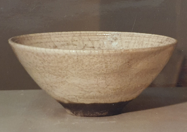
 Federation University Art Collection
Ceramic, Robin Welch, Stoneware Bowl by Robin Welch, c1980
Robin WELCH ( 23 July 1936-5 December 2019) Born Nuneaton, Warwickshire, England Robin Welch is one of the most highly respected contemporary British potters. The full range of his work includes large vessels with related paintings, fine drawings, and distinctive bowls and vases which explore colour, surface texture, form, detail of edge, and line. He is one of small group of significant British potters who expanded the language of throwing pots on the wheel through post-wheel additions and alteration. This gave his generally cylindrical forms a more organic and sculptural aspect, but their heavily coloured and textured surfaces were as much about painting, too, as Robin sought an integration of the visual disciplines he enjoyed. As he once wrote: “There’s no divide between art or craft. You decide to be an artist and you’ll use anything. If marooned on a desert island you’d use driftwood.” (https://www.theguardian.com/artanddesign/2019/dec/27/robin-welch-obituary, accessed 23 March 2021) Initially studying at Penzance School of Art under Michael Leach (son of Bernard Leach) and the Central School of Art, London Robin Welch then worked part-time at the Leach Pottery between 1953 and 1959 before opening his own pottery in London's west end (1960 to 1962). After a couple of years of world travel, including working in Australia from 1962 to1965 helping Ian Sprague set up his Mungeribar Pottery and exhibiting in Melbourne, Robin Welch returned to England setting up Stadbroke Pottery in Eye, Suffolk in 1965. Apart from his studion work Robnin Welch was a skilled designer for industry including Wedgwood. When not in his Suffolk studio Robin Welch spent much time in Australia where he appreciated the outback’s arid earth, brilliant light, grittier textures and luminous colour. When not in his Suffolk studio Robin Welch spent much time in Australia where he appreciated the outback’s arid earth and brilliant light, its grittier textures and luminous colour, qualities he sought to convey in-the-round and on canvas. Apart from his studion work Robnin Welch was a skilled designer for industry including Wedgwood, Midwinter and Denby.Stoneware bowl with flange. Glazed in white matt crackle with a faint copper red tint. Dry black glazed rim. Gift of the artist.Robin Welch stamped on baseceramics, robin welch, gippsland, gppsland campus, jan feder memorial ceramics collection -
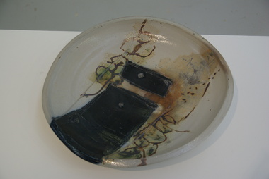 Federation University Art Collection
Ceramic - Artwork - Ceramics, Sandra Johnstone, Salt Glazed Platter by Sandra Johnstone, c1985
Sandra JOHNSTONE (1936-Jan 1991) Born Southern California, USA Worked California, USA Sandra Johnstone was awarded a MA in Ceramics and an MFA in Plastic Arts at San Jose State University, where she later also lectured. Specialiing in functional and sculptural forms, with emphasis on wheel-thrown shapes and salt-glazed stoneware and porcelain, her work is best known for salt glazing, using surface texture and colour to enhance the character of the clay. Sandra Johnstone was a visiting artist to the Gippsland Centre for Art and Design (GCAD). Salt glazed platter. This work is part of the Jan Feder Memorial Ceramics Collection. Jan Feder was an alumna of the Gippsland Campus who studied ceramics on the campus. She passed away in the mid 1980s. Her student peers raised funds to buy ceramic works in her memory. They bought works from visiting lecturers who became leading ceramic artists around the world, as well as from many of the staff who taught there."Johnstone" on basesandra johnstone, ceramics, artist, artwork, gippsland campus, jan feder memorial ceramics collection -
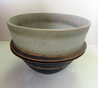
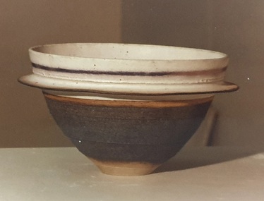 Federation University Art Collection
Ceramic - Artwork - Ceramics, Stoneware Bowl by Robin Welch, c1980, 1980
Robin WELCH (1936- ) Born Nuneaton, Warwickshire, England Robin Welch is one of the most highly respected contemporary British potters. The full range of his work includes large vessels with related paintings, fine drawings, and distinctive bowls and vases which explore colour, surface texture, form, detail of edge, and line. Initially studying at Penzance School of Art and the Central School of Art, London Robin Welch then worked part-time at the Leach Pottery between 1953 and 1959 before opening his own pottery in London's west end (1960 to 1962). After a couple of years of world travel, including working in Australia from 1962 to1965 helping Ian Sprague set up his Mungeribar Pottery and exhibiting in Melbourne, Robin Welch returned to England setting up Stadbroke Pottery in Eye, Suffolk in 1965. This work is part of the Jan Feder Memorial Ceramics Collection. Jan Feder was an alumna of the Gippsland Campus who studied ceramics on the campus. She passed away in the mid 1980s. Her student peers raised funds to buy ceramic works in her memory. They bought works from visiting lecturers who became leading ceramic artists around the world, as well as from many of the staff who taught there.Stoneware bowl with single flange. White glaze with copper tint. Dry black glaze underneath and airbrushed lustre banding. Robin Welch stamped on base.ceramics, robin welch, jan feder memorial ceramics collection, jan feder, gippsland campus, stadbroke pottery, mungeribar pottery -
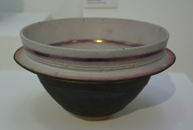
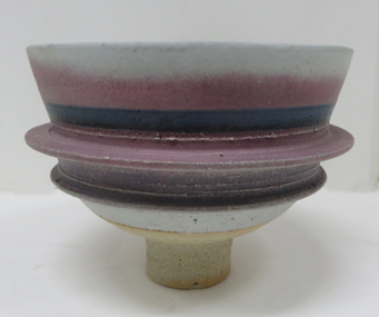 Federation University Art Collection
Ceramic - Artwork - Ceramics, Stoneware Bowl by Robin Welch, 1980
Robin WELCH ( 23 July 1936-5 December 2019) Born Nuneaton, Warwickshire, England Robin Welch is one of the most highly respected contemporary British potters. The full range of his work includes large vessels with related paintings, fine drawings, and distinctive bowls and vases which explore colour, surface texture, form, detail of edge, and line. He is one of small group of significant British potters who expanded the language of throwing pots on the wheel through post-wheel additions and alteration. This gave his generally cylindrical forms a more organic and sculptural aspect, but their heavily coloured and textured surfaces were as much about painting, too, as Robin sought an integration of the visual disciplines he enjoyed. As he once wrote: “There’s no divide between art or craft. You decide to be an artist and you’ll use anything. If marooned on a desert island you’d use driftwood.” (https://www.theguardian.com/artanddesign/2019/dec/27/robin-welch-obituary, accessed 23 March 2021) Initially studying at Penzance School of Art under Michael Leach (son of Bernard Leach) and the Central School of Art, London Robin Welch then worked part-time at the Leach Pottery between 1953 and 1959 before opening his own pottery in London's west end (1960 to 1962). After a couple of years of world travel, including working in Australia from 1962 to1965 helping Ian Sprague set up his Mungeribar Pottery and exhibiting in Melbourne, Robin Welch returned to England setting up Stadbroke Pottery in Eye, Suffolk in 1965. Apart from his studion work Robnin Welch was a skilled designer for industry including Wedgwood. When not in his Suffolk studio Robin Welch spent much time in Australia where he appreciated the outback’s arid earth, brilliant light, grittier textures and luminous colour. Stoneware bowl on a tall foot. Calcium matt glaze, underglaze colour with underglaze metallic lustre. ceramic, jan feder memorial ceramics collection, robin welch, gippsland campus, mungeribar pottery, stadbroke pottery -
 Federation University Art Collection
Ceramic, Raku Fired Bowl with White Crackle Glaze by Robin Welch, 1980
Robin WELCH (1936- ) Born Nuneaton, Warwickshire, England Robin Welch is one of the most highly respected contemporary British potters. The full range of his work includes large vessels with related paintings, fine drawings, and distinctive bowls and vases which explore colour, surface texture, form, detail of edge, and line. Initially studying at Penzance School of Art and the Central School of Art, London Robin Welch then worked part-time at the Leach Pottery between 1953 and 1959 before opening his own pottery in London's west end (1960 to 1962). After a couple of years of world travel, including working in Australia from 1962 to1965 helping Ian Sprague set up his Mungeribar Pottery and exhibiting in Melbourne, Robin Welch returned to England setting up Stadbroke Pottery in Eye, Suffolk in 1965. This work is part of the Jan Feder Memorial Ceramics Collection. Jan Feder was an alumna of the Gippsland Campus who studied ceramics on the campus. She passed away in the mid 1980s. Her student peers raised funds to buy ceramic works in her memory. They bought works from visiting lecturers who became leading ceramic artists around the world, as well as from many of the staff who taught there.Raku Fired stoneware bowl with White Crackle Glaze by Robin Welch Robin Welch stamped on baserobin welch, ceramics, jan feder memorial ceramics collection, gippsland campus -
 Federation University Art Collection
Ceramic, Bowl by Robin Welch, 1980
Robin WELCH ( 23 July 1936-5 December 2019) Born Nuneaton, Warwickshire, England Robin Welch is one of the most highly respected contemporary British potters. The full range of his work includes large vessels with related paintings, fine drawings, and distinctive bowls and vases which explore colour, surface texture, form, detail of edge, and line. He is one of small group of significant British potters who expanded the language of throwing pots on the wheel through post-wheel additions and alteration. This gave his generally cylindrical forms a more organic and sculptural aspect, but their heavily coloured and textured surfaces were as much about painting, too, as Robin sought an integration of the visual disciplines he enjoyed. As he once wrote: “There’s no divide between art or craft. You decide to be an artist and you’ll use anything. If marooned on a desert island you’d use driftwood.” (https://www.theguardian.com/artanddesign/2019/dec/27/robin-welch-obituary, accessed 23 March 2021) When not in his Suffolk studio Robin Welch spent much time in Australia where he appreciated the outback’s arid earth and brilliant light, its grittier textures and luminous colour, qualities he sought to convey in-the-round and on canvas. Apart from his studion work Robnin Welch was a skilled designer for industry including Wedgwood, Midwinter and Denby. Initially studying at Penzance School of Art under Michael Leach (son of Bernard Leach) and the Central School of Art, London Robin Welch then worked part-time at the Leach Pottery between 1953 and 1959 before opening his own pottery in London's west end (1960 to 1962). After a couple of years of world travel, including working in Australia from 1962 to1965 helping Ian Sprague set up his Mungeribar Pottery and exhibiting in Melbourne, Robin Welch returned to England setting up Stadbroke Pottery in Eye, Suffolk in 1965.Stoneware bowl with split flange, glazed with matt white, black and a touch of copper red Tobin Welch stamped on basejan feder memorial ceramics collection, ceramics, robin welch, gippsland campus, jan feder -
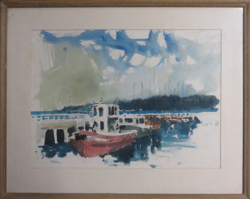 Federation University Art Collection
Painting - Artwork - Painting, [Boats] by Wes Walters
... ballarat technical art school Framed water colour showing boats ...Wes WALTERS (06 August 1928 - 19 August 2014) Born Mildura, Victoria From 1940 t0 1945 Wes Walters attended the Ballarat High School. He then studied architecture at the Gordon Institute in Geelong, followed by art at the Ballarat School of Mines (a division of the Ballarat School of Mines). During his time at the Ballarat Technical Art School (later Federation University Australia) Walters studied under Neville Bunning and Taylor Kelloch, and was awarded the Ballarat Ladies Art Association Scholarship in 1948. He next moved to Melbourne to work as a commercial artist with the George Patterson advertising agency. Each evening Walters studied life drawing at the Victoria Artists’ Society and taught himself anatomy. Wes Walters excelled in both abstract and realist art. He won the Art Gallery of Ballarat’s Minnie Crouch Prize for watercolour art in 1953 and 1956. He won the prestigious Archibald Prize in 1879 for his portrait of Phillip Adams. This item is part of the Federation University Art Collection. The Art Collection features over 1000 works and was listed as a 'Ballarat Treasure' in 2007.Framed water colour showing boats along a pier.wes walters, watercolour, boats, vessels, sailing, available, alumni, ballarat technical art school -
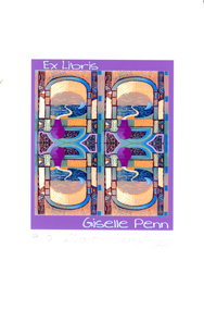 Federation University Art Collection
Work on paper - Artwork - Bookplate, Sharon Tomkins, 'Ex Libris Giselle Penn' by Sharon Tomkins, 2001
The Keith Wingrove Trust conducts a competition among Australian artists, graphic designers and students for the production of Ex Libris Bookplates. The competition is called The Australian Bookplate Design Award. The purpose of the competition is to increase interest in and to attract publicity to the artistic value of bookplates. Although the competition is referred to as 'Australian' there is a category of award open to International artists. This bookplate was entered in the 2001 Australian Bookplate Design Awards.Graphic Print bookplate for fibre artist, Giselle Penn, who loves textures and brilliant colour. The design was made with the colours and patterns to portray Giselle Penn's art making and to show the theme of textiles or fabrics. Signed below artwork '9/10 Sharon Tompkins 2001'bookplate, sharon tomkins, textiles, australian bookplate design award, keith wingrove memorial trust -
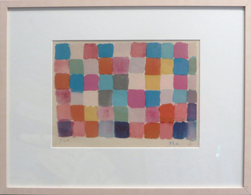 Federation University Art Collection
Work on paper - Artwork - lithograph, 'Untitled' by Paul Klee
Paul KLEE (1879-1949) Born Switzerland Paul Klee was a Swiss painter who trained at the Academy of Fine Art, Munich. From 1911 he was involved with the Blaue Reiter group at Munich, and the following year he took part in the Blaue Reiter exhibition.The lithograph depicts blocks of colour, and is framed in a blonde timber frame. Signed lower left 'Klee'. Edition 116/200feduni art collection, klee, paul klee, printmaking, blaue reiter, lithograph, colour lithograph -
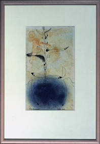 Federation University Art Collection
Drawing - Drawing - Pen/wash, Clarke, Peter, "Escape from the Fish" by Peter Clarke, 1960
PETER CLARKE (1935 - ) Born Deloraine, Tasmania Peter Clarke was both artist and teacher. He held 14 exhibitions between 1957 and 1977, as well as participating in a number of group exhibitions, including Contemporary Australian Painting shown in Los Angeles and San Francisco. He is best known for large colour-field works. Peter Clarke's abstract painting emphasises texture, colour and gesture. He won the George Crouch Memorial Prize in 1967 This item is part of the Federation University Art Collection. The Art Collection features over 2000 works and was listed as a 'Ballarat Treasure' in 2007.Framed abstract painting with an ink wash.art, artwork, peter clarke, abstract -
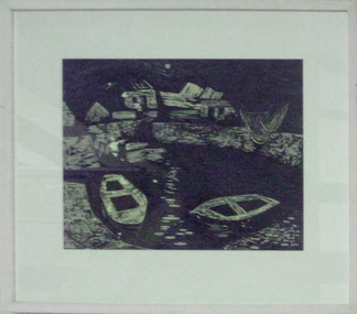 Federation University Art Collection
Work on paper - Printmaking - Woodcut, 'Irish Fishing Village' by Tate Adams, 1954
Tate ADAMS (1922-8 April 2018 ) Born Hollywood, County Wicklow, Ireland Arrived Australia 1952 England 1956-58 This item is part of the Federation University Art Collection. The Art Collection features over 2000 works and was listed as a 'Ballarat Treasure' in 2007.Framed paper linocut, printed in colour inks, from three blocks. art, artwork, tate adams, printmaking, available, woodblock, woodcut, sailing, boats, ballarat teachers' college collection -
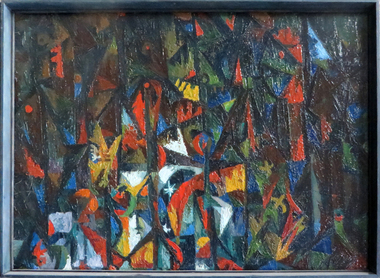 Federation University Art Collection
Painting, 'Forest Ritual' by Peter Clarke, c1956
PETER CLARKE (1935 - ) Born Deloraine, Tasmania Peter Clarke was both artist and teacher. He held 14 exhibitions between 1957 and 1977, as well as participating in a number of group exhibitions, including Contemporary Australian Painting shown in Los Angeles and San Francisco. He is best known for large colour-field works. Peter Clarke's abstract painting emphasises texture, colour and gesture. He won the George Crouch Memorial Prize in 1967 This item is part of the Federation University Art Collection. The Art Collection features over 2000 works and was listed as a 'Ballarat Treasure' in 2007.Abstract painting with black, red, yellow, green, blue and white predominating.art, artwork, peter clarke, clarke, abstract, colour-field -
 Federation University Art Collection
Drawing - Drawing - Pen/wash drawing, 'Pale Sun Bird Rising', 1957
PETER CLARKE (1935 - ) Born Deloraine, Tasmania Peter Clarke was both artist and teacher. He held 14 exhibitions between 1957 and 1977, as well as participating in a number of group exhibitions, including Contemporary Australian Painting shown in Los Angeles and San Francisco. He is best known for large colour-field works. Peter Clarke's abstract painting emphasises texture, colour and gesture. He won the George Crouch Memorial Prize in 1967 This item is part of the Federation University Art Collection. The Art Collection features over 2000 works and was listed as a 'Ballarat Treasure' in 2007.Framed abstract drawing with wash.art, artwork, printmaking, peter clarke, mixed media, ballarat teachers' college collection, abstract -
 Federation University Art Collection
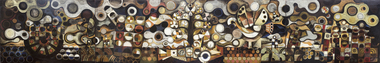
Painting - Mural, French, Leonard, 'The Tapestry' by Leonard French, 1959
Artist Leonard French said of this work:- "The centre panel suggests a tree of knowledge growing out of a jewelled fish (a spiritual accompaniment is intended), and from the tree birds rise, spreading out through the cloud shapes of the other panels. Hands and figures rise from the earth, reaching for the birds. The left hand panel depicts the journey of figures in a boat, the seeking after or journeying to the source of knowledge. The far right hand panel is the garden, figures in a primitive state, a sort of evolution of figures from a primitive garden (the first garden). Visualization, verbalization, music and dance are tools we have to express a concept. The analysis of an art work is a delicate and sensitive task and great harm can be done in an attempt to become verbal about a form which relies upon elements peculiar to itself for intrinsic meaning." Leonard FRENCH (OBE) (08 October 1928 - 10 January 2017) Born Brunswick, Victoria Died Heathcote, Victoria Known for his enormous dalle de verre (concrete and slab glass) ceiling in the Great Hall of the National Gallery of Victoria Leonard French produced a large body of work throughout his lifetime. French won the Sulman Prize in 1960, and the Blake Prize for Religious Art in 1963 and in 1980. He was also awarded a Harkness Fellowship in 1965. In the Queen's Birthday Honours of June 1968 he was appointed an Officer of the Order of the British Empire. In early 1959 Leonard French was commissioned by the Ballarat Teachers' College students to paint a mural. The students were responsible for the payment of the work. When unveiled artist George Bush remarked: "the 1959 students have left something not just to 'oooh' and 'ah' at, but something that is thought provoking, arresting and interesting. This work of art keeps something in reserve and draws you to search for deeper meaning behind the splendour of colour. This mural is not one which will not fade the interest of its beholders, but one which will provide intrigue for generations to come." Originally French intended the mural to be five panels, each entitled (left to right) 'the Journey', 'Man', 'The Tree', 'The Earth', 'The Garden'. The finished mural was reduced to four panels with the central tree incorporated into the panels 'Earth' and 'Man'. Ballarat Teachers' College Art lecturer Arch Cuthbertson explained that the artist:- "Aims at evoking emotional flashed, opening doors to simultaneous thinking and feeling. To accomplish this he juxtaposes the threads of conscious and unconscious images, thus effecting a tapestry that allows many points of reference to converge upon his singular images. Whether the colours offer metaphysical sensations or convey a literal meaning will depend upon the breadth and depth of the viewer's experience. Similarly with the bird - we might well ask is it a defiance of gravity, a metaphysical ascension or the elusive winged knowledge? Again the answer could well be that these three associations have a singular purpose. " This item is part of the Federation University Art Collection. The Art Collection features over 2000 works and was listed as a 'Ballarat Treasure' in 2007.A four panel mural by Leonard French, commissioned and gifted by the Ballarat Teachers' College Student in 1959. Art lecturer Arch Cuthbertson was highly involved in this commission. Artist Charles Bush unveiled the mural at the Ballarat Teachers' College in Gillies Street, Ballarat. At that time he said:- "You have left behind you on object which will be full of interest to a lot of people. A work of art, so long as it is in existence, is constantly under review. Most of the good things that keep on going are usually to the uninitiated a little worrying. Many of you will be worried by this, because it does not make its message immediately clear. But come back and assess it again and again." art, leonard french, french, artwork, mural, ballarat teachers' college, class of 1959