Showing 3623 items
matching 1950s
-
 Federation University Historical Collection
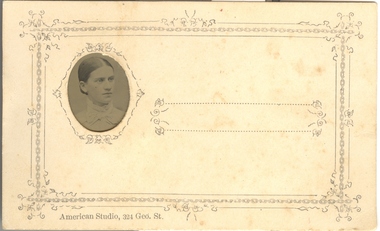
Photograph - Little Gem tintype, American Studio, Portrait of a Woman, (exact)
The tintype (or ferrotype or Melainotype) was produced on metallic sheet (not, actually, tin) instead of glass. The plate was coated with collodion and sensitized just before use. It was introduced by Adolphe Alexandre Martin in 1853. The most common size was about the same as the carte-de-visite, 5.5cm x 9.0cm, but both larger and smaller ferrotypes were made. The smallest were "Little Gem" tintypes, about the size of a postage-stamp, made simultaneously on a single plate in a camera with 12 or 16 lenses. They were often produced by travelling photographers, and were cheaper than Ambrotypes so made photography available to working classes, not just to the more well-to-do. The print would come out laterally reversed (as one sees oneself in a mirror). Being quite rugged, tintypes could be sent by post. Tintypes were eventually superseded by gelatin emulsion dry plates in the 1880s, though street photographers in various parts of the world continued with this process until the 1950s. (Above information abridged from http://www.rleggat.com/photohistory/history/tintype.htm) The firm of Gove and Allen opened in Sydney in 1880 and were responsible for the belated popularizing of the gem tintype in Australia. The firm traded as both The American Gem Studio and The American Studio. Others franchises were opened in Melbourne, Ballarat and Sandhurst (Bendigo). The Sandhurst branch closed in 1882 and Adelaide in 1884. All Gove and Allen studios had ceased trading by 1885. The studio addresses were: 23 King William St, Adelaide; 324 George St, Sydney; 95 Swanston St, Melbourne; Howard Place, Sandhurst; 7 Queen St, Brisbane; The card mounts used in Gove and Allen studios in Australia are identical to those used in America. They were initially made of plain white card with embossing around the oval image opening in the mount while some also had simple geometric and floral printed designs as well. Although Gove and Allen studios produced the majority of gem tintypes in Australia, other studios offered them including: - London, American & Sydney Photo Company, 328 George St, Sydney; - David Edelsten, 55 & 57 Bourke St, Melbourne; - Burman's Portrait Rooms, St. George's Hall, 209 Bourke St, Melbourne; - Bell's Gem Portrait Studio, 57 Bourke St East, Melbourne; - R. H. Kenny, Bridge St, Ballarat; - Marinus W. Bent, Sandhurst (Bendigo); - George Fisher, Victoria; - Anson Brothers, Hobart Town. (Abridged information from http://members.ozemail.com.au/~msafier/photos/tintypes.html) A tintype portrait of a woman's head, attached to a card.Printed lower left hand side of the card "American Studio, 324 Geo. St."tintype, american studio, woman, unidentified woman, women, photograph -
 Federation University Historical Collection
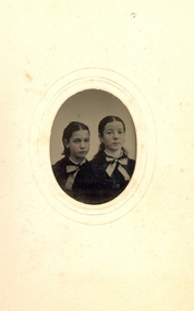
Photograph - Tintype, Portrait of two young girls
The tintype (or ferrotype or Melainotype) was produced on metallic sheet (not, actually, tin) instead of glass. The plate was coated with collodion and sensitized just before use. It was introduced by Adolphe Alexandre Martin in 1853. The most common size was about the same as the carte-de-visite, 5.5cm x 9.0cm, but both larger and smaller ferrotypes were made. The smallest were "Little Gem" tintypes, about the size of a postage-stamp, made simultaneously on a single plate in a camera with 12 or 16 lenses. They were often produced by travelling photographers, and were cheaper than Ambrotypes so made photography available to working classes, not just to the more well-to-do. The print would come out laterally reversed (as one sees oneself in a mirror). Being quite rugged, tintypes could be sent by post. Tintypes were eventually superseded by gelatin emulsion dry plates in the 1880s, though street photographers in various parts of the world continued with this process until the 1950s. (Above information abridged from http://www.rleggat.com/photohistory/history/tintype.htm) The firm of Gove and Allen opened in Sydney in 1880 and were responsible for the belated popularizing of the gem tintype in Australia. The firm traded as both The American Gem Studio and The American Studio. Others franchises were opened in Melbourne, 6 Sturt St Ballarat and Sandhurst (Bendigo). The Sandhurst branch closed in 1882 and Adelaide in 1884. All Gove and Allen studios had ceased trading by 1885. The studio addresses were: 23 King William St, Adelaide; 324 George St, Sydney; 95 Swanston St, Melbourne; Howard Place, Sandhurst; 7 Queen St, Brisbane; The card mounts used in Gove and Allen studios in Australia are identical to those used in America. They were initially made of plain white card with embossing around the oval image opening in the mount while some also had simple geometric and floral printed designs as well. Although Gove and Allen studios produced the majority of gem tintypes in Australia, other studios offered them including: - London, American & Sydney Photo Company, 328 George St, Sydney; - David Edelsten, 55 & 57 Bourke St, Melbourne; - Burman's Portrait Rooms, St. George's Hall, 209 Bourke St, Melbourne; - Bell's Gem Portrait Studio, 57 Bourke St East, Melbourne; - R. H. Kenny, Bridge St, Ballarat; - Marinus W. Bent, Sandhurst (Bendigo); - George Fisher, Victoria; - Anson Brothers, Hobart Town. (Abridged information from http://members.ozemail.com.au/~msafier/photos/tintypes.html) .2) A tintype portrait of two girls heads, attached to a card. The girls are wearing a cloak with a large bow at the frontlittle gem, women, children, photography, tintype -
 Federation University Historical Collection
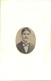
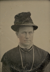
Photograph - Little Gem tintype, Portrait of a Man
The tintype (or ferrotype or Melainotype) was produced on metallic sheet (not, actually, tin) instead of glass. The plate was coated with collodion and sensitized just before use. It was introduced by Adolphe Alexandre Martin in 1853. The most common size was about the same as the carte-de-visite, 5.5cm x 9.0cm, but both larger and smaller ferrotypes were made. The smallest were "Little Gem" tintypes, about the size of a postage-stamp, made simultaneously on a single plate in a camera with 12 or 16 lenses. They were often produced by travelling photographers, and were cheaper than Ambrotypes so made photography available to working classes, not just to the more well-to-do. The print would come out laterally reversed (as one sees oneself in a mirror). Being quite rugged, tintypes could be sent by post. Tintypes were eventually superseded by gelatin emulsion dry plates in the 1880s, though street photographers in various parts of the world continued with this process until the 1950s. (Above information abridged from http://www.rleggat.com/photohistory/history/tintype.htm) The firm of Gove and Allen opened in Sydney in 1880 and were responsible for the belated popularizing of the gem tintype in Australia. The firm traded as both The American Gem Studio and The American Studio. Others franchises were opened in Melbourne, Ballarat and Sandhurst (Bendigo). The Sandhurst branch closed in 1882 and Adelaide in 1884. All Gove and Allen studios had ceased trading by 1885. The studio addresses were: 23 King William St, Adelaide; 324 George St, Sydney; 95 Swanston St, Melbourne; Howard Place, Sandhurst; 7 Queen St, Brisbane; The card mounts used in Gove and Allen studios in Australia are identical to those used in America. They were initially made of plain white card with embossing around the oval image opening in the mount while some also had simple geometric and floral printed designs as well. Although Gove and Allen studios produced the majority of gem tintypes in Australia, other studios offered them including: - London, American & Sydney Photo Company, 328 George St, Sydney; - David Edelsten, 55 & 57 Bourke St, Melbourne; - Burman's Portrait Rooms, St. George's Hall, 209 Bourke St, Melbourne; - Bell's Gem Portrait Studio, 57 Bourke St East, Melbourne; - R. H. Kenny, Bridge St, Ballarat; - Marinus W. Bent, Sandhurst (Bendigo); - George Fisher, Victoria; - Anson Brothers, Hobart Town. (Abridged information from http://members.ozemail.com.au/~msafier/photos/tintypes.html) .4) A tintype portrait of a man, attached to a card. little gem, tintype, man, unidentified man -
 Federation University Historical Collection
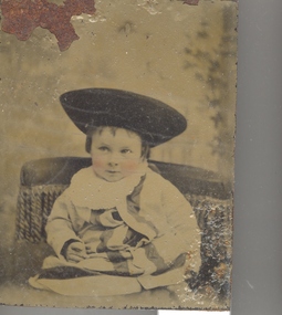
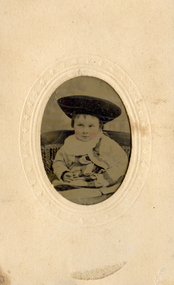
Photograph - Photograph - Little Gem tintype, Possibly American Studio, Portrait of a child
The tintype (or ferrotype or Melainotype) was produced on metallic sheet (not, actually, tin) instead of glass. The plate was coated with collodion and sensitized just before use. It was introduced by Adolphe Alexandre Martin in 1853. The most common size was about the same as the carte-de-visite, 5.5cm x 9.0cm, but both larger and smaller ferrotypes were made. The smallest were "Little Gem" tintypes, about the size of a postage-stamp, made simultaneously on a single plate in a camera with 12 or 16 lenses. They were often produced by travelling photographers, and were cheaper than Ambrotypes so made photography available to working classes, not just to the more well-to-do. The print would come out laterally reversed (as one sees oneself in a mirror). Being quite rugged, tintypes could be sent by post. Tintypes were eventually superseded by gelatin emulsion dry plates in the 1880s, though street photographers in various parts of the world continued with this process until the 1950s. (Above information abridged from http://www.rleggat.com/photohistory/history/tintype.htm) The firm of Gove and Allen opened in Sydney in 1880 and were responsible for the belated popularizing of the gem tintype in Australia. The firm traded as both The American Gem Studio and The American Studio. Others franchises were opened in Melbourne, Ballarat and Sandhurst (Bendigo). The Sandhurst branch closed in 1882 and Adelaide in 1884. All Gove and Allen studios had ceased trading by 1885. The studio addresses were: 23 King William St, Adelaide; 324 George St, Sydney; 95 Swanston St, Melbourne; Howard Place, Sandhurst; 7 Queen St, Brisbane; The card mounts used in Gove and Allen studios in Australia are identical to those used in America. They were initially made of plain white card with embossing around the oval image opening in the mount while some also had simple geometric and floral printed designs as well. Although Gove and Allen studios produced the majority of gem tintypes in Australia, other studios offered them including: - London, American & Sydney Photo Company, 328 George St, Sydney; - David Edelsten, 55 & 57 Bourke St, Melbourne; - Burman's Portrait Rooms, St. George's Hall, 209 Bourke St, Melbourne; - Bell's Gem Portrait Studio, 57 Bourke St East, Melbourne; - R. H. Kenny, Bridge St, Ballarat; - Marinus W. Bent, Sandhurst (Bendigo); - George Fisher, Victoria; - Anson Brothers, Hobart Town. (Abridged information from http://members.ozemail.com.au/~msafier/photos/tintypes.html) A tintype portrait of a child, attached to a card. little gem, child, hat -
 Federation University Historical Collection
Photograph - Photo - Little Gem tintype, Possibly American Studio, Portrait of a child
The tintype (or ferrotype or Melainotype) was produced on metallic sheet (not, actually, tin) instead of glass. The plate was coated with collodion and sensitized just before use. It was introduced by Adolphe Alexandre Martin in 1853. The most common size was about the same as the carte-de-visite, 5.5cm x 9.0cm, but both larger and smaller ferrotypes were made. The smallest were "Little Gem" tintypes, about the size of a postage-stamp, made simultaneously on a single plate in a camera with 12 or 16 lenses. They were often produced by travelling photographers, and were cheaper than Ambrotypes so made photography available to working classes, not just to the more well-to-do. The print would come out laterally reversed (as one sees oneself in a mirror). Being quite rugged, tintypes could be sent by post. Tintypes were eventually superseded by gelatin emulsion dry plates in the 1880s, though street photographers in various parts of the world continued with this process until the 1950s. (Above information abridged from http://www.rleggat.com/photohistory/history/tintype.htm) The firm of Gove and Allen opened in Sydney in 1880 and were responsible for the belated popularizing of the gem tintype in Australia. The firm traded as both The American Gem Studio and The American Studio. Others franchises were opened in Melbourne, Ballarat and Sandhurst (Bendigo). The Sandhurst branch closed in 1882 and Adelaide in 1884. All Gove and Allen studios had ceased trading by 1885. The studio addresses were: 23 King William St, Adelaide; 324 George St, Sydney; 95 Swanston St, Melbourne; Howard Place, Sandhurst; 7 Queen St, Brisbane; The card mounts used in Gove and Allen studios in Australia are identical to those used in America. They were initially made of plain white card with embossing around the oval image opening in the mount while some also had simple geometric and floral printed designs as well. Although Gove and Allen studios produced the majority of gem tintypes in Australia, other studios offered them including: - London, American & Sydney Photo Company, 328 George St, Sydney; - David Edelsten, 55 & 57 Bourke St, Melbourne; - Burman's Portrait Rooms, St. George's Hall, 209 Bourke St, Melbourne; - Bell's Gem Portrait Studio, 57 Bourke St East, Melbourne; - R. H. Kenny, Bridge St, Ballarat; - Marinus W. Bent, Sandhurst (Bendigo); - George Fisher, Victoria; - Anson Brothers, Hobart Town. (Abridged information from http://members.ozemail.com.au/~msafier/photos/tintypes.html) .5) A tintype portrait of a child, attached to a card. little gem, photography, child, portrait -
 Federation University Historical Collection
Photograph - Photograph - Little Gem tintype, American Studio, Portrait of a Woman
The tintype (or ferrotype or Melainotype) was produced on metallic sheet (not, actually, tin) instead of glass. The plate was coated with collodion and sensitized just before use. It was introduced by Adolphe Alexandre Martin in 1853. The most common size was about the same as the carte-de-visite, 5.5cm x 9.0cm, but both larger and smaller ferrotypes were made. The smallest were "Little Gem" tintypes, about the size of a postage-stamp, made simultaneously on a single plate in a camera with 12 or 16 lenses. They were often produced by travelling photographers, and were cheaper than Ambrotypes so made photography available to working classes, not just to the more well-to-do. The print would come out laterally reversed (as one sees oneself in a mirror). Being quite rugged, tintypes could be sent by post. Tintypes were eventually superseded by gelatin emulsion dry plates in the 1880s, though street photographers in various parts of the world continued with this process until the 1950s. (Above information abridged from http://www.rleggat.com/photohistory/history/tintype.htm) The firm of Gove and Allen opened in Sydney in 1880 and were responsible for the belated popularizing of the gem tintype in Australia. The firm traded as both The American Gem Studio and The American Studio. Others franchises were opened in Melbourne, 6 Sturt St Ballarat and Sandhurst (Bendigo). The Sandhurst branch closed in 1882 and Adelaide in 1884. All Gove and Allen studios had ceased trading by 1885. The studio addresses were: 23 King William St, Adelaide; 324 George St, Sydney; 95 Swanston St, Melbourne; Howard Place, Sandhurst; 7 Queen St, Brisbane; The card mounts used in Gove and Allen studios in Australia are identical to those used in America. They were initially made of plain white card with embossing around the oval image opening in the mount while some also had simple geometric and floral printed designs as well. Although Gove and Allen studios produced the majority of gem tintypes in Australia, other studios offered them including: - London, American & Sydney Photo Company, 328 George St, Sydney; - David Edelsten, 55 & 57 Bourke St, Melbourne; - Burman's Portrait Rooms, St. George's Hall, 209 Bourke St, Melbourne; - Bell's Gem Portrait Studio, 57 Bourke St East, Melbourne; - R. H. Kenny, Bridge St, Ballarat; - Marinus W. Bent, Sandhurst (Bendigo); - George Fisher, Victoria; - Anson Brothers, Hobart Town. (Abridged information from http://members.ozemail.com.au/~msafier/photos/tintypes.html) A tintype portrait of a woman's head, attached to a card. Printed on the lower edge of the card "Allen & Gove, American Studion, 6 Sturt St, Ballarat"ballarat, american studio, little gem, allen gove, tintype, woman, unidentified woman, photography -
 Federation University Historical Collection
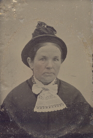
Photograph - Little Gem tintype, Portrait of a Woman in a hat
The tintype (or ferrotype or Melainotype) was produced on metallic sheet (not, actually, tin) instead of glass. The plate was coated with collodion and sensitized just before use. It was introduced by Adolphe Alexandre Martin in 1853. The most common size was about the same as the carte-de-visite, 5.5cm x 9.0cm, but both larger and smaller ferrotypes were made. The smallest were "Little Gem" tintypes, about the size of a postage-stamp, made simultaneously on a single plate in a camera with 12 or 16 lenses. They were often produced by travelling photographers, and were cheaper than Ambrotypes so made photography available to working classes, not just to the more well-to-do. The print would come out laterally reversed (as one sees oneself in a mirror). Being quite rugged, tintypes could be sent by post. Tintypes were eventually superseded by gelatin emulsion dry plates in the 1880s, though street photographers in various parts of the world continued with this process until the 1950s. (Above information abridged from http://www.rleggat.com/photohistory/history/tintype.htm) The firm of Gove and Allen opened in Sydney in 1880 and were responsible for the belated popularizing of the gem tintype in Australia. The firm traded as both The American Gem Studio and The American Studio. Others franchises were opened in Melbourne, Ballarat and Sandhurst (Bendigo). The Sandhurst branch closed in 1882 and Adelaide in 1884. All Gove and Allen studios had ceased trading by 1885. The studio addresses were: 23 King William St, Adelaide; 324 George St, Sydney; 95 Swanston St, Melbourne; Howard Place, Sandhurst; 7 Queen St, Brisbane; The card mounts used in Gove and Allen studios in Australia are identical to those used in America. They were initially made of plain white card with embossing around the oval image opening in the mount while some also had simple geometric and floral printed designs as well. Although Gove and Allen studios produced the majority of gem tintypes in Australia, other studios offered them including: - London, American & Sydney Photo Company, 328 George St, Sydney; - David Edelsten, 55 & 57 Bourke St, Melbourne; - Burman's Portrait Rooms, St. George's Hall, 209 Bourke St, Melbourne; - Bell's Gem Portrait Studio, 57 Bourke St East, Melbourne; - R. H. Kenny, Bridge St, 6 Sturt St Ballarat; - Marinus W. Bent, Sandhurst (Bendigo); - George Fisher, Victoria; - Anson Brothers, Hobart Town. (Abridged information from http://members.ozemail.com.au/~msafier/photos/tintypes.html) .9) A tintype portrait of a woman's head, attached to a card. The cheeks have been hand coloured.little gem, woman, unidentified woman, women, photography -
 Federation University Historical Collection
Photograph - Little Gem tintype, Possibly American Studio, Portrait of a Boy
The tintype (or ferrotype or Melainotype) was produced on metallic sheet (not, actually, tin) instead of glass. The plate was coated with collodion and sensitized just before use. It was introduced by Adolphe Alexandre Martin in 1853. The most common size was about the same as the carte-de-visite, 5.5cm x 9.0cm, but both larger and smaller ferrotypes were made. The smallest were "Little Gem" tintypes, about the size of a postage-stamp, made simultaneously on a single plate in a camera with 12 or 16 lenses. They were often produced by travelling photographers, and were cheaper than Ambrotypes so made photography available to working classes, not just to the more well-to-do. The print would come out laterally reversed (as one sees oneself in a mirror). Being quite rugged, tintypes could be sent by post. Tintypes were eventually superseded by gelatin emulsion dry plates in the 1880s, though street photographers in various parts of the world continued with this process until the 1950s. (Above information abridged from http://www.rleggat.com/photohistory/history/tintype.htm) The firm of Gove and Allen opened in Sydney in 1880 and were responsible for the belated popularizing of the gem tintype in Australia. The firm traded as both The American Gem Studio and The American Studio. Others franchises were opened in Melbourne, Ballarat and Sandhurst (Bendigo). The Sandhurst branch closed in 1882 and Adelaide in 1884. All Gove and Allen studios had ceased trading by 1885. The studio addresses were: 23 King William St, Adelaide; 324 George St, Sydney; 95 Swanston St, Melbourne; Howard Place, Sandhurst; 7 Queen St, Brisbane; The card mounts used in Gove and Allen studios in Australia are identical to those used in America. They were initially made of plain white card with embossing around the oval image opening in the mount while some also had simple geometric and floral printed designs as well. Although Gove and Allen studios produced the majority of gem tintypes in Australia, other studios offered them including: - London, American & Sydney Photo Company, 328 George St, Sydney; - David Edelsten, 55 & 57 Bourke St, Melbourne; - Burman's Portrait Rooms, St. George's Hall, 209 Bourke St, Melbourne; - Bell's Gem Portrait Studio, 57 Bourke St East, Melbourne; - R. H. Kenny, Bridge St, 6 Sturt St Ballarat; - Marinus W. Bent, Sandhurst (Bendigo); - George Fisher, Victoria; - Anson Brothers, Hobart Town. (Abridged information from http://members.ozemail.com.au/~msafier/photos/tintypes.html) .9) A tintype portrait of a child's head and torso, attached to a card. The boy is wearing a suit and the cheeks have been hand coloured.little gem -
 Federation University Historical Collection
Photograph - Little Gem tintype, Portrait of a Woman in a Hat
The tintype (or ferrotype or Melainotype) was produced on metallic sheet (not, actually, tin) instead of glass. The plate was coated with collodion and sensitized just before use. It was introduced by Adolphe Alexandre Martin in 1853. The most common size was about the same as the carte-de-visite, 5.5cm x 9.0cm, but both larger and smaller ferrotypes were made. The smallest were "Little Gem" tintypes, about the size of a postage-stamp, made simultaneously on a single plate in a camera with 12 or 16 lenses. They were often produced by travelling photographers, and were cheaper than Ambrotypes so made photography available to working classes, not just to the more well-to-do. The print would come out laterally reversed (as one sees oneself in a mirror). Being quite rugged, tintypes could be sent by post. Tintypes were eventually superseded by gelatin emulsion dry plates in the 1880s, though street photographers in various parts of the world continued with this process until the 1950s. (Above information abridged from http://www.rleggat.com/photohistory/history/tintype.htm) The firm of Gove and Allen opened in Sydney in 1880 and were responsible for the belated popularizing of the gem tintype in Australia. The firm traded as both The American Gem Studio and The American Studio. Others franchises were opened in Melbourne, Ballarat and Sandhurst (Bendigo). The Sandhurst branch closed in 1882 and Adelaide in 1884. All Gove and Allen studios had ceased trading by 1885. The studio addresses were: 23 King William St, Adelaide; 324 George St, Sydney; 95 Swanston St, Melbourne; Howard Place, Sandhurst; 7 Queen St, Brisbane; The card mounts used in Gove and Allen studios in Australia are identical to those used in America. They were initially made of plain white card with embossing around the oval image opening in the mount while some also had simple geometric and floral printed designs as well. Although Gove and Allen studios produced the majority of gem tintypes in Australia, other studios offered them including: - London, American & Sydney Photo Company, 328 George St, Sydney; - David Edelsten, 55 & 57 Bourke St, Melbourne; - Burman's Portrait Rooms, St. George's Hall, 209 Bourke St, Melbourne; - Bell's Gem Portrait Studio, 57 Bourke St East, Melbourne; - R. H. Kenny, Bridge St, 6 Sturt St Ballarat; - Marinus W. Bent, Sandhurst (Bendigo); - George Fisher, Victoria; - Anson Brothers, Hobart Town. (Abridged information from http://members.ozemail.com.au/~msafier/photos/tintypes.html) A tintype portrait of a woman's head and shoulders, attached to a card. The cheeks have been hand coloured.little gem, woman, unidentified woman, women, photography -
 Flagstaff Hill Maritime Museum and Village
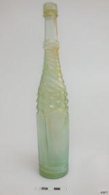
Container - Bottle, 1870s-1910s
This clear, green tinged, Half Whirley (or Whirly) salad oil bottle has been handmade by a glassblower from 1870s-1910s. A bottle with such elaborate decoration would have been sought after as there was no need to decant the sauce into another jug or bottle to make it acceptable for table service. It is possible that this bottle was recovered from the Loch Ard, wrecked in 1878. A diver found the bottle on a shipwreck in the coastal waters of Victoria about 100 years from when it was made. The diver who found this bottle has recovered objects from several different shipwrecks between the late 1950s and early 1970s. A sizeable proportion of those objects was from the wreck of the famous clipper ship Loch Ard. This salad oil bottle may very well have been amongst that ship’s cargo. It is part of the John Chance Collection. A paper titled ‘Glass Bottles from the Loch Ard Shipwreck (1878): A Preliminary Study’ by Iain Stuart, (published in Australian Historical Archaeology, 9, 1991) included a study of twelve salad oil bottles from the wreck of the Loch Ard. The bottles were of this same Half Whirley design (half meaning that it was Whirley on the upper half but not on the lower half of the body), as well as the same colour and size. A diagram of one of these twelve bottles matches the bottle in our collection. The paper mentions that eleven of the twelve bottles have a number on their base, just as this one has. It is estimated that foreign and salad oil bottles totalled four percent of all of the bottles carried as cargo on the ship. The Half Whirley bottle has side seams from below the lip to the base, indicating that the bottle was made in a two-piece mould that included the heel, body, shoulder and neck. The fancy ‘whirly’ twist pattern and panelled sides would have been cut into the mould’s inner surface. The uneven thickness of the ridge around the base comes from adding a separately moulded and embossed base after the bottle was removed from the mould. The applied finish (mouth and lip) was also added to the bottle. The elongated bubbles in the glass are evidence of the glass being mouth blown into the mould, thus forming the shape and pattern from the inside shape of the mould. The bottle probably had a glass stopper with a round top and wedge-shaped shank with a ground surface, allowing the bottle to be re-sealed. The ring between upper and lower lip allows the closure to be sealed and anchored. The embossed numbers are either “133” or “833” and may represent a particular bottle pattern, manufacturer or filler. Although the bottle is not currently linked to a particular shipwreck, it is recognised as being historically significant as an example of bottles imported for use in Colonial Victoria in the mid-to-late 19th century. This whirley salad oil bottle is matches the whirley salad oil bottles recovered from the Loch Ard in the 1990s, adding depth of interpretation to the array of salvaged Loch Ard artefacts in Flagstaff Hill’s collection. The salad oil bottle is an example of the type of food condiment containers that were used in Victoria’s early days. The bottle is also significant as it was recovered by John Chance, a diver in Victoria’s coastal waters in the late 1960s to early 1970s. Items that come from several wrecks, including the Loch Ard, have since been donated to the Flagstaff Hill Maritime Village’s museum collection by his family, illustrating this item’s level of historical value. Bottle; glass Half Whirley salad oil bottle, green-tinged, with some opalescence. Handmade, elaborately decorated bottle with round neck and base, and five-sided body. Applied double lip; straight upper, flared lower. The lower neck and shoulder have twisted spiral whirley patterns in the glass. The body tapers slightly inwards towards the base. It has five plain panels, one wider than the others. Side seams run from below the lip to the heel. The heel of the bottle is uneven in width, height and density where it joins the body of the bottle. The base is not level. Embossed characters on base. Glass has elongated bubbles towards the base and orange-brown sediment inside, on one side. Embossed "133" or “833” (the first character may be an “8”) flagstaff hill, warrnambool, flagstaff hill maritime museum, maritime museum, shipwreck coast, flagstaff hill maritime village, great ocean road, shipwreck artefact, john chance, glass bottle, antique bottle, handmade, mouth blown, blown bottle, 19th century bottle, collectable, bottle, green glass, tinged green, two piece mould, food bottle, oil bottle, salad oil bottle, whirley, whirly, half whirley, condiment bottle -
 Monash University Museum of Computing History
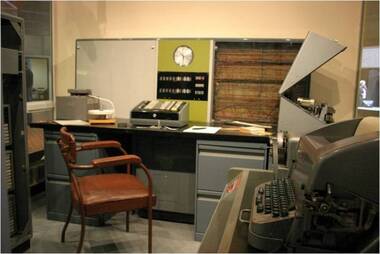
Ferranti Sirius mainframe computer, 1961
The Ferranti Sirius is an electronic second-generation transistor computer and is one of three remaining examples of this machine left in the world. It was an important addition to the computing facilities at Monash University in the early 1960s and provided access for computer programming and research for many early computer professionals, academics and teachers. The Ferranti Sirius computer was built in a period of rapid growth in computing technology. The first stored program computers appeared in the late 1940s and used individual designs with valve technology. By the mid-1950s valve technology was replaced by transistors and the first mass produced commercial computers became available. The Ferranti Sirius was announced in 1959 and offered a “small” academic computer. It was designed and built by the English company Ferranti Ltd and sold through a local office of the company in Melbourne. The Sirius was manufactured at the Ferranti Ltd.’s West Gorton, England factory from 1959 to 1963 and, in all, the company produced probably 22 installations although only 16 were actually recorded as sold; this included one at Ferranti’s Bureau in London and one at Ferranti’s Melbourne Bureau. Only 7 were exported and 4 of these 7 were located in Melbourne, Australia. All four were associated with computing at Monash University – the Sirius in the MMoCH collection was purchased by Monash University in 1962, a smaller Ferranti Sirius was used on the Caulfield campus (prior to amalgamation with Monash University) from 1963, the Ferranti company had its own Ferranti Sirius initially temporarily installed at Clayton campus in 1962 and then placed in their office in Queens Road, Melbourne. A fourth computer was purchased by ICIANZ (now Orica) in 1962 and was transferred to Clayton campus in 1967. Only two of these Melbourne examples have survived; one in the MMoCH collection and one at Museums Victoria. There is an example of the Ferranti Sirius in the Science Museum Group collection in the UK as well. The Ferranti Sirius in the MMoCH collection was the first computer purchased by Monash University and it was shipped to Australia to be installed by November 1962. The University had a similar model computer on loan from Ferranti Ltd during the first part of the year and it was returned to the office of the company in Queens Road, Melbourne once the University’s own machine was installed. The computer was placed on site at Clayton campus, Monash University. The computer operated from 1962 until 1972 when it was officially decommissioned. The Ferranti Sirius was sold to Mr Paul Stewart in late 1974 and removed from Monash University. Mr Stewart later donated the computer back to the University in 1988 and it was transferred to the collection of the Monash Museum of Computing History after 2001. The Ferranti Sirius is an electronic second-generation transistor computer and is one of three remaining examples of this machine left in the world. It was an important addition to the computing facilities at Monash University in the early 1960s and provided access for computer programming and research for many early computer professionals, academics and teachers. The Ferranti Sirius is of scientific (technological) significance as one of the early transistor digital computers that transitioned computing from first-generation valve computers to second generation commercial installations. This example of the Sirius is of historical significance in its role as a part of the Computer Centre, Clayton campus, Monash University which provided computing facilities in Melbourne in the early 1960s when there were few installations available for academic, administrative and commercial users. Staff and students were able to undertake investigative research and learn programming techniques. The Computer Centre encouraged the use of the computer across all disciplines and this provided the base to establish computer science as a subject offering and, later, a new department in the University. This growth in computer education eventually culminated in the establishment of the Faculty of Information Technology, Monash University. The Ferranti Sirius in the collection at Monash Museum of Computing History has a main unit with a CPU and memory combined with input/output equipment and one extra cabinet of memory. The Central Processing Unit is a floor-standing unit which contains the computer circuits, power supplies and has a decimal digit display panel and a normal clock. A moveable control panel is placed in front of the Unit (Currently set on a recreated desk/filing cabinet support in the display). The Sirius base unit uses acoustic delay line memory with 1000 word store. An additional 3000 word memory cabinet is set adjacent to the CPU and can be connected to increase the memory. The computer is supported by a range of input/output devices. There is a Ferranti Paper tape reader, located on desk in front of CPU. Red label on front “Ferranti tape reader. Type TR 5. Serial No. 477”. Adjacent to the CPU is a set of Simplified tape editing equipment in three pieces which includes a (1) Table unit with switches on front face. Metal tag on reverse reads “Creed & Co. Model No. S4060. Serial No. 1457. Original Customers Marking GRP7 V706”. The table has a numbered internal tag “Table Serial No. 198579. (2)Creed teletype set on table unit. Metal tag on reverse “Creed & Co. Model No. 75RPR K4M4. Serial No. 5897 Made in England”. (3)Creed paper tape reader set on table unit. This set of equipment could read paper tape and print it, or copy paper tape while allowing it to be edited, or allow a programmer or data preparation person to type and punch a new program or data. It has no electrical connection to the computer. Paper tapes were usually torn off and carried across to the computer. There is also another table unit with switches on front face and changeable setting switch on front right side which holds a Ferranti Westrex paper tape punch set. Label on reverse “Teletype Code BRPE11” This was the Computer’s only output device. BRPE-11 is a teletype model number. -
 Melton City Libraries
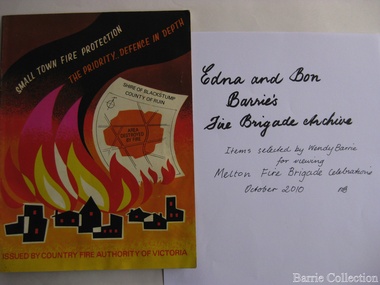
Archive, Edna and Bon Barries Fire Brigade Archives, 2010
In the 1950s with the introduction two-way HF and later VHF very high frequency radio sets. Melton Rural Fire Brigade was part of the Bacchus Marsh Group. Radio sets where located in the Melton Fire Truck, and in the house of the Barrie family at Ferris Road. This was an ideal location to observe a 360 degree view in all directions when smoke appeared on the horizon. An antenna was erected beside the house. The set OX 7 was located in the kitchen and monitored 24 hours by the family. When an electrical fire occurred at the junction of the electricity to the house there was time to radio the fire station and summons the men working in the paddocks, thus saving the house from possible destruction. With the introduction of UHF – ultra high frequency Vinten Radios the signal was clearer and static and interference lessened and radio traffic became easier to read, and reduced noise levels in the household. VL3 LY Radio Base became the Group Headquarters was established in 1967. By 1970 the Brigades were: Melton, Rockbank, Sydenham, Toolern Vale, Diggers Rest, Truganina, and Werribee. In 1974 when the family moved to First Avenue, another antenna and a small building were erected adjacent to the residence and used to house the equipment, maps. Radio traffic consisted of regular schedule times and communication with adjoining groups of brigades such as Bacchus Marsh, Mt Macedon and Little River Groups. Many of the brigade and group base radios were situated in private residences and operated primarily by fire fighters wives who held the position of Communications Officer, either registered as a brigade member or informally. Edna was never registered as an operational brigade member but operated informally as an assistant to her husband Bon. She was however a member of the Melton Fire Brigade Ladies Auxiliary from its inception in 1968, a non-operational position. Edna kept up to date with radio procedure following the 1967 handbook; preparing maps, plotting compass points and taking notes on weather forecasts from the SA Border and Western District. Daily notes were taken in anticipation of fire warnings. These log books and daily radio traffic were incidental to the regular radio schedules. Emergency turnouts noted, burning off times and predicted location of smoke. In the summer fire season all TBF (total fire ban days were recorded.) In times of emergency the Barrie family assisted Bon the base radio operator to plot the position and location of fire trucks and to help clarify garbled radio traffic, keep notes and make telephone calls. These log books are held in the EE and EW Family Archive. Items selected by Wendy Barrie for viewing Melton Fire Brigade celebrationsemergency services, local identities -
 Melbourne Legacy
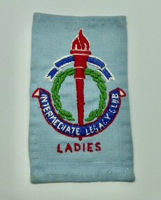
Badge, Intermediate Legacy Club Ladies Cloth Badge
An example of a Melbourne Ladies Intermediate Legacy Club Badge that was stitched onto clothes. ILC was formed from junior legatees who had become too old for the usual junior legatee activities. It was most active from the 1930s to 1950s. This badge came from a donation of material from a former Junior Legatee, Valma Hutchinson (nee Wigg). She was involved with the Ladies ILC. The badge of Legacy is the Torch and Wreath of Laurel. The Torch signifies the undying flame of service and sacrifice of those who gave their lives for their country. The Wreath of Laurel is the symbol of our remembrance of them. Background: The ILC was formed in 1929. The idea of the club sprang from those boys who had outgrown the Junior Legacy Club. In the early days it fielded a lacrosse team and it was this that mainly held the members together. Enthusiasm wained after a few years as it lacked a solid objective. The answer came from one of its members and in 1938 they founded the Don Esses Club. This was a club for the children of incapacitated ex-servicemen which met every Thursday night at 7.30 run by the ILC members. The name came from the signallers' code Disabled Servicemen's Sons. During the second world war 80% of the members of the ILC enlisted in the services. Leaving only 8 members that could not join due to ill health or reserved occupations. They continued the Don Esses and whatever aid they could to Legacy. ILC members had always helped Legacy where possible including being camp leaders or camp staff, with the annual demonstrations, and coffee stalls at the ANZAC dawn service. Post second world war some ILC members were nominated into Legacy, others drifted away in civil occupations. It was found difficult to recruit new blood into the ILC and eventually membership waned when the boys from the Don Esses clubs found other youth activities to join. The ILC ceased to meet regularly in the mid fifties. However a strong comradeship still existed between members and they would meet in one anothers homes. Members were always ready to help the senior Legacy Club in any way in their power and still helped at Christmas parties and summer camps. ILC was a service rendering organisation and was self governing. Non-sectarian and non-political, the members were ex-junior legatees over 18 years of age. After serving in World War 2 members were eligible to become members of Legacy.A record of the cloth badge worn by Intermediate Legacy Club members.Cloth badge of the Legacy torch stitched on pale blue fabric containing the words Intermediate Legacy Club - Ladies.Embroidered with 'Intermediate Legacy Club - Ladies'ilc, membership -
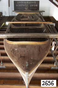 Flagstaff Hill Maritime Museum and Village
Vehicle - Vessel - Surf Boat, 1949
In 1952 the subject surf boat crewed by Geoff Scott, Ron Blackney, Wes McLaren, Jim Tibb, and Stan Stephens, won the Victorian Surf Boat Championships. When the club had finished with the boat Mr. Harold Stephenson paid one shilling and it eventually found its way into a garage where it remained for over 20 years before being donated to Flagstaff Hill. This boat is regarded as a unique example of craftsmanship, closely resembling Bay whaleboats used around the Warrnambool area in the 1800s. This timber caravel surf boat was named “Aeroplane Jelly” and was built by N & E Towns a Newcastle boat builder in 1949 Aeroplane Jellies and David Jones as sponsors of the Sydney Surf Carnival of 1950/1951 donated jointly the vessel. George Towns started his boat-building business in 1869 on Dempsey Island on the Hunter River, NSW. George's sons took over the business as N & E Towns (Norman and Eldrid) and continued until the early 1950s. The business made a variety of small craft including fishing boats, launches, and flood boats. In 1928 they built their first surf boat it took about six weeks to build with cedar planks and hardwood frames. After World War II surf boats became their main focus and they became well known for the lighter and faster designs. Many “Towns built” craft have won events at state and national surf championships. They were renowned Boat Builders producing a much lighter and faster running boat than anything previously made, with a buoyant type bow design giving it the lift necessary to get out and through heavy surf. while its sleek lines from amidships aft provided very fast running qualities. Either side of its bows, it bore the bright silver aircraft transfer of the Aeroplane Jellies Company. After a surf competition at Narrabeen NSW, the competing Warrnambool surf lifesaving team returned home to Warrnambool their club committee decided to purchase the "Aeroplane Jellies" Surf boat if and when it became available as the team had been so impressed with the boat. On 30 October 1951 a cheque for £207-2/6' was raised, £180 for the boat, balance for oars. Transport was arranged and the boat was delivered in November 1951. When the "Aeroplane Jellies" competition days were over in the early 1960's due largely to changing surf boat design, Warrnambool Club's Secretary, Mr. Harold Stephenson, sought permission from the Committee to purchase the boat for the nominal sum of one shilling thus preserving the vessel for posterity. The boat had been stored for many years at the Nullawarre Bakery where it remained until Mr. Stephenson died in 1985. After Mr. Stephenson's passing his family donated the vessel to Flagstaff Hill Maritime Museum in 1986.A very rare example of a surf lifesaving boat that for its time was a unique creation that revolutionised small vessel design in Australia. It was made by a renowned maker that today unfortunately many of his examples of boats he made, especially surf life-saving boats no longer exist making the Flagstaff Hill boat very significant to not only surf lifesaving history but to the part it played in our social life for all those who went to the beaches in 1960s Australia.Surf boat named "Aeroplane Jellies". Timber, double ender carvel, built in 1949 by N & E Towns, Newcastle, NSW. Only a few are in existence. She was a trophy prize at Sydney Surf Carnival 1950/1951, donated by Aeroplane Jellies and David Jones Dept. Store, Sydney. The boat was won by South Narrabeen Surf Club. Warrnambool Surf Club purchased her on 30/10/1951 for £207-2/6, and she was sold to Harold Stephenson in early 1960's for 1 shilling. Donated to Flagstaff Hill by the family of Harold Stephenson around 1985-1986. The name Aeroplane Jellies was lettered in gold across the boat's coaming and there is a remnant of some of the gold lettering still there.warrnambool, flagstaff hillflagstaff hill maritime museum, great ocean road, ememgency, historic boat, surf boat, n & e towns, carvel, vintage boat, double ender boat, lifesaving boat, geoff scott, south narrabeen surf club, warrnambool surf life saving club, lifeboat -
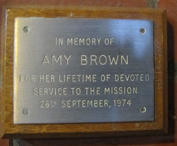 Mission to Seafarers Victoria
Plaque - Memorial Plaque, Amy Neville Brown (1882-1974), 1976
Amy Neville Brown (1882-1974) was a longlife member of the Mission to Seafarers ladies' Committees: 1910 - Amy is first mentioned in our records as LHLG branch secretary for Elsternwick. (from diaries written by her and her sister Beatrice during 1909-1913 and held at the Glen Eira Historical Society, Amy tells she attends “kirk” with Miss Godfrey about once a month and each time they go to the “Institute” afterwards.) 1918 - 1922 sees Amy as “Schools secretary” LHLG. 1933 - Miss A N Brown becomes Honorary Secretary of the LHLG. 1946 – LHLG becomes “Harbour Lights Guild”. 1949 – Dora Simpson is president of HLG & Amy Brown is Honorary Secretary. 1957 – Amy retires as Honorary Secretary of the HLG. Other interests: 1933 - Amy founded the Victorian Aboriginal Group along with Valentine Alexa Leeper (1900-2001). She acted as Hon. Sec. to the VAG for 40 years until its winding up in 1971 8 boxes of papers related to their activities are held at the SLV under Amy’s name (with Val Leeper). 1950 - Amy was a member of the YWCA 1963 – she was president of the Agnes Benson Auxiliary of the YWCA. Amy’s parents were Andrew Howden Brown & Catherine Marianne (Kitty) Wight. She had 2 brothers: Charles John Brown, Edward Byam Brown & 3 sisters: Jean Constance Brown (1884-1973), Catherine Philpott Brown (1886-1980), Grace *Beatrice Brown (1889-1984) who was also a member of the Mission's ladies' committee. None of 4 sisters married, they lived all their lives in Elsternwick. Edward Byam Brown was an academic at Melbourne University rising to become Ass. Prof. of Electrical Engineering by the 1950s. He married Vera Scantlebury in 1926 – they had 2 children. Amy’s maternal grandparents were Edward Byam Wight and Catherine Philpott. Both arrived in Melbourne in the early 1840s. Edward Wight is included on Thomas Chuck’s collage of early Victorian pioneers. Anne Jackson has written a short biography of Catherine’s brother, William Philpott, which includes a paragraph on Edward Wight. Catherine’s youngest son, Neville Wight, became a solicitor living at Woodend. He married Grace Rutherford – Mrs Neville Wight was a member of our Executive Committee from 1929 to 1933. Neville Wight’s obituary states that “he served his articles with … the firm of Moule & Seddon”. The principal of this firm was W H Moule, well known judge and cricketer. His son, also W H Moule, was Honorary Secretary of MtSV Executive Committee for 20 years until his retirement in 1958. was a member of the Harbour Lights Guild ( Honorary General Secretary in the 30s) then the Flying Angel League. She passed away in September 1974. A protege and friend of the Godfreys and Ina Higgins she actively assisted in setting up school branches of LHLG and eventually became a leading member in the 1930s.The window made by Tony Hall along with this plaque were dedicated in 1976. Amy Neville Brown had a lifelong association with the Mission and other philanthropic and social causes. Small plaque mounted on wooded board.In memory of Amy Brown For her lifetime of devoted service to the Mission 26th September, 1974amy brown, plaque, memorial, flying angel club, lhlg, amy neville brown (1882-1974), victoria aboriginal group (1933-1971), vag, val leeper, valentina alexa leeper (1900-2001) -
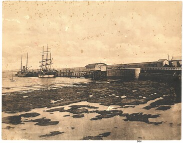 Flagstaff Hill Maritime Museum and Village
Photograph - Coastal Scene, Joseph Jordan Photographic Studio, Lady Bay and Breakwater, Warrnambool, circa 1907
The Port of Warrnambool - In the early years the Port of Warrnambool was a busy port. Steamships and sailing ships were frequent visitors to the port. Steam navigation companies were plentiful, carrying passengers and freighting cargo such as coal, timber, food, livestock, furniture, hardware and haberdashery between Melbourne and the ports along the southwest coast of Victoria, including Warrnambool. The carts would take their loads into the township for distribution. The Breakwater was built (using 32 ton blocks of concrete) between 1874 and 1890 to provide ships with greater protection from the Southern Ocean. The Lifeboat and Rocket House - The coastline of South West Victoria has had over 600 shipwrecks and many lost lives; even in Warrnambool’s Lady Bay there were around 16 known shipwrecks between 1850 and 1905, with eight lives lost. In 1859 the first Government-built lifeboat arrived at Warrnambool Harbour and a shed was soon built to house it, followed in 1864 by a rocket house to safely store the Rocket Rescue equipment. In 1878 the buildings were moved to the Breakwater area, and in 1910 the new Lifeboat Warrnambool arrived with its ‘self-righting’ design. For almost one hundred years the lifeboat and rocket crews, mostly local volunteers, trained regularly to maintain and improve their skills, summoned when needed by alarms, gunshots, ringing bells and foghorns. Some became local heroes but all served an important role. By the end of the 1950s the lifeboat and rescue equipment had become obsolete. Joseph Jordan - Joseph Jordan was born in 1841 in Leicester England. When he was 16 he joined the 7th Queen's Own Hussars and was sent to India at the outbreak of the mutiny. He took part in the relief of Lucknow and remained in India for eleven years. It was during this time, he became interested in photography. He was posted to New Zealand and later came to Victoria, becoming a sergeant major of the Mounted Rifles. In the mid 1880s he came to the Western district where he was responsible for establishing units of the Mounted Rifles in various country towns such as Dunkeld, Mortlake, Panmure, Bushfield, Koroit etc. He resigned from the army in 1889 and set up a professional photography studio in Liebig Street, Warrnambool. He became very well known in the Western District for family photographs, official photographs of local councillors and groups as well as views of local scenery. In 1891 he photographed the wrecked barque "Fiji" at "Wrecks Beach" near Princetown. His business was taken over by his son Arthur around 1917. Joseph was a keen rifle shot and in 1924 he donated the "Jordan Shield" as a prize to the Victorian Rifle Association. He was made a "Life Honorary Member" of the Warrnambool Returned Soldiers League and in 1933 he was recognised as being the oldest living soldier in Victoria. Joseph died in 1935 aged 95.This photograph is significant for its association with the Port of Warrnambool and the Warrnambool Breakwater as it shows a point in time when shipping activities were an important part of Warrnambool's commerce and social development. It is also a record of the Warrnambool Lifeboat and Rocket house which was important in aiding ordinary citizens, harbour employees and the volunteer boat and rescue crew in saving the lives of sailors and passengers due to the high number of shipwrecks that occurred along the coastline. Joseph Jordan is a significant figure in Warrnambool history as he helped to establish early units of the Mounted Rifles (G Company) in local towns during the late 1880's and later, photographed local scenes, groups and citizens of early Warrnambool. Sepia photograph showing the beach and the Breakwater in Lady Bay Warrnambool, two ships (a steamship and a barque), a small sailboat, and the Lifeboat and Rocket House plus two smaller sheds.Front of photo - BREAKWATER, WARRNAMBOOL, VICTORIA Back of photo - "From: P Gregory / 365 Beach Road / BLACK ROCK 3193"flagstaff hill, flagstaff hill maritime museum, warrnambool, warrnambool harbour, port of warrnambool, tramway jetty, breakwater, lifeboat and rocket shed, steamship, barque, photograph of lady bay, rocket house, shipping, joseph jordan, lady bay, views of warrnambool, jordan photography -
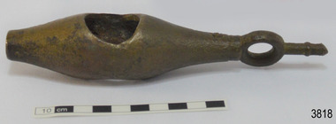 Flagstaff Hill Maritime Museum and Village
Instrument - Ship Log, early to mid-1800s
The ship's log part, called a fish, is likely to be from a mechanical taffrail log system. It was recovered from the wreck site of the barque, the 1840-1852 Grange. There are no marks on the fish to identify its maker or model. It is part of the John Chance Collection. This ‘fish’ is part of an early to mid-1800s ship's log. It would likely have been part of a taffrail log connected to a rotor (also called propeller, spinner) by a strong line, and the other end connected by a line to a dial mounted on the taffrail, or stern rail, at the stern of the vessel. As the propeller rotated through the water it would spin the log, which in turn would cause a number to register on the dial, showing the current speed in knots; one knot equals one nautical mile per hour. TAFFRAIL LOGS A taffrail log is a nautical instrument used for measuring the speed of a vessel, providing vital navigational information to be calculated, such as location and direction. A log has been used to measure the speed of a vessel since the 1500s. A simple piece of wood was tied to a long line and thrown into sea at the back of the vessel. The rope was knotted all along at equal distances apart. On a given signal the log line was pulled back into the vessels, the knots counted until the log came up, then the figures were calculated by a navigator In 1802 the first successful mechanical log available for general use was invented by Edward Massey. It had a rotor 'V' section connected to a recording mechanism. The water’s movement rotated the rotor, which intern sent the movement to the recorder. There are examples of this invention available to see in some of the maritime museums. Thomas Walker, nephew of Edward Massey, improved on Massey’s design, and Walker and his son took out a patent on the A1 Harpoon Log. In 1861. Both Massey and Walker continued to improve the designs of the taffrail log. New designs were still being introduced, even up to the 1950s. THE GRANGE, 1840-1858- The wooden barque ’Grange’ was a three-masted ship built in Scotland in 1840 for international and coastal trade. On March 22, 1858, the Grange set sail from Melbourne under Captain A. Alexander, carrying a cargo of ballast. The barque had left the Heads of Phillip Bay and was heading west along the Victorian coast towards Cape Otway. The ship struck Little Haley’s Reef at Apollo Bay due to a navigational error and was stuck on the rocks. The crew left the ship carrying whatever they could onto the beach. Eventually, the remains of the hull, sails and fittings were salvaged before the wreck of the Grange broke up about a month later. About 110 years later, in 1968, the wreck of the Grange was found by divers from the Underwater Explorers Club of Victoria. They were amazed to find a unique, six to nine pound carronade (type of small cannon) and a cannonball on the site. There have been no other similar carronades recorded. In that same year the anchor of the Grange was recovered by diver John Chance and Mal Brown. The ship’s log is significant historically as an example of hardware used when building wooden ships in the early to mid-19th century. The ship’s log is historically significant as an example of the work and trade of blacksmith. The ship’s log also has significant as it was recovered by John Chance, a diver from the wreck of the Grange in the 1968. Items that come from several wrecks along Victoria's coast have since been donated to the Flagstaff Hill Maritime Village’s museum collection by his family, illustrating this item’s level of historical value. The ship’s log is historically significant for its association with the 1840s wooden barque, the Grange. The Grange is an historical example of a Scottish built vessel used for international and coastal trader of both cargo and passengers in the mid-19th century. The Grange is an example of an early ship, designed with a wooden hull. It is significant as a ship still available to divers along the south coast of Victoria, for research and education purposes. The Grange is an example of a mid-19th century vessel that carried a weapon of defence onboard. Ship log fitting, called a fish; part of a brass navigational instrument, likely to be from a taffrail log. The metal is a tan colour and has rough surface with a sheen, and discolouration in places. Its basic shape is a hollow cylinder with ends tapering to a smaller size. In the centre there are opposing openings cut out, showing a rough texture inside. One end on the cylinder is closed with a ring and shank installed, fixed by an embedded screw through the end of the cylinder. There are no inscriptions.flagstaff hill, warrnambool, flagstaff hill maritime museum, maritime museum, shipwreck coast, flagstaff hill maritime village, great ocean road, west coast trader, apollo bay, mid-19th century shipwreck, the grange, scottish barque, little henty reef, captain a alexander, underwater explorers club of victoria, vhr 5297, coastal trader, wooden shipwreck, john chance, wooden ship, taffrail log, marine instrument, marine technology, navigation, nautical instrument, mechanical log, nautical navigation, navigation equipment, scientific instrument, ship log, ship log register, ship speed, taff rail log, patent log, towed log, taffrail log fish, edward massey, thomas walker -
 Flagstaff Hill Maritime Museum and Village
Functional object - Hat Box, John Brush, Son & Co, 1920s
This sturdy, deep hat box has been carefully constructed to give the contents utmost protection in the roughest of travel conditions. At the same time, attention to detail and quality of materials makes the box an attractive, desirable and useful piece of luggage. The supports inside the hat box show that the hat’s brim dipped at the front and back in the popular 1920s Homburg or Derby style. The hat box was likely to have been purchased, complete with its fashionable hat and personalised with the initials ‘G.M.’. The five shipping labels on the hat box tell that the owner traveller overseas with it on more than one occasion. The owner had first travelled with the shipping line Peninsular & Orient Steam Navigation Company, and may have been one the first Australian passengers in 1932, as the remnant of label on the base reads Sydney. The owner later voyaged under the company’s new name of P & O. and travelled from at least one of the voyages from Melbourne to London The square label, with “P & O” and red printed “M” in centre of circle, refers to alphabetical organisation of baggage by surname, connecting the owner ‘G.M.’ to the owner’s voyage with P & O. The P & O shipping line’s early beginnings started with the partnership of London ship broker Brodie McGhie Willcox and Scottish sailor Arthur Anderson in 1822. The partnership was joined by Irish shipowner Captain Richard Bourne in 1835 and they began operation as the Peninsular & Orient Steam Navigation Company with a service between London- Spain - Portugal. In 1932 the company expanded to include Australia with its passenger services departing from Sydney; in 1840 the company was incorporated. After various take-overs of other shipping lines and businesses, it operated under the name P & O. JOHN BRUSH The hat box was made by Australian saddle designer and maker, John Brush, Sons & Co. Brush began his saddlery trade in Roma, Queensland, His designing process included consulting with the men who rode and worked the horses. He was described in the Sydney Morning Herald of December 15, 1897, as a leading Sydney saddler, well known and reliable, with every kind of English and Australian saddle on view. John Brush established his business in 1840, operating from 371 George Street Sydney. A catalogue from that era jointly advertises John Brush (371 George Sty Sydney) and Butlers & Brush (432-4 Queen Street Sydney), both under the name of Edward Butler & Co. Pty. Ltd. The catalogue included saddlery, harness equipment, riding wear and travel goods, and strongly promoted the Wienkek made saddles, which he distributed Australia wide. John Brush, So & co. advertised its ‘new’ address in 1887, as 403 George Street Sydney. In 1898 Brush made a side-saddle for a customer, a design popular with gentlewomen of the era. The business was still operating over 100 years later, producing a catalogue in the 1950s.This early 20th century hat box is significant for being one of a kind in our Collection. Its fitted design shows the shape of the hat, dating it from the 1920s men’s fashions. The hat box is significant for being a high quality hat box made in Sydney, Australia by prominent and successful early colonial saddler and leather goods business, John Brush, Son & Co. The labels on the outside of the hat box are also significant, representing the prosperous lifestyle of an Australian traveller who purchased quality goods and cared for them. The traveller was able to depart from firstly the Port of Sydney and later the Port of Melbourne. Hatbox, oval shape, brown leather, strong, sturdy construction, six pieces, and metal lock on base. Wide lid, then tapers to a narrower base that has a red leather trim. Brown velvet fabric lining inside and covers some accessories. Other internal accessories are trimmed with plain red paper and blue and white striped paper. The lid has two attached leather tabs and a leather handle and underneath it has a drawstring liner and oval, gold-lettered maker’s label. The internal oval box has a leather retention strap and brim support. Separate moulded brim support is included. A detached leather strap with catch is inside the base. Inscriptions are stamped on the lid, printed on the maker’s label, attached as printed paper labels to the lid, sides, and under the base. Maker is John Brush, Son & Co. of Sydney. The owner’s initials “G.M” are embossed on the lid.Stamped on lid “G. M.” Label, oval, inside lid “JOHN BRUSH, SON & CO. / MANUFACTURERS & IMPORTERS / of / SADDLERY AND HARNESS / 403, GEORGE ST. / SYDNEY” Label, paper: “BAGGAGE, MELBOURNE TO LONDON’, part of word ‘CABIN’ and “P & O” Label, square, white background, black print, circular emblem: ‘PE - - - - - & ORIEN-’, ‘STEAM NAVIATION COMPY.’ BAGGAGE’ and a red printed “M” in centre of circle. Label, rectangular, white background, black print; narrow line border, text in rows and an ‘X’ overprinted, from corner to corner of the border: “BAGGAGE / P. & O. S. N. Co. / MELBOURNE / To / LONDON” Label, paper, rectangular, white background, black print, an “X” across the label: “CABIN / P & O / “ Label, paper, on base, “– aid” [Paid], “SYDNEY” flagstaff hil, warrnambool, flagstaff hill maritime museum, maritime museum, shipwreck coast, flagstaff hill maritime village, great ocean road, hat box, leather hat box, vintage hat box, top hat, homburg hat, derby hat, travel ware, luggage, leather goods, travel goods, clothing accessory, men’s clothing, john brush, son & co, saddler, sydney firm, peninsular & orient steam navigation company, p & o, g.m., melbourne to london, sydney port, melbourne port, hat case -
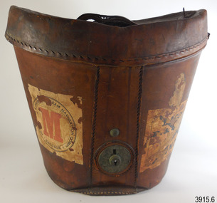
 Flagstaff Hill Maritime Museum and Village
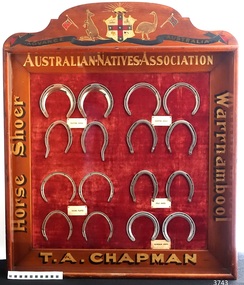
Memorabilia - Horseshoe Case, 1906 – 1907
The horseshoes in this purpose-built display case were made by Thomas Alfred Chapman in 1906-1907. Chapman operated a blacksmith’s shop in Mortlake Rd, Purnim, about 15 mins drive from Warrnambool. Chapman made this horseshoe case especially for the 3rd Exhibition of Australian Manufacturers and Products, held in the Exhibition Building in Melbourne, which was organised and promoted by the Australian Natives Association (ANA). Reference is made to the horseshoe case in the Exhibition’s Souvenir Catalogue of 1907 on page 85, under the heading 'In the Machinery Section the following exhibits are also shown … 'CHAPMAN, T.A. , Woolsthorpe, via Warrnambool, Case of Horseshoes'. The Australian Natives’ Association (ANA) were a non-partisan and non-sectarian, friendly society founded in Melbourne, Australia in April 1871. It was set-up for the benefit of Australian-born white men, and membership was restricted exclusively to that group. Men of other races including the Chinese and Indigenous people were not allowed to join. The ANA had relatively progressive views on women (for the time) and attracted suffragists seeking support for their cause, and in 1894, the ANA advocated for women’s enfranchisement. Although, white women were only admitted as members from 1964. The organisation was most prominent in Victoria and sought to shape Australia’s national identity and was a training ground for businessmen, trade unionists and politicians including many of Australia’s early prime ministers such as Edmund Barton, Alfred Deakin, James Scullin and Francis Forde, and the first Australian-born governor-general, Isaac Isaacs, was a member. By 1910 it had developed into a nationwide association with real political and social influence, and members would participate in many activities. The ANA lobbied strongly for anti-Chinese legislation and were an ardent believer of colonial unification. Its mission and efforts are largely credited for the successful referendums that resulted in Federation of the six Australian colonies into a new nation, the association’s most important legacy. The ANA was also a supporter of trade protection, and were a staunch advocate of the first act of Australia's new parliament, the Immigration Restriction Act 1901 (cth) or commonly known as the White Australia Policy, which became one of the central pillars of Australian nationalism in the 20th-century. The ANA campaigned against the Australian Federal Government's new immigration policy after the Second World War (non-British immigration from southern and central Europe) in order to maintain a 'white Australia', and resisted changes when the Labor government during the 1970s fully dismantled and abandoned the White Australia Policy. The ANA merged with Manchester Unity Independent Order of Oddfellows, in 1993 to become Australian Unity Ltd. The display case of horseshoes changed hands several times, going from its maker Thomas Chapman to his mother then various other members of his family. The case was also displayed at the Lee Family’s butcher shop at 188 Liebig St Warrnambool, and in the Purnim Hotel during the Warrnambool May Races. In the late 1950s the horseshoe case went to Thomas’s son, Brian. He was a Master Farrier and completed his apprenticeship at Flemington Racecourse, and in Warrnambool he owned a blacksmith business at the Warrnambool Racecourse Grounds. Brian later operated a blacksmith’s at Flagstaff Hill, where his customers would bring their horses to be shod. Brian passed away in August 2017. The horseshoe case is significant as an example of trades in the early 20th century in Western Victoria, Australia. It is also significant as an example of horseshoes from the early 20th century. The horseshoe display case is also significant for its association with the Australian Exhibition of 1907, showcasing Australian produce and manufacturing to the world. The horseshoe display case is locally significant for its association with local families, essential businesses and community events. Display case of homemade horseshoes. Wooden case with glass front containing 16 horse shoes grouped in sets, each set with a label: Made 1906-1907 for Australian Exhibition of 1907 by Thomas Alfred Chapman of Warrnambool. The case contains (a) complete chrome set each of Trotting Shoes, Hunting Shoes and Racing Plates, and (b) one pair of Hind Polo Shoes and one pair of Front Aluminium Shoes. The wooden frame has gold lettering on each side proclaiming “Australian Natives Association, T.A. Chapman, horse shoer, Warrnambool” and is topped by a painted Australian coat of arms. Gold lettering on frame, in the order of top/bottom/ left/right “AUSTRALIAN.NATIVES.ASSOCIATION / T.A. CHAPMAN / Horse Shoer / Warrnambool”flagstaff hill, warrnambool, shipwrecked coast, maritime museum, shipwreck coast, horseshoe display case 1906-1907, chromed set of trotting shoes 1906-1907, chrome set of hunting shoes 1906-1907, chrome set of racing plates 1906-1907, pair of hind polo shoes 1906-1907, pair of front aluminium shoes 1906-1907, australian exhibition 1907, australian natives association (ana), t.a. chapman horse shoer warrnambool, thomas alfred chapman, brian chapman, brian “snacks” chapman, blacksmith warrnambool, warrnambool may races, warrnambool racecourse, purnim hotel, lee family’s butcher shop warrnambool -
 MYLI My Community Library
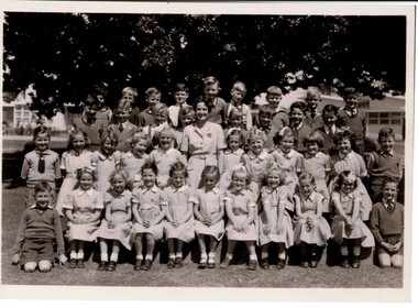
Photograph - Pakenham Consolidated School Grade Two Class Photo, 1953
Grade 2 of Pakenham Consolidated School in 1953 with their teacher Mrs Joyce Hosking. Back row L to R: Paul Manestar or Bill Vallender, Bernie Carter, (?), Norman Whitelaw, Richard Shelton, Rodney Shallard, Ian Reid (Reidy?) or Duncan Beard (Reidy), Ken Jarred, Glen Jolly. 2nd back row L to R: Keith Crofts, Peter Johnstone, Kevin Lewis, Robert Tulloch (Bones), Nipper Reid, Duncan Beard(?), Bruce Weatherhead, Peter Hobson (Hobbo). 2nd row from front L to R: David Langley, Kath Mauger, Jill Peck, Rosamund Hunt, Beth Schilling, Roslyn Smith, Lynne Tuena, Pat Stone, Joy Higgins, Lynette Wheeler, Grif Fearon or Kevin McInnis. Front row L to R: Ken McCaffrey, Marion Butcher, Helen Stephens, Mary Lou Walsh, Glenis Tuena, Dawn Hillderbrick/ Hillbrick(?), Marion Hansford, Kaye Wollard, Beverley Payne (Payney), Edna Sinclair(?), Paul Braemar. In the 1940s and 1950s there was a movement to consolidate small rural schools into one larger school. This was partly a response to a shortage of teachers, due to many male teachers enlisting during the Second World War. The War also caused a shortage of materials and labour and many Schools fell into disrepair. The Education Department decided that Pakenham would be one of the first six Consolidated Schools to be established and that all schools within 8 kms or 5 miles would be closed. The Pakenham Consolidated School was officially opened on May 29, 1951, on the site of the Pakenham State School, No.1359, in Main Street. The original Pakenham School had opened on a site near the Toomuc Creek in January 1875 and it moved to the Main Street site in 1891. The first Head Master was Charles Hicks. The School offered classes up to Year 10 (Form 4). The schools that formed the Consolidated School were Pakenham Upper No. 2155 (closed January 1952), Pakenham South No. 3755 (closed September 1951), Toomuc Valley No. 3034 (closed September 1951), Army Road No. 3847 (closed April 1947), Mount Burnett No. 4506 (closed October 1949), Tynong No. 2854 (closed April 1951), Tynong North No.4464 (closed December 1951), Nar Nar Goon North No. 2914 (closed October 1951), Nar Nar Goon South No. 4554 (closed May 1951), Rythdale No. 4231 (closed September 1951), Officedale No. 4242 (closed May 1951), Cora Lynn No. 3502 (closed May 1951) and Koo-Wee-Rup North (Five Mile) No. 3198 (closed November 1959). The School consisted of new buildings, which at the time cost one hundred thousand pounds, and many of the old School buildings. Some towns did not realise that their School buildings would be removed from the sites and transferred to Pakenham. The Pakenham Consolidated School moved from its original location in Main Street to its current location in Rundell, Way in 1997.This photograph is of historic and social significance. Pakenham Consolidated School was one of the first six Consolidated Schools established by the Education Department, and was born out of shortages of teachers, labour, and materials during World War II. The school can be used more broadly to reflect on the evolution of education in the state of Victoria, as the school can trace its origins all the way back to 1875, when the original Pakenham School was opened near Toomuc Creek. The photograph is also of social significance to many community groups, including Cardinia Shire, past and current students and teachers, allowing various groups to reflect on and share intangible memories of times spent at Pakenham Consolidated School.Copy of a rectangular black and white photograph on matte photographic paperpakenham consolidated school, primary school, class photo, grade two, grade 2, pakenham, school, photo -
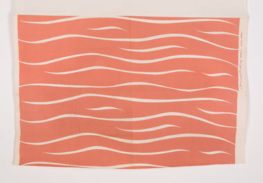
 Ararat Gallery TAMA
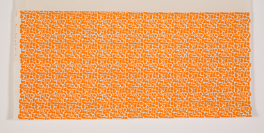
Textile, Frances Burke, Mosaic, c. 1962
Frances Burke: Designer of Modern Textiles Australia’s most influential and celebrated textile designer of the mid-20th century, Frances Burke (1904-1994), employed Australian native flora, garden flowers, marine subjects, Indigenous culture and increasingly, abstract motifs in her stunning modern fabrics. A confident, determined designer and businesswoman; Burke made the shift from fine art to design in 1937. While she began by designing dress fabrics for Melbourne’s fashionable Georges Department store, printing them on linen using lino blocks, she was an early adopter of the screen-printing process and during the war years began printing on cotton. Burke’s furnishing fabrics took their place in influential modern buildings Australia-wide through collaborations with leading architects and interior designers. They included Robin Boyd’s 1949 House of Tomorrow, Roy Grounds’ Quamby flats, Guilford Bell’s Royal Hayman Island Resort for Ansett Airlines, and Yuncken, Freeman Brothers, Griffiths and Simpson’s Canberra Civic Centre Theatre. In the post-war period, Burke made regular trips to the United States and Europe, on her return advising homeowners and manufacturers on the latest trends in products, colours and home design in lectures and interviews. At New Design her fabric showroom and interior design consultancy Burke introduced furniture by emerging designers Clement Meadmore and Grant Featherston in the early 1950s and presented local and imported homewares, mostly from the United States. She was enthusiastic about the convenient and comfortable lifestyle experienced by ordinary American women. Her fabrics and advice were regularly featured in Australian Home Beautiful, Australian House and Garden and the newspapers of the day. Some of Burke’s designs had remarkable longevity. Tiger Stripe (1938) for example, continued to be produced in a wide range of colours until 1970 and Crete (1946) remained a popular choice for interiors into the 1960s. Drawing from a rich variety of sources including Indigenous culture in Goanna (c.1954) and Pacific Island tapa cloth designs in Bird and Tree (1940), Burke also looked to Japan in designs such as Plum Blossom (1948) and Zen (1965). She loved exploring the potential of native flora, seen in designs including Waratah (1955) and Flannel Flower (1955), while garden flowers were the source for many other designs including Belladonna (1940), Periwinkle (n.d.) and Rose (1947). Burke’s clever interplay of a single striking printed colour with lively gestural lines revealing the white base fabric, gave her designs a vibrancy that characterised the optimistic post-war era. This can be seen in Burke’s fabrics for Hayman Island including Angel Fish and Seapiece (both 1949) which expressed the freshness and excitement of the luxurious new tropical resort and led to further commissions. Burke’s three decades in business (1937-1970) were an unparalleled success in the story of Australian design. Her fabrics have been collected by the NGA, the Powerhouse Museum, NGV, RMIT Design Archives and Sydney Living Museums in addition to Ararat Gallery TAMA. Written by Nanette Carter and Robyn Oswald-Jacobs. -
 Ararat Gallery TAMA
Textile, Frances Burke, Tiger Stripe, c. 1939
Frances Burke: Designer of Modern Textiles Australia’s most influential and celebrated textile designer of the mid-20th century, Frances Burke (1904-1994), employed Australian native flora, garden flowers, marine subjects, Indigenous culture and increasingly, abstract motifs in her stunning modern fabrics. A confident, determined designer and businesswoman; Burke made the shift from fine art to design in 1937. While she began by designing dress fabrics for Melbourne’s fashionable Georges Department store, printing them on linen using lino blocks, she was an early adopter of the screen-printing process and during the war years began printing on cotton. Burke’s furnishing fabrics took their place in influential modern buildings Australia-wide through collaborations with leading architects and interior designers. They included Robin Boyd’s 1949 House of Tomorrow, Roy Grounds’ Quamby flats, Guilford Bell’s Royal Hayman Island Resort for Ansett Airlines, and Yuncken, Freeman Brothers, Griffiths and Simpson’s Canberra Civic Centre Theatre. In the post-war period, Burke made regular trips to the United States and Europe, on her return advising homeowners and manufacturers on the latest trends in products, colours and home design in lectures and interviews. At New Design her fabric showroom and interior design consultancy Burke introduced furniture by emerging designers Clement Meadmore and Grant Featherston in the early 1950s and presented local and imported homewares, mostly from the United States. She was enthusiastic about the convenient and comfortable lifestyle experienced by ordinary American women. Her fabrics and advice were regularly featured in Australian Home Beautiful, Australian House and Garden and the newspapers of the day. Some of Burke’s designs had remarkable longevity. Tiger Stripe (1938) for example, continued to be produced in a wide range of colours until 1970 and Crete (1946) remained a popular choice for interiors into the 1960s. Drawing from a rich variety of sources including Indigenous culture in Goanna (c.1954) and Pacific Island tapa cloth designs in Bird and Tree (1940), Burke also looked to Japan in designs such as Plum Blossom (1948) and Zen (1965). She loved exploring the potential of native flora, seen in designs including Waratah (1955) and Flannel Flower (1955), while garden flowers were the source for many other designs including Belladonna (1940), Periwinkle (n.d.) and Rose (1947). Burke’s clever interplay of a single striking printed colour with lively gestural lines revealing the white base fabric, gave her designs a vibrancy that characterised the optimistic post-war era. This can be seen in Burke’s fabrics for Hayman Island including Angel Fish and Seapiece (both 1949) which expressed the freshness and excitement of the luxurious new tropical resort and led to further commissions. Burke’s three decades in business (1937-1970) were an unparalleled success in the story of Australian design. Her fabrics have been collected by the NGA, the Powerhouse Museum, NGV, RMIT Design Archives and Sydney Living Museums in addition to Ararat Gallery TAMA. Written by Nanette Carter and Robyn Oswald-Jacobs. -
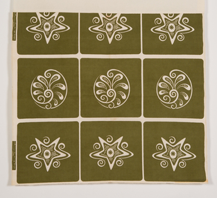 Ararat Gallery TAMA
Textile, Frances Burke, Crete, 1948
Frances Burke: Designer of Modern Textiles Australia’s most influential and celebrated textile designer of the mid-20th century, Frances Burke (1904-1994), employed Australian native flora, garden flowers, marine subjects, Indigenous culture and increasingly, abstract motifs in her stunning modern fabrics. A confident, determined designer and businesswoman; Burke made the shift from fine art to design in 1937. While she began by designing dress fabrics for Melbourne’s fashionable Georges Department store, printing them on linen using lino blocks, she was an early adopter of the screen-printing process and during the war years began printing on cotton. Burke’s furnishing fabrics took their place in influential modern buildings Australia-wide through collaborations with leading architects and interior designers. They included Robin Boyd’s 1949 House of Tomorrow, Roy Grounds’ Quamby flats, Guilford Bell’s Royal Hayman Island Resort for Ansett Airlines, and Yuncken, Freeman Brothers, Griffiths and Simpson’s Canberra Civic Centre Theatre. In the post-war period, Burke made regular trips to the United States and Europe, on her return advising homeowners and manufacturers on the latest trends in products, colours and home design in lectures and interviews. At New Design her fabric showroom and interior design consultancy Burke introduced furniture by emerging designers Clement Meadmore and Grant Featherston in the early 1950s and presented local and imported homewares, mostly from the United States. She was enthusiastic about the convenient and comfortable lifestyle experienced by ordinary American women. Her fabrics and advice were regularly featured in Australian Home Beautiful, Australian House and Garden and the newspapers of the day. Some of Burke’s designs had remarkable longevity. Tiger Stripe (1938) for example, continued to be produced in a wide range of colours until 1970 and Crete (1946) remained a popular choice for interiors into the 1960s. Drawing from a rich variety of sources including Indigenous culture in Goanna (c.1954) and Pacific Island tapa cloth designs in Bird and Tree (1940), Burke also looked to Japan in designs such as Plum Blossom (1948) and Zen (1965). She loved exploring the potential of native flora, seen in designs including Waratah (1955) and Flannel Flower (1955), while garden flowers were the source for many other designs including Belladonna (1940), Periwinkle (n.d.) and Rose (1947). Burke’s clever interplay of a single striking printed colour with lively gestural lines revealing the white base fabric, gave her designs a vibrancy that characterised the optimistic post-war era. This can be seen in Burke’s fabrics for Hayman Island including Angel Fish and Seapiece (both 1949) which expressed the freshness and excitement of the luxurious new tropical resort and led to further commissions. Burke’s three decades in business (1937-1970) were an unparalleled success in the story of Australian design. Her fabrics have been collected by the NGA, the Powerhouse Museum, NGV, RMIT Design Archives and Sydney Living Museums in addition to Ararat Gallery TAMA. Written by Nanette Carter and Robyn Oswald-Jacobs. -
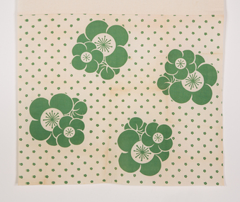 Ararat Gallery TAMA
Textile, Frances Burke, Plum Blossom, 1948
Frances Burke: Designer of Modern Textiles Australia’s most influential and celebrated textile designer of the mid-20th century, Frances Burke (1904-1994), employed Australian native flora, garden flowers, marine subjects, Indigenous culture and increasingly, abstract motifs in her stunning modern fabrics. A confident, determined designer and businesswoman; Burke made the shift from fine art to design in 1937. While she began by designing dress fabrics for Melbourne’s fashionable Georges Department store, printing them on linen using lino blocks, she was an early adopter of the screen-printing process and during the war years began printing on cotton. Burke’s furnishing fabrics took their place in influential modern buildings Australia-wide through collaborations with leading architects and interior designers. They included Robin Boyd’s 1949 House of Tomorrow, Roy Grounds’ Quamby flats, Guilford Bell’s Royal Hayman Island Resort for Ansett Airlines, and Yuncken, Freeman Brothers, Griffiths and Simpson’s Canberra Civic Centre Theatre. In the post-war period, Burke made regular trips to the United States and Europe, on her return advising homeowners and manufacturers on the latest trends in products, colours and home design in lectures and interviews. At New Design her fabric showroom and interior design consultancy Burke introduced furniture by emerging designers Clement Meadmore and Grant Featherston in the early 1950s and presented local and imported homewares, mostly from the United States. She was enthusiastic about the convenient and comfortable lifestyle experienced by ordinary American women. Her fabrics and advice were regularly featured in Australian Home Beautiful, Australian House and Garden and the newspapers of the day. Some of Burke’s designs had remarkable longevity. Tiger Stripe (1938) for example, continued to be produced in a wide range of colours until 1970 and Crete (1946) remained a popular choice for interiors into the 1960s. Drawing from a rich variety of sources including Indigenous culture in Goanna (c.1954) and Pacific Island tapa cloth designs in Bird and Tree (1940), Burke also looked to Japan in designs such as Plum Blossom (1948) and Zen (1965). She loved exploring the potential of native flora, seen in designs including Waratah (1955) and Flannel Flower (1955), while garden flowers were the source for many other designs including Belladonna (1940), Periwinkle (n.d.) and Rose (1947). Burke’s clever interplay of a single striking printed colour with lively gestural lines revealing the white base fabric, gave her designs a vibrancy that characterised the optimistic post-war era. This can be seen in Burke’s fabrics for Hayman Island including Angel Fish and Seapiece (both 1949) which expressed the freshness and excitement of the luxurious new tropical resort and led to further commissions. Burke’s three decades in business (1937-1970) were an unparalleled success in the story of Australian design. Her fabrics have been collected by the NGA, the Powerhouse Museum, NGV, RMIT Design Archives and Sydney Living Museums in addition to Ararat Gallery TAMA. Written by Nanette Carter and Robyn Oswald-Jacobs. -
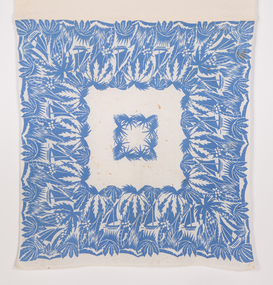 Ararat Gallery TAMA
Textile, Frances Burke, Jungle, 1945
Frances Burke: Designer of Modern Textiles Australia’s most influential and celebrated textile designer of the mid-20th century, Frances Burke (1904-1994), employed Australian native flora, garden flowers, marine subjects, Indigenous culture and increasingly, abstract motifs in her stunning modern fabrics. A confident, determined designer and businesswoman; Burke made the shift from fine art to design in 1937. While she began by designing dress fabrics for Melbourne’s fashionable Georges Department store, printing them on linen using lino blocks, she was an early adopter of the screen-printing process and during the war years began printing on cotton. Burke’s furnishing fabrics took their place in influential modern buildings Australia-wide through collaborations with leading architects and interior designers. They included Robin Boyd’s 1949 House of Tomorrow, Roy Grounds’ Quamby flats, Guilford Bell’s Royal Hayman Island Resort for Ansett Airlines, and Yuncken, Freeman Brothers, Griffiths and Simpson’s Canberra Civic Centre Theatre. In the post-war period, Burke made regular trips to the United States and Europe, on her return advising homeowners and manufacturers on the latest trends in products, colours and home design in lectures and interviews. At New Design her fabric showroom and interior design consultancy Burke introduced furniture by emerging designers Clement Meadmore and Grant Featherston in the early 1950s and presented local and imported homewares, mostly from the United States. She was enthusiastic about the convenient and comfortable lifestyle experienced by ordinary American women. Her fabrics and advice were regularly featured in Australian Home Beautiful, Australian House and Garden and the newspapers of the day. Some of Burke’s designs had remarkable longevity. Tiger Stripe (1938) for example, continued to be produced in a wide range of colours until 1970 and Crete (1946) remained a popular choice for interiors into the 1960s. Drawing from a rich variety of sources including Indigenous culture in Goanna (c.1954) and Pacific Island tapa cloth designs in Bird and Tree (1940), Burke also looked to Japan in designs such as Plum Blossom (1948) and Zen (1965). She loved exploring the potential of native flora, seen in designs including Waratah (1955) and Flannel Flower (1955), while garden flowers were the source for many other designs including Belladonna (1940), Periwinkle (n.d.) and Rose (1947). Burke’s clever interplay of a single striking printed colour with lively gestural lines revealing the white base fabric, gave her designs a vibrancy that characterised the optimistic post-war era. This can be seen in Burke’s fabrics for Hayman Island including Angel Fish and Seapiece (both 1949) which expressed the freshness and excitement of the luxurious new tropical resort and led to further commissions. Burke’s three decades in business (1937-1970) were an unparalleled success in the story of Australian design. Her fabrics have been collected by the NGA, the Powerhouse Museum, NGV, RMIT Design Archives and Sydney Living Museums in addition to Ararat Gallery TAMA. Written by Nanette Carter and Robyn Oswald-Jacobs. -
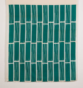 Ararat Gallery TAMA
Textile, Frances Burke, Staccato, c.1962
Frances Burke: Designer of Modern Textiles Australia’s most influential and celebrated textile designer of the mid-20th century, Frances Burke (1904-1994), employed Australian native flora, garden flowers, marine subjects, Indigenous culture and increasingly, abstract motifs in her stunning modern fabrics. A confident, determined designer and businesswoman; Burke made the shift from fine art to design in 1937. While she began by designing dress fabrics for Melbourne’s fashionable Georges Department store, printing them on linen using lino blocks, she was an early adopter of the screen-printing process and during the war years began printing on cotton. Burke’s furnishing fabrics took their place in influential modern buildings Australia-wide through collaborations with leading architects and interior designers. They included Robin Boyd’s 1949 House of Tomorrow, Roy Grounds’ Quamby flats, Guilford Bell’s Royal Hayman Island Resort for Ansett Airlines, and Yuncken, Freeman Brothers, Griffiths and Simpson’s Canberra Civic Centre Theatre. In the post-war period, Burke made regular trips to the United States and Europe, on her return advising homeowners and manufacturers on the latest trends in products, colours and home design in lectures and interviews. At New Design her fabric showroom and interior design consultancy Burke introduced furniture by emerging designers Clement Meadmore and Grant Featherston in the early 1950s and presented local and imported homewares, mostly from the United States. She was enthusiastic about the convenient and comfortable lifestyle experienced by ordinary American women. Her fabrics and advice were regularly featured in Australian Home Beautiful, Australian House and Garden and the newspapers of the day. Some of Burke’s designs had remarkable longevity. Tiger Stripe (1938) for example, continued to be produced in a wide range of colours until 1970 and Crete (1946) remained a popular choice for interiors into the 1960s. Drawing from a rich variety of sources including Indigenous culture in Goanna (c.1954) and Pacific Island tapa cloth designs in Bird and Tree (1940), Burke also looked to Japan in designs such as Plum Blossom (1948) and Zen (1965). She loved exploring the potential of native flora, seen in designs including Waratah (1955) and Flannel Flower (1955), while garden flowers were the source for many other designs including Belladonna (1940), Periwinkle (n.d.) and Rose (1947). Burke’s clever interplay of a single striking printed colour with lively gestural lines revealing the white base fabric, gave her designs a vibrancy that characterised the optimistic post-war era. This can be seen in Burke’s fabrics for Hayman Island including Angel Fish and Seapiece (both 1949) which expressed the freshness and excitement of the luxurious new tropical resort and led to further commissions. Burke’s three decades in business (1937-1970) were an unparalleled success in the story of Australian design. Her fabrics have been collected by the NGA, the Powerhouse Museum, NGV, RMIT Design Archives and Sydney Living Museums in addition to Ararat Gallery TAMA. Written by Nanette Carter and Robyn Oswald-Jacobs. -
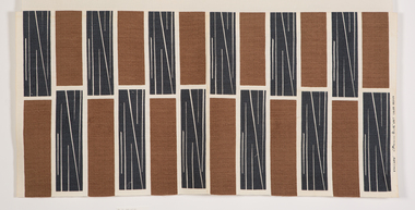 Ararat Gallery TAMA
Textile, Frances Burke, Staccato (brown-gray), c.1962
Frances Burke: Designer of Modern Textiles Australia’s most influential and celebrated textile designer of the mid-20th century, Frances Burke (1904-1994), employed Australian native flora, garden flowers, marine subjects, Indigenous culture and increasingly, abstract motifs in her stunning modern fabrics. A confident, determined designer and businesswoman; Burke made the shift from fine art to design in 1937. While she began by designing dress fabrics for Melbourne’s fashionable Georges Department store, printing them on linen using lino blocks, she was an early adopter of the screen-printing process and during the war years began printing on cotton. Burke’s furnishing fabrics took their place in influential modern buildings Australia-wide through collaborations with leading architects and interior designers. They included Robin Boyd’s 1949 House of Tomorrow, Roy Grounds’ Quamby flats, Guilford Bell’s Royal Hayman Island Resort for Ansett Airlines, and Yuncken, Freeman Brothers, Griffiths and Simpson’s Canberra Civic Centre Theatre. In the post-war period, Burke made regular trips to the United States and Europe, on her return advising homeowners and manufacturers on the latest trends in products, colours and home design in lectures and interviews. At New Design her fabric showroom and interior design consultancy Burke introduced furniture by emerging designers Clement Meadmore and Grant Featherston in the early 1950s and presented local and imported homewares, mostly from the United States. She was enthusiastic about the convenient and comfortable lifestyle experienced by ordinary American women. Her fabrics and advice were regularly featured in Australian Home Beautiful, Australian House and Garden and the newspapers of the day. Some of Burke’s designs had remarkable longevity. Tiger Stripe (1938) for example, continued to be produced in a wide range of colours until 1970 and Crete (1946) remained a popular choice for interiors into the 1960s. Drawing from a rich variety of sources including Indigenous culture in Goanna (c.1954) and Pacific Island tapa cloth designs in Bird and Tree (1940), Burke also looked to Japan in designs such as Plum Blossom (1948) and Zen (1965). She loved exploring the potential of native flora, seen in designs including Waratah (1955) and Flannel Flower (1955), while garden flowers were the source for many other designs including Belladonna (1940), Periwinkle (n.d.) and Rose (1947). Burke’s clever interplay of a single striking printed colour with lively gestural lines revealing the white base fabric, gave her designs a vibrancy that characterised the optimistic post-war era. This can be seen in Burke’s fabrics for Hayman Island including Angel Fish and Seapiece (both 1949) which expressed the freshness and excitement of the luxurious new tropical resort and led to further commissions. Burke’s three decades in business (1937-1970) were an unparalleled success in the story of Australian design. Her fabrics have been collected by the NGA, the Powerhouse Museum, NGV, RMIT Design Archives and Sydney Living Museums in addition to Ararat Gallery TAMA. Written by Nanette Carter and Robyn Oswald-Jacobs. -
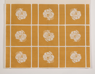 Ararat Gallery TAMA
Textile, Frances Burke, Tiger Lily, 1951
Frances Burke: Designer of Modern Textiles Australia’s most influential and celebrated textile designer of the mid-20th century, Frances Burke (1904-1994), employed Australian native flora, garden flowers, marine subjects, Indigenous culture and increasingly, abstract motifs in her stunning modern fabrics. A confident, determined designer and businesswoman; Burke made the shift from fine art to design in 1937. While she began by designing dress fabrics for Melbourne’s fashionable Georges Department store, printing them on linen using lino blocks, she was an early adopter of the screen-printing process and during the war years began printing on cotton. Burke’s furnishing fabrics took their place in influential modern buildings Australia-wide through collaborations with leading architects and interior designers. They included Robin Boyd’s 1949 House of Tomorrow, Roy Grounds’ Quamby flats, Guilford Bell’s Royal Hayman Island Resort for Ansett Airlines, and Yuncken, Freeman Brothers, Griffiths and Simpson’s Canberra Civic Centre Theatre. In the post-war period, Burke made regular trips to the United States and Europe, on her return advising homeowners and manufacturers on the latest trends in products, colours and home design in lectures and interviews. At New Design her fabric showroom and interior design consultancy Burke introduced furniture by emerging designers Clement Meadmore and Grant Featherston in the early 1950s and presented local and imported homewares, mostly from the United States. She was enthusiastic about the convenient and comfortable lifestyle experienced by ordinary American women. Her fabrics and advice were regularly featured in Australian Home Beautiful, Australian House and Garden and the newspapers of the day. Some of Burke’s designs had remarkable longevity. Tiger Stripe (1938) for example, continued to be produced in a wide range of colours until 1970 and Crete (1946) remained a popular choice for interiors into the 1960s. Drawing from a rich variety of sources including Indigenous culture in Goanna (c.1954) and Pacific Island tapa cloth designs in Bird and Tree (1940), Burke also looked to Japan in designs such as Plum Blossom (1948) and Zen (1965). She loved exploring the potential of native flora, seen in designs including Waratah (1955) and Flannel Flower (1955), while garden flowers were the source for many other designs including Belladonna (1940), Periwinkle (n.d.) and Rose (1947). Burke’s clever interplay of a single striking printed colour with lively gestural lines revealing the white base fabric, gave her designs a vibrancy that characterised the optimistic post-war era. This can be seen in Burke’s fabrics for Hayman Island including Angel Fish and Seapiece (both 1949) which expressed the freshness and excitement of the luxurious new tropical resort and led to further commissions. Burke’s three decades in business (1937-1970) were an unparalleled success in the story of Australian design. Her fabrics have been collected by the NGA, the Powerhouse Museum, NGV, RMIT Design Archives and Sydney Living Museums in addition to Ararat Gallery TAMA. Written by Nanette Carter and Robyn Oswald-Jacobs. -
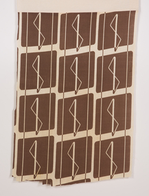 Ararat Gallery TAMA
Textile, Frances Burke, Pacifica, 1954
Frances Burke: Designer of Modern Textiles Australia’s most influential and celebrated textile designer of the mid-20th century, Frances Burke (1904-1994), employed Australian native flora, garden flowers, marine subjects, Indigenous culture and increasingly, abstract motifs in her stunning modern fabrics. A confident, determined designer and businesswoman; Burke made the shift from fine art to design in 1937. While she began by designing dress fabrics for Melbourne’s fashionable Georges Department store, printing them on linen using lino blocks, she was an early adopter of the screen-printing process and during the war years began printing on cotton. Burke’s furnishing fabrics took their place in influential modern buildings Australia-wide through collaborations with leading architects and interior designers. They included Robin Boyd’s 1949 House of Tomorrow, Roy Grounds’ Quamby flats, Guilford Bell’s Royal Hayman Island Resort for Ansett Airlines, and Yuncken, Freeman Brothers, Griffiths and Simpson’s Canberra Civic Centre Theatre. In the post-war period, Burke made regular trips to the United States and Europe, on her return advising homeowners and manufacturers on the latest trends in products, colours and home design in lectures and interviews. At New Design her fabric showroom and interior design consultancy Burke introduced furniture by emerging designers Clement Meadmore and Grant Featherston in the early 1950s and presented local and imported homewares, mostly from the United States. She was enthusiastic about the convenient and comfortable lifestyle experienced by ordinary American women. Her fabrics and advice were regularly featured in Australian Home Beautiful, Australian House and Garden and the newspapers of the day. Some of Burke’s designs had remarkable longevity. Tiger Stripe (1938) for example, continued to be produced in a wide range of colours until 1970 and Crete (1946) remained a popular choice for interiors into the 1960s. Drawing from a rich variety of sources including Indigenous culture in Goanna (c.1954) and Pacific Island tapa cloth designs in Bird and Tree (1940), Burke also looked to Japan in designs such as Plum Blossom (1948) and Zen (1965). She loved exploring the potential of native flora, seen in designs including Waratah (1955) and Flannel Flower (1955), while garden flowers were the source for many other designs including Belladonna (1940), Periwinkle (n.d.) and Rose (1947). Burke’s clever interplay of a single striking printed colour with lively gestural lines revealing the white base fabric, gave her designs a vibrancy that characterised the optimistic post-war era. This can be seen in Burke’s fabrics for Hayman Island including Angel Fish and Seapiece (both 1949) which expressed the freshness and excitement of the luxurious new tropical resort and led to further commissions. Burke’s three decades in business (1937-1970) were an unparalleled success in the story of Australian design. Her fabrics have been collected by the NGA, the Powerhouse Museum, NGV, RMIT Design Archives and Sydney Living Museums in addition to Ararat Gallery TAMA. Written by Nanette Carter and Robyn Oswald-Jacobs. -
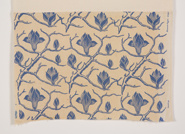 Ararat Gallery TAMA
Textile, Frances Burke, Magnolia, 1938-1942
Frances Burke: Designer of Modern Textiles Australia’s most influential and celebrated textile designer of the mid-20th century, Frances Burke (1904-1994), employed Australian native flora, garden flowers, marine subjects, Indigenous culture and increasingly, abstract motifs in her stunning modern fabrics. A confident, determined designer and businesswoman; Burke made the shift from fine art to design in 1937. While she began by designing dress fabrics for Melbourne’s fashionable Georges Department store, printing them on linen using lino blocks, she was an early adopter of the screen-printing process and during the war years began printing on cotton. Burke’s furnishing fabrics took their place in influential modern buildings Australia-wide through collaborations with leading architects and interior designers. They included Robin Boyd’s 1949 House of Tomorrow, Roy Grounds’ Quamby flats, Guilford Bell’s Royal Hayman Island Resort for Ansett Airlines, and Yuncken, Freeman Brothers, Griffiths and Simpson’s Canberra Civic Centre Theatre. In the post-war period, Burke made regular trips to the United States and Europe, on her return advising homeowners and manufacturers on the latest trends in products, colours and home design in lectures and interviews. At New Design her fabric showroom and interior design consultancy Burke introduced furniture by emerging designers Clement Meadmore and Grant Featherston in the early 1950s and presented local and imported homewares, mostly from the United States. She was enthusiastic about the convenient and comfortable lifestyle experienced by ordinary American women. Her fabrics and advice were regularly featured in Australian Home Beautiful, Australian House and Garden and the newspapers of the day. Some of Burke’s designs had remarkable longevity. Tiger Stripe (1938) for example, continued to be produced in a wide range of colours until 1970 and Crete (1946) remained a popular choice for interiors into the 1960s. Drawing from a rich variety of sources including Indigenous culture in Goanna (c.1954) and Pacific Island tapa cloth designs in Bird and Tree (1940), Burke also looked to Japan in designs such as Plum Blossom (1948) and Zen (1965). She loved exploring the potential of native flora, seen in designs including Waratah (1955) and Flannel Flower (1955), while garden flowers were the source for many other designs including Belladonna (1940), Periwinkle (n.d.) and Rose (1947). Burke’s clever interplay of a single striking printed colour with lively gestural lines revealing the white base fabric, gave her designs a vibrancy that characterised the optimistic post-war era. This can be seen in Burke’s fabrics for Hayman Island including Angel Fish and Seapiece (both 1949) which expressed the freshness and excitement of the luxurious new tropical resort and led to further commissions. Burke’s three decades in business (1937-1970) were an unparalleled success in the story of Australian design. Her fabrics have been collected by the NGA, the Powerhouse Museum, NGV, RMIT Design Archives and Sydney Living Museums in addition to Ararat Gallery TAMA. Written by Nanette Carter and Robyn Oswald-Jacobs.