Showing 2049 items
matching colour and design
-
 Flagstaff Hill Maritime Museum and Village
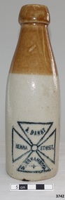
Bottle, circa 1899
This clay soft drink bottle was made by Bendigo Pottery circa 1899. It was badged for and sold by A. [Alfred] Darby of Henna Street Warrnambool, (between Raglan Pde and Lava St). The internal screw thread in the neck of this bottle allows for an applied ‘blob’ top stopper to be added. The company A. Darby bottled soda water, cordial, lemonade, ginger ale and ginger beer. Darby’s also made cider, lime juice, raspberry vinegar and other specialties. There was a branch of Darby’s cordial factory in Shepparton Victoria. The building has the year 1910 on it and is now the council office. The bottle’s manufacturer, Bendigo Pottery, was established in the 1858 during the gold rush era. The bottle is part of the “W.R. Angus Collection” that includes historical medical equipment, surgical instruments and material once belonging to Dr Edward Ryan and Dr Thomas Francis Ryan, (both of Nhill, Victoria) as well as Dr Angus’ own belongings. The Collection’s history spans the medical practices of the two Doctors Ryan, from 1885-1926 plus that of Dr Angus, up until 1969. ABOUT THE “W.R.ANGUS COLLECTION” Doctor William Roy Angus M.B., B.S., Adel., 1923, F.R.C.S. Edin.,1928 (also known as Dr Roy Angus) was born in Murrumbeena, Victoria in 1901 and lived until 1970. He qualified as a doctor in 1923 at University of Adelaide, was Resident Medical Officer at the Royal Adelaide Hospital in 1924 and for a period was house surgeon to Sir (then Mr.) Henry Simpson Newland. Dr Angus was briefly an Assistant to Dr Riddell of Kapunda, then commenced private practice at Curramulka, Yorke Peninsula, SA, where he was physician, surgeon and chemist. In 1926, he was appointed as new Medical Assistant to Dr Thomas Francis Ryan (T.F. Ryan, or Tom), in Nhill, Victoria, where his experiences included radiology and pharmacy. In 1927 he was Acting House Surgeon in Dr Tom Ryan’s absence. Dr Angus had become engaged to Gladys Forsyth and they decided he further his studies overseas in the UK in 1927. He studied at London University College Hospital and at Edinburgh Royal Infirmary and in 1928, was awarded FRCS (Fellow from the Royal College of Surgeons), Edinburgh. He worked his passage back to Australia as a Ship’s Surgeon on the on the Australian Commonwealth Line’s T.S.S. Largs Bay. Dr Angus married Gladys in 1929, in Ballarat. (They went on to have one son (Graham 1932, born in SA) and two daughters (Helen (died 12/07/1996) and Berenice (Berry), both born at Mira, Nhill According to Berry, her mother Gladys made a lot of their clothes. She was very talented and did some lovely embroidery including lingerie for her trousseau and beautifully handmade baby clothes. Dr Angus was a ‘flying doctor’ for the A.I.M. (Australian Inland Ministry) Aerial Medical Service in 1928. Its first station was in the remote town of Oodnadatta, where Dr Angus was stationed. He was locum tenens there on North-South Railway at 21 Mile Camp. He took up this ‘flying doctor’ position in response to a call from Dr John Flynn; the organisation was later known as the Flying Doctor Service, then the Royal Flying Doctor Service. A lot of his work during this time involved dental surgery also. Between 1928-1932 he was surgeon at the Curramulka Hospital, Yorke Peninsula, South Australia. In 1933 Dr Angus returned to Nhill and purchased a share of the Nelson Street practice and Mira hospital (a 2 bed ward at the Nelson Street Practice) from Dr Les Middleton one of the Middleton Brothers, the current owners of what previously once Dr Tom Ryan’s practice. Dr Tom and his brother had worked as surgeons included eye surgery. Dr Tom Ryan performed many of his operations in the Mira private hospital on his premises. He had been House Surgeon at the Nhill Hospital 1902-1926. Dr Tom Ryan had one of the only two pieces of radiology equipment in Victoria during his practicing years – The Royal Melbourne Hospital had the other one. Over the years Dr Tom Ryan had gradually set up what was effectively a training school for country general-practitioner-surgeons. Each patient was carefully examined, including using the X-ray machine, and any surgery was discussed and planned with Dr Ryan’s assistants several days in advance. Dr Angus gained experience in using the X-ray machine there during his time as assistant to Dr Ryan. When Dr Angus bought into the Nelson Street premises in Nhill he was also appointed as the Nhill Hospital’s Honorary House Surgeon 1933-1938. His practitioner’s plate from his Nhill surgery is now mounted on the doorway to the Port Medical Office at Flagstaff Hill Maritime Village, Warrnambool. When Dr Angus took up practice in the Dr Edward and Dr Tom Ryan’s old premises he obtained their extensive collection of historical medical equipment and materials spanning 1884-1926. A large part of this collection is now on display at the Port Medical Office at Flagstaff Hill Maritime Village in Warrnambool. In 1939 Dr Angus and his family moved to Warrnambool where he purchased “Birchwood,” the 1852 home and medical practice of Dr John Hunter Henderson, at 214 Koroit Street. (This property was sold in1965 to the State Government and is now the site of the Warrnambool Police Station and an ALDI sore is on the land that was once their tennis court). The Angus family was able to afford gardeners, cooks and maids; their home was a popular place for visiting dignitaries to stay whilst visiting Warrnambool. Dr Angus had his own silk worm farm at home in a Mulberry tree. His young daughter used his centrifuge for spinning the silk. Dr Angus was appointed on a part-time basis as Port Medical Officer (Health Officer) in Warrnambool and held this position until the 1940’s when the government no longer required the service of a Port Medical Officer in Warrnambool; he was thus Warrnambool’s last serving Port Medical Officer. (Masters of immigrant ships arriving in port reported incidents of diseases, illness and death and the Port Medical Officer made a decision on whether the ship required Quarantine and for how long, in this way preventing contagious illness from spreading from new immigrants to the residents already in the colony.) Dr Angus was a member of the Australian Medical Association, for 35 years and surgeon at the Warrnambool Base Hospital 1939-1942, He served with the Australian Department of Defence as a Surgeon Captain during WWII 1942-45, in Ballarat, Victoria, and in Bonegilla, N.S.W., completing his service just before the end of the war due to suffering from a heart attack. During his convalescence he carved an intricate and ‘most artistic’ chess set from the material that dentures were made from. He then studied ophthalmology at the Royal Melbourne Eye and Ear Hospital and created cosmetically superior artificial eyes by pioneering using the intrascleral cartilage. Angus received accolades from the Ophthalmological Society of Australasia for this work. He returned to Warrnambool to commence practice as an ophthalmologist, pioneering in artificial eye improvements. He was Honorary Consultant Ophthalmologist to Warrnambool Base Hospital for 31 years. He made monthly visits to Portland as a visiting surgeon, to perform eye surgery. He represented the Victorian South-West subdivision of the Australian Medical Association as its secretary between 1949 and 1956 and as chairman from 1956 to 1958. In 1968 Dr Angus was elected member of Spain’s Barraquer Institute of Barcelona after his research work in Intrasclearal cartilage grafting, becoming one of the few Australian ophthalmologists to receive this honour, and in the following year presented his final paper on Living Intrasclearal Cartilage Implants at the Inaugural Meeting of the Australian College of Ophthalmologists in Melbourne In his personal life Dr Angus was a Presbyterian and treated Sunday as a Sabbath, a day of rest. He would visit 3 or 4 country patients on a Sunday, taking his children along ‘for the ride’ and to visit with him. Sunday evenings he would play the pianola and sing Scottish songs to his family. One of Dr Angus’ patients was Margaret MacKenzie, author of a book on local shipwrecks that she’d seen as an eye witness from the late 1880’s in Peterborough, Victoria. In the early 1950’s Dr Angus, painted a picture of a shipwreck for the cover jacket of Margaret’s book, Shipwrecks and More Shipwrecks. She was blind in later life and her daughter wrote the actual book for her. Dr Angus and his wife Gladys were very involved in Warrnambool’s society with a strong interest in civic affairs. He had an interest in people and the community. They were both involved in the creation of Flagstaff Hill, including the layout of the gardens. After his death (28th March 1970) his family requested his practitioner’s plate, medical instruments and some personal belongings be displayed in the Port Medical Office surgery at Flagstaff Hill Maritime Village, and be called the “W. R. Angus Collection”. This glazed clay bottle represents early Warrnambool industry. It is also a good example of soft drink containers used in the late 19th and early 20th century and of Australian made products. Bendigo Pottery is Australia’s oldest working pottery. The kilns at Bendigo Pottery are now on the Victorian Heritage Register. The W.R. Angus Collection is significant for still being located at the site it is connected with, Doctor Angus being the last Port Medical Officer in Warrnambool. The collection of medical instruments and other equipment is culturally significant, being an historical example of medicine, administration, household equipment and clothing from late 19th to mid-20th century. Dr Angus assisted Dr Tom Ryan, a pioneer in the use of X-rays and in ocular surgery. Earthenware soft drink bottle, part of the W.R. Angus Collection. Glazed clay, 'champ' shape, two-toned colour; caramel from mouth to shoulder, beige on lower section. Inside of neck has an internal thread that could have been sealed with an applied internal ‘blob’ top stopper. Black stamped Maltese cross design emblem on front with each quarter containing text, black oval stamp on back with maker’s details. Bottle was made by Bendigo Pottery of Victoria circa 1899 and sold by A Darby of Henna Street Warrnambool.Maltese cross design, each quarter has text "A. DARBY", "HENNA", 'STREET,", WARRNAMBOOL" Oval stamp” - - - - - -RE BENDIGO POTTERY [EPSO] M - - - - - O” flagstaff hill, warrnambool, shipwrecked coast, flagstaff hill maritime museum, maritime museum, shipwreck coast, flagstaff hill maritime village, great ocean road, dr w r angus, dr ryan, nhill base hospital, mira hospital, flying doctor, department of defence australia, australian army, army uniform, bottle, earthernware soft drink bottle, earthernware bottle, a. darby, henna street warrnambool, soft drink industry warrnambool, bendigo pottery, 1899 soft drink bottle, champ shape soft drink bottle, ginger beer bottle, cordial bottle, blob top, blob stopper, internal stopper -
 National Wool Museum
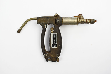
Tool - Drench Gun, 1940-1950
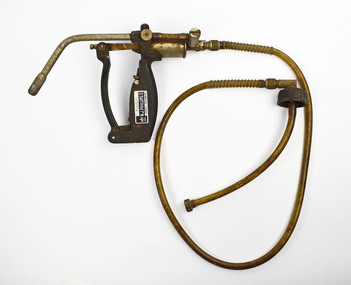
There are several different designs of drench guns within the NWM Collection that show the change in their development over time. This drench gun has a large diameter curvature suggesting this gun was typically used for dosing ewes as opposed to lambs. The attached spring-loaded hose is the only example in our collection how this mechanism works. The hose will be screwed into the liquid which is used to drench the sheep. This liquid is typically located on the back of the operator who will wear a large container in a backpack. This gun also has a adjustable dosing mechanism located on the right side of the gun.Silver metal with black finishing drench gun. Large curvature tip on gun protrudes from the body which feature a thin squeezable trigger to the front of the body. The main bulk, which the trigger is squeezed towards, has badge which reads “Manufactured and designed by N.J. Phillips Pty Ltd, Sydney”. Behind this body is silver cylinder featuring attachment point for the tubing which would have carried the liquid drench into the gun. The attached tubing has a yellow/orange appearance from remanence of drench which would have been this colour.Left rotated lettering: MANUFACTURED/ & DESIGNED BY/ N.J.PHILLIPS PTY. LTD./ SYDNEY . AUSTRALIA/sheep drenching, veterinary instruments -
 Glen Eira City Council History and Heritage Collection
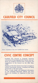
Pamphlet, "CAULFIELD CITY COUNCIL CIVIC CENTRE CONCEPT", c. 1976
Pamphlet commissioned by Council to promote and call for resident's comments on the Caulfield City Council's proposed Civic Centre by the 28th May 1976.Cream colour paper pamplet folded to create 4 panels with text and images printed in blue and orange ink on recto and verso of the four panels. The cover panel has "Caulfield City Council Civic Centre Concept" printed in orange with a blue copy of an artist's impression of the new Caulfield Centre and a blue representation of the City of Caulfield Coat of arms at the top. The other seven panels have been individually numbered from 1 to 7 however panels 1&2, 3&4 and 5&6 have been designed to be viewed together. -
 Bendigo Historical Society Inc.
Clothing - BARBARA JOHNSON COLLECTION: WEDDING HEAD DRESS, 1958
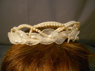
Wire-framed circlet. Frame covered in cotton netting. Frame has a scalloped design 3cms high. The over lapping scallops are covered in small pearl beads. Around the base of the head dress are attached net covered “lilies” each with a tear-drop shaped pearl bead at the centre. An elastic band is attached to hold the head dress firmly to the head. The head dress originally also held a veil. Cream in colour. Part of wedding dress collection 11400.528, 11400.53029, 11400.530, 11400.531 Wedding dress worn at marriage of Barbara Johnson to her first husband Ian Bulte.costume, female ceremonial, wedding head dress -
 National Wool Museum
Tool - Drench Gun, 1940-1950
There are several different designs of drench guns within the NWM Collection that show the change in their development over time. On the left side of this gun white paint indicates the adjustable dose lever. It is a sliding scale from 10 to 0 cubic centimetres of liquid (now typical measure in millilitres). It also has a large diameter curvature suggesting this gun was typically used for dosing ewes as opposed to lambs. The manual adjuster helped to minimise cases of overdosing which can be fatal for livestock while the additional curvature helped to ensure the liquid reached the desired location within the sheep’s mouth. This desired location is on the left rear of the sheep’s tongue (from the sheep’s point of view) as this is where the oesophagus is located. The main risks are that drench may be delivered into the lungs via the trachea or “windpipe”, which can also prove fatal. The opening to the trachea which leads to the lungs is in the middle of the back of the throat. Another risk is the throat can also be damaged due to rough handling.Silver metal with black finishing drench gun. Large curvature tip on gun protrudes from the body which feature a thin squeezable trigger to the front of the body. The main bulk, which the trigger is squeezed towards, has badge which reads “Manufactured and designed by N.J. Phillips Pty Ltd, Sydney”. Behind this body is silver tubing featuring attachment point for the tubing which would have carried the liquid drench into the gun. The small section of tubing still attached has a yellow/orange appearance from remanence of drench which would have been this colour.Left lettering: 10CC 5CC 0/ 7.5 2.5/ Left rotated lettering: MANUFACTURED/ & DESIGNED BY/ N.J.PHILLIPS PTY. LTD./ SYDNEY . AUSTRALIA/sheep drenching, veterinary instruments -
 Federation University Art Collection
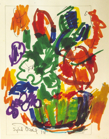
Drawing - Texta sketch, [Flower Bowl] by Sybil Craig, 1979
Sybil CRAIG (18 November 1901-09 September 1989) Born London, England Arrived Australia 1902 The National Gallery School, Melbourne, gave Craig a sound training for her popular flower and portrait studies. However, her association with leading modernists between the wars led her to pursue her art in a deliberately experimental and spontaneous way. Sybil Craig was the third woman appointed by the Australian War Memorial as an official war artist. She was the first woman to paint women working in the munitions’ factories. The Castlemaine Art Gallery & Historical Museum, held the first retrospective exhibition of Sybil Craig's in 2006. The exhibition highlighted her wonderful use of colour and design in a diverse range of media, techniques and subject matter. This item is part of the Federation University Art Collection. The Art Collection features over 2000 works and was listed as a 'Ballarat Treasure' in 2007.ModernismDrawing in texta of a bright bowl of flowers.art, artwork, sybil craig, craig, texta, flowers -
 Federation University Art Collection
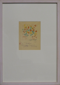
Drawing - Texta sketch, 'In Chamber African Daisies' by Sybil Craig', 1978
Sybil CRAIG (18 November 1901-09 September 1989) Born London, England Arrived Australia 1902 The National Gallery School, Melbourne, gave Craig a sound training for her popular flower and portrait studies. However, her association with leading modernists between the wars led her to pursue her art in a deliberately experimental and spontaneous way. Sybil Craig was the third woman appointed by the Australian War Memorial as an official war artist. She was the first woman to paint women working in the munitions’ factories. The Castlemaine Art Gallery & Historical Museum, held the first retrospective exhibition of Sybil Craig's in 2006. The exhibition highlighted her wonderful use of colour and design in a diverse range of media, techniques and subject matter. This item is part of the Federation University Art Collection. The Art Collection features over 2000 works and was listed as a 'Ballarat Treasure' in 2007.ModernismFramed sketch of flowers undertaken in texta colour.art, artwork, sybil craig, craig, flora, texta, texta colour, available -
 Federation University Art Collection
Drawing - Coloured pencil sketch, 'Untitled' by Sybil Craig
Sybil CRAIG (18 November 1901-09 September 1989) Born London, England Arrived Australia 1902 The National Gallery School, Melbourne, gave Craig a sound training for her popular flower and portrait studies. However, her association with leading modernists between the wars led her to pursue her art in a deliberately experimental and spontaneous way. Sybil Craig was the third woman appointed by the Australian War Memorial as an official war artist. She was the first woman to paint women working in the munitions’ factories. The Castlemaine Art Gallery & Historical Museum, held the first retrospective exhibition of Sybil Craig's in 2006. The exhibition highlighted her wonderful use of colour and design in a diverse range of media, techniques and subject matter. This item is part of the Federation University Art Collection. The Art Collection features over 2000 works and was listed as a 'Ballarat Treasure' in 2007.Framed pencil drawing of a flower.art, artwork, sybil craig, craig, flowers, drawing -
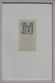 Federation University Art Collection
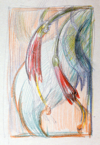
Drawing - Artwork, [Tree Study] by Sybil Craig
Sybil CRAIG (18 November 1901-09 September 1989) Born London, England Arrived Australia 1902 The National Gallery School, Melbourne, gave Craig a sound training for her popular flower and portrait studies. However, her association with leading modernists between the wars led her to pursue her art in a deliberately experimental and spontaneous way. Sybil Craig was the third woman appointed by the Australian War Memorial as an official war artist. She was the first woman to paint women working in the munitions’ factories. The Castlemaine Art Gallery & Historical Museum, held the first retrospective exhibition of Sybil Craig's in 2006. The exhibition highlighted her wonderful use of colour and design in a diverse range of media, techniques and subject matter. This item is part of the Federation University Art Collection. The Art Collection features over 2000 works and was listed as a 'Ballarat Treasure' in 2007.Framed pencil and watercolour sketchart, artwork, sybil craig, craig, available, pencil drawing, watercolour -
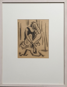 Federation University Art Collection
Drawing - Drawing - charcoal sketch, [Seated Woman] by Sybil Craig
Sybil CRAIG (18 November 1901-09 September 1989) Born London, England Arrived Australia 1902 The National Gallery School, Melbourne, gave Craig a sound training for her popular flower and portrait studies. However, her association with leading modernists between the wars led her to pursue her art in a deliberately experimental and spontaneous way. Sybil Craig was the third woman appointed by the Australian War Memorial as an official war artist. She was the first woman to paint women working in the munitions’ factories. The Castlemaine Art Gallery & Historical Museum, held the first retrospective exhibition of Sybil Craig's in 2006. The exhibition highlighted her wonderful use of colour and design in a diverse range of media, techniques and subject matter. This item is part of the Federation University Art Collection. The Art Collection features over 2000 works and was listed as a 'Ballarat Treasure' in 2007.Framed life drawing by Sybil Craigart, artwork, sybil craig, craig, life drawing, life model, charcoal, drawing, available -
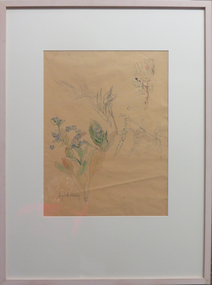 Federation University Art Collection
Drawing - Pencil ink & Water colour on paper, [Flower Study] by Sybil Craig
Sybil CRAIG (18 November 1901-09 September 1989) Born London, England Arrived Australia 1902 The National Gallery School, Melbourne, gave Craig a sound training for her popular flower and portrait studies. However, her association with leading modernists between the wars led her to pursue her art in a deliberately experimental and spontaneous way. Sybil Craig was the third woman appointed by the Australian War Memorial as an official war artist. She was the first woman to paint women working in the munitions’ factories. The Castlemaine Art Gallery & Historical Museum, held the first retrospective exhibition of Sybil Craig's in 2006. The exhibition highlighted her wonderful use of colour and design in a diverse range of media, techniques and subject matter. This item is part of the Federation University Art Collection. The Art Collection features over 2000 works and was listed as a 'Ballarat Treasure' in 2007.Framed sketches of plantsSigned lower left side "Sybil Craig"art, artwork, sybil craig, craig, flora, plants, flowers, available -
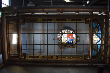 City of Greater Geelong
Decorative object - Stain Glass Window, Arthur S. Pittock, Geelong Crest Stained Glass Window, 1916
This stained glass was originally installed at Geelong Town Hall following its expansion in 1917. The Geelong Council involved the staff and former students of the Gordon Technical College in designing the artwork and aesthetic of the building. Arthur S. Pittock, former student and local glazier, was responsible for the design and construction of the large stained glass window in the stair hall. The window was described as “a special feature” in the new building with the leaded glass work using “the motif throughout in Greek form, of admirable colour”. The window showcases the City of Geelong’s original coat of arms, featuring images of Geelong’s early industries: sailing, wool, wine and wheat production, and a kangaroo as an inescutcheon. During the redevelopment of City Hall in the late 1960s the stained glass window was removed from the building. The surviving City Hall window is the most elaborate, known surviving stained glass window by PittockGeelong Crest fashioned in glassBy the right use of God's gifts 1894stain glass window, arthur s. pittock, city hall geelong -
 Federation University Historical Collection
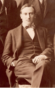
Photograph - Photograph - Black and White, Harold Herbert of the Ballarat Technical Art School, 1919
Harold Brocklebank Herbert (16.09.1891-1945) Harold Herbert was one of the first pupils at the school starting in 1891, commencing as a 15 years old he studied Applied Design and Architecture at the Ballarat Technical School of design attached to the Ballarat Fine Art Galery, transferring to the Ballarat Technical Art school attached to the Ballarat School of Mines. He was a certificated Art Teacher with the Victorian Education Department. His talents were identified by Ballarat’s Ponsonby Carew-Smith who rose to become Art Inspector with the Victorian Education Department. His teaching career included being appointed Principal of the Sale Technical Art School in 1898. Harold Herbert undertook further studies in England returning to Ballarat with all new entrepreneurial ideas. He worked at the Ballarat Technical Art School between 1915-19. Harold Herbert was involved with the design of the Ballarat Arch of Victory, and was responsible for the reproductions in ‘The Education Department’s Record of War Service. Had been principal of the Sale Technical Art School since 1898, and had undertaken further studies in England returning to Ballarat with all sorts of entrepreneurial ideas. In 1924 the Ballarat School of Mines Students’ Magazine reported “We are perfectly safe in claiming on behalf of our school, that no institution of its kind has turned out a greater number of men and women students who have since “made good” while some have achieved enviable prominence in the world of art. Amongst these later, the most brilliant is Harold B. Herbert whose work is so widely and justly appreciated throughout Australia and whose achievements are watched by his old school with the greatest pride. He commenced at the School when he was about 15 years of age, and followed a course of training very similar to what most students are doing the most valuable qualities shown by him during his career as a student were a passion for drawing and a capacity for taking pains, so essential in all artwork. He was appointed as Assistant Art Teacher at Ballarat on completion of his course, and later assistant in the office of Art Inspector. All of his spare time was devoted to out-door sketching and commercial drawing and he showed an ability in practical design for various crafts quite equal to the ability he has since displayed in depictive art. His return to this School as senior master and his departure to devote himself entirely to fine art are quite recent happenings with which all students are familiar. The wonderful exhibition he held in Melbourne on return from a sketching trip abroad has place him amongst the leading artists of Australia. Upon his death in 1945 the Ballarat School of Mines Student's Magazine recorded: "The death of the famous water-colour artist, Harold Herbert, will be a distinct loss to art in Australia. he was educated at the Ballarat Art School which it was situated in Sturt Street, and the gave promise of becoming a famous artist then. his talents were recognised, and in water-colour work he quickly made a name for himself. his landscapes in water-colour are in the principle galleries of the world, and many of them are to be found in the Ballarat gallery and in other provincial galleries. In 1941 he was appointed official war artist for the COmmonwealth, and he served in the Middle East and Syria. Exhibitions of his war pictures have been seen at different times in Melbourne."Portrait of a young man in a suit. He is Harold Brocklehurst Herbert, staffmember of the Ballarat Technical Art School (a division of the Ballarat Technical Art School). The photograph is a detail of the Ballarat School of Mines Magazine Committee, 1919. (http://victoriancollections.net.au/items/54923a682162f116140de59c)harold herbert, harold b. herbert, harold brocklebank herbert, ballarat school of mines, ballarat technical art school, art, arch of victory -
 National Wool Museum
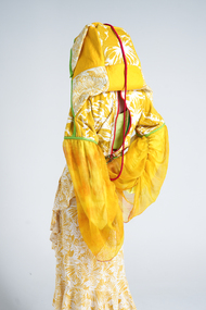
Clothing - 35 Life, Canwen Zhao, 2022
Canwen Zhao was awarded the $10,000 We The Makers Acquisitive Prize for '35 Life' in 2023. Artist Statement: "35life" is a sustainable fashion project that transforms second-hand clothing materials into urban street outdoor-style products. Highlighting prominent Chinese classic red and green colours not only conveys eastern aesthetics but also adds a sense of unity to the clothing collection. The high-saturation and high-brightness full-colour palette keeps the clothing consistently "fresh," allowing any trendy colours to seamlessly integrate into the project's designs, thus extending the lifespan of the garments. Additionally, all clothing items can quickly transform into a stylish bag for convenient daily carrying and home storage. These bags are made from leftover fabric generated during the production process and serve as original packaging for sale. This approach not only reduces excessive packaging but also enhances the chances of resale in the second-hand market. The project draws inspiration from the traditional Chinese cultural concept of "huo feng ding," meaning "exchange the old for the new." it's also influenced by the designer's personal experience with health issues, making the designs suitable for individuals who can't be exposed to sunlight for extended periods, adapting to the changing urban lifestyle. 35life aims to provide visually pleasing and comfortable dressing experiences for urban dwellers who are busy with work and experience high levels of stress. Unlike traditional design patterns, this project adopts a unique design approach. It selects 3-5 pieces of raw materials based on their colours, and then disassembles them through structural lines. While retaining most of their functionality, these materials are rearranged and assembled on a flat surface before being shaped on a dress form. Subsequently, various ways of creating storage bags are derived from the initial clothing prototypes. After refining the designs, the final products are developed, and similar materials are used to create samples. Therefore, under this design methodology, even for the same garment, it is impossible to produce two identical pieces of clothing. Each garment is truly one-of-a-kind, which enhances its rarity and contributes to the longevity of the fashion pieces. The project includes various types of clothing, each with unique storage methods. This yellow look, named "elegant beach sunscreen monarch," draws its fashion inspiration from traditional Han Chinese attire and its storage concept from the Chinese cultural concept of "jiu jiu gui yi." the design employs flat pattern cutting, utilizing materials from the second-hand market such as beach towels, children's waterproof clothing, and women's dresses. Similar colours and patterns are reassembled through cutting and combining. For the sleeves, quick-drying, sun-protective sport fabric forms the base, overlaid with discarded silk fabric dyed with turmeric and plant dyes. This not only ensures functionality but also adds a sense of elegance. The length can be adjusted using drawstrings. Artist Bio: Zhao Canwen is a multidisciplinary fashion designer with a strong passion for integrating art, history, culture, and sustainable design. With over 15 years of experience in painting, she draws inspiration from ancient Chinese philosophy and aesthetics, which gives her a unique sense of beauty. After 8 years of fashion and art training, she possesses a keen insight into current trends and tends to combine art with commercial needs. Zhao's design style is diverse, characterized by a multidimensional approach, a focus on colour application, and storytelling through details.Outfit consisting of six pieces: - Orange plastic eye wear with green paint - Pair of red and green metal clip on earrings - Red beaded phone case with attached beads on string - Pair of red and green painted running shoes - Yellow and green hooded garment with red piping and zips - Brown bag with green beaded handlessustainable, fashion, we the makers, art, culture, design, chinese philosophy, prize -
 Warrnambool and District Historical Society Inc.
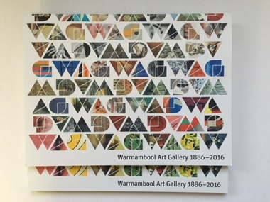
Book, Warrnambool Art Gallery 1886-2016, 2016
These books celebrate the 130th anniversary of the establishment of the Warrnambool Art Gallery. This Gallery is owned and operated by the Warrnambool City Council as a memorial to Sir David Fletcher Jones who was nationally known and a leading citizen in Warrnambool for many years as a businessman (Fletcher Jones and Staff) and as a philanthropist. The Warrnambool Art Gallery was founded in 1886 and is the third oldest institutional collection in Victoria and the fifth oldest in Australia. This book is of considerable interest as it reproduces many works of art from the Warrnambool Art Gallery, a highly significant collecting institute in Warrnambool. These are two copies of the book containing 130 reproductions of works of art (both in colour and in black and white) held at the Warrnambool Art Gallery. It is a soft cover book of 128 pages edited by Vanessa Gerrans. The cover designed by Ian Robertson has a white background and the shapes of the Warrnambool Art Gallery logo have been used as multi-coloured windows containing details of each of the 130 reproduced works. The title of the book is in black print. As well as the reproduced works of art the book contains A Message from the Mayor, notes on the Friends of the Warrnambool Art Gallery and the Warrnambool Art Gallery Foundation and an article on the history of the Art Gallery. warrnambool art gallery, warrnambool city council, david fletcher jones, history of warrnambool -
 4th/19th Prince of Wales's Light Horse Regiment Unit History Room
Rifle Bucket
This type of rifle bucket was in use by the 4th Light Horse Regiment AIF in 1918. It was introduced into service following the Charge at Beersheba (Palestine, Oct. 31 1917) which lead to the introduction of the Cavalry sword to the Light Horse Brigades of the 1st AIF. The use of the cavalry sword required the riders arms to be free and this caused the relocation of the rifle from being slung on the rider's shoulder or carried in his right hand to being carried by the saddle. The Sword and the Rifle Bucket continued in use after WW1 by the 4th Corangamite Light Horse, the 17th Prince of Wales Light Horse Regiment and the 19th Yarrowee Light Horse Regiments in the 1920's and 1930's and possibly as late as 1941/42 prior to mechanisation and the demise of the use of the horse in combat. This item was designed to allow the rifle to be carried secured to the saddle and allow the right arm to be free to use the sword in combat. This Rifle bucket has had the mid strap replaced in service as evidenced by the use of 'black waxed, hand made thread', which was the type of stitching used by the Army on all saddlery and harness. On the rifle bucket, the makers name is usually stamped on this strap and the in service replacement of the strap explains why the maker's name is not present. The reinforcing leather at the lower edge of the bucket is unusual and judging by the colour of the leather it was added to the bucket by the regimental saddler as a repair probably at the same time as the mid section strap.None sightedrifle bucket, light horse, saddlery -
 Federation University Historical Collection
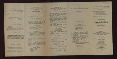
Document, Ballarat Technical Art School Prospectus, 1908, 1908
The Ballarat Technical Art School was established in 1907 as a division of the Ballarat School of Mines. Folded brochure with a prospectus for the newly established Ballarat Technical Art School. The principal was Herbert H. Smith. Subjects taught included Dressmaking, Millinery. Ladies Tailoring, Manual training, Carpentry, House Decoration, Signwriting, Lettering, Stenciling, Marbling, Graining, Glass Embossing, Ticket Writing, Art Teachers' Course, Life Classes, State School Teachers' CLasses, Drawing from a Flat Example, Drawing Ornament for the Cast, Practical Geometry, Perspective. Drawing in Light and Shade from the Cast, Modelling Plant Forms, Historic Ornament, Drawing the Antique From Memory, Composition of Form and COlour, Human Anatomy, Design, etc.ballarat technical art school, ballarat school of mines technical art and trade schools, prospectus, herbert h. smith, h.h. smith, f. foster, m. young, g. clegg, j. barber, t.r. pridgeon, albert steane, a.w. steane, e. cornell, art education -
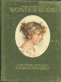 Bendigo Historical Society Inc.
Book - WARD LOCK & CO'S WONDER BOOK, 1906
Hard cover picture annual for boys and girls published by Ward Lock & Co Ltd London New York and Melbourne, edited by Harry Golding. A book of childrens stories with green cover showing a portrait of a young girl, title in gold lettering surrounded with black decorative design, contains black and white plus some colour illustrations. Inscription inside front cover reads, Xmas examination 1906 prize awarded to Miss Ralla Mitchell for dux of third class 1st in arithmetic, reading, grammar, geography & spelling U V.Obrien Principal ''Vinery'' Myers St & View St private schools.books, children's, picture annual -
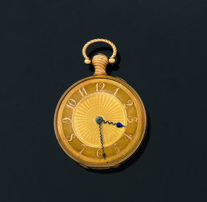 Flagstaff Hill Maritime Museum and Village
Instrument - Fob watch, 1814
Watchmaker History: James McCabe born in 1748 and was the son of Patrick McCabe, a notable watchmaker from Lurgan in County Armagh, Ireland. James McCabe immigrated to London in 1775 where he established his own business in Bells Building, Fleet Street. On 2nd April 1781, James McCabe was made an Honorary Freeman of the Clockmakers Company. The House of McCabe was renowned for the sheer variety of its designs and the creativity and prestige of their manufacture was celebrated and revered by owners worldwide. These pieces remain highly collectable today and fetch increasingly higher prices at auction houses worldwide. Watch association with the Loch Ard: The watch was saved from the sea when discovered on the body of Mrs Rebecca Carmichael from Dublin and handed to Eva Carmichael, the only family member to survive the fatal wreck of the Loch Ard on 1st June 1878. Eva gifted the watch to her husband, Thomas Achilles Townsend when they married in 1884; his name is engraved on the rear movement cover. The watch has been held by the family until 2011 when they decided to bring the watch, to Australia for auction. At this time the watch was in the possession of Eva Carmichael's grandson, Robert Townsend. Given its connection with the Loch Ard shipwreck It was purchased at auction by Flagstaff Hill Maritime Village on 25th October 2011 to add to it's Loch Ard collection and is currently referred to as the Carmichael watch. It is now on display alongside the Minton Peacock, which also survived the Loch Ard shipwreck, and other artefacts from the collection. James McCabe was originally a Belfast watchmaker who had moved his business to London. At the time James McCabe was much esteemed for producing fine watches and clocks, especially for export to India. Only the best watches were inscribed “James McCabe” and many with highly decorated cases were intended for the Indian market. Contemporary newspaper accounts of the watches discovery echoed a Carmichael family tradition that the watch had been intended as a gift from the City of Dublin to King George IV to mark his planned visit to the city in 1821 however there is no evidence to support this theory. Dr Evory Carmichael at some stage bought this watch some accounts say from a nobleman for about £100 and so it travelled with him on his final fateful journey to Australia. Today we can only guess at the actions of Mrs Carmichael in the chaos and darkness of the pre-dawn shipwreck. Perhaps the two items that were found on her body, the watch and a locket, were items that reminded her of those she held most dear, her husband and her family. When Mrs Carmichael's body was washed ashore the watch was found secreted in the waistband of her dress. In its own right the watch is of artistic and monetary value and is a rare and beautiful object depicting watch making in the early 19th century. It is a historically significant object in it’s own right and there is additional importance, surviving a significant event in the maritime history of Victoria. The wreck of the Loch Ard, Victoria's greatest maritime disaster has also been declared an event of National Significance because of its strong connection to Australia's immigration and maritime history. The watch, together with the Loch Ard Peacock, make up the two most significant shipwreck artefacts in Australia. Both of these items are of great social significance to not only local people but the wider Australian community. Funding for the watches purchase came from six local trusts and one anonymous citizen and is now on permanent display. Both these artefacts symbolise and helps to interpret the stories of survival along the Shipwreck Coast. Fob Watch, known as the "Carmichael Watch" or the "Loch Ard Watch". 1814 fob pocket watch belonging to the Carmichael family, recovered from the wreck of the Loch Ard. Fob watch (or pocket watch)and winding key, made by James McCabe and Son, of Cornhill, London. The watch is in excellent condition and its design is decorative and intricate. The gold face is covered by glass. The gold rear cover is hinged over a silver inner cover that includes the winding hole. The watch has a knob with a swinging ring from which it can be hung. The dial of the gold watch face is textured and has raised Arabic numerals and every minute is marked around the perimeter by a dot, with the 5-minute dots slightly larger. The numerals and dots are a different coloured gold than the rest of the face. The centre of the face has a wavy pattern fanning out to the base of the numerals. The hour and minute hands are of a dark colour. The stems of the hands are a wavy shape and finish with spade shaped tips; the tip of the hour hand is larger than that of the minute hand. The hour hand reaches to the base of the numerals and the minute hand is long enough to rest between the minute dots. The back of the watch is decorated with a detailed design on a textured gold background. The design is embossed in coloured metals; gold, silver, greenish-gold and pink. In the centre is a dove resting on leaves of a pot plant that sits on a silver circular base. Another dove is flying above it, and their beaks touch together. On the right of the base of the pot plant is a dog resting on its hind legs, body facing away from the plant and head twisted around to look at the birds. On the sides of this design and meeting at the base are sprigs of leaves and buds. Around this central design is a rope-like border. Around the perimeter of the case is a border of leaves and budding stems. The inside of this cover has embossed hallmarks, numbers and etched markings indicating that the watch is 18 carat gold, made by James McCabe, assayed in London in 1814 and the case may have been made by Daniel Willmott, case maker. The silver inner workings cover has a full name beautifully engraved on it. There is a winding hole that accesses a square-ended lever for the key to fit over. The handle of the watch is a twisted gold knob with a hollow ‘D’-shaped swinging ring attached to the end of it. This knob also has a hallmark.On the silver inner workings cover “Thomas Achilles Townshend” is engraved, underscored by a thin, delicately decorated line. On the gold handle is the logo of a crown with “18”’ next to it. Inside the gold rear case is stamped “DW’. Under that is etched “JAN 77 II”. Underneath this are 3 logos; a logo “leopard, crowned”’, a logo “ crown on top of 18”, and a logo “T”. Under these 3 symbols is part of a stamp that could possibly be “IMC”. Under this is “ ’ 5 9 4 ”. Other numbers, symbols and letters are etched into this case including “15001”, “2/5/19”. Others are difficult to read.warrnambool, shipwrecked coast, shipwreck coast, flagstaff hill, flagstaff hill maritime museum, flagstaff hill maritime village, maritime museum, shipwrecked artefact, shipwreck artefact, carmichael, townshend, townsend, carmichael watch, loch ard watch, pocket watch, loch ard, 1st june 1878, james mccabe, thomas walker, robert townshend, loch ard gorge, great ocean road, victoria., memorial headstone -
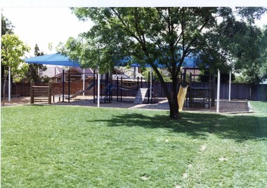 Glen Eira Historical Society
Photograph, Dalny Road, 5-17 Rear, Murrumbeena, 2001
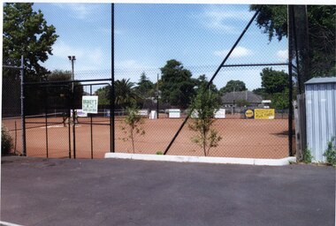
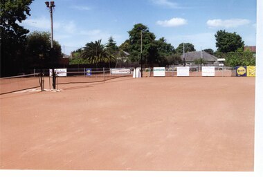
Originally labelled "Beauville Estate, Established 1936, Still Thriving 65 years on, 10th March 2001", the Beauville Estate Album contains colour photographs of houses in the Estate. They were taken around the time of the Beauville Estate’s 65th Heritage Celebration held on 10/03/2001 and donated to the Caulfield Historical Society shortly afterwards. Photographer unknown. From Glen Eira’s Heritage Management Plan by Andrew Ward (1996) Vol 2 p78: "Beauville Avenue is unusual in that it is terminated in a cul-de-sac (see Section 3.9.2) whilst the design of the estate may well be unique for its time in that the houses back onto 6 tennis courts for public use. St. Patrick's Church, which adjoins the estate is a comparatively recent structure whilst the school has one building erected in 1930 and prior to the release of the Beauville lots." It also notes that St.Patrick's Church and School now run the tennis courts. The Beauville Historic Area is important at the State level as the first large housing estate undertaken by the AV Jennings Construction Co, later Jennings Group Limited, Victoria’s largest home builder. It is important also as a very early estate development incorporating a range of features other than houses and including made roads, shops and recreation facilities. In this respect it was the forerunner of the comprehensively planned housing estate of the post war era. The estate is distinguished by its aesthetic values, as is the earlier and comparable Hillcrest Estate, which are formed by a combination of restrained diversity in house styles, with the exception of no. 30 in the emerging International style, and by a landscaped garden environment. See Significance Statement in Glen Eira’s Heritage Management Plan by Andrew Ward (1996) Vol 2 p.79. Available from https://www.gleneira.vic.gov.au/media/4779/heritage_management_plan_volume_2.pdf (Note see p.84 of pdf)Colour photograph of a playground on the Beauville Estate. murrumbeena, houses, 1930's, a.v. jennings, av jennings, jennings, beauville estate, playgrounds, parks and reserves, sir albert victor jennings, a v jennings construction co, beauville estate heritage area, glen eira city council, jennings group limited, land subdivision, gardens, beauville historic area, st patrick's church, st patrick's school, dalny road -
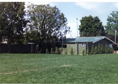 Glen Eira Historical Society
Photograph, Dalny Road, 5-17 Rear, Murrumbeena, 2001
Originally labelled "Beauville Estate, Established 1936, Still Thriving 65 years on, 10th March 2001", the Beauville Estate Album contains colour photographs of houses in the Estate. They were taken around the time of the Beauville Estate’s 65th Heritage Celebration held on 10/03/2001 and donated to the Caulfield Historical Society shortly afterwards. Photographer unknown. From Glen Eira’s Heritage Management Plan by Andrew Ward (1996) Vol 2 p78: "Beauville Avenue is unusual in that it is terminated in a cul-de-sac (see Section 3.9.2) whilst the design of the estate may well be unique for its time in that the houses back onto 6 tennis courts for public use. St. Patrick's Church, which adjoins the estate is a comparatively recent structure whilst the school has one building erected in 1930 and prior to the release of the Beauville lots." It also notes that St.Patrick's Church and School now run the tennis courts.City of Glen Eira’s Heritage Management Plan Vol 2 p79 (this is p84 of the pdf version) – HO12 Beauville Estate and environs, Murrumbeena: The Beauville Historic Area is important at the State level as the first large housing estate undertaken by the AV Jennings Construction Co, later Jennings Group Limited, Victoria’s largest home builder. It is important also as a very early estate development incorporating a range of features other than houses and including made roads, shops and recreation facilities. In this respect it was the forerunner of the comprehensively planned housing estate of the post war era. The estate is distinguished by its aesthetic values, as is the earlier and comparable Hillcrest Estate, which are formed by a combination of restrained diversity in house styles, with the exception of no. 30 in the emerging International style, and by a landscaped garden environment. Colour photograph of a tennis club house and a park on the Beauville Estate. murrumbeena, houses, 1930's, a.v. jennings, av jennings, jennings, beauville estate, jennings albert victor, parks and reserves, sports and recreations establishments, clubhouses, tennis clubs, beauville tennis courts, st patrick's tennis club, sir albert victor jennings, a v jennings construction co, beauville estate heritage area, glen eira city council, architectural features, jennings group limited, land subdivision, gardens, beauville historic area, dalny road -
 Glen Eira Historical Society
Photograph, Dalny Road, 5-17 Rear, Murrumbeena, 2001
Originally labelled "Beauville Estate, Established 1936, Still Thriving 65 years on, 10th March 2001", the Beauville Estate Album contains colour photographs of houses in the Estate. They were taken around the time of the Beauville Estate’s 65th Heritage Celebration held on 10/03/2001 and donated to the Caulfield Historical Society shortly afterwards. Photographer unknown. From Glen Eira’s Heritage Management Plan by Andrew Ward (1996) Vol 2 p78: "Beauville Avenue is unusual in that it is terminated in a cul-de-sac (see Section 3.9.2) whilst the design of the estate may well be unique for its time in that the houses back onto 6 tennis courts for public use. St. Patrick's Church, which adjoins the estate is a comparatively recent structure whilst the school has one building erected in 1930 and prior to the release of the Beauville lots." It also notes that St.Patrick's Church and School now run the tennis courts.City of Glen Eira’s Heritage Management Plan Vol 2 p79 (this is p84 of the pdf version) – HO12 Beauville Estate and environs, Murrumbeena: The Beauville Historic Area is important at the State level as the first large housing estate undertaken by the AV Jennings Construction Co, later Jennings Group Limited, Victoria’s largest home builder. It is important also as a very early estate development incorporating a range of features other than houses and including made roads, shops and recreation facilities. In this respect it was the forerunner of the comprehensively planned housing estate of the post war era. The estate is distinguished by its aesthetic values, as is the earlier and comparable Hillcrest Estate, which are formed by a combination of restrained diversity in house styles, with the exception of no. 30 in the emerging International style, and by a landscaped garden environment. Colour photograph of tennis courts and surrounding mesh fencing on the Beauville Estate. murrumbeena, houses, 1930's, a.v. jennings, av jennings, jennings, beauville estate, parks and reserves, sports and recreations establishments, tennis courts, sportsgrounds, sir albert victor jennings, a v jennings construction co, beauville estate heritage area, glen eira city council, architectural features, jennings group limited, land subdivision, gardens, beauville historic area, tennis clubs, beauville tennis courts, st patrick's tennis club, dalny road -
 Glen Eira Historical Society
Photograph, Dalny Road, 5-17 Rear, Murrumbeena, 2001
Originally labelled "Beauville Estate, Established 1936, Still Thriving 65 years on, 10th March 2001", the Beauville Estate Album contains colour photographs of houses in the Estate. They were taken around the time of the Beauville Estate’s 65th Heritage Celebration held on 10/03/2001 and donated to the Caulfield Historical Society shortly afterwards. Photographer unknown. From Glen Eira’s Heritage Management Plan by Andrew Ward (1996) Vol 2 p78: "Beauville Avenue is unusual in that it is terminated in a cul-de-sac (see Section 3.9.2) whilst the design of the estate may well be unique for its time in that the houses back onto 6 tennis courts for public use. St. Patrick's Church, which adjoins the estate is a comparatively recent structure whilst the school has one building erected in 1930 and prior to the release of the Beauville lots." It also notes that St.Patrick's Church and School now run the tennis courts. City of Glen Eira’s Heritage Management Plan Vol 2 p79 (this is p84 of the pdf version) – HO12 Beauville Estate and environs, Murrumbeena: The Beauville Historic Area is important at the State level as the first large housing estate undertaken by the AV Jennings Construction Co, later Jennings Group Limited, Victoria’s largest home builder. It is important also as a very early estate development incorporating a range of features other than houses and including made roads, shops and recreation facilities. In this respect it was the forerunner of the comprehensively planned housing estate of the post war era. The estate is distinguished by its aesthetic values, as is the earlier and comparable Hillcrest Estate, which are formed by a combination of restrained diversity in house styles, with the exception of no. 30 in the emerging International style, and by a landscaped garden environment. Colour photograph of tennis courts with lights on the Beauville Estate. murrumbeena, houses, 1930's, a.v. jennings, av jennings, jennings, beauville estate, parks and reserves, sports and recreations establishments, tennis courts, sportsgrounds, sir albert victor jennings, a v jennings construction co, beauville estate heritage area, glen eira city council, architectural features, jennings group limited, land subdivision, gardens, beauville historic area, tennis clubs, beauville tennis courts, st patrick's tennis club, dalny road -
 Flagstaff Hill Maritime Museum and Village
Flyer - Advertisement for Wright's Coal Tar Soap, c. late-9th century
Wright’s Coal Tar Soap was a popular brand of household soap, manufactured by William Valentine Wright from 1860. The soap was antiseptic and orange colour designed to thoroughly cleanse the skin. It was originally named Sapo Carbonis Detergens, which remains a registered trademark. The product was developed from ‘liquor carbonis detergens’, the liquid by-product of the distillation of coal to make coke; the liquid was made into an antiseptic soap for the treatment of skin diseases William Valentine Wright, born in 1826 in Aldeburgh, Suffolk, was a wholesale druggist and chemist who had a small business, W.V. Wright & Co. at 11 Old Fish Street Hill, City of London, where he first sold the soap. In 1867, n 1867, Wright moved his firm, Wright, Sellers & Layman, to small premises at 50 Southwark Street, Southwark, London. The company's name changed to Wright, Layman & Umney, when Charles Umney (1843–1909) was taken into the partnership in 1876. The advertisement of Wright’s Coal Tar Soap is representative of the many consumer goods sold at pharmacy/chemist shops across the world, such as Sambell and Son, who operated a pharmacy in Fairy Street, Warrnambool in the 19th-century.Paper with printed text for the promotion of Wright's Coal Tar Soap1176soap, wright's, coal tar soap, bathing, london, southwark, chemist, flagstaff hill, maritime museum -
 Puffing Billy Railway
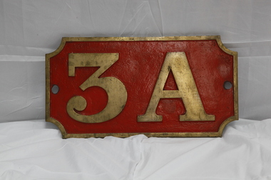
Number Plate - 3A
Loco: 3A In service Monday, 4th June 1900 Livery Not painted Owner Puffing Billy Gauge 762 Status Stored 3A Built in 1900 and painted two-tone green, this locomotive was issued to the Upper Ferntree Gully to Gembrook line and was used in the line’s construction. Over the years, it saw service on the Colac to Crowes and Moe to Walhalla lines, but it saw more service on the Gembrook line than any other. It was withdrawn from service in 1955 at Upper Fern Tree Gully and sold in 1960 to the Lord Mayor’s Camp at Portsea where it remained on static display until 1977. From there it was eventually brought to Belgrave for eventual restoration. When restored, it will be returned, as far as possible to its original condition with wooden cow-catchers, original design side tanks, low bunker, no smoke-box ash chute, etc. It will also have its original colour scheme of two-tone green with white lining.Historic - Victorian Railways Locomotive Number Plate used on Steam Locomotive 3ALocomotive Number Plate from 3A made of cast metal & Brass3Apuffing billy, 3a, number plate -
 Kew Historical Society Inc
Slide - Residences, 99 Princess Street, 1 Fellows Street, 1979
One of a group of slides taken by members of the Society of built heritage in Kew in 1979-80. The selection of subject matter reflects the priorities of the period. The colour of some slides has degraded. 99 Princes sStreet (1 Fellows Street) was built by the architects Oakden, Addison and Kemp. The Kew Conservation Study (1988) noted that: Erected By Bennie And Olivers, these Two Attached Houses Attracted An Initial Construction N.A.V. of £260. The houses were originally owned and occupied by the architect Henry Kemp, however Kemp appears not to have lived there long because, while he retained ownership for at least a decade, by 1891 George Martin, merchant and bank manager, was recorded as the tenant of No.1 Fellows Street. At that date the N.A.V. for this individual building was £83 and Kemp remained the owner of both properties until at least 1910. Kemp had arrived in Australia in 1886 and this was therefore one of the first of the many buildings he was to design in Melbourne. While late Victorian in date, the houses are of a unified design that is an interesting precursor of the Edwardian architecture produced by Kemp. Somewhat awkwardly composed with steep gables, a rectangular castellated tower and slated single storeyed verandahs projecting from the overall boxlike form, the house contains features common to the 1880s such as the use of polychromy in the brickwork and slates cladding the roof. The building departs from the norm of the time with the use of terracotta tile ridge cappings, and strapwork to the corbelled chimneys.The slides represent a snapshot in time of built architecture in Kew, much of which has changed in the forty-plus period since they were created.Colour positive transparency (slide) of the pair of residences on the corner of Princess Street and Fellows Street in Kew. The point of view is the Fellows Street frontage.comaques, historic houses -- kew (vic.), glenferrie road -- kew (vic.) -
 Australian Army Museum of Western Australia
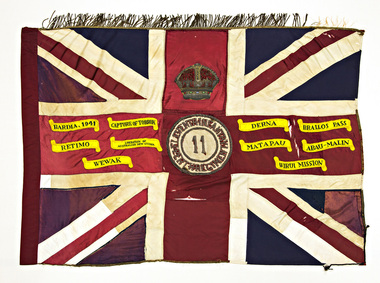
Queen's Colour - 11th Australian Infantry Regiment (Perth Regiment)
This former King's Colour was originally authorised by King George V in 1919 in recognition of services of 11th Battalion (AIF) during the Great War. Presented by HE the Governor General Sir Ronald Munro-Ferguson, PC, CGMG at a parade in King's Park on 2 October 1920 and handed over to 2nd Battalion, 11th Infantry Regiment (Perth Regiment) of the Citizen Forces. In 1921 this unit became re-designated 11th Battalion (The Perth Regiment) (The title was changed to "The City of Perth Regiment" in 1933). Subsequently consecrated by the Chaplain General, Archbishop COL Riley, OBE, VD, DD at a parade on the Esplanade, Perth, 15 November 1924. At the time of presentation this colour was a plain union flag with no central devices or other distinctions included on it. Following Military Board approval given in 1925 the centre circle and Crown were later added, in accordance with the approved design for a King's Colour. With the re-activation of the Citizen Military Forces (CMF) following the Second World War, the 11th/44th Infantry Battalion (The City of Perth Regiment) was raised as a linked battalion in 1948 to carry on the identity and traditions of the pre-war 11th and 44th Battalions respectively. The King's and Regimental Colours formerly held by these two battalions were passed on to the new battalion who paraded them in rotation on ceremonial occasions. With the accession of HM Queen Elizabeth II to the throne in 1953, all Colours that had originally been presented as King's Colours, and were still carried by units on the current Order of Battle, were automatically deemed to be Queen's Colours. Under major reorganisation of the CMF in 1960, all individual infantry battalions that existed at the time within each State were amalgamated to form State regiments, taking effect from 1 July 1960. Thus from that date the 11/44th, 16th and 28th Infantry Battalions were amalgamated to form The Royal Western Australia Regiment. In September 1960, at a ceremonial parade held at Northam Camp, the Colours carried by all former battalions were handed over for safe keeping by the new regiment. Battle Honours for the Second World War were promulgated under Australian Army Order 135/1961 and the 10 selected honours approved for emblazoning on the Queen's Colour were subsequently added in 1962 These former colours were subsequently laid up in the undercroft at the State War Memorial, King's Park on 29 November 1964. These were transferred to the Army Museum of WA in 1988 as part of the Bicentenary Colours Project. Union flag with gold fringes. In the centre the Arabic numeral "11" on a red background within a gold circle inscribed "ELEVENTH INFANTRY - PERTH REGIMENT", surmounted by the Crown. Emblazoned on the colour are the following Second World War Battle Honours:- BARDIA 1941, CAPTURE OF TOBRUK, DERNA, BRALLOS PASS, RETIMO, LIBERATION OF AUSTRALIAN NEW GUINEA, MATAPAU, ABAU-MALIN, WEWAK, WIRUI MISSION -
 Ballarat Tramway Museum
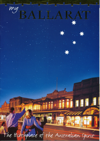
Pamphlet, Ballarat Tourism, "My Ballarat, the Birthplace of the Australian Spirit", Nov/Dec. 1998
48 page, colour printed on glossy paper, Ballarat Tourism brochure designed for interstate and overseas tourist to make Ballarat, their destination. P13 associated with Steve Moneghetti's story of 'my Ballarat', including a photograph of tram 26, at Gardens Loop during a Begonia festival. Conductor in rear compartment of 26. Telephone box open, obscuring a BTM member standing by phone in uniform. P45 has City of Ballarat map, showing tramway and museum/depot. Track does not project beyond depot spur to Carlton St. Brochure features stories from Ballarat residents and visitors, including other district items, features and accommodation section.trams, tramways, ballarat tourism, city of ballarat, btm -
 National Wool Museum
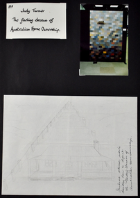
Document - The Fading Dream of Australian Home Ownership, Design and Photograph, Judy Turner, 1989
‘The Fading Dream of Australian Home Ownership’ was made by Judy Turner in 1989 for her son Nicholas (then 14 years) after a family discussion about mortgages and rising interest rates (17% at the time), out of concern for his generation. “Perhaps this will keep my son warm when he can’t afford a house”, wrote Judy at the time. As a quilting teacher for over thirty years, Judy was well aware of the ‘wagga’ tradition of making do with what you have and reusing resources to make something useful. The quilt was made using approximately 270 different men’s woollen suiting samples. The fabrics in the quilt were a gift from Micheal Haze who was a travelling men’s ware salesman and friend of the artist’s late husband. The suiting samples were used just as they were, without cutting, and are stacked liked house bricks. The pieces have been machine pieced and tied. The quilt has woollen backing, with no batting. Judy’s son Nicholas, always interested in drawing, and keen to see what his mother was making, helped with the drawing and design of the house. The quilt has been exhibited in Canberra, Armidale and Sydney and featured in publications in Australian and Japan. Judy’s work has been exhibited Nationally and Internationally, including in Japan, Korea, Germany, Switzerland and the United States of America. Judy’s work has featured extensively in publications around the world, and has received many awards. Her work is held in public and private collections across Australia and the USA. As well as a successful career as an artist, Judy spent three decades imparting skills to the next generation as a patient and skilled teacher. ARTIST STATEMENT The medium of my artistic practice is quilt making and my focus is the use of colour and speedy, accurate and efficient methods of making successful quilts. In 1995 I developed an original technique of applying woollen yarn to a woollen background, focusing on the subtle blending of colour to express an idea. Author of Awash With Colour (1997) and co-author with Margaret Rolfe of Successful Scrap Quilts (2002).Folio page depicting three items attached to a black card background. One item is a title written in black ink on white background, another is a photograph of a quilt, the third shows a hand drawn sketch of a house with a verandah.Front: [handwritten] 95 / Judy Turner / The fading dream of / Australian Home Ownership. / Initial sketch while / deciding how to depict / the Fading Dream of / Australian Home Ownership.quilt, wagga, home, house, housing affordability, design -
 National Wool Museum
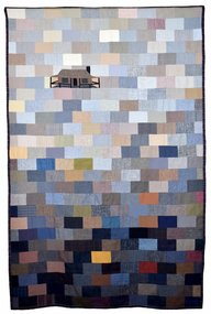
Textile - Quilt, Judy Turner, The Fading Dream of Australian Home Ownership, 1989
‘The Fading Dream of Australian Home Ownership’ was made by Judy Turner in 1989 for her son Nicholas (then 14 years) after a family discussion about mortgages and rising interest rates (17% at the time), out of concern for his generation. “Perhaps this will keep my son warm when he can’t afford a house”, wrote Judy at the time. As a quilting teacher for over thirty years, Judy was well aware of the ‘wagga’ tradition of making do with what you have and reusing resources to make something useful. The quilt was made using approximately 270 different men’s woollen suiting samples. The fabrics in the quilt were a gift from Micheal Haze who was a travelling men’s ware salesman and friend of the artist’s late husband. The suiting samples were used just as they were, without cutting, and are stacked liked house bricks. The pieces have been machine pieced and tied. The quilt has woollen backing, with no batting. Judy’s son Nicholas, always interested in drawing, and keen to see what his mother was making, helped with the drawing and design of the house. The quilt has been exhibited in Canberra, Armidale and Sydney and featured in publications in Australian and Japan. Judy’s work has been exhibited Nationally and Internationally, including in Japan, Korea, Germany, Switzerland and the United States of America. Judy’s work has featured extensively in publications around the world, and has received many awards. Her work is held in public and private collections across Australia and the USA. As well as a successful career as an artist, Judy spent three decades imparting skills to the next generation as a patient and skilled teacher. ARTIST STATEMENT The medium of my artistic practice is quilt making and my focus is the use of colour and speedy, accurate and efficient methods of making successful quilts. In 1995 I developed an original technique of applying woollen yarn to a woollen background, focusing on the subtle blending of colour to express an idea. Author of Awash With Colour (1997) and co-author with Margaret Rolfe of Successful Scrap Quilts (2002).Quilt featuring block pieces in tones of grey, blue, tan and brown, graduating in light to dark tones from top to bottom. The top third features a house with a verandah.quilt, wagga, home, house, housing affordability, design