Showing 80 items
matching lady's fashion
-
 National Wool Museum
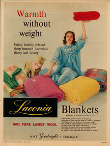
Archive - Advertisement, Laconia Woollen Mills, 1959
Note from collector- "For more than 100 years blankets were made all over Australia in over 100 woollen mills. My aim, is to preserve 100 examples of these wonderful pieces of history. Ten years ago I started collecting the iconic Onkaparinga travel rugs, so that on movie nights at home there would be plenty to go around. Everyone had their favourite; even the cat had his own – a small red tartan one. Keeping an eye out for those travel rugs at op-shops and markets, collectable stores and bazaars, led to noticing vintage blankets. I'd never really thought about them before or paid much attention though of course I had grown up with them at my grandmother's. When I discovered my first Laconia cream blanket with blue stripes, my eyes just went gaga. Well that was it, I was hooked and since then over 500 blankets have passed through my hands. These common, everyday items, found in all households for so many decades, were traditional engagement gifts. Pairs were prized wedding presents turning into family heirlooms. They were fashionable dressers of beds, givers of warmth, bestowers of security and reliability. The comfort found in these objects resonates with almost all of us; we grew up with them ourselves or fondly recall them in a grandparent’s home. There is no modern replacement with the integrity of these old blankets, many of them now older than most of us. They are romantic, sensible, special, familiar, nostalgic and nothing else feels so appropriate in so many situations. No offense to the great Aussie doona, but from hippie to hipster, at a music festival, picnic, campsite or couch, a vintage blanket is something coveted by all. This industry that employed tens of thousands and must have been such a huge contributor to the economy is almost completely lost now. Blanket Fever is an ode to everything that came before: the land, the sheep, the shearers, the hands, the mills, the weavers, the designers, the distributors, the department stores. To the grandparents that gave them, the people that received them, the families that kept them; thank you. I’m passionate about my collection of Australian blankets manufactured in mostly Victoria, South Australia and Tasmania from the 1930s to the end of the 1960s. The collection has blankets from each of these four decades representing the styles and fashions of their time and includes dated advertisements which help determine the eras the blankets are from." 'Warmth without weight' Sheep with lady wearing blue nightclothesWarmth without weight/Laconia Blankets/100% Pure Lamb's Wool /Make Goodnight a Certainty blanket, blanket fever, wool, laconia, advertisement, australian women's weekly -
 National Wool Museum
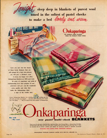
Archive - Advertisement, Onkaparinga Woollen Mill Company, 1956
Note from collector- "For more than 100 years blankets were made all over Australia in over 100 woollen mills. My aim, is to preserve 100 examples of these wonderful pieces of history. Ten years ago I started collecting the iconic Onkaparinga travel rugs, so that on movie nights at home there would be plenty to go around. Everyone had their favourite; even the cat had his own – a small red tartan one. Keeping an eye out for those travel rugs at op-shops and markets, collectable stores and bazaars, led to noticing vintage blankets. I'd never really thought about them before or paid much attention though of course I had grown up with them at my grandmother's. When I discovered my first Laconia cream blanket with blue stripes, my eyes just went gaga. Well that was it, I was hooked and since then over 500 blankets have passed through my hands. These common, everyday items, found in all households for so many decades, were traditional engagement gifts. Pairs were prized wedding presents turning into family heirlooms. They were fashionable dressers of beds, givers of warmth, bestowers of security and reliability. The comfort found in these objects resonates with almost all of us; we grew up with them ourselves or fondly recall them in a grandparent’s home. There is no modern replacement with the integrity of these old blankets, many of them now older than most of us. They are romantic, sensible, special, familiar, nostalgic and nothing else feels so appropriate in so many situations. No offense to the great Aussie doona, but from hippie to hipster, at a music festival, picnic, campsite or couch, a vintage blanket is something coveted by all. This industry that employed tens of thousands and must have been such a huge contributor to the economy is almost completely lost now. Blanket Fever is an ode to everything that came before: the land, the sheep, the shearers, the hands, the mills, the weavers, the designers, the distributors, the department stores. To the grandparents that gave them, the people that received them, the families that kept them; thank you. I’m passionate about my collection of Australian blankets manufactured in mostly Victoria, South Australia and Tasmania from the 1930s to the end of the 1960s. The collection has blankets from each of these four decades representing the styles and fashions of their time and includes dated advertisements which help determine the eras the blankets are from." Tonight sleep deep in blankets of purest wool (lady making bed and range of blankets) Tonight sleep deep in blankets of purest wool toned in the softest of pastel checks to make a bed lovely and warm/Onkaparinga, the worlds finest blanket from the world's finest wool/Onkaparinga new pastel multi-check blankets/Buy Well-Buy Wool/Obtainable from leading stores throughout Australiablanket, blanket fever, wool, onkaparinga, advertisement, australian women's weekly -
 National Wool Museum
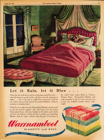
Archive - Advertisement, The Warrnambool Woollen Mill, 1945
Note from collector- "For more than 100 years blankets were made all over Australia in over 100 woollen mills. My aim, is to preserve 100 examples of these wonderful pieces of history. Ten years ago I started collecting the iconic Onkaparinga travel rugs, so that on movie nights at home there would be plenty to go around. Everyone had their favourite; even the cat had his own – a small red tartan one. Keeping an eye out for those travel rugs at op-shops and markets, collectable stores and bazaars, led to noticing vintage blankets. I'd never really thought about them before or paid much attention though of course I had grown up with them at my grandmother's. When I discovered my first Laconia cream blanket with blue stripes, my eyes just went gaga. Well that was it, I was hooked and since then over 500 blankets have passed through my hands. These common, everyday items, found in all households for so many decades, were traditional engagement gifts. Pairs were prized wedding presents turning into family heirlooms. They were fashionable dressers of beds, givers of warmth, bestowers of security and reliability. The comfort found in these objects resonates with almost all of us; we grew up with them ourselves or fondly recall them in a grandparent’s home. There is no modern replacement with the integrity of these old blankets, many of them now older than most of us. They are romantic, sensible, special, familiar, nostalgic and nothing else feels so appropriate in so many situations. No offense to the great Aussie doona, but from hippie to hipster, at a music festival, picnic, campsite or couch, a vintage blanket is something coveted by all. This industry that employed tens of thousands and must have been such a huge contributor to the economy is almost completely lost now. Blanket Fever is an ode to everything that came before: the land, the sheep, the shearers, the hands, the mills, the weavers, the designers, the distributors, the department stores. To the grandparents that gave them, the people that received them, the families that kept them; thank you. I’m passionate about my collection of Australian blankets manufactured in mostly Victoria, South Australia and Tasmania from the 1930s to the end of the 1960s. The collection has blankets from each of these four decades representing the styles and fashions of their time and includes dated advertisements which help determine the eras the blankets are from." Let it rain, let it blow... (lady in bed)Let it Rain, Let it Blow…/Warrnambool Blankets and Rugs/Warmer Wool from Warrnambool blanket, blanket fever, wool, warrnambool, advertisement, australian women's weekly -
 City of Ballarat Libraries
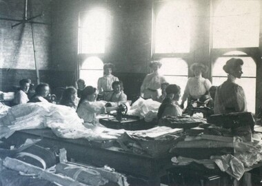
Photograph - Card Box Photographs, Sewing workshop, Tylers, Ballarat 1909
This photo shows seamstresses at their sewing machines at what could be, Tylers which is located on the first floor of the corner of Bridge and Grenville Streets. The lady in the foreground is 'Baby' Gingell who later became Mrs W. Wallis.tylers, sewing, business, commerical, fashion, ballarat, bridge street, grenville street, manufacturing, costume work -
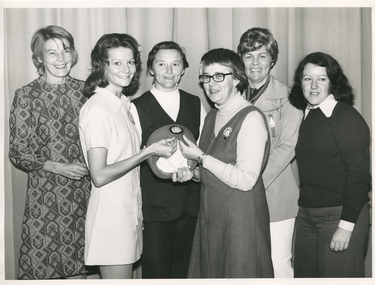 Royal District Nursing Service (now known as Bolton Clarke)
Photograph - Photograph, black and white, Barry Sutton, 24.04.1974
Sister Pat (Paddy) Rowley is the Principal Nurse Educator at Royal District Nursing Service (RDNS) and is standing with a group of RDNS staff in the Education Department at RDNS Headquarters, 452 St. Kilda Road, Melbourne. Sr. Rowley is wearing the RDNS winter uniform of a blue/grey skivvie under a blue/grey V neck tunic style dress made of herring bone winter material. She, and the lady in the white dress, are displaying the RDNS winter beret made of the same herringbone material as the RDNS winter dress.From its earliest years when the Trained nurses (Nurses) of Melbourne District Nursing Society (MDNS began to wear uniforms the chosen colour was grey, though the style changed throughout the years as fashions changed from the late 1800s through to the 1970s. Their Nurses firstly wore long grey frocks, and on their heads, a white cap with a long white tail hanging from the centre back. When bicycles were introduced the headgear changed to a white pith helmet adorned with a red Maltese cross in the centre front. This was held on with a veil going over the hat and tied under the chin. Over the years there were complaints that the veils became wet in the rain and they asked for a change of uniform, but this did not happen until 1921. Later the Trained nurses (Sisters) complained their skirts became wet when riding their bicycles in the rain and asked, when raining, to be able to wear breeches and gaiters. This was granted provided they wore aprons when attending patients. It was not long before the uniform changed to a shorter length grey frock, red cardigan, grey coat and grey brimmed hat; later changed to a peaked grey hat. In 1966 MDNS were granted Royal patronage. Now as Royal District Nursing Service (RDNS), the uniform was redesigned and colour changed in 1971. By 1972 the Sisters were wearing the new winter uniform of a blue/grey skivvie under a V neck tunic style frock made of blue/grey herringbone winter material with the RDNS insignia on the upper left, and a beret of the same material. In summer the uniform became a royal blue V neck tunic style frock, with the RDNS insignia on the upper left, worn over a short sleeve white blouse. A royal blue peaked hat with the RDNS insignia in the centre front was worn at first and then only worn on official occasions. This uniform was worn until changed to a corporate style in the mid 1980s,This black and white photograph depicts six Royal District Nursing Service (RDNS) staff standing in two rows in front of closed long grey curtains. They are looking at the camera and smiling, some are partly hidden. L- R back row - A lady who has short dark hair and is wearing a grey and black patterned frock. Next is a lady with her black hair drawn back; is wearing black pants and a black sleeveless V neck jacket over a white skivvie. The next lady has wavy short dark hair; is wearing white slacks, a light grey jacket with lapels and the pocket on its upper left has a vertical zip in the centre. She has a black and white striped scarf around her neck. Front row L-R - A lady with shoulder length black curled hair who is wearing a white uniform style dress and is turned toward the right of the photograph. Her right hand is on the top edge of an RDNS beret which is held on its edge with the inner white lining seen, and the upper section showing the deep front of the beret which has a central RDNS logo. To the right of this, is Sister Pat (Paddy) Rowley who has short dark straight hair; is wearing dark rimmed glasses and is wearing a light grey skivvie under a darker V neck tunic style dress. She is turned toward the left of the photograph and her right hand is holding the bottom edge of the RDNS beret and her left hand is on the top edge. The next lady, on the far right, has shoulder length black curly hair and is wearing dark grey slacks, and a black round neck jumper over a white blouse with the peaks and cuff seen.Barry Sutton MA 23 rdns, rdns education, royal district nursing service, rdns uniform, sister pat (paddy) rowley -
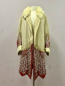 Kew Historical Society Inc
Clothing - Evening Coat, 1920–1930
The donor, whose parents owned an antique shop believed that the evening coat was owned by the family of Cr Morris Nathan and his wife Margaret Frances, nee MacKay. Maurice Nathan was born in Kew in 1914 and died in East Melbourne in 1982. He was a student of Trinity Grammar School, Kew. He was Lord Mayor, and his wife Lady Mayoress, of the City of Melbourne for two terms between 1961 and 1963. The age of the coat, created in a design typical of the 1920s would suggest that it is of an earlier vintage, almost certainly dating from the 1920s, but perhaps earlier. The opulence of the sequinned and beaded embroidery have led to the supposition that it may be an opera coat inherited from an earlier generation.Three quarter length, red and cream silk, padded evening coat highlighted on the cuffs and hem with iridescent sequins, beading and pearls of different shapes and sizes. These decorative features are arranged in a formal design, particularly at centre back. Above the beaded sections are sunbursts outlined in gold beads.Trimmed rabbit fur at collar and cuffs. The sleeves are shaped above the embroidered sections while the hem features a zig-zag profile. MEASUREMENTS - Neck to hem front 93cm; Neck to hem back 100cm; Circumference 126cm; Shoulder to cuff 72cm; Shoulder width 36cm.Traditionally, pre acquisition, stored in brown suitcase embossed in gilt with the name R. NATHANevening jackets, opera coats, fashion -- 1920s -
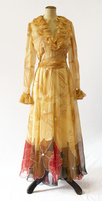 Brighton Historical Society
Dress, Evening dress, 1970s
This item is part of the Di Reidie collection. Diane Reidie was a much loved volunteer and President of Brighton Historical Society from 1999 until 2016. Originally from New Zealand, Di and her family lived in Male Street, Brighton for many years. A vibrant and energetic person with a zest for life and a gift for bringing people together, Di was a friend to many in the Bayside community and active in local community organisations. Her tireless work as President of BHS saw her named Bayside Citizen of the Year in 2008. As a seller and collector of vintage clothing, she was passionate about fashion history; one of her many enduring contributions to BHS was her extensive work in preserving, developing and promoting the Society's costume collection. In 2018-19, Di donated more than one hundred items from her personal vintage clothing collection to the Society. The collection, which includes clothing, hats, handbags and shoes from local and international designers, is representative of Di's wide-ranging interests, colourful personality, creativity, humour and love of fashion and travel. Di purchased this dress as a vintage item. Elvie Hill (1917-2018) was a Melbourne fashion designer and a longtime Brighton resident. She established her eponymous label and became well-known for her elegant and feminine designs. She dressed some of Australia's best known women, including Lady Sonia McMahon and Dame Pattie Menzies, and was also known for her boutiques in Melbourne (the last store closed in 1991). She retired in 1999, aged 80.Long-sleeved silk chiffon evening dress with yellow/gold floral print and brown, red and black border at hem. Ruffled neckline and cuffs. Snap fastenings at cuffs and zip at back. Matching silk chiffon sash.Label, inside collar, black on white: "ELVIE HILL / OF MELBOURNE" Label inside seam: "SIZE 10 / TO FIT / Bust 80cm"di reidie, vintage clothing, melbourne designers, elvie hill, 1970s -
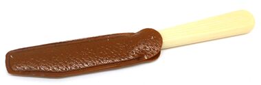 Wodonga & District Historical Society Inc
Domestic object - Lady's Fruit Knife
This item is from a collection donated by descendants of John Francis Turner of Wodonga. Mr. Turner was born on 6 June 1885. He completed all of his schooling at Scotts Boarding School in Albury, New South Wales. On leaving school, he was employed at Dalgety’s, Albury as an auctioneer. In 1924 John was promoted to Manager of the Wodonga Branch of Dalgety’s. On 15/03/1900 he married Beatrice Neal (born 7/12/1887 and died 7/2/1953) from Collingwood, Victoria. They had 4 daughters – Francis (Nancy), Heather, Jessie and Mary. In 1920, the family moved from Albury to Wodonga, purchasing their family home “Locherbie” at 169 High Street, Wodonga. "Locherbie" still stands in Wodonga in 2022. The collection contains items used by the Turner family during their life in Wodonga. This "lady’s" fruit knife was used up to the late 1900's by influential and "well off" ladies, not only as a fashion statement but as a practical tool when away from the kitchen/home to peel fruit and provide a cutting instrument for small items. The first true stainless steel was melted on August 13,1913. However, it did not produce blades that held an edge nor could edges be put onto blades easily so its inventor, Harry Brealey soon earned the reputation of being the inventor of the "knife that would not cut". Over the following decade further developments to the composition of stainless steel led to its wide use in the manufacture of cutlery.A small fruit knife with stainless steel blade. It has an ivory handle and a leather cover for the blade.On blade: Stainless Steel"cutlery, stainless steel, lady's fruit knife -
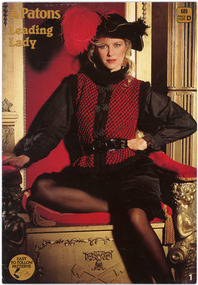 National Wool Museum
Book - Pattern Book, Patons Knitting Book, No.689, Patons and Baldwins, 1980s
Twenty four page knitting pattern book featuring black and white text and colour images. The colour cover features a woman wearing a black and red knitted top and a black hat with a large red feather.front: [printed] Patons / Leading / Lady / 689 / PRICE / CODE / D / EASY / TO FOLLOW / PATTERNS / 1fashion, design, knitwear, home made, wool, pattern book, patons -
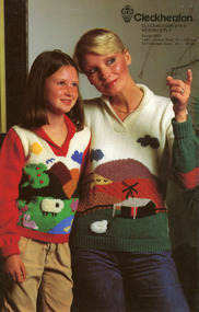 National Wool Museum
Booklet - Pattern Booklet, Cleckheaton Design 0053, Cleckheaton, 1980s
Four page fold out knitting pattern booklet featuring a colour image on the cover of a woman and a girl wearing knitted jumpers with farm motifs.front: [printed] Cleckheaton / CLECKHEATON 8 PLY / MERINO 8 PLY / Design 0053 / Lady's Jumper Sizes: 71 - 102 cm / Girl's Jumper Sizes: 61 - 68 cmknitting, pattern, fashion, knitwear, cleckheaton -
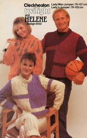 National Wool Museum
Booklet - Pattern Booklet, Cleckheaton Design 0153, Cleckheaton, 1990s
Six page fold out knitting pattern booklet featuring a colour image on the cover of two women and a man wearing knitted jumpers. One of the women is seated, one woman holds a pair of shoes and the man in holding a basketball.front: [printed] Cleckheaton / twilight / and / HELENE / Design 0153 / Lady/Man Jumper: 76 - 107 cm / Lady's Jumper: 76 - 102 cmknitting, pattern, fashion, knitwear, cleckheaton -
 Bendigo Historical Society Inc.
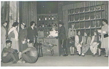
Photograph - GERTRUDE PERRY COLLECTION: PHOTOGRAPHS THEATRICAL, 1961
Photographs. Gertrude Perry Collection, Seventeen black and white photographs of performers of Oklahoma (12) and Lady Jane (5) including Gertrude Perry, Alf Annison, Wendy Griffith, Annette Wilson, Brian B ?, and Harry Br? & Ruth B? Photographs in a cream envelope with No 271 in the top left corner and addressed to Miss G Perry C/- Fashion House. Oklahoma.entertainment, theatre, gertrude perry collection, alf annison, wendy griffith, annete wilson, brian b ?, harry b ?, ruth b ? -
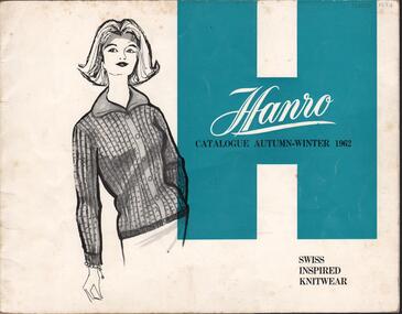 Bendigo Historical Society Inc.
Magazine - HANRO COLLECTION: HANRO AUTUMN WINTER CATALOGUE 1962, 1962
The Hanro company was established in Switzerland in 1884. In 1926 a site in Hargreaves Street Bendigo, behind the School of Mines, was purchased to establish the Bendigo Knitting Mills, a subsidiary of Hanro. The managing director was Charles Handerchin who came from Switzerland. The company was delisted from the Australian Stock Exchange in 1963 when it was taken over by John Brown Industries.Hanro Autumn-Winter Catalogue 1962: The cover is of card with a white background with a large H in blue to the right. Sketched in black pen is a lady with a cardigan buttoned up with six buttons, long sleeves and a collar. To the right in white is *Hanro* under that in black print is *Catalogue Autumn-Winter 1962 Swiss Inspired Knitwear* Inside the cover is advertising. Attached with cello tape is a green sheet of paper with a sketch of a lady wearing a sweater with long sleeves and collar and bow. To the right is a medal, circular in shape with *Fashion Award Australian wool bureau* under that is Hanro, Gold Medal Winner 1962 Wool Fashion Awards*, a description of the garment, size and colour. Look better in a Hanro Sweater!* The catalogue is on gloss paper with sketched so ladies modelling Pullovers, cardigans, twin sets and jackets. Each item has its garment number description, sizes and colour. The back page is white with a large H to the left with *Hanro* in white and (Aust) Knitting Mills Limited* to the right is a box with a black border with the Sales offices addresses and phone numbers. At the bottom is *The Quality Is A Proud Tradition*.book, magazine, catalogue, hanro. catalogue. -
 Bendigo Historical Society Inc.
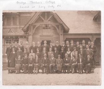
Photograph - LA TROBE UNIVERSITY BENDIGO COLLECTION: BENDIGO TEACHERS' COLLEGE PHOTOGRAPH
A black and white photograph of staff and students at Bendigo Teachers' College located at Long Gully Primary School. Names unknown. 1926. The formal clothing of the day is evident here. The men all wear suits with white collar and tie. Many wear a waistcoat. The women all wear frocks or skirts with stockings. One lady wears a hat. Long Gully Primary School is in the background. See 3320.100bendigo, education, bendigo teachers' college, la trobe university bendigo collection, collection, bendigo, education, long gully primary school, state schools, primary schools, bendigo teachers' college, students, tertiary education, teacher training, photo, photograph, photographs, photography, clothing, attire, fashion, costume, miss j.c. burnett, mr. geoff. pryor -
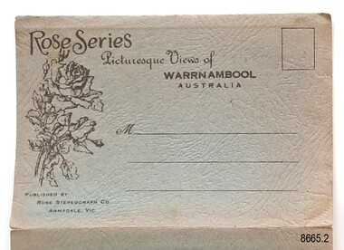
 Flagstaff Hill Maritime Museum and Village
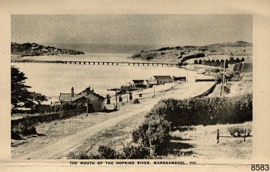
Postcard - Postcard Folder - scenes, George Rose, Rose Stereographic Company, Rose Series Picturesque Views of Warrnambool Australia [Warrnambool], 1880-1942
This postcard folder contains lithographs of photographs taken locally by Georg Rose between 1880 and 1942. He reproduced them at his company's premises, the Rose Stereographic Company at Armadale, Victoria. The postcard folder was purchased as a Warrnambool souvenir by the donor's parents around 1945 to 1950. Interestingly, the city on the cover is printed as "Warrambool", which is a location in New South Wales, but the postcards within all have the locations and text of Warrnambool. The photographs include the 'new' concrete bridge, built in 1922 to replace the original bridge, built in 1872. The boathouses belonging to Proudfoots and to Flett/Fanny Nelson are also pictured on the Hopkins River mouth. The twelve photographs included locations connected to other items in our Collection. The photographs are titled: - b. The Avenue and War Memorial. Warrnambool. Vic. c. The Blow-hole. Thunder Point. Warrnambool. Vic. d. Botanical Gardens. Warrnambool. Vic. e. Eagle Rock. Warrnambool. Vic. f. The New Concrete Bridge and Breakwater. Warrnambool. Vic. g. Liebig Street. Warrnambool. Vic. h. Looking to Thunder Point. Warrnambool. Vic. i. The Beach. Warrnambool. Vic. j. Hopkins Falls. Warrnambool. Vic. k. Shelly Beach. Warrnambool. Vic. l. The Mouth of the Hopkins River. Warrnambool. Vic. m. Panorama of Warrnambool. Vic. [Kepler Street towards Presbyterian Church on Spence St] George Rose, 1861-1942: - famous for his Late 19th and early 20th century photography. He was born in Clunes, Victoria, and was in his 20th year when he founded Rose Stereograph Company in 1880. He took the opportunity of a popular trend of the times to produce stereographs, pairs of almost duplicate photographs which appeared to be in 3D when viewed in a handheld stereo viewer. By the 1920s these lost their popularity, so he used his photographic skills to produce cards and postcards of scenes and people. The photographs in this postcard folder were taken between 1880 and 1942 by the renowned Victorian photographer George Rose. The locations match photographs and postcards in our collection that were taken at different times. A comparison between them shows the changes over time in the land and bay, the buildings and other structures, transportation and even the fashions of the times, building the story of our local history.This copy of a postcard folder has a blue-grey textured rectangular card cover with a sketch of a rose on the front along with the name of the postcard series. the location of the series' focus, the producer's details and lines for adding an address. The folded cover contains a long, concertinaed page with six titled photographs on each side, totalling twelve in all. Interestingly, the cover has the location name of "Warrambool", a place in NSW, instead of Warrnambool, the location of all of the photographs inside. The folder contains scenes from Warrnambool and nearby popular areas including Lady Bay, Port of Warrnambool, Warrnambool Breakwater, Viaduct, Merri River Footbridge, the Hopkins River Mouth, with Proudfoot’s and the Fanny Nelson/Flett boathouses. The cover has a sketch of a rose and inscriptions. The photographs for the lithographs were taken prior between 1880 and 1942 by well-known Victorian photographer, George Rose, Rose Stereograph Company of Armadale, Victoria.Image: [Rose with rosebud and leaves] Printed: "Rose Series / Picturesque Views of / WARRAMBOOL / AUSTRALIA" [correct spelling is WARRNAMBOOL] "PUBLISHED BY / ROSE STEREOGRAPH CO / ARMADALE. VIC." Printed lines (3) for an address. Printed rectangle [ ] for attaching a stamp.flagstaff hill maritime museum and village, great ocean road, shipwreck coast, warrnambool, flagstaff hill, flagstaff hill maritime museum, flagstaff hill maritime village, warramble, postcard, postcard folder, warrnambool scenes, picturesque views of warrnambool, picturesque views of warramble, lady bay, port of warrnambool, breakwater, warrnambool breakwater, viaduct, merri river footbridge, merri river suspension bridge, suspension footbridge, merri river mouth, hopkins river mouth, proudfoot's, fanny nelson, nelson's boatsheds, nelson's boathouse, boathouse, hopkins river boathouses, flett's boathouse, flett, george rose, image of a rose, rose series, rose stereograph co, rose stereographic company, lighograph, armadale victoria, lady bay beach, beach scene, lower light, concrete footbridge, 1922 footbridge, viaduct road, rose postcard, new concrete bridge, 1945, 1890, 1922, small footbridge, 1872 footbridge, 1872, merri river estuary, stingray bay, postcards -
 Flagstaff Hill Maritime Museum and Village
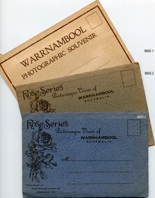
Postcard - Postcard Folder set, George Rose, Rose Stereographic Company, 1880-1942
Each postcard folder in this set has no address, message or postage stamp. Postcard folders such as these were popular as holiday souvenirs in the early to mid-20th century and were kept in good condition by collectors. The size is convenient for posting to friends and relatives and packing as holiday luggage. Postcards in the early-to-mid-19th century were an inexpensive way to remember and share holiday scenes, as few people could afford a camera and the price of developing the photographs. The images on these postcards were produced from black and white lithographs of photographs taken at Warrnambool and the surrounding district during the early to mid-20th century. Publishing firms such as Melbourne-based Valentine and Rose purchased photographs from local photographers and reproduced them for sale. This set of postcard folders shows that more than one publishing company had access to the same or almost the same images. The photographs include street scapes, the Warrnambool Breakwater and Pier, Botanical Gardens, beach scenes, cliff formations, the Hopkins River, municipal buildings, the Post Office and the Soldiers’ Memorial. The postcard folders in this set of three are significant as a record of local history from the late 19th century to the mid-20th century. The locations of the images match photographs and postcards in our collection that were taken at different times and provide a historical record of the Warrnambool and southwest Victorian locations, growth and changes.. The images record changes in the coastline, land, bay, buildings and other structures, roads, transportation and even the fashions of the times. Set of three postcard folders containing black and white images of photographed scenes showcasing Warrnambool and district between 1880 and 1942. The images were produced from lithographs of the original photographs and are printed on both sides of long strips of white photographic paper that are Z-folded into covers of textured card. Some of the images are repeated in all three folders. Folder 8665.1 - the cream-coloured folder was produced by The Valentine Publishing Co. Pty. Ltd. Melbourne and contains 15 photographs, some of which are also in the blue and the green folders. Folders 8665.2, the green folder, and 8665.3, the blue folder, were published by Rose Stereograph Co, Armadale, Vic. Each contains the same twelve images, but they are presented in a different order. flagstaff hill maritime museum and village, great ocean road, shipwreck coast, warrnambool, flagstaff hill, flagstaff hill maritime museum, flagstaff hill maritime village, warramble, postcard, postcard folder, warrnambool scenes, picturesque views of warrnambool, picturesque views of warramble, lady bay, port of warrnambool, breakwater, warrnambool breakwater, viaduct, merri river footbridge, merri river suspension bridge, suspension footbridge, merri river mouth, hopkins river mouth, proudfoot's, fanny nelson, nelson's boatsheds, nelson's boathouse, boathouse, hopkins river boathouses, flett's boathouse, flett, george rose, image of a rose, rose series, rose stereograph co, rose stereographic company, lighograph, armadale victoria, lady bay beach, beach scene, lower light, concrete footbridge, 1922 footbridge, viaduct road, rose postcard, new concrete bridge, 1945, 1890, 1922, small footbridge, 1872 footbridge, 1872, merri river estuary, stingray bay, postcards, shipwrecked coast, maritime museum, souvenir, warrnambool local scenes, hopkins river, botanic gardens, soldiers’ memorial, pier, post office, municipal buildings, merri river, proudfoot’s, the cliffs at shelly beach, the road to sandy beach, tourism, photographs, visitors, travel, scenes, local history, mid-20th century, 1940s, 1950s, rose stereograph co armadale. vic, valentine publishing co. pty. ltd melbourne, valentine publishing co. pty. ltd sydney -
 Flagstaff Hill Maritime Museum and Village
Postcard - Postcard Folder, scenes, George Rose, Rose Stereographic Company, Rose Series, Picturesque Views of Warrnambool Australia, 1880-1942
GEORGE ROSE 1861-1942: - George Rose was a well-known Victorian photographer, famous for his late 19th and early 20th century photography. He was born in Clunes, Victoria, and was in his 20th year when he founded Rose Stereograph Company in 1880. He took the opportunity of a popular trend of the times to produce stereographs, pairs of almost duplicate photographs that appeared in 3D when viewed in a handheld stereo viewer. By the 1920s, these lost their popularity, so he used his photographic skills to produce cards and postcards of scenes and people. The twelve photographs in the Rose postcard folders include locations connected to other items in our Collection, including the Valentine postcard folder in this set. The photographs are titled: - . The Avenue and War Memorial. Warrnambool. Vic. . The Blow-hole. Thunder Point. Warrnambool. Vic. . Botanical Gardens. Warrnambool. Vic. . Eagle Rock. Warrnambool. Vic. . The New Concrete Bridge and Breakwater. Warrnambool. Vic. . Liebig Street. Warrnambool. Vic. . Looking to Thunder Point. Warrnambool. Vic. . The Beach. Warrnambool. Vic. . Hopkins Falls. Warrnambool. Vic. . Shelly Beach. Warrnambool. Vic. . The Mouth of the Hopkins River. Warrnambool. Vic. . Panorama of Warrnambool, Vic. [Kepler Street towards Presbyterian Church on Spence St] This postcard folder shows scenes and places of interest in and around Warrnambool. The George Rose postcard folders in this set were produced in Victoria and include pictures taken by the renowned photographer between 1880 and 1942. Other postcards in our collection have photographs of the same or similar locations at different periods in time. Each postcard records a moment in history and is significant as a way to compare and show the changes in the local environment and community, building a story of the local history. The images record changes in the coastline, land, bay, buildings and other structures, roads, transportation and even the fashions of the times. This copy folder is one of a set of three. This folder has a green-grey textured rectangular card cover with a sketch of a rose on the front. The cover also contains the name of the postcard series, the location of the series' focus, the producer's details, and lines for adding an address. The folded cover contains a long, concertinaed page with six titled photographs on each side, totalling twelve. The folder contains scenes from Warrnambool and nearby popular areas, including Lady Bay, the Port of Warrnambool, the Warrnambool Breakwater, the Viaduct, the Merri River Footbridge, the Hopkins River Mouth, and Proudfoot’s and the Fanny Nelson/Flett boathouses. The cover has a sketch of a rose and inscriptions. The lithograph photographs were taken between 1880 and 1942 by well-known Victorian photographer George Rose, Rose Stereograph Company of Armadale, Victoria.Image: [Rose with rosebud and leaves] Printed: "Rose Series / Picturesque Views of / WARRNAMBOOL / AUSTRALIA" "PUBLISHED BY / ROSE STEREOGRAPH CO / ARMADALE. VIC."flagstaff hill maritime museum and village, great ocean road, shipwreck coast, warrnambool, flagstaff hill, flagstaff hill maritime museum, flagstaff hill maritime village, warramble, postcard, postcard folder, warrnambool scenes, picturesque views of warrnambool, lady bay, port of warrnambool, breakwater, warrnambool breakwater, viaduct, merri river footbridge, merri river suspension bridge, suspension footbridge, merri river mouth, hopkins river mouth, proudfoot's, fanny nelson, nelson's boatsheds, nelson's boathouse, boathouse, hopkins river boathouses, flett's boathouse, flett, george rose, image of a rose, rose series, rose stereograph co, rose stereographic company, lighograph, armadale victoria, lady bay beach, beach scene, lower light, concrete footbridge, 1922 footbridge, viaduct road, rose postcard, new concrete bridge, 1945, 1890, 1922, small footbridge, 1872 footbridge, 1872, merri river estuary, stingray bay, postcards, green-grey postcard folder, shipwrecked coast, maritime museum, souvenir, warrnambool local scenes, photography, local history, tourism, photographs, visitors, travel, scenes, mid-20th century, 1940s, 1950s, concertina fold, z-fold, 1880s, collection, correspondence, rose stereograph co armadale, victorian photographer, soldiers’ memorial, hopkins river, the cliffs at shelly beach, the road to sandy beach, pier, botanic gardens, post office, municipal buildings, merri river, proudfoot’s -
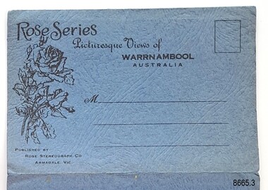 Flagstaff Hill Maritime Museum and Village
Postcard - Postcard Folder, scenes, George Rose, Rose Stereographic Company, Rose Series Picturesque Views of Warrnambool Australia, 1880-1942
GEORGE ROSE 1861-1942: - George Rose was a well-known Victorian photographer, famous for his late 19th and early 20th century photography. He was born in Clunes, Victoria, and was in his 20th year when he founded Rose Stereograph Company in 1880. He took the opportunity of a popular trend of the times to produce stereographs, pairs of almost duplicate photographs that appeared in 3D when viewed in a handheld stereo viewer. By the 1920s, these lost their popularity, so he used his photographic skills to produce cards and postcards of scenes and people. The twelve photographs in the Rose postcard folders include locations connected to other items in our Collection, including the Valentine postcard folder in this set. The photographs are titled: - . The Avenue and War Memorial. Warrnambool. Vic. . The Blow-hole. Thunder Point. Warrnambool. Vic. . Botanical Gardens. Warrnambool. Vic. . Eagle Rock. Warrnambool. Vic. . The New Concrete Bridge and Breakwater. Warrnambool. Vic. . Liebig Street. Warrnambool. Vic. . Looking to Thunder Point. Warrnambool. Vic. . The Beach. Warrnambool. Vic. . Hopkins Falls. Warrnambool. Vic. . Shelly Beach. Warrnambool. Vic. . The Mouth of the Hopkins River. Warrnambool. Vic. . Panorama of Warrnambool, Vic. [Kepler Street towards Presbyterian Church on Spence St] The photographs in this postcard folder were taken between 1880 and 1942 by the renowned Victorian photographer George Rose. The locations match photographs and postcards in our collection that were taken at different times. A comparison between them shows the changes over time in the land and bay, the buildings and other structures, transportation and even the fashions of the times, building the story of our local history.Postcard folder, Rose Series, blue cover. One of a set of three containing images of Warrnambool and district before 1942. Green folder, textured cardboard folder containing a Z-folded strip of white matte photographic paper with six black and white photographs on each side. Titles are printed below the images. The folder is secured by placing two tabs into two slots on the back cover to hold the cover in place and create an envelope shape. Three horizontal lines are printed on the front for the receiver’s address. There is a logo of a long-stemmed rose on the left side and inscriptions on the front cover. The lithograph photographs were taken between 1880 and 1942 by well-known Victorian photographer George Rose and published by Rose Stereograph Company of Armadale, Victoria. The folder contains scenes of popular areas at Warrnambool and nearby locations including Lady Bay, the Port of Warrnambool, the Warrnambool Breakwater, the Viaduct, the Merri River Footbridge, the Hopkins River Mouth, and Proudfoot’s and the Fanny Nelson/Flett boathouses. Image: [Rose with rosebud and leaves] Printed: "Rose Series / Picturesque Views of / WARRNAMBOOL / AUSTRALIA" "PUBLISHED BY / ROSE STEREOGRAPH CO / ARMADALE. VIC." flagstaff hill maritime museum and village, great ocean road, shipwreck coast, warrnambool, flagstaff hill, flagstaff hill maritime museum, flagstaff hill maritime village, warramble, postcard, postcard folder, warrnambool scenes, picturesque views of warrnambool, picturesque views of warramble, lady bay, port of warrnambool, breakwater, warrnambool breakwater, viaduct, merri river footbridge, merri river suspension bridge, suspension footbridge, merri river mouth, hopkins river mouth, proudfoot's, fanny nelson, nelson's boatsheds, nelson's boathouse, boathouse, hopkins river boathouses, flett's boathouse, flett, george rose, image of a rose, rose series, rose stereograph co, rose stereographic company, lighograph, armadale victoria, lady bay beach, beach scene, lower light, concrete footbridge, 1922 footbridge, viaduct road, rose postcard, new concrete bridge, 1945, 1890, 1922, small footbridge, 1872 footbridge, 1872, merri river estuary, stingray bay, postcards -
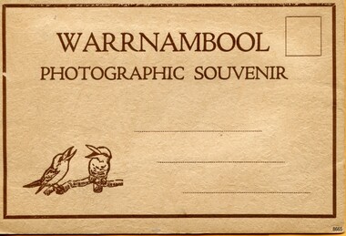 Flagstaff Hill Maritime Museum and Village
Postcard - Postcard Folder, scenes, Valentine & Sons Co. Publishing Ltd, Warrnambool Photographic Souvenir, Early-to-mod 20th century
This postcard folder is one of three in a set of postcards that were published in Victoria, Australia, and collected together. The Valentine Publishing Co. Pty. Ltd. produced this folder. Valentine and Sons was a printing and photography business based in Dundee, Scotland, and in Canada. In the early 1900s, at the height of the postcard craze, the firm published large numbers of postcards in the U.K., Canada, U.S., Australia and South Africa. From around 1900 or earlier, the firm bought many lithographic images for its postcards from local and national photographers who sold publishing rights to Valentines, and the business was famous for publishing photographs of popular sites worldwide. Postcard titles in this folder include many of those in the Rose postcard folders plus the following titles that are not duplicated. . Municipal Buildings and Post Office . Soldiers’ Memorial . Hopkins River . The Cliffs at Shelly Beach . The Road to Sandy Beach . The Breakwater and Pier This Valentine postcard folder was produced in Australia. It includes pictures from the early-to-mid 20th century. It is one of three in a set, with images of the same locations as other images in our collection but at different periods in time. Each postcard records a moment in history and is significant as a way to compare and show the changes in the local environment and community, building a story of the local history. The images record changes in the coastline, land, bay, buildings and other structures, roads, transportation and even the fashions of the times.Postcard folder, Valentine Publishing, cream cover. One of a set of three displaying images of Warrnambool and district around the mid-20th century. Print on the front and back covers is in brown ink. The front has an image of two laughing kookaburras on a branch, three address lines and an outline for a postage stamp. The back cover has the publisher’s details and a line for a return address. The cover opens like a book, and then the double-sided, Z-folded page of photographs drops downward. Titles are printed below each of the fifteen black and white photographs inside. The folder is secured on the back cover by placing a tab into a slot. The folder was produced by The Valentine Publishing Co. Pty. Ltd. Melbourne“WARRNAMBOOL / PHOTOGRAPHIC SOUVENIR” Symbol: [Two facing kookaburras standing on a branch with beaks open] “Published by The Valentine Publishing Co. Pty. Ltd. Melbourne” flagstaff hill maritime museum and village, great ocean road, shipwreck coast, warrnambool, flagstaff hill, flagstaff hill maritime museum, flagstaff hill maritime village, warramble, postcard, postcard folder, warrnambool scenes, picturesque views of warrnambool, picturesque views of warramble, lady bay, port of warrnambool, breakwater, warrnambool breakwater, viaduct, merri river footbridge, merri river suspension bridge, suspension footbridge, merri river mouth, hopkins river mouth, proudfoot's, fanny nelson, nelson's boatsheds, nelson's boathouse, boathouse, hopkins river boathouses, flett's boathouse, flett, george rose, image of a rose, rose series, rose stereograph co, rose stereographic company, lighograph, armadale victoria, lady bay beach, beach scene, lower light, concrete footbridge, 1922 footbridge, viaduct road, rose postcard, new concrete bridge, 1945, 1890, 1922, small footbridge, 1872 footbridge, 1872, merri river estuary, stingray bay, postcards, concertina fold, z fold, shipwrecked coast, maritime museum, souvenir, warrnambool local scenes, photography, local history, tourism, photographs, visitors, travel, scenes, mid-20th century, 1940s, 1950s, z-fold, 1880s, collection, correspondence, valentine publishing co. pty. ltd melbourne, valentine publishing co. pty. ltd sydney, municipal buildings and post office, soldiers’ memorial, hopkins river, the cliffs at shelly beach, the road to sandy beach, the breakwater and pier -
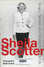 Narre Warren and District Family History Group
Book, Sheila Scotter, Sheila Scotter : snaps, secrets and stories from my life, 1998
There is no other store like David Jones... and there is no other consultant like Sheila Scotter! Known variously as the Kangaroo editor (by Diana Vreeland), the black and white lady from Albert Park, and the Silver Duchess, this is the autobiography, scrapbook-style, of one of Australia's doyennes of style. For Sheila Scotter's seventeenth birthday her parents put on a 'coming out ball' in the United Services Club in Calcutta, where they lived at the time. The teenager wore a pale turquoise silk taffeta ball gown. Sheila no longer remembers what happened to that dress, but she does know that it is responsible for the black-and-white wardrobe that has been her hallmark ever since, with the exception of one occasion and one occasion only. For her seventieth birthday party, close friend John Truscott conned her into wearing red, insisting that the theme for the event was all red. And what did the guests all wear? Black and white! This anecdote lite, stylish, idiosyncratic is typical of the many that make up Sheila Scotter's autobiographical assortment. Most Australian women know Sheila Scotter through her Women's Weekly column 'Sheila Scotter Suggests' which ran between 1975 and 1980 and totalled some 235 instalments. The fact that this column is still vividly remembered 17 years later attests to the sacred place it held in every Australian household. A feminist before the word was invented, Sheila has had a formidable career. Two chapters are devoted to her career in fashion, including her time as the editor-in-chief of Vogue and founding editor of Vogue Living. The art of fundraising is also treated in some depth. In snippets, we hear of her love of cricket (which she once played); we find out how she came to live in Australia in the first place and why she has made Melbourne her home. Not surprisingly, the book reflects the personal contradictoriness of its author/subject on the one hand an aristocrat, on the other a rogue who does not respect rank; blithely mixing innate feminism with blatant coquettishness; outrageous yet scrupulously stylish; in the know yet discrete; courting notoriety while at the same time needing solitude a Like all celebrity autobiographers Sheila reserves her right to privacy while basking in the limelight. But she has used this book to set the record straight on a number of issues, including why she left Vogue, her many romantic involvements, her much-publicised spat with socialite Lillian Frank, and what was wrong with David Jones, to whom she consulted during 1994-95. The book contains the expected wining, dining and partying, as well as the inside story on some recent scandals. Sheila Scotter is glamorous and alluring, a forthright mover and shaker who inspires fear in some, awe and respect in others, and admiration and loyalty in most. No matter what you think of her, you simply cannot ignore her. Friends and enemies alike are awaiting this book with bated breath for one reason: when Sheila Scotter speaks, people listen. Contents Foreword (by Ruth Cracknell, a personal friend) Before I Begin a (explaining the rationale for the book) 1 Thursday's Child (birthdays) 2 Christmases to Remember 3 In Fashion (career in fashion) 4 A Matter of Style (Vogue Living and its influence) 5 Marriage and Other Liaisons 6 A Mixed Salad of Letters (letters, personal and business, from prominent people) 7 Fundraising: Are Committees Really Necessary? 8 Loved Ones Departed (or Why I Envy the Angels) 9 Disappointments and Other Disasters (scandals and inside stories) 10 London, Paris, Sydney, Melbourne (the places she has lived) 11 Not the Last Instalment (a look ahead) Postscript (a tribute to some special men read between the lines) Source: Publisher253 p.; 25 cmnon-fictionThere is no other store like David Jones... and there is no other consultant like Sheila Scotter! Known variously as the Kangaroo editor (by Diana Vreeland), the black and white lady from Albert Park, and the Silver Duchess, this is the autobiography, scrapbook-style, of one of Australia's doyennes of style. For Sheila Scotter's seventeenth birthday her parents put on a 'coming out ball' in the United Services Club in Calcutta, where they lived at the time. The teenager wore a pale turquoise silk taffeta ball gown. Sheila no longer remembers what happened to that dress, but she does know that it is responsible for the black-and-white wardrobe that has been her hallmark ever since, with the exception of one occasion and one occasion only. For her seventieth birthday party, close friend John Truscott conned her into wearing red, insisting that the theme for the event was all red. And what did the guests all wear? Black and white! This anecdote lite, stylish, idiosyncratic is typical of the many that make up Sheila Scotter's autobiographical assortment. Most Australian women know Sheila Scotter through her Women's Weekly column 'Sheila Scotter Suggests' which ran between 1975 and 1980 and totalled some 235 instalments. The fact that this column is still vividly remembered 17 years later attests to the sacred place it held in every Australian household. A feminist before the word was invented, Sheila has had a formidable career. Two chapters are devoted to her career in fashion, including her time as the editor-in-chief of Vogue and founding editor of Vogue Living. The art of fundraising is also treated in some depth. In snippets, we hear of her love of cricket (which she once played); we find out how she came to live in Australia in the first place and why she has made Melbourne her home. Not surprisingly, the book reflects the personal contradictoriness of its author/subject on the one hand an aristocrat, on the other a rogue who does not respect rank; blithely mixing innate feminism with blatant coquettishness; outrageous yet scrupulously stylish; in the know yet discrete; courting notoriety while at the same time needing solitude a Like all celebrity autobiographers Sheila reserves her right to privacy while basking in the limelight. But she has used this book to set the record straight on a number of issues, including why she left Vogue, her many romantic involvements, her much-publicised spat with socialite Lillian Frank, and what was wrong with David Jones, to whom she consulted during 1994-95. The book contains the expected wining, dining and partying, as well as the inside story on some recent scandals. Sheila Scotter is glamorous and alluring, a forthright mover and shaker who inspires fear in some, awe and respect in others, and admiration and loyalty in most. No matter what you think of her, you simply cannot ignore her. Friends and enemies alike are awaiting this book with bated breath for one reason: when Sheila Scotter speaks, people listen. Contents Foreword (by Ruth Cracknell, a personal friend) Before I Begin a (explaining the rationale for the book) 1 Thursday's Child (birthdays) 2 Christmases to Remember 3 In Fashion (career in fashion) 4 A Matter of Style (Vogue Living and its influence) 5 Marriage and Other Liaisons 6 A Mixed Salad of Letters (letters, personal and business, from prominent people) 7 Fundraising: Are Committees Really Necessary? 8 Loved Ones Departed (or Why I Envy the Angels) 9 Disappointments and Other Disasters (scandals and inside stories) 10 London, Paris, Sydney, Melbourne (the places she has lived) 11 Not the Last Instalment (a look ahead) Postscript (a tribute to some special men read between the lines) Source: Publishersheila scotter, fashion