Showing 1487 items matching "ceramics/3d."
-
 Ararat Gallery TAMA
Functional object, Rice crackers, c. 1900s
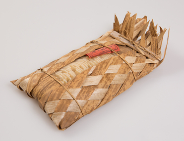
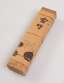
‘The Art of the Japanese Package’ was an exhibition that toured to 10 Australian and 11 New Zealand public galleries in 1979 and 1980. The touring exhibition comprised 221 objects of traditional Japanese packaging which extended from ceramics, wood and paper to woven fibre containers. At the conclusion of the tour, The Japan Foundation and the Crafts Board of the Australia Council donated the vast majority of the exhibition to the Ararat Gallery for its permanent collection. Combining the natural qualities of bamboo, paper and straw with delicate craftsmanship, these unique objects express Japanese aesthetics as applied through fibre crafts. In Japan, the qualities and traits of natural materials are exploited rather than hidden. The texture of straw, the septa of bamboo are not concealed but lovingly incorporated into the whole. In 1979 Hideyuki Oka, curator of ‘The Art of the Japanese Package’ wrote: “In no way self-conscious or assertive, these wrappings have an artless and obedient air that greatly moves the modern viewer. They are whispered evidence of the Japanese ability to create beauty from the simplest products of nature. They also teach us that wisdom and feeling are especially important in packaging because these qualities, or the lack of them, are almost immediately apparent. What is the use of a package if it shows no feeling?” The descriptions of the featured objects were written by Hideyuki Oka, curator of ‘The Art of the Japanese Package’, 1979.Gift of the Japan-Australia Foundation and the Crafts Board of the Australia Council, 1981This tropical-looking package for rice crackers is woven with strips of bamboo sheath - an interesting variation in the use of this ubiquitous material. It comes from the island of Kyushu, from the vicinity of the volcano Asozan in Kumamoto Prefecture. - Professor Hideyuki Oka, curator.japanese art, japanese packaging, tsutsumi, gift giving -
 Ararat Gallery TAMA
Functional object, Preserved shrimp, c. 1900s
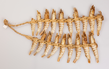
‘The Art of the Japanese Package’ was an exhibition that toured to 10 Australian and 11 New Zealand public galleries in 1979 and 1980. The touring exhibition comprised 221 objects of traditional Japanese packaging which extended from ceramics, wood and paper to woven fibre containers. At the conclusion of the tour, The Japan Foundation and the Crafts Board of the Australia Council donated the vast majority of the exhibition to the Ararat Gallery for its permanent collection. Combining the natural qualities of bamboo, paper and straw with delicate craftsmanship, these unique objects express Japanese aesthetics as applied through fibre crafts. In Japan, the qualities and traits of natural materials are exploited rather than hidden. The texture of straw, the septa of bamboo are not concealed but lovingly incorporated into the whole. In 1979 Hideyuki Oka, curator of ‘The Art of the Japanese Package’ wrote: “In no way self-conscious or assertive, these wrappings have an artless and obedient air that greatly moves the modern viewer. They are whispered evidence of the Japanese ability to create beauty from the simplest products of nature. They also teach us that wisdom and feeling are especially important in packaging because these qualities, or the lack of them, are almost immediately apparent. What is the use of a package if it shows no feeling?” The descriptions of the featured objects were written by Hideyuki Oka, curator of ‘The Art of the Japanese Package’, 1979.Gift of the Japan-Australia Foundation and the Crafts Board of the Australia Council, 1981Shrimp and fish were often preserved by drying them and stringing them together with straw. The age-old technique is also used for other foods, including fish, peppers, and giant white radishes known as daikon. The shrimp here are likely to be from Kagoshima, the southernmost prefecture of Kyushu. - Professor Hideyuki Oka, curator.japanese art, japanese packaging, tsutsumi, gift giving -
 Ararat Gallery TAMA
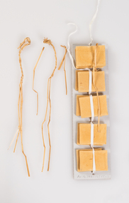
Functional object, Bean curd cakes, c. 1900s
‘The Art of the Japanese Package’ was an exhibition that toured to 10 Australian and 11 New Zealand public galleries in 1979 and 1980. The touring exhibition comprised 221 objects of traditional Japanese packaging which extended from ceramics, wood and paper to woven fibre containers. At the conclusion of the tour, The Japan Foundation and the Crafts Board of the Australia Council donated the vast majority of the exhibition to the Ararat Gallery for its permanent collection. Combining the natural qualities of bamboo, paper and straw with delicate craftsmanship, these unique objects express Japanese aesthetics as applied through fibre crafts. In Japan, the qualities and traits of natural materials are exploited rather than hidden. The texture of straw, the septa of bamboo are not concealed but lovingly incorporated into the whole. In 1979 Hideyuki Oka, curator of ‘The Art of the Japanese Package’ wrote: “In no way self-conscious or assertive, these wrappings have an artless and obedient air that greatly moves the modern viewer. They are whispered evidence of the Japanese ability to create beauty from the simplest products of nature. They also teach us that wisdom and feeling are especially important in packaging because these qualities, or the lack of them, are almost immediately apparent. What is the use of a package if it shows no feeling?” The descriptions of the featured objects were written by Hideyuki Oka, curator of ‘The Art of the Japanese Package’, 1979.Gift of the Japan-Australia Foundation and the Crafts Board of the Australia Council, 1981japanese art, japanese packaging, tsutsumi, gift giving -
 Ararat Gallery TAMA
Functional object, Candied papaya, c. 1900s
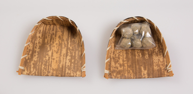
‘The Art of the Japanese Package’ was an exhibition that toured to 10 Australian and 11 New Zealand public galleries in 1979 and 1980. The touring exhibition comprised 221 objects of traditional Japanese packaging which extended from ceramics, wood and paper to woven fibre containers. At the conclusion of the tour, The Japan Foundation and the Crafts Board of the Australia Council donated the vast majority of the exhibition to the Ararat Gallery for its permanent collection. Combining the natural qualities of bamboo, paper and straw with delicate craftsmanship, these unique objects express Japanese aesthetics as applied through fibre crafts. In Japan, the qualities and traits of natural materials are exploited rather than hidden. The texture of straw, the septa of bamboo are not concealed but lovingly incorporated into the whole. In 1979 Hideyuki Oka, curator of ‘The Art of the Japanese Package’ wrote: “In no way self-conscious or assertive, these wrappings have an artless and obedient air that greatly moves the modern viewer. They are whispered evidence of the Japanese ability to create beauty from the simplest products of nature. They also teach us that wisdom and feeling are especially important in packaging because these qualities, or the lack of them, are almost immediately apparent. What is the use of a package if it shows no feeling?” The descriptions of the featured objects were written by Hideyuki Oka, curator of ‘The Art of the Japanese Package’, 1979.Gift of the Japan-Australia Foundation and the Crafts Board of the Australia Council, 1981Here candied papaya from the tropical island of Okinawa is wrapped in a betel-palm leaf to create a simple but strikingly effective package. Like many of the other packages shown in this book, this one has a distinctly regional flavour and, for mainland Japanese, an exotic flavour as well. - Professor Hideyuki Oka, curator.japanese art, japanese packaging, tsutsumi, gift giving -
 Ararat Gallery TAMA
Functional object, Dried salted fish, c. 1900s
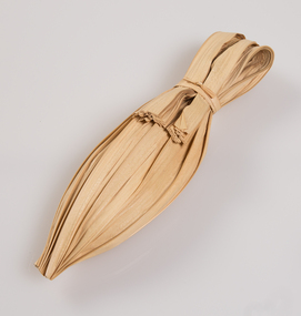
‘The Art of the Japanese Package’ was an exhibition that toured to 10 Australian and 11 New Zealand public galleries in 1979 and 1980. The touring exhibition comprised 221 objects of traditional Japanese packaging which extended from ceramics, wood and paper to woven fibre containers. At the conclusion of the tour, The Japan Foundation and the Crafts Board of the Australia Council donated the vast majority of the exhibition to the Ararat Gallery for its permanent collection. Combining the natural qualities of bamboo, paper and straw with delicate craftsmanship, these unique objects express Japanese aesthetics as applied through fibre crafts. In Japan, the qualities and traits of natural materials are exploited rather than hidden. The texture of straw, the septa of bamboo are not concealed but lovingly incorporated into the whole. In 1979 Hideyuki Oka, curator of ‘The Art of the Japanese Package’ wrote: “In no way self-conscious or assertive, these wrappings have an artless and obedient air that greatly moves the modern viewer. They are whispered evidence of the Japanese ability to create beauty from the simplest products of nature. They also teach us that wisdom and feeling are especially important in packaging because these qualities, or the lack of them, are almost immediately apparent. What is the use of a package if it shows no feeling?” The descriptions of the featured objects were written by Hideyuki Oka, curator of ‘The Art of the Japanese Package’, 1979.Gift of the Japan-Australia Foundation and the Crafts Board of the Australia Council, 1981Here a whole dried and salted fish (a yellow tail, to be exact) has been wrapped in a sheath of straw and wound with a continuous length of straw rope. The effect is attractively rustic, and the tightly wound rope makes a pleasing pattern. When the fish is to be eaten, it is necessary only to unwind the rope part of the way, slice off as much as is needed, and then close the package by rewinding. This rope-wound yellowtail, makiburi, as the Japanese call it, is a well-known product from the city of Kanazawa, Ishikawa Prefecture, in the Sea of Japan. - Professor Hideyuki Oka, curator.japanese art, japanese packaging, tsutsumi, gift giving -
 Ararat Gallery TAMA
Functional object, Burdock root basket, c. 1900s
‘The Art of the Japanese Package’ was an exhibition that toured to 10 Australian and 11 New Zealand public galleries in 1979 and 1980. The touring exhibition comprised 221 objects of traditional Japanese packaging which extended from ceramics, wood and paper to woven fibre containers. At the conclusion of the tour, The Japan Foundation and the Crafts Board of the Australia Council donated the vast majority of the exhibition to the Ararat Gallery for its permanent collection. Combining the natural qualities of bamboo, paper and straw with delicate craftsmanship, these unique objects express Japanese aesthetics as applied through fibre crafts. In Japan, the qualities and traits of natural materials are exploited rather than hidden. The texture of straw, the septa of bamboo are not concealed but lovingly incorporated into the whole. In 1979 Hideyuki Oka, curator of ‘The Art of the Japanese Package’ wrote: “In no way self-conscious or assertive, these wrappings have an artless and obedient air that greatly moves the modern viewer. They are whispered evidence of the Japanese ability to create beauty from the simplest products of nature. They also teach us that wisdom and feeling are especially important in packaging because these qualities, or the lack of them, are almost immediately apparent. What is the use of a package if it shows no feeling?” The descriptions of the featured objects were written by Hideyuki Oka, curator of ‘The Art of the Japanese Package’, 1979.Gift of the Japan-Australia Foundation and the Crafts Board of the Australia Council, 1981japanese art, japanese packaging, tsutsumi, gift giving -
 Ararat Gallery TAMA
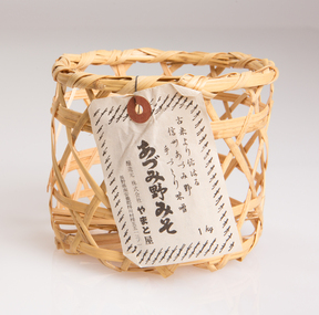
Functional object, Miso container, c. 1900s
‘The Art of the Japanese Package’ was an exhibition that toured to 10 Australian and 11 New Zealand public galleries in 1979 and 1980. The touring exhibition comprised 221 objects of traditional Japanese packaging which extended from ceramics, wood and paper to woven fibre containers. At the conclusion of the tour, The Japan Foundation and the Crafts Board of the Australia Council donated the vast majority of the exhibition to the Ararat Gallery for its permanent collection. Combining the natural qualities of bamboo, paper and straw with delicate craftsmanship, these unique objects express Japanese aesthetics as applied through fibre crafts. In Japan, the qualities and traits of natural materials are exploited rather than hidden. The texture of straw, the septa of bamboo are not concealed but lovingly incorporated into the whole. In 1979 Hideyuki Oka, curator of ‘The Art of the Japanese Package’ wrote: “In no way self-conscious or assertive, these wrappings have an artless and obedient air that greatly moves the modern viewer. They are whispered evidence of the Japanese ability to create beauty from the simplest products of nature. They also teach us that wisdom and feeling are especially important in packaging because these qualities, or the lack of them, are almost immediately apparent. What is the use of a package if it shows no feeling?” The descriptions of the featured objects were written by Hideyuki Oka, curator of ‘The Art of the Japanese Package’, 1979.Gift of the Japan-Australia Foundation and the Crafts Board of the Australia Council, 1981These are containers for miso. The wooden box, a product of Osaka, is lacquered in black on the outside and in bright red on the inside. The binding of split bamboo, in natural colour, gives it a sturdy look. - Professor Hideyuki Oka, curator.japanese art, japanese packaging, tsutsumi, gift giving -
 Ararat Gallery TAMA
Functional object, Basket and sweets, c. 1900s
‘The Art of the Japanese Package’ was an exhibition that toured to 10 Australian and 11 New Zealand public galleries in 1979 and 1980. The touring exhibition comprised 221 objects of traditional Japanese packaging which extended from ceramics, wood and paper to woven fibre containers. At the conclusion of the tour, The Japan Foundation and the Crafts Board of the Australia Council donated the vast majority of the exhibition to the Ararat Gallery for its permanent collection. Combining the natural qualities of bamboo, paper and straw with delicate craftsmanship, these unique objects express Japanese aesthetics as applied through fibre crafts. In Japan, the qualities and traits of natural materials are exploited rather than hidden. The texture of straw, the septa of bamboo are not concealed but lovingly incorporated into the whole. In 1979 Hideyuki Oka, curator of ‘The Art of the Japanese Package’ wrote: “In no way self-conscious or assertive, these wrappings have an artless and obedient air that greatly moves the modern viewer. They are whispered evidence of the Japanese ability to create beauty from the simplest products of nature. They also teach us that wisdom and feeling are especially important in packaging because these qualities, or the lack of them, are almost immediately apparent. What is the use of a package if it shows no feeling?” The descriptions of the featured objects were written by Hideyuki Oka, curator of ‘The Art of the Japanese Package’, 1979.Gift of the Japan-Australia Foundation and the Crafts Board of the Australia Council, 1981japanese art, japanese packaging, tsutsumi, gift giving -
 Ararat Gallery TAMA
Functional object, Container, c. 1900s
‘The Art of the Japanese Package’ was an exhibition that toured to 10 Australian and 11 New Zealand public galleries in 1979 and 1980. The touring exhibition comprised 221 objects of traditional Japanese packaging which extended from ceramics, wood and paper to woven fibre containers. At the conclusion of the tour, The Japan Foundation and the Crafts Board of the Australia Council donated the vast majority of the exhibition to the Ararat Gallery for its permanent collection. Combining the natural qualities of bamboo, paper and straw with delicate craftsmanship, these unique objects express Japanese aesthetics as applied through fibre crafts. In Japan, the qualities and traits of natural materials are exploited rather than hidden. The texture of straw, the septa of bamboo are not concealed but lovingly incorporated into the whole. In 1979 Hideyuki Oka, curator of ‘The Art of the Japanese Package’ wrote: “In no way self-conscious or assertive, these wrappings have an artless and obedient air that greatly moves the modern viewer. They are whispered evidence of the Japanese ability to create beauty from the simplest products of nature. They also teach us that wisdom and feeling are especially important in packaging because these qualities, or the lack of them, are almost immediately apparent. What is the use of a package if it shows no feeling?” The descriptions of the featured objects were written by Hideyuki Oka, curator of ‘The Art of the Japanese Package’, 1979.Gift of the Japan-Australia Foundation and the Crafts Board of the Australia Council, 1981japanese art, japanese packaging, tsutsumi, gift giving -
 Ararat Gallery TAMA
Functional object, Shosho, c. 1900s
‘The Art of the Japanese Package’ was an exhibition that toured to 10 Australian and 11 New Zealand public galleries in 1979 and 1980. The touring exhibition comprised 221 objects of traditional Japanese packaging which extended from ceramics, wood and paper to woven fibre containers. At the conclusion of the tour, The Japan Foundation and the Crafts Board of the Australia Council donated the vast majority of the exhibition to the Ararat Gallery for its permanent collection. Combining the natural qualities of bamboo, paper and straw with delicate craftsmanship, these unique objects express Japanese aesthetics as applied through fibre crafts. In Japan, the qualities and traits of natural materials are exploited rather than hidden. The texture of straw, the septa of bamboo are not concealed but lovingly incorporated into the whole. In 1979 Hideyuki Oka, curator of ‘The Art of the Japanese Package’ wrote: “In no way self-conscious or assertive, these wrappings have an artless and obedient air that greatly moves the modern viewer. They are whispered evidence of the Japanese ability to create beauty from the simplest products of nature. They also teach us that wisdom and feeling are especially important in packaging because these qualities, or the lack of them, are almost immediately apparent. What is the use of a package if it shows no feeling?” The descriptions of the featured objects were written by Hideyuki Oka, curator of ‘The Art of the Japanese Package’, 1979.Gift of the Japan-Australia Foundation and the Crafts Board of the Australia Council, 1981japanese art, japanese packaging, tsutsumi, gift giving -
 Federation University Art Collection
Ceramic - Artwork - Ceramics, Jan Feder, Lidded Stoneware Casseroles with iron glaze by Jan Feder, 1981
Jan FEDER ( - 1981) Jan Feder is an alumna of Federation University having studied ceramics at the Gippsland Institute of Advanced Education (now Federation Univesity Gippsland campus). Jan Feder was respected by all students for her diligence and technical ability. Her tragic death in 1981 evoked an immediate response from her peers for a memorial. Students discussed a number of memorial options, such as funds for equipment, scholarships and awards. The decision to commence a collection was made based on the idea that all future students culd benefit from the availability of a collection, whereas only a very few individuals could benefit from a scholarship. Students immediately set about raising money by selling 'seconds' called 'Junque Sales'. a total of $760.00 was raised and the first two works purchased were by Victor Greenaway and Victoria Howlett. Ceramic works were purchased from visiting lecturers who became leading ceramic artists around the world, as well as from many of the staff who taught at the Gippsland Campus. The Artist in Residendence Program assisted the collection, with many resident artists conrtibuting to the Collection (ie Robin Welch, Anna Zamorska, Sandy Brown), as well as international guests. Ceramic events such as 'Strzelecki Spotkanie 1984' and 'Woodfire 86' also resulted on major contributions to the collection. Three lidded pots by Jan Feder made in 1981.jan feder, jan feder memorial ceramics collection, ceramics, gippsland campus, alumni, casserole -
 Wodonga & District Historical Society Inc
Domestic object - Ceramic toast rack, Maruhon Ware, 1920s
This item is from a collection donated by descendants of John Francis Turner of Wodonga. Mr. Turner was born on 6 June 1885. He completed all of his schooling at Scotts Boarding School in Albury, New South Wales. On leaving school, he was employed at Dalgety’s, Albury as an auctioneer. In 1924 John was promoted to Manager of the Wodonga Branch of Dalgety’s. On 15/03/1900 he married Beatrice Neal (born 7/12/1887 and died 7/2/1953) from Collingwood, Victoria. They had 4 daughters – Francis (Nancy), Heather, Jessie and Mary. In 1920, the family moved From Albury to Wodonga, purchasing their family home “Locherbie” at 169 High Street, Wodonga. "Locherbie" still stands in Wodonga in 2022. The collection contains items used by the Turner family during their life in Wodonga. Japanese pottery and ceramics had varying basemarks, particularly those designed for export. Some restrictions were due to requirements imposed by other countries after WW2. This Japanese type of china was advertised in the 1920's and 1930's. During the years of the American occupation of Japan (1945-1952), all exports from Japan were marked "Made in Occupied Japan" and after the occupation simply "Japan". This information helps to establish the provenance of items such as this toast rack.This item is representative of ceramic domestic items used in Australian homes in the 1920s and 1930s.A ceramic rectangular toast rack decorated with a cherry design. Each end is shaped as a shallow bowl and there are 3 upright dividers to support slices of toast. The cherry design is hand painted and then glazed. The bottom centre is stamped with MARUHON WARE, HAND PAINTED, JAPAN around a K in a circle.Underneath "Maruhon Ware/ K in circle/ HANDPAINTED/ JAPAN"domestic items, japanese pottery -
 Wodonga & District Historical Society Inc
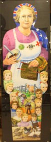
Painting - Portrait of Dolly Barton for Peoplescape, Betty L. Barberis, 2001
In February 2001 the National Council for the Centenary of Federation called upon Australians to nominate someone whom they felt had significantly affected their lives, their community or our country. Thousands of these heroes and quiet achievers were selected. Betty Churcher, a member of the National Council, chaired the Peoplescape Selection Panel. Nominators then made life size, cutout figures to represent their "hero". The sculptures were installed in alphabetical order, on the hill at Parliament House and down to the Federation Mall in Canberra, each with a plaque at its base outlining the individual's achievement. This portrait was painted by Betty Barberis to represent her mother "Dolly" Barton. Dolly raised 12 children, lived through 2 World Wars and the depression. She kept the family dairy farm running whilst her husband was serving in World War 2 whilst still supporting the war effort through the Red Cross and CWA and the church guild. Betty’s great body of work included landscapes, banners, millinery, ceramics, and a bronze sculpture of her husband Vern Barberis who was a fellow schoolteacher and represented Australia as a weightlifter, winning a bronze medal at the Helsinki Olympics in 1952. She was also an art teacher of 22 years. Betty passed away at The Grange, Wodonga on 26 November 2013.This portrait was created by a renowned and highly regarded artist from Northeast Victoria for a national celebration of the centenary of Australian Federation in 2001.A large oil painting depicting a portrait of Dolly Barton, mother of the artist Betty L. Barberis. The painting includes representations of her 12 children, her farming way of life, her commitment to the community and to the war effort. The image was painted on to yellow corflute for exhibition. It has since been covered with perspex to protect the image.betty l. barberis, myrtle ann 'dolly" barton, peoplescape 2001 -
 Ballarat Tramway Museum
Document - Ticket Manual, State Electricity Commission of Victoria (SECV), Bendigo Tramways (SEC), ticket manual, 1937
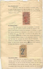
Set of 9 colour laser printed images of a Bendigo Tramways (SEC), ticket manual or ticket instruction sheets issued by the SEC c1937. Details the methodology of the ticketing system. Original sheets in poor order forwarded to Bendigo Tramways June 2005, contained within Zetta Florence foolscap size polypropylene enclosures, along with a set of the colour laser prints. All tickets printed in black ink, and the word "cancelled" written across the face of the ticket in red ink unless noted otherwise. Sheet 1 - not received at time of donation. Sheet 2 - 1 1/2d children's fare - orange ticket, price in red, image t1 2d section check - off white ticket, price in blue, image t2 Sheet 3 - 1d section check - off white ticket, price in red, image t3 4d transfer - light green ticket, blue price, image t4 (See Reg Item 4006 for a Ballarat sample) Sheet 4 - 3d transfer - off white, price in red, image t5. Has been punched to show a particular time and date explained in the text. 2d transfer - off white, price in blue, image t6 1 1/2d children's transfer - off white ticket, printing in red ink, price in black, image t7 Sheet 5 - 3d Parcels check - off white, printed in red, image t8. Sheet 6 - 2/- Weekly ticket, green card ticket, printed in red, stamped cancelled - image t9 1/6 Weekly ticket, orange card ticket, printed in dark green, stamped cancelled - image t10 - see Reg Item 3071 for another sample. 2/- Weekly Sectional ticket - yellow card ticket, printed in red, stamped cancelled - image t11 Sheet 7 4/- and 6/- Scholars Monthly Tickets, off white card with blue and black printing respectively - image t12. this sheet has had the two 1d and 2d section tickets removed from the bottom. Sheet 7 - as above, stamped cancelled - image t13 Sheet 8 - 2d section tickets - green card - both sides - image t14 - see Reg Item 3069 for another sample. 1d section tickets - pink or red card - both sides - image t15 - see Reg Item 3070 for another sample. 2d Newspaper package ticket - image t16 Sheet 9 - 1/- Tourist ticket, white card, with "Cancelled" written across ticket in red colour pencil - see Reg Item 3072 for another sample. trams, tramways, tickets, secv, bendigo -
 Federation University Art Collection
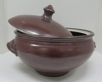
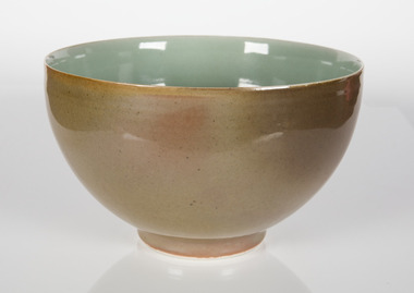
Ceramic, 'Ceramic Bowl' by Gwyn Hanssen Piggot, 1990
Gwyn HANSSEN PIGGOT (1935-11.07.2013) Born Ballarat Gwyn Hanssen Piggot completed a Bachelor of Fine Arts at Melbourne University in 1954. She spent three years apprenticed to Ivan McMeekin at Sturt Pottery, Mittagong, New South Wales. Between 1958 and 1965 Gwyn Hanssen Piggot worked at various potteries in the United Kingdom, including Winchcombe Pottery in Gloucestershire, Leach Pottery at St Ives, and Wenford Bridge Pottery and Aldermaston Pottery in Berkshire. In 1960 she established her own studio in London. The essence of her work is purity, simplicity and form. She worked with porcelain for strength and for its translucent nature, and fired with wood to add a dine ash bloom to glazes. In 1992 Gwyn Hanssen-Piggott visited the Ballarat School of Mines Ceramics students, under the direction if lecturers Neville French and Prue Venables In 1994 she was artist in residence at the Ballarat School of Mines for six months. Gwyn Hanson Piggott received the Order of Australia Medal in 2002. Born Gwynion Lawrie John at Ballarat on 01 January 1935, Gwyn Hanssen Pigott died in London on 11 July 2018 London where she was for a solo exhibition of her new work. This item was purchased by the Ballarat University College Acquisition Committee. It is part of the Federation University Art Collection. The Art Collection features over 2000 works and was listed as a 'Ballarat Treasure' in 2007. A bowl by internationally renowned ceramicist Gwyn Hanssen-Piggott. Photograph: HStudioart, artwork, ceramics, bowl, ballarat, gwynn hanssen piggot -
 Federation University Art Collection
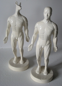
Ceramic - Sculpture, 'Platonic Friends' by Christopher Headley, c2009
Christopher HEADLEY Born York, England Arrived Australia 1974 Chris Headley studied at York School of Art before majoring in Ceramics at the Central School of Art in London, learning to throw with (the late) Michael Casson and hand-build with Gordon Baldwin. Chris graduated in 1973 and set out for Australia. He travelled overland across Europe and Asia, through Turkey, Afghanistan and Iran. He was invited to attend a traditional wedding in Pakistan by someone he made friends with on the bus trip from Isfahan to Teheran, got lost several times in India and ran out of money in Thailand. Eventually, a year after leaving England, he arrived in Australia, where he has lived and worked ever since. He undertook his Master’s degree at the Australian National University, graduating in 1991; and in 1999, with Dr Owen Rye as his supervisor, gained his PhD from Monash University, Victoria. (http://www.christopherheadley.net/#!about) While artist-in-residence at the Arts Academy, Federation University in 2009 Chris was spotted dragging his ceramic figures and photographic equipment across mullock heaps near Ullina, around Lake Wendouree and inside the Art Gallery of Ballarat where he was photographing Mount Warrenheip. These figures were used in the photographs. This item is part of the Federation University Art Collection. The Art Collection features over 2000 works and was listed as a 'Ballarat Treasure' in 2007.Two white earthenware glazed ceramic figures, one with a kangaroo head.art, artwork, christopher headley, ceramics, sculpture, artist in residence, figures -
![Ceramic - Artwork - Ceramics, Untitled [Pair Tea Cups], by Silvia Richardson, c1985, c1985](/media/collectors/530576742162ef0fa09a2288/items/56b7f64c2162f11c0c8c7590/item-media/59d0c82d21ea690cc8367f56/item-fit-380x285.jpg) Federation University Art Collection
Federation University Art CollectionCeramic - Artwork - Ceramics, Untitled [Pair Tea Cups], by Silvia Richardson, c1985, c1985
Silvia RICHARDSON A post graduate student at the Gippsland Centre for Art and Desish (GCAD) who presented this work to the Jan Feder Art Collection. Jan Feder was an alumna of Federation University having studied ceramics at the Gippsland Institute of Advanced Education (now Federation University Gippsland campus). Jan Feder was respected by all students for her diligence and technical ability. Her tragic death in 1981 evoked an immediate response from her peers for a memorial. Students discussed a number of memorial options, such as funds for equipment, scholarships and awards. The decision to commence a collection was made based on the idea that all future students could benefit from the availability of a collection, whereas only a very few individuals could benefit from a scholarship. Students immediately set about raising money by selling 'seconds' called 'Junque Sales'. a total of $760.00 was raised and the first two works purchased were by Victor Greenaway and Victoria Howlett. Ceramic works were purchased from visiting lecturers who became leading ceramic artists around the world, as well as from many of the staff who taught at the Gippsland Campus. The Artist in Residence Program assisted the collection, with many resident artists contributing to the Collection (ie Robin Welch, Anna Zamorska, Sandy Brown), as well as international guests. Ceramic events such as 'Strzelecki Spotkanie 1984' and 'Woodfire 86' also resulted on major contributions to the collection. Two low tempreture fused slipcase bone china with inlaid decoration. Jan Feder Memorial Collectionjan feder memorial collection, jan feder, sylvia richardson, ceramics, gippsland campus, artwork, artist -
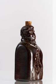
 Wodonga & District Historical Society Inc
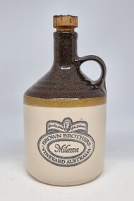
Functional object - Earthenware Bottle - Brown Brothers Milawa, 1970s - 1980s
In 1885 John Francis Brown first planted 10 acres of vines in Milawa, Victoria. Brown Brothers was founded in 1889 when the vines were ready to produce their first crop, as John hoped his brothers would join him in this new and promising venture. This did not happen but the name remained. Since 1899 Brown Brothers has grown into one of Australia’s largest family-owned wine businesses and now operates several vineyards in Victoria and Tasmania. These ceramic jars were used by Brown Brothers in the 1970s and 1980s to package Port, Muscat and Tokay. Fortified wines packaged in this manner would maintain their quality for decades as long as the wax seal was unbroken. Elischer Pottery was started in Sandringham, Melbourne Victoria in 1947 by well-known sculptor John (Johann Wolfgang) Elischer (1891-1966) and his son, also named John, (known as Wolly). John (Snr) was born in Vienna and trained at the Academy of Vienna from 1908 to 1911 and was an Associate of the Royal Academy Vienna. John (Senior) died in 1966 and the business was continued by his son John (Wolly), until 1987 when it was sold. Prior to that, at some time, he started making pieces the brand NCP. The business continues today as “Unique Ceramics” in Highett, Victoria. They continue to use the “Elischer” brand on some of their products.This jug is representative of an historic and continuing leading Australian Winemaker located in Northeast Victoria.An earthenware wine jug created for Brown Brothers Milawa Vineyard manufactured by John Elischer Pottery. The jug has a tradition loop handle. The bottom half of the jug is a traditional beige colour with a darker brown top section. The logo is imprinted in black and is covered in a clear glaze. The cork stopper is still intact although before being opened would have been sealed with wax.Company logo on one side: at top a central male image between the text "Founding Father /John F Brown. In a central oval around the name "Milawa", BROWN BROTHERS/ VINEYARD AUSTRALIA" On base: "97"brown brothers milawa, elischer pottery, northeast victorian wineries -
 City of Greater Bendigo - Civic Collection
Ceramic - Bendigo Pottery :: Australian Prime Minister Flask, Bendigo Pottery, Sir Edmund Barton, c 1975
Established by George Guthrie in 1857 (about 5km north of its current site) and then again seven years later in 1864 after it initially closed, Bendigo Pottery remains one of the most influential and longest running Pottery’s in Australia. Over the years the Pottery has contributed to the growth and development of the district through both its products including building products, table ware and decorative and commemorative war as well as artistically, being responsible for training and supporting many potters locally. The City of Greater Bendigo has had a long history of partnering with Bendigo Pottery and the Civic Collection holds a number of important items within its collection. This Sir Edmund Barton 'reform' flask was one of a limited edition character bottles produced by the Pottery to commemorate his contribution to Australian politics. Edmund Barton became Australia’s first Prime Minister on New Year’s Day 1901, at a huge public ceremony in Centennial Park in Sydney. Reform flasks were English salt-glazed stoneware flasks produced in the early 19th century shaped into the form of figures connected with the Reform Bill of 1832. Much was made of puns like ‘the spirit of reform’ at the time. Artist John Frith has taken the reform flask form as inspiration for a series of political ceramics of some Australian Prime Ministers. The series includes Edmund Barton, Alfred Deakin and Chris Watson. Glazed ceramic flask in the shape of Sir Edmund Barton. Square shaped with most of the detail on the front facing side other than head which is more detailed. Cork still in place in top of head.On reverse of flask; Sir Edmund / Barton / Prime Minister / of Australia / 1901 to 1908 Bendigo Pottery / LMTED / Edition Series / 110/1200 /Australia Signed lower centre; 'Frith'australian politics, bendigo pottery -
 Ballarat Tramway Museum
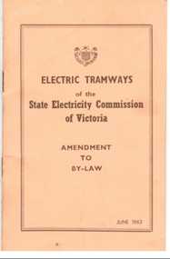
Book, State Electricity Commission of Victoria (SECV), "Electric Tramways Amendment to By-Law June 1963", Jun. 1963
Demonstrates aspects of the SEC governance system in issuing By-laws for the travelling public, as part of their Act. Yields information about fares charged for tram services in Ballarat and Bendigo. Issued to crews.Booklet with orange card cover and 12 pages, numbered 1 to 10, side stapled, off set printed giving details of fares, revised in June 1963 for both Ballarat and Bendigo, to come into force on 1/8/1963. Has details of sections etc. Was shown as being approved by the Governor in Council on 25/6/1963. Adjust the City Section fares only. See Alan Bradley notes in references re this. Full pdf copy added 28/5/2019. Alan Bradley advised 25/4/2005. In the "Courier" of 26/6/1963, the adjustments to fares from 1/8/1963 were announced. They were only for adjustments to city section fares. Fares outside the city area remained unchanged. The SEC promoted these as being cheaper city section fares. Tom Evans gave me a copy of a poster showing a Scotsman boarding a tram. The caption was: "Now! It's cheaper to travel by tram! Beats walking every time!" New economy city fares. From Dawson St to the Railway Station return, & from Dawson St to the east end of Bridge St or return, 4d. From the intersection of Lydiard & Sturt Sts - To Dawson St, east end Bridge St, to Railway Station 3d. trams, tramways, secv rules, by-laws, tickets, fares -
 Flagstaff Hill Maritime Museum and Village
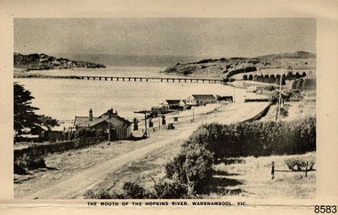
Postcard - Postcard Folder - scenes, George Rose, Rose Stereographic Company, Rose Series Picturesque Views of Warrnambool Australia [Warrnambool], 1880-1942
This postcard folder contains lithographs of photographs taken locally by Georg Rose between 1880 and 1942. He reproduced them at his company's premises, the Rose Stereographic Company at Armadale, Victoria. The postcard folder was purchased as a Warrnambool souvenir by the donor's parents around 1945 to 1950. Interestingly, the city on the cover is printed as "Warrambool", which is a location in New South Wales, but the postcards within all have the locations and text of Warrnambool. The photographs include the 'new' concrete bridge, built in 1922 to replace the original bridge, built in 1872. The boathouses belonging to Proudfoots and to Flett/Fanny Nelson are also pictured on the Hopkins River mouth. The twelve photographs included locations connected to other items in our Collection. The photographs are titled: - b. The Avenue and War Memorial. Warrnambool. Vic. c. The Blow-hole. Thunder Point. Warrnambool. Vic. d. Botanical Gardens. Warrnambool. Vic. e. Eagle Rock. Warrnambool. Vic. f. The New Concrete Bridge and Breakwater. Warrnambool. Vic. g. Liebig Street. Warrnambool. Vic. h. Looking to Thunder Point. Warrnambool. Vic. i. The Beach. Warrnambool. Vic. j. Hopkins Falls. Warrnambool. Vic. k. Shelly Beach. Warrnambool. Vic. l. The Mouth of the Hopkins River. Warrnambool. Vic. m. Panorama of Warrnambool. Vic. [Kepler Street towards Presbyterian Church on Spence St] George Rose, 1861-1942: - famous for his Late 19th and early 20th century photography. He was born in Clunes, Victoria, and was in his 20th year when he founded Rose Stereograph Company in 1880. He took the opportunity of a popular trend of the times to produce stereographs, pairs of almost duplicate photographs which appeared to be in 3D when viewed in a handheld stereo viewer. By the 1920s these lost their popularity, so he used his photographic skills to produce cards and postcards of scenes and people. The photographs in this postcard folder were taken between 1880 and 1942 by the renowned Victorian photographer George Rose. The locations match photographs and postcards in our collection that were taken at different times. A comparison between them shows the changes over time in the land and bay, the buildings and other structures, transportation and even the fashions of the times, building the story of our local history.This copy of a postcard folder has a blue-grey textured rectangular card cover with a sketch of a rose on the front along with the name of the postcard series. the location of the series' focus, the producer's details and lines for adding an address. The folded cover contains a long, concertinaed page with six titled photographs on each side, totalling twelve in all. Interestingly, the cover has the location name of "Warrambool", a place in NSW, instead of Warrnambool, the location of all of the photographs inside. The folder contains scenes from Warrnambool and nearby popular areas including Lady Bay, Port of Warrnambool, Warrnambool Breakwater, Viaduct, Merri River Footbridge, the Hopkins River Mouth, with Proudfoot’s and the Fanny Nelson/Flett boathouses. The cover has a sketch of a rose and inscriptions. The photographs for the lithographs were taken prior between 1880 and 1942 by well-known Victorian photographer, George Rose, Rose Stereograph Company of Armadale, Victoria.Image: [Rose with rosebud and leaves] Printed: "Rose Series / Picturesque Views of / WARRAMBOOL / AUSTRALIA" [correct spelling is WARRNAMBOOL] "PUBLISHED BY / ROSE STEREOGRAPH CO / ARMADALE. VIC." Printed lines (3) for an address. Printed rectangle [ ] for attaching a stamp.flagstaff hill maritime museum and village, great ocean road, shipwreck coast, warrnambool, flagstaff hill, flagstaff hill maritime museum, flagstaff hill maritime village, warramble, postcard, postcard folder, warrnambool scenes, picturesque views of warrnambool, picturesque views of warramble, lady bay, port of warrnambool, breakwater, warrnambool breakwater, viaduct, merri river footbridge, merri river suspension bridge, suspension footbridge, merri river mouth, hopkins river mouth, proudfoot's, fanny nelson, nelson's boatsheds, nelson's boathouse, boathouse, hopkins river boathouses, flett's boathouse, flett, george rose, image of a rose, rose series, rose stereograph co, rose stereographic company, lighograph, armadale victoria, lady bay beach, beach scene, lower light, concrete footbridge, 1922 footbridge, viaduct road, rose postcard, new concrete bridge, 1945, 1890, 1922, small footbridge, 1872 footbridge, 1872, merri river estuary, stingray bay, postcards -
 Mont De Lancey
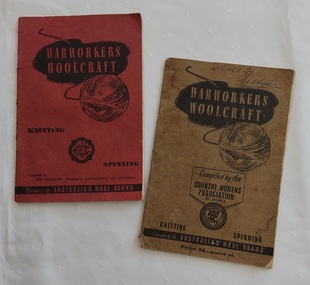
Booklet - Knitting Patterns, The Country Womens Associaotion of Victoria, War Workers' Woolcraft, c.1940's
The red covered book is compiled by The Country Women's Association of Victoria and sponsored by the Australian Wool Board. On the back of the front cover is an Introduction by the Chairman of the Australian Wool Board, Sir Dalziel Kelly, K.B., L.L.B. explaining the reason for these books encouraging the use of Australian wool to support the Empire Forces. The Foreward promotes the CWA in a similar vein. The book has knitting hints, patterns useful for war service members in the navy, army and air force patterns for clothing.The khaki covered book is similar, but is compiled by the Country Women's Association of Victoria. It is a Third Edition.Two small copies of War Workers' Woolcraft - Knitting and Spinning books: one with a red paper cover and the other with a faded khaki coloured paper cover. 1. The red front cover book shows the title printed inside a black cloud shape with a black lined illustration of a ball of wool underneath. The Country Women's Assoc. South Aust. is printed on the cover inside a round shaped black crest. It is compiled by The Country Women's Association of Victoria and sponsored by the Australian Wool Board. Inside on the back of the front cover is an Introduction by the Chairman of the Australian Wool Board, Sir Dalziel Kelly, K.B., L.L.B. explaining the reason for these books encouraging the use of Australian wool to support the Empire Forces. The Foreward promotes the CWA in a similar vein. The book has knitting hints, patterns useful for war service members in the navy, army and air force patterns for clothing - caps, sleeveless pullover, waistcoat muffler, armlets, man's socks and mittens, kneecaps, hot water bottle covers and scarves. Inside the back cover is advice on checking your tape measure against the 6 Inch one printed on the page. 2. The khaki covered book is similar, but is compiled by the Country Women's Association of Victoria with Price 3d.- posted 4d. at the bottom of the cover. It is a Third Edition. Both have advertising on the last few pages.non-fictionThe red covered book is compiled by The Country Women's Association of Victoria and sponsored by the Australian Wool Board. On the back of the front cover is an Introduction by the Chairman of the Australian Wool Board, Sir Dalziel Kelly, K.B., L.L.B. explaining the reason for these books encouraging the use of Australian wool to support the Empire Forces. The Foreward promotes the CWA in a similar vein. The book has knitting hints, patterns useful for war service members in the navy, army and air force patterns for clothing.The khaki covered book is similar, but is compiled by the Country Women's Association of Victoria. It is a Third Edition. knitting, knitting patterns, knitting equipment -
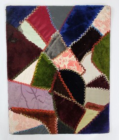 Wodonga & District Historical Society Inc
Textile - Hamilton-Smith Collection Victorian-era Crazy Quilt Sampler
The Hamilton-Smith collection was donated by the children of Grace Mary Hamilton-Smith nee Ellwood (1911-2004) and John Hamilton-Smith (1909-1984) who settled in Wodonga in the 1940s. The Ellwood family had lived in north-east Victoria since the late 1800s. Grace’s mother, Rosina Ellwood nee Smale, was the first teacher at Baranduda in 1888, and a foundation member of the C.W.A. Rosina and her husband Mark retired to Wodonga in 1934. Grace and John married at St. David’s Church, Albury in 1941. John was a grazier, and actively involved in Agricultural Societies. The collection contains significant items which reflect the local history of Wodonga, including handmade needlework, books, photographs, a wedding dress, maps, and material relating to the world wars. This quilt sampler was made before 1900 by Rosina Ellwood. Crazy quilts were fashionable in the late Victorian era. The rise of the trend is attributed to the display of Japanese art and ceramics at the 1876 Philadelphia Centennial Exposition (U.S.A.) that featured asymmetrical designs. Inspired, quilters began sewing pieces of fabric of different sizes and textures together into abstract, asymmetrical patterns. The craze spread from America around the world. Embroidery, ribbon and silk embellishments, and hand stitched applique birds and flowers were popular additions. One magazine estimated that a detailed crazy quilt could take over 1,500 hours to complete. Crazy quilts remained in fashion in metropolitan cities until about 1910, though the style endured for longer in rural areas. This item is unique, handmade and has a known owner. It forms part of a significant and representative historical collection which reflects the local history of Wodonga. It contributes to our understanding of domestic and family life in early twentieth century Wodonga, as well as providing interpretative capacity for themes including local history, social history and women’s history.A colourful patchwork quilt sampler using mixed fabric types including velvet, cotton, brocade and satin, backed on cardboard.hamilton-smith collection, hamilton-smith, stiching, needlework, sewing, handmade, domestic, quilt, quilts, crazy quilt, crazy quilts, women's history -
 Federation University Historical Collection
Magazine - Booklet, University of Ballarat, Everyone@UB, 2001
The University of Ballarat in 1998 comprised the Mt Helen Campus, SMB (Ballarat School of Mines) Campus and the Horsham Campus. It's current name is Federation University Australia. In 1998 Everyone@UB was a monthly staff newsletter edited by Peter Baird in consultation with Don Moconachie.A series of monthly bulletins covering all University of Ballarat campuses. .1) University merger, John Bailey, Michael Adermann, Vice-Chancellor, Jenny Nemeth, Katherine Birkin, Rowena Coutts, Ballarat Technology Park, Ron Wild .2) Chancellor appointment, Chancellor retirement, Geoffrey Blainey tribute, David Caro, Katherine Birkin, Arno Besse, George Murdoch, Bullarook, Stephen Kemmus, Neville French, ceramics, Tristan Smith, Horsham, Arnhem Land film, Ararat, Kerry Cox, anorexia, salary packages, University of Ballarat Brass Band, Natalie Radomski, becoming a university. Images: Geoffrey Blainey, David Caro, David James, Katherine Birkin, Arno Besse, George Murdoch, Geoffrey Blainey, Stephen Kemmis, Neville French, John Ackland, Richard Jardine, Glen Auld, Dennis Arne, Andrew Kotsonis, Kerry Cox, Suzanne McLaren, Marcia Pope, Rosemary Green, Leonie Otago, Natalie Rodomski .5) October 1998 - Carolyn Taylor, misogyny, Horsham campus building under construction, David Caro, Miranda Kerr, Martin Westbrook, Iain Reid, virtual monitors, teaching practice, Joanne Knight, John Pidgeon, Sally Buckland, arsenic, Ian Rae, Bob Allan, Patricia Cartwright, Matthew Baker, Sundru Sivamalai, Janine Smith, Pat Mann, International Student Market Research, Steve Mennen, Copyright, internet to the outback, Charters Towers, Engineering students, Darryl Dyason, Andrew McDougall, Dianne Jacono, Ross Morgan, Keith Boast, Cranbrook Academy of Art (Detroit), Helmut Stenzel, Mt Helen vegetation, Jan Bedggood, Ann-Maree Haintz, Kathleen Lakey, Adrienne Ryan, Fiona Schmidt. .11) Phil Candy, flexible learning, strategic planning. .12) diving, Reconciliation, Learning City, Student residence, Alex Rubinov, Graduate Centre, Ceramics, horse, Wimmera, tree regeneration, student poverty, UB museum, David Manterfeild, Heather Hatfeild. Redundancy, video conferencing Images: Steve Matthews, Craig Holloway, Peter Pilven, Sneha Kirubakaran, Phil Honeywood, Kerry Cox, David Manterfield, Martin Westbrooke, Ram Karan, Barry Jones, Gael Ramsay, Jenny Hargave, Heather Hatfield. .16) Jeff Kennett, Honorary Doctorate, Technology Park, Mary Atkinson, Ian Wright, Internet, Disability Action Plan, Robert Munt obituary, Sandra Stepcich obituary, Virginia Fenwlon, East Timor, Centre for Environmental Management, Wayne Jolly, 130th anniversary, Craig Hurley, Barry Wemyss, John Murray, Tori Power, Grant Curnow. Images: Vivienne Witwer, Claire Hetherington, Ian Wright, Virginia Fenelin .17) Broadband, AARNet, David James Retirement, wetlands, Debbie Eagles, Centre for Rural and Regional Health, numeracy, nursing, Sue Turale, Max Palmer, Camp Street, Arts Academy, library, SMB scholarship, Landcare, Mallee pipeline, Verna Barry, Alice Mills, Marian Brown, .18) Fiji, Texans, Greenhill, Robert Whitson, Ian Clark, Abororiginal history, Yuille St, Peter Baird, Martin Westrbrook, Robert Allen, Arts Academy, John McGrath, Phil Ruglen, 3BBB, John Ferrier .21) Beverley. Lassiter, Vice-ChAncellor appointment, Kerry Cox, Craig Hurley, Barry Wemyss, Ceramics, Bill Pryor, University Games, Olympics, Broken Hill, Alex Rubinov, Jonathan Halls, Dare to be different, Wayne Muir, Student Union Refit. Images: Wayne Muir, Alex Ruminov, Kerry Cox .22) December 2000 - nursing, David James, Phil Candy, John McLean, Debbie Eagles, brewery, brewing, Meredith Sussex, Lyn Faneco, TAFE,Joy Nunn, ARC, mosaics, Timor, Alfredo Pires, Centre for Rural and Regional Health, diabetes, kangaroos, Murray-Darling, Leagher Homestead, David Welch, Joy Nunn, Jill Blee, Maryanne Coutts, positive discrimination, Theresa Saunders, Imelda Crebbin .23) March 2001 - Nancy Lange, Paul Lambeth, Yvonne Button, Don Pennell, Natalie Radomski, Marcia Pope, McKinnon Walker, Marc Brodie, TAFE, WorldSkills, Horticulture, Ararat, Website, library, Leeanne Pitman, Liz Hartmann, nursing, Miranda Walker, Ciaran Pier, Anxiety Disorders, volcano, brewing, beer, Peter Aldred, Rob Greig, Jeremy Smith, Alice Mills, Geoff Burgess, .24) May 2001 - Graduations, Talia Venn, Stephen Carthew, Honory Doctorate, Steve Monaghetti, Heather Moore, Brendan O'Brien, Bill Pryr, Terry O'Brien, Carole Wilson, Carolyn Taylor, rape law reform, Federation at the Ballarat School of Mines, Work Skills, Debbie Eagles, Sue Purtle, Longerenong, Mohair, Early Childhood, Horsham, Kerry Cox, Willy Hobbs, David Firth, Kim Durban, BAPA, maryanne Coutts, Ewen McDonald, butterflys, Fukuoaka INstitute of Technology, Jane Wilkinson .25) Wayne Robinson, Neil McAdam retirement, Anne Beggs Sunter, nursing, Eileen Sellers, Hannelore Best, international nursing, Francis Adams, copyright, Roy Taylor, Wendy Bolger, unplugged, Horsham, Robert Irvine, Horsham graduations, Anxiety Clinic, Carole Wilson, Heart Mat, University of Ballarat Mission, Diabetes, Emelia Martinez-Brawley. Images include Wayne Robinson, Anne Beggs Sunter, Eileen Sellers, Hannelore Best, Phil Candy. Meg Tasker, Roy Taylor, Wendy Bolger, Robert Irvine, Angus McLachlan, Roger Castleman, Stephen Roberts, Philip Smith, Bob Allen, Rob Greig, Dennis Jeandet, Carole Wilson, Doug Lloyduniversity of ballarat, ballarat school of mines, wetland, broadband, david janes, smb, kennett, leadership, eagles, centre for rural and regional health, microwave, turale, arts academy, camp street, library, landcare, mallee, mallee pipeline, barry, verna barry, mills, brown, palmer, caro, geoffrey blainey, blainey, birkin, besse, kemmis, adermann, ackland, jardine, auld, mclaren, pope, green, otago, radomski, honorary doctorate, munt, stepcich, wemyss, rubinov, muir, everyone@ub, robinson, horsham, stawell, ararat, fukuoaka, taylor, moneghetti, coutt, hatfeild, westbrooke, karan, bailey, james, nemeth, wild, de bono, texas, sharpam, fiji, clark, ruyg, kropp, sugget, baird, allen, westbrook, rural health, stacpoole, mcgrath, ruglen, ferrier, manterfield, pilven, michael adermann, tafe, mount helen vegetation, dennis arne -
 National Wool Museum
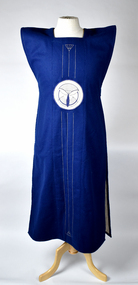
Clothing - Tabard, Jun Tomita, 1970s
This tabard is one of a small number that were produced/woven by Japanese master weaver Jun Tomita during the period that he was resident artisan at the Jam Factory in Adelaide. The tabard incorporates Ikat/Kasuri woven central panels. Tomita was born in 1951 in Toyama prefecture, and is based in Kyoto, the textile centre of Japan. The technique he uses kasuri (the Japanese term for ikat) is selectively pre-dying yarns before weaving to create pattern. The other decorative features of this garment are based on Japanese family crest designs (kamon). The pointed shoulders of this garment are reminiscent of the stiffened shoulders of kataginu, the upper part of the kamishimo ensemble that was formal wear for samurai men. Tomita was at the Jam factory from 1976-78 and he has works in numerous public collections, including: - Stanthorpe Art Museum, Art Gallery of South Australia / Australia - Oslo National Gallery / Norway - National Museum of Israel / Israel - Stedelik Museum, Museum of Rotterdam / The Netherlands - Denver Art Museum, St. Louis Art Museum, Long House Foundation - Cooper-Hewitt Museum of Art/USA - Victoria and Albert Museum, UK - Toyama Prefectural Museum of Art, Japan The donor purchased this tabard from an exhibition held at Wool House in Parkville Victoria, which was sponsored by the Australian Wool Board to promote the use of Australian Wool in textiles and fashion at that time, around April/May in 1977. At that time (1976-1977) the donor owned and run a retail/display shop for craft products such as ceramics, artworks and jewellery. The donor subsequently retained this in storage with some other items since the business closed.Double sided reversible tabard featuring woven centrals panels. One side is navy blue with white and blue detail panels, one side is grey with green, brown and cream central panel detail.textile, tabard, japan, art, clothing, weaving, fashion, design, ikat, kasuri -
 Melbourne Tram Museum
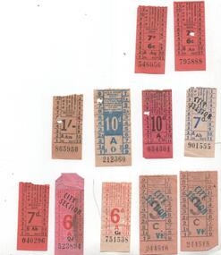
Ephemera - Ticket/s, Melbourne & Metropolitan Tramways Board (MMTB), Set of 9 MMTB imperial currency tickets and two decimal currency conversion tickets, 1960's
Set of 9 MMTB imperial currency tickets and two decimal currency conversion tickets. Some tickets have notes or advertisements on the rear as noted. If not noted, all printed with black ink on coloured paper with black numbers. 1 - 3d - on a light cream paper, overprinted "City Section" and letter Vt in Blue, numbers 244515 and 244516, both with Stamina trousers adverts on rear. 2 - 6d - red ink on off white paper - GE 751538 (has been creased badly) 3 - 6d - red ink on pink paper - overprinted "City Section" Qd 523894 - has dirt marks at top and stains on right hand side 4 - 7d - blue ink on off white paper, overprinted "City Section" in black ink, Ab901555 - with pencil note "Wed 23 Dec 1964 ? Collins St Sp St to Swanston St." 5 - 7d - on orange paper Ah 040296 - with an advert for "Blind babies" help on rear. 6 - 10d - on pink paper Ch 034301 - with a "Hicks advert on rear - 385 Bourke St for a trade in on a new Kelvinator Refrigerator" 7 - 10d - on off white paper, printed in blue ink, O 212360, with Stamina trousers adverts on rear 8 - 1/- on off white paper, Am 865950 9 - 7d / 6c - decimal conversion - orange paper, numbers Aq 548056 and An 795888, the second with a note in pencil on the rear "W2 604 6pm Glenferrie Road Gardiner to Camberwell 7D Fri 14 Nov 1965"trams, tramways, mmtb, tickets, decimal currency, decimal conversion, advertisements, city section