Showing 1372 items matching " colour in art"
-
 Wangaratta Art Gallery
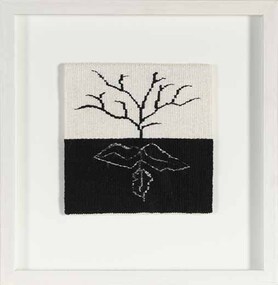
Textile, Valerie Kirk, Tree + Roots
I draw inspiration from the world around me and from particular aspects of life. Previously my work dealt with my experience as a Scottish migrant – looking back and forward, north and south, here and there, between two countries. This ‘in-between-ness’ of the migratory experience, while not unique to me or other Australians, contributes to my sense of being made up of many parts, a kind of fragmentation where certain components come into play at different times. There is an eternal mismatch or sense of being out of place in my world as I am recognized as Scottish in Australia when people hear me speak but in Scotland people comment on my Australian accent. In a wider sense Australia’s history and culture is made up of many examples of people and things brought together without a good likeness or fit. Woven tapestry allows me to combine my interests in textiles and visual art using the tactile qualities of materials in the highly complex woven form. It allows be to create realistic images, but change format, composition and placement to create images which invite the viewer to question. The intricate nature of multiple wefts twined between warps parallels the complexities of life and tapestry’s building /constructed process embodies the advancement of time.Wangaratta Art Gallery CollectionA small tapestry of a tree and its root system handwoven using a colour palette of black, grey, and white.valerie kirk, tapestry, textile -
 Wangaratta Art Gallery
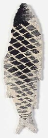
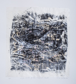
Textile, Valerie Kirk, Caught Fish, PANGASIANODON GIGAS, 2010
Caught Fish, PANGASIANODON GIGAS” is a miniature version of the larger tapestry described below and it embodies the same ideas: The giant Mekong Catfish is under threat of extinction due to over-fishing and loss of habitat. It is beleived that the fish used to reach sizes over 3 metres, but the largest recorded catch to date is 2.7 metres – a monster fish caught in Thailand in 2005. As its fame and the mythology surrounding it increases, so does the number of game fishermen keen to land a record catch or earn a sizeable amount of money in the exotic food marketplace. However, the water flow of the river is increasingly more controlled by China, changing the natural habitat of the river. It seems that survival of the great catfish is being left to chance and the fish’s ability to avoid nets, lines and traps in the murky green waters of the Mekong. My exhibition piece is a giant, woven Pangasianodon Gigas – made as a shaped tapestry which will hang the way a fisherman would hold up his catch to display or be photographed as his trophy. The drawing was made from photographs of very large fish I observed in Laos and the detail on the body of the fish is deliberately ambiguous scales/nets. The piece will be woven on cotton seine twine (which was originally made as a string for fish netting) with mixed weft yarns. Artist statement about the work: The final work is an abstraction of fish and nets – an image made with a hand drawn quality suggesting the personal observation that goes with looking and responding with ink on paper. The tapestry technique mimics the original marks to a certain degree but is also very obviously a woven form with its stepped edges and shapes, blending of tones through hachure and broad set of warp and weft.Wangaratta Art Gallery CollectionA small tapestry of a caught fish handwoven using a colour palette of black, grey, and white.valerie kirk, tapestry, textile, fish -
 Wangaratta Art Gallery
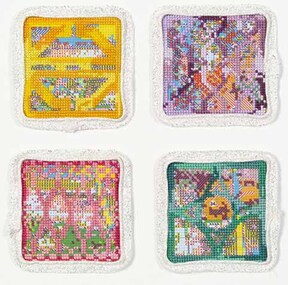
Textile, Clare McCracken, Remembering the White Building
Remembering the White Building, 2017 Clare McCracken As Cambodia rapidly urbanises, it is the urban poor that are forcibly removed from their homes to make way for shiny new apartment towers they cannot afford. In 2014 during a residency at the White Building, a medium-density slum in central Phnom Penh, Clare stitched pocket-sized cross-stitches of the ornate bricks of the building over the top of cross-stitch patterns of Angkor Wat. She gifted these tiny works to the residents she met - something they could take with them as a reminder of their community when it was demolished. In 2017, as the Cambodian government demolished the building, Clare created another series of the works: in memory of a community that had now been destroyed.Wangaratta Art Gallery CollectionA textile artwork that is made up of 4 cross stitch squares with each square a different colour and design.clare mccracken, cross stitch, textile -
 Wangaratta Art Gallery
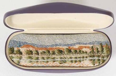
Textile, Sharon Peoples, Lake Tuggeranong 2, 2019
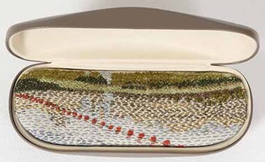
In 2019 Peoples undertook a residency at the Tuggeranong Arts Centre, Canberra. The original proposal was to explore the suburban gardens. However, it was the man-made lake with a different bloom, blue-green algae that held her attention. The still waters of the lake in the early mornings are tranquil. Becoming more familiar with the Lake, details caught Peoples’ eye. However, she realised the only interaction by humans with the Lake were two men who motored a small boat to the centre of the Lake, a hint as to the connection between tranquility and blue/green algae.Wangaratta Art Gallery Collection. Donated by June Brown.A small embroidery using a colour palette of green, orange, blue and brown depicting a scene of Lake Tuggeranong mounted into a purple spectacle case.sharon peoples, textile, embroidery, lake tuggeranong, landscape -
 Wangaratta Art Gallery
Textile, Sharon Peoples, Lake Tuggeranong 3, 2019
In 2019 Peoples undertook a residency at the Tuggeranong Arts Centre, Canberra. The original proposal was to explore the suburban gardens. However, it was the man-made lake with a different bloom, blue-green algae that held her attention. The still waters of the lake in the early mornings are tranquil. Becoming more familiar with the Lake, details caught Peoples’ eye. However, she realised the only interaction by humans with the Lake were two men who motored a small boat to the centre of the Lake, a hint as to the connection between tranquility and blue/green algae.Wangaratta Art Gallery Collection. Donated by June Brown.A small embroidery using a colour palette of green, red, blue and brown depicting a scene of Lake Tuggeranong mounted into a brown spectacle case.sharon peoples, embroidery, textile, lake tuggeranong -
 Duldig Studio museum + sculpture garden
Fabric, Mathilda Flogl, Falter designed by Mathilda Flogl 1924-31, 1924-31
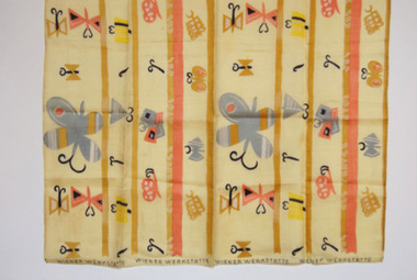
This piece of fabric, known Fälter (butterfly), was designed by Mathilda Flögl (1893-1958), who worked in the textile department of the Wiener Werkstätte in Vienna. It is a remnant of the fabric that was used to make a bedspread for Karl and Slawa’s bed in their Vienna apartment where it lay decoratively over a gold brocade eiderdown. The purchase demonstrated Slawa’s interest in and knowledge of modern design and her commitment to the idea of enriching everyday life with beautiful objects, a principal of the Viennese Secession. Following the Duldigs removal from Vienna, the original bedspread and remnant were safeguarded and preserved by Slawa’s sister, Rella, in the basement of her Paris apartment. In 1948 the bedspread and this remnant were sent to Australia. The bedspread was a much-loved item but deteriorated over the years. In 1955 it was made into curtains, which are held in the Duldig Studio Collection. The Photographs of the bedspread in its original location are also held in the collection. The remnant is in pristine condition. The Wiener Werkstätte (Vienna Workshop) was a guild of designers and craftsmen that was founded by the architect Josef Hoffman (1879-1956) and the designer Koloman Moser (1868-1918). The firm manufactured a range of interior furnishings between 1903 and 1932. The textile department opened in 1900, and produced about 1,800 designs, mainly for printed fabrics for furnishings and apparel. The designs were characterised by simplified forms and vivid colours, and inspired by Eastern European peasant art and geometric motifs in contemporary painting. The workshop had a profound impact of European art and design, and its work is still celebrated today. Mathilde Flögl was born in the Czech Republic in 1893, and studied at the Kunstgerwerbeschule in Vienna. In 1916 she began working at the Weiner Werkstätte, and where she designed more than 120 textile patterns. This fabric Fälter or Butterfly was designed in 1924. The butterfly was a favourite motif of Flögl. In this design she plays with a variety of whimsical abstractions and arrangement of both the butterfly and the snail on a background of abstract colour stripes and blocks. Ann Carew 2016The fabric is of great aesthetic interest as an example of the work of the Viennese workshops, and the noted designer textile designer Mathilde Flögl. The original pencil drawings, pencil and gouache designs, and fabric swatches for Fälter are held in the MAK Museum in Vienna, and the Victorian and Albert Museum in London have a sample of piece of the silk fabric in an alternate colour wave. The Museum of Applied Arts in Sydney holds a swatch book of textiles from the Wiener Werkstätte, however Flögl’s work is not represented. The National Gallery of Victoria holds a similar swatch book. The remnant has an excellent provenance, is associated with a powerful personal narrative, and is significant and rare item relating to history of the Wiener Werkstätte in Vienna, and the oeuvre of Matilda Flögl. Ann Carew 2016Remnant of a block-printed silk fabric used to make the bedspread for Karl Duldig and Slawa Horowitz-Duldig's bed in Vienna. -
 Duldig Studio museum + sculpture garden
Advertising card, Card, Kosmetik Institut, Wien ( Cosmetic Institute, Vienna) c. 1932, c.1932
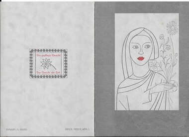
This advertising card was designed by Slawa Horowitz-Duldig. It was printed by 'Frisch, Wein 1'. Slawa undertook a number of sculpture commissions after graduating from the Akademie der Bildenden Künste Wien (Viennese Academy of Art) where she studied under Professor Hans Bitterlich from 1925-1929. She also undertook design commissions such as this card for the Cosmetic Institute which sold beauty creams. Reminiscent of the work of Austrian painter, designer and ceramic artist Berthold Löffler, in Slawa’s card her stylish typography, colour and design unite to create a unique work.This is an example of Austrian graphic design work between the wars and is of historical and artistic significance. Grey card front with print of single tone line stylised drawing of woman with red lips holding flowers - inside printed inscription in grey and red highlights Back logo - Printer's name (Frisch, Wien, 1) and artist's name ( S Duldig) credited -
 Nillumbik Shire Council
Painting: Walter MAGILTON, Walter Magilton, Sunlight and Shadows, Warrandyte, 2011
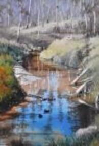
Walter Magilton's professional painting career is highlighted by numerous solo exhibitions, five of which have been in Great Britain. He has also won countless prizes, which include many 'Best in Show' awards. Walter is represented in a great number of private and corporate national and international collections, including ART Bank, in approximately twelve countries.This painting is a one of a series of approximately eight works of the river at Warrandyte and the local creeks, with particular emphasis on the reflections in the water and of the wattle growing along the banks. I was particularly inspired by Penleigh Boyde who did similar work while living in Warrandyte in the early 1920s.'Sunlight and Shadows, Warrandyte' is an oil on canvas painting depicting the Warrandyte landscape, featuring a winding creek with beautiful reflections cast upon it. The colour palate comprises muted green and earth tones, with a vivid aqua for reflective water.walter magilton, nillumbik, warrandyte -
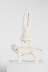 Nillumbik Shire Council
Sculpture: Liz Williams, Liz Williams, In Love, c.1996
Williams' use of the dog and poem was inspired by a print by the late Barbara Hanrahan (an artist friend) in which a women was holding a cat accompanied by a dog and in which words from a William Blake poem were included / After her mother died Williams made a work of her mother with the dog, holding the cat and using the same words in the Hanrahan print / The dog is a family pet; Dolcie, that Williams fell in love with / The dog as a symbol has been used in fifteenth and sixteenth century painting to represent fidelity in marriage / The use of the dog is also a contradiction to the themes in this work by Williams / Williams found that many of her women friends were having emotional and romantic difficulties, suffering from the same malady again and again, feeling rejected, destroyed and having unfulfilled desires / The female figure standing on her hands is not seeing things realistically / The figure is head over heels, vulnerable, with her skirt around her head revealing more than normal / The text enhances the meaning of the work and draws the viewer into experiencing the foolishness of love, demanding the viewer travel around and around to read it / Overall the dog provides structure to the work and a reliable object on which all else balances / Balance has been one of the recurring or repetitive themes within William's work / It references the physicality of clay, the difficulties in creating balance with the clay and balance in the work / Williams' work is about form rather than colour / Sometimes she uses a coloured clay like a pale terracotta / Williams likes the flatness of the surface in relationship to the marks of the text / She describes herself as a Minimalist, paring down the form to the bare essentials. 'In Love' was a finalist in the 1997 Nillumbik Art Award held at the Eltham Community and Reception Centre, Pitt Street, Eltham. A ceramic sculpture made of white stoneware clay (coated with a wash of gesso) of a girl doing a hand stand on the back of a dog (retriever?) / Her face/head is partially covered by her skirt which has come down / Her skirt is inscribed in the round with the poem "The Lady's First Song" (1938) by W.B. Yeats (see inscriptions and markings) / The dog is looking straight ahead and upwards towards the sky and his tail is pointing straight out. The dog is covered with cross-hatch incised lines to give the illusion of fur and texture / Hand written inscription of W.B. Yeats poem "The Lady's First Song" (1938) on girl's skirt / I turn round / Like a dumb beast in a show. / Neither know what I am / Nor where I go, / My language beaten / Into one name; / I am in love / And that is my shame. / What hurts the soul / My soul adores, / No better than a beast / Upon all fours.williams / yeats / love / ceramic / stoneware / dog -
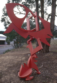 Nillumbik Shire Council
Public Art: Edward GINGER (b.1951 Kegalle, Sri Lanka - arrived 1975 Aus), Edward Ginger, The Breeze, Location: Main Road, Research - opposite Eltham Little Theatre, 1990
The first sculpture awarded the Shire of Eltham 'Art in Public Places' Award/Commission. The Judges were Inge King, Jenny Zimmer and Daryl Jackson. The work deals with the juxtaposition of suburban and rural surroundings. This scupture is a typical example of the artist's oevre of the period. This sculptre is site specific and refers to the nature of the environment. The colour - bushfire red / sienna - alludes to the history of fire in the urban/rural fringe and the title, as well as the sculpture's shapes, forms and material refer to the natural and local elements. Judges report noted: "The most vital and expressive work for the site...with a great sense of dynamic movement and vibrant colour. Its' abstract forms will enliven the surroundings and the urban and natural environment. This work is the most appropriate for the site and expressive of the dynamics of an evolving community in which artistic discourse and debate has always thrived." The work has acquired the status of a major landmark from the National Trust. The Breeze is an abstract work made out of welded steel and painted in enamel in bush fire red / sienna. It comprises a series of flat, cut-out shapes, interlocking at different angles, giving the impression of being hinged together rather than fixed. The work references nature and the built environment. Its geometric shapes suggest man-made structures within industry and suburban life, while rural areas can be identified by the organic flame-like shapes fanned by the wind. The circular cut-out in the eye mimics the sun, symbolising the intense heat of the Australian climate, while the colour red alludes to the history of bushfire within the urban and rural fringe. N/Apublic art, ginger, red, sienna, elements, steel, abstract, breeze, fire, sculpture -
 Nillumbik Shire Council
Public Art: Helen BODYCOMB (b.1964, South Australia) and Enver CAMDAL (Lives and works Turkey), Enver Camdal et al, Nest (Location: Roundabout, Main and Luck Street, Eltham), 1997
Commissioned by Nillumbik Shire Council - 1997 The selection panel in the commissioning process to this 'extraordinary acquisition' was Rhonda Noble, Director of La Trobe University Museum of Art, Jeph Neale, Eltham Roundabout Advisory Group, Chris Marks, NSC Curator of Collections, Geoff Glynn, NSC Manager of Infrastructure Development.'Nest' highlights the indigenous flora and fauna of the Shire. The stiff, coarse grass used to create the nest is indigenous to the area and the eggs are like those of the spotted quail thrush, a ground-nesting bird of the Shire. The circular flow or placement of the eggs recalls the revolution of the seasons and nesting cycles. There is a tall light pole above the eggs, shining down at night. The effect is of a giant incubator. Enrichment and nurturing of the larger environment can be associated with this sculpture. This work resembles a large bird's nest, with three egg-like forms of fibreglass covered in a pebble render, set on sand. The nest is positioned within the paved boundary of the roundabout. The nest shape has been created out of stiff, coarse indigenous grass, periodically trimmed so the view is not obstructed. The eggs are a brown-speckled, creamy yellow colour. The three eggs are arranged in a ring, with the narrow end of each pointing to the large end of the next, in a circle that mimics the flow of traffic. N/Apublic art, nest, eggs, eltham, ekphrasis2017, mosaic, pebbles, roundabout, spotted quail thrush -
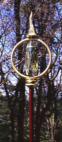 Nillumbik Shire Council
Sculpture: Michael WILSON (b.1943 Hastings, Victoria), Cicada, 1997
Michael Wilson learnt the craft of Goldsmithing after seeing well known sculptor and silversmith Matcham Skipper working in his studio at Montsalvat in and around 1970. This work is a gift to the Eltham Community in recognition of his twenty five years of developing his goldsmith skills and operating his business within the Shire. Wilson officially opened his commercial premises in 1985. Michael Wilson is a local jewellery maker. His work is influenced directly by the environment in which he lives. This sculpture is representative of his distinctive style of work as a nationally and an internationally recognised Designer and Goldsmith. Made of steel and powdercoated in aluminium with a concrete base. Decorative elements such as the ring encasing the cicada and the cicada's wings are guilded with 24ct gold leaf. The steel rod is burgundy in colour with the cicada painted a dark olive green to represent the 'Green Grocer' variety common in Eltham. The colours used in this sculpture match the surrounding Elm and Ash trees in the landscape. N/Apublic art, cicada, wilson, gold, green grocer, jewellery -
 Nillumbik Shire Council
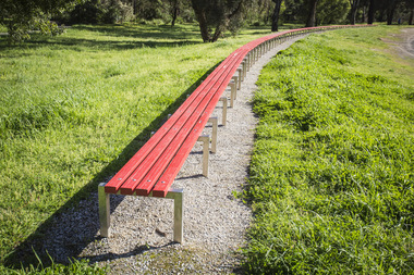
Public Art: Susie KUMAR & Naomi KUMAR, Benchmark (Location: Conventry Oval, Elizabeth Street, Diamond Creek), 1997
1996 Nillumbik Art in Public Places Award (installed late 1997). A biennial program that ceased in 2007. The program commissioned artists to make and install public art in various sites around the Shire. Award judges that year were Tony Trembath and artist Peter D. Cole. Susie Kumar has a Bachelor of Landscape Architecture degree from RMIT and Naomi Kumar has a Bachelor of Fine Art in photography degree from VCA. The Kumar sisters designed the sixty meter gently curving bench in response to the topography of the site, Conventry Oval. The sculpture is designed to describe the boundary between the formal oval and the natural creek bank and a considered relationship to the bike track and the river. It forms a link between the activities and aesthetics of its environment. The work is a comical interpretation of the utilitarian public bench. From a distance the bright red runners (the colour of the local football team's stripe) appear to float about the surrounding green. One end of the work is straight and finished. The other remains 'unfinished' hence allowing for the concept of unlimited extension. The 'legs' (steel hurdles) are arranged with a sense of movement and rhythm in sympathy with the activities happening around the work and with the stands of trees in he background. 'Benchmark' also serves as a functional purpose; providing a choice of places to sit to watch action on the oval. Stainless steel, timber (Victorian Ash) and red enamel paint. Sixty meter long red bench that gently curves in response to Conventry Oval. Bolted on top of evenly spaced stainless steel hurdles, four rows of timber runners are joined to provide unbroken continuous lengths. The bench stands on a framed bed of crushed rock (Lilydale topping).N/Abench, sport, wood, victorian ash, stainless steel, public art, ekphrasis2017 -
 Nillumbik Shire Council
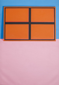
Painting: Jan MURRAY, Window onto the World (Orange), 1999
Murray is an artist with a renowned reputation within contemporary art practice. This painting was exhibitied in the 1999 Nillumbik Art Award. Oil on linen abstract painting. A painting within a painting. A stretched orange canvas with its back (black wooden support and brace) facing the viewer. It is resting on a pink floor and against a blue wall. Style is quite graphic with strong lines and flat colour. Not signed and not dated. ek prac 2015 -
 Nillumbik Shire Council
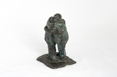
Sculpture: Peter WEGNER (b.1954 NZ - a.1958 AUS), Peter Wegner, The Embrace (from the 'Black Saturday' series), 2011
The 'Black Saturday' bushfires were a series of bushfires that ignited across the Australian state of Victoria on and around Saturday, 7 February 2009. It was Australia's worst ever natural disaster. The fires occurred during extreme bushfire-weather conditions and resulted in Australia's highest ever loss of life from a bushfire: 173 people died and 414 were injured as a result of the fires.This work is by a local contemporary artist with a national and international reputation for figurative and portrait works. The 'Black Saturday' series is a powerful investigation of emotion and grief as experienced by many Nillumbik residents during the 2009 'Black Saturday' bushfires. A cluster of bronze figurines either stand alone or embrace in groups. Their expressions and gestures of despair are made more pertinent with the raw like application and surface treatment of the material used. The 'Black Saturday' series is a challenging work, but one that encourages healing, connection and empathy. Two men embrace in despair. One man throws his arms around the other man's shoulders. The other man holds the other's back. Surface treatment is textured. Dark metallic brown colour with figures starting to turn a green patina. Note stuck with tape underside of sculpture 'Savage Art Prize Peter Wegner (phone number) The Embrace 2011'wegner, bronze, figurines, black saturday, sculpture -
 Nillumbik Shire Council
Prints (solar etchings): Christine JOHNSON (b. 1959 AUS), Voyages Botanical, 2014
Johnson undertook this project with a State Library of Victoria 'Creative Fellowship' in 2012, drawing on early botanical illustrations by Sydney Parkinson, Pierre-Joseph Redoute, Ferdinand Bauer and others from the Library's 'Rare Books' Collection. Johnson printed this series in 2013 while working as artist in residence at Baldessin Press, St. Andrews. 'Voyages Botanical' celebrates the untamed treasures of Australia’s (Nillumbik) vast native flower garden. The work speaks to Nillumbik's natural environment and colonial heritage in the context of our national story. Charcoal solander box with artwork title, artist name and flower motif in silver lettering bottom centre (edition 4/5). Catalogue: 52 colour pages. Solar plate engravings x 30; ink on paper. Series A: Ten multi-layered solar plate engravings (edition of 12); Series B: Ten flower images drawn from living specimens (edition of 12); Series C: Ten details from early botanical art engravings (open edition) Charcoal solander box with artwork title, artist name and flower motif in silver lettering bottom centre. Solar plate engravings x 30: Series A, B: all prints have edition number '4/12' to bottom left of image, artwork title () centre and artist signature 'Christine Johnson 2014' to bottom right of image. Series C: all prints have artist initials signed 'CJ' bottom right of images. All inscriptions in pencil. johnson, solar plate, engravings, creative fellowship, baldessin press, state library of victoria, botanical, flora, native, european explorers, cartography, wildflowers -
 Nillumbik Shire Council
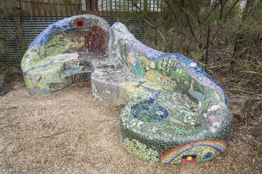
Public Art: Lasting Memories Mosaic GROUP, Lasting Memories Mosaic Seat (Location: St.Andrews Hall, 1 Proctor Street, St. Andrews), 2012
The 'Black Saturday' bushfires were a series of bushfires that ignited across the Australian state of Victoria on and around Saturday, 7 February 2009. It was Australia's worst ever natural disaster. The fires occurred during extreme bushfire-weather conditions and resulted in Australia's highest ever loss of life from a bushfire: 173 people died and 414 were injured as a result of the fires. For most women being part of the Lasting Memories Mosaic Group was a way of reconnecting to the area, friends and neighbours. As the months went by, the idea of creating a gift to the community together was born. The women wanted to artistically express their memories of what they had experienced. Creating a mosaic seat in the heart of St Andrews allowed the group to be 'in control' of building something from the ground up - a symbol of hope, recovery and renewal. All of their experiences and memories have been included into the seat design, which makes it so special. This mosaic seat is proudly positioned outside the St Andrews Hall, which is also the site for the St Andrews market held every Saturday throughout the year.The Lasting Memories Mosaic group began this piece just after the Black Saturday fires in 2009. After the horrific fires ravaged through St Andrews and the surrounding areas, a group of bushfire affected ladies bravely came back to St Andrews to begin their healing in an artistic way. Each woman created something beautiful and meaningful, using remnants of crockery, glass, tiles and bricks salvaged from their own properties. This artworks identifies who they are and tells their personal 'life journey' and family heritage and memories of what they had experienced before, during and beyond Black Saturday. It is also an expression of their love for the St. Andrews area and the nature and people within it. A large concrete seat in the style of an organic chaise lounge covered in mosaic (broken tiles, glass, crockery and ceramics of all shapes and colour). The pieces have been placed to form pictures, words and patterns that tell and recount stories and memories of reflection, hope and love of a group of people who experienced the Black Saturday bushfires. (Click on links to view details of the seat) black saturday, mosaic, art, lasting memories, st andrews, tiles, glass, fire, concrete, cement, chris reade, ekphrasis2017 -
 Nillumbik Shire Council
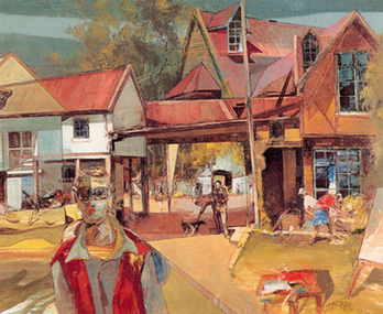
Reinis ZUSTERS (b.1918 Ukraine, arr.1950 Aus - d.1999 NSW Aus), Sunday Morning Montsalvat, 1979
Reinis Zusters OAM was born 15 October 1918 in Odessa, Ukraine, of Latvian parents. Zusters’ father died before he was two years old and he was raised in an orphanage from an early age. He had one sister. He studied Art at the Riga Technical College, Latvia, from 1935 to 1940. He married Aldija Kapteinis, and they had a daughter, Rudite (born 1942 in Riga). After World War II the Zusters family were refugees. They reached Western Australia in 1950, where they stayed for 6 months before moving to Canberra, ACT. In 1952, Zusters moved from Canberra to Pennant Hills in Sydney with his second wife, Arija Biks. Their daughter Laura was born in Sydney in 1956. In 1966, Zusters met his future third wife, Venita Salnajs. In 1969, Zusters bought a house in Greenwich, Sydney. He married Venita on September 17, 1976, and they moved to Wentworth Falls in the Blue Mountains. Zusters died on 8 October, 1999 at Wentworth Falls, and was cremated at Rookwood Crematorium, Sydney. His ashes are buried in the Latvian section of Rookwood Cemetery. Zusters studied at the Technical College of Riga (Latvia), and at East Sydney Technical College, Australia. He was influenced by his Latvian cultural heritage, and admired the artist Voldemars Tone (1892-1958). Shortly after arrival in Australia, Zusters became a draughtsman with the Department of Works and Housing in Canberra. Later he was appointed chief designer with the Australian-American architectural firm Austin-Anderson, at St. Leonards, Sydney. Zusters practised as a full-time professional artist from 1968. Zusters was a prolific painter, predominantly in oils. He produced many large landscapes, including triptychs of the Blue Mountains. His landscapes were mountain scenes prepared in the manner of Jackson Pollock and completed with washes and pale glazes of colour. His cityscapes featured a rich paint surface and sharp-edged thickness of paint applied with a palette knife, layer upon layer. He painted urban scenes of Sydney, inland Australian scenes, and several major portraits including Sir Winston Churchill’s gardener (purchased by Art Gallery of NSW). He made many small informal portrait-drawings of friends. His usual signature was “Zusters”. His work is represented in numerous public and private collections in Australia and abroad. He won numerous prestigious awards in Australia, Japan and USA and was honoured with the Order of Australia Medal in 1994. -
 Nillumbik Shire Council
Print (woodcut and etching on chine-colle): John WOLSELEY (b.1938 Somerset, UK; arrived 1976 Melb., AUS), John Wolseley, 'Life world of the Longicorn beetle' from the 'Baldessin & Friends commemorative folio', 2016
Painter, printmaker and installation artist John Wolseley was born in Somerset, England. He lived and worked throughout Europe before relocating to Australia in 1976. His work explores how people dwell and move within landscape. Wolseley see's himself as a hybrid mix of artist and scientist; one who tries to relate the minutiae of the natural world - leaf, feather and beetle wing - to the abstract dimensions of the earth's dynamic systems. Using techniques of watercolour, collage, frottage, nature printing and other methods of direct physical or kinetic contact Wolseley finds ways of collaborating with the actual plants, birds, trees, rocks and earth of a particular place. George Baldessin was one of the first artists John Wolseley met when he arrived in Australia in 1976. Both immigrated to Australia and connected through this shared experience. They were both at 'Realities Gallery' with Marianne Baillieu in the 1970s and 80s. George Baldessin (1939-1978) was born in San Biagio di Callalta, in the Veneto in Northern Italy and arrived in Australia ten years later. A printmaker and sculptor he built his bluestone studio at St Andrews (Nillumbik) in 1971 with his partner Tess and the three Hails brothers, Rob, Doug and Don. Made of recycled materials the studio today contains all of George’s equipment including the large press, which he modelled himself with the help of Neil Jeffrey (Enjay Presses). George won many prizes throughout his career and is represented in many of Australia's public art collections including his famous 'Pears' sculpture in front of the National Gallery of Australia, Canberra. In 1975 he represented Australia in the Sao Paulo Biennale, before living and working in Paris until his return to St Andrews in 1977. In 1978 George was killed in a car accident aged 39 years. In 2001 Tess returned to St Andrews to reclaim the run-down studio and reconstitute it as The Baldessin Press & Studio - a printmaking retreat. It operates in George’s memory, so that artists may continue to create, perpetuating the generous spirit of George. 'Life world of the Longicorn beetle' is one of eight prints in the 'Baldessin & Friends commemorative folio. The folio was conceived by Tess Edwards as a fundraising initiative in celebration of the The Baldessin Press & Studio's fifteen year anniversary, and as a way to honour George Baldessin's memory. The Baldessin Press & Studio is a not-for-profit organisation created in memory of the late George Baldessin (1939-1978), whose original studio is now open to the public for creative use and as a practical legacy to living artists. The Studio is located in St Andrews, Nillumbik. The folio is a unique coming together of seven very different and acclaimed artists who are connected by their friendship to the missing eighth member, George Baldessin. Communion and collaboration with nature are central to Wolseley's practice. He assembles different drawing methods to represent a kind of inventory or document about the state of the earth. His interest is to paint the processes and energy field of the living systems of this land. 'Life world of the Longicorn beetle' is his continued exploration of Australia's natural eco-systems. The beetle attacks the eucalypt and in the process of tunnelling into the wood of the tree leaves scribbly patterns. The work celebrates the cycle of life, and the wisdom and delicacy of these creatures. This three dimensional work consisting of three layers of paper is a varied edition, offering just the slightest difference between each print, reflective of variation in nature. The found log used as a woodcut acknowledges the interconnectedness of nature and living beings; the log is not apart from the art and the beetle has become an active artistic collaborator. An intimate and layered print of a tree log with line trails from the Longicorn beetle. Patches of pink, yellow and orange watercolour placed randomly. Woodcut from found log and etching on chine-colle with water colour on Gampi (top layer), Mulberry (middle layer) and Arches (bottom layer) paper. In pencil (handwritten): low plate: left '14/25' (edition); centre 'Life world of the Longicorn beetle' (title); right 'John Wolseley' (signature); low paper: right emboss 'GB' (Baldessin Press & Studio monogram)woodcut, etching, chine-colle, landscape, environment, longicorn beetle, print, baldessin, ekphrasis2018, eco, mixed media -
 National Wool Museum
Rug
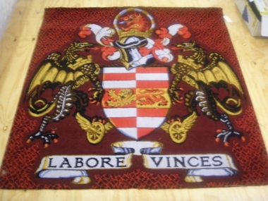
The rug hung in the boardroom at the Brintons Carpet premises/factory at Fellmongers Road, Breakwater. Acquired on closure of factory.W7199 Page 1 of a history of Brintons Carpets. Page 2 of a history of Brintons Carpets. A list of catalogues/items in the Brintons Collection donated after closure of Fellmongers Road factory in July 2008.Labore Vinces Brintons Carpets/Special Enquiry Prepared for/Ref. No 15/2878 for Aurora/Quality colours in trial/standard/non standard/Design and colour sample does not represent qualitytextile art, brintons australia pty ltd brintons pty ltd (geelong) brintons ltd (uk), carpet -
Swan Hill Regional Art Gallery
Print, MacQUEEN, Mary McCartney, Colour morning (cockatoos), 1964
-
 Stawell Historical Society Inc
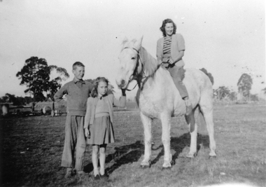
Photograph, Isobel Drefke on horse with her two children
Donated with a Water Colour painting (6642) of a cottage by Will ReesBlack and white photo of woman on horse with her two children in a rural setting. c 1950's Isobel is the daughter of Will Reeswill rees, art, painting -
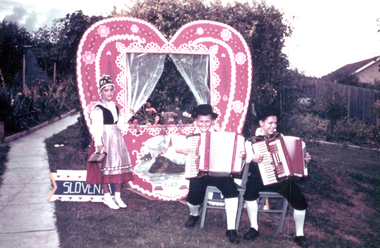 Slovenian Association Melbourne
Slovenian children at the Royal Melbourne Show, not known
Slovenian Club Melbourne participated many times at the Royal Melbourne Show with the musicians, dancers, folk dances, art and craft exhibitions. They were always warmly welcomed.The second Slovenian children of the first generations keeping up the traditionsColour photo of the large decorative heart with the Slovenian children in national costumes and boys playing piano accordions at the Royal Melbourne Show. The children are:Young generation of Slovenians, born in Australia, keeping the Slovenian traditionsslovenian traditions, slovenian national costume, slovenian music, slovenian polka -
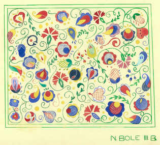 Slovenian Association Melbourne
Colour drawing, Neva Roeder-Bole, colour drawing of carnations
Colour drawing of stylised carnation, influenced by folk art. Motif is for embroidery.Neva Bole, 3B -
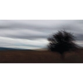 The 69 Collective
Photograph, Jenny Gibson, Towards Braidwood, 2011
... space photography landscape melbourne art galleries colour ...This artwork is part of 69Fifteen, the book published in 2013 celebrating 69 Smith Street Gallery’s 15th year in operation as an artist-run space.Blurred vision of a tree against brown landscape and blue/grey sky.jenny gibson, 69 smith street gallery, artist-run initiative, artist-run space, photography, landscape, melbourne art galleries, colour photography, digital photography -
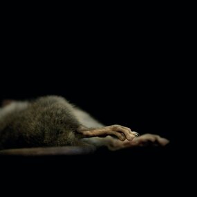 The 69 Collective
Photograph, Aneta Bozic, After Life: Mouse, 2012
... space melbourne art galleries photography colour photography ...This artwork is part of 69Fifteen, the book published in 2013 celebrating 69 Smith Street Gallery’s 15th year in operation as an artist-run space.Colour digital print of a dead mouse. Image is a cropped detail of the animal's hind legs and tail.aneta bozic, 69 smith street gallery, artist-run initiative, artist-run space, melbourne art galleries, photography, colour photography, animal photography, death in art, www.anetabozic.com -
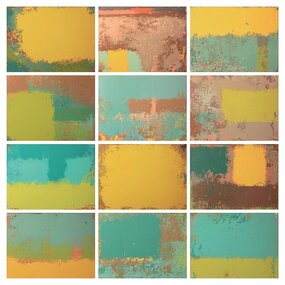 The 69 Collective
Painting, Julie Harmsworth, Walk in the Sun, April 2013
This artwork is part of 69Fifteen, the book published in 2013 celebrating 69 Smith Street Gallery’s 15th year in operation as an artist-run space.Acrylic painting. Abstract image comprising twelve canvases. Colour scheme includes yellow, brown, aqua and green.julie harmsworth, 69 smith street gallery, artist-run initiative, artist-run space, melbourne art galleries, painting, abstract art, abstract painting, www.incarastudio.com.au -
 National Wool Museum
Sculpture - Bollard, Jan Mitchell, The Lost Bollards, 1999
Geelong is famous for its bollards. Created by local artist Jan Mitchell, the colourful bollards spot the foreshore, representing a fascinating and fun chronicle of the city’s past. Few people know that Mitchell planned for a flock of sheep to be part of her public art project. The wool industry is an important part of Geelong’s history, so Mitchell thought what better than a flock of sheep to welcome people to the city. The flock (and a Shepard) were to be placed out on the Melbourne-Geelong highway, near Lara, to welcome travellers to the city. The sheep would then be scattered along the road as a wayfinding signal to bring people to Geelong. When traffic authorities heard the plan for bollard sheep along the road, they squashed the project as a potential distraction for drivers. Another flock was also suggested for the hills of the eastern gardens, overlooking the bay. This was also disapproved; so Mitchell only ever partially completed four sheep bollards. The bollards are remnants of Jan Mitchell’s flock of sheep. The sheep also show the evolution of one of Geelong’s most iconic art installations. From the first sheep showing the raw timber of the old Yarra Street pier, to the sheep without a face, through to the completed sheep, it is possible to trace Mitchell’s process in the preparation of the bollards. The lost bollards form part of the National Wool Museum’s unique collection. The first bollard is the least complete, still in its original timber colour. From the central cylindrical shape, an additional wedge protrudes. This unpainted wedge forms what would have been the face of the sheep, with an ear present on either side that would have been painted white. Presently they are a bare metal. No legs are present on this bollard. The second and third bollard are completed to a similar level. They have a central cylindrical shape with an additional wedge protruding from the front of the timber. This wedge forms what would have been the face of the sheep, with an ear present on either side. The face and ears have been painted white but the finer details such as the eyes have not been added. These bollards bodies have also been painted white and have their legs attached. The legs are thin metal cylinders, approximately 50mm in diameter and 500mm long. The fourth bollard Is complete. It has the same central cylindrical shape with an additional wedge protruding from the front of the timber. This wedge forms the completed face of the sheep, with an ear present on either side that has been painted white. The face also features completed painted eyes. This bollard has its legs attached. The legs are thin metal cylinders, approximately 50mm in diameter and 500mm long. geelong, bollards, geelong's bollards, jan mitchell -
Koorie Heritage Trust
Book, Abdulla, Ian W, Tucker, 1994
Ian's narrative paintings recall the stories of his youth with refreshing simplicity, while their rich textures and brilliant colours evoke a deep love for a time and a place that are never very far from his imagination. He has mounted seven solo shows and fifteen joint exhibitions and represented in many galleries throughout Australia, including the National Gallery.38 unnumbered pages colour illustrations, map ; 26 x 31 cm.Ian's narrative paintings recall the stories of his youth with refreshing simplicity, while their rich textures and brilliant colours evoke a deep love for a time and a place that are never very far from his imagination. He has mounted seven solo shows and fifteen joint exhibitions and represented in many galleries throughout Australia, including the National Gallery.abdulla, ian w., 1947-2011 -- childhood and youth. | aboriginal australians -- murray river region (n.s.w.-s.a.) -- food -- juvenile literature. | aboriginal australians -- south australia -- food -- juvenile literature. | aboriginal australians, in art -- juvenile literature. | painting, australian -- south australia -- aboriginal artists -- juvenile literature. | wild foods -- murray river region (n.s.w.-s.a.) -- juvenile literature. | wild foods -- south australia -- juvenile literature. -
Koorie Heritage Trust
Book, Abdulla, Ian W, As I grew older : the life and times of a Nunga growing up along the River Murray, 1993
As I Grew Older affirms the culture of rural Aborigines who, despite being dispossessed, have been determined to stay onb their own land. The painting of Ian Abdulla offer us a window on to the life of an Aboriginal Family on the Murray River in the mid-twentieth century.40 unnumbered pages : colour illustrations, 1 colour map ; 26 x 31 cm.As I Grew Older affirms the culture of rural Aborigines who, despite being dispossessed, have been determined to stay onb their own land. The painting of Ian Abdulla offer us a window on to the life of an Aboriginal Family on the Murray River in the mid-twentieth century.abdulla, ian w., 1947-2011. | aboriginal australians -- murray river region (n.s.w.-s.a.) -- biography. | aboriginal australians -- south australia -- juvenile literature. | aboriginal australians, in art -- juvenile literature. | painting, aboriginal australian -- south australia -- juvenile literature. | murray river region (n.s.w.-s.a.) -- biography. | australian