Showing 388 items
matching modern art
-
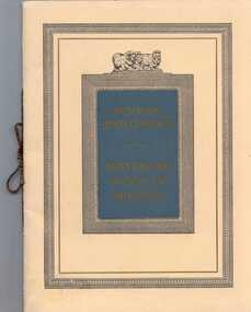
 Robin Boyd Foundation
Document - Manuscript, Robin Boyd, ('… by being squeezed through…')
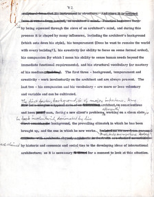
Discusses the influence of background, temperament and creativity on an architect as well as the three phases in the development of architecture in 20th century and the theme of space. A long critique on the issue of the sails of the Sydney Opera House. The question of art versus technology in the future of architecture is argued. (Is this related to D020)This is an untitled speech, annotated with numbers indicating markers for slides, "Lights".Typewritten (carbon copy), with major pencil edits, quarto, 21 pages. Starts on page 2.On page 2, the title 'The Phases of Modern Architecture' is crossed out.creativity, functionalism, ornament, romanticism, fragmentation, space, computer, beauty, sydney opera house, sigfried giedion, jorn utzon, ove arup, super-functionalism, robin boyd, manuscript -
 Robin Boyd Foundation
Document - Manuscript, Robin Boyd, Architecture in the Seventies
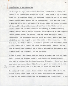
Boyd outlines the focus of the Modern Movement: function determining form and the rejection of ornamentation; outlines three phases of Modernism: the plain informal functionalist box style; 1950s monolithic sculptural forms (eg TWA terminal); and fragmented systematic expandable forms. Boyd proposes a new phase: a New Revolution Against Architecture, wherein the barriers between art and science are broken down and combined with technology; suggests looking to Japanese Metabolism.Typewritten, pencil edits, quarto, 21 pagesPage 1 refers to a chart (not attached). Sporadic annotations throughout. Appears to be a talk. Pages 6-8 refer to a chart, page 11 refers to an image of apartments by James Stirling, p14 refers to Robert Venturi's Guild House.page 1 refers to a chart (not attached). sporadic annotations throughout. appears to be a talk. pages 6-8 refer to a chart, page 11 refers to an image of apartments by james stirling, p14 refers to robert venturi's guild house -
 Robin Boyd Foundation
Document - Manuscript, Robin Boyd, Current Architecture, c. 1970
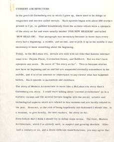
This text summarises the differences in architecture and proposes, unlike in other art forms, that architecture has a mainstream which has consistency in it, yet is also ever changing. The term 'modern architecture' is becoming suspect and obsolete. Visual art is inevitably involved with social evolution. It discusses utilitarian and creative architecture. Boyd proposes architecture is between science and art, and that architecture by itself means the architecture of this age.Typewritten, quarto, 11 pages (Note: Mentions the 1960s, possibly implying it was written late 1960s-1970/1971)modern architecture, social evolution, utilitarian architecture, creative architecture, mcluhan era, glutternberg era, henry russell hitchcock, paul rudolph, philip johnson, kenzo tange, archigram, sydney opera house, reston, robin boyd, manuscript -
 Robin Boyd Foundation
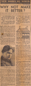
Newspaper - Clipping, Clive Turnbull, Why not Make It Better?, 05.07.1947
This is a book review by Clive Turnbull of 'Victorian Modern' by Robin Boyd and 'Art Appreciation" by R Haughton James. The review of Boyd's book ends with a high complement - Turnbull wishes the book could have been longer!Handwritten in pen the date at the topclive turnbull, victorian modern, walsh st library -
 Robin Boyd Foundation
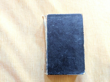
Book, John Ruskin, Modern Painters Vol II
HardcoverEx Libris/Pen Boydart, painting, walsh st library -
 Robin Boyd Foundation
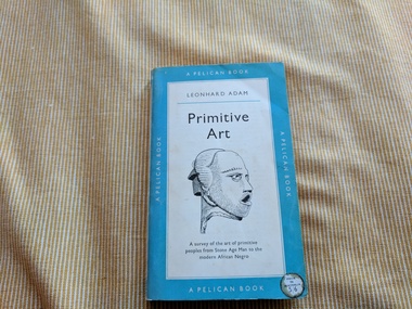
Book, Leonhard Adam, Primitive Art: A survey of the art of primitive peoples from Stone Age Man to the modern African Negro, 1954
SoftcoverInscription on title page, black ink: 'Patricia Boyd' Typed letter (2 copies), c. letter size, thin paper. Folded in quarters and loosely placed within paperback book. Titled 'RADIOCARBON - DATING'. art, walsh st library -
 Robin Boyd Foundation
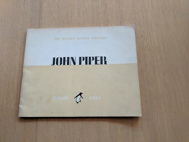
Book, John Betjeman, John Piper, The Penguin Modern Painters, 1944
SoftcoverLetters R.P.B top right on first pagebritish painting, british art, british artists, walsh st library -
 Robin Boyd Foundation
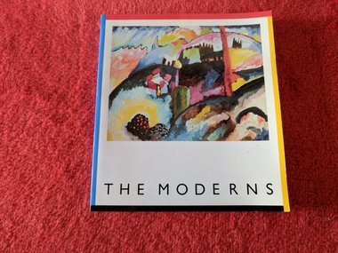
Book, Jan Meek, The Moderns, 1984
... The Moderns Book Jan Meek Art Gallery of New South Wales ...SoftcoverInserted in front cover: introduction to the exhibition, written by Peter Lawson-Johnston, President of The Solomon R. Guggenheim Foundationart, australia, walsh st library -
 Robin Boyd Foundation
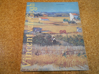
Book, Evert van Uitert, Louis van Tilborgh, Sjraar van Heugten, Vincent Van Gogh: Paintings, 1990
... melbourne Art painting modern Dutch 19th century Vincent van Gogh ...Soft Coverart, painting, modern, dutch, 19th century, vincent van gogh, the netherlands, walsh st library -
 Victorian Aboriginal Corporation for Languages
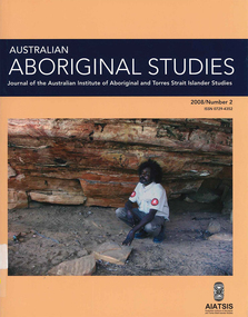
Periodical, Australian Institute of Aboriginal and Torres Strait Islander Studies, Australian Aboriginal studies : journal of the Australian Institute of Aboriginal and Torres Strait Islander Studies, 2008
Mawul Rom Project: Openness, obligation and reconciliation Morgan Brigg (Universtiy of Queensland) and Anke Tonnaer (University of Aarhus, Denmark) Aboriginal Australian initiatives to restore balanced relationships with White Australians have recently become part of reconciliation efforts. This paper provides a contextualised report on one such initiative, the Mawul Rom crosscultural mediation project. Viewing Mawul Rom as a diplomatic venture in the lineage of adjustment and earlier Rom rituals raises questions about receptiveness, individual responsibility and the role of Indigenous ceremony in reconciliation efforts. Yolngu ceremonial leaders successfully draw participants into relationship and personally commit them to the tasks of cross-cultural advocacy and reconciliation. But Mawul Rom must also negotiate a paradox because emphasis on the cultural difference of ceremony risks increasing the very social distance that the ritual attempts to confront. Managing this tension will be a key challenge if Mawul Rom is to become an effective diplomatic mechanism for cross-cultural conflict resolution and reconciliation. Living in two camps: the strategies Goldfields Aboriginal people use to manage in the customary economy and the mainstream economy at the same time Howard Sercombe (Strathclyde University, Glasgow) The economic sustainability of Aboriginal households has been a matter of public concern across a range of contexts. This research, conducted in the Eastern Goldfields of Western Australia, shows how economically successful Aboriginal persons manage ?dual economic engagement?, or involvement in the customary economy and the mainstream economy at the same time. The two economies sometimes reinforce each other but are more often in conflict, and management of conflicting obligations requires high degrees of skill and innovation. As well as creating financially sustainable households, the participants contributed significantly to the health of their extended families and communities. The research also shows that many Aboriginal people, no matter what their material and personal resources, are conscious of how fragile and unpredictable their economic lives can be, and that involvement in the customary economy is a kind of mutual insurance to guarantee survival if times get tough. Indigenous population data for evaluation and performance measurement: A cautionary note Gaminiratne Wijesekere (Dept. of Families, Housing, Community Services and Indigenous Affairs, Canberra) I outline the status of population census counts for Indigenous peoples, identifying information on Indigenous births and deaths, and internal migration estimates. I comment on the ?experimental? Indigenous population projections and question the rationale for having two sets of projections. Program managers and evaluators need to be mindful of limitations of the data when using these projections for monitoring, evaluating and measuring Indigenous programs. Reaching out to a younger generation using a 3D computer game for storytelling: Vincent Serico?s legacy Theodor G Wyeld (Flinders University, Adeliade) and Brett Leavy (CyberDreaming Australia) Sadly, Vincent Serico (1949?2008), artist, activist and humanist, recently passed away. Born in southern Queensland in Wakka Wakka/Kabi Kabi Country (Carnarvon Gorge region) in 1949, Vincent was a member of the Stolen Generations. He was separated from his family by White administration at four years of age. He grew up on the Cherbourg Aboriginal Reserve in the 1950s, when the policies of segregation and assimilation were at their peak. Only returning to his Country in his early forties, Vincent started painting his stories and the stories that had been passed on to him about the region. These paintings manifest Vincent?s sanctity for tradition, storytelling, language, spirit and beliefs. A team of researchers was honoured and fortunate to have worked closely with Vincent to develop a 3D simulation of his Country using a 3D computer game toolkit. Embedded in this simulation of his Country, in the locations that their stories speak to, are some of Vincent?s important contemporary art works. They are accompanied by a narration of Vincent?s oral history about the places, people and events depicted. Vincent was deeply concerned about members of the younger generation around him ?losing their way? in modern times. In a similar vein, Brett Leavy (Kooma) sees the 3D game engine as an opportunity to engage the younger generation in its own cultural heritage in an activity that capitalises on a common pastime. Vincent was an enthusiastic advocate of this approach. Working in consultation with Vincent and the research team, CyberDreaming developed a simulation of Vincent?s Country for young Aboriginal and non-Aboriginal persons from the Carnarvon Gorge region to explore Vincent?s life stories of the region. The use of Vincent?s contemporary paintings as storyboards provides a traditional medium for the local people to interactively re-engage with traditional values. Called Serico?s World, it represents a legacy to his life?s works, joys and regrets. Here we discuss the background to this project and Vincent?s contribution. A singular beeswax representation of Namarrkon, the Lightning Man, from western Arnhem Land RG Gunn (La Trobe University) and RL Whear (Jawoyn Association) Samples from a beeswax representation of Namarrkon, the Lightning Man, from western Arnhem Land were analysed for radiocarbon and dated to be about 150 years old. An underlying beeswax figure was found to be approximately 1100 years old. The Dreaming Being Namarrkon is well known throughout Arnhem Land, although his sphere of activity is concentrated around the northern half of the Arnhem Land plateau. Namarrkon is well represented in rock-paintings in this area and continues to be well represented in contemporary canvas-paintings by artists from the broader plateau region. We conclude that representations of Namarrkon in both painted and beeswax forms appear to be parallel manifestations of the late Holocene regionalisation of Arnhem Land. ?Missing the point? or ?what to believe ? the theory or the data?: Rationales for the production of Kimberley points Kim Akerman (Moonah) In a recent article, Rodney Harrison presented an interesting view on the role glass Kimberley points played in the lives of the Aborigines who made and used them. Harrison employed ethnographic and historical data to argue that glass Kimberley points were not part of the normal suite of post-contact artefacts used primarily for hunting and fighting or Indigenous exchange purposes, but primarily were created to service a non-Indigenous market for aesthetically pleasing artefacts. Harrison asserted that this market determined the form that these points took. A critical analysis of the data does not substantiate either of these claims. Here I do not deal with Harrison?s theoretical material or arguments; I focus on the ethnographic and historical material that he has either omitted or failed to appreciate in developing his thesis and which, in turn, renders it invalid. The intensity of raw material utilisation as an indication of occupational history in surface stone artefact assemblages from the Strathbogie Ranges, central Victoria Justin Ian Shiner (La Trobe University, Bundoora) Stone artefact assemblages are a major source of information on past human?landscape relationships throughout much of Australia. These relationships are not well understood in the Strathbogie Ranges of central Victoria, where few detailed analyses of stone artefact assemblages have been undertaken. The purpose of this paper is to redress this situation through the analysis of two surface stone artefact assemblages recorded in early 2000 during a wider investigation of the region?s potential for postgraduate archaeological fieldwork. Analysis of raw material utilisation is used to assess the characteristics of the occupational histories of two locations with similar landscape settings. The analysis indicates variability in the intensity of raw material use between the assemblages, which suggests subtle differences in the occupational history of each location. The results of this work provide a direction for future stone artefact studies within this poorly understood region.document reproductions, maps, b&w photographs, colour photographskimberley, mawul rom project, 3d computer game, storytelling, vincent serico, beeswax, namarrkon, artefact assemblages, strathbogie ranges, groote eylandt, budd billy ii -
 Duldig Studio museum + sculpture garden
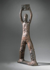
Sculpture, Karl Duldig, Moses by Karl Duldig 1956 (Bronze Cast 1979), 1956 / 1979
... of Modern Art at Heide.' Apart from the formal qualities of a work ...This sculpture is a bronze cast of Karl Duldig’s 1956 terracotta sculpture titled 'Moses'. The terracotta sculpture won the 1956 Victorian Sculptor of the Year award, an honor given by the Victorian Society of Sculptors. The National Gallery of Victoria purchased the original terracotta sculpture for the Gallery’s collection in 1956. In 1979 the NGV allowed Karl to cast the original terracotta sculpture in bronze (to a limited edition of 5). The National Gallery of Victoria holds one of these casts and one is in Duldig Studio collection. The original terracotta sculpture was exhibited in 1956 at the Olympic Arts Exhibition in Wilson Hall at the University of Melbourne. Two other works by Karl were also exhibited, a sandstone titled 'Adam and Eve' and a work titled 'Fountain'. The catalogue for the Olympic exhibition, which promoted modernism across a variety of disciplines, noted that Australia’s post war immigration program had given ‘further momentum to the modernist cause’. The identification of émigré artists, such as Karl Duldig, with the acceptance of modernism in Australia became a major theme in any discussion of art and design in the post war period. Ann Carew 2016The subject Moses and the tablets of law is an important theme in the history of art. For example the National Gallery of Victoria collection includes paintings on this topic by the Australian Aboriginal artist, Queenie McKenzie (1991), prints by the Russian-French modernist artist, Marc Chagall (1956), and a painting by 19th century British academic painter, John Rogers Herbert (1870s). Michelangelo’s sculpture of Moses is perhaps the most famous sculptural interpretation of the subject. In Karl’s hands we have a modern interpretation of the theme. His simplification and abstraction of form and attention to surface modeling is masterly. The figure has an emotional intensity and despite its relatively small scale, a ‘forceful monumentality’. The sculpture is aesthetically significant for its craftsmanship, expressive qualities and modernity. It is historically significant because of its associations with the 1956 Olympic Arts Festival. The Duldig Studio’s bronze cast of the sculpture was exhibited in the exhibition '1956: Melbourne, modernity and the XVI Olympiad, Museum of Modern Art at Heide.' Apart from the formal qualities of a work like Moses, its relevance as a motif in Judaism and Christian faiths ensures its place as a work of spiritual significance. Ann Carew 2016Bronze cast from terracotta sculpture. Depicts Moses as in Exodus 32 when he returns from Sinai with the tablets of the law to find his people worshipping the golden calf, in his fury he holds the tablets aloft above his head before crashing them down on the ground. -
 Duldig Studio museum + sculpture garden
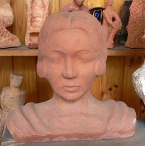
Sculpture, Slawa Horowitz-Duldig, Self-portrait by Slawa Horowitz-Duldig c. 1924, c.1924
This self-portrait exemplifies Karl and Slawa's shared interest in the art forms of other cultures - also seen in the significant number of Viennese art books on these topics in the Duldig Studio library. It takes inspiration from Egyptian sculptures and is strikingly similar to the cover image of Götter Ӓgyptens (Gods of Egypt) by Alexander Scharff (Library) although her short hair puts a stylish and very modern slant upon the image. The sculpture is hollow, with a large opening at the rear. Slawa on full face, eyes downcast, hair parted in the middle & pulled back in bun with large comb. Drapes across both shoulders. modernism -
 National Wool Museum
Book, Modern Developments in the Australian Wool Industry
"Modern Developments in the Australian Wool Industry", c.1923. Examines the operations of the Yarra Falls Spinning Co. Pty Ltd and the Australian Knitting Mills Limited (makers of Golden Fleece and Kookaburra knitted underwear). Includes photos of processes and of the buildings.Book, front cover: "Modern Developments in the Australia Woollen Industry" c.1923; Yarra Falls Spinning Co. Pty Ltd and Australian Knitting Mills Limited.weaving textile industry - history textile production machine knitting textile mills, yarra falls spinning co. pty ltd australian knitting mills limited, yarn - woollen, cloth - worsted, yarn - worsted, wool tops, yarn - cashmere, logo merino: sheep in australian art and design - exhibition (29/07/2000 - 04/02/2001), weaving, textile industry - history, textile production, machine knitting, textile mills -
 National Wool Museum
Book, Fabric of Our Community
"Fabric of our community" - City of Hamilton Art Gallery, 1988. Catalogue for an exhibition of modern quilts produced to celebrate the bicentenary in Hamilton. They were accompanied by a display of historic textiles from the Hamilton Art Gallery's permanent collection.quilting patchwork handicrafts, city of hamilton art gallery, quilting, patchwork, handicrafts -
Embroiderers Guild Victoria
Domestic object - Enamel thimble celebrating Embroiders Guild Victoria' 20th year anniversary, The Embroiderrs Guild, 1980
... and promoting the art of traditional and modern embroidery.... and promoting the art of traditional and modern embroidery. One ...Embroiderers Guild Victoria was founded in 1960. It is a not-for-profit organisation, focusing on teaching, sharing, encouraging and promoting the art of traditional and modern embroidery.One of a limited edition of three hundred produced for the 20th Anniversary of The Embroiderers Guild of Victoria Enamel thimble decorated with Embroiderers Guild logo on one side and Victoria 1960-1980 on other with sprigs of pink heath.The Embroiderers Guild, Halcyon Days backstamp, Bilston and Battersea Enamels Made In Englandembroiderers guild, enamel thimble, bilston & battersea -
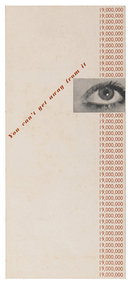 RMIT Design Archives
Booklet - Brochures, You can't get away from it
Richard Beck established a consultancy as an industrial designer in London in the 1930s, designing posters, booklets and advertisements for London Transport, Shell-Mex, Orient Line and the London GPO. His work was illustrated in Radio Times, Evening Standard and News Chronicle. His posters used montage and surrealist techniques, as in this example, reminiscent of E McKnight Kauffer who was prominent in commercial art in interwar England. The London Journal Art and Industry reproduced a number of Beck's posters for the Orient Line and London Transport and in 1938 Modern Publicity's annual round-up featured Beck's cover design and included a profile of his work.Brochure for London Transportgraphic design, mid-century modern, design -
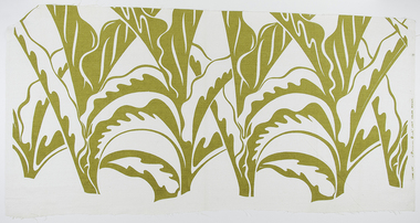 RMIT Design Archives
Textile lengths, Canna leaf
Dr. Frances Mary Burke (1907 - 1994) was a textile designer and printer, businesswoman, artist and Australian design advocate and retailer. Burke’s modern abstract textile designs incorporated motifs and colours inspired by Australian Indigenous art, Pacific Island cultures, Australian flora and fauna, English gardens, and the sea and its wildlife. Following Burke’s death in 1994, her life-long companion Miss Fabie Chamberlain donated the contents of Burke’s studio to RMIT University.Single colour screenprint, white fabric with chartreuse coloured print of positive large format design featuring large stylised canna leaf motif.Printed on selvedge 'CANNA LEAF' a "Frances Burke" UNIT COLOUR DESIGN'textile, australian flora, rmit design archives -
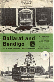 Ballarat Tramway Museum
Book, Light Railway Transport League, "Ballarat and Bendigo, Victorian Tramway Preservation", 1975
Twelve page booklet, titled "Ballarat and Bendigo, Victorian Tramway Preservation" written by D. Menzies and J.H. Price, reprinted from Modern Tramway. Front cover has BTPS tram 38 on original depot fan, green banner centrally with title, and Bendigo Birney No. 28. A circular white sticker with "1.00" written on is stuck on the right hand side, centrally. Saddle stapled print in black ink on 120gsm art paper. Written material covers background history of both Ballarat and Bendigo tramways, tramcars, closure, the formation of the BTPS and the Bendigo Trust tramways and their operational history up to about mid 1975 as it mentions the first COTMA meeting. Also has 12 photos inside. On rear cover is an advertisement for the TMSV and the Light Railway Transport League (UK) (LRTL) PDF copy of book added 16-3-2017 Price sticker as noted abovetrams, tramways, ballarat, bendigo, lrtl, tram preservation -
 Ballarat Tramway Museum
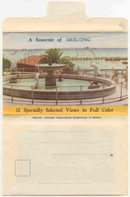
Postcard - Folder set, Nu-color-vue or Nucolorvue Productions, "A Souvenir of Geelong", 1950's
Set of 12 colour views of Geelong on a folded strip, glued within a colour printed cover, titled "A Souvenir of Geelong", printed on both sides of the strip. Booklet printed with an address area on rear. Produced by Nulcolorvue Productions, Mentone, Victoria. The rear has a slit on the rear cover that allowed the folder to be secured. On the inside of the front cover, has an introduction to Geelong, notes "modern tram and bus routes" Pictures are: 1. Gheringhap St showing Geelong City Hall and Post Office 2. The Barwon River, Geelong 3. T&G Building, Ryrie St - shows tramway overhead 4. Christ Church, Moorabool St 5. Malop St Geelong 6. Art Gallery and Park 7. St Marys Roman Catholic Cathedral 8. The Geelong Post Office with buses in background and a Safety Zone sign 9. Moorabool St Geelong - has overhead and a bar traffic light/ 10. Queens Park Geelong 11. The Waterfront at Geelong. 12. Eastern Beach Swimming Pool. Made during the early 1950's, given motor cars in the photo. trams, tramways, geelong, moorabool st, ryrie st -
 Bayside Gallery - Bayside City Council Art & Heritage Collection
Work on paper - ink and watercolour, Annette Meikle, Semco Park, 1977
In 1977, artist Annette Meikle undertook a commission to illustrate a book recording stories of places and people in the Bayside area. It was published in 1978 as Sandringham Sketchbook, with text by Elizabeth Waters. The sketches were intended to record remaining examples of Bayside’s early architecture and environment, as well as reflect newer architectural changes. Meikle went on to donate 22 of these sketches to Bayside City Council in 2003. Semco Park was a model of exemplary modern business in the 1920s. Located on Cheltenham Road, Black Rock, then considered to be an outer suburb, the property was home to Semco, a manufacturing and importing business of paper goods and cotton fabric items. The business’s governing director, Charles Mylius, wanted a firm that treated staff with fairness, created healthy and spacious working sites and offered recreational facilities. The site contained a factory as well as three houses for staff, a park with lawns, trees and flowerbeds, a cricket oval and a canteen serving hot food. Staff enjoyed soft background music played in the factory, and benefited from a superannuation scheme. Semco Park was sold to developers in 1977 but the business continued until the early 1990s with the office moving to Mulgrave, while factory work shifted to New Zealand.Annette Meikle, Semco Park 1977, ink and watercolour, 25.8 x 35.7 cm. Bayside City Council Art and Heritage Collection. Donated by the artist, 2003annette meikle, sandringham sketchbook, elizabeth waters, semco park, semco, cheltenham road, black rock -
 Bayside Gallery - Bayside City Council Art & Heritage Collection
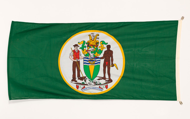
Flag, Evan Evans, City of Brighton flag
The coat of arms on this flag were granted by the British College of Arms in 1970 and represented Brighton City Council's "growing awareness of the importance of formality and correct symbolism in local government". It replaced the council's crest of a pier and yachting scene and was used as council's seal, emblem on its flag and letterhead. The new Coat of Arms, drawn up by the College of Arms in England, depicts the progression from a seaside gardening community to a modern residential city. The prominent forms are on the shield-like coat of arms include waves and a Lymphad (a ship, symbolic of the sea); a market gardener; an aboriginal man; two horns of plenty with abundant fruit and vegetables (the wealth and plenty) and Elster Creek (now Elster Canal). It is underscored by the motto "By their fruits, ye shall know them". Brighton was first incorporated as a borough on 18 January 1859, it became a town on 18 March 1887 and was proclaimed a city on 12 March 1919.Green flag with circular City of Brighton Coat of Arms in the centre. The central circle is white with a yellow edge, with a polychrome coat of arms featuring: the crest which is two cornucopia with fruits and vegetables, above sits a seagull. The mantle above the helmet is in green and gold. The shield is also green and gold with a lymphad (ship) and blue and white waves. The market gardener, holding a hoe, and Aboriginal figure, bearing a boomerang, support the shield and stand upon the compartment which is soil with a representation of Elster creek. A ribbon below contains the motto in blue 'FRUCTU NOSCITUR'.flag, brighton, city of brighton, coat of arms, college of arms, market gardener, aboriginal, elster creek, lymphad, fructu noscitur, armorial bearings, heraldry, cornucopia, by their fruits ye shall know them, motto -
 Bayside Gallery - Bayside City Council Art & Heritage Collection
Painting - oil on board, Clarice Beckett, Cliff path, c.1929
Painted from Beaumaris Cliffs looking over to Mentone this work is a characteristic example of Beckett's ability to create a sense of place with an economy of means. The bands of floated colour create a flattened 'modern' space while still rendering a truthful impression of the location. oil on boardbeach, coast, cliff, path, tree, clarice beckett, beaumaris, beaumaris bay, bay, bayside, water, meldrum school, painting, mentone -
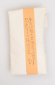
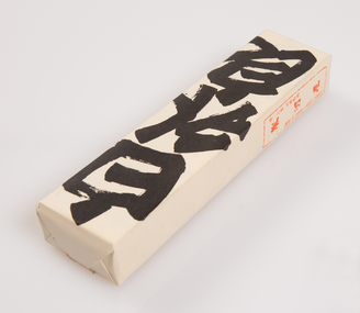 Ararat Gallery TAMA
Functional object, Shiro Uiro, c. 1900s
‘The Art of the Japanese Package’ was an exhibition that toured to 10 Australian and 11 New Zealand public galleries in 1979 and 1980. The touring exhibition comprised 221 objects of traditional Japanese packaging which extended from ceramics, wood and paper to woven fibre containers. At the conclusion of the tour, The Japan Foundation and the Crafts Board of the Australia Council donated the vast majority of the exhibition to the Ararat Gallery for its permanent collection. Combining the natural qualities of bamboo, paper and straw with delicate craftsmanship, these unique objects express Japanese aesthetics as applied through fibre crafts. In Japan, the qualities and traits of natural materials are exploited rather than hidden. The texture of straw, the septa of bamboo are not concealed but lovingly incorporated into the whole. In 1979 Hideyuki Oka, curator of ‘The Art of the Japanese Package’ wrote: “In no way self-conscious or assertive, these wrappings have an artless and obedient air that greatly moves the modern viewer. They are whispered evidence of the Japanese ability to create beauty from the simplest products of nature. They also teach us that wisdom and feeling are especially important in packaging because these qualities, or the lack of them, are almost immediately apparent. What is the use of a package if it shows no feeling?” The descriptions of the featured objects were written by Hideyuki Oka, curator of ‘The Art of the Japanese Package’, 1979.Gift of the Japan-Australia Foundation and the Crafts Board of the Australia Council, 1981Another Kyoto confection, a kind of sweetened rice paste, is simply but strikingly wrapped in a package marked with its name (uiro) in vigorously written characters. Simplicity could hardly be carried further, but, as seen in this ensemble of three separate packages, the effect is altogether engaging. - Professor Hideyuki Oka, curator.japanese art, japanese packaging, tsutsumi, gift giving -
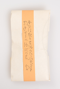
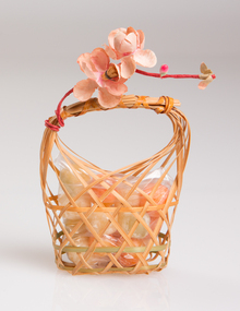 Ararat Gallery TAMA
Functional object, Sekku no Iwaimono, c. 1900s
‘The Art of the Japanese Package’ was an exhibition that toured to 10 Australian and 11 New Zealand public galleries in 1979 and 1980. The touring exhibition comprised 221 objects of traditional Japanese packaging which extended from ceramics, wood and paper to woven fibre containers. At the conclusion of the tour, The Japan Foundation and the Crafts Board of the Australia Council donated the vast majority of the exhibition to the Ararat Gallery for its permanent collection. Combining the natural qualities of bamboo, paper and straw with delicate craftsmanship, these unique objects express Japanese aesthetics as applied through fibre crafts. In Japan, the qualities and traits of natural materials are exploited rather than hidden. The texture of straw, the septa of bamboo are not concealed but lovingly incorporated into the whole. In 1979 Hideyuki Oka, curator of ‘The Art of the Japanese Package’ wrote: “In no way self-conscious or assertive, these wrappings have an artless and obedient air that greatly moves the modern viewer. They are whispered evidence of the Japanese ability to create beauty from the simplest products of nature. They also teach us that wisdom and feeling are especially important in packaging because these qualities, or the lack of them, are almost immediately apparent. What is the use of a package if it shows no feeling?” The descriptions of the featured objects were written by Hideyuki Oka, curator of ‘The Art of the Japanese Package’, 1979.Gift of the Japan-Australia Foundation and the Crafts Board of the Australia Council, 1981japanese art, japanese packaging, tsutsumi, gift giving -
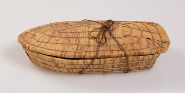 Ararat Gallery TAMA
Functional object, Container for pastries, c. 1900s
‘The Art of the Japanese Package’ was an exhibition that toured to 10 Australian and 11 New Zealand public galleries in 1979 and 1980. The touring exhibition comprised 221 objects of traditional Japanese packaging which extended from ceramics, wood and paper to woven fibre containers. At the conclusion of the tour, The Japan Foundation and the Crafts Board of the Australia Council donated the vast majority of the exhibition to the Ararat Gallery for its permanent collection. Combining the natural qualities of bamboo, paper and straw with delicate craftsmanship, these unique objects express Japanese aesthetics as applied through fibre crafts. In Japan, the qualities and traits of natural materials are exploited rather than hidden. The texture of straw, the septa of bamboo are not concealed but lovingly incorporated into the whole. In 1979 Hideyuki Oka, curator of ‘The Art of the Japanese Package’ wrote: “In no way self-conscious or assertive, these wrappings have an artless and obedient air that greatly moves the modern viewer. They are whispered evidence of the Japanese ability to create beauty from the simplest products of nature. They also teach us that wisdom and feeling are especially important in packaging because these qualities, or the lack of them, are almost immediately apparent. What is the use of a package if it shows no feeling?” The descriptions of the featured objects were written by Hideyuki Oka, curator of ‘The Art of the Japanese Package’, 1979.Gift of the Japan-Australia Foundation and the Crafts Board of the Australia Council, 1981japanese art, japanese packaging, tsutsumi, gift giving -
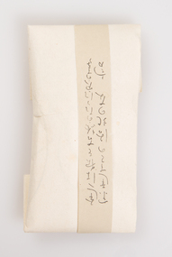
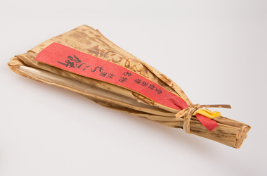 Ararat Gallery TAMA
Functional object, Gion Chigo Mochi, c. 1900s
‘The Art of the Japanese Package’ was an exhibition that toured to 10 Australian and 11 New Zealand public galleries in 1979 and 1980. The touring exhibition comprised 221 objects of traditional Japanese packaging which extended from ceramics, wood and paper to woven fibre containers. At the conclusion of the tour, The Japan Foundation and the Crafts Board of the Australia Council donated the vast majority of the exhibition to the Ararat Gallery for its permanent collection. Combining the natural qualities of bamboo, paper and straw with delicate craftsmanship, these unique objects express Japanese aesthetics as applied through fibre crafts. In Japan, the qualities and traits of natural materials are exploited rather than hidden. The texture of straw, the septa of bamboo are not concealed but lovingly incorporated into the whole. In 1979 Hideyuki Oka, curator of ‘The Art of the Japanese Package’ wrote: “In no way self-conscious or assertive, these wrappings have an artless and obedient air that greatly moves the modern viewer. They are whispered evidence of the Japanese ability to create beauty from the simplest products of nature. They also teach us that wisdom and feeling are especially important in packaging because these qualities, or the lack of them, are almost immediately apparent. What is the use of a package if it shows no feeling?” The descriptions of the featured objects were written by Hideyuki Oka, curator of ‘The Art of the Japanese Package’, 1979. Gift of the Japan-Australia Foundation and the Crafts Board of the Australia Council, 1981An elegant wooden box, fashioned in the style of boxes used for gifts to the emperor some eight or nine centuries ago, is filled with a Kyoto confection called Gion Chigo Mochi. The Gion is one of Kyoto's entertainment districts, chigo are children dressed in ceremonial Buddhist costume for one of the city's numerous festivals, and mochi are cakes of steamed and pounded rice. The name of the confection derives from the style of the bamboo-sheath wrapping, which suggests the figure of a chigo. - Professor Hideyuki Oka, curator.japanese art, japanese packaging, tsutsumi, gift giving -
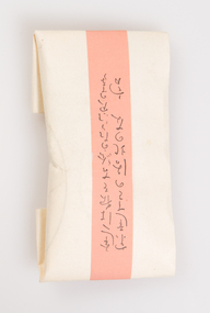
 Ararat Gallery TAMA
Functional object, Evening Moon confection, c. 1900s
‘The Art of the Japanese Package’ was an exhibition that toured to 10 Australian and 11 New Zealand public galleries in 1979 and 1980. The touring exhibition comprised 221 objects of traditional Japanese packaging which extended from ceramics, wood and paper to woven fibre containers. At the conclusion of the tour, The Japan Foundation and the Crafts Board of the Australia Council donated the vast majority of the exhibition to the Ararat Gallery for its permanent collection. Combining the natural qualities of bamboo, paper and straw with delicate craftsmanship, these unique objects express Japanese aesthetics as applied through fibre crafts. In Japan, the qualities and traits of natural materials are exploited rather than hidden. The texture of straw, the septa of bamboo are not concealed but lovingly incorporated into the whole. In 1979 Hideyuki Oka, curator of ‘The Art of the Japanese Package’ wrote: “In no way self-conscious or assertive, these wrappings have an artless and obedient air that greatly moves the modern viewer. They are whispered evidence of the Japanese ability to create beauty from the simplest products of nature. They also teach us that wisdom and feeling are especially important in packaging because these qualities, or the lack of them, are almost immediately apparent. What is the use of a package if it shows no feeling?” The descriptions of the featured objects were written by Hideyuki Oka, curator of ‘The Art of the Japanese Package’, 1979.Gift of the Japan-Australia Foundation and the Crafts Board of the Australia Council, 1981japanese art, japanese packaging, tsutsumi, gift giving -
 Ararat Gallery TAMA
Functional object, Evening Moon confection, c. 1900s
‘The Art of the Japanese Package’ was an exhibition that toured to 10 Australian and 11 New Zealand public galleries in 1979 and 1980. The touring exhibition comprised 221 objects of traditional Japanese packaging which extended from ceramics, wood and paper to woven fibre containers. At the conclusion of the tour, The Japan Foundation and the Crafts Board of the Australia Council donated the vast majority of the exhibition to the Ararat Gallery for its permanent collection. Combining the natural qualities of bamboo, paper and straw with delicate craftsmanship, these unique objects express Japanese aesthetics as applied through fibre crafts. In Japan, the qualities and traits of natural materials are exploited rather than hidden. The texture of straw, the septa of bamboo are not concealed but lovingly incorporated into the whole. In 1979 Hideyuki Oka, curator of ‘The Art of the Japanese Package’ wrote: “In no way self-conscious or assertive, these wrappings have an artless and obedient air that greatly moves the modern viewer. They are whispered evidence of the Japanese ability to create beauty from the simplest products of nature. They also teach us that wisdom and feeling are especially important in packaging because these qualities, or the lack of them, are almost immediately apparent. What is the use of a package if it shows no feeling?” The descriptions of the featured objects were written by Hideyuki Oka, curator of ‘The Art of the Japanese Package’, 1979.Gift of the Japan-Australia Foundation and the Crafts Board of the Australia Council, 1981japanese art, japanese packaging, tsutsumi, gift giving