Showing 180 items
matching rural scene
-
 Stawell Historical Society Inc
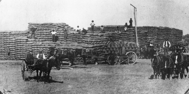
Photograph, Wheat Stacks during Harvest at Marnoo 1908 - 1909
... Rural Scene - Wheat Stacks at Marnoo 1908 - 1909 Harvest...Rural Scene - Wheat Stacks at Marnoo 1908 - 1909 Harvest ...Rural Scene - Wheat Stacks at Marnoo 1908 - 1909 Harvest. Horse drawn carts unloading wheat. These large bagged wheat stacks were in anticipation of the railway. This was the last season of the four Bushell bag. The following year they reduced to three Bushell's. Black and white photograph of large stacks of bagged grain with horse drawn wagons and people standing on stacks and wagons.harvesting -
 Phillip Island and District Historical Society Inc.
Photograph, c 1900
... Rural scene in San Remo area. Cows grazing with cart...-island-and-the-bass-coast Rural scene in San Remo area. Cows ...Rural scene in San Remo area. Cows grazing with cart horses in background. Beautiful trees, large gathering of people of all ages in their Sunday-best clothing, hats and umbrellas as protection from the sun. Butter churns in foreground. Anderson property - "Netherwood"Picnic gathering beneath large trees - rural setting at Anderson' home "Netherwood"local history, photography, photographs, slides, film, picnic gathering, sepia photograph, miss elms, san remo, anderson property netherwood -
 Greensborough Historical Society
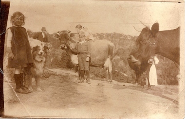
Photograph (copy), Unknown, Weaver and Partington families, 1914_
... Rural scene with children identified as Lorna Weaver... Plenty Lower Plenty melbourne Rural scene with children ...Rural scene with children identified as Lorna Weaver, William and Annie May Partington with baby Jack, Alan Partington and Nancy Weaver. The Weavers were friends of the Partington family. Alan's father, William Partington, can be seen in the left background, with Alan Partington centre foreground.The Partington family were Greensborough pioneers. Descendents still live in the area.Copy of sepia photograph of children and cows.alan partington, lorna weaver, nancy weaver, william partington -
 Bendigo Historical Society Inc.
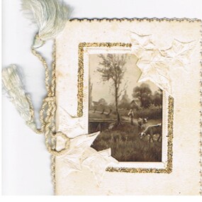
Document - MALONE COLLECTION: GREETING CARDS
... window. Through the window is a sepia rural scene with two cows.... Through the window is a sepia rural scene with two cows, a lady ...Document. Greeting Cards. Small creamy card with cut out window. Through the window is a sepia rural scene with two cows, a lady, a bridge and some trees. Around the window is an embossed border inside a gold glitter border. At the top right and bottom left corners are embossed ivy like leaves which extend into the window. The edges are scallop cut. Card & insert held together with a pa;le blue twisted cord.person, greeting cards, malone collection, malone collection, greeting cards, mr. and mrs. john elliot, commercial bank footscray -
 Wodonga & District Historical Society Inc
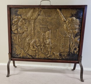
Domestic object - Beaten Copper fire screen
... rural scenes.... beaten or forged copper. Their decorations often depicted rural ...Fire screens were developed early in the 19th century to prevent sparks from flying into the room or logs rolling out when a fire was left unattended. They also served as ornamental or decorative items, particularly ones such as this fire screen made from beaten or forged copper. Their decorations often depicted rural scenes.This item is representative of fire screens used in Australian homes to protect them from fire during the 19th and early 20th century when open fires were the main form of household heating.A fire screen made from beaten copper with a wooden frame. The screen design depicts a group of people sitting outside an Elizabethan building with a dog in the foreground and trees either side. The building is possibly a tavern as the people are seated on barrels. The frame is made from wood and has wrought iron legs screwed in place on either side and a handle attached at the centre top edge.forged copper, fire screens, decorative household items -
 Museum of Indonesian Arts Inc.
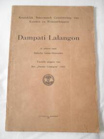
Book, Dampati Lalangon, 1948
... with the words "Batavia's Genootschap" above a stylized tree and rural... a stylized tree and rural scene below which are the words "opgerrgt ...When the Balinese King of West Lombok was defeated by the Dutch in November 1894, after nearly two and a half centuries of Balinese rule, a collection of beautifully illustrated lontar leaves was found, among other documents, in the palace library at Cakranegara, capital of the Balinese Kingdom in Lombok. This collection was published in a book called ‘Dampati Lalangon’ meaning “The delight of the spouses”. It is a rare example of a lontar, containing illustrations but no text. It is an allegorical story about a royal couple, the queen representing the godess of wisdom, Saraswati. The illustrations are of a mystical and erotic naturePaperback brown covered book containing eleven plates. Each plate covers 2 pages across and depicts 6 pages of illustrated lontar leaves. Lontar is a type of palm-leaf manuscript from Indonesia. The contents of this book show a rare example of a lontar, containing etched illustrations but no text. The title and preface of this book are in Dutch language.Front cover and title page have the insciptions: Koninklijk Bataviaasch Genootschap van Kunsten en Wetenschappen -Dampati Lalangon - 11 platen naar Balische lontar-illustraties. Tweede uitgave van het "Darmo Lelangon" (1912) There is a circular stamp with the words "Batavia's Genootschap" above a stylized tree and rural scene below which are the words "opgerrgt 24 priz 1778" -
 Eltham District Historical Society Inc
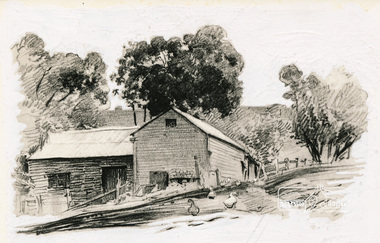
Photograph, Pencil Drawing
... ) of a rural scene was printed mirror imaged in Alan Marshall's...) of a rural scene was printed mirror imaged in Alan Marshall's ...This image attributed to Walter Withers (1854-1914) of a rural scene was printed mirror imaged in Alan Marshall's "Pioneers and Painters: one hundred years of Eltham and it's Shire" (1971) on page 101: Chapter 17 "Educationalists and Writers". This and other Withers pencil drawings came from his sketch book held by the National Gallery of Victoria.Photograph of black and white pencil drawing 101 Deep etch all round image walter withers, pencil drawing -
 Bendigo Historical Society Inc.
Document - MALONE COLLECTION: GREETING CARDS
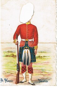
... . Coloured rural scene behind him. The card was designed to stand up... shoes & a black & white sporran. Coloured rural scene behind him ...White card with pale blue scalloped edge. It is picture of a Scottish Highlander wearing a blue, yellow & black kilt and a red jacket with gold buttons & braid. He is wearing white spats & belt. He is holding a brown rifle with a white sling. He has red/black tartan socks, black shoes & a black & white sporran. Coloured rural scene behind him. The card was designed to stand up and the man's head is missing. A Happy Yuletide is printed in dark blue. Seaforth Highlander is printed at the bottom in grey.Printed in Germanyperson, greeting cards, malone collection, malone collection, greeting cards -
 Bendigo Military Museum
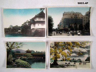
Photograph - PHOTOGRAPH, JAPAN
... . Colour photograph of a rural scene. Deer grazing in an open... photograph of a rural scene. Deer grazing in an open field. Large ...2. The Ernie Pyle Theatre was named after the American War correspondent who was killed in action during WW2. Part of the Bennetts Collection. See Catalogue No. 9726P for details of service for "Alva Marie Bennetts"., 1. Colour photograph of a Japanese style building facing a lake, second building in the background. White border around photograph. 2. Colour photograph of a street scene. Pedestrians on road fronting a multi story building. White border around photograph. 3. Colour photograph of a Japanese style building within a garden which features a lake. White border around photograph. 4. Colour photograph of a rural scene. Deer grazing in an open field. Large tree on LHS. White border around photograph.1. Handwritten in black ink on back: "The Imperial Palace". 2. Handwritten in black ink on back: Information explaining the naming of the building (Ernie Pyle Theatre).bennetts collection, alva bennetts, photographs, japan, ww2, ernie pyle. -
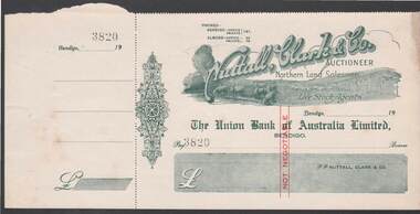 Bendigo Historical Society Inc.
Document - CAMBRIDGE PRESS COLLECTION: CHEQUE - NUTTAL CLARK
... is a rural scene with cattle drinking from a creek , some sheep... Salesmen and Live Stock Agents. Under the name is a rural scene ...Cheque with cheque butt attached. Nuttall, Clark & Co. is printed at an angle across the top. Underneath is Auctioneer, Northern Land Salesmen and Live Stock Agents. Under the name is a rural scene with cattle drinking from a creek , some sheep in a paddock and a two log rail fence. On the other side of the fence are stacks of hay and two men loading the sheaves onto a horse drawn wagon. Date line ends in 19- -. Decorative work on the left side. 3820 stamped after Pay. Printed in a greyish green with red Not Negotiable in the centre.business, printers, cambridge press, cambridge press collection, nuttall clark & co, the union bank of australia limited bendigo -
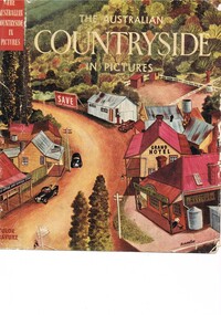 Kiewa Valley Historical Society
Book - Reference Countryside, The Australian Countryside in Pictures, circa 1950s
... leaf is a colour photograph of a rural scene with dirt road... of a rural scene with dirt road running in the centre and to the left ...This book is a "snapshot" in time (1950s) detailing life in Australia covering a time when a "man's word and handshake" were his moral and quasi legal bond, and the now relative defunct saying "smoko" (having a "time out" from work for a cigarette and tea or coffee). The book spans an era where the male was still the "head" of the family even though for a majority of families the women took on the many "male only" roles during the World War II period. This shift in the leadership of the family hierarchy is mentioned, so ever slightly, (not to offend the still predominant macho male image) in both rural and city environments. The effects of the war, and later the push for women's emancipation and equality in both family, social, workplace and political areas of life, since this book was published, is now finally resolved. However there are still some sections of the recent migrate population where this male dominance is causing a few problems.The significance of this book is not only because it was donated by Mrs C. Roper ( from the Roper Family, a pioneer Kiewa Valley and surrounding Region family - originally beef cattle graziers) but also a Kiewa Valley resident and family, experiencing the shift in the social and economical life of post World War II rural Australia. The strong heritage link to this region of many families still residing within its boundaries, is a clear affirmation of the bond that the Kiewa Valley and its Regions have upon family unity. This unity within the rural environment is something that is attracting more and more families from sometimes alienating city life.This printed coloured sketched, or painted paper sleeve of the book is freely wrapped over a dark red hard cover. Into the front of the cover is pressed a standing pose of a farmer with long sleeves rolled up over his elbows. Behind him and to the right are what appears to be three sacks of wheat and next to him is a merino sheep. To the left and down are two dogs one with a fox in its jaws. The book contains 240 pages, 300 illustrations in gravure and 25 pictures in full colour. The inside fly leaf is a colour photograph of a rural scene with dirt road running in the centre and to the left a farm house and a five bay open storage barnOn the tittle page is a signature "C Roper"country life, australian "outback", rural industries, life on the land, swag-man of the bush -
 Bendigo Military Museum
Album - ALBUM, PHOTOGRAPHS, C.WW1
... , ship scenes, return journey & rural Australia scenes. Contains... scenes, return journey & rural Australia scenes. Contains 1 or 2 ...Herbert Trangmar Allan, refer to Cat No 2755.4 for his extensive service records and awards.Hard, dark green buckram covered book. Subjects are group portraits of 19th Reinforcements, through the voyage, English scenes, ship scenes, return journey & rural Australia scenes. Contains 1 or 2 panoramas. Most of the photos have a small caption. There are 25 cardboard pages with 4 black & white photos on each side.Front right corner has gold embossed sun rays with words: Photographsalbum, photographs -
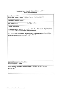 Eltham District Historical Society Inc
Document - Series Listing, Fraser Faithfull et al, Series 65: Russell Yeoman's 30 Years Service Function, negatives, 2000
... colour negatives of rural Shire scenes, including a road running... colour negatives of rural Shire scenes, including a road running ...13 colour negatives taken on the occasion of Mr Russell Yeoman's 30 years service celebrations. Mr Yeoman worked in Shire Planning. Also on same film (included in this Series) are 12 colour negatives of rural Shire scenes, including a road running through bushland.shire of eltham archives, series listing -
 Greensborough Historical Society
Photograph - Digital image, St Helena and Diamond Creek Roads, 1925c
... Creek Roads pre-1950. The scene is rural.... of St Helena and Diamond Creek Roads pre-1950. The scene ...Photograph of the intersection of St Helena and Diamond Creek Roads pre-1950. The scene is rural.Digital copy of black and white photograph.st helena road, diamond creek road, greensborough -
Glenelg Shire Council Cultural Collection
Equipment - Whale Oil Lamp, n.d
... , decorated in the repousse manner, including rural and maritime..., including rural and maritime scenes. Base circular, with flatside ...Antique brass hanging or standing whale oil lamp, Dutch, decorated in the repousse manner, including rural and maritime scenes. Base circular, with flatside to fit against wall. Removable oil well, single spout with wick, decorative hook for wall hanging. Weighted base. -
 Ballarat Tramway Museum
Postcard - Folder set, Nu-color-vue or Nucolorvue Productions, "A Souvenir of Beautiful Ballarat", late 1940's
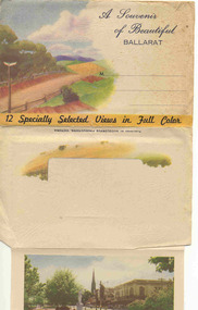
... a colour rural scene, title, address area and on base of cover "12... cover has a colour rural scene, title, address area and on base ...Set of 12 coloured views of Ballarat printed with six photos on either side of a folded strip of paper glued within an embossed paper folder. Published by Nucolorvue Productions Vic., titled "A Souvenir of Beautiful Ballarat". Front cover has a colour rural scene, title, address area and on base of cover "12 Specially Selected Views in Full Colour". Rear of Cover has a part of a colour scene as well and a slit for the envelope to be closed over and sealed. On the inside of the front cover are notes on the City of Ballarat and that it has just embarked upon its second century. 1. Another section of Ballarat's Fine Botanical Gardens 2. Overlooking Ballarat City 3. Botanical Gardens showing statues of Australian Prime Ministers 4. Sturt Street showing City Hall and Fine Statues 5. Lake Wendouree Ballarat 6. Lovely Trees and Statuary Botanical Gardens 7. Botanical Gardens showing Wallace's Statue 8. Lovely Sturt St looking West 9. Overlooking Sturt St towards Mt Warrenheip (has single truck tram in photo) - see image i9 for a hi res version. 10. Ballarat's Famous Art Gallery 11. One of Ballarat's many fine Reservoirs 12. Eureka Stockade Monument, Ballarat. On front cover in pencil in stamp area "1/-"trams, tramways, ballarat, postcards, sturt st, bridge st, gardens -
 Kiewa Valley Historical Society
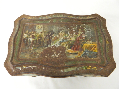
Tin Biscuit/Tea, Early to mid 1900s
... shakespearian scenes. This item however demonstrates that the rural... scenes. This item however demonstrates that the rural (Kiewa ...This biscuit/tea caddy was probably targeting the "theatre going" family or those who liked looking at the colourful shakespearian scenes. This item however demonstrates that the rural (Kiewa Valley) appreciation of classic English plays was, in this time period (early 1900's), just as strong as in the larger towns and cities. This item also presents the period in which the "olde" Elizabethian phrases and words were taught in regional high schools. Although this speech pattern and phraseology was of a specific time period and going out of fashion when Australia was first settled it was an inherited form of communication(higher social/economical level). In the context of the rural Australia "scene" and in this time frame of the elite "boarding school" generation this item was a visual reinforcement of the education level and position of the family who owned this tin.This item is highly significant because it not only presents the social aspects of early life in the Kiewa Valley but also the variety of educational levels and economical variations of the rural population within the Kiewa Valley. The egalitarian perception of the inhabitants of the Kiewa Valley was still at the infancy of early Australian social interactions. This biscuit /tea container was however a leveling of the socio-economic playing field of the time.This biscuit or tea tin, has besides having an outer lid (hinged), it also has an internal lid(with a circular finger grip). Although the shape is rectangular it has a slight concave bulge at each side of the centre of each of its main frame. It is made of pressed light steel and has a raised floor. The corners are bevelled and the outer lid has a bevelled slope ridge in parallel to the extremities of the main tin frame. There are painted scenes from the following Shakespearian plays on each side of the tin; "As you like it", "Hamlet" and on each of the bevelled corners are the portraits of Shakespeare(in the middle), the caricature mask faces of "the theatre" above and on the bottom section the "Director's chair"food storage, kitchen table container, domestic educational storage, shakespeare illustrations -
 Bendigo Historical Society Inc.
Painting - PICTURES FROM PICKWICK
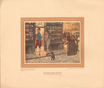
... missing from folder. Images depict rural and city English scenes... 10 print missing from folder. Images depict rural and city ...Nine prints in cardboard folders titled 'Pictures From Pickwick' copyright Richard Wyman & Co London. Number 10 print missing from folder. Images depict rural and city English scenes in the mid 1850's. [1] Sam Weller and Mr Smauker. [21] Mr Weller chastises Stiggins. [3] Skating at Dingley Dell. [4] Bardell v Pickwick. [5] Mr Winkle Rides to Dingley Dell. [6] Chasing the Runaways. [8] The Start from the 'Bull' at Rochester. [9] Mr Winkle Partridge Shooting. [10] Mr Tupman on Richmond Hill, missing from folder.artwork, print, mr picwick -
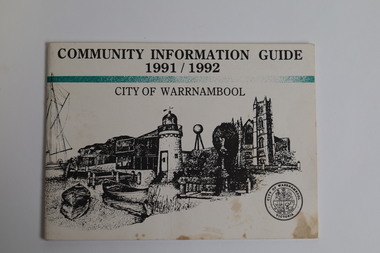 Warrnambool and District Historical Society Inc.
Booklet - Booklet Collection: City of Warrnambool Tourist Guides, Collett, Bain and Gaspar, Warrnambool
... passing the Lake Pertobe playground, and a rural scene... passing the Lake Pertobe playground, and a rural scene ...This is a collection of sixteen tourist guides dating from the mid 1970's to 2013. These contain listings of businesses, accommodation, eateries and events in Warrnambool and district. They also include maps of Warrnambool and surrounds, advertising and photographs of various attractions. While mainly covering Warrnambool a small number of the guides cover the South West Region. These directories have mainly been published by the Warrnambool City Council and are a selection of the types of information provided to visitors at the Tourist information centre during this time period.These tourist guides give snapshots of the City of Warrnambool for the years covered and will be useful for research.[.1] An 8 page paper booklet with black printing and a black & white photo of the pond at the Botanical Gardens on the front cover. [.2] two photocopied A4 black and white pages from the book "On the Trail" K Winser 1956 (Main Roads of Australia) [.3] A trifold colour brochure with a stylised map of the coast on the yellow and blue front cover. The inside has stylised colour drawings on Warrnambool attractions. The rear cover has coloured photographs of bush, Liebig Street and Fletcher Jones gardens [.4] A trifold black and white brochure with a black line drawing of a whale on the front cover. [.5] A trifold white card with mauve printing. The front cover has a line drawing of the former Timor Street post office and a map of businesses and landmarks in Timor Street. The reverse side contains a brief history of Warrnambool. [.6] A 98 page stapled booklet with a foreword by Vanda Savill. There are 4 pages of coloured photographs. The remainder are black and white photographs. The front cover is purple with white writing in the lower third. There is an outline of the coast and five colour photographs of district attractions. The inside middle page has a map of the Western wonderland region. The content covers towns in this area. Content relating to Warrnambool is in the last six pages. [.7] Twelve loose photocopied black and white pages. The front cover has the Warrnambool Premier Town 1988-1991 logo and a photo of a Southern Right Whale and calf. The bottom right hand corner has a Standard Warrnambool logo. [.8] 44 page booklet printed with blue ink. The staples have been removed. The glossy front cover has blue printing with a coloured photo of Flagstaff Hill Maritime Village pond. The centre pages has a fold out map of the City of Warrnambool. The rear cover has photos of The Twelve Apostles and Hopkins Falls. [.9] 4 loose photocopied pages with Warrnambool Library and Corangamite Regional Library Service Warrnambool City Library black ink stamps. The front page line drawing illustrations of Warrnambool attractions [.10] A single sheet of glossy white paper folded in half to make four pages. The front page has a Warrnambool premier town logo 1979-1982 and blue printing and a visitor survey. [.11] A conference pack of light card folded to make a pocket containing three brochures, a shipwreck coast tourist directory and a Australian Heritage Parks Association conference program dated 24 to 27 May 1992. The front cover of the pack has green writing over a stylised upward arrow. There is a City of Warrnambool logo in the top right hand corner and two film strips diagonally across the cover containing photographs of Warrnambool. The rear cover has a coloured Warrnambool Premier Town logo. [.12] A 63 page stapled booklet with coloured photographs of Warrnambool. The front cover has black writing on white background. There is a coloured photograph of Flagstaff Hill in the middle of the cover and a Warrnambool City and Visit Victoria logos on the lower edge. The middle pages has a coloured of the city of Warrnambool with an inset map of Allansford. [.13] A single large sheet of white paper folded in ten to make a brochure. The front cover has black printing. The rear cover has a purple ink stamp for the City of Warrnambool Tourist Information Centre. When folded out the reverse side has a green, grey and white map of the South West Region of Victoria. [.14] A 48 page colour booklet on glossy paper. The front cover has white writing on a blue background and includes photographs of the Twelve Apostles, the Promenade walk, Flagstaff Hill and a southern right whale's tail. The rear cover has photographs of The Twelve apostles, a passenger train from Melbourne passing the Lake Pertobe playground, and a rural scene. There is white writing and a white Warrnambool City logo on a blue background. The centre pages have a stylised green and blue map of the city of Warrnambool. [.15] A 48 page colour booklet on glossy paper. The front cover has white writing over colour photographs of two people at a lookout, Flagstaff Hill, three southern right whales and a child at the Lake Pertobe playground. The lower edge has blue upper case writing on a white background. The rear cover has a colour photograph of the Twelve Apostles. The lower white border on the rear covers has a a blue and green City of Warrnambool logo and blue writing. The centre pages have a stylised green and blue map of the city of Warrnambool. [.16] A 64 page colour booklet on glossy paper. The front cover has black writing on a black background and there is a photograph of a southern right whale's tail. The lower edge has the Warrnambool City and Visit Victoria Logos. The centre pages have maps of Warrnambool and surrounds. [.1] This week in Warrnambool Vol 2 No. 5 Thurs 1st Feb. For the time of your life [.2] Warrnambool Way [.3] Warrnambool The Holiday Host on the South West Coast with compliments City of Warrnambool and Warrnambool Chamber of Commerce [.4] MMI Insurance presents Whales Giants of the Deep Whale Watcher's Logbook Warrnambool [.5] Warrnambool History began in Timor Street [.6] Western Wonderland Tourist Association [.7] A Premier Arrow Tour of Warrnambool Victoria's Premier Town Australia's Southern Right Whale Nursery [.8] Warrnambool The Heart of Victoria's Great Southwest Visitor's Handbook [.9] What to see in Warrnambool Victoria's Premier City 1979-1982 [.10] Win a Free Holiday & $200 Cash in Victoria's Premier Town [.11] Advancing Warrnambool together! [.12] Great Ocean Road Warrnambool Official Visitor Guide [.13] Tourist guide to the South West Region Victoria All it needs is you [.14] Warrnambool visitor guide 2005 the great ocean road experience attractions accommodation entertainment dining [.15] Warrnambool Visitor Guide 2006 the great ocean road experience Attractions Accommodation Entertainment Dining [.16] Official Visitors' Guide Warrnambool Victoria Australia Discover the Great Ocean Road warrnambool, warrnambool tourist guides -
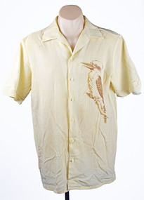 National Wool Museum
Clothing - 1984 Los Angeles Olympics Men's Opening Ceremony Shirt, c. 1984
... and a pleated skirt with a rural scene of kangaroos, hills and plants... and a pleated skirt with a rural scene of kangaroos, hills and plants ...On the 1984 Los Angeles Olympic Uniforms donator Doug wrote- During the 1980s the Australian wool industry was at its most prosperous times with record numbers of sheep producing wool receiving ever increasing values due to the success of the Reserve Price Scheme, and the overall guidance of the Australian Wool Corporation (AWC). As a humble technician, my role was a low profile newly created position of “Controller, Technical Marketing” where wool was to be marketed on its technical properties, as distinct from the “Product Marketing Group” which exploited trhe traditional high profile approach of marketing wool;s superior fashion attributes. The Woolmark was the tool central to this approach. When the forthcoming Los Angeles Olympic Games was announced, the Product Marketing Group seized upon the chance to show the world that we could make top fashion garments and display them on our elite athletes on the world stage. A concept was launched using a contemporary top designer, Adel Weiss, with the most exclusive fabrics and knits available, and all with a lot of hype. This launch failed dismally for the following reasons- - The designer did a wonderful job presenting an excellent fashion range on perfect skinny models. The AOC however wanted a uniform which had an obvious Australian appearance when fitted to elite, and frequently muscular, athletes. - The fabrics chosen did not reflect the performance required by travelling athletes, there was no recognition of the need for ‘easy care.’ - There was no recognition given to the problem of measuring, manufacturing and distribution of a range of articles when the selected athlete could be domiciled anywhere in Australia. - There was no appreciation of such historical facts as Fletcher Jones, who had been unofficial suppliers dating back to the 1954 Olympics in Melbourne, and the Fletcher Jones board member, who was also an AWC board member, and was not in favour of the change. The project passed from Product Marketing to Public Relations, a big spending off-shoot of the AWC Chairman David Asimus, and due to the day to day operations of the project was passed to me and PR took care of the financial matters. The first task was to meet with the AOC and find out exactly their requirements. This lead to the production of a design and manufacturing brief, cointaining exact time lines for each event required to ensure an appropriate uniform on every athlete chosen to represent his/her country on the date given for the Opening Ceremony in Los Angeles. Working backwards the timeline becomes- 1. Noted the exact date of the Opening Ceremony. 2. Estimated the date for distributing completed garments to each athlete. 3. Estimated the time span available for measuring each athlete and commence making each component of the ensemble to the individual measurements of each athlete. 4. Decided the date for making the final choice of uniform design concept. 5. Decided the date for distribution of the design brief to selected designers. These five steps were spread out over a two year period. The Commonwealth Games occur midway between each Olympic Games, work on the Olympic uniform commences the week after the Commonwealth Games closing ceremony and MUST be ready by the prescribed day two years hence. The project also had to remain cognisant of trade politics existing within the span of the task, as well as the temperament of designers in general. It is no overstatement to say that in the past every designer in Australia believed they could, and should, be chosen to design the Australian Uniform. The final choice of designer almost always faced criticism from the fashion press and any designer who had been overlooked. However, with the contenders receiving an exacting brief the numbers of serious contenders greatly reduced. The Los Angeles Olympic Uniforms. A further reason for the AWC bid failure to design the LA uniform was that the AOC had already chosen Prue Acton to design it. This was based on her proven performance during previous games as she had a talent for creating good taste Australiana. Her design concepts also considered the effect when they were viewed on a single athlete as well as the impact when viewed on a 400 strong team coming on to the arena. A blazer trouser/skirt uniform in bright gold was chosen for the formal uniform. It was my task to select a pure wool faille fabric from Foster Valley weaving mill and have sufficient woven and ready within the prescribed timeline. The trouser/skirt fabric selected was a 60/40 wool polyester plain weave fabric from Macquarie Worsted. This fabric had a small effect thread of linen that was most attractive when dyed to match some eucalyptus bark Prue had brought back from central Australia. For the Opening Ceremony uniform, Prue designed a series of native fauna, a kookaburra for the men’s shirt and a pleated skirt with a rural scene of kangaroos, hills and plants. This presented an insurmountable printing challenge to the local printing industry as it had an unacceptably large repeat size and the number required (50) was also commercially unacceptable. The solution was a DIY mock up at RMIT and the employment of four student designers. The fabric selected for this garment was a light weight 19 micron, pure wool with a very high twist yarn in alternating S and Z twist, warp and weft. This fabric proved to be the solution to a very difficult problem, finding a wool product which is universally acceptable when worn next to the sin by young athletes competing in the heat of a Los Angeles summer. Modifications to this fabric were developed to exploit its success when facing the same problem in future games. Garment Making- The most exacting garment in the ensemble is the tailored blazer, plus the related trouser/skirt. Unfortunately tailoring athletes that come in various shapes and sizes such as; - Weight lifters develop an enormous chest, arms and neck size. A shirt made to a neck size of 52 would produce a shirt with cuffs extending well beyond the wearer’s hands. - Basketball players are up to 7 feet tall and garments relying ona chest measurement grading would produce a shirt with cuffs extending only to elbow length. - Swimmers develop enormous shoulders and slim hips, cyclists by contrast develop thighs I liken to tree trunks and a uniform featuring tight trousers must be avoided at all cost. Suffice to say many ensembles require specialist ‘one off’ treatment for many athletes. Meanwhile there is a comfortable in between group who can accept regular sizes so you can cater for these by having back up stock with plenty of built in contingencies. Athletes may be domiciled anywhere in Australia, this creates a fundamental problem of taking their measurements. The Fletcher Jones organisation was key to answering this problem due to their presence in every capital city, as well as many provincial towns around Australia. Each athlete on being selected for the Olympic Team was simultaneously requested to visit their nearest Fletcher Jones shop. The standardised measurement data collected was shared with the other manufacturers, e.g. Pelaco Shirts, Holeproof Socks and Knitwear, Maddison Belts, and even Hush Puppy Shoes. As the time for the Games approached the AOC made arrangements for combining meeting of all. Selected available athletes at the Australian Institute of Sport, Canberra, where, among other things, they were fitted and supplied with their uniform. The method evolved as follows.Men’s cream coloured button up, collared shirt. Images of a kookaburra have been printed onto the shirt, a single kookaburra on the left breast and a pair of kookaburras on the reverse of the shirt. The kookaburras are printed in a brown tone to complement the cream colour of the fabric.On tag - FMaustralian wool corporation, 1984 los angeles olympics, olympic uniforms, men's uniforms, sport, athletes -
 The Beechworth Burke Museum
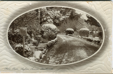
Postcard, R & B Hall, c.1930
This postcard was published by R. & B. Hall in Beechworth and printed in Saxony, circa 1930. Saxony is a landlocked state of Germany which borders the states of Brandenburg, Saxony-Anhalt, Thuringia, Bavaria and the countries of Poland and the Czech Republic. This particular postcard is embossed with a pattern which surrounds the middle image in the center of the card. This image depicts Asylum Avenue which leads to the Mayday Hills Asylum in Beechworth, Victoria. What makes this scene particularly interesting is the appearance of snow which is rare in Beechworth. The road depicted on the postcard has track marks made by a car with thin wheels. Beechworth's Mayday Hills was chosen as the site of Victoria's newest asylum, at the time, due to the landscape and altitude. The hilltop atmosphere and the native fauna, it was argued, would assist in the cure of the patients kept at the hospital (Wood 1985, 122). The positioning of the hospital had a beneficial effect on the rural town. A pamphlet published by James Ingram and Son (1849) reveal that famous landmarks in Beechworth which included the Post Office, Gaol, Courthouse and Asylum "demonstrate the appreciation of Beechworth by the Government not only as as important district center, but also as a site unrivaled as a sanitarium". There were other locations in contention at the time, but ultimately Beechworth was chosen (Craig 2000, 33). Prior to the creation of the Asylum in Beechworth, those charged with having mental illnesses or, as it was termed, "insanity" were unable to be properly cared for in the Gaol (which is where they were often sent). John Buckley Castieau wrote, in 1861 for the Ovens and Murray Advertiser, that the Gaol was unable to properly care for those classified then as "insane" but that they would endeavor to treat them above the other inmates (which he notes is not always the case in other establishments). Castieau wrote this in favour of supporting the building of the Mayday Hills Hospital in Beechworth. It was stated that at the time the Mayday Hills Hospital was built, there were 83 prisoners kept in the Gaol who were to be rehoused to the Hospital on the grounds of "insanity". The classification as someone as "insane", in this period of time is a reflection on the inability to cure and understand illnesses of the mind during the mid to late 1800s. Beechworth's Mayday Hills was chosen as the site of Victoria's newest asylum, at the time, due to the landscape and altitude. Opening on the 24th of October 1867, the Mayday Hills Hospital was originally named the "Ovens Lunatic Asylum", a title which is very much a product of its time. Whilst controversial, changes to the name is part of the history of the Hospital and can provide much insight into the understanding of mental illness throughout history and the use/disuse of this term provides information into the reception/changing opinions of mental illness in society. The Hospital would later become known as the "Mayday Hills Asylum" and/or "Mayday Hills Hospital" with the latter being the most commonly used title. An article in the Ovens and Murray Advertiser notes that on the 7th of March 1865, the foundation stone of the Hospital was laid (it would officially open in 1867) and that it was such a moment of accomplishment and joy for Beechworth that a letter to the editor even suggested that there should be a holiday dedicated to the day the foundation stone as laid. This reveals an extent to which the townspeople of early Beechworth valued the construction of the Hospital in their town. It provided the town with a sense of prestige and honour.At first glance, the remains of the Mayday Hills Hospital in Beechworth, Victoria, inspire tragedy, trauma and beauty. The buildings themselves, with their Italianate style Renaissance architecture designed by J.J. Clark (Craig 2000, 49 & Smith 2016, 203) reflect a bygone period of European and Australian history. The gardens provide a sense of tranquility and beauty. The experience of those within these walls remains a valuable area of study to provide a more complete understanding. This particular hospital is considered the fourth of its like and one of three identified as the largest of their kind. The Mayday Hills Hospital is a sister to the Kew and Ararat Asylums in Melbourne which are both located in relative proximity. Understanding the role of the Mayday Hills Hospital in Beechworth history is integral to understanding the development of the goldfields town, but also for providing important information as to the history of caring for, and the reception of, mental illnesses in Australian and wider European history. Mayday Hills provides a case study which can be researched through oral history, an analysis of the grounds/buildings and through images like this postcard which portray the structure in a highly deliberate manner. Images like this depict the strong façade of the Hospital and provide a glimpse into the tranquility of the gardens. This has been done deliberately to provide a sense of comfort and healing about the building to those looking from the outside. Further research into the importance of the Hospital in Beechworth and it's connection to the town will be supported through images like these kept in the Mayday Hills photo album in the collection of the Burke Museum.Pale coloured rectangular postcard printed on matte embossed card.Obverse: Snow Scene; Asylum Avenue, Beechworth. / Reverse: POST CARD / ADDRESS ONLY / Published by R. & B. Hall, Beechworth. / Printed in Saxony. / 3447 [crossed out] / 1997.2492 / AFFIX STAMP /asylum, asylum avenue, beechworth, snow north-east vic, victoria, snow scene, mayday hills, mayday hills hospital, mental hospital, colonial attitudes, mental health, history, town development, postcard -
 The Beechworth Burke Museum
Photograph, c1950s
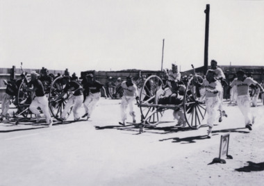
Photograph of 2 teams with hoses and reels in a race as part of a CFA competition. Fire brigade competitions have been running for almost 150 years with the first State Championship held in Melbourne in 1874. State Championships have continued every year since 1873. The event goes on regardless of weather conditions or natural disasters. The only cancellations being due to WWI and WWII. In the 1950s, the Rural State Championships were developed to reflect the unique skills of rural brigades. The competitions started out as 'Demonstrations' with the introduction of hose reels into the fire service in the mid 1800s. This was to assist in getting hose and other necessary equipment to the scene of a fire faster. Brigades soon find that competing with other brigades improved their training and efficiency. The State Championship became the peak of the season's competitions conducted by districts and associations across the state. Black and white rectangular photo reproduction printed on matte photographic paperemergency services, beechworth, fire brigade, firemen, photograph, competition, black and white, fire -
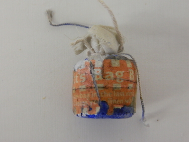 Kiewa Valley Historical Society
Bag Whitening Agent Reckitts, circa early 1900s
This little bag of "whitener" additive for the washing of white clothes was manufactured in Hull in the United Kingdom mid and later 1900's. The Manufacturer, Ricketts, was one of the first manufacturers to employ women in equal proportions with males (a rarity before 1914). This product was used to improve the appearance of white fabrics. This ability to use a product that would "whiten" clothes chemically rather than the "hard boiling" of clothes was a time saver and a lot easier on the fabrics. This is a boon to rural families where time was of the essence (boiling took time). The blue coloring was introduced because the white colour perception is enhanced by the blue (fadeable and not permanent). The "washing machine industry" of the late 1900's emphasised "whitening" agents that were not so haphazard in producing blue stains, and allowed a "gentle" washing action. This item is very significant in detailing the early 1900's rural household domestic "chore" of washing white clothes to a "social" standard of cleanliness. White shirts were the mark cleanliness that those outside of the family judged the family unit by. The best clothes were worn to church on Sundays. Hard and mostly rural activities/work in the Kiewa Valley encompassing farming, crop cultivation, cattle/sheep and "field work" to do with the SEC Vic Hydro Scheme involved provided a stain prone environment. As appearances, of clothing, was on the whole not significant it was a different scenario at social and religious scenes. The ability to attain "brilliant" white shirts, dresses and bonnets by a less drastic method to that of "boiling" of clothes in vats, was a boon of that "era". The anti establishment revolt came later in the 1950's onward took longer to migrate from the cities and larger rural townships to eventually sneak into the Kiewa valley.This "blue bag" is a whitening agent wrapped in flannel or muslin, or sold ready bagged (1 ounce).It was used in the final rinse to "whiten white coloured clothes" The string was used to facilitate finger grip onto the "bag" after the wash had finished for easy removal to stop the hand and other surfaces from being stained by the blue colour residue drips.domestic and commercial laundries, starch and whitening additive, washing brightener -
 Warrnambool and District Historical Society Inc.
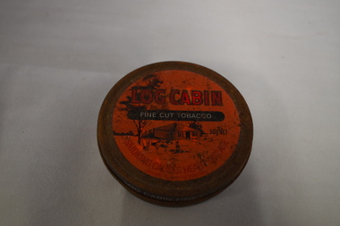
Tin, Log Cabin Tobacco, Late 20th century
The firm of W.D. & H.O. Wills is a British firm which first began making tobacco and cigarettes in Australia in 1913. This tin is a reminder of the times when many people (especially men in rural areas) used to make their own cigarettes (‘rolling your own’). This tin is retained as an example of a tobacco tin in the times when smoking was more popular in society and when pipe smoking and ‘rolling your own’ cigarettes were more common.This is a round tin, originally painted brown, with a vacuum-sealing lid and a red and black painted label on the lid. The label has an image of a farm scene with a log cabin. The base of the tin has a ridge in the middle on to which the lid fits. The tin is empty and very rusty. ‘Log Cabin Fine Cut Tobacco’ ‘To open insert coin under lid and twist’ tobacco tin, log cabin tobacco tin, vintage tobacco tin -
 Eltham District Historical Society Inc
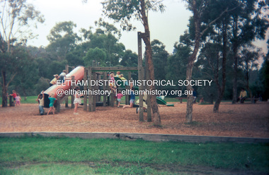
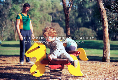
Photograph (Item) - Print, Lucas McAuliffe, Untitled (Playground Scene), 1988
Eltham Town Park was partially constructed on a tip site. The park and lake were landscaped in 1973-1974. As early as late 1980 a proposal to rename it Alistair Knox Park was met with significant community resistance with a petition of 1600 signatures against however Council ultimately pushed the name through in 1987. Many residents continued to call it Eltham Town Park for some years later. Lucas McAuliffe 1988 Entrant No. 37 Ref: Series 34, Items 15, 16, 69, 70 SHIRE OF ELTHAM COMMUNITY PHOTOGRAPHIC SURVEY Photography is an artform which many of us practice, sometimes purely for artistic pursuit, sometimes to record the people and events in our lives. In 1988, as part of a local Bicentennial project, the Shire of Eltham conducted the Eltham Community Photographic Survey. Up to 100 entries were to be selected by a panel of photographers for entry into the Eltham Photographic Survey Exhibition. Entries had to be submitted by May 13, 1988. Entrants whose images were selected for the exhibition were contacted and requested to further submit an entry form providing entrant’s name, area of residence, age, and proposed captions. These details were then used to produce labels for the exhibition mounts. Where negatives had not been supplied, these were requested to support the display of printed enlargements mounted on 10” x 8” cardboard. The mounted prints were made available post exhibition for sale at $8.50 each for colour prints and $7.00 for B&W prints. Residents in the Shire were invited to collect a free roll of film and take a photograph of what they either liked or did not like about the area. A total of 160 entrants submitted multiple entries for the exhibition. Of those selected for exhibition, entrants ranged in age from 9 to 70 years. All custom colour and black and white printing for the exhibition was completed by Wattle Studios of Eltham. The Eltham Photographic Survey was jointly auspiced by the Shire of Eltham and Wattle Studios, of 953 Main Road, Eltham. The project was greatly assisted by: • David McRitchie, Media Studies Lecturer Victoria College, Rusden Campus. • Ian and Annette Toohill of Wattle Studios • Tracy Naughton, Eltham Community Arts Officer • Neville Emerson Pty. Ltd. • Superior Press, Eltham • Kodak Australasia Pty. Ltd. • Agfa Gevaert Ltd. • Townsend Colourtech Pty. Ltd. • The Australian Bicentennial Authority • Eleanor Bowers, Secretary, Eltham Arts Council The exhibition was placed on display in the Woolworths Arcade, Eltham between Monday June 6th and Saturday June 11, 1988. It was also intended to hold the exhibition at a venue in the Shire’s North Riding from Monday, June 20 to Friday June 24. It was then displayed at the Were Street Theatre, Montmorency from Friday, June 24 to Thursday, July 7. Series 34: Eltham Community Photographic Survey 1988 - Prints & Documentation Series consists of 117 photographs of Shire scenes taken by members of the community. Items I - 41 are larger photographs mounted on card, which were exhibited. Items 42 - 117 are unmounted copies, alternative takes and other entries. Corresponding negatives contained in Series 35: Eltham Community Photographic Survey 1988 – Negatives which consists of 267 colour and B&W negatives and one colour slide of Shire scenes taken by members of the community. The negatives are arranged by the entrant number of the photographer. The Eltham Community Photographic Survey collection is significant to the local community as it was curated by the local community - ordinary people of all ages - representing what they liked and did not like in the area where they lived. It represents an unfiltered representation of the Shire of Eltham as it was in 1988. It also represents one of many projects as part of the national programme of events and celebrations to commemorate the bicentenary. It is a time capsule of life in the 1980s of this urban and rural municipality in Melbourne's north. Front: Entrant No. and name on printed label Rear: Entrant No., name and address on printed label; also 'Series 34' and the 'Item No.' in pencilshire of eltham archives, bicentennial project, eltham, eltham community photographic survey, eltham photographic survey exhibition, series 34, series 35, alistair knox park, eltham town park, film - kodak ga 100 5095, lucas mcauliffe, playground, scan - 35mm negative -
 Eltham District Historical Society Inc
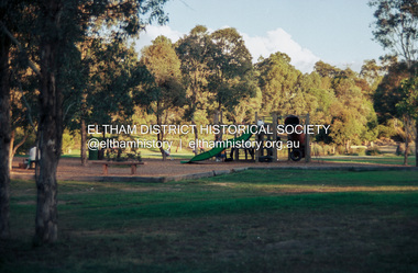
Photograph (Item) - Print, Sean Brady, Untitled (Playground Scene), 1988
Eltham Town Park was partially constructed on a tip site. The park and lake were landscaped in 1973-1974. As early as late 1980 a proposal to rename it Alistair Knox Park was met with significant community resistance with a petition of 1600 signatures against however Council ultimately pushed the name through in 1987. Many residents continued to call it Eltham Town Park for some years later. Sean Brady 1988 Entrant No. 145 Ref: Series 34, Items 33, 34, 105, 106 SHIRE OF ELTHAM COMMUNITY PHOTOGRAPHIC SURVEY Photography is an artform which many of us practice, sometimes purely for artistic pursuit, sometimes to record the people and events in our lives. In 1988, as part of a local Bicentennial project, the Shire of Eltham conducted the Eltham Community Photographic Survey. Up to 100 entries were to be selected by a panel of photographers for entry into the Eltham Photographic Survey Exhibition. Entries had to be submitted by May 13, 1988. Entrants whose images were selected for the exhibition were contacted and requested to further submit an entry form providing entrant’s name, area of residence, age, and proposed captions. These details were then used to produce labels for the exhibition mounts. Where negatives had not been supplied, these were requested to support the display of printed enlargements mounted on 10” x 8” cardboard. The mounted prints were made available post exhibition for sale at $8.50 each for colour prints and $7.00 for B&W prints. Residents in the Shire were invited to collect a free roll of film and take a photograph of what they either liked or did not like about the area. A total of 160 entrants submitted multiple entries for the exhibition. Of those selected for exhibition, entrants ranged in age from 9 to 70 years. All custom colour and black and white printing for the exhibition was completed by Wattle Studios of Eltham. The Eltham Photographic Survey was jointly auspiced by the Shire of Eltham and Wattle Studios, of 953 Main Road, Eltham. The project was greatly assisted by: • David McRitchie, Media Studies Lecturer Victoria College, Rusden Campus. • Ian and Annette Toohill of Wattle Studios • Tracy Naughton, Eltham Community Arts Officer • Neville Emerson Pty. Ltd. • Superior Press, Eltham • Kodak Australasia Pty. Ltd. • Agfa Gevaert Ltd. • Townsend Colourtech Pty. Ltd. • The Australian Bicentennial Authority • Eleanor Bowers, Secretary, Eltham Arts Council The exhibition was placed on display in the Woolworths Arcade, Eltham between Monday June 6th and Saturday June 11, 1988. It was also intended to hold the exhibition at a venue in the Shire’s North Riding from Monday, June 20 to Friday June 24. It was then displayed at the Were Street Theatre, Montmorency from Friday, June 24 to Thursday, July 7. Series 34: Eltham Community Photographic Survey 1988 - Prints & Documentation Series consists of 117 photographs of Shire scenes taken by members of the community. Items I - 41 are larger photographs mounted on card, which were exhibited. Items 42 - 117 are unmounted copies, alternative takes and other entries. Corresponding negatives contained in Series 35: Eltham Community Photographic Survey 1988 – Negatives which consists of 267 colour and B&W negatives and one colour slide of Shire scenes taken by members of the community. The negatives are arranged by the entrant number of the photographer. The Eltham Community Photographic Survey collection is significant to the local community as it was curated by the local community - ordinary people of all ages - representing what they liked and did not like in the area where they lived. It represents an unfiltered representation of the Shire of Eltham as it was in 1988. It also represents one of many projects as part of the national programme of events and celebrations to commemorate the bicentenary. It is a time capsule of life in the 1980s of this urban and rural municipality in Melbourne's north. Front: Entrant No. and name on printed label Rear: Entrant No., name and address on printed label; also 'Series 34' and the 'Item No.' in pencilshire of eltham archives, bicentennial project, eltham, eltham community photographic survey, eltham photographic survey exhibition, series 34, series 35, alistair knox park, eltham town park, film - kodak ga 100 5095, scan - 35mm negative, sean brady -
 Eltham District Historical Society Inc
Photograph (Item) - Print, Fred Mitchell, Untitled (Playground Scene), 1988
Eltham Town Park was partially constructed on a tip site. The park and lake were landscaped in 1973-1974. As early as late 1980 a proposal to rename it Alistair Knox Park was met with significant community resistance with a petition of 1600 signatures against however Council ultimately pushed the name through in 1987. Many residents continued to call it Eltham Town Park for some years later. Fred Mitchell 1988 Entrant No. 5 Ref: Series 34, Items 3, 4, 46-49 SHIRE OF ELTHAM COMMUNITY PHOTOGRAPHIC SURVEY Photography is an artform which many of us practice, sometimes purely for artistic pursuit, sometimes to record the people and events in our lives. In 1988, as part of a local Bicentennial project, the Shire of Eltham conducted the Eltham Community Photographic Survey. Up to 100 entries were to be selected by a panel of photographers for entry into the Eltham Photographic Survey Exhibition. Entries had to be submitted by May 13, 1988. Entrants whose images were selected for the exhibition were contacted and requested to further submit an entry form providing entrant’s name, area of residence, age, and proposed captions. These details were then used to produce labels for the exhibition mounts. Where negatives had not been supplied, these were requested to support the display of printed enlargements mounted on 10” x 8” cardboard. The mounted prints were made available post exhibition for sale at $8.50 each for colour prints and $7.00 for B&W prints. Residents in the Shire were invited to collect a free roll of film and take a photograph of what they either liked or did not like about the area. A total of 160 entrants submitted multiple entries for the exhibition. Of those selected for exhibition, entrants ranged in age from 9 to 70 years. All custom colour and black and white printing for the exhibition was completed by Wattle Studios of Eltham. The Eltham Photographic Survey was jointly auspiced by the Shire of Eltham and Wattle Studios, of 953 Main Road, Eltham. The project was greatly assisted by: • David McRitchie, Media Studies Lecturer Victoria College, Rusden Campus. • Ian and Annette Toohill of Wattle Studios • Tracy Naughton, Eltham Community Arts Officer • Neville Emerson Pty. Ltd. • Superior Press, Eltham • Kodak Australasia Pty. Ltd. • Agfa Gevaert Ltd. • Townsend Colourtech Pty. Ltd. • The Australian Bicentennial Authority • Eleanor Bowers, Secretary, Eltham Arts Council The exhibition was placed on display in the Woolworths Arcade, Eltham between Monday June 6th and Saturday June 11, 1988. It was also intended to hold the exhibition at a venue in the Shire’s North Riding from Monday, June 20 to Friday June 24. It was then displayed at the Were Street Theatre, Montmorency from Friday, June 24 to Thursday, July 7. Series 34: Eltham Community Photographic Survey 1988 - Prints & Documentation Series consists of 117 photographs of Shire scenes taken by members of the community. Items I - 41 are larger photographs mounted on card, which were exhibited. Items 42 - 117 are unmounted copies, alternative takes and other entries. Corresponding negatives contained in Series 35: Eltham Community Photographic Survey 1988 – Negatives which consists of 267 colour and B&W negatives and one colour slide of Shire scenes taken by members of the community. The negatives are arranged by the entrant number of the photographer. The Eltham Community Photographic Survey collection is significant to the local community as it was curated by the local community - ordinary people of all ages - representing what they liked and did not like in the area where they lived. It represents an unfiltered representation of the Shire of Eltham as it was in 1988. It also represents one of many projects as part of the national programme of events and celebrations to commemorate the bicentenary. It is a time capsule of life in the 1980s of this urban and rural municipality in Melbourne's north. Rear: Entrant No., name and address in blue ink; also 'Series 34' and the 'Item No.' in ornage inkshire of eltham archives, bicentennial project, eltham, eltham community photographic survey, series 34, series 35, alistair knox park, eltham town park, film - kodak ga 100 5095, fred mitchell, scan - 35mm negative -
 Eltham District Historical Society Inc
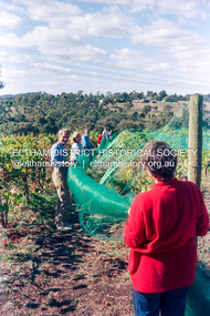
Photograph (Item) - Print, Graham Scott, Untitled (Vineyard Scene), 1988
Graham Scott 1988 Entrant No. 45 Ref: Series 34, Items 20, 77, 78 SHIRE OF ELTHAM COMMUNITY PHOTOGRAPHIC SURVEY Photography is an artform which many of us practice, sometimes purely for artistic pursuit, sometimes to record the people and events in our lives. In 1988, as part of a local Bicentennial project, the Shire of Eltham conducted the Eltham Community Photographic Survey. Up to 100 entries were to be selected by a panel of photographers for entry into the Eltham Photographic Survey Exhibition. Entries had to be submitted by May 13, 1988. Entrants whose images were selected for the exhibition were contacted and requested to further submit an entry form providing entrant’s name, area of residence, age, and proposed captions. These details were then used to produce labels for the exhibition mounts. Where negatives had not been supplied, these were requested to support the display of printed enlargements mounted on 10” x 8” cardboard. The mounted prints were made available post exhibition for sale at $8.50 each for colour prints and $7.00 for B&W prints. Residents in the Shire were invited to collect a free roll of film and take a photograph of what they either liked or did not like about the area. A total of 160 entrants submitted multiple entries for the exhibition. Of those selected for exhibition, entrants ranged in age from 9 to 70 years. All custom colour and black and white printing for the exhibition was completed by Wattle Studios of Eltham. The Eltham Photographic Survey was jointly auspiced by the Shire of Eltham and Wattle Studios, of 953 Main Road, Eltham. The project was greatly assisted by: • David McRitchie, Media Studies Lecturer Victoria College, Rusden Campus. • Ian and Annette Toohill of Wattle Studios • Tracy Naughton, Eltham Community Arts Officer • Neville Emerson Pty. Ltd. • Superior Press, Eltham • Kodak Australasia Pty. Ltd. • Agfa Gevaert Ltd. • Townsend Colourtech Pty. Ltd. • The Australian Bicentennial Authority • Eleanor Bowers, Secretary, Eltham Arts Council The exhibition was placed on display in the Woolworths Arcade, Eltham between Monday June 6th and Saturday June 11, 1988. It was also intended to hold the exhibition at a venue in the Shire’s North Riding from Monday, June 20 to Friday June 24. It was then displayed at the Were Street Theatre, Montmorency from Friday, June 24 to Thursday, July 7. Series 34: Eltham Community Photographic Survey 1988 - Prints & Documentation Series consists of 117 photographs of Shire scenes taken by members of the community. Items I - 41 are larger photographs mounted on card, which were exhibited. Items 42 - 117 are unmounted copies, alternative takes and other entries. Corresponding negatives contained in Series 35: Eltham Community Photographic Survey 1988 – Negatives which consists of 267 colour and B&W negatives and one colour slide of Shire scenes taken by members of the community. The negatives are arranged by the entrant number of the photographer. The Eltham Community Photographic Survey collection is significant to the local community as it was curated by the local community - ordinary people of all ages - representing what they liked and did not like in the area where they lived. It represents an unfiltered representation of the Shire of Eltham as it was in 1988. It also represents one of many projects as part of the national programme of events and celebrations to commemorate the bicentenary. It is a time capsule of life in the 1980s of this urban and rural municipality in Melbourne's north. Rear: Entrant No., name and address in blue ink; also 'Series 34' and the 'Item No.' in orange inkshire of eltham archives, bicentennial project, eltham, eltham community photographic survey, series 34, series 35, film - kodak ga 100 5095, graham scott, scan - 35mm negative, vineyards -
 Eltham District Historical Society Inc
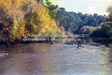
Photograph (Item) - Print, Mathew Wakefield, Untitled (Yarra River Scene), 1988
Mathew Wakefield 1988 Entrant No. 40 Ref: Series 34, Items 87, 88 The photographer noted that in a sad indictment of the local community, this German Shepherd dog and another had been abandoned by their owners to scavenge through the bins and chase the drunks around the lake at dawn. Both dogs were impounded and the owners never claimed them. As a consequence they were eventually both put down. SHIRE OF ELTHAM COMMUNITY PHOTOGRAPHIC SURVEY Photography is an artform which many of us practice, sometimes purely for artistic pursuit, sometimes to record the people and events in our lives. In 1988, as part of a local Bicentennial project, the Shire of Eltham conducted the Eltham Community Photographic Survey. Up to 100 entries were to be selected by a panel of photographers for entry into the Eltham Photographic Survey Exhibition. Entries had to be submitted by May 13, 1988. Entrants whose images were selected for the exhibition were contacted and requested to further submit an entry form providing entrant’s name, area of residence, age, and proposed captions. These details were then used to produce labels for the exhibition mounts. Where negatives had not been supplied, these were requested to support the display of printed enlargements mounted on 10” x 8” cardboard. The mounted prints were made available post exhibition for sale at $8.50 each for colour prints and $7.00 for B&W prints. Residents in the Shire were invited to collect a free roll of film and take a photograph of what they either liked or did not like about the area. A total of 160 entrants submitted multiple entries for the exhibition. Of those selected for exhibition, entrants ranged in age from 9 to 70 years. All custom colour and black and white printing for the exhibition was completed by Wattle Studios of Eltham. The Eltham Photographic Survey was jointly auspiced by the Shire of Eltham and Wattle Studios, of 953 Main Road, Eltham. The project was greatly assisted by: • David McRitchie, Media Studies Lecturer Victoria College, Rusden Campus. • Ian and Annette Toohill of Wattle Studios • Tracy Naughton, Eltham Community Arts Officer • Neville Emerson Pty. Ltd. • Superior Press, Eltham • Kodak Australasia Pty. Ltd. • Agfa Gevaert Ltd. • Townsend Colourtech Pty. Ltd. • The Australian Bicentennial Authority • Eleanor Bowers, Secretary, Eltham Arts Council The exhibition was placed on display in the Woolworths Arcade, Eltham between Monday June 6th and Saturday June 11, 1988. It was also intended to hold the exhibition at a venue in the Shire’s North Riding from Monday, June 20 to Friday June 24. It was then displayed at the Were Street Theatre, Montmorency from Friday, June 24 to Thursday, July 7. Series 34: Eltham Community Photographic Survey 1988 - Prints & Documentation Series consists of 117 photographs of Shire scenes taken by members of the community. Items I - 41 are larger photographs mounted on card, which were exhibited. Items 42 - 117 are unmounted copies, alternative takes and other entries. Corresponding negatives contained in Series 35: Eltham Community Photographic Survey 1988 – Negatives which consists of 267 colour and B&W negatives and one colour slide of Shire scenes taken by members of the community. The negatives are arranged by the entrant number of the photographer. The Eltham Community Photographic Survey collection is significant to the local community as it was curated by the local community - ordinary people of all ages - representing what they liked and did not like in the area where they lived. It represents an unfiltered representation of the Shire of Eltham as it was in 1988. It also represents one of many projects as part of the national programme of events and celebrations to commemorate the bicentenary. It is a time capsule of life in the 1980s of this urban and rural municipality in Melbourne's north. Rear: Entrant No., name and address in blue ink; also 'Series 34' and the 'Item No.' in orange inkshire of eltham archives, bicentennial project, eltham, eltham community photographic survey, series 34, series 35, film - fuji 100, mathew wakefield, scan - 35mm negative, yarra river -
 Eltham District Historical Society Inc
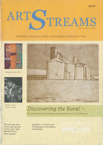
Journal, Peter Doughtery, ArtStreams: Vol. 10, No. 4, 2005
Vol. 10, No. 4, Sep-Oct 2005 CONTENTS Short story In Shadows by Bill Collopy 3 Discovery of the rural by Clive Dickson 7 Wagga based artists by Thomas A. Middlemost 10 Short Story by Emilie Anita Teear 12 Gallipoli : A Turkish view Photography at Bundoora Homestead 13 Musicians who answered the call 16 Book reviews 18 Australian landscape Conference 2005 by Kate Herd 20 Threads that bind the CSA and CWA 22 Music at Wellers Restaurant 23 Music reviews 24 The Snakes in Eden by John Jenkins 27 Artin' About 29 Wining & Dining 30 Listings 32"Peter Dougherty has been involved in the local art scene for many years. As publisher and editor of the arts magazine Artstreams, his comments on the various branches of the arts are widely respected. His "The Arts" column in the Diamond Valley Leader presents a brief summary for a much wider cross section of the local community. Peter also operates his own gallery and the Artstreams Cafe at the St Andrews market. Peter has a wealth of knowledge about present day and historical aspects of local art and artists." - Eltham District Historical Society Newsletter No. 161, March 2005Colour front and back cover with feature articles and literary pieces with photographs and advertisements printed in black and white. 32 pages, 30 cm. Vol. 1, no. 1 (Nov. 1996) - Vol. 10, no. 5 (summer ed. 2005/06) art streams, art streams magazine, silos, australian landscape conference 2005, bill collopy, bundoora homestead, click here to add keywords, clive dickson, emilie anita teear, gallipoli, john jenkins, kate herd, the snakes in eden, thomas a. middlemost, wagga based artists