Showing 436 items
matching viewers
-
 Footscray Community Arts
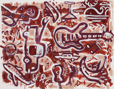
Holiday Yardage Mambo, David Bowers, (exact); 2003
MEDIUM: Acrylic on paper. DESCRIPTION: Image ranges from dark brown to pale brown with white. Light colored timber, outer frame with glass covering, white board and an inner frame. A very busy piece full of activity, starting from the bottom left we have an areoplane which is perhaps how this vacation begins, the sun sits above it and a bikini clad woman who has arrived to her destination is placed above the sun. There is cruise ship, a martini glass and a whale embracing the outer scene. Waves, a surfer, a marlin and a small guitar sit at the lower right. A large car takes the viewer to the centre of the picture where we come across a giant guitar. The music is what matters, this piece dances about the canvas in mushroom pinks and chocolates. Little outlines of fish fill the gaps. A very beachy scene. The image lyes quite flat to the eye, rough stick outlines of the images above. Signed proper left hand corner of image.bowers holiday, yardage, mambo acrylic -
 Kew Historical Society Inc
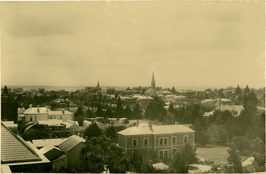
Photograph, J F C Farquhar, Bird's Eye View Looking North, 1891
At the beginning of the 1890s, the Kew businessman and Town Councillor, Henry Kellett, commissioned J.F.C. Farquhar to photograph scenes of Kew. These scenes included panoramas as well as pastoral scenes. The resulting set of twelve photographs was assembled in an album, Kew Where We Live, from which customers could select images for purchase.The preamble to the album describes that the photographs used the ‘argentic bromide’ process, now more commonly known as the gelatine silver process. This form of dry plate photography allowed for the negatives to be kept for weeks before processing, hence its value in landscape photography. The resulting images were considered to be finely grained and everlasting. Evidence of the success of Henry Kellett’s venture can be seen today, in that some of the photographs are held in national collections.It is believed that the Kew Historical Society’s copy of the Kellett album is unique and that the photographs in the book were the first copies taken from the original plates. It is the first and most important series of images produced about Kew. The individual images have proved essential in identifying buildings and places of heritage value in the district.This panoramic view was probably taken from the roof of Xavier College. It invites the viewer to look down on the buildings and streets of Kew, and across to the distant horizon. Mansions and solid bourgeois villas dominate the view of Charles and Wellington Streets. The imposing spires of the Presbyterian and Methodist Churches, built in one of the highest areas of Kew, can be seen in the distance. In the foreground, the photographer includes three significant mansions: Molina, Roxeth and Elsinore. Molina, in the foreground, and the group of weatherboard buildings in its yard was used at this stage for the privately operated ‘Kew High School’ (founded 1872). Roxeth, the home of Herbert Henty can be identified by its distinctive four-sided tower. All three buildings are now part of Trinity Grammar. Other built structures observable in the photograph include Wilton (now the Kew RSL), designed by Guyon Purchas for Dr William Walsh in 1886, and the only known image of the Prospect Hill Hotel prior to the renovation of 1935. Bird's Eye View Looking Northkew illustrated, kew where we live, photographic books, henry kellett -
 Federation University Art Collection
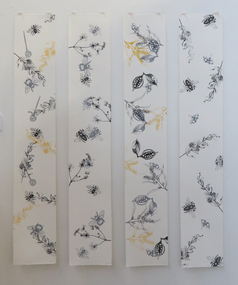
Work on paper - Artwork - Printmaking, Jessica Price, 'Garden #1, #2, #3 and #4' by Jessica Price, 10/2017
Jessica PRICE (1996- ) Born Busselton, Western Australia In 2017 Jessica Price completed a Bachelor of Arts (Fine Arts) Printmaking at the Federation University Arts Academy. A general theme in her work is nature to reveal the beauty of God in nature. This item is part of the Federation University Art Collection. The Art Collection features over 2000 works and was listed as a 'Ballarat Treasure' in 2007.Four limited edition screenprints with fineliner printed on Somerset Satin White paper. Artist's Statement: I am a practising printmaking artist and enjoy experimenting with various forms of print including chine colle, screenprinting and monoprint. I also enjoy drawing and painting, and hope to expand my practise to incorporate all these methods to create a unique style of artwork for myself. I am constantly in awe of the delicacy and grandeur of creation. I find that bringing this concept and theme thorughout my work using a botanical like approach not only expresses a part of who I am, but connects me with the creator of the universe. My hope is that by making these works I can create a similar experience for my viewers, as well as celebrate the master craftsmanship of the creator. This item is part of the Federation University Art Collection. The Art Collection features over 2000 works and was listed as a 'Ballarat Treasure' in 2007.1/1jessica price, screenprint, printmaking, flora, alumni, bee, australian nature -
 Merri-bek City Council
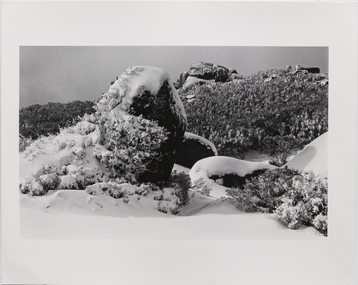
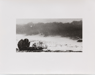
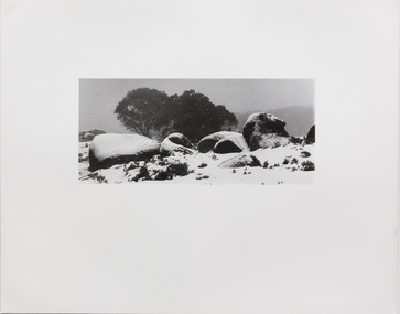
Hand printed vintage black and white silver print, Stephen Wickham, Untitled 2, c. 1980
Stephen Wickham is an Australian photographer and painter who has been actively exhibiting his works since the 1980s. A long standing preoccupation with Mt Buffalo since the 1980's has seen the artist produce a number of photographic suites and exhibitions that have been likened to German Romantic iconography and associated heavily with the European migrant experience (Robert Nelson, The Age 16 June 2001). Born to Viennese parents, hiking in the mountains for Wickham represents a traditional European family pastime. This series of work is comprised of expeditionary photographs taken between 1980 and 1985. Charles Green describes Wickham's landscape photographs as sublime, transcendental, spiritual and symbolic (Art in Australia Spring 1988). Set in Victoria’s Mount Buffalo National Park, the Mount Buffalo series captures the mountain plateau during winter. Rather than focusing on a lush green landscape, Wickham presents the viewer with close-ups of the snow-covered flaura and fauna of the alpine region.Donated through the Australian Government's Cultural Gifts Program by Miriam Kenter in memory of Master George Willibrord Kenter -
 Merri-bek City Council
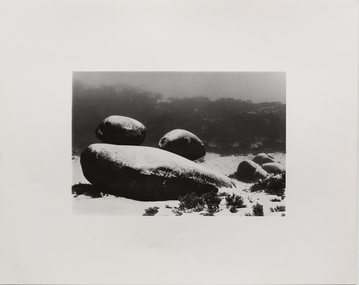
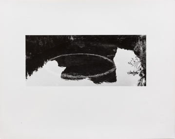
Hand printed vintage black and white silver print, Stephen Wickham, Untitled 5, c. 1980
Stephen Wickham is an Australian photographer and painter who has been actively exhibiting his works since the 1980s. A long standing preoccupation with Mt Buffalo since the 1980's has seen the artist produce a number of photographic suites and exhibitions that have been likened to German Romantic iconography and associated heavily with the European migrant experience (Robert Nelson, The Age 16 June 2001). Born to Viennese parents, hiking in the mountains for Wickham represents a traditional European family pastime. This series of work is comprised of expeditionary photographs taken between 1980 and 1985. Charles Green describes Wickham's landscape photographs as sublime, transcendental, spiritual and symbolic (Art in Australia Spring 1988). Set in Victoria’s Mount Buffalo National Park, the Mount Buffalo series captures the mountain plateau during winter. Rather than focusing on a lush green landscape, Wickham presents the viewer with close-ups of the snow-covered flaura and fauna of the alpine region.Donated through the Australian Government's Cultural Gifts Program by Miriam Kenter in memory of Master George Willibrord Kenter -
 Merri-bek City Council
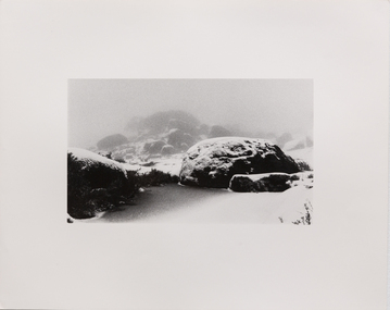
Hand printed vintage black and white silver print, Stephen Wickham, Untitled 6, c. 1980
Stephen Wickham is an Australian photographer and painter who has been actively exhibiting his works since the 1980s. A long standing preoccupation with Mt Buffalo since the 1980's has seen the artist produce a number of photographic suites and exhibitions that have been likened to German Romantic iconography and associated heavily with the European migrant experience (Robert Nelson, The Age 16 June 2001). Born to Viennese parents, hiking in the mountains for Wickham represents a traditional European family pastime. This series of work is comprised of expeditionary photographs taken between 1980 and 1985. Charles Green describes Wickham's landscape photographs as sublime, transcendental, spiritual and symbolic (Art in Australia Spring 1988). Set in Victoria’s Mount Buffalo National Park, the Mount Buffalo series captures the mountain plateau during winter. Rather than focusing on a lush green landscape, Wickham presents the viewer with close-ups of the snow-covered flaura and fauna of the alpine region.Donated through the Australian Government's Cultural Gifts Program by Miriam Kenter in memory of Master George Willibrord Kenter -
 Merri-bek City Council
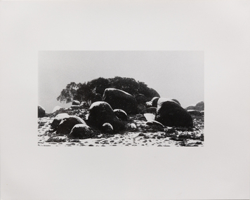
Hand printed vintage black and white silver print, Stephen Wickham, Untitled 7, c. 1980
Stephen Wickham is an Australian photographer and painter who has been actively exhibiting his works since the 1980s. A long standing preoccupation with Mt Buffalo since the 1980's has seen the artist produce a number of photographic suites and exhibitions that have been likened to German Romantic iconography and associated heavily with the European migrant experience (Robert Nelson, The Age 16 June 2001). Born to Viennese parents, hiking in the mountains for Wickham represents a traditional European family pastime. This series of work is comprised of expeditionary photographs taken between 1980 and 1985. Charles Green describes Wickham's landscape photographs as sublime, transcendental, spiritual and symbolic (Art in Australia Spring 1988). Set in Victoria’s Mount Buffalo National Park, the Mount Buffalo series captures the mountain plateau during winter. Rather than focusing on a lush green landscape, Wickham presents the viewer with close-ups of the snow-covered flaura and fauna of the alpine region.Donated through the Australian Government's Cultural Gifts Program by Miriam Kenter in memory of Master George Willibrord Kenter -
 Merri-bek City Council
Hand printed vintage black and white silver print, Stephen Wickham, Untitled 8, c. 1980
Stephen Wickham is an Australian photographer and painter who has been actively exhibiting his works since the 1980s. A long standing preoccupation with Mt Buffalo since the 1980's has seen the artist produce a number of photographic suites and exhibitions that have been likened to German Romantic iconography and associated heavily with the European migrant experience (Robert Nelson, The Age 16 June 2001). Born to Viennese parents, hiking in the mountains for Wickham represents a traditional European family pastime. This series of work is comprised of expeditionary photographs taken between 1980 and 1985. Charles Green describes Wickham's landscape photographs as sublime, transcendental, spiritual and symbolic (Art in Australia Spring 1988). Set in Victoria’s Mount Buffalo National Park, the Mount Buffalo series captures the mountain plateau during winter. Rather than focusing on a lush green landscape, Wickham presents the viewer with close-ups of the snow-covered flaura and fauna of the alpine region.Donated through the Australian Government's Cultural Gifts Program by Miriam Kenter in memory of Master George Willibrord Kenter -
 Merri-bek City Council
Hand printed vintage black and white silver print, Stephen Wickham, Untitled 9, c. 1980
Stephen Wickham is an Australian photographer and painter who has been actively exhibiting his works since the 1980s. A long standing preoccupation with Mt Buffalo since the 1980's has seen the artist produce a number of photographic suites and exhibitions that have been likened to German Romantic iconography and associated heavily with the European migrant experience (Robert Nelson, The Age 16 June 2001). Born to Viennese parents, hiking in the mountains for Wickham represents a traditional European family pastime. This series of work is comprised of expeditionary photographs taken between 1980 and 1985. Charles Green describes Wickham's landscape photographs as sublime, transcendental, spiritual and symbolic (Art in Australia Spring 1988). Set in Victoria’s Mount Buffalo National Park, the Mount Buffalo series captures the mountain plateau during winter. Rather than focusing on a lush green landscape, Wickham presents the viewer with close-ups of the snow-covered flaura and fauna of the alpine region.Donated through the Australian Government's Cultural Gifts Program by Miriam Kenter in memory of Master George Willibrord Kenter -
 Merri-bek City Council
Hand printed vintage black and white silver print, Stephen Wickham, Untitled 10, c. 1980
Stephen Wickham is an Australian photographer and painter who has been actively exhibiting his works since the 1980s. A long standing preoccupation with Mt Buffalo since the 1980's has seen the artist produce a number of photographic suites and exhibitions that have been likened to German Romantic iconography and associated heavily with the European migrant experience (Robert Nelson, The Age 16 June 2001). Born to Viennese parents, hiking in the mountains for Wickham represents a traditional European family pastime. This series of work is comprised of expeditionary photographs taken between 1980 and 1985. Charles Green describes Wickham's landscape photographs as sublime, transcendental, spiritual and symbolic (Art in Australia Spring 1988). Set in Victoria’s Mount Buffalo National Park, the Mount Buffalo series captures the mountain plateau during winter. Rather than focusing on a lush green landscape, Wickham presents the viewer with close-ups of the snow-covered flaura and fauna of the alpine region.Donated through the Australian Government's Cultural Gifts Program by Miriam Kenter in memory of Master George Willibrord Kenter -
 Kew Historical Society Inc
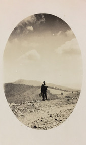
Photograph - Rural landscape, c.1926
Henry Beater Christian (1886-1962) , was a descendant of one of the earliest settler families in Kew. Employed at the Kew Asylum as a 'public servant', he was a skilled amateur photographer, photographing numerous scenes in Kew and on his travels around Victoria. The majority of his photographs date from 1916 to 1929. His finest photographs are housed in two photograph albums. Digital copy of a photograph from page 17 of the 47-page photograph album containing 261 gelatinous silver images, loaned by Diane Washfold with permission given to digitise and hold a copy in our collection. This photograph, dating from c.1926, forms part of a group of photos preceding images of [Black] Spur, so the photographs may have been taken as part of that bushwalking trip. John Chapman has written in 'Bushwalking Clubs - A Brief History', about the establishment in Victoria of the first bushwalking club in 1888, and the popularisation of bushwalking during the interwar period. Henry Christian's 'walks' appear to have been undertaken solely or with a companion/s. This camera shot invites the viewer to access the landscape through the point-of-view of the man standing with his back to the camera at the edge of the road. The man holds leaves in his left hand [to deter insects], and has a knapsack on his back. The landscape in the distance includes both cleared land for farming and remnant vegetation. The oval framing device was used when Henry Christian developed the photo.Illegible ink inscription on pagehenry beater christian (1886-1962), landscape photography, kew (vic.) — yarra river, christian-washfold collection, photograph albums, bushwalking -- victoria -
 Federation University Art Collection
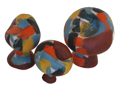
Sculpture - Artwork - Ceramic, 'Barbara' by Sarah Anderson, 2017
Sarah ANDERSON (1984- ) Born Ararat, Victoria Sarah Anderson is a ceramic artist currently completing her tertiary education at Federation University, and upon completion intends to study for a post-graduate teaching qualification. Influences on Sarah’s work range greatly, from historical Mexican tilework to delicate pinched porcelain sculpture. Barbara Hepworth, Constantin Brancusi and Jun Kaneko continue to be great sources of inspiration for Sarah’s final year of studies, for their challenging looks at shape, form and colour in their ceramic work. Sarah’s current ceramic practice involves exploring organic shapes in brightly coloured finishes. At once the shapes are earthy and vaguely figurative, an exploration of three dimensional shape and how our minds seek to align them with familiar forms. Her colour treatments are designed to create a dichotomy between shape and colour, inviting the viewer to apply their own meaning to the works. In future, Sarah hopes to combine her love for art history and education with her art practice in a fulfilling career. Sarah Anderson completed a Bachelor Visual Arts (Ceramics) at the Federation University Arts Acadamy in 2017. Three earthernware sculptures with mid-fired underglaze treatment. An airplant is attached to one of the items. This work won the 2017 Federation University 3D Art Acquisition award.On each base 'Sarah Anderson'sarah anderson, ceramics, sculpture, alumni, art acquisition award, available -
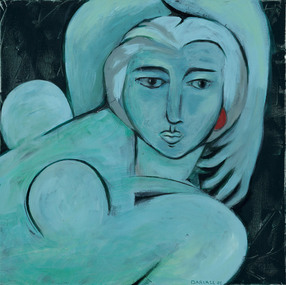 Footscray Community Arts
Oh Matise, Jo Darvall, (exact); 2006
MEDIUM: Acrylic on canvas. DESCRIPTION: Blue and black, no external frame. A figurative nude, the close up takes most of the canvas. It sits on a dark background in undefined surroundings. The blue woman sits flat as many of Matisse’s works do, favouring this style over the illusionistic depth to achieve his aim, here we see this replicated. Matisse is also noted for his use of colour as a means of expression rather than description. Here we have a woman painted all in blue, with this knowledge we could say the artist has painted his subject as someone who has been captured in a very relaxed, very calm version of herself, an ocean onto herself, mysterious and captivating in this moment. Her arm slung confidently above and around her head, her view directly facing the viewer provocatively. The only other colour on her other than the thick black lines which outline and shadow her contours, is the circular red of her earring -mirroring the generous sweeping curves of the work. The presence of visible brushstrokes produces a sense of movement and energy as well as providing a decorative quality to the painting.Signed and dated on bottom proper left of center of image (on reverse of canvas).acrylic, darvall, matisse -
 National Wool Museum
Painting, The White Farm, 2020/21
The farm buildings that Linda Gallus has studied and painted are on the farmland adjoining the Leura Park properties in Curlewis, on the Bellarine Peninsula. The current owner of the property told Linda that he bought the farm in 1994. He has used it for both sheep and cattle grazing since purchasing the property. When the farmer bought the land all the buildings on the property were painted white for sale, despite the fact they were very old. The shearing shed was in use up until the time of sale but was in a bad state of disrepair. The roof, stumps and floor required replacing. The building was no longer in use after the sale, so the shearing shed gradually fell into further disrepair. The previous owner had also used the property for growing potatoes, crops and livestock, mainly sheep. Linda’s fascination with the property came when she caught a glimpse of the white chimney over the hill driving towards Point Lonsdale, which still stands proud today on the roof of the old shearing shed. The owner kindly allowed her to visit the property over the past few years to capture the buildings using photography and painting. During this time many of the buildings have fallen. Linda calls it The White Farm as there are remnants of that original white paint on the outside of most of the buildings giving it a strange and rather beautiful patina. The structures are wonderful remnants of the history of the Bellarine. Linda first spotted the old shearing shed when she was driving home to Clifton Springs from Geelong. It was the white chimney on the shearing shed that stood out behind the rolling grassy hills. It was intriguing – bright white and still in good condition, unlike the rest of the building. After further investigation Linda got to know the owner of the property and visited it frequently to draw, take photos and paint. There is a variety of lovely old buildings on the property, but it was the shearing shed that held extra fascination for Linda. The most intriguing thing for Linda was that the buildings were all painted white at some stage and now the patina of peeling paint and bleached timber brought a wonderful mood and feeling to the farm. This is what she has tried to capture in this series of 11 paintings. Most of the buildings are falling, so Linda felt an urgency to capture them using acrylic paint on canvas in order to commemorate them forever.Acrylic Paint on Canvas. The images both feature a falling down shearing shed as the central focus. The wood of the shearing shed is a central theme of importance. The old buildings were painted white for sale despite being in a state of structural instability. After time this same painted wood has been left with an interesting complex patina like film on the surface which the artist has taken great care to capture. Image 1 is titled ‘Another gust of Wind’. It shows the exterior of the shearing shed which is in the process of collapsing from the forces of mother nature. In the background of this painting another of the buildings in the ‘White Farm’ complex is visible, in addition to blue skies and overgrown green grasses. Image 2 is titled ‘Green Trough’. It features the interior of the same collapsing shearing shed. The image is painted as though the viewer is peering through a crack of the external wall. Internally a green trough is seen hanging on an internal fence. Unlike everything else in the shearing shed, the trough appears new and in good condition. It provides a strong juxtaposition to the rest of the shearing shed, and the larger surrounding ‘White Farm’ complexbellarine peninsula, the white farm, shearing shed -
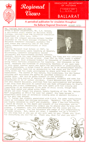 Federation University Historical Collection
Document, Retirement of Alan Sonsee, 1976, 08/1976
Born in 1911, Cecil Alan Sonsee lived at Springmount near Creswick, and taught natural history at the Ballarat Teachers' College for 30 years. His teaching career stretched over a 48 year period. He spent six years as a student teacher before reaching the position of first class teacher. He had the distinction of never attending a teachers' college, but spending half his teaching career training students to become teachers. At the time of his retirement Mr Sonsee said during his years at the college, "the training had changed from a one year course to a two year course, followed by a three year course, and now a four year course was offered." He recalled "in the early days all country schools had eight grades and a child finished with a merit certificate. Today [1976], children went to high schools from sixth grade and most of the country schools had disappeared.' Alan Sonsee spent 10 years on a television program on BTV6 answering questions sent by viewers regarding aspects of plant and animal live. Mr Sonsee was a life member of both Creswick and Ballarat Field naturalists Clubs. Alan Sonsee died in 1985.1) Foolscap Department of Victoria Ballarat newsletter titled Education 'Regional Views'. The newsletter depicts an image of Alan Sonsee and outlines his career at the time of his retirement on 20 July 1976. The author of the newsletter is unknown. .2) newspaper article on the retirement of Alan Sonsee dated 25 August 1976 (probably from the Ballarat Courier).1) Mr "Nature Man" Retires After a quiet celebration, Mr C.A. Sonsee, a well-known staff member at Ballarat State College, retired from the Victorian Education Department on 20th July, 1976. Alan was the longest serving primary teacher seconded to the State College (Formerly the Ballarat teachers' College), probably the best known and certainly one of the most highly respected educationalists in this region. Leaving Ballarat high School in 1927, he spent the following years teaching at Smeaton, Willowvale, Lawrence (originally called Jerusalem) and Kooroocheang primary schools. However, during the last twenty-nine years, his fame and his influence spread further and further afield. From 1947 to 1976, under a number of principals, Alan endeared himself to thousands of students undergoing their tertiary preparation for teaching. And thousands is the word! Hundreds and hundreds of practising teachers of all ages came to this great teacher again and again for assistance in understanding natural phenomena, a broad field in which he is an acknowledged expert. What undoubtedly made him so accessible to the young and the no-so-young alike was his ready willingness to share with them is rich experience. The warmth of his nature, his kindliness, his dry humour enriched and enlivened the gifts he lavished liberally on all who needed help. Nor did he spare himself in the process. During his ling period of service to teachers, students and some two generations or so of school children, Field Naturalists also, within and well beyond Ballarat, profited from his participation and guidance. A car trip from Ballarat to Lancefield was made unforgettable by Alan's running and lively commentary; the time spent with him viewing and fossicking in an aboriginal flint area is still vivid, thouhg many moons have waxed and waned since then. And who can ever forget his palcid, home;y handling of "Mr nature Man" programmes on BTV 6 for over ten years? his name became a hose-hold word over an existence viewing area in Western Victoria - as his mail bag showed. Mr T. Turner was closely associated with C.A.S. for some twenty-three years as colleague and college principal. Recently tome said, "Alan was highly esteemed by staff and students, When I saw him lecturing I would be struck by the depth and breadth of his knowledge, and by the smooth, almost deceptively simple way he shared what he knew with others. I remember, too, his consideration for the views and the feelings of others; for the tolerance and range of his understanding of human nature. But, above all else, I remember him as a friend." All who know him in any way at all will want to say, "Thanks you, Alan, for everything you did for us. Thank you, Alan for what you are."alan sonsee, ballarat teachers' college, ballarat state college, education, teaching, ballarat field naturalists, creswick field naturalists, aborigines, lancefield flint, smeaton primary school, willowvale primary school, lawrence primary school, jerusalum primary school, kooroocheang primary school, nature studies, mr nature man -
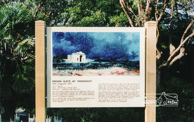 Eltham District Historical Society Inc
Photograph, Information Panel: Will Longstaff's "Menin Gate at Midnight"
In April 2002, illustrative panels were set in place at Kangaroo Ground War Memorial Park designed to inform visitors about significant aspects of the reserve and its tower. One of these deals with its indigenous story, another portrays its original 1920 memorial, a third has upon it Will Longstaff’s famous war painting, “Midnight at Menin Gate.” This sign establishes a connection with the First World War by way of the painting "Menin Gate at Midnight". (NL 144) The artist William Longstaff lived in Eltham; his son attended school at Kangaroo Ground. The orignal of his painting is on permanent display in the Australian War Memorial. Since this photograph was taken (date unknown) the information panel has been restored and re-erected by staff of the Shire of Nillumbik who replicated the wooden side frame pieces with the same wood-turn design as seen here in the original. Colour photographMENIN GATE AT MIDNIGHT Will Longstaff, 1927 Oil on canvas, Size 135cm high x 254cm wide Collection: Australian War Memorial The artist Will Longstaff was born in in Ballarat in 1879 and died at Littlehampton, Sussex, UK, 1953. Will Longstaff for many years lived in Eltham, his son Tommy, attending school at Kangaroo Ground. As an Official War Artist, will Longstaff depicted in his alegorical painting the Menin Gate Memorial, Ypres, Belgium. The Memorial unveiled on 24th July 1927 honours by name over 50, 000 allied soldiers who fell in the Great War and have no known graves. The names of 6,208 men of the first Australian Imperial Force (A.I.F.) are listed within the Memorial on stone tablets. The painting held huge emotional appeal to Australians when it arrived from England in 1928, attracting an estimated one million viewers, many of whom interpreted the field of red poppies in the foreground as the spirits of the dead rising from their unknown graves. The painting is to be found in the Australian War Memorial, Canberra.menin gate at midnight, william longstaff, kangaroo ground memorial, information panel, shire of eltham war memorial -
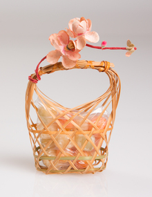
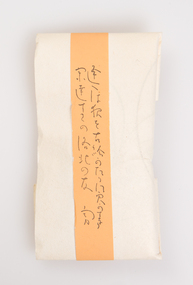
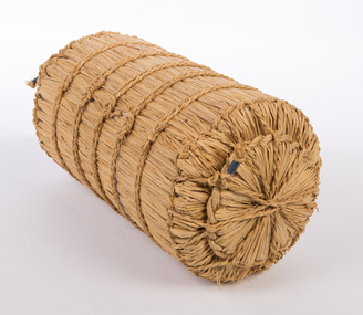
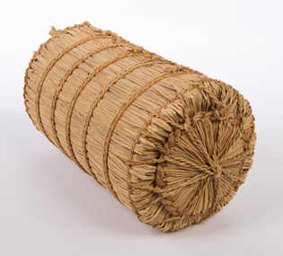
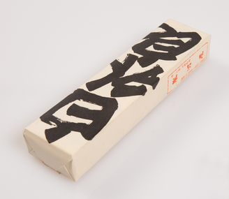 Ararat Gallery TAMA
Functional object, Shiro Uiro, c. 1900s
‘The Art of the Japanese Package’ was an exhibition that toured to 10 Australian and 11 New Zealand public galleries in 1979 and 1980. The touring exhibition comprised 221 objects of traditional Japanese packaging which extended from ceramics, wood and paper to woven fibre containers. At the conclusion of the tour, The Japan Foundation and the Crafts Board of the Australia Council donated the vast majority of the exhibition to the Ararat Gallery for its permanent collection. Combining the natural qualities of bamboo, paper and straw with delicate craftsmanship, these unique objects express Japanese aesthetics as applied through fibre crafts. In Japan, the qualities and traits of natural materials are exploited rather than hidden. The texture of straw, the septa of bamboo are not concealed but lovingly incorporated into the whole. In 1979 Hideyuki Oka, curator of ‘The Art of the Japanese Package’ wrote: “In no way self-conscious or assertive, these wrappings have an artless and obedient air that greatly moves the modern viewer. They are whispered evidence of the Japanese ability to create beauty from the simplest products of nature. They also teach us that wisdom and feeling are especially important in packaging because these qualities, or the lack of them, are almost immediately apparent. What is the use of a package if it shows no feeling?” The descriptions of the featured objects were written by Hideyuki Oka, curator of ‘The Art of the Japanese Package’, 1979.Gift of the Japan-Australia Foundation and the Crafts Board of the Australia Council, 1981Another Kyoto confection, a kind of sweetened rice paste, is simply but strikingly wrapped in a package marked with its name (uiro) in vigorously written characters. Simplicity could hardly be carried further, but, as seen in this ensemble of three separate packages, the effect is altogether engaging. - Professor Hideyuki Oka, curator.japanese art, japanese packaging, tsutsumi, gift giving -
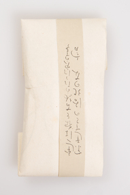
 Ararat Gallery TAMA
Functional object, Sekku no Iwaimono, c. 1900s
‘The Art of the Japanese Package’ was an exhibition that toured to 10 Australian and 11 New Zealand public galleries in 1979 and 1980. The touring exhibition comprised 221 objects of traditional Japanese packaging which extended from ceramics, wood and paper to woven fibre containers. At the conclusion of the tour, The Japan Foundation and the Crafts Board of the Australia Council donated the vast majority of the exhibition to the Ararat Gallery for its permanent collection. Combining the natural qualities of bamboo, paper and straw with delicate craftsmanship, these unique objects express Japanese aesthetics as applied through fibre crafts. In Japan, the qualities and traits of natural materials are exploited rather than hidden. The texture of straw, the septa of bamboo are not concealed but lovingly incorporated into the whole. In 1979 Hideyuki Oka, curator of ‘The Art of the Japanese Package’ wrote: “In no way self-conscious or assertive, these wrappings have an artless and obedient air that greatly moves the modern viewer. They are whispered evidence of the Japanese ability to create beauty from the simplest products of nature. They also teach us that wisdom and feeling are especially important in packaging because these qualities, or the lack of them, are almost immediately apparent. What is the use of a package if it shows no feeling?” The descriptions of the featured objects were written by Hideyuki Oka, curator of ‘The Art of the Japanese Package’, 1979.Gift of the Japan-Australia Foundation and the Crafts Board of the Australia Council, 1981japanese art, japanese packaging, tsutsumi, gift giving -
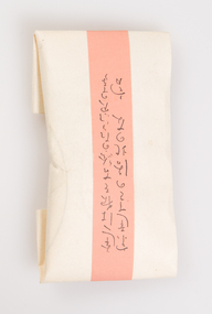
 Ararat Gallery TAMA
Functional object, Container for pastries, c. 1900s
‘The Art of the Japanese Package’ was an exhibition that toured to 10 Australian and 11 New Zealand public galleries in 1979 and 1980. The touring exhibition comprised 221 objects of traditional Japanese packaging which extended from ceramics, wood and paper to woven fibre containers. At the conclusion of the tour, The Japan Foundation and the Crafts Board of the Australia Council donated the vast majority of the exhibition to the Ararat Gallery for its permanent collection. Combining the natural qualities of bamboo, paper and straw with delicate craftsmanship, these unique objects express Japanese aesthetics as applied through fibre crafts. In Japan, the qualities and traits of natural materials are exploited rather than hidden. The texture of straw, the septa of bamboo are not concealed but lovingly incorporated into the whole. In 1979 Hideyuki Oka, curator of ‘The Art of the Japanese Package’ wrote: “In no way self-conscious or assertive, these wrappings have an artless and obedient air that greatly moves the modern viewer. They are whispered evidence of the Japanese ability to create beauty from the simplest products of nature. They also teach us that wisdom and feeling are especially important in packaging because these qualities, or the lack of them, are almost immediately apparent. What is the use of a package if it shows no feeling?” The descriptions of the featured objects were written by Hideyuki Oka, curator of ‘The Art of the Japanese Package’, 1979.Gift of the Japan-Australia Foundation and the Crafts Board of the Australia Council, 1981japanese art, japanese packaging, tsutsumi, gift giving -
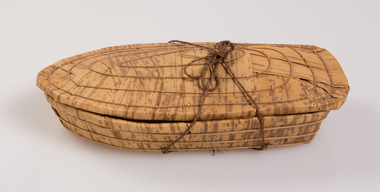
 Ararat Gallery TAMA
Functional object, Gion Chigo Mochi, c. 1900s
‘The Art of the Japanese Package’ was an exhibition that toured to 10 Australian and 11 New Zealand public galleries in 1979 and 1980. The touring exhibition comprised 221 objects of traditional Japanese packaging which extended from ceramics, wood and paper to woven fibre containers. At the conclusion of the tour, The Japan Foundation and the Crafts Board of the Australia Council donated the vast majority of the exhibition to the Ararat Gallery for its permanent collection. Combining the natural qualities of bamboo, paper and straw with delicate craftsmanship, these unique objects express Japanese aesthetics as applied through fibre crafts. In Japan, the qualities and traits of natural materials are exploited rather than hidden. The texture of straw, the septa of bamboo are not concealed but lovingly incorporated into the whole. In 1979 Hideyuki Oka, curator of ‘The Art of the Japanese Package’ wrote: “In no way self-conscious or assertive, these wrappings have an artless and obedient air that greatly moves the modern viewer. They are whispered evidence of the Japanese ability to create beauty from the simplest products of nature. They also teach us that wisdom and feeling are especially important in packaging because these qualities, or the lack of them, are almost immediately apparent. What is the use of a package if it shows no feeling?” The descriptions of the featured objects were written by Hideyuki Oka, curator of ‘The Art of the Japanese Package’, 1979. Gift of the Japan-Australia Foundation and the Crafts Board of the Australia Council, 1981An elegant wooden box, fashioned in the style of boxes used for gifts to the emperor some eight or nine centuries ago, is filled with a Kyoto confection called Gion Chigo Mochi. The Gion is one of Kyoto's entertainment districts, chigo are children dressed in ceremonial Buddhist costume for one of the city's numerous festivals, and mochi are cakes of steamed and pounded rice. The name of the confection derives from the style of the bamboo-sheath wrapping, which suggests the figure of a chigo. - Professor Hideyuki Oka, curator.japanese art, japanese packaging, tsutsumi, gift giving -
 Ararat Gallery TAMA
Functional object, Evening Moon confection, c. 1900s
‘The Art of the Japanese Package’ was an exhibition that toured to 10 Australian and 11 New Zealand public galleries in 1979 and 1980. The touring exhibition comprised 221 objects of traditional Japanese packaging which extended from ceramics, wood and paper to woven fibre containers. At the conclusion of the tour, The Japan Foundation and the Crafts Board of the Australia Council donated the vast majority of the exhibition to the Ararat Gallery for its permanent collection. Combining the natural qualities of bamboo, paper and straw with delicate craftsmanship, these unique objects express Japanese aesthetics as applied through fibre crafts. In Japan, the qualities and traits of natural materials are exploited rather than hidden. The texture of straw, the septa of bamboo are not concealed but lovingly incorporated into the whole. In 1979 Hideyuki Oka, curator of ‘The Art of the Japanese Package’ wrote: “In no way self-conscious or assertive, these wrappings have an artless and obedient air that greatly moves the modern viewer. They are whispered evidence of the Japanese ability to create beauty from the simplest products of nature. They also teach us that wisdom and feeling are especially important in packaging because these qualities, or the lack of them, are almost immediately apparent. What is the use of a package if it shows no feeling?” The descriptions of the featured objects were written by Hideyuki Oka, curator of ‘The Art of the Japanese Package’, 1979.Gift of the Japan-Australia Foundation and the Crafts Board of the Australia Council, 1981japanese art, japanese packaging, tsutsumi, gift giving -
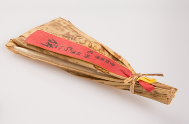
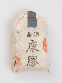
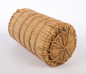 Ararat Gallery TAMA
Functional object, Rice bag, c. 1900s
‘The Art of the Japanese Package’ was an exhibition that toured to 10 Australian and 11 New Zealand public galleries in 1979 and 1980. The touring exhibition comprised 221 objects of traditional Japanese packaging which extended from ceramics, wood and paper to woven fibre containers. At the conclusion of the tour, The Japan Foundation and the Crafts Board of the Australia Council donated the vast majority of the exhibition to the Ararat Gallery for its permanent collection. Combining the natural qualities of bamboo, paper and straw with delicate craftsmanship, these unique objects express Japanese aesthetics as applied through fibre crafts. In Japan, the qualities and traits of natural materials are exploited rather than hidden. The texture of straw, the septa of bamboo are not concealed but lovingly incorporated into the whole. In 1979 Hideyuki Oka, curator of ‘The Art of the Japanese Package’ wrote: “In no way self-conscious or assertive, these wrappings have an artless and obedient air that greatly moves the modern viewer. They are whispered evidence of the Japanese ability to create beauty from the simplest products of nature. They also teach us that wisdom and feeling are especially important in packaging because these qualities, or the lack of them, are almost immediately apparent. What is the use of a package if it shows no feeling?” The descriptions of the featured objects were written by Hideyuki Oka, curator of ‘The Art of the Japanese Package’, 1979.Gift of the Japan-Australia Foundation and the Crafts Board of the Australia Council, 1981japanese art, japanese packaging, tsutsumi, gift giving -
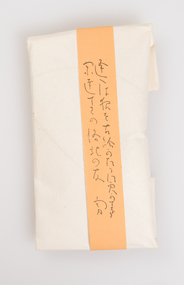
 Ararat Gallery TAMA
Functional object, Gift bag, c. 1900s
‘The Art of the Japanese Package’ was an exhibition that toured to 10 Australian and 11 New Zealand public galleries in 1979 and 1980. The touring exhibition comprised 221 objects of traditional Japanese packaging which extended from ceramics, wood and paper to woven fibre containers. At the conclusion of the tour, The Japan Foundation and the Crafts Board of the Australia Council donated the vast majority of the exhibition to the Ararat Gallery for its permanent collection. Combining the natural qualities of bamboo, paper and straw with delicate craftsmanship, these unique objects express Japanese aesthetics as applied through fibre crafts. In Japan, the qualities and traits of natural materials are exploited rather than hidden. The texture of straw, the septa of bamboo are not concealed but lovingly incorporated into the whole. In 1979 Hideyuki Oka, curator of ‘The Art of the Japanese Package’ wrote: “In no way self-conscious or assertive, these wrappings have an artless and obedient air that greatly moves the modern viewer. They are whispered evidence of the Japanese ability to create beauty from the simplest products of nature. They also teach us that wisdom and feeling are especially important in packaging because these qualities, or the lack of them, are almost immediately apparent. What is the use of a package if it shows no feeling?” The descriptions of the featured objects were written by Hideyuki Oka, curator of ‘The Art of the Japanese Package’, 1979.Gift of the Japan-Australia Foundation and the Crafts Board of the Australia Council, 1981japanese art, japanese packaging, tsutsumi, gift giving -
 Ararat Gallery TAMA
Functional object, Bag, c. 1900s
‘The Art of the Japanese Package’ was an exhibition that toured to 10 Australian and 11 New Zealand public galleries in 1979 and 1980. The touring exhibition comprised 221 objects of traditional Japanese packaging which extended from ceramics, wood and paper to woven fibre containers. At the conclusion of the tour, The Japan Foundation and the Crafts Board of the Australia Council donated the vast majority of the exhibition to the Ararat Gallery for its permanent collection. Combining the natural qualities of bamboo, paper and straw with delicate craftsmanship, these unique objects express Japanese aesthetics as applied through fibre crafts. In Japan, the qualities and traits of natural materials are exploited rather than hidden. The texture of straw, the septa of bamboo are not concealed but lovingly incorporated into the whole. In 1979 Hideyuki Oka, curator of ‘The Art of the Japanese Package’ wrote: “In no way self-conscious or assertive, these wrappings have an artless and obedient air that greatly moves the modern viewer. They are whispered evidence of the Japanese ability to create beauty from the simplest products of nature. They also teach us that wisdom and feeling are especially important in packaging because these qualities, or the lack of them, are almost immediately apparent. What is the use of a package if it shows no feeling?” The descriptions of the featured objects were written by Hideyuki Oka, curator of ‘The Art of the Japanese Package’, 1979.Gift of the Japan-Australia Foundation and the Crafts Board of the Australia Council, 1981japanese art, japanese packaging, tsutsumi, gift giving