Showing 436 items
matching viewers
-
 Ararat Gallery TAMA
Functional object, Candied papaya, c. 1900s
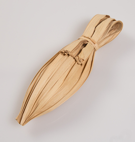
‘The Art of the Japanese Package’ was an exhibition that toured to 10 Australian and 11 New Zealand public galleries in 1979 and 1980. The touring exhibition comprised 221 objects of traditional Japanese packaging which extended from ceramics, wood and paper to woven fibre containers. At the conclusion of the tour, The Japan Foundation and the Crafts Board of the Australia Council donated the vast majority of the exhibition to the Ararat Gallery for its permanent collection. Combining the natural qualities of bamboo, paper and straw with delicate craftsmanship, these unique objects express Japanese aesthetics as applied through fibre crafts. In Japan, the qualities and traits of natural materials are exploited rather than hidden. The texture of straw, the septa of bamboo are not concealed but lovingly incorporated into the whole. In 1979 Hideyuki Oka, curator of ‘The Art of the Japanese Package’ wrote: “In no way self-conscious or assertive, these wrappings have an artless and obedient air that greatly moves the modern viewer. They are whispered evidence of the Japanese ability to create beauty from the simplest products of nature. They also teach us that wisdom and feeling are especially important in packaging because these qualities, or the lack of them, are almost immediately apparent. What is the use of a package if it shows no feeling?” The descriptions of the featured objects were written by Hideyuki Oka, curator of ‘The Art of the Japanese Package’, 1979.Gift of the Japan-Australia Foundation and the Crafts Board of the Australia Council, 1981Here candied papaya from the tropical island of Okinawa is wrapped in a betel-palm leaf to create a simple but strikingly effective package. Like many of the other packages shown in this book, this one has a distinctly regional flavour and, for mainland Japanese, an exotic flavour as well. - Professor Hideyuki Oka, curator.japanese art, japanese packaging, tsutsumi, gift giving -
 Ararat Gallery TAMA
Functional object, Dried salted fish, c. 1900s
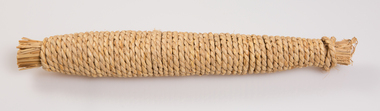
‘The Art of the Japanese Package’ was an exhibition that toured to 10 Australian and 11 New Zealand public galleries in 1979 and 1980. The touring exhibition comprised 221 objects of traditional Japanese packaging which extended from ceramics, wood and paper to woven fibre containers. At the conclusion of the tour, The Japan Foundation and the Crafts Board of the Australia Council donated the vast majority of the exhibition to the Ararat Gallery for its permanent collection. Combining the natural qualities of bamboo, paper and straw with delicate craftsmanship, these unique objects express Japanese aesthetics as applied through fibre crafts. In Japan, the qualities and traits of natural materials are exploited rather than hidden. The texture of straw, the septa of bamboo are not concealed but lovingly incorporated into the whole. In 1979 Hideyuki Oka, curator of ‘The Art of the Japanese Package’ wrote: “In no way self-conscious or assertive, these wrappings have an artless and obedient air that greatly moves the modern viewer. They are whispered evidence of the Japanese ability to create beauty from the simplest products of nature. They also teach us that wisdom and feeling are especially important in packaging because these qualities, or the lack of them, are almost immediately apparent. What is the use of a package if it shows no feeling?” The descriptions of the featured objects were written by Hideyuki Oka, curator of ‘The Art of the Japanese Package’, 1979.Gift of the Japan-Australia Foundation and the Crafts Board of the Australia Council, 1981Here a whole dried and salted fish (a yellow tail, to be exact) has been wrapped in a sheath of straw and wound with a continuous length of straw rope. The effect is attractively rustic, and the tightly wound rope makes a pleasing pattern. When the fish is to be eaten, it is necessary only to unwind the rope part of the way, slice off as much as is needed, and then close the package by rewinding. This rope-wound yellowtail, makiburi, as the Japanese call it, is a well-known product from the city of Kanazawa, Ishikawa Prefecture, in the Sea of Japan. - Professor Hideyuki Oka, curator.japanese art, japanese packaging, tsutsumi, gift giving -
 Ararat Gallery TAMA
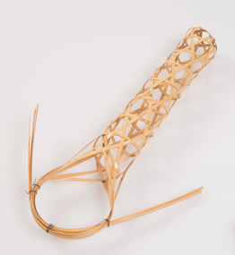
Functional object, Burdock root basket, c. 1900s
‘The Art of the Japanese Package’ was an exhibition that toured to 10 Australian and 11 New Zealand public galleries in 1979 and 1980. The touring exhibition comprised 221 objects of traditional Japanese packaging which extended from ceramics, wood and paper to woven fibre containers. At the conclusion of the tour, The Japan Foundation and the Crafts Board of the Australia Council donated the vast majority of the exhibition to the Ararat Gallery for its permanent collection. Combining the natural qualities of bamboo, paper and straw with delicate craftsmanship, these unique objects express Japanese aesthetics as applied through fibre crafts. In Japan, the qualities and traits of natural materials are exploited rather than hidden. The texture of straw, the septa of bamboo are not concealed but lovingly incorporated into the whole. In 1979 Hideyuki Oka, curator of ‘The Art of the Japanese Package’ wrote: “In no way self-conscious or assertive, these wrappings have an artless and obedient air that greatly moves the modern viewer. They are whispered evidence of the Japanese ability to create beauty from the simplest products of nature. They also teach us that wisdom and feeling are especially important in packaging because these qualities, or the lack of them, are almost immediately apparent. What is the use of a package if it shows no feeling?” The descriptions of the featured objects were written by Hideyuki Oka, curator of ‘The Art of the Japanese Package’, 1979.Gift of the Japan-Australia Foundation and the Crafts Board of the Australia Council, 1981japanese art, japanese packaging, tsutsumi, gift giving -
 Ararat Gallery TAMA
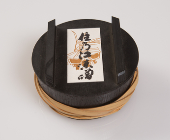
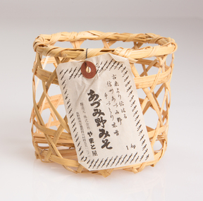
Functional object, Miso container, c. 1900s
‘The Art of the Japanese Package’ was an exhibition that toured to 10 Australian and 11 New Zealand public galleries in 1979 and 1980. The touring exhibition comprised 221 objects of traditional Japanese packaging which extended from ceramics, wood and paper to woven fibre containers. At the conclusion of the tour, The Japan Foundation and the Crafts Board of the Australia Council donated the vast majority of the exhibition to the Ararat Gallery for its permanent collection. Combining the natural qualities of bamboo, paper and straw with delicate craftsmanship, these unique objects express Japanese aesthetics as applied through fibre crafts. In Japan, the qualities and traits of natural materials are exploited rather than hidden. The texture of straw, the septa of bamboo are not concealed but lovingly incorporated into the whole. In 1979 Hideyuki Oka, curator of ‘The Art of the Japanese Package’ wrote: “In no way self-conscious or assertive, these wrappings have an artless and obedient air that greatly moves the modern viewer. They are whispered evidence of the Japanese ability to create beauty from the simplest products of nature. They also teach us that wisdom and feeling are especially important in packaging because these qualities, or the lack of them, are almost immediately apparent. What is the use of a package if it shows no feeling?” The descriptions of the featured objects were written by Hideyuki Oka, curator of ‘The Art of the Japanese Package’, 1979.Gift of the Japan-Australia Foundation and the Crafts Board of the Australia Council, 1981These are containers for miso. The wooden box, a product of Osaka, is lacquered in black on the outside and in bright red on the inside. The binding of split bamboo, in natural colour, gives it a sturdy look. - Professor Hideyuki Oka, curator.japanese art, japanese packaging, tsutsumi, gift giving -
 Ararat Gallery TAMA
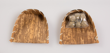
Functional object, Basket and sweets, c. 1900s
‘The Art of the Japanese Package’ was an exhibition that toured to 10 Australian and 11 New Zealand public galleries in 1979 and 1980. The touring exhibition comprised 221 objects of traditional Japanese packaging which extended from ceramics, wood and paper to woven fibre containers. At the conclusion of the tour, The Japan Foundation and the Crafts Board of the Australia Council donated the vast majority of the exhibition to the Ararat Gallery for its permanent collection. Combining the natural qualities of bamboo, paper and straw with delicate craftsmanship, these unique objects express Japanese aesthetics as applied through fibre crafts. In Japan, the qualities and traits of natural materials are exploited rather than hidden. The texture of straw, the septa of bamboo are not concealed but lovingly incorporated into the whole. In 1979 Hideyuki Oka, curator of ‘The Art of the Japanese Package’ wrote: “In no way self-conscious or assertive, these wrappings have an artless and obedient air that greatly moves the modern viewer. They are whispered evidence of the Japanese ability to create beauty from the simplest products of nature. They also teach us that wisdom and feeling are especially important in packaging because these qualities, or the lack of them, are almost immediately apparent. What is the use of a package if it shows no feeling?” The descriptions of the featured objects were written by Hideyuki Oka, curator of ‘The Art of the Japanese Package’, 1979.Gift of the Japan-Australia Foundation and the Crafts Board of the Australia Council, 1981japanese art, japanese packaging, tsutsumi, gift giving -
 Ararat Gallery TAMA
Functional object, Container, c. 1900s
‘The Art of the Japanese Package’ was an exhibition that toured to 10 Australian and 11 New Zealand public galleries in 1979 and 1980. The touring exhibition comprised 221 objects of traditional Japanese packaging which extended from ceramics, wood and paper to woven fibre containers. At the conclusion of the tour, The Japan Foundation and the Crafts Board of the Australia Council donated the vast majority of the exhibition to the Ararat Gallery for its permanent collection. Combining the natural qualities of bamboo, paper and straw with delicate craftsmanship, these unique objects express Japanese aesthetics as applied through fibre crafts. In Japan, the qualities and traits of natural materials are exploited rather than hidden. The texture of straw, the septa of bamboo are not concealed but lovingly incorporated into the whole. In 1979 Hideyuki Oka, curator of ‘The Art of the Japanese Package’ wrote: “In no way self-conscious or assertive, these wrappings have an artless and obedient air that greatly moves the modern viewer. They are whispered evidence of the Japanese ability to create beauty from the simplest products of nature. They also teach us that wisdom and feeling are especially important in packaging because these qualities, or the lack of them, are almost immediately apparent. What is the use of a package if it shows no feeling?” The descriptions of the featured objects were written by Hideyuki Oka, curator of ‘The Art of the Japanese Package’, 1979.Gift of the Japan-Australia Foundation and the Crafts Board of the Australia Council, 1981japanese art, japanese packaging, tsutsumi, gift giving -
 Ararat Gallery TAMA
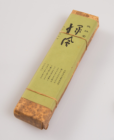
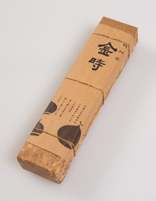
Functional object, Shosho, c. 1900s
‘The Art of the Japanese Package’ was an exhibition that toured to 10 Australian and 11 New Zealand public galleries in 1979 and 1980. The touring exhibition comprised 221 objects of traditional Japanese packaging which extended from ceramics, wood and paper to woven fibre containers. At the conclusion of the tour, The Japan Foundation and the Crafts Board of the Australia Council donated the vast majority of the exhibition to the Ararat Gallery for its permanent collection. Combining the natural qualities of bamboo, paper and straw with delicate craftsmanship, these unique objects express Japanese aesthetics as applied through fibre crafts. In Japan, the qualities and traits of natural materials are exploited rather than hidden. The texture of straw, the septa of bamboo are not concealed but lovingly incorporated into the whole. In 1979 Hideyuki Oka, curator of ‘The Art of the Japanese Package’ wrote: “In no way self-conscious or assertive, these wrappings have an artless and obedient air that greatly moves the modern viewer. They are whispered evidence of the Japanese ability to create beauty from the simplest products of nature. They also teach us that wisdom and feeling are especially important in packaging because these qualities, or the lack of them, are almost immediately apparent. What is the use of a package if it shows no feeling?” The descriptions of the featured objects were written by Hideyuki Oka, curator of ‘The Art of the Japanese Package’, 1979.Gift of the Japan-Australia Foundation and the Crafts Board of the Australia Council, 1981japanese art, japanese packaging, tsutsumi, gift giving -
 Ararat Gallery TAMA
Functional object, Shosho, c. 1900s
‘The Art of the Japanese Package’ was an exhibition that toured to 10 Australian and 11 New Zealand public galleries in 1979 and 1980. The touring exhibition comprised 221 objects of traditional Japanese packaging which extended from ceramics, wood and paper to woven fibre containers. At the conclusion of the tour, The Japan Foundation and the Crafts Board of the Australia Council donated the vast majority of the exhibition to the Ararat Gallery for its permanent collection. Combining the natural qualities of bamboo, paper and straw with delicate craftsmanship, these unique objects express Japanese aesthetics as applied through fibre crafts. In Japan, the qualities and traits of natural materials are exploited rather than hidden. The texture of straw, the septa of bamboo are not concealed but lovingly incorporated into the whole. In 1979 Hideyuki Oka, curator of ‘The Art of the Japanese Package’ wrote: “In no way self-conscious or assertive, these wrappings have an artless and obedient air that greatly moves the modern viewer. They are whispered evidence of the Japanese ability to create beauty from the simplest products of nature. They also teach us that wisdom and feeling are especially important in packaging because these qualities, or the lack of them, are almost immediately apparent. What is the use of a package if it shows no feeling?” The descriptions of the featured objects were written by Hideyuki Oka, curator of ‘The Art of the Japanese Package’, 1979.Gift of the Japan-Australia Foundation and the Crafts Board of the Australia Council, 1981japanese art, japanese packaging, tsutsumi, gift giving -
 Flagstaff Hill Maritime Museum and Village
Decorative object - Wall Decoration, Late 19th to early 20th centuries
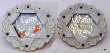
During the Victorian era, the period (1837-1901) in which Queen Victoria ruled England. The queen’s influence was felt throughout the world, including in the United States and Australia where Victorian values shaped society and style, especially in home décor. This period’s distinct style presents an eclectic mix of highly ornamented furniture, wallpaper, and knick-knacks. Particularly in terms of furniture, and the characteristic floral patterns and rich, contrasting colours, wall hanging that enjoyed the height of its popularity during the Victorian era were of the spiritual type with an either embroidered or punched paper religious motto or bible quote. Mottoes were commonly hung high up on the wall or in an area of prominence, to remind the viewer of their important message, such as “He Leadeth Me” and “Honesty, Industry, and Sobriety.” Short and pithy, they embodied the ideals of Victorian society. Technological advances contributed to the boom of religious mottoes whereas before the Industrial Revolution home décor of this sort was handmade and therefore minimal, now consumers could purchase and fill their homes with all sorts of mass-produced ephemera goods similar to the subject item. Many of these mass-produced period pieces still exist today, often in their original frames, ceramic, or paper formats. Flagstaff maritime museum has many examples of mottoes on display that serve to reflect the period in which values of home, faith, and Christianity were very prominent in everyday Victorian society.An item that reflects the social values and attitudes of the late Victorian era that was used to promote good Christian and moral values in many households. These items of decoration were very popular at this time and the subject item is significant as it gives a snapshot into the social norms of past generations. Wall decoration white china with relief circular hanging pieces, paper folds pinned back to reveal words Paper is pinned by metal studs. Paper folds create star shape. (set of 2)Watch and Pray and Come Unto Meflagstaff hill, warrnambool, shipwrecked coast, flagstaff hill maritime museum, shipwreck coast, great ocean road, paper wall decoration -
 Flagstaff Hill Maritime Museum and Village
Artwork, other - Wall decoration, Vera Giles, late 19th to early 20th century
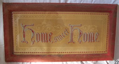
During the Victorian era, the period (1837-1901) in which Queen Victoria ruled England. The queen’s influence was felt throughout the world, including in the United States and Australia where Victorian values shaped society and style, especially in home décor. This period’s distinct style presents an eclectic mix of highly ornamented furniture, wallpaper, and knick-knacks. Particularly in terms of furniture, and the characteristic floral patterns and rich, contrasting colours, wall hanging that enjoyed the height of its popularity during the Victorian era were of the spiritual type with an either embroidered or punched paper religious motto or bible quote. Mottoes were commonly hung high up on the wall or in an area of prominence, to remind the viewer of their important message, such as "Home sweet Home “He Leadeth Me” and “Honesty, Industry, and Sobriety.” Short and pithy, they embodied the ideals of Victorian society. Technological advances contributed to the boom of religious mottoes whereas before the Industrial Revolution home décor of this sort was handmade and therefore minimal, now consumers could purchase and fill their homes with all sorts of mass-produced ephemera goods similar to the subject item. Many of these mass-produced period pieces still exist today, often in their original frames, ceramic, or paper formats. Flagstaff maritime museum has many examples of mottoes on display that serve to reflect the period in which values of home, faith, and Christianity were very prominent in everyday Victorian society. For more information on the Giles collection see Acquisition section this document: An item that reflects the social values and attitudes of the late Victorian era that was used to promote good Christian and moral values in many households. These items of decoration were very popular at this time and the subject item is significant as it gives a snapshot into the social norms of past generations. The Giles family collection is of additional social significance at a local level, because it not only illustrates the level of material support the Warrnambool community gave to Flagstaff Hill during it’s establishment. But the Giles collection also gives us an additional view into what domestic life was like in early colonial times prior to Federation.Wall decoration, framed handmade embroidered tapestry with the woven inscription, Frame has velvet cover. This item is part of the Giles CollectionHome Sweet Home, in gothic scriptflagstaff hill, warrnambool, shipwrecked coast, flagstaff hill maritime museum, flagstaff hill maritime village, great ocean road, soft furnishing, wall decoration, home sweet home, wall hanging, handmade wall hanging, giles collection, henry giles, tower hill, cooramook, warrnambool breakwater, mailor’s flat, wangoom, 19th century handcraft, mrs vera giles -
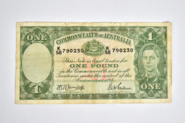 National Wool Museum
Currency - One Pound Note, John Ash, 1938 - 1948
John Ash succeeded Thomas Harrison as the Australian Note Printer in 1927 and oversaw the printing of a new series of banknotes, known as the Ash Series. First issued between 1933 and 1934, the new banknotes sought to improve the currency's resistance to counterfeiting. A special watermark was created to increase the security of the new series. Shaped as a medallion, the watermark showed the profile of Edward, the Prince of Wales. A new portrait of the King was also introduced, depicting him frontally rather than in profile as he had appeared in the prior banknotes of the Harrison Series (1923-1925). The back of each denomination contained an individual vignette that reflected a sector of the country's economy. The wool and agricultural industries were represented, as they had been in the first series of the nation's banknotes (1913-1914), and they were joined by manufacturing and commerce. The prominent British sculptor, Paul Montford, contributed to the design of the new series. Recognised for his sculptural works on the exterior of Melbourne's Shrine of Remembrance, Montford was commissioned to produce relief sculptures that formed the basis of the banknotes' vignettes. His sculptures were translated into wash drawings by Frank Manley, the artist and engraver for the Commonwealth Bank's Note Printing Branch. Manley accentuated the sculpture's three-dimensional qualities with deep shadows and touches of illusionism. A sheep in Montford's pastoral scene, for example, stands forward from the frame as if entering the viewer's space to escape branding and Manley preserves this visual conceit in his drawing. Whereas the printing of the previous series of Australian banknotes had been criticised for its poor definition, the sculptural basis of the Ash Series clarified the banknotes' imagery. During a period of record unemployment, the scenes emphasised the strength of the human figure in gestures of labour, evoking classical, heroic qualities in their poses. The sculptural forms suggested stability in the turbulence of the Great Depression and imparted a sense of solidity to paper currency. - museum.rba.gov.auCommonwealth of Australia paper one pound note in green and white tones depicting graphics and text. The obverse has a framed design with a blank portal to the left and King George VI in the right portal. The centre shows the Australian Coat of Arms, serial number, and detail over one pound symbol on a mosaic background, with signatories below. The reverse features a framed pastoral scene with farmers tending sheep, with a blank portal to the right.Obverse: ONE / 1 / 1 / ONE / COMMONWEALTH OF AUSTRALIA / K / 58 / 790230 / K / 58 / 790230 / This Note is legal tender for / ONE POUND / in the Commonwealth and in all / Territories under the control of the / Commonwealth. / [signature] / GOVERNOR / COMMONWEALTH BANK ON AUSTRALIA / [signature] / SECRETARY TO THE TREASURY Reverse: 1 /1 / 1 / 1 / PASTORALcurrency, money, pound note, pastoral scene, industry, commonwealth of australia, paul montford, king george vi, frank manly, john ash -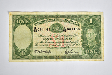
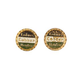 City of Greater Bendigo - Civic Collection
Badge - Member Pins, Cohn Brothers, Cohns
Danish brothers, Moritz, Julius and Jacob Cohn arrived in Bendigo in 1853 and by 1856 started making cider and soft drinks, building a brewery 1880 to further extend their commercial enterprises and stock their hotels with their own brand of beer. Having sent Moritz's son, (also Julius) to Germany to learn to brew, the Cohn Brothers began to produce Excelsior Lager in 1882, which was traditionally served cold, the first time this had been done in Australia. Overtime the Cohn brothers expanded their operations adding cordials and in 1916 produced a non-alcoholic beer to satisfy the temperance activists. Cohn Brothers built an empire of breweries, cordial factories, hotels and liquor stores and ice works. In 1925 they sold the hotels and breweries to Carlton & United but continued to make their other products until the 1970s when the company became part of the Coca Cola Amatil Group. These Cohn's Cobber Member pins relate to the Cohn's Cobbers TV Club which was sponsored by Cohn's Soft drinks. The Cobbers TV Club was an afternoon children's variety program modelled on the Tarax Show. When local TV station BCV8 opened in Bendigo they broadcast Cobber’s teleclub in their afternoon timeslot for young viewers. Jacob Isaac Cohn was born in 1830 (died 1911) in Horsens Denmark and entered the Sandhurst Borough Council in 1863 where he served as a member for three years, returning again in 1887 to serve as Mayor of the City of Bendigo from 1888-1889. Jacob Cohn was a great supporter of the Mechanics Institute, the Hospital and the Benevolent Asylum. It is believed that through his connection with the Mechanics Institute he exhibited some loaned engravings from the Dresden Art Gallery which were then donated to the City of Bendigo, forming the nuclei of the Art Gallery's collection. Jacob Cohn held the position of President of the Art Gallery for 18 years.Two small multi coloured member pins. Gold coloured metal and fastening pin on back. Brown, white and green inner sections with gold text on front.Cohns / Cobber / Membermayor jacob cohn, city of bendigo commerce, cohn brothers, cohns -
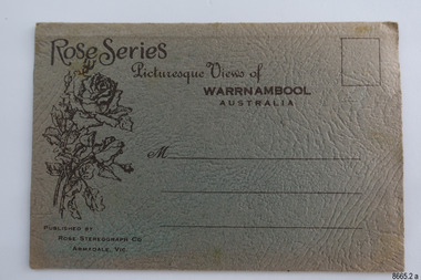 Flagstaff Hill Maritime Museum and Village
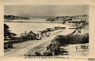
Postcard - Postcard Folder, Warrnambool region, George Rose, Rose Stereographic Company, Rose Series Picturesque Views of Warrnambool Australia, 1880-1942
This postcard folder is one of a set of three that were donated together. This one contains lithographs of photographs taken locally by Georg Rose between 1880 and 1942. He reproduced them at his company's premises, the Rose Stereographic Company at Armadale, Victoria. The postcard folder was purchased as a Warrnambool souvenir by the donor's parents from 1945 to 1950. The photographs include the 'new' concrete bridge, built in 1922 to replace the original bridge, built in 1872. The boathouses belonging to Proudfoots and Flett/Fanny Nelson are also pictured on the Hopkins River mouth. The twelve photographs included locations connected to other items in our Collection. The photographs are titled: - b. The Avenue and War Memorial. Warrnambool. Vic. c. The Blow-hole. Thunder Point. Warrnambool. Vic. d. Botanical Gardens. Warrnambool. Vic. e. Eagle Rock. Warrnambool. Vic. f. The New Concrete Bridge and Breakwater. Warrnambool. Vic. g. Liebig Street. Warrnambool. Vic. h. Looking to Thunder Point. Warrnambool. Vic. i. The Beach. Warrnambool. Vic. j. Hopkins Falls. Warrnambool. Vic. k. Shelly Beach. Warrnambool. Vic. l. The Mouth of the Hopkins River. Warrnambool. Vic. m. Panorama of Warrnambool. Vic. [Kepler Street towards Presbyterian Church on Spence St] George Rose, 1861-1942: - famous for his Late 19th and early 20th century photography. He was born in Clunes, Victoria, and was in his 20th year when he founded Rose Stereograph Company in 1880. He took the opportunity of a popular trend of the times to produce stereographs, pairs of almost duplicate photographs that appeared to be in 3D when viewed in a handheld stereo viewer. By the 1920s these lost their popularity, so he used his photographic skills to produce cards and postcards of scenes and people. The photographs in this postcard folder were taken between 1880 and 1942 by the renowned Victorian photographer George Rose. The locations match photographs and postcards in our collection that were taken at different times. A comparison between them shows the changes over time in the land and bay, the buildings and other structures, transportation and even the fashions of the times, building the story of our local history.This copy folder is one of a set of three. This folder has a green-grey textured rectangular card cover with a sketch of a rose on the front. The cover also contains the name of the postcard series, the location of the series' focus, the producer's details, and lines for adding an address. The folded cover contains a long, concertinaed page with six titled photographs on each side, totalling twelve. The folder contains scenes from Warrnambool and nearby popular areas, including Lady Bay, the Port of Warrnambool, the Warrnambool Breakwater, the Viaduct, the Merri River Footbridge, the Hopkins River Mouth, with Proudfoot’s and the Fanny Nelson/Flett boathouses. The cover has a sketch of a rose and inscriptions. The lithograph photographs were taken between 1880 and 1942 by well-known Victorian photographer George Rose, Rose Stereograph Company of Armadale, Victoria.Image: [Rose with rosebud and leaves] Printed: "Rose Series / Picturesque Views of / WARRNAMBOOL / AUSTRALIA" "PUBLISHED BY / ROSE STEREOGRAPH CO / ARMADALE. VIC." Printed lines (3) for an address. Printed rectangle [ ] for attaching a stamp.flagstaff hill maritime museum and village, great ocean road, shipwreck coast, warrnambool, flagstaff hill, flagstaff hill maritime museum, flagstaff hill maritime village, warramble, postcard, postcard folder, warrnambool scenes, picturesque views of warrnambool, lady bay, port of warrnambool, breakwater, warrnambool breakwater, viaduct, merri river footbridge, merri river suspension bridge, suspension footbridge, merri river mouth, hopkins river mouth, proudfoot's, fanny nelson, nelson's boatsheds, nelson's boathouse, boathouse, hopkins river boathouses, flett's boathouse, flett, george rose, image of a rose, rose series, rose stereograph co, rose stereographic company, lighograph, armadale victoria, lady bay beach, beach scene, lower light, concrete footbridge, 1922 footbridge, viaduct road, rose postcard, new concrete bridge, 1945, 1890, 1922, small footbridge, 1872 footbridge, 1872, merri river estuary, stingray bay, postcards, green-grey postcard folder -
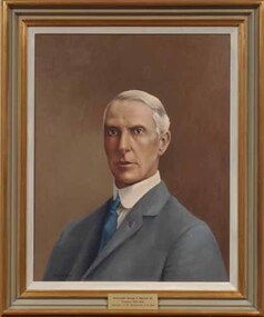 Vision Australia
Painting - Artwork, Portrait of George Maxwell, 1990
Framed portrait of George Maxwell who was President of the Association for the Advancement of the Blind 1920-1935. It is part of a series of paintings commissioned by the AFB Board to commemorate the work of past presidents of the organisation. Mr Maxwell is turned slightly away from the viewer, and wears a blue suit, white high collared shirt and a blue tie. George Maxwell was President of Vision Australia from 1920 to 1935. After an early teaching career he studied law, was admitted to the Bar and became one of Victoria’s great criminal lawyers and later a Federal Member of Parliament. He took an interest the welfare of blind people from his student days. A detached retina in 1920 led to total blindness nine years later, which gave him a great empathy for those with a similar affliction. Through his contacts he was also instrumental in obtaining the first voting rights for blind Australians. Up until 1902 blind people were unable to vote if they couldn’t write with a pen. George Maxwell was working at that time at the legal firm of Strongman and Crouch one of the partners, Mr. Crouch, was elected as a member of Parliament. When the Commonwealth Electoral Bill was being drafted, Mr. Crouch has a clause added enabling blind people to vote in Federal elections, constituting a world first. But perhaps his greatest achievement was obtaining the pension for legally blind people. Until 1910 only those who met the age and means test criteria were eligible. With the help of his legal and political friends a bill was passed which granted the pension to all persons over 16 years of age who were unable to work due to physical disability or blindness. Until this time these people had to be supported by their families or go to a benevolent institution. This was a world first and gave to blind and vision impaired people a measure of independence which increased both their self reliance and self esteem. 1 art original in gold/brown frameThe plaque at the base of the painting reads 'Honourable George A Maxwell Q.C. / President 1920-1935 / Association for Advancement of the Blind'.association for the advancement of the blind, george maxwell -
 Flagstaff Hill Maritime Museum and Village
Postcard - Postcard Folder - scenes, George Rose, Rose Stereographic Company, Rose Series Picturesque Views of Warrnambool Australia [Warrnambool], 1880-1942
This postcard folder contains lithographs of photographs taken locally by Georg Rose between 1880 and 1942. He reproduced them at his company's premises, the Rose Stereographic Company at Armadale, Victoria. The postcard folder was purchased as a Warrnambool souvenir by the donor's parents around 1945 to 1950. Interestingly, the city on the cover is printed as "Warrambool", which is a location in New South Wales, but the postcards within all have the locations and text of Warrnambool. The photographs include the 'new' concrete bridge, built in 1922 to replace the original bridge, built in 1872. The boathouses belonging to Proudfoots and to Flett/Fanny Nelson are also pictured on the Hopkins River mouth. The twelve photographs included locations connected to other items in our Collection. The photographs are titled: - b. The Avenue and War Memorial. Warrnambool. Vic. c. The Blow-hole. Thunder Point. Warrnambool. Vic. d. Botanical Gardens. Warrnambool. Vic. e. Eagle Rock. Warrnambool. Vic. f. The New Concrete Bridge and Breakwater. Warrnambool. Vic. g. Liebig Street. Warrnambool. Vic. h. Looking to Thunder Point. Warrnambool. Vic. i. The Beach. Warrnambool. Vic. j. Hopkins Falls. Warrnambool. Vic. k. Shelly Beach. Warrnambool. Vic. l. The Mouth of the Hopkins River. Warrnambool. Vic. m. Panorama of Warrnambool. Vic. [Kepler Street towards Presbyterian Church on Spence St] George Rose, 1861-1942: - famous for his Late 19th and early 20th century photography. He was born in Clunes, Victoria, and was in his 20th year when he founded Rose Stereograph Company in 1880. He took the opportunity of a popular trend of the times to produce stereographs, pairs of almost duplicate photographs which appeared to be in 3D when viewed in a handheld stereo viewer. By the 1920s these lost their popularity, so he used his photographic skills to produce cards and postcards of scenes and people. The photographs in this postcard folder were taken between 1880 and 1942 by the renowned Victorian photographer George Rose. The locations match photographs and postcards in our collection that were taken at different times. A comparison between them shows the changes over time in the land and bay, the buildings and other structures, transportation and even the fashions of the times, building the story of our local history.This copy of a postcard folder has a blue-grey textured rectangular card cover with a sketch of a rose on the front along with the name of the postcard series. the location of the series' focus, the producer's details and lines for adding an address. The folded cover contains a long, concertinaed page with six titled photographs on each side, totalling twelve in all. Interestingly, the cover has the location name of "Warrambool", a place in NSW, instead of Warrnambool, the location of all of the photographs inside. The folder contains scenes from Warrnambool and nearby popular areas including Lady Bay, Port of Warrnambool, Warrnambool Breakwater, Viaduct, Merri River Footbridge, the Hopkins River Mouth, with Proudfoot’s and the Fanny Nelson/Flett boathouses. The cover has a sketch of a rose and inscriptions. The photographs for the lithographs were taken prior between 1880 and 1942 by well-known Victorian photographer, George Rose, Rose Stereograph Company of Armadale, Victoria.Image: [Rose with rosebud and leaves] Printed: "Rose Series / Picturesque Views of / WARRAMBOOL / AUSTRALIA" [correct spelling is WARRNAMBOOL] "PUBLISHED BY / ROSE STEREOGRAPH CO / ARMADALE. VIC." Printed lines (3) for an address. Printed rectangle [ ] for attaching a stamp.flagstaff hill maritime museum and village, great ocean road, shipwreck coast, warrnambool, flagstaff hill, flagstaff hill maritime museum, flagstaff hill maritime village, warramble, postcard, postcard folder, warrnambool scenes, picturesque views of warrnambool, picturesque views of warramble, lady bay, port of warrnambool, breakwater, warrnambool breakwater, viaduct, merri river footbridge, merri river suspension bridge, suspension footbridge, merri river mouth, hopkins river mouth, proudfoot's, fanny nelson, nelson's boatsheds, nelson's boathouse, boathouse, hopkins river boathouses, flett's boathouse, flett, george rose, image of a rose, rose series, rose stereograph co, rose stereographic company, lighograph, armadale victoria, lady bay beach, beach scene, lower light, concrete footbridge, 1922 footbridge, viaduct road, rose postcard, new concrete bridge, 1945, 1890, 1922, small footbridge, 1872 footbridge, 1872, merri river estuary, stingray bay, postcards -
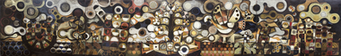 Federation University Art Collection
Painting - Mural, French, Leonard, 'The Tapestry' by Leonard French, 1959
Artist Leonard French said of this work:- "The centre panel suggests a tree of knowledge growing out of a jewelled fish (a spiritual accompaniment is intended), and from the tree birds rise, spreading out through the cloud shapes of the other panels. Hands and figures rise from the earth, reaching for the birds. The left hand panel depicts the journey of figures in a boat, the seeking after or journeying to the source of knowledge. The far right hand panel is the garden, figures in a primitive state, a sort of evolution of figures from a primitive garden (the first garden). Visualization, verbalization, music and dance are tools we have to express a concept. The analysis of an art work is a delicate and sensitive task and great harm can be done in an attempt to become verbal about a form which relies upon elements peculiar to itself for intrinsic meaning." Leonard FRENCH (OBE) (08 October 1928 - 10 January 2017) Born Brunswick, Victoria Died Heathcote, Victoria Known for his enormous dalle de verre (concrete and slab glass) ceiling in the Great Hall of the National Gallery of Victoria Leonard French produced a large body of work throughout his lifetime. French won the Sulman Prize in 1960, and the Blake Prize for Religious Art in 1963 and in 1980. He was also awarded a Harkness Fellowship in 1965. In the Queen's Birthday Honours of June 1968 he was appointed an Officer of the Order of the British Empire. In early 1959 Leonard French was commissioned by the Ballarat Teachers' College students to paint a mural. The students were responsible for the payment of the work. When unveiled artist George Bush remarked: "the 1959 students have left something not just to 'oooh' and 'ah' at, but something that is thought provoking, arresting and interesting. This work of art keeps something in reserve and draws you to search for deeper meaning behind the splendour of colour. This mural is not one which will not fade the interest of its beholders, but one which will provide intrigue for generations to come." Originally French intended the mural to be five panels, each entitled (left to right) 'the Journey', 'Man', 'The Tree', 'The Earth', 'The Garden'. The finished mural was reduced to four panels with the central tree incorporated into the panels 'Earth' and 'Man'. Ballarat Teachers' College Art lecturer Arch Cuthbertson explained that the artist:- "Aims at evoking emotional flashed, opening doors to simultaneous thinking and feeling. To accomplish this he juxtaposes the threads of conscious and unconscious images, thus effecting a tapestry that allows many points of reference to converge upon his singular images. Whether the colours offer metaphysical sensations or convey a literal meaning will depend upon the breadth and depth of the viewer's experience. Similarly with the bird - we might well ask is it a defiance of gravity, a metaphysical ascension or the elusive winged knowledge? Again the answer could well be that these three associations have a singular purpose. " This item is part of the Federation University Art Collection. The Art Collection features over 2000 works and was listed as a 'Ballarat Treasure' in 2007.A four panel mural by Leonard French, commissioned and gifted by the Ballarat Teachers' College Student in 1959. Art lecturer Arch Cuthbertson was highly involved in this commission. Artist Charles Bush unveiled the mural at the Ballarat Teachers' College in Gillies Street, Ballarat. At that time he said:- "You have left behind you on object which will be full of interest to a lot of people. A work of art, so long as it is in existence, is constantly under review. Most of the good things that keep on going are usually to the uninitiated a little worrying. Many of you will be worried by this, because it does not make its message immediately clear. But come back and assess it again and again." art, leonard french, french, artwork, mural, ballarat teachers' college, class of 1959 -
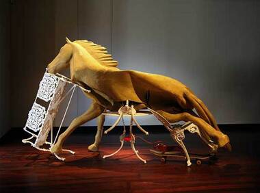 Federation University Art Collection
Sculpture - Sculpture - Installation, 'Dead Still Standing' by Lou Hubbard, 2015
Lou HUBBARD (1957 -) Born Brisbane, Queensland After a career in the film and television, Melbourne based artist Lou Hubbard completed a Master of Fine Art at RMIT University in 2001. She works primarily with video and installation, and has exhibited widely throughout Australia and internationally, Lou Hubbard is currently the Head of Photography at the Victorian College of the Arts. In announcing the award 2015 Guiguis New Art Award the judges applauded Lou Hubbard on her compelling installation, which comprised a deflated, disembowelled latex horse collapsed over a Coalbrookdale patio chair, table and bench seat situated over a skateboard and plastic dog. “Occupying a space between the traditions of equine, assemblage and unmonumental sculpture, Lou Hubbard’s Dead Still Standing confounds and compels viewers in its uncanny play of materials and movement,” senior curator, contemporary art, National Gallery of Victoria and judge Max Delany said. “In this elaborate yet concise work, Hubbard has created a form of surprising and unsettling effect that reflects our experience of a world in translation.” The win came as a surprise for Hubbard, who said she was overwhelmed at the talent of all 15 finalists. “I was so surprised, because I was in good company with the other artists, who were all quite extraordinary,” she said. “In the nature of the competition, I feel very lucky.” With multi-layer meanings to her piece, Hubbard said it was actually Ballarat’s rich history that inspired her work. She said it was the Ballarat goldfields and the idea of what horses might have gone through during those years that gave her a concept to work with. But that wasn’t the only source of ideals portrayed in the piece – Hubbard also explored the effect training had on horses. “The horse stands in a way that portrays (how) the human exhorts the way of training,” she said. “The horse is edging like it wants to move, which is impossible, and the furniture acts in lots of ways. The chair, for example, is like the horse’s ribs, which are being ripped out.” It was these multiple meanings that also had the curator of the Post Office Gallery, Shelley Hinton, impressed with the work. “The work challenges us ethically and culturally, in a way that pleads for analysis, as we do in our complex daily lives,” she said. Lou Hubbard's 'Dead Still Standing' won the was awarded the prestigious $20,000 Guirguis New Art Prize in 2015. The Federation University Guirguis New Art Prize was a national biennial and aquisitive contemporary art prize. The $20,000 biennial acquisitive prize was sponsored by Ballarat surgeon Mark Guirguis, administered by Federation University Australia and presented in partnership with the Art Gallery of Ballarat.The genesis of the prize was to raise the profile and encourage the Art School of what was then Ballarat University. lou hubbard, guirguis, guirguis new art prize, sculpture, horse, animal, installation artwork -
 Flagstaff Hill Maritime Museum and Village
Decorative object - Wall Decoration, 1850 to 1901
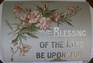
This item is part of the Giles Collection, dating back to the late Victorian era, from the 1880s to the early 1900s, in which Queen Victoria ruled England. The queen’s influence was felt throughout the world, including in the United States and Australia where Victorian values shaped society and style, especially in home décor. This period’s distinct style presents an eclectic mix of highly ornamented furniture, wallpaper, and knick-knacks. Particularly in terms of furniture, and the characteristic floral patterns and rich, contrasting colours, wall hangings that enjoyed the height of their popularity during the Victorian era were of the spiritual type with either embroidered or punched paper religious motto or bible quote. Mottoes were commonly hung high up on the wall or in an area of prominence, to remind the viewer of their important message, such as “He Leadeth Me” and “Honesty, Industry, and Sobriety.” Short and pithy, they embodied the ideals of Victorian society. Technological advances contributed to the boom of religious mottoes whereas before the Industrial Revolution home décor of this sort was handmade and therefore minimal, now consumers could purchase and fill their homes with all sorts of mass-produced ephemera goods similar to the subject item. Many of these mass-produced period pieces still exist today, often in their original frames, ceramic, enamelled or paper formats. Flagstaff maritime museum has many examples of mottoes on display that serve to reflect the period in which values of home, faith, and Christianity were very prominent in everyday Victorian society. The Giles Family There are many 19th century items of furniture, linen and crockery donated to Flagstaff Hill Maritime Village by Vera and Aurelin Giles. The items are associated with the Giles Family and are known as the “Giles Collection”. These items mostly came from the simple home of Vera’s parents-in-law, Henry Giles and his wife Mary Jane (nee Freckleton), whose photos are in the parlour. They married in 1880. Henry Giles was born at Tower Hill in 1858. He was a labourer on the construction of the Breakwater before leaving in 1895 to build bridges in N.S.W. for about seven years. Mary Jane was born in 1860 at Cooramook. She attended Mailor’s Flat State School where she was also a student teacher before, as a family legend has it, she became a governess at “Injemiara” where her grandfather, Francis Freckleton, once owned land. Henry and Mary’s family of six, some of whom were born at Mailor’s Flat and later children at Wangoom, lived with their parents at Wangoom and Purnim west, where Henry died in 1933 and Mary Jane in 1940.The Giles family collection has social significance at a local level, because it illustrates the level of material support the Warrnambool community gave to Flagstaff Hill when the Museum was established. This wall decoration reflects the social values and attitudes of the late Victorian era that was used to promote good Christian and moral values in many households. These items of decoration were very popular at this time and the subject item is significant as it gives a snapshot into the social norms of past generations. Printed card wall hanging with floral design. Religious text on the sign is embossed onto the card and highlighted in silver print. There is a handwritten ink inscription, and a pencil inscription, on the back. A string is attached to two holes on top of the card. Embossed"THE BLESSING / OF THE LORD/ BE UPON YOU." "PS 129.8." In pencil "H/S" In ink "To dear Granny with lots of love / from Dorothy. X X."flagstaff hill, warrnambool, shipwrecked coast, flagstaff hill maritime museum, shipwreck coast, great ocean road, paper wall decoration, religious, home decoration, societal values, victorian moral values, wall hanging, wall decoration, spiritual decoration, bible verse, giles collection -
 Duldig Studio museum + sculpture garden
Drawing, Karl Duldig, The Buddhist Monk, Guangqia by Karl Duldig 1940, 1940
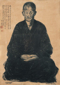
The Buddhist monk Guangqia visited Karl Duldig’s studio on two consecutive days, in the company of the noted Chinese writer, Professor Yu Dafu, a friend of Karl’s. Karl made two portraits of the monk, the first depicting him sitting, and the second in a standing pose. The portraits were drawn using a Chinese brush and Indian ink. Surviving sketches in the Studio’s collection indicate that Karl thought about creating a life-size sculpture later on, but this was not realised. Guangqia added inscriptions in his own hand to both drawings and stamped them with a red seal. The seated drawing has an inscription in which he quoted from a Buddhist poem, ‘A Contented Mind’ by the scholar Lingfeng of Mt Tiantai. In the summer I went to visit the Austrian sculptor Duldig with Professor Yu Da Fu. My virtue is slight – I cannot accept your offerings and gifts; I am amply rewarded by the clouds and springs. Rather than a table laden with pearl-like rice, I prefer the wind and leaves falling on my bed. Sitting quietly on my meditation cushion Is sweeter than the wheat offered by a thousand families. The pity is that I am gradually growing old; My bitter journey is not worthy of your offerings. The second drawing has a quote from a Buddhist poem on the study of Chán (Zen) Buddhism, by the famed Chán master, Dàjiàn Huìnéng (638–713): The portrait, with its figure positioned on a scroll-like ground and inscription is reminiscent of traditional Zen Buddhist portraiture. In this school of portraiture, which stretched back to at least the thirteenth century, monks were depicted sitting or standing facing the viewer, and typically the monk added an autographic inscription to the portrait. The portraits were often passed from master to disciple, continuing the disciples’ journey of spiritual enlightenment and were revered for their association with remarkable or holy priests. The Buddhist monk, Guangqai who added his inscription and stamp to the drawings would most certainly have been aware of this tradition. It is likely that Karl was aware of this tradition, one of the points where the studio’s collections of art works from Singapore intersect with the earlier Viennese collections can be found in the Library where a catalogue of an exhibition, 'Ausstellung Ostasiatischer Malerie und Graphik' is held. The Viennese Friends of Asian Art and Culture and the Albertina Museum staged this exhibition of East Asian painting and graphic works in 1932. Such was the internationalism of Duldig’s education in Vienna, that adaption to a new environment and culture in the Straits Settlement was swift, and he was able to interpret the artistic traditions of the place, and make them his own. It is part of the strength of the collection, that in many cases contemporary supporting documentation for the works of art is available. In this case there is a photograph of the Monk with Yu Ta-fu, and Karl and Eva Duldig, outside the studio at the time the drawings were made. Ann Carew 2016The portraits of Guangqai have national and international aesthetic significance. The works of art demonstrate the artist’s skill in capturing the physical appearance and demeanour of his subject, and his ability to adapt his working methods to incorporate traditional Asian materials and cultural practices. The portrait is one of few examples in Melbourne of a central European modernist artists working in, and engaging with Asia, during this period and it is culturally and aesthetically significant for this reason. The portraits are also historically interesting in documenting the life and experiences of Karl Duldig in the Straits Settlement (Singapore). Ann Carew 2016Brush drawing in chinese ink on paper. Seated Buddhist Monk. Chinese calligraphy hand written in black ink. Two red stamps under calligraphy.Signed Karl Duldig in l.r. corner. Dated Singapore 1940 in l.l. corner. -
 Eltham District Historical Society Inc
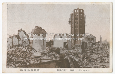
Photograph - Postcard, The Great Tokyo Earthquake on September 1st, 1923: Asakusa 12-Story Tower with its Upper Floors Destroyed, 1923
The Great Kantō Earthquake of 1 September 1923 devastated the major cities of Tokyo and Yokohama, as well as five other surrounding prefectures and was one of the world’s worst natural disasters of the early twentieth century. In terms of loss of life and material damage, with an estimated 140,000 deaths and countless homeless, it is still Japan’s worst national disaster. Nearly 90% of the newspaper printers were destroyed in the earthquake. These postcards were not produced for aesthetics but as a major tool for the spread of information. Seeing how newspaper companies were left with their offices in shambles, postcard publishers tried to fill the gap hence some were in three languages. A very small number of publishing companies were fortunate enough to survive, one of them being Mitsumura Printing, which took advantage of its remaining resources to churn out postcards. When the Ōsaka Mainichi Shinbunsha published its bilingual three-volume photographic pictorial of the Great Kantō Earthquake just two weeks after the event, the calamity had already been captured in thousands of images that circulated on a national and international media highway. Commercial photographers and photojournalists produced the most abundant and immediate images of the quake, which were transmitted in newspapers, special-issue newspaper pictorials, commemorative photography collections, illustrated survivors’ accounts, and sets of commemorative postcards. These photographic images functioned as both news and souvenirs, rendering their consumers/viewers, inside and outside the devastated locale, into both witnesses and voyeurs. Images in the news media and those issued by respected publishing houses carried the visual authority of supposed facticity. As such they both produced and became the historical record of the event. Since the vast majority of 1923 disaster postcards that survive have no writing on them, they were likely treated more as collectibles than as a form of postal communication. Many were put into albums, creating new ways to combine images and create visual cultures of disaster for home viewing. Accordion-style albums allowed for personalized, serial organization of images that produced unique, imagistic narratives of the event. The album pages were also two-sided and could be stretched out to view a series of images on recto and verso. References: Imaging Disaster: Tokyo and the Visual Culture of Japan’s Great Earthquake of 1923 震災をイメージ化する 東京と1923年関東大震災のヴィジュアルカルチャー - The Asia. (2024, March 31). Retrieved from https://apjjf.org/2015/13/6/gennifer-weisenfeld/4270 The Great Kanto Earthquake: Postcards of Tragedy. (2024, March 31). Retrieved from https://www.tokyoweekender.com/art_and_culture/japanese-culture/the-great-kanto-earthquake-postcards/ See also: Postcards from Hell – Glimpses of the Great Kantō Earthquake; M. William STEELE (International Christian University, Japan) 14th Conference of the European Association of Japanese Studies: Visual Culture and Postcard Research Papers – East Asia Image Collection Blog. (2024, March 31). Retrieved from https://sites.lafayette.edu/eastasia/2014/09/01/14th-conference-of-the-european-association-of-japanese-studies-visual-culture-and-postcard-research-papers/] And https://icu.repo.nii.ac.jp/record/4503/files/ACS44_01Steele.pdfThis item, a souvenir from Japan from between the wars (circa 1923) was brought home to Research, Victoria by Bill Teagle who was serving in the Royal Australian Navy (1919-1945). Bill Teagle's sister Violet Amelda Teagle had married Theodore (Curly) Feldbauer in 1933. Bill's brother-in-law Curly was taken as a Prisoner of War by the Japanese and died at Sandakan in March 1945. The family did not learn of Curly’s death till months later and Bill's sister, Violet, herself could never forgive the Japanese for what happened to Curly. Curly is remembered on the Eltham Roll of Honour Board and his son, Albert Feldbauer (Bill’s nephew and youngest child of the children of the soldier fathers attending a school in the district), was given the honour of turning the first sod for the Eltham War Memorial Infant Welfare Centre Building. Despite this, the family maintained this cherished souvenir from a time of previous foreign friendship with Japan. The item was possibly given by Bill Teagle to his sister Margaret Rose (formerly Ingram) who later married Richard Edward (Eddie) Fielding in early 1948. (Eddie had been engaged to someone else before he went to war, but his fiancée broke it off before his return to Australia.) It was cared for by the Teagle/Fielding family for approximately one hundred years. It is of particular significance given the family's connection to the Eltham War Memorial and the significance of that memorial to the local community and represents that despite the horrors of war, former friends then foes can become friends again.tom fielding collection, japanese postcard, postcard, 1923, great kanto earthquake, japan, tokyo, yokohama -
 Eltham District Historical Society Inc
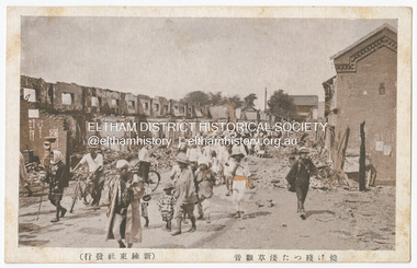
Photograph - Postcard, The Great Tokyo Earthquake on September 1st, 1923: burnt remains of Asakusa Kannon Temple, 1923
The Great Kantō Earthquake of 1 September 1923 devastated the major cities of Tokyo and Yokohama, as well as five other surrounding prefectures and was one of the world’s worst natural disasters of the early twentieth century. In terms of loss of life and material damage, with an estimated 140,000 deaths and countless homeless, it is still Japan’s worst national disaster. Nearly 90% of the newspaper printers were destroyed in the earthquake. These postcards were not produced for aesthetics but as a major tool for the spread of information. Seeing how newspaper companies were left with their offices in shambles, postcard publishers tried to fill the gap hence some were in three languages. A very small number of publishing companies were fortunate enough to survive, one of them being Mitsumura Printing, which took advantage of its remaining resources to churn out postcards. When the Ōsaka Mainichi Shinbunsha published its bilingual three-volume photographic pictorial of the Great Kantō Earthquake just two weeks after the event, the calamity had already been captured in thousands of images that circulated on a national and international media highway. Commercial photographers and photojournalists produced the most abundant and immediate images of the quake, which were transmitted in newspapers, special-issue newspaper pictorials, commemorative photography collections, illustrated survivors’ accounts, and sets of commemorative postcards. These photographic images functioned as both news and souvenirs, rendering their consumers/viewers, inside and outside the devastated locale, into both witnesses and voyeurs. Images in the news media and those issued by respected publishing houses carried the visual authority of supposed facticity. As such they both produced and became the historical record of the event. Since the vast majority of 1923 disaster postcards that survive have no writing on them, they were likely treated more as collectibles than as a form of postal communication. Many were put into albums, creating new ways to combine images and create visual cultures of disaster for home viewing. Accordion-style albums allowed for personalized, serial organization of images that produced unique, imagistic narratives of the event. The album pages were also two-sided and could be stretched out to view a series of images on recto and verso. References: Imaging Disaster: Tokyo and the Visual Culture of Japan’s Great Earthquake of 1923 震災をイメージ化する 東京と1923年関東大震災のヴィジュアルカルチャー - The Asia. (2024, March 31). Retrieved from https://apjjf.org/2015/13/6/gennifer-weisenfeld/4270 The Great Kanto Earthquake: Postcards of Tragedy. (2024, March 31). Retrieved from https://www.tokyoweekender.com/art_and_culture/japanese-culture/the-great-kanto-earthquake-postcards/ See also: Postcards from Hell – Glimpses of the Great Kantō Earthquake; M. William STEELE (International Christian University, Japan) 14th Conference of the European Association of Japanese Studies: Visual Culture and Postcard Research Papers – East Asia Image Collection Blog. (2024, March 31). Retrieved from https://sites.lafayette.edu/eastasia/2014/09/01/14th-conference-of-the-european-association-of-japanese-studies-visual-culture-and-postcard-research-papers/] And https://icu.repo.nii.ac.jp/record/4503/files/ACS44_01Steele.pdfThis item, a souvenir from Japan from between the wars (circa 1923) was brought home to Research, Victoria by Bill Teagle who was serving in the Royal Australian Navy (1919-1945). Bill Teagle's sister Violet Amelda Teagle had married Theodore (Curly) Feldbauer in 1933. Bill's brother-in-law Curly was taken as a Prisoner of War by the Japanese and died at Sandakan in March 1945. The family did not learn of Curly’s death till months later and Bill's sister, Violet, herself could never forgive the Japanese for what happened to Curly. Curly is remembered on the Eltham Roll of Honour Board and his son, Albert Feldbauer (Bill’s nephew and youngest child of the children of the soldier fathers attending a school in the district), was given the honour of turning the first sod for the Eltham War Memorial Infant Welfare Centre Building. Despite this, the family maintained this cherished souvenir from a time of previous foreign friendship with Japan. The item was possibly given by Bill Teagle to his sister Margaret Rose (formerly Ingram) who later married Richard Edward (Eddie) Fielding in early 1948. (Eddie had been engaged to someone else before he went to war, but his fiancée broke it off before his return to Australia.) It was cared for by the Teagle/Fielding family for approximately one hundred years. It is of particular significance given the family's connection to the Eltham War Memorial and the significance of that memorial to the local community and represents that despite the horrors of war, former friends then foes can become friends again.tom fielding collection, japanese postcard, postcard, 1923, great kanto earthquake, japan, tokyo, yokohama -
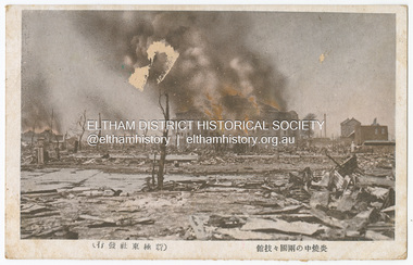 Eltham District Historical Society Inc
Photograph - Postcard, The Great Tokyo Earthquake on September 1st, 1923: Fire in the middle of rain - National Sumo Stadium on fire, 1923
The Great Kantō Earthquake of 1 September 1923 devastated the major cities of Tokyo and Yokohama, as well as five other surrounding prefectures and was one of the world’s worst natural disasters of the early twentieth century. In terms of loss of life and material damage, with an estimated 140,000 deaths and countless homeless, it is still Japan’s worst national disaster. Nearly 90% of the newspaper printers were destroyed in the earthquake. These postcards were not produced for aesthetics but as a major tool for the spread of information. Seeing how newspaper companies were left with their offices in shambles, postcard publishers tried to fill the gap hence some were in three languages. A very small number of publishing companies were fortunate enough to survive, one of them being Mitsumura Printing, which took advantage of its remaining resources to churn out postcards. When the Ōsaka Mainichi Shinbunsha published its bilingual three-volume photographic pictorial of the Great Kantō Earthquake just two weeks after the event, the calamity had already been captured in thousands of images that circulated on a national and international media highway. Commercial photographers and photojournalists produced the most abundant and immediate images of the quake, which were transmitted in newspapers, special-issue newspaper pictorials, commemorative photography collections, illustrated survivors’ accounts, and sets of commemorative postcards. These photographic images functioned as both news and souvenirs, rendering their consumers/viewers, inside and outside the devastated locale, into both witnesses and voyeurs. Images in the news media and those issued by respected publishing houses carried the visual authority of supposed facticity. As such they both produced and became the historical record of the event. Since the vast majority of 1923 disaster postcards that survive have no writing on them, they were likely treated more as collectibles than as a form of postal communication. Many were put into albums, creating new ways to combine images and create visual cultures of disaster for home viewing. Accordion-style albums allowed for personalized, serial organization of images that produced unique, imagistic narratives of the event. The album pages were also two-sided and could be stretched out to view a series of images on recto and verso. References: Imaging Disaster: Tokyo and the Visual Culture of Japan’s Great Earthquake of 1923 震災をイメージ化する 東京と1923年関東大震災のヴィジュアルカルチャー - The Asia. (2024, March 31). Retrieved from https://apjjf.org/2015/13/6/gennifer-weisenfeld/4270 The Great Kanto Earthquake: Postcards of Tragedy. (2024, March 31). Retrieved from https://www.tokyoweekender.com/art_and_culture/japanese-culture/the-great-kanto-earthquake-postcards/ See also: Postcards from Hell – Glimpses of the Great Kantō Earthquake; M. William STEELE (International Christian University, Japan) 14th Conference of the European Association of Japanese Studies: Visual Culture and Postcard Research Papers – East Asia Image Collection Blog. (2024, March 31). Retrieved from https://sites.lafayette.edu/eastasia/2014/09/01/14th-conference-of-the-european-association-of-japanese-studies-visual-culture-and-postcard-research-papers/] And https://icu.repo.nii.ac.jp/record/4503/files/ACS44_01Steele.pdfThis item, a souvenir from Japan from between the wars (circa 1923) was brought home to Research, Victoria by Bill Teagle who was serving in the Royal Australian Navy (1919-1945). Bill Teagle's sister Violet Amelda Teagle had married Theodore (Curly) Feldbauer in 1933. Bill's brother-in-law Curly was taken as a Prisoner of War by the Japanese and died at Sandakan in March 1945. The family did not learn of Curly’s death till months later and Bill's sister, Violet, herself could never forgive the Japanese for what happened to Curly. Curly is remembered on the Eltham Roll of Honour Board and his son, Albert Feldbauer (Bill’s nephew and youngest child of the children of the soldier fathers attending a school in the district), was given the honour of turning the first sod for the Eltham War Memorial Infant Welfare Centre Building. Despite this, the family maintained this cherished souvenir from a time of previous foreign friendship with Japan. The item was possibly given by Bill Teagle to his sister Margaret Rose (formerly Ingram) who later married Richard Edward (Eddie) Fielding in early 1948. (Eddie had been engaged to someone else before he went to war, but his fiancée broke it off before his return to Australia.) It was cared for by the Teagle/Fielding family for approximately one hundred years. It is of particular significance given the family's connection to the Eltham War Memorial and the significance of that memorial to the local community and represents that despite the horrors of war, former friends then foes can become friends again.tom fielding collection, japanese postcard, postcard, 1923, great kanto earthquake, japan, tokyo, yokohama -
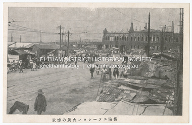 Eltham District Historical Society Inc
Photograph - Postcard, The Great Tokyo Earthquake on September 1st, 1923: The situation is miserable, 1923
The Great Kantō Earthquake of 1 September 1923 devastated the major cities of Tokyo and Yokohama, as well as five other surrounding prefectures and was one of the world’s worst natural disasters of the early twentieth century. In terms of loss of life and material damage, with an estimated 140,000 deaths and countless homeless, it is still Japan’s worst national disaster. Nearly 90% of the newspaper printers were destroyed in the earthquake. These postcards were not produced for aesthetics but as a major tool for the spread of information. Seeing how newspaper companies were left with their offices in shambles, postcard publishers tried to fill the gap hence some were in three languages. A very small number of publishing companies were fortunate enough to survive, one of them being Mitsumura Printing, which took advantage of its remaining resources to churn out postcards. When the Ōsaka Mainichi Shinbunsha published its bilingual three-volume photographic pictorial of the Great Kantō Earthquake just two weeks after the event, the calamity had already been captured in thousands of images that circulated on a national and international media highway. Commercial photographers and photojournalists produced the most abundant and immediate images of the quake, which were transmitted in newspapers, special-issue newspaper pictorials, commemorative photography collections, illustrated survivors’ accounts, and sets of commemorative postcards. These photographic images functioned as both news and souvenirs, rendering their consumers/viewers, inside and outside the devastated locale, into both witnesses and voyeurs. Images in the news media and those issued by respected publishing houses carried the visual authority of supposed facticity. As such they both produced and became the historical record of the event. Since the vast majority of 1923 disaster postcards that survive have no writing on them, they were likely treated more as collectibles than as a form of postal communication. Many were put into albums, creating new ways to combine images and create visual cultures of disaster for home viewing. Accordion-style albums allowed for personalized, serial organization of images that produced unique, imagistic narratives of the event. The album pages were also two-sided and could be stretched out to view a series of images on recto and verso. References: Imaging Disaster: Tokyo and the Visual Culture of Japan’s Great Earthquake of 1923 震災をイメージ化する 東京と1923年関東大震災のヴィジュアルカルチャー - The Asia. (2024, March 31). Retrieved from https://apjjf.org/2015/13/6/gennifer-weisenfeld/4270 The Great Kanto Earthquake: Postcards of Tragedy. (2024, March 31). Retrieved from https://www.tokyoweekender.com/art_and_culture/japanese-culture/the-great-kanto-earthquake-postcards/ See also: Postcards from Hell – Glimpses of the Great Kantō Earthquake; M. William STEELE (International Christian University, Japan) 14th Conference of the European Association of Japanese Studies: Visual Culture and Postcard Research Papers – East Asia Image Collection Blog. (2024, March 31). Retrieved from https://sites.lafayette.edu/eastasia/2014/09/01/14th-conference-of-the-european-association-of-japanese-studies-visual-culture-and-postcard-research-papers/] And https://icu.repo.nii.ac.jp/record/4503/files/ACS44_01Steele.pdfThis item, a souvenir from Japan from between the wars (circa 1923) was brought home to Research, Victoria by Bill Teagle who was serving in the Royal Australian Navy (1919-1945). Bill Teagle's sister Violet Amelda Teagle had married Theodore (Curly) Feldbauer in 1933. Bill's brother-in-law Curly was taken as a Prisoner of War by the Japanese and died at Sandakan in March 1945. The family did not learn of Curly’s death till months later and Bill's sister, Violet, herself could never forgive the Japanese for what happened to Curly. Curly is remembered on the Eltham Roll of Honour Board and his son, Albert Feldbauer (Bill’s nephew and youngest child of the children of the soldier fathers attending a school in the district), was given the honour of turning the first sod for the Eltham War Memorial Infant Welfare Centre Building. Despite this, the family maintained this cherished souvenir from a time of previous foreign friendship with Japan. The item was possibly given by Bill Teagle to his sister Margaret Rose (formerly Ingram) who later married Richard Edward (Eddie) Fielding in early 1948. (Eddie had been engaged to someone else before he went to war, but his fiancée broke it off before his return to Australia.) It was cared for by the Teagle/Fielding family for approximately one hundred years. It is of particular significance given the family's connection to the Eltham War Memorial and the significance of that memorial to the local community and represents that despite the horrors of war, former friends then foes can become friends again.tom fielding collection, japanese postcard, postcard, 1923, great kanto earthquake, japan, tokyo, yokohama -
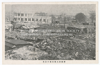 Eltham District Historical Society Inc
Photograph - Postcard, The Great Tokyo Earthquake on September 1st, 1923: Keizen's after-disaster earthquake Daiichi Hamaki - overall view of Yokohama City, 1923
The Great Kantō Earthquake of 1 September 1923 devastated the major cities of Tokyo and Yokohama, as well as five other surrounding prefectures and was one of the world’s worst natural disasters of the early twentieth century. In terms of loss of life and material damage, with an estimated 140,000 deaths and countless homeless, it is still Japan’s worst national disaster. Nearly 90% of the newspaper printers were destroyed in the earthquake. These postcards were not produced for aesthetics but as a major tool for the spread of information. Seeing how newspaper companies were left with their offices in shambles, postcard publishers tried to fill the gap hence some were in three languages. A very small number of publishing companies were fortunate enough to survive, one of them being Mitsumura Printing, which took advantage of its remaining resources to churn out postcards. When the Ōsaka Mainichi Shinbunsha published its bilingual three-volume photographic pictorial of the Great Kantō Earthquake just two weeks after the event, the calamity had already been captured in thousands of images that circulated on a national and international media highway. Commercial photographers and photojournalists produced the most abundant and immediate images of the quake, which were transmitted in newspapers, special-issue newspaper pictorials, commemorative photography collections, illustrated survivors’ accounts, and sets of commemorative postcards. These photographic images functioned as both news and souvenirs, rendering their consumers/viewers, inside and outside the devastated locale, into both witnesses and voyeurs. Images in the news media and those issued by respected publishing houses carried the visual authority of supposed facticity. As such they both produced and became the historical record of the event. Since the vast majority of 1923 disaster postcards that survive have no writing on them, they were likely treated more as collectibles than as a form of postal communication. Many were put into albums, creating new ways to combine images and create visual cultures of disaster for home viewing. Accordion-style albums allowed for personalized, serial organization of images that produced unique, imagistic narratives of the event. The album pages were also two-sided and could be stretched out to view a series of images on recto and verso. References: Imaging Disaster: Tokyo and the Visual Culture of Japan’s Great Earthquake of 1923 震災をイメージ化する 東京と1923年関東大震災のヴィジュアルカルチャー - The Asia. (2024, March 31). Retrieved from https://apjjf.org/2015/13/6/gennifer-weisenfeld/4270 The Great Kanto Earthquake: Postcards of Tragedy. (2024, March 31). Retrieved from https://www.tokyoweekender.com/art_and_culture/japanese-culture/the-great-kanto-earthquake-postcards/ See also: Postcards from Hell – Glimpses of the Great Kantō Earthquake; M. William STEELE (International Christian University, Japan) 14th Conference of the European Association of Japanese Studies: Visual Culture and Postcard Research Papers – East Asia Image Collection Blog. (2024, March 31). Retrieved from https://sites.lafayette.edu/eastasia/2014/09/01/14th-conference-of-the-european-association-of-japanese-studies-visual-culture-and-postcard-research-papers/] And https://icu.repo.nii.ac.jp/record/4503/files/ACS44_01Steele.pdfThis item, a souvenir from Japan from between the wars (circa 1923) was brought home to Research, Victoria by Bill Teagle who was serving in the Royal Australian Navy (1919-1945). Bill Teagle's sister Violet Amelda Teagle had married Theodore (Curly) Feldbauer in 1933. Bill's brother-in-law Curly was taken as a Prisoner of War by the Japanese and died at Sandakan in March 1945. The family did not learn of Curly’s death till months later and Bill's sister, Violet, herself could never forgive the Japanese for what happened to Curly. Curly is remembered on the Eltham Roll of Honour Board and his son, Albert Feldbauer (Bill’s nephew and youngest child of the children of the soldier fathers attending a school in the district), was given the honour of turning the first sod for the Eltham War Memorial Infant Welfare Centre Building. Despite this, the family maintained this cherished souvenir from a time of previous foreign friendship with Japan. The item was possibly given by Bill Teagle to his sister Margaret Rose (formerly Ingram) who later married Richard Edward (Eddie) Fielding in early 1948. (Eddie had been engaged to someone else before he went to war, but his fiancée broke it off before his return to Australia.) It was cared for by the Teagle/Fielding family for approximately one hundred years. It is of particular significance given the family's connection to the Eltham War Memorial and the significance of that memorial to the local community and represents that despite the horrors of war, former friends then foes can become friends again.tom fielding collection, japanese postcard, postcard, 1923, great kanto earthquake, japan, tokyo, yokohama -
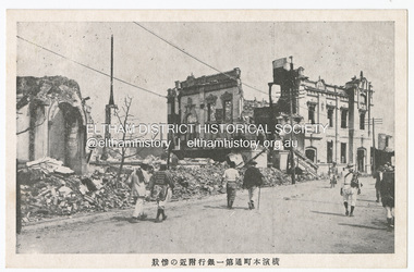 Eltham District Historical Society Inc
Photograph - Postcard, The Great Tokyo Earthquake on September 1st, 1923: Bank in Chidoricho Hungama - Disastrous scene of Yokohama Honmachi Town. No. 1 Bank Building, 1923
The Great Kantō Earthquake of 1 September 1923 devastated the major cities of Tokyo and Yokohama, as well as five other surrounding prefectures and was one of the world’s worst natural disasters of the early twentieth century. In terms of loss of life and material damage, with an estimated 140,000 deaths and countless homeless, it is still Japan’s worst national disaster. Nearly 90% of the newspaper printers were destroyed in the earthquake. These postcards were not produced for aesthetics but as a major tool for the spread of information. Seeing how newspaper companies were left with their offices in shambles, postcard publishers tried to fill the gap hence some were in three languages. A very small number of publishing companies were fortunate enough to survive, one of them being Mitsumura Printing, which took advantage of its remaining resources to churn out postcards. When the Ōsaka Mainichi Shinbunsha published its bilingual three-volume photographic pictorial of the Great Kantō Earthquake just two weeks after the event, the calamity had already been captured in thousands of images that circulated on a national and international media highway. Commercial photographers and photojournalists produced the most abundant and immediate images of the quake, which were transmitted in newspapers, special-issue newspaper pictorials, commemorative photography collections, illustrated survivors’ accounts, and sets of commemorative postcards. These photographic images functioned as both news and souvenirs, rendering their consumers/viewers, inside and outside the devastated locale, into both witnesses and voyeurs. Images in the news media and those issued by respected publishing houses carried the visual authority of supposed facticity. As such they both produced and became the historical record of the event. Since the vast majority of 1923 disaster postcards that survive have no writing on them, they were likely treated more as collectibles than as a form of postal communication. Many were put into albums, creating new ways to combine images and create visual cultures of disaster for home viewing. Accordion-style albums allowed for personalized, serial organization of images that produced unique, imagistic narratives of the event. The album pages were also two-sided and could be stretched out to view a series of images on recto and verso. References: Imaging Disaster: Tokyo and the Visual Culture of Japan’s Great Earthquake of 1923 震災をイメージ化する 東京と1923年関東大震災のヴィジュアルカルチャー - The Asia. (2024, March 31). Retrieved from https://apjjf.org/2015/13/6/gennifer-weisenfeld/4270 The Great Kanto Earthquake: Postcards of Tragedy. (2024, March 31). Retrieved from https://www.tokyoweekender.com/art_and_culture/japanese-culture/the-great-kanto-earthquake-postcards/ See also: Postcards from Hell – Glimpses of the Great Kantō Earthquake; M. William STEELE (International Christian University, Japan) 14th Conference of the European Association of Japanese Studies: Visual Culture and Postcard Research Papers – East Asia Image Collection Blog. (2024, March 31). Retrieved from https://sites.lafayette.edu/eastasia/2014/09/01/14th-conference-of-the-european-association-of-japanese-studies-visual-culture-and-postcard-research-papers/] And https://icu.repo.nii.ac.jp/record/4503/files/ACS44_01Steele.pdfThis item, a souvenir from Japan from between the wars (circa 1923) was brought home to Research, Victoria by Bill Teagle who was serving in the Royal Australian Navy (1919-1945). Bill Teagle's sister Violet Amelda Teagle had married Theodore (Curly) Feldbauer in 1933. Bill's brother-in-law Curly was taken as a Prisoner of War by the Japanese and died at Sandakan in March 1945. The family did not learn of Curly’s death till months later and Bill's sister, Violet, herself could never forgive the Japanese for what happened to Curly. Curly is remembered on the Eltham Roll of Honour Board and his son, Albert Feldbauer (Bill’s nephew and youngest child of the children of the soldier fathers attending a school in the district), was given the honour of turning the first sod for the Eltham War Memorial Infant Welfare Centre Building. Despite this, the family maintained this cherished souvenir from a time of previous foreign friendship with Japan. The item was possibly given by Bill Teagle to his sister Margaret Rose (formerly Ingram) who later married Richard Edward (Eddie) Fielding in early 1948. (Eddie had been engaged to someone else before he went to war, but his fiancée broke it off before his return to Australia.) It was cared for by the Teagle/Fielding family for approximately one hundred years. It is of particular significance given the family's connection to the Eltham War Memorial and the significance of that memorial to the local community and represents that despite the horrors of war, former friends then foes can become friends again.tom fielding collection, japanese postcard, postcard, 1923, great kanto earthquake, japan, tokyo, yokohama -
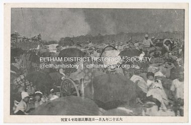 Eltham District Historical Society Inc
Photograph - Postcard, The Great Tokyo Earthquake on September 1st, 1923: Refugee evacuation, 1923
The Great Kantō Earthquake of 1 September 1923 devastated the major cities of Tokyo and Yokohama, as well as five other surrounding prefectures and was one of the world’s worst natural disasters of the early twentieth century. In terms of loss of life and material damage, with an estimated 140,000 deaths and countless homeless, it is still Japan’s worst national disaster. Nearly 90% of the newspaper printers were destroyed in the earthquake. These postcards were not produced for aesthetics but as a major tool for the spread of information. Seeing how newspaper companies were left with their offices in shambles, postcard publishers tried to fill the gap hence some were in three languages. A very small number of publishing companies were fortunate enough to survive, one of them being Mitsumura Printing, which took advantage of its remaining resources to churn out postcards. When the Ōsaka Mainichi Shinbunsha published its bilingual three-volume photographic pictorial of the Great Kantō Earthquake just two weeks after the event, the calamity had already been captured in thousands of images that circulated on a national and international media highway. Commercial photographers and photojournalists produced the most abundant and immediate images of the quake, which were transmitted in newspapers, special-issue newspaper pictorials, commemorative photography collections, illustrated survivors’ accounts, and sets of commemorative postcards. These photographic images functioned as both news and souvenirs, rendering their consumers/viewers, inside and outside the devastated locale, into both witnesses and voyeurs. Images in the news media and those issued by respected publishing houses carried the visual authority of supposed facticity. As such they both produced and became the historical record of the event. Since the vast majority of 1923 disaster postcards that survive have no writing on them, they were likely treated more as collectibles than as a form of postal communication. Many were put into albums, creating new ways to combine images and create visual cultures of disaster for home viewing. Accordion-style albums allowed for personalized, serial organization of images that produced unique, imagistic narratives of the event. The album pages were also two-sided and could be stretched out to view a series of images on recto and verso. References: Imaging Disaster: Tokyo and the Visual Culture of Japan’s Great Earthquake of 1923 震災をイメージ化する 東京と1923年関東大震災のヴィジュアルカルチャー - The Asia. (2024, March 31). Retrieved from https://apjjf.org/2015/13/6/gennifer-weisenfeld/4270 The Great Kanto Earthquake: Postcards of Tragedy. (2024, March 31). Retrieved from https://www.tokyoweekender.com/art_and_culture/japanese-culture/the-great-kanto-earthquake-postcards/ See also: Postcards from Hell – Glimpses of the Great Kantō Earthquake; M. William STEELE (International Christian University, Japan) 14th Conference of the European Association of Japanese Studies: Visual Culture and Postcard Research Papers – East Asia Image Collection Blog. (2024, March 31). Retrieved from https://sites.lafayette.edu/eastasia/2014/09/01/14th-conference-of-the-european-association-of-japanese-studies-visual-culture-and-postcard-research-papers/] And https://icu.repo.nii.ac.jp/record/4503/files/ACS44_01Steele.pdfThis item, a souvenir from Japan from between the wars (circa 1923) was brought home to Research, Victoria by Bill Teagle who was serving in the Royal Australian Navy (1919-1945). Bill Teagle's sister Violet Amelda Teagle had married Theodore (Curly) Feldbauer in 1933. Bill's brother-in-law Curly was taken as a Prisoner of War by the Japanese and died at Sandakan in March 1945. The family did not learn of Curly’s death till months later and Bill's sister, Violet, herself could never forgive the Japanese for what happened to Curly. Curly is remembered on the Eltham Roll of Honour Board and his son, Albert Feldbauer (Bill’s nephew and youngest child of the children of the soldier fathers attending a school in the district), was given the honour of turning the first sod for the Eltham War Memorial Infant Welfare Centre Building. Despite this, the family maintained this cherished souvenir from a time of previous foreign friendship with Japan. The item was possibly given by Bill Teagle to his sister Margaret Rose (formerly Ingram) who later married Richard Edward (Eddie) Fielding in early 1948. (Eddie had been engaged to someone else before he went to war, but his fiancée broke it off before his return to Australia.) It was cared for by the Teagle/Fielding family for approximately one hundred years. It is of particular significance given the family's connection to the Eltham War Memorial and the significance of that memorial to the local community and represents that despite the horrors of war, former friends then foes can become friends again.tom fielding collection, japanese postcard, postcard, 1923, great kanto earthquake, japan, tokyo, yokohama -
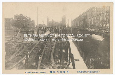 Eltham District Historical Society Inc
Photograph - Postcard, The Great Tokyo Earthquake on September 1st, 1923: Azuma Bridge, Tokyo, 1923
The Great Kantō Earthquake of 1 September 1923 devastated the major cities of Tokyo and Yokohama, as well as five other surrounding prefectures and was one of the world’s worst natural disasters of the early twentieth century. In terms of loss of life and material damage, with an estimated 140,000 deaths and countless homeless, it is still Japan’s worst national disaster. Nearly 90% of the newspaper printers were destroyed in the earthquake. These postcards were not produced for aesthetics but as a major tool for the spread of information. Seeing how newspaper companies were left with their offices in shambles, postcard publishers tried to fill the gap hence some were in three languages. A very small number of publishing companies were fortunate enough to survive, one of them being Mitsumura Printing, which took advantage of its remaining resources to churn out postcards. When the Ōsaka Mainichi Shinbunsha published its bilingual three-volume photographic pictorial of the Great Kantō Earthquake just two weeks after the event, the calamity had already been captured in thousands of images that circulated on a national and international media highway. Commercial photographers and photojournalists produced the most abundant and immediate images of the quake, which were transmitted in newspapers, special-issue newspaper pictorials, commemorative photography collections, illustrated survivors’ accounts, and sets of commemorative postcards. These photographic images functioned as both news and souvenirs, rendering their consumers/viewers, inside and outside the devastated locale, into both witnesses and voyeurs. Images in the news media and those issued by respected publishing houses carried the visual authority of supposed facticity. As such they both produced and became the historical record of the event. Since the vast majority of 1923 disaster postcards that survive have no writing on them, they were likely treated more as collectibles than as a form of postal communication. Many were put into albums, creating new ways to combine images and create visual cultures of disaster for home viewing. Accordion-style albums allowed for personalized, serial organization of images that produced unique, imagistic narratives of the event. The album pages were also two-sided and could be stretched out to view a series of images on recto and verso. References: Imaging Disaster: Tokyo and the Visual Culture of Japan’s Great Earthquake of 1923 震災をイメージ化する 東京と1923年関東大震災のヴィジュアルカルチャー - The Asia. (2024, March 31). Retrieved from https://apjjf.org/2015/13/6/gennifer-weisenfeld/4270 The Great Kanto Earthquake: Postcards of Tragedy. (2024, March 31). Retrieved from https://www.tokyoweekender.com/art_and_culture/japanese-culture/the-great-kanto-earthquake-postcards/ See also: Postcards from Hell – Glimpses of the Great Kantō Earthquake; M. William STEELE (International Christian University, Japan) 14th Conference of the European Association of Japanese Studies: Visual Culture and Postcard Research Papers – East Asia Image Collection Blog. (2024, March 31). Retrieved from https://sites.lafayette.edu/eastasia/2014/09/01/14th-conference-of-the-european-association-of-japanese-studies-visual-culture-and-postcard-research-papers/] And https://icu.repo.nii.ac.jp/record/4503/files/ACS44_01Steele.pdfThis item, a souvenir from Japan from between the wars (circa 1923) was brought home to Research, Victoria by Bill Teagle who was serving in the Royal Australian Navy (1919-1945). Bill Teagle's sister Violet Amelda Teagle had married Theodore (Curly) Feldbauer in 1933. Bill's brother-in-law Curly was taken as a Prisoner of War by the Japanese and died at Sandakan in March 1945. The family did not learn of Curly’s death till months later and Bill's sister, Violet, herself could never forgive the Japanese for what happened to Curly. Curly is remembered on the Eltham Roll of Honour Board and his son, Albert Feldbauer (Bill’s nephew and youngest child of the children of the soldier fathers attending a school in the district), was given the honour of turning the first sod for the Eltham War Memorial Infant Welfare Centre Building. Despite this, the family maintained this cherished souvenir from a time of previous foreign friendship with Japan. The item was possibly given by Bill Teagle to his sister Margaret Rose (formerly Ingram) who later married Richard Edward (Eddie) Fielding in early 1948. (Eddie had been engaged to someone else before he went to war, but his fiancée broke it off before his return to Australia.) It was cared for by the Teagle/Fielding family for approximately one hundred years. It is of particular significance given the family's connection to the Eltham War Memorial and the significance of that memorial to the local community and represents that despite the horrors of war, former friends then foes can become friends again.tom fielding collection, japanese postcard, postcard, 1923, great kanto earthquake, japan, tokyo, yokohama