Showing 2052 items
matching colour and design
-
 Flagstaff Hill Maritime Museum and Village
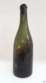
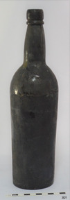
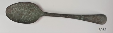
Container - Bottle, 1840s to 1878
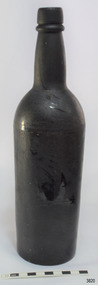
This handmade green glass bottle was recovered between the late 1960s to early 1970s from the wreck of the sailing ship Loch Ard. The ship was wrecked in 1878 and its remains are located at Mutton Bird Island, near Port Campbell, Victoria and bottles of liquor were listed as part of the Loch Ard’s cargo. All glass is made from silica, which is found in quartz sand. The naturally occurring sand has impurities, such as iron, that determine the colour of the glass. Residual iron leads to green or amber-coloured glass and carbon in the sand makes that glass appear as ‘black’. A strong light behind the glass will show its colour as dark green or dark amber. This handmade bottle appears to have been made in a dip mould, with the molten glass blown into a seamless shoulder-height mould to give the body a uniform symmetrical shape and size. After the body is blown, the glass blower continues blowing free-form (without the mould) to form the shoulder and neck, then the base is pushed up with a tool, and the finish for the mouth is added with his tools. The dip mould gives the body a slightly textured surface, with the free-blown shoulders and neck being smoother and shinier. There is usually a line around the shoulder where the mould of the body meets the shoulder, and a lump or mark in the centre of the base, called a pontil mark, where the push-up tool was removed. The ship Loch Ard was built on the River Clyde in Scotland in 1873 for the prestigious Loch Line of colonial clipper ships, designed for the Australian run. It sailed from England on 1 March 1878 carrying 37 crew, 17 passengers and a diverse general cargo ranging from luxury items to bulk railway iron. On 1 June 1878, emerging from the fog and hearing too late the sound of breakers against the tall limestone cliffs, the vessel struck the southern foot of Mutton Bird Island and sank in 23 metres of water. Of the fifty-four people on board only two survived, one young male crewman, Tom Pearce, and one young female passenger, Eva Carmichael. This bottle is historically significant as an example of liquor bottles imported into to Colonial Victoria in the mid-1800s to early-1900s. The bottle is also significant for being part of Flagstaff Hill’s collection of artefacts from the Loch Ard, which is significant for being one of the largest collections of artefacts from this shipwreck in Victoria. The collection is significant for its association with the shipwreck, which is on the Victorian Heritage Register (VHR S417. The collection has additional significance because of the relationship between the objects, as together they have a high potential to interpret the story of the Loch Ard. The Loch Ard collection is archaeologically significant as the remains of a large international passenger and cargo ship. The Loch Ard collection is historically significant for representing aspects of Victoria’s shipping history and its potential to interpret sub-theme 1.5 of Victoria’s Framework of Historical Themes (living with natural processes). The shipwreck is one of the worst, and best-known, shipwrecks in Victoria’s history.Bottle, green glass wine bottle with contents. Glass has ripples and crease lines. The mouth has a seal in place. The applied lip is cracked. It has a deep pushed-up base with a pontil mark. Handmade with no seams in the body. The contents smell like apple cider vinegar. flagstaff hill, warrnambool, flagstaff hill maritime museum, maritime museum, shipwreck coast, flagstaff hill maritime village, great ocean road, shipwreck artefact, loch ard, mutton bird island, eva carmichael, tom pearce, john chance, bottle, antique bottle, bulge neck bottle, handmade, dip mould, mouth blown, pontil base, blown bottle, liquor bottle, ale bottle, green glass -
 Flagstaff Hill Maritime Museum and Village
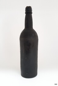
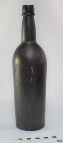
Container - Bottle, 1840s to 1878
This handmade black glass bottle was recovered between the late 1960s to early 1970s from the wreck of the sailing ship Loch Ard. The ship was wrecked in 1878 and its remains are located at Mutton Bird Island, near Port Campbell, Victoria and bottles of liquor were listed as part of the Loch Ard’s cargo. All glass is made from silica, which is found in quartz sand. The naturally occurring sand has impurities, such as iron, that determine the colour of the glass. Residual iron leads to green or amber-coloured glass and carbon in the sand makes that glass appear as ‘black’. A strong light behind the glass will show its colour as dark green or dark amber. This handmade bottle appears to have been made in a two-piece dip mould, with the molten glass blown into a seamless shoulder-height mould to give the body a uniform symmetrical shape and size. After the body is blown, the glass blower continues blowing free-form (without the mould) to form the shoulder and neck, then the base is pushed up with a tool, and the finish for the mouth is added with his tools. The dip mould gives the body a slightly textured surface, with the free-blown shoulders and neck being smoother and shinier. There is usually a line around the shoulder where the mould of the body meets the shoulder, and a lump or mark in the centre of the base, called a pontil mark, where the push-up tool was removed. The ship Loch Ard was built on the River Clyde in Scotland in 1873 for the prestigious Loch Line of colonial clipper ships, designed for the Australian run. It sailed from England on 1 March 1878 carrying 37 crew, 17 passengers and a diverse general cargo ranging from luxury items to bulk railway iron. On 1 June 1878, emerging from the fog and hearing too late the sound of breakers against the tall limestone cliffs, the vessel struck the southern foot of Mutton Bird Island and sank in 23 metres of water. Of the fifty-four people on board only two survived, one young male crewman, Tom Pearce, and one young female passenger, Eva Carmichael. This bottle is historically significant as an example of liquor bottles imported into to Colonial Victoria in the mid-1800s to early-1900s. The bottle is also significant for being part of Flagstaff Hill’s collection of artefacts from the Loch Ard, which is significant for being one of the largest collections of artefacts from this shipwreck in Victoria. The collection is significant for its association with the shipwreck, which is on the Victorian Heritage Register (VHR S417. The collection has additional significance because of the relationship between the objects, as together they have a high potential to interpret the story of the Loch Ard. The Loch Ard collection is archaeologically significant as the remains of a large international passenger and cargo ship. The Loch Ard collection is historically significant for representing aspects of Victoria’s shipping history and its potential to interpret sub-theme 1.5 of Victoria’s Framework of Historical Themes (living with natural processes). The shipwreck is one of the worst, and best-known, shipwrecks in Victoria’s history.Bottle, black glass wine bottle with contents. Glass has ripples, crease lines and side seams. The mouth has a seal in place. The applied lip is wide. The base has been pushed-up base and has a pontil mark. Handmade with a ridge in the body around the base of the shoulder. The bottle has a white sticker.flagstaff hill, warrnambool, flagstaff hill maritime museum, maritime museum, shipwreck coast, flagstaff hill maritime village, great ocean road, shipwreck artefact, loch ard, mutton bird island, eva carmichael, tom pearce, john chance, bottle, antique bottle, bulge neck bottle, handmade, dip mould, mouth blown, pontil base, blown bottle, liquor bottle, ale bottle, black glass, black bottle -
 Flagstaff Hill Maritime Museum and Village
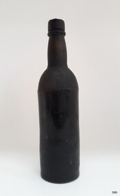
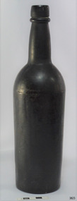
Container - Bottle, 1840s to 1878
This handmade black glass bottle was recovered between the late 1960s to early 1970s from the wreck of the sailing ship Loch Ard. The ship was wrecked in 1878 and its remains are located at Mutton Bird Island, near Port Campbell, Victoria and bottles of liquor were listed as part of the Loch Ard’s cargo. All glass is made from silica, which is found in quartz sand. The naturally occurring sand has impurities, such as iron, that determine the colour of the glass. Residual iron leads to green or amber-coloured glass and carbon in the sand makes that glass appear as ‘black’. A strong light behind the glass will show its colour as dark green or dark amber. This handmade bottle appears to have been made in a two-piece dip mould, with the molten glass blown into a seamless shoulder-height mould to give the body a uniform symmetrical shape and size. After the body is blown, the glass blower continues blowing free-form (without the mould) to form the shoulder and neck, then the base is pushed up with a tool, and the finish for the mouth is added with his tools. The dip mould gives the body a slightly textured surface, with the free-blown shoulders and neck being smoother and shinier. There is usually a line around the shoulder where the mould of the body meets the shoulder, and a lump or mark in the centre of the base, called a pontil mark, where the push-up tool was removed. The ship Loch Ard was built on the River Clyde in Scotland in 1873 for the prestigious Loch Line of colonial clipper ships, designed for the Australian run. It sailed from England on 1 March 1878 carrying 37 crew, 17 passengers and a diverse general cargo ranging from luxury items to bulk railway iron. On 1 June 1878, emerging from the fog and hearing too late the sound of breakers against the tall limestone cliffs, the vessel struck the southern foot of Mutton Bird Island and sank in 23 metres of water. Of the fifty-four people on board only two survived, one young male crewman, Tom Pearce, and one young female passenger, Eva Carmichael. This bottle is historically significant as an example of liquor bottles imported into to Colonial Victoria in the mid-1800s to early-1900s. The bottle is also significant for being part of Flagstaff Hill’s collection of artefacts from the Loch Ard, which is significant for being one of the largest collections of artefacts from this shipwreck in Victoria. The collection is significant for its association with the shipwreck, which is on the Victorian Heritage Register (VHR S417. The collection has additional significance because of the relationship between the objects, as together they have a high potential to interpret the story of the Loch Ard. The Loch Ard collection is archaeologically significant as the remains of a large international passenger and cargo ship. The Loch Ard collection is historically significant for representing aspects of Victoria’s shipping history and its potential to interpret sub-theme 1.5 of Victoria’s Framework of Historical Themes (living with natural processes). The shipwreck is one of the worst, and best-known, shipwrecks in Victoria’s history.Bottle, black glass wine bottle with contents. Glass has ripples, and crease lines and the neck has side seams. The mouth has a seal, the top of which comes away from the rest of the seal. The applied lip is wide. The base has been pushed-up base and has a pontil mark. Handmade with a ridge in the body around the base of the shoulder. The contents have no colour or odour. The bottle has a white sticker.flagstaff hill, warrnambool, flagstaff hill maritime museum, maritime museum, shipwreck coast, flagstaff hill maritime village, great ocean road, shipwreck artefact, loch ard, mutton bird island, eva carmichael, tom pearce, john chance, bottle, antique bottle, bulge neck bottle, handmade, dip mould, mouth blown, pontil base, blown bottle, liquor bottle, ale bottle, black glass, black bottle -
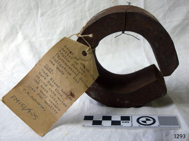
 Coal Creek Community Park & Museum
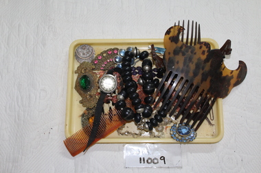
Jewellery Holder Case
11009.1 - multi-coloured hair comb with mustache shape on top 11009.2 - dark brown crown clip with black beads 11009.3 - black and silver beaded necklace with silver clasp 11009.4 - amber comb - bends in half 11009.5 - black band, silver watch middle, rusted clasp, rose gold clock hands. 11009.6 - nail file kit, blue with cream ribbon 11009.7 - brown/bronze locket with flower design and crest, inside is gold. 11009.8 - tiny photo 1.5 cm man on one side and woman on other, bronze gold colour 11009.10 - locket, bronze flower design 11009.11 - blue beads, pin, missing some of the blue beads 11009.12 - green bead centre with flowers and ropes - pin does not come out 11009.13 - pin fan with swirls and pink beads - missing one bead 11009.14 - broad clip blue beads silver coloured outside 11009.15 - hair brooch amber and brown with flowers 11009.16 - rusted hair bun pin - 6.4 cm 11009.17 - rusted hair bun pin - 7.6 cm 11009.18 - bent rusted hair pin 11009.19 - bent rusted hair pin 11009.20 - bent rusted hair pin 11009.21 - purple beaded necklace with loop clasp 11009.22 - pink beaded necklace with no clasp 11009.23 - black beads long and heart shaped - BROKEN 11009.24 - white clear beads necklace - diamond shaped clasp - 2 pieces rusted 11009.25 - cream yellow holder11009.5 - Olymp on back, numbers on front -
 Kew Historical Society Inc
Album, Scrapbook, c.1930
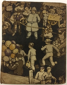
Scrapbooks and albums provide a unique record of individuals, families, organizations, and associations. This scrapbook was compiled for Raymond and Rosemary by their Aunt Gertrude. It was donated to the Society by Rosemary Vaughan-Smith.Illustrated cloth bound, hard cover album used as a scrapbook. On the inside front cover the creator of the scrapbook is identified in 'scrap' lettering as "Aunt Gertrude" and that the recipients were "Raymond [&] Rosemary". Each of the 80 pages in the scrapbook includes pasted monochrome or colour printed illustrations and or texts. Typically, there is one design per page. Most of the material used in the scrapbook is undated, however dates may be deduced from the style of individual items. Some of the illustrations date from the 19th century while others are clearly from the first decades of the 20th century. A number of the items included have their publication date included in the design, including British soldiers in regimental uniform (1914), and covers of popular magazines such as Punch (1924). Many of the items include their original captions or the designer's name such as popular cartoons such as 'The Emergency Exit by W Heath Robinson, or 'Wheels and Squeals: A Study in Progress' by Alfred Leete. Illustrated advertisements for products such as 'O-Cedar Mop Polish', and magazine covers such as 'Passing Show' also provide opportunities for dating materials used in the book. In addition to the aforementioned types of material used, the scrapbook also contains sentimental, floral and religious illustrations, instructional educative materials, and patriotic content. The materials used would appear to be British in origin. Typical of many scrapbooks of the period, the album has a number of conservation-related issues, including foxing on some of the pages and illustrations. These may have resulted from the residue of sweat on fingers or from the glues used for pasting in some of the content.manuscripts - kew historical society, rosemary vaughan-smith, vaughan-smith collection, scrapbooks -
 National Wool Museum
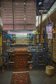
Machine - Axminster Carpet Loom, Brintons Ltd (UK), c. 1910
The Axminster Carpet Loom has been set up as a focal point in the centre of the National Wool Museum. The loom was originally built by Brintons in England around 1910 and was initially operating in Geelong in 1960. Brintons designed and built most of their own looms and ancillary equipment. When superseded in 1975 the loom was donated to the Melbourne College of Textiles for weaving training. The College has now donated the loom to the National Wool Museum and Brintons engineering staff has restored it to full working condition. This loom is known as an Axminster gripper loom. The gripper system was invented by Brintons in 1890 and operates using a gripper shaped like a birds beak. This grips the yarn, the yarn is then cut and the gripper swings down to place the tuft into the woven backing. This particular loom also uses a jacquard system for weaving colours. In jacquard weaving, punched cards are used to instruct the loom as to which colour to use. The system was invented by Joseph Jacquard, a silk weaver from Lyon, and was introduced in 1804. It revolutionised pattern weaving as it had the capacity to create intricate patterns through the use of the cards. By 1833 there were approximately 100,000 power-looms used in Great Britain that had been influenced by Jacquards invention. Joseph Jacquard died in 1834. Charles Babbage was later to adapt Jacquards punch-card system to produce a calculator that was the forerunner of todays methods of computer programmingAxminster carpet loom featuring over 1000 Jacquard punch cards and over 100 bobbins of different colours of wool.loom carpet wool, geelong woolbrokers' association, geelong, auction -
 Ballarat Tramway Museum
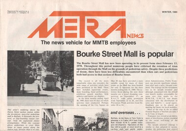
Magazine, Melbourne and Metropolitan Tramways Board (MMTB), "Metra News - Winter 1980", 1980
Single sheet of paper, folded to from a four page newsletter, titled "METRA News, the news vehicle for MMTB employees" and dated Winter 1980. Has the title printed in red ink and uses the same colour for other titles for items with the newssheet.. Items of interest: 1. Bourke St. Mall 2. Senior citizens help design new tram - Z3 class trams 3. Bus only lane in Johnston Street 4. Education of City Police 5. An extensive item on people, new employees, promotions - including the promotion of BTM Board Member Greg Rodgers to Trainer Drivers at Camberwell. A number of these people have been underlined or circled in red ink. 6. Depot employees' social and facility fund 7. Profile on R.C.Dummond, Traffic Manager 8. Wilbur's corner - a review of out of court settlements for accidents. 9. Two cartoons by AugustineRed ink circling or underling specific employee names in the people section.trams, tramways, mmtb, bourke st, bus only lane, accidents -
 Flagstaff Hill Maritime Museum and Village
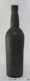
Container - Bottle, 1840s to 1878
This handmade black glass bottle was recovered between the late 1960s to early 1970s from the wreck of the sailing ship Loch Ard. The ship was wrecked in 1878 and its remains are located at Mutton Bird Island, near Port Campbell, Victoria and bottles of liquor were listed as part of the Loch Ard’s cargo. This bottle is now part of the John Chance collection. Black glass is one of the oldest bottle colours and dates back to the early 17th century. In the 1840s to late-1870s black glass bottles were mainly used for liquor and ale. All glass is made from silica, which is found in quartz sand. The naturally occurring sand has impurities, such as iron, that determine the colour of the glass. Residual iron leads to green or amber coloured glass, and carbon in the sand makes that glass appear as ‘black’. A strong light behind the glass will show its colour as dark green or dark amber. This handmade bottle appears to have been made in a dip mould, with the molten glass blown into a seamless shoulder-height mould to give the body a uniform symmetrical shape and size. After the body is blown, the glass blower continues blowing free-form (without the mould) to form the shoulder and neck, then the base is pushed up with a tool, and the finish for the mouth is added with his tools. The dip mould gives the body a slightly textured surface, with the free blown shoulders and neck being smoother and shinier. There is usually a line around the shoulder where the mould of the body meets the shoulder, and a lump or mark in the centre of the base, called a pontil mark, where the push-up tool was removed. The ship Loch Ard was built on the River Clyde in Scotland in 1873 for the prestigious Loch Line of colonial clipper ships, designed for the Australian run. It sailed from England on 1 March 1878 carrying 37 crew, 17 passengers and a diverse general cargo ranging from luxury items to bulk railway iron. On 1 June 1878, emerging from fog and hearing too late the sound of breakers against the tall limestone cliffs, the vessel struck the southern foot of Mutton Bird Island and sank in 23 metres of water. Of the fifty-four people on board only two survived, one young male crewman, Tom Pearce, and one young female passenger, Eva Carmichael. This bottle is historically significant as an example of liquor bottles imported into to Colonial Victoria in the mid-1800s to early-1900s. Its significance is increased by also being an artefact recovered by John Chance, a diver from the wreck of the Loch Ard and other wrecks in the late-1960s to early-1970s. Items that come from several wrecks along Victoria's coast have since been donated to the Flagstaff Hill Maritime Village’s museum collection by his family, illustrating this item’s level of historical value. The bottle is also significant for being part of Flagstaff Hill’s collection of artefacts from the Loch Ard, which is significant for being one of the largest collections of artefacts from this shipwreck in Victoria. The collection is significant for its association with the shipwreck, which is on the Victorian Heritage Register (VHR S417. The collection has additional significance because of the relationship between the objects, as together they have a high potential to interpret the story of the Loch Ard. The Loch Ard collection is archaeologically significant as the remains of a large international passenger and cargo ship. The Loch Ard collection is historically significant for representing aspects of Victoria’s shipping history and its potential to interpret sub-theme 1.5 of Victoria’s Framework of Historical Themes (living with natural processes). The shipwreck is one of the worst, and best known, shipwrecks in Victoria’s history.Bottle, black glass. Thick matt body, with slightly bumpy texture, areas with sheen, colour imperfections. Tooled cork-top finish with ring below, slightly bulged neck. Shoulder has some diagonal creases and a line where shoulder meets body. Body tapers inwards to base. Heel varies in width. Pushed up base has pontil mark. Base is uneven. Handmade, dip mould. No inscriptions.flagstaff hill, warrnambool, flagstaff hill maritime museum, maritime museum, shipwreck coast, flagstaff hill maritime village, great ocean road, shipwreck artefact, loch ard, mutton bird island, eva carmichael, tom pearce, john chance, bottle, black glass, antique bottle, bulge neck bottle, handmade, dip mould, mouth blown, pontil base, blown bottle, liquor bottle, ale bottle -
 Flagstaff Hill Maritime Museum and Village
Container - Bottle, 1840s to 1878
This handmade black glass bottle was recovered between the late 1960s to early 1970s from the wreck of the sailing ship Loch Ard. The ship was wrecked in 1878 and its remains are located at Mutton Bird Island, near Port Campbell, Victoria and bottles of liquor were listed as part of the Loch Ard’s cargo. This bottle is now part of the John Chance collection. Black glass is one of the oldest bottle colours and dates back to the early 17th century. In the 1840s to late-1870s black glass bottles were mainly used for liquor and ale. All glass is made from silica, which is found in quartz sand. The naturally occurring sand has impurities, such as iron, that determine the colour of the glass. Residual iron leads to green or amber coloured glass, and carbon in the sand makes that glass appear as ‘black’. A strong light behind the glass will show its colour as dark green or dark amber. This handmade bottle appears to have been made in a dip mould, with the molten glass blown into a seamless shoulder-height mould to give the body a uniform symmetrical shape and size. After the body is blown, the glass blower continues blowing free-form (without the mould) to form the shoulder and neck, then the base is pushed up with a tool, and the finish for the mouth is added with his tools. The dip mould gives the body a slightly textured surface, with the free blown shoulders and neck being smoother and shinier. There is usually a line around the shoulder where the mould of the body meets the shoulder, and a lump or mark in the centre of the base, called a pontil mark, where the push-up tool was removed. The ship Loch Ard was built on the River Clyde in Scotland in 1873 for the prestigious Loch Line of colonial clipper ships, designed for the Australian run. It sailed from England on 1 March 1878 carrying 37 crew, 17 passengers and a diverse general cargo ranging from luxury items to bulk railway iron. On 1 June 1878, emerging from fog and hearing too late the sound of breakers against the tall limestone cliffs, the vessel struck the southern foot of Mutton Bird Island and sank in 23 metres of water. Of the fifty-four people on board only two survived, one young male crewman, Tom Pearce, and one young female passenger, Eva Carmichael. This bottle is historically significant as an example of liquor bottles imported into to Colonial Victoria in the mid-1800s to early-1900s. Its significance is increased by also being an artefact recovered by John Chance, a diver from the wreck of the Loch Ard and other wrecks in the late-1960s to early-1970s. Items that come from several wrecks along Victoria's coast have since been donated to the Flagstaff Hill Maritime Village’s museum collection by his family, illustrating this item’s level of historical value. The bottle is also significant for being part of Flagstaff Hill’s collection of artefacts from the Loch Ard, which is significant for being one of the largest collections of artefacts from this shipwreck in Victoria. The collection is significant for its association with the shipwreck, which is on the Victorian Heritage Register (VHR S417. The collection has additional significance because of the relationship between the objects, as together they have a high potential to interpret the story of the Loch Ard. The Loch Ard collection is archaeologically significant as the remains of a large international passenger and cargo ship. The Loch Ard collection is historically significant for representing aspects of Victoria’s shipping history and its potential to interpret sub-theme 1.5 of Victoria’s Framework of Historical Themes (living with natural processes). The shipwreck is one of the worst, and best known, shipwrecks in Victoria’s history.Bottle, black glass. Thick matt body, with slightly bumpy texture, areas with sheen, colour imperfections. Tooled cork-top finish with ring below, slightly bulged neck. Shoulder has a line where shoulder meets body. Body tapers inwards to base. Heel varies in width. Pushed up base has pontil mark. Handmade, dip mould. No inscriptions.flagstaff hill, warrnambool, flagstaff hill maritime museum, maritime museum, shipwreck coast, flagstaff hill maritime village, great ocean road, shipwreck artefact, loch ard, mutton bird island, eva carmichael, tom pearce, john chance, bottle, black glass, antique bottle, bulge neck bottle, handmade, dip mould, mouth blown, pontil base, blown bottle, liquor bottle, ale bottle -
 Flagstaff Hill Maritime Museum and Village
Container - Bottle, 1840s to 1878
This handmade black glass bottle was recovered between the late 1960s to early 1970s from the wreck of the sailing ship Loch Ard. The ship was wrecked in 1878 and its remains are located at Mutton Bird Island, near Port Campbell, Victoria and bottles of liquor were listed as part of the Loch Ard’s cargo. This bottle is now part of the John Chance collection. Black glass is one of the oldest bottle colours and dates back to the early 17th century. In the 1840s to late-1870s black glass bottles were mainly used for liquor and ale. All glass is made from silica, which is found in quartz sand. The naturally occurring sand has impurities, such as iron, that determine the colour of the glass. Residual iron leads to green or amber coloured glass, and carbon in the sand makes that glass appear as ‘black’. A strong light behind the glass will show its colour as dark green or dark amber. This handmade bottle appears to have been made in a dip mould, with the molten glass blown into a seamless shoulder-height mould to give the body a uniform symmetrical shape and size. After the body is blown, the glass blower continues blowing free-form (without the mould) to form the shoulder and neck, then the base is pushed up with a tool, and the finish for the mouth is added with his tools. The dip mould gives the body a slightly textured surface, with the free blown shoulders and neck being smoother and shinier. There is usually a line around the shoulder where the mould of the body meets the shoulder, and a lump or mark in the centre of the base, called a pontil mark, where the push-up tool was removed. The ship Loch Ard was built on the River Clyde in Scotland in 1873 for the prestigious Loch Line of colonial clipper ships, designed for the Australian run. It sailed from England on 1 March 1878 carrying 37 crew, 17 passengers and a diverse general cargo ranging from luxury items to bulk railway iron. On 1 June 1878, emerging from fog and hearing too late the sound of breakers against the tall limestone cliffs, the vessel struck the southern foot of Mutton Bird Island and sank in 23 metres of water. Of the fifty-four people on board only two survived, one young male crewman, Tom Pearce, and one young female passenger, Eva Carmichael. This bottle is historically significant as an example of liquor bottles imported into to Colonial Victoria in the mid-1800s to early-1900s. Its significance is increased by also being an artefact recovered by John Chance, a diver from the wreck of the Loch Ard and other wrecks in the late-1960s to early-1970s. Items that come from several wrecks along Victoria's coast have since been donated to the Flagstaff Hill Maritime Village’s museum collection by his family, illustrating this item’s level of historical value. The bottle is also significant for being part of Flagstaff Hill’s collection of artefacts from the Loch Ard, which is significant for being one of the largest collections of artefacts from this shipwreck in Victoria. The collection is significant for its association with the shipwreck, which is on the Victorian Heritage Register (VHR S417. The collection has additional significance because of the relationship between the objects, as together they have a high potential to interpret the story of the Loch Ard. The Loch Ard collection is archaeologically significant as the remains of a large international passenger and cargo ship. The Loch Ard collection is historically significant for representing aspects of Victoria’s shipping history and its potential to interpret sub-theme 1.5 of Victoria’s Framework of Historical Themes (living with natural processes). The shipwreck is one of the worst, and best known, shipwrecks in Victoria’s history.Bottle, black glass. Thick matt body, with slightly bumpy texture, areas with sheen, colour imperfections. Mouth has cork seal. Tooled cork-top finish with ring below, slightly bulged neck. Shoulder a line where shoulder meets body. Body tapers inwards to base. Heel varies in width. Pushed up base has pontil mark. White discolouration in a narrow line down the body. Handmade, dip mould. No inscriptions.flagstaff hill, warrnambool, flagstaff hill maritime museum, maritime museum, shipwreck coast, flagstaff hill maritime village, great ocean road, shipwreck artefact, loch ard, mutton bird island, eva carmichael, tom pearce, john chance, bottle, black glass, antique bottle, bulge neck bottle, handmade, dip mould, mouth blown, pontil base, blown bottle, liquor bottle, ale bottle -
 Flagstaff Hill Maritime Museum and Village
Container - Bottle, 1840s to 1878
This handmade black glass bottle was recovered between the late 1960s to early 1970s from the wreck of the sailing ship Loch Ard. The ship was wrecked in 1878 and its remains are located at Mutton Bird Island, near Port Campbell, Victoria and bottles of liquor were listed as part of the Loch Ard’s cargo. This bottle is now part of the John Chance collection. Black glass is one of the oldest bottle colours and dates back to the early 17th century. In the 1840s to late-1870s black glass bottles were mainly used for liquor and ale. All glass is made from silica, which is found in quartz sand. The naturally occurring sand has impurities, such as iron, that determine the colour of the glass. Residual iron leads to green or amber coloured glass, and carbon in the sand makes that glass appear as ‘black’. A strong light behind the glass will show its colour as dark green or dark amber. This handmade bottle appears to have been made in a dip mould, with the molten glass blown into a seamless shoulder-height mould to give the body a uniform symmetrical shape and size. After the body is blown, the glass blower continues blowing free-form (without the mould) to form the shoulder and neck, then the base is pushed up with a tool, and the finish for the mouth is added with his tools. The dip mould gives the body a slightly textured surface, with the free blown shoulders and neck being smoother and shinier. There is usually a line around the shoulder where the mould of the body meets the shoulder, and a lump or mark in the centre of the base, called a pontil mark, where the push-up tool was removed. The ship Loch Ard was built on the River Clyde in Scotland in 1873 for the prestigious Loch Line of colonial clipper ships, designed for the Australian run. It sailed from England on 1 March 1878 carrying 37 crew, 17 passengers and a diverse general cargo ranging from luxury items to bulk railway iron. On 1 June 1878, emerging from fog and hearing too late the sound of breakers against the tall limestone cliffs, the vessel struck the southern foot of Mutton Bird Island and sank in 23 metres of water. Of the fifty-four people on board only two survived, one young male crewman, Tom Pearce, and one young female passenger, Eva Carmichael. This bottle is historically significant as an example of liquor bottles imported into to Colonial Victoria in the mid-1800s to early-1900s. Its significance is increased by also being an artefact recovered by John Chance, a diver from the wreck of the Loch Ard and other wrecks in the late-1960s to early-1970s. Items that come from several wrecks along Victoria's coast have since been donated to the Flagstaff Hill Maritime Village’s museum collection by his family, illustrating this item’s level of historical value. The bottle is also significant for being part of Flagstaff Hill’s collection of artefacts from the Loch Ard, which is significant for being one of the largest collections of artefacts from this shipwreck in Victoria. The collection is significant for its association with the shipwreck, which is on the Victorian Heritage Register (VHR S417. The collection has additional significance because of the relationship between the objects, as together they have a high potential to interpret the story of the Loch Ard. The Loch Ard collection is archaeologically significant as the remains of a large international passenger and cargo ship. The Loch Ard collection is historically significant for representing aspects of Victoria’s shipping history and its potential to interpret sub-theme 1.5 of Victoria’s Framework of Historical Themes (living with natural processes). The shipwreck is one of the worst, and best known, shipwrecks in Victoria’s history.Bottle, black glass. Thick matt body, with slightly bumpy texture, areas with sheen, colour imperfections. Mouth has cork seal. Tooled cork-top finish with ring below, slightly bulged neck. Shoulder has a line with a long bump where shoulder meets body. Body tapers inwards to base. Pushed up base has pontil mark. Handmade, dip mould. No inscriptions.flagstaff hill, warrnambool, flagstaff hill maritime museum, maritime museum, shipwreck coast, flagstaff hill maritime village, great ocean road, shipwreck artefact, loch ard, mutton bird island, eva carmichael, tom pearce, john chance, bottle, black glass, antique bottle, bulge neck bottle, handmade, dip mould, mouth blown, pontil base, blown bottle, liquor bottle, ale bottle -
 Flagstaff Hill Maritime Museum and Village
Container - Bottle, 1840s to 1878
This handmade black glass bottle was recovered between the late 1960s to early 1970s from the wreck of the sailing ship Loch Ard. The ship was wrecked in 1878 and its remains are located at Mutton Bird Island, near Port Campbell, Victoria and bottles of liquor were listed as part of the Loch Ard’s cargo. This bottle is now part of the John Chance collection. Black glass is one of the oldest bottle colours and dates back to the early 17th century. In the 1840s to late-1870s black glass bottles were mainly used for liquor and ale. All glass is made from silica, which is found in quartz sand. The naturally occurring sand has impurities, such as iron, that determine the colour of the glass. Residual iron leads to green or amber coloured glass, and carbon in the sand makes that glass appear as ‘black’. A strong light behind the glass will show its colour as dark green or dark amber. This handmade bottle appears to have been made in a dip mould, with the molten glass blown into a seamless shoulder-height mould to give the body a uniform symmetrical shape and size. After the body is blown, the glass blower continues blowing free-form (without the mould) to form the shoulder and neck, then the base is pushed up with a tool, and the finish for the mouth is added with his tools. The dip mould gives the body a slightly textured surface, with the free blown shoulders and neck being smoother and shinier. There is usually a line around the shoulder where the mould of the body meets the shoulder, and a lump or mark in the centre of the base, called a pontil mark, where the push-up tool was removed. The ship Loch Ard was built on the River Clyde in Scotland in 1873 for the prestigious Loch Line of colonial clipper ships, designed for the Australian run. It sailed from England on 1 March 1878 carrying 37 crew, 17 passengers and a diverse general cargo ranging from luxury items to bulk railway iron. On 1 June 1878, emerging from fog and hearing too late the sound of breakers against the tall limestone cliffs, the vessel struck the southern foot of Mutton Bird Island and sank in 23 metres of water. Of the fifty-four people on board only two survived, one young male crewman, Tom Pearce, and one young female passenger, Eva Carmichael. This bottle is historically significant as an example of liquor bottles imported into to Colonial Victoria in the mid-1800s to early-1900s. Its significance is increased by also being an artefact recovered by John Chance, a diver from the wreck of the Loch Ard and other wrecks in the late-1960s to early-1970s. Items that come from several wrecks along Victoria's coast have since been donated to the Flagstaff Hill Maritime Village’s museum collection by his family, illustrating this item’s level of historical value. The bottle is also significant for being part of Flagstaff Hill’s collection of artefacts from the Loch Ard, which is significant for being one of the largest collections of artefacts from this shipwreck in Victoria. The collection is significant for its association with the shipwreck, which is on the Victorian Heritage Register (VHR S417. The collection has additional significance because of the relationship between the objects, as together they have a high potential to interpret the story of the Loch Ard. The Loch Ard collection is archaeologically significant as the remains of a large international passenger and cargo ship. The Loch Ard collection is historically significant for representing aspects of Victoria’s shipping history and its potential to interpret sub-theme 1.5 of Victoria’s Framework of Historical Themes (living with natural processes). The shipwreck is one of the worst, and best known, shipwrecks in Victoria’s history.Bottle, black glass. Thick matt body, with slightly bumpy texture, areas with sheen, colour imperfections. Mouth has cork seal, partly removed, with content remnants inside. Tooled cork-top finish with ring below, slightly bulged neck. Shoulder a line where shoulder meets body. Body tapers inwards to base. Heel varies in width. Base is uneven. Pushed up base has pontil mark. Handmade, dip mould. No inscriptions.flagstaff hill, warrnambool, flagstaff hill maritime museum, maritime museum, shipwreck coast, flagstaff hill maritime village, great ocean road, shipwreck artefact, loch ard, mutton bird island, eva carmichael, tom pearce, john chance, bottle, black glass, antique bottle, bulge neck bottle, handmade, dip mould, mouth blown, pontil base, blown bottle, liquor bottle, ale bottle -
 Flagstaff Hill Maritime Museum and Village
Container - Bottle, 1840s to 1878
This handmade black glass bottle was recovered between the late 1960s to early 1970s from the wreck of the sailing ship Loch Ard. The ship was wrecked in 1878 and its remains are located at Mutton Bird Island, near Port Campbell, Victoria and bottles of liquor were listed as part of the Loch Ard’s cargo. This bottle is now part of the John Chance collection. Black glass is one of the oldest bottle colours and dates back to the early 17th century. In the 1840s to late-1870s black glass bottles were mainly used for liquor and ale. All glass is made from silica, which is found in quartz sand. The naturally occurring sand has impurities, such as iron, that determine the colour of the glass. Residual iron leads to green or amber coloured glass, and carbon in the sand makes that glass appear as ‘black’. A strong light behind the glass will show its colour as dark green or dark amber. This handmade bottle appears to have been made in a dip mould, with the molten glass blown into a seamless shoulder-height mould to give the body a uniform symmetrical shape and size. After the body is blown, the glass blower continues blowing free-form (without the mould) to form the shoulder and neck, then the base is pushed up with a tool, and the finish for the mouth is added with his tools. The dip mould gives the body a slightly textured surface, with the free blown shoulders and neck being smoother and shinier. There is usually a line around the shoulder where the mould of the body meets the shoulder, and a lump or mark in the centre of the base, called a pontil mark, where the push-up tool was removed. The ship Loch Ard was built on the River Clyde in Scotland in 1873 for the prestigious Loch Line of colonial clipper ships, designed for the Australian run. It sailed from England on 1 March 1878 carrying 37 crew, 17 passengers and a diverse general cargo ranging from luxury items to bulk railway iron. On 1 June 1878, emerging from fog and hearing too late the sound of breakers against the tall limestone cliffs, the vessel struck the southern foot of Mutton Bird Island and sank in 23 metres of water. Of the fifty-four people on board only two survived, one young male crewman, Tom Pearce, and one young female passenger, Eva Carmichael. This bottle is historically significant as an example of liquor bottles imported into to Colonial Victoria in the mid-1800s to early-1900s. Its significance is increased by also being an artefact recovered by John Chance, a diver from the wreck of the Loch Ard and other wrecks in the late-1960s to early-1970s. Items that come from several wrecks along Victoria's coast have since been donated to the Flagstaff Hill Maritime Village’s museum collection by his family, illustrating this item’s level of historical value. The bottle is also significant for being part of Flagstaff Hill’s collection of artefacts from the Loch Ard, which is significant for being one of the largest collections of artefacts from this shipwreck in Victoria. The collection is significant for its association with the shipwreck, which is on the Victorian Heritage Register (VHR S417. The collection has additional significance because of the relationship between the objects, as together they have a high potential to interpret the story of the Loch Ard. The Loch Ard collection is archaeologically significant as the remains of a large international passenger and cargo ship. The Loch Ard collection is historically significant for representing aspects of Victoria’s shipping history and its potential to interpret sub-theme 1.5 of Victoria’s Framework of Historical Themes (living with natural processes). The shipwreck is one of the worst, and best known, shipwrecks in Victoria’s history.Bottle, black glass. Thick matt body, with slightly bumpy texture, areas with sheen, colour imperfections. Mouth is sealed, and has remnants of tape on outside. Tooled cork-top finish with ring below. Slightly bulged neck. Shoulder has some diagonal creases and a distinct line where shoulder meets body. Body tapers inwards to base. It has a bubble and diagonal crease lines. Base is uneven. Pushed up base has pontil mark. Handmade, dip mould. No inscriptions.flagstaff hill, warrnambool, flagstaff hill maritime museum, maritime museum, shipwreck coast, flagstaff hill maritime village, great ocean road, shipwreck artefact, loch ard, mutton bird island, eva carmichael, tom pearce, john chance, bottle, black glass, antique bottle, bulge neck bottle, handmade, dip mould, mouth blown, pontil base, blown bottle, liquor bottle, ale bottle -
 Flagstaff Hill Maritime Museum and Village
Container - Bottle, 1840s to 1878
This handmade black glass bottle was recovered between the late 1960s to early 1970s from the wreck of the sailing ship Loch Ard. The ship was wrecked in 1878 and its remains are located at Mutton Bird Island, near Port Campbell, Victoria and bottles of liquor were listed as part of the Loch Ard’s cargo. This bottle is now part of the John Chance collection. Black glass is one of the oldest bottle colours and dates back to the early 17th century. In the 1840s to late-1870s black glass bottles were mainly used for liquor and ale. All glass is made from silica, which is found in quartz sand. The naturally occurring sand has impurities, such as iron, that determine the colour of the glass. Residual iron leads to green or amber coloured glass, and carbon in the sand makes that glass appear as ‘black’. A strong light behind the glass will show its colour as dark green or dark amber. This handmade bottle appears to have been made in a dip mould, with the molten glass blown into a seamless shoulder-height mould to give the body a uniform symmetrical shape and size. After the body is blown, the glass blower continues blowing free-form (without the mould) to form the shoulder and neck, then the base is pushed up with a tool, and the finish for the mouth is added with his tools. The dip mould gives the body a slightly textured surface, with the free blown shoulders and neck being smoother and shinier. There is usually a line around the shoulder where the mould of the body meets the shoulder, and a lump or mark in the centre of the base, called a pontil mark, where the push-up tool was removed. The ship Loch Ard was built on the River Clyde in Scotland in 1873 for the prestigious Loch Line of colonial clipper ships, designed for the Australian run. It sailed from England on 1 March 1878 carrying 37 crew, 17 passengers and a diverse general cargo ranging from luxury items to bulk railway iron. On 1 June 1878, emerging from fog and hearing too late the sound of breakers against the tall limestone cliffs, the vessel struck the southern foot of Mutton Bird Island and sank in 23 metres of water. Of the fifty-four people on board only two survived, one young male crewman, Tom Pearce, and one young female passenger, Eva Carmichael. This bottle is historically significant as an example of liquor bottles imported into to Colonial Victoria in the mid-1800s to early-1900s. Its significance is increased by also being an artefact recovered by John Chance, a diver from the wreck of the Loch Ard and other wrecks in the late-1960s to early-1970s. Items that come from several wrecks along Victoria's coast have since been donated to the Flagstaff Hill Maritime Village’s museum collection by his family, illustrating this item’s level of historical value. The bottle is also significant for being part of Flagstaff Hill’s collection of artefacts from the Loch Ard, which is significant for being one of the largest collections of artefacts from this shipwreck in Victoria. The collection is significant for its association with the shipwreck, which is on the Victorian Heritage Register (VHR S417. The collection has additional significance because of the relationship between the objects, as together they have a high potential to interpret the story of the Loch Ard. The Loch Ard collection is archaeologically significant as the remains of a large international passenger and cargo ship. The Loch Ard collection is historically significant for representing aspects of Victoria’s shipping history and its potential to interpret sub-theme 1.5 of Victoria’s Framework of Historical Themes (living with natural processes). The shipwreck is one of the worst, and best known, shipwrecks in Victoria’s history.Bottle, black glass. Thick matt body, with slightly bumpy texture, areas with sheen, colour imperfections, bubble in glass. Bottle has foul smelling contents inside. Mouth has hard capped cork seal with black, hard rubber capped stopper. Side of mouth has ship or mark. Tooled cork-top finish with ring below, slightly bulged neck. Shoulder has some diagonal creases and a line where shoulder meets body. Body tapers inwards to base. Heel varies in width. Base is uneven. Pushed up base has pontil mark. Handmade, dip mould. No inscriptions.flagstaff hill, warrnambool, flagstaff hill maritime museum, maritime museum, shipwreck coast, flagstaff hill maritime village, great ocean road, shipwreck artefact, loch ard, mutton bird island, eva carmichael, tom pearce, john chance, bottle, black glass, antique bottle, bulge neck bottle, handmade, dip mould, mouth blown, pontil base, blown bottle, liquor bottle, ale bottle -
 Geoffrey Kaye Museum of Anaesthetic History
Book, Longman, Brown, Green and Longmans, Physical Description of New South Wales and Van Diemen's Land. Accompanied by a geological map, sections, and diagrams, and figures of the organic remains, 1845
Dr. Gwen Wilson, Emeritus historian, gifted this book at ANZCA's first independent Annual Scientific Meeting held in Launceston in 1994. Dr Wilson presented this gift after her speech about the life of William Russ Pugh and his significant contribution to anaesthesia in Australia. It is unclear as to how the book came into Dr Wilson's possession. Published in London, 1845, for Longman, Brown, Green and Longmans, this book was formally owned by general practitioner Dr William Russ Pugh, being the first medical practitioner in Australia to administer ether anaesthetic on 7 June 1847, in Launceston. The author of the book, P E De Strzelecki acknowledges Pugh for his assistance during his stay in Launceston and for allowing him the use of his laboratory for the analysis of the soils and minerals that were subsequently reported in this book (Page 131). Tan coloured cloth book with an embossed circular motif on the centre of the front and back cover. The same embossed motif is repeated four times along the spine of the book. An embossed design of small, four petal flowers borders the edge of the front and back cover. The title of the book 'Strzelecki's New South Wales and Van Diemen's Land' is printed in gold on the spine. The cloth has come unstuck at various places around the spine and a small section is missing from the base of the spine. The cover is worn and has numerous dark stains possibly from mould. The book contains 19 engraved and lithographed plates. This includes a handcoloured octavo folding, geological map, bound as a frontispiece, depicting the NSW coast down to Gippsland and Tasmania, a fold out single colour geological cross section of the Newcastle Coal Basin, 14 plates illustrating shellfish and flora and three tinted lithographs. Single page maps at the back illustrate wind patterns around Australia. [front title page, two black ink stamps that have bled through to the next page] W R.PUGH [front title page, black ink, cursive writing] H Grant \ 5 May 1910 [front title page, pencil, cursive writing, written around Pugh's stamp] Purchased from \ (unrecognizable script) [front title page, previous owner's name was rubbed out and consequently tore the page making the entry unreadable] [Inner back cover, bottom LHS, blue stamp] BOUND BY \ WESTLEYS & \ CLARK \ LONDON [Inner front cover, bottom LHS, black and purple ink] P65 \ 76 \ 78 \ 98 \ 163 \ 164 \ 217strzelecki, van diemen's land, wilson, gwen, pugh, william, launceston, green and longmans -
 Sunshine and District Historical Society Incorporated
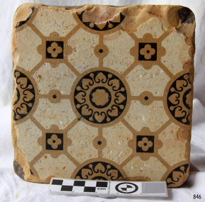
WUNDERLICH TILE, Wunderlich Limited, Circa 1965
In the Sunshine Advocate of 21/03/1925 it is reported that Wunderlich Ltd decided to establish works in Sunshine for the manufacture of terra cotta and faience for the facing of city buildings. The product was intended to imitate granite, which would give a brighter appearance to concrete walls. A stone surface finish to the terra cotta could be achieved by applying a variety of colour combinations of glazes with a special 'spackle' gun. A building that is still standing and has the imitation granite finish terra cotta is the Nicholas Building at 21 - 47 Swanston Street, Melbourne. The Nicholas Building was designed by Harry Norris for Alfred Nicholas (Aspro fame), and was built during 1925 - 1926. The building is classified by the National Trust (B4079) and has the Victorian Heritage Register (H2119). During my employment in the factory from 1964 to 1969 the tiles were generally faced with single colour glazes. For some small jobs a light coloured mottled finish was achieved by spattering a white glaze over a cream coloured background or vice versa. There were no imitation granite jobs done, probably because of changing attitudes to the intended appearance of buildings. The green coloured tile in our collection is an unfinished (untrimmed) retain tile typical of the green coloured tiles that were made for the two stages of the Commonwealth Centre Building (colloquially known as the Green Latrine), that was once located on the corner of Spring and Victoria Streets in Melbourne. Similar coloured tiles were also used on some shop fronts. The Commonwealth Centre Building no longer exists, however the Century Building at 125 - 133 Swanston Street, Melbourne is covered with single coloured tiles (white). The Century Building was built in 1939, with the architect being Marcus Barlow. The Building is classified by the National Trust (B4045). Our tile along with several others were headed for dumping among the asbestos waste at the rear of the two Wunderlich factories (Circa 1968). With permission from the Factory Superintendent of the Terra Cotta factory they were saved and taken home. Several are still in use as pavers around a barbecue in Melton from where our tile was obtained. It should be noted that the Wunderlich Architectural Terra Cotta factory in Sunshine did not manufacture terra cotta roofing tiles, as reported in the Brimbank City Council Post-contact Heritage Study HO 073 former Wunderlich now West End Market. Wunderlich terra cotta roofing tiles were manufactured at their factory in Mitcham Road, Vermont. Document HO 073 contains at least 3 errors. Other References: (1). http://nla.gov.au/nla.news-article74726224. (2). Armstrong, J. 'Investigating the historic and current use, manufacture and conservation of architectural terra cotta and faience USA & UK'. This tile is an example of the type of facing that was applied to city buildings for over 40 years from the mid 1920's. As building techniques changed the need for this type of facing diminished, and so the factory was eventually sold and demolished. A free standing tall chimney stack which serviced two of the kilns was a significant feature of the North Sunshine skyline. A part of the history of Sunshine disappeared with the demolition of the factory and the chimney stack. Only the façade of the finishing section of the factory where tiles were trimmed and stored remains. Off-white/beige architectural terra cotta tile with green coloured vitreous glaze on the face of tile. The rear of tile is ribbed. wunderlich limited, terra cotta, architectural, commonwealth centre, spring street, sunshine, mcintyre, victoria street, faience, faence, imitation granite, nicholas building, century building -
 Melbourne Tram Museum
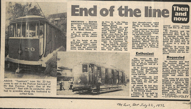
Newspaper, The Sun, “End of the line”, 22/07/1972 12:00:00 AM
Newspaper clipping titled: “End of the line” The Sun, Saturday July 22 1972 Photos and text of “toastrack” tram # 20 Tram from St Kilda Station to Brighton Beach electric street railway, Bob Prentice, Prahran back garden, 1913 vintage, bought the tram in 1959 when the line closed. Retains original colour scheme of chocolate, cream and read. Served its last days as a breakdown tram confined to Elwood depot. Built by Pengelley & Co of Adelaide in 1913, entered service between May and July 1913. Number 20 served for 5 years until the toastrack design became obsolete and it was replaced. Conductor had to move along narrow running board and enter compartments from the outside to collect fares 5 mile journey took 29 minutes Trams had gas-light fittings made of brass and displayed notice to occupants: "Please hand as nearly as possible the exact fare to the conductor. Passengers are requested to give early notice where they desire to be set down."trams, tramways, toastrack tram, st kilda brighton, 20, pengelly, elwood depot, victorian railways, tram 20 -
 Flagstaff Hill Maritime Museum and Village
Ceramic - Floor Tile, circa 1878
This Minton floor tile is from the wreck of the Loch Ard. The iron-hulled clipper ship from the Loch Line was heading for Port Phillip from London, when it ran into the cliffs of Mutton Bird Island near Port Campbell. The Loch Ard was laden with high-value cargo including luxury goods intended for display at the Melbourne International Exhibition in 1880. One notable survivor from the ship’s freight manifest was the well-packed Minton porcelain peacock, a two-meter high ceramic masterpiece of vivid glazed colours. (This is also on display in the Great Circle Gallery). The almost total loss of life and property from the Loch Ard registered as a shocking tragedy for the Colony of Victoria, at a time when social confidence and economic optimism were otherwise high. The wealth generated from Gold and Wool was increasingly being spent on grandiose private residences and imposing public buildings. The demand for quality furnishings and fittings was therefore strong. Among the products consigned to burgeoning colonial markets by the Milton Pottery at Stoke upon Trent, were their new range of colourfully patterned but very durable floor tiles ideal for the high-traffic spaces in the large civic buildings then being constructed in Australia and America. These floor tiles were “encaustic”, meaning that their designs and colours were encased “within” the depth of the tile. Rather than their decorative patterns being glazed onto the surface of the tile, their inlaid designs were created during the manufacturing process, as “coloured slips” (or liquid clay) were poured into a deep pre-moulded casting. When fired, the resulting tile was colour-fast and design-fast. The Minton floor tile is significant for its hard-wearing yet attractive design. The shipwreck of the Loch Ard is of significance for Victoria and is registered on the Victorian Heritage Register ( S 417). Flagstaff Hill has a varied collection of artefacts from Loch Ard and its collection is significant for being one of the largest accumulations of artefacts from this notable Victorian shipwreck of which the subject items are a small part. The collections of objects give us a snapshot of how we can interpret the story of this tragic event. The collection is also archaeologically significant as it represents aspects of Victoria's shipping history that allows us to interpret Victoria's social and historical themes of the time. Through is associated with the worst and best-known shipwreck in Victoria's history. A square Minton floor tile with a white background, and beige, dark blue, light blue and black geometric pattern as well as leaves in the design. The tile has corner broken off and some chipping along the edges. The reverse has five rows of five evenly spaced holes. The back of the tile has inscriptions. Made by Minton & Co. at Stoke upon Trent. This encaustic floor tile was recovered from the shipwreck of the LOCH ARD. Branded "... MINTON&CO / PATENT / STOKE UPON TRENT"flagstaff hill, warrnambool, flagstaff hill maritime museum, shipwreck coast, flagstaff hill maritime village, great ocean road, loch line, loch ard, captain gibbs, eva carmichael, tom pearce, glenample station, mutton bird island, minton floor tile, encaustic tile, melbourne international exhibition, floor tile, minton tile, minton & co., stoke upon trent -
 Australian Army Museum of Western Australia
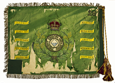
Regimental Colour - 28th Battalion (The Swan Regiment)
Presented by Lieutenant-General Sir JJ Talbot Hobbs, KCB, KCMG, VD, LLD at a parade held on the Esplanade, Perth, 22 October 1927. With the re-activation of the Citizen Military Forces (CMF) following the Second World War, the 16th/28th Infantry Battalion (The Cameron Highlanders of Western Australia) was raised as a linked battalion in 1948 to carry on the identity and traditions of the pre-war 16th and 28th Battalions respectively. The King's and Regimental Colours formerly held by these two battalions were passed on to the new battalion who paraded them in rotation on ceremonial occasions. The above battalion became unlinked in March 1952 and 28th Infantry Battalion (The Swan Regiment) became an independent battalion within its own right. The former colours of 28th Battalion were handed back at a parade at Northam Camp on 24 August 1952. Under major reorganisation of the CMF in 1960, all individual infantry battalions that existed at the time within each State were amalgamated to form State regiments, taking effect from 1 July 1960. Thus from that date the 11/44th, 16th and 28th Infantry Battalions were amalgamated to form The Royal Western Australia Regiment. In September 1960, at a ceremonial parade held at Northam Camp, the Colours carried by all former battalions were handed over for safe keeping by the new regiment. These former colours were subsequently laid up in the undercroft at the State War Memorial, King's Park on 29 November 1964. These were transferred to the Army Museum of WA in 1988 as part of the Bicentenary Colours Project. At the time of presentation this colour was a plain union flag with no central devices or other distinctions included on it. Following Military Board approval given in 1925 the centre circle and Crown were later added, in accordance with the approved design for a King's Colour. With the re-activation of the Citizen Military Forces (CMF) following the Second World War, the 16th/28th Infantry Battalion (The Cameron Highlanders of Western Australia) was raised as a linked battalion in 1948 to carry on the identity and traditions of the pre-war 16th and 28th Battalions respectively. The King's and Regimental Colours formerly held by these two battalions were passed on to the new battalion who paraded them in rotation on ceremonial occasions. The above battalion became unlinked in March 1952 and 28th Infantry Battalion (The Swan Regiment) became an independent battalion within its own right. The former colours of 28th Battalion were handed back at a parade at Northam Camp on 24 August 1952. With the accession of HM Queen Elizabeth II to the throne in 1953, all Colours that had originally been presented as King's Colours, and were still carried by units on the current Order of Battle, were automatically deemed to be Queen's Colours. Under major reorganisation of the CMF in 1960, all individual infantry battalions that existed at the time within each State were amalgamated to form State regiments, taking effect from 1 July 1960. Thus from that date the 11/44th, 16th and 28th Infantry Battalions were amalgamated to form The Royal Western Australia Regiment. In September 1960, at a ceremonial parade held at Northam Camp, the Colours carried by all former battalions were handed over for safe keeping by the new regiment. Battle Honours for the Second World War were promulgated under Australian Army Order 135/1961 and the 10 selected honours approved for emblazoning on the Queen's Colour were subsequently added in 1962 These former colours were subsequently laid up in the undercroft at the State War Memorial, King's Park on 29 November 1964. These were transferred to the Army Museum of WA in 1988 as part of the Bicentenary Colours Project. Dark green with gold fringe. In the centre the battalion colour patch of a white over blue diamond within a circle inscribed "TWENTY EIGHTH INFANTRY", the whole surrounded with a wreath of Australian wattle and surmounted by the Crown. In the upper canton the Arabic numeral "28". Battle Honours emblazoned on the colour:- POZIERES, BULLECOURT, YPRES 1917, MENIN ROAD, PASSCHENDAELE, AMIENS, MONT ST QUENTIN, HINDENBURG LINE, GALLIPOLI 1915, EGYPT 1915-16 -
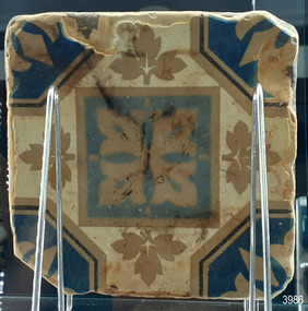
 Flagstaff Hill Maritime Museum and Village
Ceramic - Tile, circa 1878
This Minton floor tile is from the wreck of the LOCH ARD. Other examples of this manufacture have been recovered from the wreck site and form part of the collection at Flagstaff Hill. The iron-hulled clipper ship from the Loch Line was heading for Port Phillip from London when it ran into the cliffs of Mutton Bird Island near Port Campbell and was wrecked on the early morning of June 1, 1878. The LOCH ARD was laden with high-value cargo including luxury goods intended for display at the Melbourne International Exhibition in 1880. One notable survivor from the ship’s freight manifest was the well-packed Minton porcelain peacock, a two-metre-high ceramic masterpiece of vivid glazed colours. The almost total loss of life and property from the LOCH ARD registered as a shocking tragedy for the Colony of Victoria, at a time when social confidence and economic optimism were otherwise high. The wealth generated from gold and wool was increasingly being spent on magnificent private residences and imposing public buildings. The demand for quality furnishings and fittings was therefore strong. Among the products consigned to burgeoning colonial markets by the Milton Pottery at Stoke upon Trent were their new range of colourfully patterned but very durable floor tiles – ideal for the high-traffic spaces in the large civic buildings then being constructed in Australia and America. These new floor tiles were “encaustic”, meaning that their designs and colours were encased within the depth of the tile. Rather than their decorative patterns being glazed onto the surface of the tile, their inlaid designs were created during the manufacturing process, as “coloured slips” (or liquid clay) that were poured into a deep pre-moulded casting. When fired, the resulting tile was colour-fast and design-fast.The Minton encaustic floor tile is significant for its method of manufacture which makes it durable as well as decorative. The shipwreck of the LOCH ARD is of State significance. Victorian Heritage Register S417. Flagstaff Hill’s collection of artefacts from LOCH ARD is significant for being one of the largest collections of artefacts from this shipwreck in Victoria. It is significant for its association with the shipwreck, which is on the Victorian Heritage Register (VHR S417). The collection is significant because of the relationship between the objects, as together they have a high potential to interpret the story of the LOCH ARD. The LOCH ARD collection is archaeologically significant as the remains of a large international passenger and cargo ship. The LOCH ARD collection is historically significant for representing aspects of Victoria’s shipping history and its potential to interpret sub-theme 1.5 of Victoria’s Framework of Historical Themes (living with natural processes). The collection is also historically significant for its association with the LOCH ARD, which was one of the worst and best-known shipwrecks in Victoria’s history.A square Minton floor tile with a black and beige pattern against a white base. This encaustic floor tile was recovered from the shipwreck of the LOCH ARD. On the back, or base, of the tile is inscribed the number “46” and the letters “Minton & Co Patent Stoke upon Trent”.flagstaff hill, warrnambool, shipwrecked coast, flagstaff hill maritime museum, maritime museum, shipwreck coast, flagstaff hill maritime village, great ocean road, loch line, loch ard, mutton bird island, loch ard gorge, minton floor tile, encaustic tile, melbourne international exhibition, floor tile -
 Flagstaff Hill Maritime Museum and Village
Domestic object - Teaspoon, Viners Limited, Ca. 1920s
This teaspoon is an example of electroplated cutlery that was affordable alternative to more expensive silver cutlery, popular in the late 19th and early 20th century. The teaspoon has been stamped with text on the back of its handle that describes the nickel silver alloy that it was made of, and that it was made in Sheffield, but does not mention the maker's name. The plain design and light weight of this teaspoon could mean that it was used as a common, everyday utensil. The text on the back includes the words 'wears wite', assuring the buyer that even if the silverplate wears or flakes off the surface, the metal beneath it will show the white colour typical of nickel silver, or German silver. This alloy of copper, nickel and zinc is often used as a base for electroplating and named Electro Plated Nickel Silver (EPNS). An exact match of this teaspoon's inscription "WEARS-WITE STAINLESS NICKEL SILVER SHEFFIELD" has been found on cutlery made by Viners Ltd., and has not yet been found on flatware made by other manufacturers. Other cutlers have used very similar text but have used 'rustless' instead of 'stainless' and 'white throughout' instead of 'wears-wite'. Viners Limited was established in Sheffield in 1901 by Adolphe Viner and his sons. By 1908 they had a manufacturing plant in Bath Street, Sheffield, and went on to be the leading cutlers in the United Kingdom. They expanded to Hong Kong and Japan, and from 1925 they used the trademarks 'Alpha', 'Resilco' and 'Wear-wite stainless silver nickel'. They were appointed as Royal Cutlers to King George V in 1930, at which time their trademark was still 'Wear-wite' followed by the words 'Rustless Nickle Silver'. They continued to expand and prosper over the years. The Viners name is still being used by the current owners, the Rayware Group. In 2018 the Viners name celebrated 110 years as specialists in flatware. This teaspoon is historically significant, dating from the mid-1920s and made by a leading Sheffield silversmiths, Viners Limited, established in 1901 and continuing on with cutlery still branded with the Viner’s name today. Viners who were appointed as Royal Cutlers in 1930 by King George V. The teaspoon is an example of silver plated cutlery in common everyday use in the earlier half of the 20th century. This Viners teaspoon is unique in our collection as an item produced by Viners Ltd. and bearing the stamp ‘Wear-wite”.Teaspoon, small, thin, nickel silver plated. Narrow plain handle flares out to a wide, rounded end. Maker’s marks are stamped on the reverse. Made in Sheffield, England.“WEARS-WITE STAINLESS / NICKEL SILVER SHEFFIELD”flagstaff hill, warrnambool, maritime village, maritime museum, flagstaff hill maritime museum & village, shipwreck coast, great ocean road, electroplate, electro plate, nickel silver, nickel alloy, alloy composition, copper nickel zinc, german silver, epns, silversmiths, victorian era, 19th century, flatware, tableware, cutlery, cutler, dining utensils, eating utensils, silver-white metal, wears-wite stainless nickel silver sheffield, teaspoon, sheffield, wear-wite, silver nickel, stainless, rustless -
 Flagstaff Hill Maritime Museum and Village
Steel Sample, ca. 1876
The sample of steel from which the S.S. Julia Percy’s boiler was made has been tested, according to the attached label. The test involved heating the steel to blood red temperature (or dark red colour) then dipping it into water and bending it when it was cold. A “very severe test for quality” was written on the ticket by T.H. Osborne. (Mr Thomas Hamilton Osborne was the secretary for the Western Steam Navigation Co, established in Warrnambool in 1886. The company’s office was on the corner of Timor and Liebig Streets in Warrnambool and its north-western wall is now part of the current Warrnambool Regional Art Gallery. ) Cold bending of steel in a press or through rollers is the typical method of curving steel for construction. The steel needs to be manufactured in such a way that it is strong enough yet still flexible enough not to crack when bent or rolled. The boiler on the Julia Percy could have been a Scotch Boiler, a design introduced in the 1870’s and still being used today. This design was more robust that previous boilers, generating higher working steam pressures. The design incorporate greater ability to roll iron plates, leading to greater strength, thicker plating and fewer riveted joints. They were originally made of iron then later incorporated steel sections until they were entirely constructed of steel. Many examples of this type of boiler can be found on wreck sites. Shipping was the cheapest and most practical means of carrying produce and goods during the period 1840-1890. Regular domestic steamer services commenced in the Warrnambool district in the late 1850’s and by 1870 the passenger trade was booming. Produce was loaded from the jetty into ‘lighters’ (small boats), which took it to the ships at anchorage in the bay. Passengers were taken to the ship’s side then climbed aboard up ladders or gangways. The coming of the railway in October 1889 meant the gradual decline and end of the steam shipping era. Originally the ship was known as the SS Julia Percy and was later renamed as the Leeuwin. She was an iron passenger-cargo steam ship built in Glasgow by Thomas Wingate for the Warrnambool Steam Packet Company, which commissioned the ship for the steamship trade in Victoria’s western district. She was first registered in Warrnambool, Victoria in 1876. At one point in time the Julia Percy would sail from Warrnambool to Melbourne every Friday and return from Melbourne to Warrnambool every Tuesday. The cost of a return ticket for a Saloon Fare was £1.0.0. She would sail “if practical and weather permitting”. The Julia Percy changed hands several times. Her next owner was the Western Steam Navigaiton Co of Melbourne (1887). It was the manager of this company, Mr. T.H. Osborne, who tagged ths steel sample above. Melbourne Steamship Co became the next owners (1890), followed by William Howard Smith and Sons (1901) for use in Queensland coastal trades, then she was bought by George Turnbull in 1903 and used for local mail contract in Western Australia. She was sold to the Melbourne Steamship Company Ltd. (1906) and re-named the Leeuwi but continued in her Western Australian coastal run. She was converted into a coal hulk in Melbourne in 1910 as a result of damaged caused when she was driven against the jetty at Dongara during a gale. The ship was eventually dismantled and scuttled in Bass Strait on 28 December 1934. The steel sample is significant for its association with the wreck of the Leeuwin (Julia Percy), which is on the Victorian Heritage Register. It is historically significant for being a rare artefact that has potential to interpret aspects of western Victoria’s 19th century steamship trade and Victorian cultural history, including the testing and manufacturing process associated with steam power. Leeuwin is listed on the Victorian heritage Register as being historically significant ‘as one of only four wrecks of steamships in Victorian waters associated with the western district of Victoria’s coastal steamship trade. Her registered number is VHR S413. A sample of the steel from which the boiler of the "SS Julia Percy" (later named Leeuwin) was made. The piece of steel is a ‘C’ shape with the ends almost meeting. A luggage ticket is tied onto the steel and has an inscription on it. The steel is rusty.Ticket with typed information “Steel of which the Boiler of the “Julia Percy” (Warrnambool Steam Navigation Co) was made. TEST: Made Blood hot or Dark Red then dipped into water and bent cold. A very severe test for quality T.H. Osborne. Below these words is the hand written inscription in black “FM 151 / 9.75” julia percy, leeuwin, steel, boiler, steam ship, metal testing, western steam navigation co., flagstaff hill, warrnambool, shipwrecked-coast, flagstaff-hill, flagstaff-hill-maritime-museum, maritime-museum, shipwreck-coast, flagstaff-hill-maritime-village, t.h. osborne -
 Lara RSL Sub Branch
Picture Print, Hurricane, Unknown
The Hawker Hurricane is a British single-seat fighter aircraft of the 1930s–40s that was designed and predominantly built by Hawker Aircraft Ltd. for service with the Royal Air Force (RAF). It was overshadowed in the public consciousness by the Supermarine Spitfire's role during Battle of Britain in 1940, but the Hurricane actually inflicted 60 percent of the losses sustained by the Luftwaffe in the engagement, and it went on to fight in all the major theatres of the Second World War. Url Hurricane.html. The Hawker Hurricane Mk.IIc - LF363, first flew on the 1st January 1944 and is believed to be the last Hurricane to enter service in the RAF. It was in service with 63 squadron and 26 squadron. After hostilities, LF363 was spared the scrap yard and used on various station flights and also appeared in films 'Angels one five', 'Reach for the Sky' and 'The Battle of Britain'. Whilst flying to Jersey in September 1991, LF363 suffered engine problems and had to be diverted to RAF Wittering but on the final approach the aircraft suffered complete engine failure and had to make an emergency landing. The pilot was saved with relative minor injuries (a broken ankle and minor burns) but the aircraft suffered severe damage. Historic Flying Limited completely rebuilt LF363 and by 1998 it was flying again as part of the B.B.M.F. LF363 currently wears the colour scheme of a Mk.I Hurricane of 17 squadron, P3878 'YB-W' which was flown by Flying Office Harold Bird-Wilson at Debden and Tangmere. Harold 'Birdy' Bird-Wilson had previously been badly burned in a pre-war flying accident. Upon his recovery he joined 17 squadron and fought through the 'Battle of France' and the 'Battle of Britain' achieving 6 confirmed kills. On 24th September 1940, 'Birdy' was shot down by Adolf Galland, his 40th 'kill', and had to bale out. 'Birdy' survived the war and when he retired from the RAF he had reached the rank of Vice Marshall and had been awarded the CBE, DSO, DFC & Bar and the AFC & Bar. British single-seat fighter aircraft manufactured by Hawker Aircraft, Ltd., in the 1930s and ’40s. The Hurricane was numerically the most important British fighter during the critical early stages of World War II, sharing victory laurels with the Supermarine Spitfire in the Battle of Britain (1940–41) and the defense of Malta (1941–42). Hurricanes served in all theatres of war where British forces were engaged. https://www.britannica.com/technology/Hurricane-airplane Framed coloured picture print on plastic sheetOn the aircraft are the markings LF 363 -
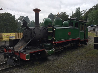 Puffing Billy Railway
6A - Victorian Railways Na class steam locomotive, 1901
6A Built in 1901 and painted two-tone green, this locomotive was issued to the Colac to Beech Forest line and was used in that line’s construction. Over the years, it saw service on all four lines, but mostly on the Colac to Crowes and Upper Fern Tree Gully to Gembrook lines. It was temporarily withdrawn from service in 1958 and returned to service at Belgrave in 1962 for the reopening of this line where it saw almost continuous service until being withdrawn in 1983. It has been restored, as far as possible, to its original condition with original design side tanks, low bunker, original size windows, etc., but a steel cow-catcher in place of the original style wooden one. It also has its original colour scheme of two-tone green with white lining. Loco: 6A In service Thursday, 18th July 1901 Livery two-tone green Owner Puffing Billy Gauge 762mm / 2' 6' Status Preserved - Operational Service History : Jul 1901 Colac - initial allocation of a new locomotive Jul 1901 - Nov 1908 Colac Mar 1909 - May 1909 Wangaratta Jun 1909 - Other Oct 1909 - Oct 1910 UFTG. Nov 1910 - Feb 1912 Colac May 1912 - Jun 1912 Wangaratta Jul 1912 - Sep 1914 Moe Oct 1914 - Aug 1924 Colac May 1925 - Jul 1927 UFTG. Aug 1927 - Oct 1928 Moe Jan 1929 - Sep 1930 UFTG. Sep 1930 - Jun 1932 Moe Dec 1932 - Workshops May 1933 - Colac Sep 1933 - May 1936 Moe Jun 1936 - Oct 1936 Workshops Oct 1936 - May 1942 UFTG. Sep 1942 - Apr 1949 Colac May 1949 - Apr 1950 Workshops May 1950 - Dec 1957 UFTG. Feb 1958 - Apr 1962 Workshops May 1962 - Belgrave - In Active Service at Puffing Billy Railway BelgraveVictorian Railways - Narrow Gauge NA class steam locomotive number 6A Victorian Heritage Register (VHR) Number H2187 Puffing Billy Locomotives and Rolling Stock Collection Dates that 6A worked on the Gembrook Line Nov-1909 to Nov-1910 May-1925 to Aug-1927 Jan-1929 to Sep-1930 Oct-1936 to Sep-1942 May-1950 to Feb-1958 May-1962 - Returned to Gembrook railway Oct-1977 - Transferred to PBR ownershipSteam Locomotive - with wrought iron frame with cast iron cylinders6Apuffing billy, victorian railways, narrow gauge, steam locomotive, 6a, 6na -
 The Beechworth Burke Museum
Ceremonial object - Ushabti of Taweret-Khaiti, Circa 1292 BC
Ushabti are tiny anthropoid (human-shaped) figures placed in the tombs of wealthy Egyptians. They were intended to do the work of the deceased in the afterlife. This purpose is implied through their name, which may have derived from the Egyptian word “to answer”. The Burke Museum in Beechworth is home to a particular ancient Egyptian Ushabti figure. This artefact was donated to the Museum in 1875. No details about how it left Egypt, arrived in Australia, and where it was located before this donation are known. The Nineteenth Century, when this artefact was donated, was a period when many museums acquired items of ancient Egyptian heritage. Many of these items were procured in less than desirable circumstances, having often been looted from ancient tombs and sold to tourists without documentation as to their original location and/or accompanying grave goods. These artefacts were also divested through partage (the trading of artefacts for funds); however, the latter is unlikely to have been the case for this artefact. Since the Ushabti was donated by an unknown donor, it is likely to have been in a private collection rather than an institution. Ushabti can be dated using iconographic analysis which is non-invasive and provides a comprehensive study of the artefact. The later period of the 18th Dynasty marked the beginning of an increase in both the inclusion of Ushabti as essential funerary items and the creation of Ushabti with tools. From this period, they are no longer depicted without tools. Depictions of tools including gardening hoes are frequently depicted grasped in the Ushabti’s hands whilst items like the seed-bag are depicted hanging on the back rather than in an alternative position. This Ushabti figure grasps a gardening hoe and a mattock and a small seed bag surrounded by a yoke bearing water jars are depicted on the upper back of the Ushabti. These features are essential in helping narrow this dating to the late 18th and before the early 20th Dynasty. The position of this seed bag also provides dating information. In the early 18th Dynasty this bag was consistently drawn on the front of the figurine; however, by the reign of Seti I, this feature moved to the back. Thus, since the seed bag is located on the back of this Ushabti, it cannot date to the early 18th Dynasty. By the 19th Dynasty, Ushabti’s were increasingly made from either faience or terracotta. The availability of these materials in Egypt resulted in the increase of Ushabti production with tombs containing many more figurines than previously seen. The Ushabti held by the Burke collections is made from terracotta. Terracotta was rarely used for Ushabti before and during the early 18th Dynasty with only the odd appearance until the late 18th Dynasty and becoming common through that period until the late Third Intermediate Period. Whilst the face has been damaged, there is no evidence for the Ushabti having been provided with an Osirian false beard. This omission rules out a dating of later than the 25th Dynasty when beards became prominent. The inscriptions also date the Ushabti to the New Kingdom. This is because of the use of sḥḏ (“to illuminate”) with Wsjr (“Osiris”) which only occurs in these periods. Therefore, considering all these elements, the Ushabti can be confidently be dated to between the late 18th to early 19th dynasty.Artefacts like this Ushabti are no longer exclusively representative of their origins in burial assemblages and significance in the mythology of the Egyptian afterlife but are also significant for the accumulated histories they have gained through travel. The movement of this artefact from Egypt to Australia allows insight into the collecting habits of the 19th century, and in particular, the reception of ancient Egyptian artefacts in small rural museums. The procurement of Egyptian artefacts was a social trend around the late 1800s to early 1900s. Egyptian artefacts were considered curiosities and recognised for their ability to attract public attention to museums. They were also utilised in Australian museums, like the Burke Museum, to connect the collection to one of the oldest civilisations known to man and since Australia was considered a “young” country by European settlers, this was vital and derived from an interest in Darwin’s “Origin of the Species” 1859. Furthermore, there was a culture of collecting in the 1800s amongst the affluent in English society which led to the appearance of many Egyptian artefacts in private collections. The acquisition of this Ushabti figure is not certain, but it was likely donated from a private collection rather than an institution. This particular artefact is significant as an example of a high-quality Ushabti representative of those produced during the late 18th or early 19th century. It provides insight into the individualism of an Ushabti and the mythology of ancient Egypt. It also provides an example of the types of items required in the tomb assemblages of this period and reinforces the importance of ensuring the successful afterlife of the deceased through art. This Ushabti belonged to a woman named Taweret-Khaiti, Chantress of Amun, in the late 18th Dynasty or early 19th Dynasty (c.1292 BC) of the Egyptian New Kingdom. It likely comes from an undetermined tomb in the locality of Thebes. This figure is made from Nile silt clay (a polyester terracotta; clay sourced from the banks of the Nile River) which was a popular material for Ushabti construction in the early 19th Dynasty. It is in a fair state of preservation (with the exception of a break through the centre) and originally made to a high quality. The face has been damaged but the eyes and eyebrows are clearly marked with black ink and the sclera painted white. The Ushabti is painted a light brown/yellow colour and features a vertical line of inscription down the lower front. The Ushabti wears a large wig and and a schematic collar. The arms are painted light brown and depicted crossed with bracelets around the wrists. It grasps a hoe and mattock. A yellow seed-basket is depicted on the Ushabti’s back. These features represent the likelihood that this particular Ushabti was intended to complete farm work for the deceased in the next life. There would have been additional Ushabti of similar design within the tomb who worked under the supervision of a foreman Ushabti. The foreman Ushabti would be depicted dressed in the clothing of the living. The inscriptions are painted freehand in black ink and written in a vertical column from the base of the collar to the foot pedestal on the front of the Ushabti. The owner of the Ushabti could elect to have the figures inscribed with their name, the Ushabti spell and any other details they deemed necessary. In the case of this example, the Ushabti is inscribed with the owner’s details and is an abbreviated version of the standard Ushabti formula. This formula ensured that the Ushabti would complete the desired task in the afterlife when called upon by the deceased. Ushabti which were not inscribed would represent their intended purpose through design; however, this Ushabti, like most made in the late 18th Dynasty, conveys its purpose both through both design and inscription. The inscription is as follows: sHD wsir nbt pr Smayt imn tA-wr(t)-xai(ti) mAa xrw which translates to: "The illuminated one, the Osiris (the deceased), the mistress of the household, Chantress of Amun, Taweret-Khaiti, true of voice (justified)"ancient egypt -
 University of Melbourne, Burnley Campus Archives
Plan, 36 Railway Ave, Armadale, 1991-1997
Sets of plans for a Residential Garden produced by students for an assignment. (1) Tracing paper and paper copies site plan sketch. (2) Janine Bugg - Assessment Preliminary Plan, Concept Plan, Site Inventory and Analysis, Site Elevation A, Section Elevation B dated 26.05.1994. (3) Carmen Skrobonja - Assessment Main Plan & Section Elevation, Concept Plan dated 31.05.1991. (4) G. Mutimer - Preliminary Plan, Section Elevation, May 1994. (5) Melissa King - Assessment, Site Inventory & Analysis, Site Concept Plan, Preliminary Main Plan, Section Elevation, May 1997. (6) Jim Despotellis - Site Inventory & Analysis, Concept Plan, Preliminary landscape Design, 25.04.1994 - 15.05.1995. (Also see B11.0775.) (7) 33 Railway Ave (sic), Colour photographs pasted on paper. (8) Marli Draper - Site Inventory and Analysis, Concept Plan, Preliminary Plan, Perspective Feature Bed. (Also see B11.0773). (9) Cowan (Creations) - Site Inventory and Analysis, Concept Plan, Preliminary Plan, Assessment, 30.05.1994. (10) McRae (Designs) - Site Inventory and Analysis, Preliminary Main Plan, Concept Plan, Section View to Tussock Grass and Eucalyptus, 30.05.1997 - 01.06.1997. (11) Leah Syme - Site Inventory and Analysis.armadale, janine bugg, carmen skrobonja, melissa king, jim despotellis, marli draper, leah syme, g. mutimer, students, assignments -
Federation University Historical Collection
Photograph, Joseph At Her Majesty's Theatre Ballarat, c1990
A student production of Joseph and His Amazing Technicolour Dreamcoat. Possibly dating c. 199039 Colour Photographs of a Student Production of Joseph At Her Majesty's Theatre Ballarat c. 1990s .1) Len Bauska (Technician) on a red ladder .2) Len Bauska .3) Unknown Student .4) Unknown Student .5) Older woman .6) Rehearsals in Progress .7) Students in Dressing Room .8) Two students .9) Student .10)Rehearsing in Orchestra Pit .11) Rehearsing In Orchestra Pit .12)Rehearsing in Orchestra Pit .13) Set Design .14)Student .15) Two Students .16) Green Room at Her Majesty's Theatre Ballarat .17)Directors and students .18)Len Bauska with Disco Balls .19)On set with ladder .20)Rehearsals .21) Making the Technicolour Dreamcoat .22)Making the Technicolour Dreamcoat .23) Student making costume .24)Students making costumes .25)Student .26)Students making costumes .27)Making costumes .28) Students making costumes .29) students making costumes .30) Younger members of the cast .31) Hair and Makeup .32)Preparing for a performance .33)Male cast members .34) Three cast members .35) Male cast members in dressing room .36) Student on phone .37)Student on phone .38) Courier poster announcing 6 more nights .39) Promotional banner for Joseph and the Amazing Technicolour Dreamcoat - Students in dressing room - Children on stairs -Male actor's headshot joseph, joseph and his amazing technicolour dreamcoat, performing arts, alumni, her majesty's theatre ballarat, ballarat, rehearsals, costume design, stage, mirror ball, orchestra pit, band, 1990, balllarat university college, bapa, ballarat academy of performing arts -
Glen Eira Historical Society
Document - Glen Eira Residents Association
Six items pertaining to Glen Eira Residents Asssociation Inc. 1/Two copies of the minutes of a Committee Meeting of Glen Eira Residents Association Inc., held on 04/12/2001. The minutes cover a range of routine meeting items, as well as the postponed release of the Princes Park Master Plans and the proposed construction of car parks at Caulfield Racecourse. 2/A copy of Glen Eira Residents’ Association Inc.’s 30/05/2003 newsletter, notifying members of matters presently before Glen Eira City Council for purposes of evaluation. Matters include an admonishment to the Council to sort out anomalies between the C25 Amendment (80/20 Plan) and the Melbourne 2030 Plan, the success at convincing the Ministerial panel to adopt GERA’s views regarding the C14 Council Plan for the Caulfield Racecourse, a request for information from the Council regarding the previous year’s rate increase, a request for information from the Council regarding spending on planning for improvements to Princes Park, a call for the Council to improve its consultative procedures, a recommendation that the purpose of Glen Eira News be expanded to the making of suggestions for city improvement, and a notification of the measures implemented to improve the visibility of Caulfield Racecourse’s usability by the public. Includes a black-and-white photograph of Orrong Road, Elsternwick, illustrating what Glen Eira’s roads would look like if lined with trees, which was excluded from Glen Eira News on account of a current prohibition on the making of suggestions for city improvements. 3/Four copies of a booklet entitled ‘A Short Guide to Planning Procedures’, composed 08/2006, which endeavours to explain, as concisely as possible, the methodology by which Glen Eira City Council approves real estate developments and issues planning permits. 4/A booklet containing the minutes of the 05/10/2009 Annual General Meeting of Glen Eira Residents’ Association Inc. Details both routine items and more specific matters of discussion, such as inappropriate charges on the part of the Glen Eira City Council and the proposed inception of a questionnaire to evaluate local residents’ opinion of the Council. 5/A booklet announcing the 07/10/2010 Annual General Meeting of Glen Eira Residents’ Association Inc. at St. John’s Uniting Church, Elsternwick. Front cover details agenda and contains four colour photographs pertaining to public transport (buses, trams, trains) within the city. Interior features president Don Dunstan reflecting on issues relevant to GERA occurring over the preceding twelve months, with an emphasis on the dubious behaviour of the City Council, as well as two colour photographs: one of Dunstan himself and one of traffic at Elsternwick Junction. The rear cover contains the Financial Statement presented to the Meeting. 6Two copies of a printout of an article from the website of Glen Eira Residents’ Association Inc., accessed 19/06/2012, explaining the affects wrought as a result of the implementation of Planning Scheme Amendment C87. Said amendment changes the Planning Scheme protecting neighbourhood character by replacing the previous Significant Character Area (SCA) designation with the new designations of Neighbourhood Character Overlay (NCO) and Design and Development Overlay (DDO). In developing the Amendment, Glen Eira City Council commissioned Planisphere to procure the Planisphere Final Report, in which recommendations regarding the expansion, creation and deletion of SCAs were offered. The article contains a summary of said recommendations.glen eira residents’ association inc., clubs and associations, glen eira, meetings, minutes, campbell jack, dunstan don, marwick geoff, pleydell max, teseriero dominic, robins kevin, princes park, south caulfield, glen eira city council, local government, councillors, brennan martin, victorian local government association (vlga), erlich mayor, project manikato, caulfield racecourse, caulfield racecourse flat, racecourses, parks, car parks, kennedy cr., kennedy norman mr., crown land, glen eira road, rippon lea, c25 plan (80/20), melbourne 2030 plan, c14 council plan, rates, orrong road, elsternwick, trees, station street, caulfield north, neerim road, glenhuntly, glenhuntly park, orrong ward, grossbard cr., martens cr., building permits, delegated planning committee (dpc), steward joy, brohier peter, campbell fliss, scutt alex, ray darren, hannah brian, st. john’s uniting church, mees paul dr., elsternwick club, sandham street, melbourne weekly bayside, glen eira debates, walsh investigation, whelen investigation, forge cheryl cr., whiteside helen mayor, save our suburbs (sos), walsh mary, walsh kevin, french christine, elsternwick junction, planning scheme, planning scheme amendment c87, significant character areas (scas), planisphere final report, oakdene crescent, carnegie, blackwood street, housing diversity areas, urandaline grove, caulfield, normanby road/park crescent, kambrook road, balaclava road, hawthorn road tramway estate, caulfield south, ulupna road, ormond, murray street, prentice street, kambea grove, chestnut street, mcpherson avenue, queens avenue, caulfield east, derby crescent, clarinda street, st. james parade/downshire road, exhibition street, mckinnon, field street, boyd park, murrumbeena, lindsay avenue, lydson street -
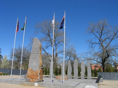 Ballarat Heritage Services
Photograph, L.J. Gervasoni, Australian Ex-Prisoner of War Memorial, Ballarat, 2014, 04/11/2014
The Trustees of the Australian Ex-Prisoners of War Memorial have defined a Prisoner of War to be a person who was captured by a common enemy and/or interned in a neutral or non-combatant country. To be defined an Australian Prisoner of War, the person needs to be either an Australian Born person serving in the Uniform of an Australian Service; or in the Uniform of a friendly country, or Born Elsewhere and serving in the Uniform of an Australian Service. A Prisoner is a person who has lost personal privileges, suffers deprivation of liberty or is unable to return home or dies in captivity.Colour photograph of a War Memorial designed by Peter Blizzard. The granite wall of the Australian Ex-Prisoners of War Memorial features a listing the names of Australian Prisoners and was opened on the 6th February 2004 by General Peter Cosgrove AM MC to recognise and remember over 36,000 Australians who became Prisoners of War during the Wars of the 20th Century. In 2008 the Memorial became the First Military Memorial of National Significance outside Canberra. The Memorial which was designed by Peter Blizzard OAM, symbolises that all Australian prisoners embarked on a journey to serve away from their homeland and acknowledges the hardship, deprivation, brutality, starvation and disease endured by Prisoners of War during their capture and the scars that many continued to endure upon their repatriation to Australia. Heritage Victoria describes the memorial in the following way" "A JOURNEY OF HONOUR, REMEMBRANCE AND HEALING - The Australian Ex-Prisoners of War Memorial is a dramatic and highly symbolic tribute to the sacrifice made by more than 35,000 young Australian service men and women in four theatres of war. At the heart of the monument is a stark, 130 metre long, highly polished black granite wall, engraved with the names of all Australian prisoners of war. The names on this 'honour roll' are listed in historical order from the Boer War in 1899, through to the Korean War in 1953. It is a testament to the contribution made by so many. Standing sentinel at the centre of the Memorial are six huge basalt obelisks, etched with the names of all the countries where Australians were held prisoner of war. The obelisks stand in a large reflective pool, set back from the central pathway, symbolising the distance that separated Australia's prisoners of war from their homes and their loved ones. Opposite the pool is a larger obelisk flanked by flagpoles and a ceremonial stone on which to lay wreaths. The central pathway is itself symbolic, with each of the paving stones cut in the shape of a railway sleeper. The pathway defines 'the journey' taken by the prisoners of war and the journey visitors take around the monument. At the end of the granite wall where the pathway ends, visitors face a large stone engraved simply 'Lest We Forget'. Water flows from beneath the stone, along the base of the granite wall and into the reflection pool in which the obelisks stand. This cycle of flowing water, symbolising spirituality, healing, cleansing, birth and rebirth, guides visitors on their journey through the Memorial." ballarat, ballarat botanical gardens, peter blizzard, ballarat north gardens, war memorial, prisoner of war, prisoners of war -
 Brighton Historical Society
Waistcoat, 1950s
This waistcoat belonged to Olga Black, a long-time Brighton resident. Part of a Greek national costume, it was designed by Olga in the 1950s, with the silver cornelli work completed by a Collins Street workshop. Olga Maria Black was born in Melbourne in 1930, the daughter of Ithacan migrants Constantine and Toula Mavrokefalos. Constantine first emigrated to Australia in 1902, returning to Greece circa 1912-13 to serve his home country in the Balkan Wars. Toula's family had left Ithaca for Romania when she was only six months old, but she happened to be visiting the island at the very time that Constantine arrived, fresh from the war. Within three weeks they were married, and when Constantine returned to Melbourne in 1914 his new bride came with him. Constantine had trained as an accountant, but his qualifications were not recognised in Australia. Changing his surname to the Anglicised "Black", he started off working in his older brother Dionysios's cafés before going into business on his own. In 1917 he opened the Paris Residential Café at 54-56 Swanston Street, which offered both dining and accommodation. The business saw some years of success, but did not survive the Great Depression. Constantine died in 1944. Olga's mother Toula learned to sew as a child, while growing up in the Romanian village of Brila. She developed her skills making lace and embroidering items for her trousseau. Some of the linen she embroidered had been woven from flax on Ithaca by her own grandmother, Efstathia. During the Depression, when money was scarce, Toula embroidered at home, doing work for a factory in Flinders Lane. Using a cotton reel, a threepence and a sixpence she created and embroidered designs on hundreds of blouses. Olga spent her preschool days sitting at the table where her mother worked. Toula would involve Olga by allowing her to help choose the colour combinations. Toula lived with Olga in Brighton until her death in 1976. Olga inherited her mother's sewing skills. She re-invented some of Toula’s trousseau nightdresses and skilfully altered other clothing, making dresses which she wore around Brighton for many years.Black velvet waistcoat, decorated with silver cornelli work. Pale blue cotton lining. Fastens with hooks and eyes.greece, ithaca, migration, olga black