Showing 7710 items matching " canners"
-
 Wodonga & District Historical Society Inc
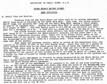
Album - Hume Reservoir Australia Album - Detail plan and explanation, Department of Public Works, N.S.W, 1927
This set of photos is from a leather bound album bearing the inscription "HUME RESERVOIR AUSTRALIA" plus 'The Rt. Hon. L. C. M. S. Amery, P. C., M .P.' all inscribed in gold. It was presented to The Rt. Hon. L. C. M. S. Amery, P. C., M. P, Secretary of State for Dominion Affairs on the occasion of his visit to the Hume Reservoir on 2nd November 1927. This album is of local and national significance as it documents the planning and development of the Hume Reservoir up to 1927. It was the largest water reservoir in the British Empire. The album records the pioneering engineering work that went into its construction.2. Detail Plan and Section. Starting from the New South Wales and there will be an earthen embankment 430 feet 6 inches long which is retained by the North Wing Wall. Then come the sluice section 284 feet 3 inches long, the spillway 720 feet long and the South Wing Wall, making a total length of 1,042 feet 6 inches of concrete wall. Beyond the South Wing Wall is earth embankment again to a length of 3,827 feet. The Full Supply Level is R.L.626.00 and allowance has been made for a surcharge of 9 feet. A road will run along the top of the dam at R.L.642.00. The sluice section contains seven offlets, the three nearest the north wing wall being 13 feet in diameter for hydro-electric purposes and the other four 9 feet in diameter for regulation purposes only. There are to be stony sluice gates on the upstream ends of the outlets and needle valves on the downstream ends. The shock of the discharged water will be taken by a stilling pool. Trash racks will protect the intake ends of the outlets. Next comes the spillway section, which is curved on the downstream face, and carried up to within 15 feet of the full supply level. Above that will be a series of piers between which will be the flood gates and on top of which the roadway will be carried. The gates will be 20 feet wide and 15 feet high and will be 29 in number. They will slide down the face of the wall when opened for the escape of the water. The investigation of the control of this cascade of water was made by means of a model and as a result the form of “bucket” or energy dissipater shown on the section of the spillway was decided upon. The earth embankment in Victoria is being constructed by the State Rivers and Water Supply Commission of Victoria who are the Constructing Authority for that State under the River Murray Waters Agreement. The core of the embankment is of concrete 6 feet wide at the base tapering to 2 feet at the top end and is reinforced with steel rods from the level of the decomposed rock upwards. On the downstream side, at about natural surface level, is a tunnel for drainage and inspection purposes. Above the tunnel is a vertical layer of large stones to drain any seepage to the tunnel. Against the core wall is packed selected material of as impervious a character as can be got locally and beyond that the bank is carefully built up in horizontal layers by means of horses and wheel scoops. The upstream slope is 3-to-1 hardening to 2½-to-1 at the top and the downstream slope is 2½-to-1 hardening to 2.07-to-1 at the top. The thrust of the upstream toe is taken by a mass of granite blocks, and this face is protected by concrete laid in situ. The width of the bank at base is 650 feet and at top 32 feet.hume reservoir australia, river murray waters scheme, hume weir diagrams, hume plan details -
 Victorian Aboriginal Corporation for Languages
Periodical, Australian Institute of Aboriginal and Torres Strait Islander Studies, Australian Aboriginal studies : journal of the Australian Institute of Aboriginal and Torres Strait Islander Studies, 2008
1. Rock-art of the Western Desert and Pilbara: Pigment dates provide new perspectives on the role of art in the Australian arid zone Jo McDonald (Australian National University) and Peter Veth (Australian National University) Systematic analysis of engraved and painted art from the Western Desert and Pilbara has allowed us to develop a spatial model for discernable style provinces. Clear chains of stylistic connection can be demonstrated from the Pilbara coast to the desert interior with distinct and stylistically unique rock-art bodies. Graphic systems appear to link people over short, as well as vast, distances, and some of these style networks appear to have operated for very long periods of time. What are the social dynamics that could produce unique style provinces, as well as shared graphic vocabularies, over 1000 kilometres? Here we consider language boundaries within and between style provinces, and report on the first dates for pigment rock-art from the Australian arid zone and reflect on how these dates from the recent past help address questions of stylistic variability through space and time. 2. Painting and repainting in the west Kimberley Sue O?Connor, Anthony Barham (Australian National University) and Donny Woolagoodja (Mowanjum Community, Derby) We take a fresh look at the practice of repainting, or retouching, rockart, with particular reference to the Kimberley region of Western Australia. We discuss the practice of repainting in the context of the debate arising from the 1987 Ngarinyin Cultural Continuity Project, which involved the repainting of rock-shelters in the Gibb River region of the western Kimberley. The ?repainting debate? is reviewed here in the context of contemporary art production in west Kimberley Indigenous communities, such as Mowanjum. At Mowanjum the past two decades have witnessed an artistic explosion in the form of paintings on canvas and board that incorporate Wandjina and other images inspired by those traditionally depicted on panels in rock-shelters. Wandjina also represents the key motif around which community desires to return to Country are articulated, around which Country is curated and maintained, and through which the younger generations now engage with their traditional lands and reach out to wider international communities. We suggest that painting in the new media represents a continuation or transference of traditional practice. Stories about the travels, battles and engagements of Wandjina and other Dreaming events are now retold and experienced in the communities with reference to the paintings, an activity that is central to maintaining and reinvigorating connection between identity and place. The transposition of painting activity from sites within Country to the new ?out-of-Country? settlements represents a social counterbalance to the social dislocation that arose from separation from traditional places and forced geographic moves out-of-Country to government and mission settlements in the twentieth century. 3. Port Keats painting: Revolution and continuity Graeme K Ward (AIATSIS) and Mark Crocombe (Thamarrurr Regional Council) The role of the poet and collector of ?mythologies?, Roland Robinson, in prompting the production of commercial bark-painting at Port Keats (Wadeye), appears to have been accepted uncritically - though not usually acknowledged - by collectors and curators. Here we attempt to trace the history of painting in the Daly?Fitzmaurice region to contextualise Robinson?s contribution, and to evaluate it from both the perspective of available literature and of accounts of contemporary painters and Traditional Owners in the Port Keats area. It is possible that the intervention that Robinson might have considered revolutionary was more likely a continuation of previously well established cultural practice, the commercial development of which was both an Indigenous ?adjustment? to changing socio-cultural circumstances, and a quiet statement of maintenance of identity by strong individuals adapting and attempting to continue their cultural traditions. 4. Negotiating form in Kuninjku bark-paintings Luke Taylor (AIATSIS) Here I examine social processes involved in the manipulation of painted forms of bark-paintings among Kuninjku artists living near Maningrida in Arnhem Land. Young artists are taught to paint through apprenticeships that involve exchange of skills in producing form within extended family groups. Through apprenticeship processes we can also see how personal innovations are shared among family and become more regionally located. Lately there have been moves by senior artists to establish separate out-stations and to train their wives and daughters to paint. At a stylistic level the art now creates a greater sense of family autonomy and yet the subjects link the artists back in to much broader social networks. 5. Making art and making culture in far western New South Wales Lorraine Gibson This contribution is based on my ethnographic fieldwork. It concerns the intertwining aspects of the two concepts of art and culture and shows how Aboriginal people in Wilcannia in far western New South Wales draw on these concepts to assert and create a distinctive cultural identity for themselves. Focusing largely on the work of one particular artist, I demonstrate the ways in which culture (as this is considered) is affectively experienced and articulated as something that one ?comes into contact with? through the practice of art-making. I discuss the social and cultural role that art-making, and art talk play in considering, mediating and resolving issues to do with cultural subjectivity, authority and identity. I propose that in thinking about the content of the art and in making the art, past and present matters of interest, of difficulty and of pleasure are remembered, considered, resolved and mediated. Culture (as this is considered by Wilcannia Aboriginal people) is also made anew; it comes about through the practice of artmaking and in displaying and talking about the art work. Culture as an objectified, tangible entity is moreover writ large and made visible through art in ways that are valued by artists and other community members. The intersections between Aboriginal peoples, anthropologists, museum collections and published literature, and the network of relations between, are also shown to have interesting synergies that play themselves out in the production of art and culture. 6. Black on White: Or varying shades of grey? Indigenous Australian photo-media artists and the ?making of? Aboriginality Marianne Riphagen (Radboud University, The Netherlands) In 2005 the Centre for Contemporary Photography in Melbourne presented the Indigenous photo-media exhibition Black on White. Promising to explore Indigenous perspectives on non-Aboriginality, its catalogue set forth two questions: how do Aboriginal artists see the people and culture that surrounds them? Do they see non-Aboriginal Australians as other? However, art works produced for this exhibition rejected curatorial constructions of Black and White, instead presenting viewers with more complex and ambivalent notions of Aboriginality and non-Aboriginality. This paper revisits the Black on White exhibition as an intercultural event and argues that Indigenous art practitioners, because of their participation in a process to signify what it means to be Aboriginal, have developed new forms of Aboriginality. 7. Culture production Rembarrnga way: Innovation and tradition in Lena Yarinkura?s and Bob Burruwal?s metal sculptures Christiane Keller (University of Westerna Australia) Contemporary Indigenous artists are challenged to produce art for sale and at the same time to protect their cultural heritage. Here I investigate how Rembarrnga sculptors extend already established sculptural practices and the role innovation plays within these developments, and I analyse how Rembarrnga artists imprint their cultural and social values on sculptures made in an essentially Western medium, that of metal-casting. The metal sculptures made by Lena Yarinkura and her husband Bob Burruwal, two prolific Rembarrnga artists from north-central Arnhem Land, can be seen as an extension of their earlier sculptural work. In the development of metal sculptures, the artists shifted their artistic practice in two ways: they transformed sculptural forms from an earlier ceremonial context and from earlier functional fibre objects. Using Fred Myers?s concept of culture production, I investigate Rembarrnga ways of culture-making. 8. 'How did we do anything without it?': Indigenous art and craft micro-enterprise use and perception of new media technology.maps, colour photographs, b&w photographswest kimberley, rock art, kuninjku, photo media, lena yarinkura, bob burruwal, new media technology -
 The Beechworth Burke Museum
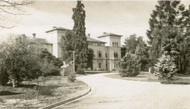
Postcard, George Rose, c.1945
The Rose Stereograph Company first began producing postcards, identified as the 'P' series (like this particular example) in 1913 and continued in this business until 1967 after which they switched to machine manufactured colour postcards printed by an external company. These were produced by Victorian-era photographer George Rose (1861-1942) often reputed as one of the best photographers in Australia during the later 19th Century and early 20th Century. Rose was born in 1861 in Clunes and began his photography business in 1880 when he founded the Rose Stereograph Company. He later switched to producing postcards after stereographs lost popularity in the early 1920s. The Mayday Hills Hospital was one of these locations photographed by George Rose and published as a postcard. Beechworth's Mayday Hills was chosen as the site of Victoria's newest asylum, at the time, due to the landscape and altitude. The hilltop atmosphere and the native fauna, it was argued, would assist in the cure of the patients kept at the hospital (Wood 1985, 122). The positioning of the hospital had a beneficial effect on the rural town. A pamphlet published by James Ingram and Son (1849) reveal that famous landmarks in Beechworth which included the Post Office, Gaol, Courthouse and Asylum "demonstrate the appreciation of Beechworth by the Government not only as as important district center, but also as a site unrivaled as a sanitarium". There were other locations in contention at the time, but ultimately Beechworth was chosen (Craig 2000,33). Prior to the creation of the Asylum in Beechworth, those charged with having mental illnesses or, as it was termed, "insanity" were unable to be properly cared for in the Gaol (which is where they were often sent). John Buckley Castieau wrote, in 1861 for the Ovens and Murray Advertiser, that the Gaol was unable to properly care for those classified then as "insane" but that they would endeavor to treat them above the other inmates (which he notes is not always the case in other establishments). Castieau wrote this in favour of supporting the building of the Mayday Hills Hospital in Beechworth. It was stated that at the time the Mayday Hills Hospital was built, there were 83 prisoners kept in the Gaol who were to be rehoused to the Hospital on the grounds of "insanity". The classification as someone as "insane", in this period of time is a reflection on the inability to cure and understand illnesses of the mind during the mid to late 1800s. Opening on the 24th of October 1867, the Mayday Hills Hospital was originally named the "Ovens Lunatic Asylum", a title which is very much a product of its time. Whilst controversial, changes to the name is part of the history of the Hospital and can provide much insight into the understanding of mental illness throughout history and the use/disuse of this term provides information into the reception/changing opinions of mental illness in society. The Hospital would later become known as the "Mayday Hills Asylum" and/or "Mayday Hills Hospital" with the latter being the most commonly used title. An article in the Ovens and Murray Advertiser notes that on the 7th of March 1865, the foundation stone of the Hospital was laid (it would officially open in 1867) and that it was such a moment of accomplishment and joy for Beechworth that a letter to the editor even suggested that there should be a holiday dedicated to the day the foundation stone as laid. This reveals an extent to which the townspeople of early Beechworth valued the construction of the Hospital in their town. It provided the town with a sense of prestige and honour. At first glance, the remains of the Mayday Hills Hospital in Beechworth, Victoria, inspire tragedy, trauma and beauty. The buildings themselves, with their Italianate style Renaissance architecture designed by J.J. Clark (Craig 2000, 49 & Smith 2016, 203) reflect a bygone period of European and Australian history. The gardens provide a sense of tranquility and beauty. The experience of those within these walls remains a valuable area of study to provide a more complete understanding. This particular hospital is considered the fourth of its like and one of three identified as the largest of their kind. The Mayday Hills Hospital is a sister to the Kew and Ararat Asylums in Melbourne which are both located in relative proximity. Understanding the role of the Mayday Hills Hospital in Beechworth history is integral to understanding the development of the goldfields town, but also for providing important information as to the history of caring for, and the reception of, mental illnesses in Australian and wider European history. Mayday Hills provides a case study which can be researched through oral history, an analysis of the grounds/buildings and through images like this postcard which portray the structure in a highly deliberate manner. Images like this depict the strong façade of the Hospital and provide a glimpse into the tranquility of the gardens. This has been done deliberately to provide a sense of comfort and healing about the building to those looking from the outside. Further research into the importance of the Hospital in Beechworth and it's connection to the town will be supported through images like these kept in the Mayday Hills photo album in the collection of the Burke Museum.Pale sepia toned rectangular postcard printed on matte card.Obverse: THE ROSE SERIES P. 4689 / COPYRIGHT / ADMINISTRATIVE OFFICES, MENTAL HOSPITAL, BEECHWORTH, VIC / Reverse: Published by the Rose Stereograph Co. / Armadale, Victoria / POST CARD / THE "ROSE" SERIES / DE LUXE / A REAL PHOTOGRAPH / PRODUCED IN AUSTRALIA /mayday hills, asylum, mental hospital, hospital, beechworth -
 The Beechworth Burke Museum
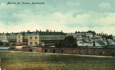
Postcard, C. F. Falk, c.1930
This postcard contains a depiction of the Mayday Hills Hospital in Beechworth, Victoria from the direction of Farm Hill, circa 1930. It was designed by C.F.Falk in Beechworth and printed in Saxony which is a landlocked state of Germany which borders the states of Brandenburg, Saxony-Anhalt, Thuringia, Bavaria and the countries of Poland and the Czech Republic. The depiction is a painting of the Mayday Hill Hospital which portrays the extensive buildings an HaHa wall (many of which have not survived to the present day). It provides a unique opportunity to reconstruct this historical site as it may have looked in approximately 1930. Beechworth's Mayday Hills was chosen as the site of Victoria's newest asylum, at the time, due to the landscape and altitude. The hilltop atmosphere and the native fauna, it was argued, would assist in the cure of the patients kept at the hospital (Wood 1985, 122). The positioning of the hospital had a beneficial effect on the rural town. A pamphlet published by James Ingram and Son (1849) reveal that famous landmarks in Beechworth which included the Post Office, Gaol, Courthouse and Asylum "demonstrate the appreciation of Beechworth by the Government not only as as important district center, but also as a site unrivaled as a sanitarium". There were other locations in contention at the time, but ultimately Beechworth was chosen (Craig 2000, 33). The extent of buildings displayed in this postcard helps convey the imposing and enormity of the structure before decommission. Prior to the creation of the Asylum in Beechworth, those charged with having mental illnesses or, as it was termed, "insanity" were unable to be properly cared for in the Gaol (which is where they were often sent). John Buckley Castieau wrote, in 1861 for the Ovens and Murray Advertiser, that the Gaol was unable to properly care for those classified then as "insane" but that they would endeavor to treat them above the other inmates (which he notes is not always the case in other establishments). Castieau wrote this in favour of supporting the building of the Mayday Hills Hospital in Beechworth. It was stated that at the time the Mayday Hills Hospital was built, there were 83 prisoners kept in the Gaol who were to be rehoused to the Hospital on the grounds of "insanity". The classification as someone as "insane", in this period of time is a reflection on the inability to cure and understand illnesses of the mind during the mid to late 1800s. The title on the obverse of this photograph as "Asylum for Insane, Beechworth" reflects a bygone era and attitude to mental health. Beechworth's Mayday Hills was chosen as the site of Victoria's newest asylum, at the time, due to the landscape and altitude. Opening on the 24th of October 1867, the Mayday Hills Hospital was originally named the "Ovens Lunatic Asylum", a title which is very much a product of its time. Whilst controversial, changes to the name is part of the history of the Hospital and can provide much insight into the understanding of mental illness throughout history and the use/disuse of this term provides information into the reception/changing opinions of mental illness in society. The Hospital would later become known as the "Mayday Hills Asylum" and/or "Mayday Hills Hospital" with the latter being the most commonly used title. An article in the Ovens and Murray Advertiser notes that on the 7th of March 1865, the foundation stone of the Hospital was laid (it would officially open in 1867) and that it was such a moment of accomplishment and joy for Beechworth that a letter to the editor even suggested that there should be a holiday dedicated to the day the foundation stone as laid. This reveals an extent to which the townspeople of early Beechworth valued the construction of the Hospital in their town. It provided the town with a sense of prestige and honour.At first glance, the remains of the Mayday Hills Hospital in Beechworth, Victoria, inspire tragedy, trauma and beauty. The buildings themselves, with their Italianate style Renaissance architecture designed by J.J. Clark (Craig 2000, 49 & Smith 2016, 203) reflect a bygone period of European and Australian history. The gardens provide a sense of tranquility and beauty. The experience of those within these walls remains a valuable area of study to provide a more complete understanding. This particular hospital is considered the fourth of its like and one of three identified as the largest of their kind. The Mayday Hills Hospital is a sister to the Kew and Ararat Asylums in Melbourne which are both located in relative proximity. Understanding the role of the Mayday Hills Hospital in Beechworth history is integral to understanding the development of the goldfields town, but also for providing important information as to the history of caring for, and the reception of, mental illnesses in Australian and wider European history. Mayday Hills provides a case study which can be researched through oral history, an analysis of the grounds/buildings and through images like this postcard which portray the structure in a highly deliberate manner. Images like this depict the strong façade of the Hospital and provide a glimpse into the tranquility of the gardens. This has been done deliberately to provide a sense of comfort and healing about the building to those looking from the outside. Further research into the importance of the Hospital in Beechworth and it's connection to the town will be supported through images like these kept in the Mayday Hills photo album in the collection of the Burke Museum.Colour rectangular postcard printed on cardObverse: Asylum for Insane, Beechworth. / Reverse: C.F. Faulk, Beechworth. Printed in Saxony. POST CARD / ADDRESS ONLY / AFFIX / STAMP / B 2298 / 1997.2457 /mental hospital, insane asylum, mayday hills mental hospital, beechworth, mayday hills, asylum, gold town, north-east victoria, ararat asylum, kew asylum -
 The Beechworth Burke Museum
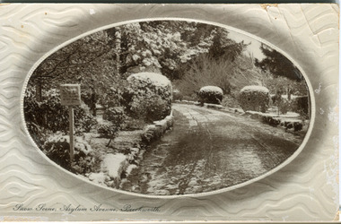
Postcard, R & B Hall, c.1930
This postcard was published by R. & B. Hall in Beechworth and printed in Saxony, circa 1930. Saxony is a landlocked state of Germany which borders the states of Brandenburg, Saxony-Anhalt, Thuringia, Bavaria and the countries of Poland and the Czech Republic. This particular postcard is embossed with a pattern which surrounds the middle image in the center of the card. This image depicts Asylum Avenue which leads to the Mayday Hills Asylum in Beechworth, Victoria. What makes this scene particularly interesting is the appearance of snow which is rare in Beechworth. The road depicted on the postcard has track marks made by a car with thin wheels. Beechworth's Mayday Hills was chosen as the site of Victoria's newest asylum, at the time, due to the landscape and altitude. The hilltop atmosphere and the native fauna, it was argued, would assist in the cure of the patients kept at the hospital (Wood 1985, 122). The positioning of the hospital had a beneficial effect on the rural town. A pamphlet published by James Ingram and Son (1849) reveal that famous landmarks in Beechworth which included the Post Office, Gaol, Courthouse and Asylum "demonstrate the appreciation of Beechworth by the Government not only as as important district center, but also as a site unrivaled as a sanitarium". There were other locations in contention at the time, but ultimately Beechworth was chosen (Craig 2000, 33). Prior to the creation of the Asylum in Beechworth, those charged with having mental illnesses or, as it was termed, "insanity" were unable to be properly cared for in the Gaol (which is where they were often sent). John Buckley Castieau wrote, in 1861 for the Ovens and Murray Advertiser, that the Gaol was unable to properly care for those classified then as "insane" but that they would endeavor to treat them above the other inmates (which he notes is not always the case in other establishments). Castieau wrote this in favour of supporting the building of the Mayday Hills Hospital in Beechworth. It was stated that at the time the Mayday Hills Hospital was built, there were 83 prisoners kept in the Gaol who were to be rehoused to the Hospital on the grounds of "insanity". The classification as someone as "insane", in this period of time is a reflection on the inability to cure and understand illnesses of the mind during the mid to late 1800s. Beechworth's Mayday Hills was chosen as the site of Victoria's newest asylum, at the time, due to the landscape and altitude. Opening on the 24th of October 1867, the Mayday Hills Hospital was originally named the "Ovens Lunatic Asylum", a title which is very much a product of its time. Whilst controversial, changes to the name is part of the history of the Hospital and can provide much insight into the understanding of mental illness throughout history and the use/disuse of this term provides information into the reception/changing opinions of mental illness in society. The Hospital would later become known as the "Mayday Hills Asylum" and/or "Mayday Hills Hospital" with the latter being the most commonly used title. An article in the Ovens and Murray Advertiser notes that on the 7th of March 1865, the foundation stone of the Hospital was laid (it would officially open in 1867) and that it was such a moment of accomplishment and joy for Beechworth that a letter to the editor even suggested that there should be a holiday dedicated to the day the foundation stone as laid. This reveals an extent to which the townspeople of early Beechworth valued the construction of the Hospital in their town. It provided the town with a sense of prestige and honour.At first glance, the remains of the Mayday Hills Hospital in Beechworth, Victoria, inspire tragedy, trauma and beauty. The buildings themselves, with their Italianate style Renaissance architecture designed by J.J. Clark (Craig 2000, 49 & Smith 2016, 203) reflect a bygone period of European and Australian history. The gardens provide a sense of tranquility and beauty. The experience of those within these walls remains a valuable area of study to provide a more complete understanding. This particular hospital is considered the fourth of its like and one of three identified as the largest of their kind. The Mayday Hills Hospital is a sister to the Kew and Ararat Asylums in Melbourne which are both located in relative proximity. Understanding the role of the Mayday Hills Hospital in Beechworth history is integral to understanding the development of the goldfields town, but also for providing important information as to the history of caring for, and the reception of, mental illnesses in Australian and wider European history. Mayday Hills provides a case study which can be researched through oral history, an analysis of the grounds/buildings and through images like this postcard which portray the structure in a highly deliberate manner. Images like this depict the strong façade of the Hospital and provide a glimpse into the tranquility of the gardens. This has been done deliberately to provide a sense of comfort and healing about the building to those looking from the outside. Further research into the importance of the Hospital in Beechworth and it's connection to the town will be supported through images like these kept in the Mayday Hills photo album in the collection of the Burke Museum.Pale coloured rectangular postcard printed on matte embossed card.Obverse: Snow Scene; Asylum Avenue, Beechworth. / Reverse: POST CARD / ADDRESS ONLY / Published by R. & B. Hall, Beechworth. / Printed in Saxony. / 3447 [crossed out] / 1997.2492 / AFFIX STAMP /asylum, asylum avenue, beechworth, snow north-east vic, victoria, snow scene, mayday hills, mayday hills hospital, mental hospital, colonial attitudes, mental health, history, town development, postcard -
 The Beechworth Burke Museum
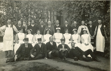
Photograph
Photographed in the early 1900s, this black and white photograph depicts 25 members of the Mayday Hills Hospital Staff. Six men sit in front of the group (Mr Imhose stands fourth from the left in front row), upon the ground and behind them, in bright white clothing, sit eight female nurses upon a long bench (one of these nurses is identified on the rear as Miss A.J. Ross). Behind these women stand 10 men. The men are all wearing dark clothing and several have 'Kepi' style hats. The staff photograph was captured by Frazer and Vallance Photographers Melbourne. This image was originally combined with 1997.2491 but these images have since been torn apart and catalogued separately. Beechworth's Mayday Hills was chosen as the site of Victoria's newest asylum, at the time, due to the landscape and altitude. The hilltop atmosphere and the native fauna, it was argued, would assist in the cure of the patients kept at the hospital (Wood 1985, 122). The positioning of the hospital had a beneficial effect on the rural town. A pamphlet published by James Ingram and Son (1849) reveal that famous landmarks in Beechworth which included the Post Office, Gaol, Courthouse and Asylum "demonstrate the appreciation of Beechworth by the Government not only as as important district center, but also as a site unrivaled as a sanitarium". There were other locations in contention at the time, but ultimately Beechworth was chosen (Craig 2000, 33). Prior to the creation of the Asylum in Beechworth, those charged with having mental illnesses or, as it was termed, "insanity" were unable to be properly cared for in the Gaol (which is where they were often sent). John Buckley Castieau wrote, in 1861 for the Ovens and Murray Advertiser, that the Gaol was unable to properly care for those classified then as "insane" but that they would endeavor to treat them above the other inmates (which he notes is not always the case in other establishments). Castieau wrote this in favour of supporting the building of the Mayday Hills Hospital in Beechworth. It was stated that at the time the Mayday Hills Hospital was built, there were 83 prisoners kept in the Gaol who were to be rehoused to the Hospital on the grounds of "insanity". The classification as someone as "insane", in this period of time is a reflection on the inability to cure and understand illnesses of the mind during the mid to late 1800s. Opening on the 24th of October 1867, the Mayday Hills Hospital was originally named the "Ovens Lunatic Asylum", a title which is very much a product of its time. Whilst controversial, changes to the name is part of the history of the Hospital and can provide much insight into the understanding of mental illness throughout history and the use/disuse of this term provides information into the reception/changing opinions of mental illness in society. The Hospital would later become known as the "Mayday Hills Asylum" and/or "Mayday Hills Hospital" with the latter being the most commonly used title. An article in the Ovens and Murray Advertiser notes that on the 7th of March 1865, the foundation stone of the Hospital was laid (it would officially open in 1867) and that it was such a moment of accomplishment and joy for Beechworth that a letter to the editor even suggested that there should be a holiday dedicated to the day the foundation stone as laid. This reveals an extent to which the townspeople of early Beechworth valued the construction of the Hospital in their town. It provided the town with a sense of prestige and honour.At first glance, the remains of the Mayday Hills Hospital in Beechworth, Victoria, inspire tragedy, trauma and beauty. The buildings themselves, with their Italianate style Renaissance architecture designed by J.J. Clark (Craig 2000, 49 & Smith 2016, 203) reflect a bygone period of European and Australian history. The gardens provide a sense of tranquility and beauty. The experience of those within these walls remains a valuable area of study to provide a more complete understanding. This particular hospital is considered the fourth of its like and one of three identified as the largest of their kind. The Mayday Hills Hospital is a sister to the Kew and Ararat Asylums in Melbourne which are both located in relative proximity. Understanding the role of the Mayday Hills Hospital in Beechworth history is integral to understanding the development of the goldfields town, but also for providing important information as to the history of caring for, and the reception of, mental illnesses in Australian and wider European history. Mayday Hills provides a case study which can be researched through oral history, an analysis of the grounds/buildings and through images like this postcard which portray the structure in a highly deliberate manner. Images like this depict the strong façade of the Hospital and provide a glimpse into the tranquility of the gardens. This has been done deliberately to provide a sense of comfort and healing about the building to those looking from the outside. Further research into the importance of the Hospital in Beechworth and it's connection to the town will be supported through images like these kept in the Mayday Hills photo album in the collection of the Burke Museum.Black and white rectangular photograph printed on photographic paper mounted on cardHandwriting reads: "Mental Hospital / Beechworth / Miss A. J. Ross / about 82 in 1944".mental asylum, beechworth, mayday hills, mayday hills hospital, victoria, mental health, history of mental illness, treatment of metal illness, asylum, hospital for mentally unwell, miss a.j. ross, nurse, staff, doctors -
 The Beechworth Burke Museum
Photograph
Photographed in the early 1900s, this black and white photograph depicts 25 members of the Mayday Hills Hospital Staff. Five men sit in front of the group, upon the ground and behind them, in bright white clothing, sit eight female nurses upon a long bench (one of these nurses is identified on the rear as Miss A.J. Ross). Behind these women stand 12 men. The men are all wearing dark clothing and several have 'Kepi' style hats. The staff photograph was captured by Frazer and Vallance Photographers Melbourne. This image was originally combined with 1997.2490 but these images have since been torn apart and catalogued separately. Beechworth's Mayday Hills was chosen as the site of Victoria's newest asylum, at the time, due to the landscape and altitude. The hilltop atmosphere and the native fauna, it was argued, would assist in the cure of the patients kept at the hospital (Wood 1985, 122). The positioning of the hospital had a beneficial effect on the rural town. A pamphlet published by James Ingram and Son (1849) reveal that famous landmarks in Beechworth which included the Post Office, Gaol, Courthouse and Asylum "demonstrate the appreciation of Beechworth by the Government not only as as important district center, but also as a site unrivaled as a sanitarium". There were other locations in contention at the time, but ultimately Beechworth was chosen (Craig 2000, 33). Prior to the creation of the Asylum in Beechworth, those charged with having mental illnesses or, as it was termed, "insanity" were unable to be properly cared for in the Gaol (which is where they were often sent). John Buckley Castieau wrote, in 1861 for the Ovens and Murray Advertiser, that the Gaol was unable to properly care for those classified then as "insane" but that they would endeavor to treat them above the other inmates (which he notes is not always the case in other establishments). Castieau wrote this in favour of supporting the building of the Mayday Hills Hospital in Beechworth. It was stated that at the time the Mayday Hills Hospital was built, there were 83 prisoners kept in the Gaol who were to be rehoused to the Hospital on the grounds of "insanity". The classification as someone as "insane", in this period of time is a reflection on the inability to cure and understand illnesses of the mind during the mid to late 1800s. Opening on the 24th of October 1867, the Mayday Hills Hospital was originally named the "Ovens Lunatic Asylum", a title which is very much a product of its time. Whilst controversial, changes to the name is part of the history of the Hospital and can provide much insight into the understanding of mental illness throughout history and the use/disuse of this term provides information into the reception/changing opinions of mental illness in society. The Hospital would later become known as the "Mayday Hills Asylum" and/or "Mayday Hills Hospital" with the latter being the most commonly used title. An article in the Ovens and Murray Advertiser notes that on the 7th of March 1865, the foundation stone of the Hospital was laid (it would officially open in 1867) and that it was such a moment of accomplishment and joy for Beechworth that a letter to the editor even suggested that there should be a holiday dedicated to the day the foundation stone as laid. This reveals an extent to which the townspeople of early Beechworth valued the construction of the Hospital in their town. It provided the town with a sense of prestige and honour.At first glance, the remains of the Mayday Hills Hospital in Beechworth, Victoria, inspire tragedy, trauma and beauty. The buildings themselves, with their Italianate style Renaissance architecture designed by J.J. Clark (Craig 2000, 49 & Smith 2016, 203) reflect a bygone period of European and Australian history. The gardens provide a sense of tranquility and beauty. The experience of those within these walls remains a valuable area of study to provide a more complete understanding. This particular hospital is considered the fourth of its like and one of three identified as the largest of their kind. The Mayday Hills Hospital is a sister to the Kew and Ararat Asylums in Melbourne which are both located in relative proximity. Understanding the role of the Mayday Hills Hospital in Beechworth history is integral to understanding the development of the goldfields town, but also for providing important information as to the history of caring for, and the reception of, mental illnesses in Australian and wider European history. Mayday Hills provides a case study which can be researched through oral history, an analysis of the grounds/buildings and through images like this postcard which portray the structure in a highly deliberate manner. Images like this depict the strong façade of the Hospital and provide a glimpse into the tranquility of the gardens. This has been done deliberately to provide a sense of comfort and healing about the building to those looking from the outside. Further research into the importance of the Hospital in Beechworth and it's connection to the town will be supported through images like these kept in the Mayday Hills photo album in the collection of the Burke Museum.Black and white rectangular photograph printed on photographic paper mounted on cardFrazer & Vallance Photographers Melbournemental asylum, beechworth -
 Flagstaff Hill Maritime Museum and Village
Glass
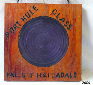
Falls of Halladale The Falls of Halladale was a four-masted sailing ship built-in 1886 in Glasgow, Scotland, for the long-distance cargo trade and was mostly used for Pacific grain trade. She had a sturdy construction built to carry maximum cargo and able to maintain full sail in heavy gales, one of the last of the ‘windjammers’ that sailed the Trade Route. She was one of the first vessels to include fore and aft lifting bridges, which kept the crew safe and dry in as they moved around the decks in stormy conditions. She was owned by Wright, Breakenridge & Co of Glasgow and was one of several Falls Line ships, all of which were named after waterfalls in Scotland. On 4th August 1908, with new sails, 29 crew, and 2800 tons of cargo, the Falls of Halladale left New York, bound for Melbourne and Sydney via the Cape of Good Hope. The cargo on board was valued at £35,000 and included 56,763 tiles of American slate roofing tiles, 5,673 coils of barbed wire, 600 stoves, 500 sewing machines, 6,500 gallons of oil, 14,400 gallons of benzene, plumbing iron, 117 cases of crockery and glassware and many other manufactured items. The Falls of Halladale had been at sail for 102 days when, at 3 am on the of 14th November 1908, under full sail in calm seas with a six knots breeze behind and misleading fog along the coast, the great vessel rose upon an ocean swell and settled on top of a submerged reef near Peterborough on south-west Victoria’s coast. The ship was jammed on the rocks and began filling with water. The crew launched the two lifeboats and all 29 crew landed safely on the beach over 4 miles away at the Bay of Islands. The postmistress at Peterborough, who kept a watch for vessels in distress, saw the stranding and sent out an alert to the local people. A rescue party went to the aid of the sailors and the Port Campbell rocket crew was dispatched, but the crew had all managed to reach shore safely by the time help arrived. The ship stayed in full sail on the rocky shelf for nearly two months, attracting hundreds of sightseers who watched her slowly disintegrate until the pounding seas and dynamiting by salvagers finally broke her back, and her remains disappeared back into deeper water. The valuable cargo was largely lost, despite two salvage attempts in 1908-09 and 1910. Further salvage operations were made from 1974-1986, during which time 22,000 slate tiles were recovered with the help of 14 oil drums to float them, plus personal artefacts, ship fittings, reams of paper and other items (a list of items held at Flagstaff Hill Maritime Village is included below). The Court of Marine Inquiry in Melbourne ruled that the foundering of the ship was entirely due to Captain David Wood Thomson’s navigational error, not too technical failure of the Clyde-built ship. The shipwreck is a popular site for divers, about 300m offshore and in 3 – 15m of water. Some of the original cargo can be seen at the site, including pieces of roof slate and coils of barbed wire. The Falls of Halladale shipwreck is listed on the Victorian Heritage Register (No. S255). She was one of the last ships to sail the Trade Routes. She is one of the first vessels to have fore and aft lifting bridges. She is an example of the remains of an International Cargo Ship and also represents aspects of Victoria’s shipping industry. The wreck is protected as a Historic Shipwreck under the Commonwealth Historic Shipwrecks Act (1976).Porthole glass secured in wood, with a crack in the glass. Writing on wood "porthole Glass Falls of Halladale."Burnt into the wood are the words "porthole Glass Falls of Halladale."falls of halladale, wright, breakenridge & co of glasgow, californian blue roof slate, warrnambool, shipwrecked-coast, flagstaff-hill, flagstaff-hill-maritime-museum, maritime-museum, shipwreck-coast, flagstaff-hill-maritime-village, shipwrecked-artefact, porthole glass -
 Eltham District Historical Society Inc
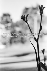
Photograph (Item) - Print, Samantha Robertson, Untitled (Silhouette of a Kangaroo Paw), 1988
Kangaroo Paw is a soft-wooded perennial which forms clumps of shiny green, long strap-like foliage which can grow to 600mm in length. The flowers are tubular and encased in a furry covering. Samantha Robertson 1988 Entrant No. 1 Ref: Series 34 Items 1, 2, 42-45 SHIRE OF ELTHAM COMMUNITY PHOTOGRAPHIC SURVEY Photography is an artform which many of us practice, sometimes purely for artistic pursuit, sometimes to record the people and events in our lives. In 1988, as part of a local Bicentennial project, the Shire of Eltham conducted the Eltham Community Photographic Survey. Up to 100 entries were to be selected by a panel of photographers for entry into the Eltham Photographic Survey Exhibition. Entries had to be submitted by May 13, 1988. Entrants whose images were selected for the exhibition were contacted and requested to further submit an entry form providing entrant’s name, area of residence, age, and proposed captions. These details were then used to produce labels for the exhibition mounts. Where negatives had not been supplied, these were requested to support the display of printed enlargements mounted on 10” x 8” cardboard. The mounted prints were made available post exhibition for sale at $8.50 each for colour prints and $7.00 for B&W prints. Residents in the Shire were invited to collect a free roll of film and take a photograph of what they either liked or did not like about the area. A total of 160 entrants submitted multiple entries for the exhibition. Of those selected for exhibition, entrants ranged in age from 9 to 70 years. All custom colour and black and white printing for the exhibition was completed by Wattle Studios of Eltham. The Eltham Photographic Survey was jointly auspiced by the Shire of Eltham and Wattle Studios, of 953 Main Road, Eltham. The project was greatly assisted by: • David McRitchie, Media Studies Lecturer Victoria College, Rusden Campus. • Ian and Annette Toohill of Wattle Studios • Tracy Naughton, Eltham Community Arts Officer • Neville Emerson Pty. Ltd. • Superior Press, Eltham • Kodak Australasia Pty. Ltd. • Agfa Gevaert Ltd. • Townsend Colourtech Pty. Ltd. • The Australian Bicentennial Authority • Eleanor Bowers, Secretary, Eltham Arts Council The exhibition was placed on display in the Woolworths Arcade, Eltham between Monday June 6th and Saturday June 11, 1988. It was also intended to hold the exhibition at a venue in the Shire’s North Riding from Monday, June 20 to Friday June 24. It was then displayed at the Were Street Theatre, Montmorency from Friday, June 24 to Thursday, July 7. Series 34: Eltham Community Photographic Survey 1988 - Prints & Documentation Series consists of 117 photographs of Shire scenes taken by members of the community. Items I - 41 are larger photographs mounted on card, which were exhibited. Items 42 - 117 are unmounted copies, alternative takes and other entries. Corresponding negatives contained in Series 35: Eltham Community Photographic Survey 1988 – Negatives which consists of 267 colour and B&W negatives and one colour slide of Shire scenes taken by members of the community. The negatives are arranged by the entrant number of the photographer. The Eltham Community Photographic Survey collection is significant to the local community as it was curated by the local community - ordinary people of all ages - representing what they liked and did not like in the area where they lived. It represents an unfiltered representation of the Shire of Eltham as it was in 1988. It also represents one of many projects as part of the national programme of events and celebrations to commemorate the bicentenary. It is a time capsule of life in the 1980s of this urban and rural municipality in Melbourne's north. Front: Entrant No. and name on printed label Rear: Entrant No., name and address on printed label; also 'Series 34' and the 'Item No.' in pencilshire of eltham archives, bicentennial project, eltham, eltham community photographic survey, eltham photographic survey exhibition, samantha robertson, series 34, series 35, film - ilford xp1 400, kangaroo paw, scan - 35mm negative -
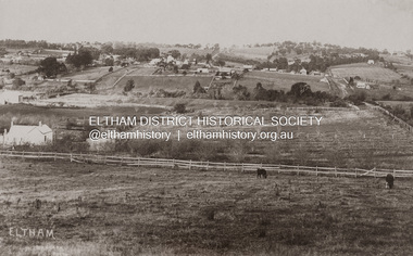 Eltham District Historical Society Inc
Photograph - Photograph postcard, J.H. Clark, Eltham (from Bolton Street), c.1915
Original sepia photo postcard of early view of Eltham looking east from Bolton Street between Bridge Street and Brougham Street (Wellington). Fenced road reserve on right is Brougham Street. Originally dated as pre-1877 introduction of the Telegraph (the Telegraph was connected to the Post Office on Thursday, June 7, 1877) given the lack of poles and wires visible, a more recent higher resolution scan has revealed more detail highlighting the presence of several Telegraph poles: one about half way between Brougham Street and Dalton Street, one opposite the Police Residence, another opposite W.B Andrew’s Corn Store (Zen Den site), one possibly near the Fountain/Evelyn Hotel. Also, given the photo was originally marked “J. H. Clark Photo” it is safer to assume the image is dated circa 1915 until dates of further image details can be confirmed. Photographer: J.H. Clark John Henry Clark was the youngest of three boys born to William Henry Clark (1823-1877) and Maria White (1843-1914). He and his brothers, William Charles Clark (1872-1945), Clement Kent Clark (1874-1912) operated a photography business (Clark Bros.) from 25 Thomas Street, Windsor near Prahran during the period c.1894 to 1914. Following death of Clement in September 1912 and their mother in 1914, the Clark Bros business appears to have dissolved, the premises demolished, and a new house was under construction in 1915. John set up business independently in 1914 operating out of 29 Moor Street, Fitzroy where he is registered in the 1914 and 1915 Electoral Rolls. By 1916 John had relocated to Eltham where he continued his practice as a photographer and took many of the early images around the district of Little Eltham. Around 1930 John changed professions and opened a small cobbler's shop in 1931 near the pond opposite Dalton Street adjacent to the Jarrold family cottage. He never married and continued his profession as a bootmaker from this little shop, maintaining a close relationship with Mrs Jarrold for the rest of their lives. His bootmaker shop remains today beside the Whitecloud cottage and is one of only three remaining shops in the area from the early 20th century. There are a couple of images of Eltham taken by Clark Bros. in the Eltham District Historical Society collection, one such example being Hunniford’s Post Office with Miss Anne Hunniford out front (EDHS_00140 - marked on the back of the print, Clark Bros., 25 Thomas St. Windsor), which would date this image between c.1894 and 1914. Other early images of Eltham taken by John Henry Clark are marked on the face “J. H. Clark Photo” and it is assumed these are dated between 1914 and 1930. It is noted that the Grant of Probate for John H Clark of Eltham South dated 5 April 1957 (513/387) records his occupation as "X Photographer".1. Original sepia postcard - water damaged lower left corner over approximate 30mm diameter destroying image and photohgrapher's markings (same as EDHS_00533 and EDHS_00535 - all from same donor collection) 2. A second black and white print copy of the same image from a different unknown source (of lower resolution quality) is also held. 3. A digital enhanced version has been created using the lower quality black and white print as a donor source for the damaged section of the postcard.In pencil on back of postcard: A. Petrie Verandah on Andrews shop Pearsons house (Living and Learning Centre)bolton street, brougham street, cafe zen den, courthouse, eltham courthouse, eltham hotel, eltham living and learning centre, eltham living and learning, eltham, fountain hotel, j.h. clark photo, knapmans forge, main road, maria street, pitt street, police residence, police station, post office, st margaret’s church, w.b. andrew corn store, wellington street, early eltham, little eltham -
 Eltham District Historical Society Inc
Folder, Mr Grimshaw, Miner, Kinglake and Caledonian Diggings
We have three folders catalogued for the Grimshaw name and these will in due course be consolidated/corrected: 1. EDHS_01361 – A.H. Grimshaw of Research, Vic., 1927 2. EDHS_01362 – John Grimshaw of Greensborough, 1862 (Correct name is Josiah Grimshaw) 3. EDHS_01375 – Mr Grimshaw, miner of Kinglake and Caledonian Diggings. (This is believed to be Mr J.L. (Jack) Grimshaw who reportedly discovered the first gold in Kinglake. These folders are made up of copies of pages of research undertaken by Mr Keith Chappel in the 1970s, which is now catalogued as a separate item. EDHS_04448 - Eltham District History, Eltham Road Board, 1856-1871; Research by Keith Chappel https://victoriancollections.net.au/items/5e4a290521ea671e9ccf9661 There is further information from this research concerning a William Grimshaw. Also included as part of EDHS_01375 is a photocopy of page44 from the book "Caledonia Diggings (St Andrews)", Gold Discovery in Victoria, James Flett, 1970, which references No. 2 Creek at the Caledonian Diggings as also been known as Grimshaws. We have a photo of J.L.(Jack) Grimshaw who discovered gold at Kinglake, which is part of the Shire of Eltham Pioneers Photograph Collection (SEPP) SEPP_0056 - Mr. J.L. Grimshaw; the man who found the first gold at Kinglake https://victoriancollections.net.au/items/5a6c158721ea6906ac29bd3c We also have another record of interest involving Aaron Grimshaw, Farmer of Greensborough who was an indentured Trustee of the Wesleyan Chapel in Little Eltham in 1856: EDHS_04610-3-1 - Document, Conveyance of Lot 20 Henry Street, Little Eltham North to Trustees of Wesleyan Chapel, 1856 https://victoriancollections.net.au/items/60f6d644ac5d4de270b83615 The record of Joshia Grimshaw of Greensborough is grim. He was arrested and charged with the murder of John Mitchell at Greensborough, September 24, 1962. Grimshaw was ultimately convicted of manslaughter and sentenced for three years in prison. Newspaper reports of the day show his name as Josiah. Whether he was also known as John is not clear, and whether he is the same as J.L. (Jack) Grimshaw who discovered gold at Kinglake, again is unclear without undertaking further research into the matter. This murder trial was extensively reported in the newspapers and you can find those reports on the National Library of Australia’s Trove https://trove.nla.gov.au/ Some of the reports of interest: TRIAL OF GRIMSHAW FOR MURDER (1862, October 23). The Kyneton Observer (Vic. : 1856 - 1900), p. 3. Retrieved April 21, 2023, from http://nla.gov.au/nla.news-article240899299 THE GREENSBOROUGH MURDER. (1862, September 30). The Argus (Melbourne, Vic. : 1848 - 1957), p. 6. Retrieved April 21, 2023, from http://nla.gov.au/nla.news-article5722929 MELBOURNE CRIMINAL SESSIONS. (1862, October 18). The Age (Melbourne, Vic. : 1854 - 1954), p. 6. Retrieved April 21, 2023, from http://nla.gov.au/nla.news-article154967162 CRIMINAL SESSIONS. I (1862, October 18). The Argus (Melbourne, Vic. : 1848 - 1957), p. 6. Retrieved April 21, 2023, from http://nla.gov.au/nla.news-article6480408 Folder of information on Mr Grimshaw, Miner, Kinglake and Caledonian Diggingsgrimshaw -
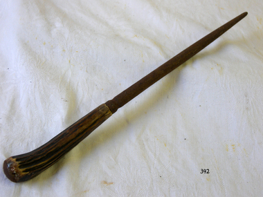 Flagstaff Hill Maritime Museum and Village
Domestic object - Sharpening Steel
A honing steel, sometimes referred to as a sharpening steel, whet steel, sharpening stick, sharpening rod, butcher's steel, and chef's steel, is a rod of steel, ceramic or diamond-coated steel used to restore keenness to dulled blade edges. They are flat, oval, or round in cross-section and up to 30 centimetres (1 ft) long. The steel and ceramic honing steels may have longitudinal ridges, whereas the diamond-coated steels are smooth but embedded with abrasive diamond particles. Non-abrasive honing rods such as smooth ceramic or ribbed steel are able to remove small amounts of metal via adhesive wear. In normal use, the rod is applied to the blade at a slightly higher angle than that of the bevel, resulting in the formation of a micro-bevel. The term "hone" is associated with light maintenance performed on a blade without the effort and precision normally associated with sharpening, so the name "hone" was borrowed. In the 1980s, ceramic abrasives became increasingly popular and proved an equal, if not superior, method for accomplishing the same daily maintenance tasks; manufacturers replaced steels with ceramic (and later, manufactured diamond abrasive) sharpening "steels" that were actually hones. Use Honing steels are used by lightly placing the near edge of the blade against the base of the steel, then sliding the blade away from yourself along the steel while moving it down – the blade moves diagonally, while the steel remains stationary. This should be done with the blade held at an angle to the steel, usually about 20°, and repeating on the opposite side at the same angle. This is repeated five to ten times per side. Steeling It is often recommended that steeling be performed immediately before or after using a knife and can be done daily. By contrast, knives are generally sharpened much less frequently. A traditional smooth honing steel is of no use if the edge is blunt, because it removes no material; instead it fixes deformations along the edge of a sharp blade, technically known as burnishing. There has long been speculation about the efficacy of steeling (re-aligning the edge) vs honing (removing minor deformation with abrasives); studies tend to favour abrasives for daily maintenance, especially in high-carbide-volume "stainless" steels (such as the popular CPM S30V steel, which tends to "tear out" when steeled rather than re-forming an edge.) Small honing steel for outdoor activities Usage trends Steels have traditionally been used in the West, especially in heavy-use scenarios (e.g. butchering, where the edge deforms due to forceful contact with bone). These scenarios also lead Western trends toward blades tempered to a lower level of hardness (and thus lower brittleness). In East Asia, notably Japan, harder knives are preferred, so there is little need for steeling intra-day, as the edge does not deform as much. Instead, the blade is honed as needed on a waterstone. While tradition has kept the practice of steeling alive in Western kitchens, the majority of honing steels sold are abrasive rather than smooth, and knives are harder and more frequently made of stainless steel, which does not respond to traditional steeling techniques as well as high-carbon/low alloy tool steels.The sharpening steel is essential to maintain the sharpness of carving and other knives.Steel knife sharpener with bone handle. Part of a carving set.None.flagstaff hill, warrnambool, shipwrecked-coast, flagstaff-hill, flagstaff-hill-maritime-museum, maritime-museum, shipwreck-coast, flagstaff-hill-maritime-village, sharpening steel, carving set, kitchen equipment -
 Flagstaff Hill Maritime Museum and Village
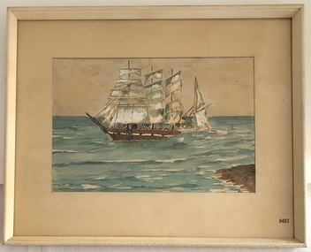
Painting - Watercolour painting, Early 20th century
FALLS of HALLADALE - History The Falls of Halladale was a four-masted sailing ship built-in 1886 in Glasgow, Scotland, for the long-distance cargo trade and was mostly used for Pacific grain trade. She had a sturdy construction, built to carry maximum cargo and maintain full sail in heavy gales. She was one of the last of the ‘windjammers’ that sailed the Trade Route and one of the first vessels to include fore and aft lifting bridges, which kept the crew safe and dry in as they moved around the decks in stormy conditions. She was owned by Wright, Breakenridge & Co of Glasgow and was one of several Falls Line ships, all of which were named after waterfalls in Scotland. On 4th August 1908, with new sails, 29 crew, and 2800 tons of cargo, the Falls of Halladale left New York, bound for Melbourne and Sydney via the Cape of Good Hope. The cargo on board was valued at £35,000 and included 56,763 tiles of American slate roofing tiles, 5,673 coils of barbed wire, 600 stoves, 500 sewing machines, 6,500 gallons of oil, 14,400 gallons of benzene, plumbing iron, 117 cases of crockery and glassware and many other manufactured items. The Falls of Halladale had been at sail for 102 days when, at 3 am on the of 14th November 1908, under full sail in calm seas with a six knots breeze behind and misleading fog along the coast, the great vessel rose upon an ocean swell and settled on top of a submerged reef near Peterborough on south-west Victoria’s coast. The ship was jammed on the rocks and began filling with water. The crew launched the two lifeboats and all 29 crew landed safely on the beach over 4 miles away at the Bay of Islands. The postmistress at Peterborough, who kept a watch for vessels in distress, saw the stranding and sent out an alert to the local people. A rescue party went to the aid of the sailors and the Port Campbell rocket crew was dispatched, but the crew had all managed to reach shore safely by the time help arrived. The ship stayed in full sail on the rocky shelf for nearly two months, attracting hundreds of sightseers who watched her slowly disintegrate until the pounding seas and dynamiting by salvagers finally broke her back, and her remains disappeared back into deeper water. The valuable cargo was largely lost, despite two salvage attempts in 1908-09 and 1910. Further salvage operations were made from 1974-1986, during which time 22,000 slate tiles were recovered with the help of 14 oil drums to float them, plus personal artefacts, ship fittings, reams of paper and other items (a list of items held at Flagstaff Hill Maritime Village is included below). The Court of Marine Inquiry in Melbourne ruled that the foundering of the ship was entirely due to Captain David Wood Thomson’s navigational error, not to technical failure of the Clyde-built ship. The shipwreck is a popular site for divers, about 300m offshore and in 3 – 15m of water. Some of the original cargo can be seen at the site, including pieces of roof slate and coils of barbed wire.The Falls of Halladale shipwreck is listed on the Victorian Heritage Register (No. S255). She was one of the last ships to sail the Trade Routes. She is one of the first vessels to have fore and aft lifting bridges. She is an example of the remains of an International Cargo Ship and also represents aspects of Victoria’s shipping industry. The wreck is protected as a Historic Shipwreck under the Commonwealth Historic Shipwrecks Act (1976).Watercolour painting behind glass, framed in the Art Deco style - stippled cream painted wood. There are some age marks under the glass. The painting depicts the Falls of Halladale with its stern under water. The back of the painting contains facts about the shipwreck handwritten in a similar style to the artist’s signature. The artist’s signature is not clear enough to identify. Inscription on the back: Pasted on typed text: Peterborough Handwriting: Falls of Halladale 2085 tons 4 masted iron barque wrecked Saturday November 14th 1908 Captain Thomson crew of 28 !st mate F Pearson 2nd mate T Griffinflagstaff hill, warrnambool, flagstaff hill maritime museum & village, maritime museum, maritime village, shipwreck coast, 1908 shipwreck, falls of halladale, peterborough, peterborough shipwreck, great ocean road, captain thomson, 1880s sailing ship, cargo vessel, 1st mate f pearson, 2nd mate t griffin, watercolour painting -
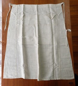 Flagstaff Hill Maritime Museum and Village
Clothing - Traveller's Apron, Eliza Towns, Circa 1915
This apron is one of several linen and clothing items that were made and belonged to Mrs. Eliza Towns and donated to Flagstaff Hill Maritime Museum and Village. Eliza was born Eliza Gould in 1857 in South Melbourne (Emerald Hill) and in 1879 married Charles Towns. In the early 1880's they moved to Nhill in western Victoria and remained there for the rest of their married life. Charles was a jeweller and later became an accountant and for many years was involved with the Shire Council, the local show committee (A & P Society), the Hospital Committee and the Board of the local newspaper (the Nhill Free Press). They had three children and lived a life that would be regarded as comfortably "middle class". Eliza probably had a treadle sewing machine and would have made many of her own clothes - adding her own handmade embroidered or crocheted decorative trim. In March 1915 Eliza travelled to San Francisco to visit her son, James. She went by train to Melbourne ("a pleasant journey on the up express') and the next day caught the express train to Sydney. She noted in her letters home that a " number of young men were going to Sydney to enlist but they had to stop in the corridors most of the way as there was no room for them to sit down". She spent the night on the train and arrived in Sydney the next morning and on the following day she boarded the R.M.S. "Moana" (a steamer which took about twenty-four days to reach San Francisco). She returned from Vancouver about five months later on board the "Manuka". It is very likely Eliza took this "Travelling Apron" with her on her travels. Eliza was travelling by herself and had no one to help her with her dress or her hair. "Travelling Aprons" (also known as Toilet Aprons or Tourist Aprons) were designed with different sized pockets for holding a lady's toiletries - hairbrush, hair pins, comb and sometimes even soap and a powder puff. This allowed the owner, when travelling and getting dressed in small places such as an overnight train compartment or a ship's cabin, to have all her requirements at hand without needing to search for them or have them roll onto the floor. Some of the pockets are finished with buttoned flaps to keep the items in place and when not in use, the apron could be hung up or rolled up and put away. Articles about the "Traveller's Apron" appeared in numerous Women's columns in Australian newspapers in the early 20th century - often with instructions and sometimes a pattern. In the "Age" on Sat 5th October 1907 in a column titled "Feminine Facts and Fancies" the author wrote "No man can appreciate the difficulties of dressing in a "wobbly" train or trying to do one's hair while a ship is weathering a storm". A year earlier (Saturday 24th March 1906) in the same column, the author wrote "... you have to spend nights in a train... forever struggling to dress yourself in a wretched little lavatory. You know how your hairpins and combs jump all over the place ... a train is always at its liveliest when you're trying to do your hair. My travelling apron saved me many a rage."This item is an example of the needlework skills of women in the early 20th century - combining machine stitching with hand embroidery to personalise and embellish a practical domestic object. It is also an excellent (and rare) example of an early 20th century innovation that helped solve the difficulties of privacy and convenience that many women experienced at a time when travel was becoming more accessible to them. A half apron, made of ivory linen with two waist ties and seven pockets. Along the top are two smaller pockets with triangular, buttoned flaps labelled "Hairpins" and "Nailbrush" and one larger unlabelled pocket. Underneath are two larger pockets labelled "Brush & Comb" and "Work" and two unlabelled narrow pockets. The seams are machine stitched and the pockets are outlined with hand embroidered feather stitch. The labels on the pockets are embroidered in stem stitch."Hairpins" / "Nailbrush" / "Brush and Comb" / "Work"flagstaff hill maritime museum and village, nhill, eliza towns, apron, travelling apron, tourist apron, textiles, toilet apron, sewing, embroidery, travel, warrnambool, great ocean road, trains, ships, moana, manuka, feather stitch, stem stitch, fashion, handmade, clothing, charles towns, needlework -
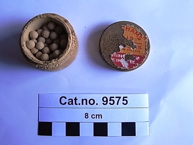 Coal Creek Community Park & Museum
Box, pill, 1930-1940 ref: Museum of Applied Arts and Sciences
As per another example in better condition displayed on shelf above Drawers 1+2 in Chemist ' Beechams Pills as sold by the proprietors St.Helens, Lancashire England. Beechams Pills Ltd. Melbourne VIC'. Earliest mention in Victorian Newspapers TROVE : Argus (Melbourne, Vic. : 1848 - 1957), Friday 19 December 1884, page 7 'A WONDERFUL MEDICINE BEECHAMS PILLS Are admitted by thousands to be worth above a guinea a box for bilious and nervous disorders such as wind and pain in tho stomach, sick headache, giddiness, fulness and swelling after meals dizziness and drowsiness, cold chills, flushings of heat, loss of appetite, shortness of breath costiveness, scurvy, blotches on the skin, disturbed sleep, frightful dreams, and all nervous and trembling sensations, &c The first dose will give relief in 20 minutes This is no fiction, for they have done it in thousands of cases. Every sufferer Is earnestly invited to try one box of these pills, and they will be acknowledged to be WORTH A GUINEA A BOX. For females of all ages these pills are invaluable as a few doses of them carry off all humours and bring about all that is required No female should be with-out them There is no medicine to be found to equal Beecham's Pills for removing any obstruction or Irregularity of the system. If taken according to the directions given with each box they will soon restore females of all ages to sound and robust health For a weak stomach, impaired digestion, and all disorders of the liver they act like "Magic, and a few doses will be found to work wonders upon the most important organs of the human machine They strengthen tho whole muscular system, restore the long lost complexion bring back the keen edge of appetite, and arouse into action with the rosebud of health, the whole physical energy of the human frame These are ' facts ' admitted by thousands embracing all classes of society, and one of the best guarantees to the nervous and debilitated Is Beechams Pills have the largest sale of any patent medicine in the world Full directions are given with each box Sold by all druggists and patent medicine dealers throughout the colonies'. Most recent article in Victorian newspapers : TROVE : Wodonga and Towong Sentinel (Vic. : 1885 - 1954), Friday 24 December 1954, page 1. 'MUM KNOWS BEST SHE KEEPS THE FAMILY FIT WITH BEECHAM'S PILLS SAFE because Beecham's Pills contain no harmful habit-forming drugs-they are a purely vegetable laxative. Pills balanced formula gives natural laxative action without harsh purgative effects banishes constipation. MOTHERS know how to keep growing children in their teens fit and happy-with Beecham' s Pill, the family laxative. TAKE Beecham's Pills WORTH A GUINEA A BOX'. Relevant local newspaper article reference : TROVE : Gippsland Times (Vic. : 1861 - 1954), Thursday 29 October 1942, page 1 'ln times like these old friends are best You will not have to go far before finding a friend who can tell you by personal experience how gentle and reliable Beecham's Pills are--and how effectively they banish head aches. digestive upsets and liverish ness. Purely vegetable....1/-....2/...per box Worth a guinea a box' Cylindrical wooden box with the remains of an orange, red and white printed label on top, containing small orb shaped pills.Label on lid : Beecham's pills...............Beecham's Pills Ltd., Melbourne, Vic.laxitive, pills -
 Uniting Church Archives - Synod of Victoria
Photograph, undated c.1980s
Rosalie Rayment originally trained and worked as an Occupational Therapist. Following completion of studies in Theology she worked for 11 years with the Church in Thailand. Rosalie was ordained in 1988. Fred Vanclay B.D., Dip AgS. ordained 1964 in the Presbyterian Church. Served: Queensland 1961 - 1975; Victoria 1976 - 1985 Vermont - Parkmore; Northern Territory Tennant-Barkly Patrol 1985 - 1993. Died in 2016. Adapted from the eulogy given by his son, Jerry Vanclay One of Fred’s first placements as a minister was in Mackay, North Queensland. Mackay was a wonderful place for Fred, his wife Donna and their young family. They all loved the beaches and the bush, and the children completed a significant part of their schooling there. Whilst posted in Mackay, Fred and Donna enjoyed long road trips in their modest HR Holden sedan, with the family, to Uluru, to Broome via the Borroloola Track, and down the Birdsville Track to the Flinders ranges; along the way, developing the bushcraft that would stand them in good stead later in the Tennant-Barkly Patrol. After many years in ministry in Mackay, then in Vermont, Victoria, Fred and Donna were called to the Tennant-Barkly Patrol in the Northern Territory, where he served for eight years, probably Fred’s most satisfying years. All Fred’s parishes were welcoming and rewarding, but Fred said on more than one occasion that he had a special love for the Patrol. He felt that in an urban congregation, he ministered mainly to those who came to Church, but in the Patrol he ministered to everyone, and especially to those in need. Fred loved to get involved with the day-to-day activities of his people, to develop a deeper relationship and greater understanding. Some remarked that when Fred helped, everything took longer, but they loved him and his assistance nonetheless. Fred was proud to follow in the footsteps of his predecessor Padre Fred McKay, and sometimes joked that he was “Fred the 2nd”, not Fred McKay, but “Fred from Mackay”. During his last few weeks in hospital, Fred liked to reminisce on his time in the Patrol. He joked about how he surprised the selection panel with his knowledge of bush tracks and outstations – knowledge that he had gained on those long road trips from Mackay. He reflected that many aspects of his life were good preparation for his time in the Patrol. After their Patrol, Fred and Donna retired to Mt Waverley, in Melbourne, but they were both restless in retirement, and undertook supply ministries in Wedderburn, Kerang and North Cairns, and made several long journeys into the interior and into their beloved Patrol [in Tennant Creek] – as well as frequent visits to their eight grandchildren and two great-grandchildren, and occasional trips to Europe to reunite with distant family. They never tired of ministering and adventuring, but as age and infirmity progressively clipped their wings, they travelled more in spirit and less by car. Despite the many celebrations that he blessed – baptisms, marriages, and funerals – Fred never sought the limelight, and I think he would be surprised by our gathering today. I can almost hear him saying “Don’t make a fuss; just say a heartfelt prayer together”. – Jerry Vanclay Informal B & W gloss photo of Rev. Fred Vanclay, his wife Donna, Rosalie Rayment (later ordained) and one other unidentified person. -
 Chiltern Athenaeum Trust
Booklet - Booklet of Selected Verse by A.W. Eustace published 1992, Selected Verse/ A.W. Eustace of Chiltern/1820-1907
Alfred William Eustace was a well-known self-taught Australian artist who spent his spare time painting the local landscapes in the Chiltern area. When not doing his work or painting, Eustace regularly contributed letters and verse to the Chiltern newspaper "The Federal Standard". A collection of A. W Eustace's verse and other writings, written between 1845 and 1899, was presented to The Chiltern Athenaeum Trust by Cam Boadle, a grandson of A.W. Eustace, and his wife Connie. The Chiltern Athenaeum Trust created a booklet of some of his poetry which was published in 1992. Copyright for the booklet is held by Chiltern Athenaeum Museum 1992. In the 1870’s he became interested in spiritualism often being involved in lively debate at lectures and séances. A.W.Eustace was born in Berkshire, England, where he was an assistant gamekeeper to the Earl of Craven at Ashdown Park. He migrated to Australia with his wife and children in 1851 and worked on the Ullina and Eldorado Runs on the Black Dog Creek at Chiltern, which was in excess of 50,000 acres of grazing land. A.W. Eustace was employed as a shepherd by Jason Withers and while tending his flocks in the solitude of the bush, Eustace turned his attention to painting and music to while away the long and weary hours. He endeavoured to capture the spirit of the bush painting on board, canvas or tin plate, but as these materials were not always readily available he then started painting on large round eucalyptus leaves from the White and Red Box trees that grew around about him. About 1856 he painted a small picture of the famous Woolshed goldrush and during the next few years became well known in North-East Victoria. John Sadlier, a police officer stationed at Beechworth said that Eustace painted 'some really exquisite scenes. He was of an easy-going dreamy temperament, a student of nature only, despising the works of men. Unfortunately his drawings were on eucalyptus leaves, the largest and roundest he could find and not on canvas, and no doubt have all perished long ago.' In 1876 the Melbourne Age newspaper reported, 'Eustace’s celebrated paintings on gum leaves are again attracting attention,…Mr Eustace is an elegant artist…he seems without effort to catch the colour and spirit of Australian scenery…' In 1864 A.W. Eustace held an Art Union in Albury, and again in 1884 in Ballarat. He exhibited at the Victorian Academy of Arts in 1877 and also held an exhibition of gum leaf paintings at Stevens Gallery, Melbourne in 1893. By 1896 he was receiving orders from heads of states in Europe, with his works acknowledged by Queen Victoria, Emperor Frederich of Germany and the Czar of Russia, as well as the Governors of New South Wales and Victoria. His paintings reflected his ability to paint the sky in his realistic style which is still noted by art critics of the day. A.W. Eustace was also a skilful taxidermist. The collection of birds and animals that can be seen at the Beechworth Museum are examples of his taxidermy skill. Alfred William Eustace died in 1907 and is buried in the Chiltern New Cemetery with his wife Sarah and one of his daughters, Elizabeth. Alfred William Eustace made a valuable contribution to the culture of 19th century Chiltern and his booklet of Selected Verse gives us an insight into life during that time.22 page booklet of Selected Verse/ A.W. Eustace of Chiltern/ 1820-1907. Printed on thick cream paper with a copy of an oval photograph of the author.a. w. eustace, selected verse, chiltern -
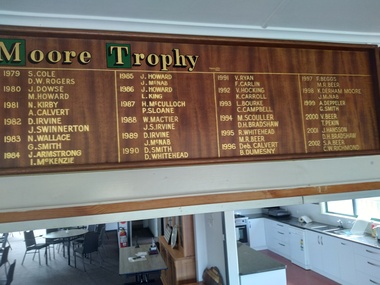 Peterborough History Group
Plaque - Fred Moore Trophy
Fred Moore was a long time holiday maker with a house in Robertson St, whose children continue to visit. This event is played on the long weekend in January and is very popular as non handicapped players can play. Draw for partners, no handicaps required, and it is a 12 hole event. It is the only time the practice tee is used in an official event, it is used as the first tee and the first becomes the 10th. Winners: 1961 F Calvert T Austin 1962 H McCulloch M Howard 1963 F Calvert T Austin, 1964 J Moore J Irvine, 1965 O Horn W Sinclair, 1966 B Nash H Lucas, 1967 P Nash T Austin, 1968 M Moore J Wilson, 1969 J Chirnside J Wilson, 1970 J Gray P Clark, 1971 D Irvine L Hobson, 1972 K Morrison B cook, 1973 G. Paton T Austin, 1974 K Harris DW Rogers, 1975 J Neville DW Rogers, 1976 F Calvert JS Irvine, 1977 S Clark TL Austin, 1978 J McNabb JS Irvine, 1979 S Cole DW Rogers 1890 J. Dowse, M Howard, 1981 N Kirby A Calvert, 1982 D Irvine J Swinnerton, 1983 N Wallace G Smith, 1984 J Armstrong J Mckenzie, 1985 J Howard L King, 1986 J Howard L king, 1987 H McCulloch P Sloan, 1988 W Mactier JS Irvine, 1989 D Irvine J McNab, 1990 D Smith D Whitehead, 1991 V Ryan F Carlin, 1992 V Hocking K Carroll, 1993 L Bourke C Campbell, 1994 M Scouller DH Bradshaw, 1995 R Whitehead M R Beer, 1996 Deb Calvert B Dumesny, 1997 F Beggs MR Beer, 1998 K Derham- Moore J McNab, 1999 A Deppeler G Smith 2000 V Beer T Pekin, 2001 J Hansson DH Bradshaw, 2002 SABeer CW Richmond, 2003 A Christian M Fisher, 2004 M Hesketh M Fisher, 2005 C Bell G Smith, 2006 T Smith P Watson, 2007 K Burl MBeer, 2008 J Manderson M Beer, 2009 A Gilson L Beer, 2010 L Hills B Dumesny, 2011 M Campbell D Dumesny, 2012 V Beer Dumesny, 2013 J Barrett M Bowden, 2014 C Cass G McGorlick, 2015 M McGorlick W Couch, 2016 C Leishman M Fisher 2017 C Bell D Laherty, 2018 J Barrett W Couch, 2019 J Muhor B Dumesny, 2020 M Hammond T Irvine, 2021 K Matheson H PetersSignificant because Fred Moore was a member and great supporter of the Golf Club. That weekend, the Australia Day long weekend, ia always a family weekend - the sandcastle competition is held, the tennis tournament is held, the cricket match against Timboon (played at Port Campbell) is played. This Canadian foursomes golf event is also held on this sporting weekend and is a very popular and social event. Two rectangular wooden honour boards, situated adjacent to each other, wih goldleaf namesList of winners of the Fred Moore Trophypeterborough, peterborough golf club, fred moore trophy, sporting honour boards, golf tournament -
 Ararat Gallery TAMA
Textile, Frances Burke, Goanna, c. early 1950s
Frances Burke: Designer of Modern Textiles Australia’s most influential and celebrated textile designer of the mid-20th century, Frances Burke (1904-1994), employed Australian native flora, garden flowers, marine subjects, Indigenous culture and increasingly, abstract motifs in her stunning modern fabrics. A confident, determined designer and businesswoman; Burke made the shift from fine art to design in 1937. While she began by designing dress fabrics for Melbourne’s fashionable Georges Department store, printing them on linen using lino blocks, she was an early adopter of the screen-printing process and during the war years began printing on cotton. Burke’s furnishing fabrics took their place in influential modern buildings Australia-wide through collaborations with leading architects and interior designers. They included Robin Boyd’s 1949 House of Tomorrow, Roy Grounds’ Quamby flats, Guilford Bell’s Royal Hayman Island Resort for Ansett Airlines, and Yuncken, Freeman Brothers, Griffiths and Simpson’s Canberra Civic Centre Theatre. In the post-war period, Burke made regular trips to the United States and Europe, on her return advising homeowners and manufacturers on the latest trends in products, colours and home design in lectures and interviews. At New Design her fabric showroom and interior design consultancy Burke introduced furniture by emerging designers Clement Meadmore and Grant Featherston in the early 1950s and presented local and imported homewares, mostly from the United States. She was enthusiastic about the convenient and comfortable lifestyle experienced by ordinary American women. Her fabrics and advice were regularly featured in Australian Home Beautiful, Australian House and Garden and the newspapers of the day. Some of Burke’s designs had remarkable longevity. Tiger Stripe (1938) for example, continued to be produced in a wide range of colours until 1970 and Crete (1946) remained a popular choice for interiors into the 1960s. Drawing from a rich variety of sources including Indigenous culture in Goanna (c.1954) and Pacific Island tapa cloth designs in Bird and Tree (1940), Burke also looked to Japan in designs such as Plum Blossom (1948) and Zen (1965). She loved exploring the potential of native flora, seen in designs including Waratah (1955) and Flannel Flower (1955), while garden flowers were the source for many other designs including Belladonna (1940), Periwinkle (n.d.) and Rose (1947). Burke’s clever interplay of a single striking printed colour with lively gestural lines revealing the white base fabric, gave her designs a vibrancy that characterised the optimistic post-war era. This can be seen in Burke’s fabrics for Hayman Island including Angel Fish and Seapiece (both 1949) which expressed the freshness and excitement of the luxurious new tropical resort and led to further commissions. Burke’s three decades in business (1937-1970) were an unparalleled success in the story of Australian design. Her fabrics have been collected by the NGA, the Powerhouse Museum, NGV, RMIT Design Archives and Sydney Living Museums in addition to Ararat Gallery TAMA. Written by Nanette Carter and Robyn Oswald-Jacobs. -
 Ararat Gallery TAMA
Textile, Frances Burke, Mosaic, c. 1962
Frances Burke: Designer of Modern Textiles Australia’s most influential and celebrated textile designer of the mid-20th century, Frances Burke (1904-1994), employed Australian native flora, garden flowers, marine subjects, Indigenous culture and increasingly, abstract motifs in her stunning modern fabrics. A confident, determined designer and businesswoman; Burke made the shift from fine art to design in 1937. While she began by designing dress fabrics for Melbourne’s fashionable Georges Department store, printing them on linen using lino blocks, she was an early adopter of the screen-printing process and during the war years began printing on cotton. Burke’s furnishing fabrics took their place in influential modern buildings Australia-wide through collaborations with leading architects and interior designers. They included Robin Boyd’s 1949 House of Tomorrow, Roy Grounds’ Quamby flats, Guilford Bell’s Royal Hayman Island Resort for Ansett Airlines, and Yuncken, Freeman Brothers, Griffiths and Simpson’s Canberra Civic Centre Theatre. In the post-war period, Burke made regular trips to the United States and Europe, on her return advising homeowners and manufacturers on the latest trends in products, colours and home design in lectures and interviews. At New Design her fabric showroom and interior design consultancy Burke introduced furniture by emerging designers Clement Meadmore and Grant Featherston in the early 1950s and presented local and imported homewares, mostly from the United States. She was enthusiastic about the convenient and comfortable lifestyle experienced by ordinary American women. Her fabrics and advice were regularly featured in Australian Home Beautiful, Australian House and Garden and the newspapers of the day. Some of Burke’s designs had remarkable longevity. Tiger Stripe (1938) for example, continued to be produced in a wide range of colours until 1970 and Crete (1946) remained a popular choice for interiors into the 1960s. Drawing from a rich variety of sources including Indigenous culture in Goanna (c.1954) and Pacific Island tapa cloth designs in Bird and Tree (1940), Burke also looked to Japan in designs such as Plum Blossom (1948) and Zen (1965). She loved exploring the potential of native flora, seen in designs including Waratah (1955) and Flannel Flower (1955), while garden flowers were the source for many other designs including Belladonna (1940), Periwinkle (n.d.) and Rose (1947). Burke’s clever interplay of a single striking printed colour with lively gestural lines revealing the white base fabric, gave her designs a vibrancy that characterised the optimistic post-war era. This can be seen in Burke’s fabrics for Hayman Island including Angel Fish and Seapiece (both 1949) which expressed the freshness and excitement of the luxurious new tropical resort and led to further commissions. Burke’s three decades in business (1937-1970) were an unparalleled success in the story of Australian design. Her fabrics have been collected by the NGA, the Powerhouse Museum, NGV, RMIT Design Archives and Sydney Living Museums in addition to Ararat Gallery TAMA. Written by Nanette Carter and Robyn Oswald-Jacobs. -
 Ararat Gallery TAMA
Textile, Frances Burke, Tiger Stripe, c. 1939
Frances Burke: Designer of Modern Textiles Australia’s most influential and celebrated textile designer of the mid-20th century, Frances Burke (1904-1994), employed Australian native flora, garden flowers, marine subjects, Indigenous culture and increasingly, abstract motifs in her stunning modern fabrics. A confident, determined designer and businesswoman; Burke made the shift from fine art to design in 1937. While she began by designing dress fabrics for Melbourne’s fashionable Georges Department store, printing them on linen using lino blocks, she was an early adopter of the screen-printing process and during the war years began printing on cotton. Burke’s furnishing fabrics took their place in influential modern buildings Australia-wide through collaborations with leading architects and interior designers. They included Robin Boyd’s 1949 House of Tomorrow, Roy Grounds’ Quamby flats, Guilford Bell’s Royal Hayman Island Resort for Ansett Airlines, and Yuncken, Freeman Brothers, Griffiths and Simpson’s Canberra Civic Centre Theatre. In the post-war period, Burke made regular trips to the United States and Europe, on her return advising homeowners and manufacturers on the latest trends in products, colours and home design in lectures and interviews. At New Design her fabric showroom and interior design consultancy Burke introduced furniture by emerging designers Clement Meadmore and Grant Featherston in the early 1950s and presented local and imported homewares, mostly from the United States. She was enthusiastic about the convenient and comfortable lifestyle experienced by ordinary American women. Her fabrics and advice were regularly featured in Australian Home Beautiful, Australian House and Garden and the newspapers of the day. Some of Burke’s designs had remarkable longevity. Tiger Stripe (1938) for example, continued to be produced in a wide range of colours until 1970 and Crete (1946) remained a popular choice for interiors into the 1960s. Drawing from a rich variety of sources including Indigenous culture in Goanna (c.1954) and Pacific Island tapa cloth designs in Bird and Tree (1940), Burke also looked to Japan in designs such as Plum Blossom (1948) and Zen (1965). She loved exploring the potential of native flora, seen in designs including Waratah (1955) and Flannel Flower (1955), while garden flowers were the source for many other designs including Belladonna (1940), Periwinkle (n.d.) and Rose (1947). Burke’s clever interplay of a single striking printed colour with lively gestural lines revealing the white base fabric, gave her designs a vibrancy that characterised the optimistic post-war era. This can be seen in Burke’s fabrics for Hayman Island including Angel Fish and Seapiece (both 1949) which expressed the freshness and excitement of the luxurious new tropical resort and led to further commissions. Burke’s three decades in business (1937-1970) were an unparalleled success in the story of Australian design. Her fabrics have been collected by the NGA, the Powerhouse Museum, NGV, RMIT Design Archives and Sydney Living Museums in addition to Ararat Gallery TAMA. Written by Nanette Carter and Robyn Oswald-Jacobs. -
 Ararat Gallery TAMA
Textile, Frances Burke, Crete, 1948
Frances Burke: Designer of Modern Textiles Australia’s most influential and celebrated textile designer of the mid-20th century, Frances Burke (1904-1994), employed Australian native flora, garden flowers, marine subjects, Indigenous culture and increasingly, abstract motifs in her stunning modern fabrics. A confident, determined designer and businesswoman; Burke made the shift from fine art to design in 1937. While she began by designing dress fabrics for Melbourne’s fashionable Georges Department store, printing them on linen using lino blocks, she was an early adopter of the screen-printing process and during the war years began printing on cotton. Burke’s furnishing fabrics took their place in influential modern buildings Australia-wide through collaborations with leading architects and interior designers. They included Robin Boyd’s 1949 House of Tomorrow, Roy Grounds’ Quamby flats, Guilford Bell’s Royal Hayman Island Resort for Ansett Airlines, and Yuncken, Freeman Brothers, Griffiths and Simpson’s Canberra Civic Centre Theatre. In the post-war period, Burke made regular trips to the United States and Europe, on her return advising homeowners and manufacturers on the latest trends in products, colours and home design in lectures and interviews. At New Design her fabric showroom and interior design consultancy Burke introduced furniture by emerging designers Clement Meadmore and Grant Featherston in the early 1950s and presented local and imported homewares, mostly from the United States. She was enthusiastic about the convenient and comfortable lifestyle experienced by ordinary American women. Her fabrics and advice were regularly featured in Australian Home Beautiful, Australian House and Garden and the newspapers of the day. Some of Burke’s designs had remarkable longevity. Tiger Stripe (1938) for example, continued to be produced in a wide range of colours until 1970 and Crete (1946) remained a popular choice for interiors into the 1960s. Drawing from a rich variety of sources including Indigenous culture in Goanna (c.1954) and Pacific Island tapa cloth designs in Bird and Tree (1940), Burke also looked to Japan in designs such as Plum Blossom (1948) and Zen (1965). She loved exploring the potential of native flora, seen in designs including Waratah (1955) and Flannel Flower (1955), while garden flowers were the source for many other designs including Belladonna (1940), Periwinkle (n.d.) and Rose (1947). Burke’s clever interplay of a single striking printed colour with lively gestural lines revealing the white base fabric, gave her designs a vibrancy that characterised the optimistic post-war era. This can be seen in Burke’s fabrics for Hayman Island including Angel Fish and Seapiece (both 1949) which expressed the freshness and excitement of the luxurious new tropical resort and led to further commissions. Burke’s three decades in business (1937-1970) were an unparalleled success in the story of Australian design. Her fabrics have been collected by the NGA, the Powerhouse Museum, NGV, RMIT Design Archives and Sydney Living Museums in addition to Ararat Gallery TAMA. Written by Nanette Carter and Robyn Oswald-Jacobs. -
 Ararat Gallery TAMA
Textile, Frances Burke, Plum Blossom, 1948
Frances Burke: Designer of Modern Textiles Australia’s most influential and celebrated textile designer of the mid-20th century, Frances Burke (1904-1994), employed Australian native flora, garden flowers, marine subjects, Indigenous culture and increasingly, abstract motifs in her stunning modern fabrics. A confident, determined designer and businesswoman; Burke made the shift from fine art to design in 1937. While she began by designing dress fabrics for Melbourne’s fashionable Georges Department store, printing them on linen using lino blocks, she was an early adopter of the screen-printing process and during the war years began printing on cotton. Burke’s furnishing fabrics took their place in influential modern buildings Australia-wide through collaborations with leading architects and interior designers. They included Robin Boyd’s 1949 House of Tomorrow, Roy Grounds’ Quamby flats, Guilford Bell’s Royal Hayman Island Resort for Ansett Airlines, and Yuncken, Freeman Brothers, Griffiths and Simpson’s Canberra Civic Centre Theatre. In the post-war period, Burke made regular trips to the United States and Europe, on her return advising homeowners and manufacturers on the latest trends in products, colours and home design in lectures and interviews. At New Design her fabric showroom and interior design consultancy Burke introduced furniture by emerging designers Clement Meadmore and Grant Featherston in the early 1950s and presented local and imported homewares, mostly from the United States. She was enthusiastic about the convenient and comfortable lifestyle experienced by ordinary American women. Her fabrics and advice were regularly featured in Australian Home Beautiful, Australian House and Garden and the newspapers of the day. Some of Burke’s designs had remarkable longevity. Tiger Stripe (1938) for example, continued to be produced in a wide range of colours until 1970 and Crete (1946) remained a popular choice for interiors into the 1960s. Drawing from a rich variety of sources including Indigenous culture in Goanna (c.1954) and Pacific Island tapa cloth designs in Bird and Tree (1940), Burke also looked to Japan in designs such as Plum Blossom (1948) and Zen (1965). She loved exploring the potential of native flora, seen in designs including Waratah (1955) and Flannel Flower (1955), while garden flowers were the source for many other designs including Belladonna (1940), Periwinkle (n.d.) and Rose (1947). Burke’s clever interplay of a single striking printed colour with lively gestural lines revealing the white base fabric, gave her designs a vibrancy that characterised the optimistic post-war era. This can be seen in Burke’s fabrics for Hayman Island including Angel Fish and Seapiece (both 1949) which expressed the freshness and excitement of the luxurious new tropical resort and led to further commissions. Burke’s three decades in business (1937-1970) were an unparalleled success in the story of Australian design. Her fabrics have been collected by the NGA, the Powerhouse Museum, NGV, RMIT Design Archives and Sydney Living Museums in addition to Ararat Gallery TAMA. Written by Nanette Carter and Robyn Oswald-Jacobs. -
 Ararat Gallery TAMA
Textile, Frances Burke, Jungle, 1945
Frances Burke: Designer of Modern Textiles Australia’s most influential and celebrated textile designer of the mid-20th century, Frances Burke (1904-1994), employed Australian native flora, garden flowers, marine subjects, Indigenous culture and increasingly, abstract motifs in her stunning modern fabrics. A confident, determined designer and businesswoman; Burke made the shift from fine art to design in 1937. While she began by designing dress fabrics for Melbourne’s fashionable Georges Department store, printing them on linen using lino blocks, she was an early adopter of the screen-printing process and during the war years began printing on cotton. Burke’s furnishing fabrics took their place in influential modern buildings Australia-wide through collaborations with leading architects and interior designers. They included Robin Boyd’s 1949 House of Tomorrow, Roy Grounds’ Quamby flats, Guilford Bell’s Royal Hayman Island Resort for Ansett Airlines, and Yuncken, Freeman Brothers, Griffiths and Simpson’s Canberra Civic Centre Theatre. In the post-war period, Burke made regular trips to the United States and Europe, on her return advising homeowners and manufacturers on the latest trends in products, colours and home design in lectures and interviews. At New Design her fabric showroom and interior design consultancy Burke introduced furniture by emerging designers Clement Meadmore and Grant Featherston in the early 1950s and presented local and imported homewares, mostly from the United States. She was enthusiastic about the convenient and comfortable lifestyle experienced by ordinary American women. Her fabrics and advice were regularly featured in Australian Home Beautiful, Australian House and Garden and the newspapers of the day. Some of Burke’s designs had remarkable longevity. Tiger Stripe (1938) for example, continued to be produced in a wide range of colours until 1970 and Crete (1946) remained a popular choice for interiors into the 1960s. Drawing from a rich variety of sources including Indigenous culture in Goanna (c.1954) and Pacific Island tapa cloth designs in Bird and Tree (1940), Burke also looked to Japan in designs such as Plum Blossom (1948) and Zen (1965). She loved exploring the potential of native flora, seen in designs including Waratah (1955) and Flannel Flower (1955), while garden flowers were the source for many other designs including Belladonna (1940), Periwinkle (n.d.) and Rose (1947). Burke’s clever interplay of a single striking printed colour with lively gestural lines revealing the white base fabric, gave her designs a vibrancy that characterised the optimistic post-war era. This can be seen in Burke’s fabrics for Hayman Island including Angel Fish and Seapiece (both 1949) which expressed the freshness and excitement of the luxurious new tropical resort and led to further commissions. Burke’s three decades in business (1937-1970) were an unparalleled success in the story of Australian design. Her fabrics have been collected by the NGA, the Powerhouse Museum, NGV, RMIT Design Archives and Sydney Living Museums in addition to Ararat Gallery TAMA. Written by Nanette Carter and Robyn Oswald-Jacobs. -
 Ararat Gallery TAMA
Textile, Frances Burke, Harlequin, c. late 1950s
Frances Burke: Designer of Modern Textiles Australia’s most influential and celebrated textile designer of the mid-20th century, Frances Burke (1904-1994), employed Australian native flora, garden flowers, marine subjects, Indigenous culture and increasingly, abstract motifs in her stunning modern fabrics. A confident, determined designer and businesswoman; Burke made the shift from fine art to design in 1937. While she began by designing dress fabrics for Melbourne’s fashionable Georges Department store, printing them on linen using lino blocks, she was an early adopter of the screen-printing process and during the war years began printing on cotton. Burke’s furnishing fabrics took their place in influential modern buildings Australia-wide through collaborations with leading architects and interior designers. They included Robin Boyd’s 1949 House of Tomorrow, Roy Grounds’ Quamby flats, Guilford Bell’s Royal Hayman Island Resort for Ansett Airlines, and Yuncken, Freeman Brothers, Griffiths and Simpson’s Canberra Civic Centre Theatre. In the post-war period, Burke made regular trips to the United States and Europe, on her return advising homeowners and manufacturers on the latest trends in products, colours and home design in lectures and interviews. At New Design her fabric showroom and interior design consultancy Burke introduced furniture by emerging designers Clement Meadmore and Grant Featherston in the early 1950s and presented local and imported homewares, mostly from the United States. She was enthusiastic about the convenient and comfortable lifestyle experienced by ordinary American women. Her fabrics and advice were regularly featured in Australian Home Beautiful, Australian House and Garden and the newspapers of the day. Some of Burke’s designs had remarkable longevity. Tiger Stripe (1938) for example, continued to be produced in a wide range of colours until 1970 and Crete (1946) remained a popular choice for interiors into the 1960s. Drawing from a rich variety of sources including Indigenous culture in Goanna (c.1954) and Pacific Island tapa cloth designs in Bird and Tree (1940), Burke also looked to Japan in designs such as Plum Blossom (1948) and Zen (1965). She loved exploring the potential of native flora, seen in designs including Waratah (1955) and Flannel Flower (1955), while garden flowers were the source for many other designs including Belladonna (1940), Periwinkle (n.d.) and Rose (1947). Burke’s clever interplay of a single striking printed colour with lively gestural lines revealing the white base fabric, gave her designs a vibrancy that characterised the optimistic post-war era. This can be seen in Burke’s fabrics for Hayman Island including Angel Fish and Seapiece (both 1949) which expressed the freshness and excitement of the luxurious new tropical resort and led to further commissions. Burke’s three decades in business (1937-1970) were an unparalleled success in the story of Australian design. Her fabrics have been collected by the NGA, the Powerhouse Museum, NGV, RMIT Design Archives and Sydney Living Museums in addition to Ararat Gallery TAMA. Written by Nanette Carter and Robyn Oswald-Jacobs. -
 Ararat Gallery TAMA
Textile, Frances Burke, Staccato, c.1962
Frances Burke: Designer of Modern Textiles Australia’s most influential and celebrated textile designer of the mid-20th century, Frances Burke (1904-1994), employed Australian native flora, garden flowers, marine subjects, Indigenous culture and increasingly, abstract motifs in her stunning modern fabrics. A confident, determined designer and businesswoman; Burke made the shift from fine art to design in 1937. While she began by designing dress fabrics for Melbourne’s fashionable Georges Department store, printing them on linen using lino blocks, she was an early adopter of the screen-printing process and during the war years began printing on cotton. Burke’s furnishing fabrics took their place in influential modern buildings Australia-wide through collaborations with leading architects and interior designers. They included Robin Boyd’s 1949 House of Tomorrow, Roy Grounds’ Quamby flats, Guilford Bell’s Royal Hayman Island Resort for Ansett Airlines, and Yuncken, Freeman Brothers, Griffiths and Simpson’s Canberra Civic Centre Theatre. In the post-war period, Burke made regular trips to the United States and Europe, on her return advising homeowners and manufacturers on the latest trends in products, colours and home design in lectures and interviews. At New Design her fabric showroom and interior design consultancy Burke introduced furniture by emerging designers Clement Meadmore and Grant Featherston in the early 1950s and presented local and imported homewares, mostly from the United States. She was enthusiastic about the convenient and comfortable lifestyle experienced by ordinary American women. Her fabrics and advice were regularly featured in Australian Home Beautiful, Australian House and Garden and the newspapers of the day. Some of Burke’s designs had remarkable longevity. Tiger Stripe (1938) for example, continued to be produced in a wide range of colours until 1970 and Crete (1946) remained a popular choice for interiors into the 1960s. Drawing from a rich variety of sources including Indigenous culture in Goanna (c.1954) and Pacific Island tapa cloth designs in Bird and Tree (1940), Burke also looked to Japan in designs such as Plum Blossom (1948) and Zen (1965). She loved exploring the potential of native flora, seen in designs including Waratah (1955) and Flannel Flower (1955), while garden flowers were the source for many other designs including Belladonna (1940), Periwinkle (n.d.) and Rose (1947). Burke’s clever interplay of a single striking printed colour with lively gestural lines revealing the white base fabric, gave her designs a vibrancy that characterised the optimistic post-war era. This can be seen in Burke’s fabrics for Hayman Island including Angel Fish and Seapiece (both 1949) which expressed the freshness and excitement of the luxurious new tropical resort and led to further commissions. Burke’s three decades in business (1937-1970) were an unparalleled success in the story of Australian design. Her fabrics have been collected by the NGA, the Powerhouse Museum, NGV, RMIT Design Archives and Sydney Living Museums in addition to Ararat Gallery TAMA. Written by Nanette Carter and Robyn Oswald-Jacobs. -
 Ararat Gallery TAMA
Textile, Frances Burke, Staccato (brown-gray), c.1962
Frances Burke: Designer of Modern Textiles Australia’s most influential and celebrated textile designer of the mid-20th century, Frances Burke (1904-1994), employed Australian native flora, garden flowers, marine subjects, Indigenous culture and increasingly, abstract motifs in her stunning modern fabrics. A confident, determined designer and businesswoman; Burke made the shift from fine art to design in 1937. While she began by designing dress fabrics for Melbourne’s fashionable Georges Department store, printing them on linen using lino blocks, she was an early adopter of the screen-printing process and during the war years began printing on cotton. Burke’s furnishing fabrics took their place in influential modern buildings Australia-wide through collaborations with leading architects and interior designers. They included Robin Boyd’s 1949 House of Tomorrow, Roy Grounds’ Quamby flats, Guilford Bell’s Royal Hayman Island Resort for Ansett Airlines, and Yuncken, Freeman Brothers, Griffiths and Simpson’s Canberra Civic Centre Theatre. In the post-war period, Burke made regular trips to the United States and Europe, on her return advising homeowners and manufacturers on the latest trends in products, colours and home design in lectures and interviews. At New Design her fabric showroom and interior design consultancy Burke introduced furniture by emerging designers Clement Meadmore and Grant Featherston in the early 1950s and presented local and imported homewares, mostly from the United States. She was enthusiastic about the convenient and comfortable lifestyle experienced by ordinary American women. Her fabrics and advice were regularly featured in Australian Home Beautiful, Australian House and Garden and the newspapers of the day. Some of Burke’s designs had remarkable longevity. Tiger Stripe (1938) for example, continued to be produced in a wide range of colours until 1970 and Crete (1946) remained a popular choice for interiors into the 1960s. Drawing from a rich variety of sources including Indigenous culture in Goanna (c.1954) and Pacific Island tapa cloth designs in Bird and Tree (1940), Burke also looked to Japan in designs such as Plum Blossom (1948) and Zen (1965). She loved exploring the potential of native flora, seen in designs including Waratah (1955) and Flannel Flower (1955), while garden flowers were the source for many other designs including Belladonna (1940), Periwinkle (n.d.) and Rose (1947). Burke’s clever interplay of a single striking printed colour with lively gestural lines revealing the white base fabric, gave her designs a vibrancy that characterised the optimistic post-war era. This can be seen in Burke’s fabrics for Hayman Island including Angel Fish and Seapiece (both 1949) which expressed the freshness and excitement of the luxurious new tropical resort and led to further commissions. Burke’s three decades in business (1937-1970) were an unparalleled success in the story of Australian design. Her fabrics have been collected by the NGA, the Powerhouse Museum, NGV, RMIT Design Archives and Sydney Living Museums in addition to Ararat Gallery TAMA. Written by Nanette Carter and Robyn Oswald-Jacobs. -
 Ararat Gallery TAMA
Textile, Frances Burke, Tiger Lily, 1951
Frances Burke: Designer of Modern Textiles Australia’s most influential and celebrated textile designer of the mid-20th century, Frances Burke (1904-1994), employed Australian native flora, garden flowers, marine subjects, Indigenous culture and increasingly, abstract motifs in her stunning modern fabrics. A confident, determined designer and businesswoman; Burke made the shift from fine art to design in 1937. While she began by designing dress fabrics for Melbourne’s fashionable Georges Department store, printing them on linen using lino blocks, she was an early adopter of the screen-printing process and during the war years began printing on cotton. Burke’s furnishing fabrics took their place in influential modern buildings Australia-wide through collaborations with leading architects and interior designers. They included Robin Boyd’s 1949 House of Tomorrow, Roy Grounds’ Quamby flats, Guilford Bell’s Royal Hayman Island Resort for Ansett Airlines, and Yuncken, Freeman Brothers, Griffiths and Simpson’s Canberra Civic Centre Theatre. In the post-war period, Burke made regular trips to the United States and Europe, on her return advising homeowners and manufacturers on the latest trends in products, colours and home design in lectures and interviews. At New Design her fabric showroom and interior design consultancy Burke introduced furniture by emerging designers Clement Meadmore and Grant Featherston in the early 1950s and presented local and imported homewares, mostly from the United States. She was enthusiastic about the convenient and comfortable lifestyle experienced by ordinary American women. Her fabrics and advice were regularly featured in Australian Home Beautiful, Australian House and Garden and the newspapers of the day. Some of Burke’s designs had remarkable longevity. Tiger Stripe (1938) for example, continued to be produced in a wide range of colours until 1970 and Crete (1946) remained a popular choice for interiors into the 1960s. Drawing from a rich variety of sources including Indigenous culture in Goanna (c.1954) and Pacific Island tapa cloth designs in Bird and Tree (1940), Burke also looked to Japan in designs such as Plum Blossom (1948) and Zen (1965). She loved exploring the potential of native flora, seen in designs including Waratah (1955) and Flannel Flower (1955), while garden flowers were the source for many other designs including Belladonna (1940), Periwinkle (n.d.) and Rose (1947). Burke’s clever interplay of a single striking printed colour with lively gestural lines revealing the white base fabric, gave her designs a vibrancy that characterised the optimistic post-war era. This can be seen in Burke’s fabrics for Hayman Island including Angel Fish and Seapiece (both 1949) which expressed the freshness and excitement of the luxurious new tropical resort and led to further commissions. Burke’s three decades in business (1937-1970) were an unparalleled success in the story of Australian design. Her fabrics have been collected by the NGA, the Powerhouse Museum, NGV, RMIT Design Archives and Sydney Living Museums in addition to Ararat Gallery TAMA. Written by Nanette Carter and Robyn Oswald-Jacobs. -
 Ararat Gallery TAMA
Textile, Frances Burke, Pacifica, 1954
Frances Burke: Designer of Modern Textiles Australia’s most influential and celebrated textile designer of the mid-20th century, Frances Burke (1904-1994), employed Australian native flora, garden flowers, marine subjects, Indigenous culture and increasingly, abstract motifs in her stunning modern fabrics. A confident, determined designer and businesswoman; Burke made the shift from fine art to design in 1937. While she began by designing dress fabrics for Melbourne’s fashionable Georges Department store, printing them on linen using lino blocks, she was an early adopter of the screen-printing process and during the war years began printing on cotton. Burke’s furnishing fabrics took their place in influential modern buildings Australia-wide through collaborations with leading architects and interior designers. They included Robin Boyd’s 1949 House of Tomorrow, Roy Grounds’ Quamby flats, Guilford Bell’s Royal Hayman Island Resort for Ansett Airlines, and Yuncken, Freeman Brothers, Griffiths and Simpson’s Canberra Civic Centre Theatre. In the post-war period, Burke made regular trips to the United States and Europe, on her return advising homeowners and manufacturers on the latest trends in products, colours and home design in lectures and interviews. At New Design her fabric showroom and interior design consultancy Burke introduced furniture by emerging designers Clement Meadmore and Grant Featherston in the early 1950s and presented local and imported homewares, mostly from the United States. She was enthusiastic about the convenient and comfortable lifestyle experienced by ordinary American women. Her fabrics and advice were regularly featured in Australian Home Beautiful, Australian House and Garden and the newspapers of the day. Some of Burke’s designs had remarkable longevity. Tiger Stripe (1938) for example, continued to be produced in a wide range of colours until 1970 and Crete (1946) remained a popular choice for interiors into the 1960s. Drawing from a rich variety of sources including Indigenous culture in Goanna (c.1954) and Pacific Island tapa cloth designs in Bird and Tree (1940), Burke also looked to Japan in designs such as Plum Blossom (1948) and Zen (1965). She loved exploring the potential of native flora, seen in designs including Waratah (1955) and Flannel Flower (1955), while garden flowers were the source for many other designs including Belladonna (1940), Periwinkle (n.d.) and Rose (1947). Burke’s clever interplay of a single striking printed colour with lively gestural lines revealing the white base fabric, gave her designs a vibrancy that characterised the optimistic post-war era. This can be seen in Burke’s fabrics for Hayman Island including Angel Fish and Seapiece (both 1949) which expressed the freshness and excitement of the luxurious new tropical resort and led to further commissions. Burke’s three decades in business (1937-1970) were an unparalleled success in the story of Australian design. Her fabrics have been collected by the NGA, the Powerhouse Museum, NGV, RMIT Design Archives and Sydney Living Museums in addition to Ararat Gallery TAMA. Written by Nanette Carter and Robyn Oswald-Jacobs. -
 Ararat Gallery TAMA
Textile, Frances Burke, Magnolia, 1938-1942
Frances Burke: Designer of Modern Textiles Australia’s most influential and celebrated textile designer of the mid-20th century, Frances Burke (1904-1994), employed Australian native flora, garden flowers, marine subjects, Indigenous culture and increasingly, abstract motifs in her stunning modern fabrics. A confident, determined designer and businesswoman; Burke made the shift from fine art to design in 1937. While she began by designing dress fabrics for Melbourne’s fashionable Georges Department store, printing them on linen using lino blocks, she was an early adopter of the screen-printing process and during the war years began printing on cotton. Burke’s furnishing fabrics took their place in influential modern buildings Australia-wide through collaborations with leading architects and interior designers. They included Robin Boyd’s 1949 House of Tomorrow, Roy Grounds’ Quamby flats, Guilford Bell’s Royal Hayman Island Resort for Ansett Airlines, and Yuncken, Freeman Brothers, Griffiths and Simpson’s Canberra Civic Centre Theatre. In the post-war period, Burke made regular trips to the United States and Europe, on her return advising homeowners and manufacturers on the latest trends in products, colours and home design in lectures and interviews. At New Design her fabric showroom and interior design consultancy Burke introduced furniture by emerging designers Clement Meadmore and Grant Featherston in the early 1950s and presented local and imported homewares, mostly from the United States. She was enthusiastic about the convenient and comfortable lifestyle experienced by ordinary American women. Her fabrics and advice were regularly featured in Australian Home Beautiful, Australian House and Garden and the newspapers of the day. Some of Burke’s designs had remarkable longevity. Tiger Stripe (1938) for example, continued to be produced in a wide range of colours until 1970 and Crete (1946) remained a popular choice for interiors into the 1960s. Drawing from a rich variety of sources including Indigenous culture in Goanna (c.1954) and Pacific Island tapa cloth designs in Bird and Tree (1940), Burke also looked to Japan in designs such as Plum Blossom (1948) and Zen (1965). She loved exploring the potential of native flora, seen in designs including Waratah (1955) and Flannel Flower (1955), while garden flowers were the source for many other designs including Belladonna (1940), Periwinkle (n.d.) and Rose (1947). Burke’s clever interplay of a single striking printed colour with lively gestural lines revealing the white base fabric, gave her designs a vibrancy that characterised the optimistic post-war era. This can be seen in Burke’s fabrics for Hayman Island including Angel Fish and Seapiece (both 1949) which expressed the freshness and excitement of the luxurious new tropical resort and led to further commissions. Burke’s three decades in business (1937-1970) were an unparalleled success in the story of Australian design. Her fabrics have been collected by the NGA, the Powerhouse Museum, NGV, RMIT Design Archives and Sydney Living Museums in addition to Ararat Gallery TAMA. Written by Nanette Carter and Robyn Oswald-Jacobs.