Showing 1559 items matching "visual"
-
 Warrnambool and District Historical Society Inc.
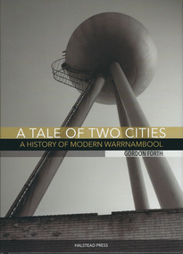
Book, A tale of two cities: a History of Modern Warrnambool, 2015
This book is the story of modern Warrnambool, describing aspects of the city from the 1980s to 2015. It looks at such topics as religion, law, population, housing, infrastructure, employment, industry, health, education and politics. The author, Gordon Forth, was formerly a lecturer in the Faculties of Education and Arts and the Director of the Centre for Regional Development at Deakin University in Warrnambool. He has written and edited a number of books dealing with Warrnambool and district history. Mark Rashleigh, responsible for the design and lay-out of the book and many of the photographs, was a lecturer in visual communication and graphic design in the Faculty of Arts at Deakin University and is now involved with the Warrnambool and District Historical Society in the preparation and cataloguing of historical photographs.The book is of some importance as it is the only comprehensive study of Warrnambool over the past 30 years and complements ‘By These We Flourish’, the story of Warrnambool’s people, places and events up to the 1980s. It is will be of great interest to readers in general and researchers in particularThis is a hardcover book of 320 pages. The dust cover is multi-coloured (black, white and gold) with an image of the water tower at the former Fletcher Jones Factory site on the front cover and an image of the Warrnambool Breakwater on the back cover. The hard cover book has the same colouring and images as the dust cover.Front covers – ‘A Tale of Two Cities – A History of Modern Warrnambool’, ‘Gordon Forth’, ‘Halstead Press’ Spines – ‘A Tale of Two Cities – A History of Modern Warrnambool’, ‘Forth’, ‘Halstead’ Back Covers – ISBN number and code warrnambool, gordon forth, a history of modern warrnambool, a tale of two cities -
 Broadmeadows Historical Society & Museum
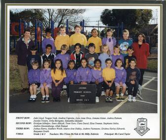
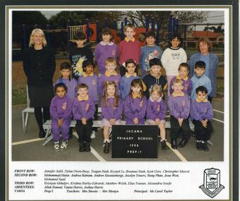
Photograph - School Photo, Fotek School Portraits, Jacana Primary School: Grade 2/3, 1999, 1999
This group photograph of the Grade 2/3 class at Jacana Primary School serves as a poignant reminder of the school’s enduring legacy within the local community. Established in 1959 and operating until the early 2000s, Jacana Primary was more than just a place of learning—it was a cornerstone of community life, shaping generations through education, inclusion, and shared experience. The image captures not only the young faces of its students but also the spirit of camaraderie, diversity, and belonging that defined the school’s culture. As a visual record, it offers insight into the everyday life of the school and reflects the broader social and educational landscape of Jacana during its years of operation.This photograph of the Grade 2/3 class at Jacana Primary School is significant as a visual record of a community-focused institution that operated from 1959 until the early 2000s. It captures the essence of the school’s role in shaping young lives through education, inclusion, and shared experience. The image reflects the values of camaraderie, diversity, and belonging that defined the school’s culture, offering insight into the social and educational environment of Jacana during this period. As one of the few remaining records of the school’s later years, it holds enduring value for understanding the local history and identity of the area.A vibrant laminated colour photograph featuring a group of children and staff seated in three rows. Their names are displayed on a white panel, printed on glossy paper, accompanied by the school logo.jacana primary school, education, photograph, group photograph, 1999, jade lloyd, teagan nash, analisa capretta, jovie anne orca, jomana matar, andrea ratnam, jocelyn towers, erika borigano, samantha iskander, kristijan mihaljev, emre akbiyik, trent gore, clara david, elias younan, stephanie melia, andrew knostenbergs, allak hamad, joshua harris, matthew welsh, maeve-aine oakley, andrew fuimaono, krishna hurley - edwards, benjamin grubb, mrs. vivien mcnish, ms. milly dobricic, ms carol taylor -
 Federation University Historical Collection
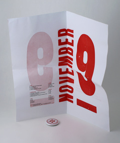
Poster - Poster invitation, Designers' Dinner 04, 2004
Promotional poster style invitation to University of Ballarat, Bachelor of Visual Arts (Graphic Design / Multimedia) third year, graduating student "Designers' Dinner '04". Styled to look like letterpress. The NOVEMBER 9 type likely to have been originally provided by Sovereign Hill, as they are acknowledged on related materials. The magnet front matches the limited edition badges produced by students this same year. (29172). This square format poster used a multiple choice quiz to provide details of the event. Invitees met at the Wharf opposite door 1 at the Melbourne Exhibition Centre (at 5.45pm) and were literally ferried to the dinner, returned at 11pm. Dress was "Smart Casual". Two colour (red and black), two-sided folded poster, magnet originally attached within. (probably with double sided tape). Magnet consists of a 'badge' style front, made with faculty badge maker, and magnet attached to reverse.university of ballarat, federation university, graphic design, multimedia -
 Federation University Historical Collection
Poster - Poster invitation, Designers' Dinner 04, 2004
Promotional poster style invitation to University of Ballarat, Bachelor of Visual Arts (Graphic Design / Multimedia) third year, graduating student "Designers' Dinner '04". Styled to look like letterpress. The NOVEMBER 9 type likely to have been originally provided by Sovereign Hill, as they are acknowledged on related materials. The magnet front matches the limited edition badges produced by students this same year. (29172). This square format poster used a multiple choice quiz to provide details of the event. Invitees met at the Wharf opposite door 1 at the Melbourne Exhibition Centre (at 5.45pm) and were literally ferried to the dinner, returned at 11pm. Dress was "Smart Casual". Two colour (red and black), two-sided folded poster, magnet originally attached within. (probably with double sided tape).university of ballarat, federation university, graphic design, multimedia -
 Federation University Historical Collection
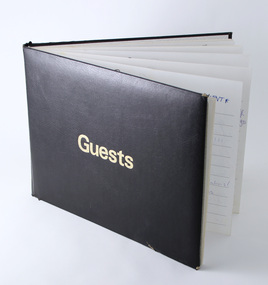
Book - Guest Book, Helmut Stenzil, Guests, 1994-2000
Guest book signed by some of those who attended the Bachelor of Visual Art (Graphic Design / Multimedia) exhibitions and dinners hosted by the University of Ballarat. Names include the students themselves, parents, friends and alumni. Attendees' addresses include Victoria and interstate, USA (eg Florida, California), UK, the Phillipines in addresses. Other entries demonstrate the attendance of some of Victoria's well known designers and agencies at the time, including representatives from local Ballarat studios. Helmut Stenzel was third year lecturer throughout this time. Students putting together these end of year exhibitions were usually overseen by Helmut Stenzel, Steven Roberts and other lecturing staff.This guest book is significant in that it represents a period during which the Graphic Design/Multimedia program was thriving. Students and staff were engaged with Australian and international designers and guests. Several students at this time were award-winning.Hardcover bound guest book signed by Graphic Design/Multimedia exhibition attendees c1994–2000. Black leather-look cover with debossed gold foil reading "Guests".Handwritten names and comments by exhibition attendeesuniversity of ballarat, federation university, graphic design, multimedia, bachelor, degree, mt helen campus -
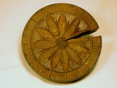 Kiewa Valley Historical Society
Butter Stamp Block, Circa 1950
At the time when this shortbread / butter stamp block was used, rural dairies and larger properties who manufactured their own butter used butter stamps blocks for identifying the source of the butter or for decoration.. The patterns stamped into the warmed butter provided for a range of decorative visual enhancement to the "plain" and "boring" straight leveled normal butter surface. Although the wooden surfaces could be hard to keep clean commercial usage would have been limited and eventually replaced by a non porous and hygienically cleaner material. Greater hygiene controls where introduced. from the late 1940s on. These controls were the result of high infectious illnesses due to contaminated milk and dairy handling methods.This shortbread / butter stamp was used by a Kiewa Valley dairy and it presents what the domestic butter beautification processes were available during the mid to latter 1900s was. Their was a pride by rural properties in their produce and its by-products.This shortbread / butter stamp is made from wood, round and fashioned from a flat bed to a dome top. The top has a round moulded hole with screw indentations for fastening a pressure pole. The pattern on the face of the stamp is of an eleven petalled flower pattern around a small circular flower head. Both the head and petals have indentations which are will produce raised points in the pressed butter. Enclosing the flower pattern is a pattern which when pressed against the butter would produce small ridges radiating outward.On the dome stamped in black ink "T. & W. Davies"butter stamp, domestic butter blocks, domestic food preparations., shortbread, stamp, dairy, butter -
 Federation University Art Collection
Painting - Artwork - Painting, Craig Harrison, 'Introduction to the Figure/ Landscape Puzzle,' by Craig Harrison, 1989
Craig HARRISON Dr Craig Harrison has held solo exhibitions regularly since the mid-1970s, including curated exhibitions at the La Trobe University, Australian Catholic University, and the Ballarat Fine Art Gallery. He was a finalists in a number of prestigious awards and prizes, including the Dobell Prize for Drawing (2010, NSW), and the Rick Amor Prize for Drawing (2016, Ballarat). Craig Harrison is also a respected art educator, who had taught fine art at the Deakin Univerity, MLC, and ACU between 1975 and 2004. From 1988 to 1989 Craig Harrison was Senior Lecturer in Visual Arts at Ballarat College of Advanced Education (later Federation University Australia). Mounted behind white conservation board, pale timber frame, glass cover. Gift of Professor Shirley Kaye Randell, AO, PhD, Hon.DLitt, FACE, FAICD, FIML, first woman in the Executive Team of the Ballarat College of Advanced Education as Dean of Academic Affairs, 1989- 1990signature bottom right - "Craig Harrison '89."art, artwork, craig harrison, painting, available, ballarat college of advanced education -
![[Vessel] by Peter Wilson](/media/collectors/530576742162ef0fa09a2288/items/60f8e6cfc71f4e5913bcf304/item-media/62efaa00550f772ce0875a15/item-fit-380x285.jpg) Federation University Art Collection
Federation University Art CollectionCeramic, Peter WIlson / Rosemont Pottery, [Vessel] by Peter Wilson, c1993
Peter WILSON Peter Wilson maintains a ceramic practice at Rosemont Pottery in Bathurst, NSW, as well as working as a senior lecturer in the Faculty of Education at the Charles Sturt University Bathurst Campus. He trained at Macquarie University, obtaining a Bachelor of Arts in 1976, and has been making reduced stoneware and tableware and exhibiting ceramics since 1980. Wilson writes extensively about ceramics and obtained a Graduate Diploma of Arts (Visual Arts) from Monash University Gippsland in 1993, a Master of Creative Arts from Wollongong University in 1995 and a Doctor of Creative Arts from the University of Western Sydney in 2003. Work may be marked with an incised 'Peter Wilson' or 'Wilson'.Spherical ceramic formjan feder memorial ceramics collection, peter wilson, alumni -
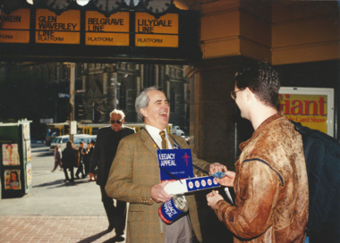 Melbourne Legacy
Photograph, Legacy Appeal 1995, September 1995
Photos during Badge Week in September 1995, including President David Millie selling badges under the clocks at Flinders Street Station. The article in the Answer mentions that the results of the appeal were expected to be higher than normal due to the promotion "Australia Remembers" which emphasised the 50th anniversary of the end of World War 2. It mentions that other visual publicity throughout 1995 included: The Legacy Tram (see 00856), a special Legacy flyer inserted into the Herald-Sun for free, and special Legacy placemats that were in McDonald's restaurants so for two weeks the Legacy story was in every McDonalds throughout Australia - reaching 10 million people.A record of the fundraising for the Legacy Appeal in 1995.Colour photo x 4 of various badge sellers, including President David Millie, during Badge week and an article in The Answer.Printed on the back legacy appeal, fundraising, badge week -
 Federation University Art Collection
Painting, Ronald Edwards-Pepper, 2020
Ronald EDWARDS PEPPER Gunai Ronald Edwards Pepper is the grandson of Dulcie (Dolly) Mullet and Watson Pepper, Ronald’s family moved to Morwell in the 1960s from Lake Tyers Mission. He graduated from Federation University with a Bachelor of Visual and Media Arts in 2017, and has completed several commissions and participated in numerous exhibitions, in Australia and overseas. Artist Ronald Edwards-Pepper is keen to express himself through painting and telling stories of his Gunai/Kurnai ancestors. "My nanna and her stories have been part of my life, and who I have become today, and this influences my artworks. My grand-parents are Dolly Mullet & Watson Pepper. They came from Lake Tyers Mission and moved to Morwell in the 1960s with their mob of kids. Now this is the family home." EDUCATION: 2013-2017 - Bachelor of Visual & Media Arts/Federation University. 2010 - Trainee Mentor in Education (Latrobe Regional Gallery, Morwell) 2008 - Certificate III in Aboriginal Torres Strait Islander in Languages 2007 - Traineeships, Young Ambassador at the Latrobe Regional Gallery, Morwell 2006 - Completed & Graduated - Awarded 'Student of the Year’ 2005 - Certificate IV ATSI Cultural Arts, TAFE Mid-valley Campus Gippsland 2003 - Certificate 4 in Aboriginal and Torres Strait lslander Art & Design, TAFE Mid-valley Campus, Gippsland 2002 - Certificate 3 in Aboriginal and Torres Strait Islander Art & Design, TAFE Mid-valley Campus, Gippsland AboriginalSigned verso "R.Edwards"ronald edwards, aboriginal, gunai kurnai -
 Robin Boyd Foundation
Document - Invention, Clement Hack, Hector Crawford Productions, Sound Illustrator documentation, Dec-59
There are three parts: (i) A letter from Hector Crawford to Robin Boyd (8 December 1959) confirming agreement regarding production rights, profits and use of Robin Boyd's invention of the 'Sound Illustrator', plus a letter from Clement Hack and Co (Patent Attorneys) to Hector Crawford (10 December 1959), confirming lodgment of Patent Application for ‘Sound Illustrator’ in the joint names of Robin Boyd and Hector Crawford Productions. (ii) a document 'Specification of Patent Application' (7 December 1959) provides a detailed description of its operation (five pages).The invention is an "apparatus for producing synchronised audio-visual effects" (iii) Penleigh Boyd, Robin Boyd's son, has provided an explanatory illustration of the apparatus. The South Illustrator was designed by Robin Boyd for the presentation of The Flying Dogtor television series.Typewritten, foolscap, 5 pages includes covers, plus additional explanation of apparatus.The letter (i) is countersigned 'Confirmed Dec 9, R.' in Robin Boyd's handwriting.hector crawford, the flying dogtor -
 Vision Australia
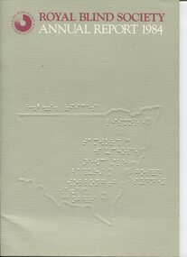
Administrative record - Text, Royal Blind Society of N.S.W. : Annual Report 1984, 1984
Articles in the annual report include: opening two field offices in Riverina and North Coast, C.L.D. Mears awarded in awarded Companion of Order of Australia, Technical Aids for the Disabled provided switchboard simulators for vocational training programs, review of Lighthouse and Community Cottages is required, Roselands Nursing Home cared for 104 residents, installation of computerised book and circulation system, the workshop area began trading as Mitchell Manufacturing, and the creation of a biennial Royal Blind Society National Sculpture award sponsored by James Hardie and the Visual Arts Board. Please note: page 21 is not scanned. Titled 'Extra curricular involvement of staff' the Braille on the reverse side impacted upon the visibility of the text.1 volume of text and imagesroyal blind society of new south wales, corporation records -
 Wyndham Art Gallery (Wyndham City Council)
Painting, Tony Albert, Interior Composition (with Appropriated Aboriginal Design Vase) IX, 2022
Tony Albert’s 2022 solo exhibition at Sullivan+Strumpf, Remark, continues the artist’s investigation into the imagery and identification of appropriated Indigenous Australian iconography in domestic decoration and design. Incorporating fabric from his extensive collection of ‘Aboriginalia’, Remark sees Albert expand on his acclaimed Conversations with Margaret Preston series dimensionality, critically engaging with the fabric in his own right. Like the fabric of Australian society, the appropriated Indigenous imagery printed on souvenir tea towels intertwines in a complicated web of national identity. These are not images by Aboriginal people and our voices and autonomy continued to be silenced through the object’s inauthenticity. As a country we must reconcile with these objects’ very existence. They are painful reiterations of a violent and oppressive history, but we also cannot hide or destroy them because they are an important societal record that should not be forgotten. As an artist this juxtaposition and tension fascinates me. Tony Albert’s multidisciplinary practice investigates contemporary legacies of colonialism, prompting audiences to contemplate the human condition. Drawing on both personal and collective histories, Albert explores the ways in which optimism can be utilised to overcome adversity. His work poses important questions such as how do we remember, give justice to, and rewrite complex and traumatic histories. Albert’s technique and imagery are distinctly contemporary, displacing traditional Australian Aboriginal aesthetics with an urban conceptuality. Appropriating textual references from sources as diverse as popular music, film, fiction, and art history, Albert plays with the tension arising from the visibility, and in-turn, the invisibility of Aboriginal People across the news media, literature, and the visual world. australian first nations art, colonialisation -
 Wyndham Art Gallery (Wyndham City Council)
Painting, Tony Albert, Interior Composition (with Appropriated Aboriginal Design Vase) VII, 2022
Tony Albert’s 2022 solo exhibition at Sullivan+Strumpf, Remark, continues the artist’s investigation into the imagery and identification of appropriated Indigenous Australian iconography in domestic decoration and design. Incorporating fabric from his extensive collection of ‘Aboriginalia’, Remark sees Albert expand on his acclaimed Conversations with Margaret Preston series dimensionality, critically engaging with the fabric in his own right. Like the fabric of Australian society, the appropriated Indigenous imagery printed on souvenir tea towels intertwines in a complicated web of national identity. These are not images by Aboriginal people and our voices and autonomy continued to be silenced through the object’s inauthenticity. As a country we must reconcile with these objects’ very existence. They are painful reiterations of a violent and oppressive history, but we also cannot hide or destroy them because they are an important societal record that should not be forgotten. As an artist this juxtaposition and tension fascinates me. Tony Albert’s multidisciplinary practice investigates contemporary legacies of colonialism, prompting audiences to contemplate the human condition. Drawing on both personal and collective histories, Albert explores the ways in which optimism can be utilised to overcome adversity. His work poses important questions such as how do we remember, give justice to, and rewrite complex and traumatic histories. Albert’s technique and imagery are distinctly contemporary, displacing traditional Australian Aboriginal aesthetics with an urban conceptuality. Appropriating textual references from sources as diverse as popular music, film, fiction, and art history, Albert plays with the tension arising from the visibility, and in-turn, the invisibility of Aboriginal People across the news media, literature, and the visual world. australian first nations art, colonialisation -
 Wyndham Art Gallery (Wyndham City Council)
Painting, Tony Albert, Interior Composition (with Appropriated Aboriginal Design Vase) X, 2022
Tony Albert’s 2022 solo exhibition at Sullivan+Strumpf, Remark, continues the artist’s investigation into the imagery and identification of appropriated Indigenous Australian iconography in domestic decoration and design. Incorporating fabric from his extensive collection of ‘Aboriginalia’, Remark sees Albert expand on his acclaimed Conversations with Margaret Preston series dimensionality, critically engaging with the fabric in his own right. Like the fabric of Australian society, the appropriated Indigenous imagery printed on souvenir tea towels intertwines in a complicated web of national identity. These are not images by Aboriginal people and our voices and autonomy continued to be silenced through the object’s inauthenticity. As a country we must reconcile with these objects’ very existence. They are painful reiterations of a violent and oppressive history, but we also cannot hide or destroy them because they are an important societal record that should not be forgotten. As an artist this juxtaposition and tension fascinates me. Tony Albert’s multidisciplinary practice investigates contemporary legacies of colonialism, prompting audiences to contemplate the human condition. Drawing on both personal and collective histories, Albert explores the ways in which optimism can be utilised to overcome adversity. His work poses important questions such as how do we remember, give justice to, and rewrite complex and traumatic histories. Albert’s technique and imagery are distinctly contemporary, displacing traditional Australian Aboriginal aesthetics with an urban conceptuality. Appropriating textual references from sources as diverse as popular music, film, fiction, and art history, Albert plays with the tension arising from the visibility, and in-turn, the invisibility of Aboriginal People across the news media, literature, and the visual world. australian first nations art, colonialisation -
 Broadmeadows Historical Society & Museum
Photograph - School Photo, Fotek School Portraits, Jacana Primary School Grade Prep/1 1998, 1998
This group photograph of the Grade Prep/1 class at Jacana Primary School, taken in 1998, stands as a meaningful testament to the school’s lasting impact on the Jacana community. Founded in 1959 and active until the early 2000s, Jacana Primary was more than an educational institution—it was a vital hub of community life. Through decades of service, it fostered a spirit of inclusion, learning, and shared experience that shaped the lives of countless students and families. The image not only preserves the youthful faces of its students but also encapsulates the values of camaraderie, diversity, and belonging that were central to the school’s ethos. As a visual document, it offers valuable insight into the everyday experiences of school life and reflects the broader social and educational environment of Jacana during that era.The 1998 Grade Prep/1 class photograph from Jacana Primary School holds enduring historical and cultural value as a representation of the school’s pivotal role within the Jacana community. Established in 1959 and operated until the early 2000s, Jacana Primary was a foundational institution that contributed significantly to the educational and social development of the area. This image is significant not only as a record of the students and staff of that time but also as a reflection of the school’s inclusive and community-oriented ethos. It embodies the values of diversity, belonging, and collective identity that defined the school’s culture. As a visual artifact, it offers insight into the lived experiences of local families and the broader educational landscape of late 20th-century suburban Melbourne. The photograph serves as a tangible link to the past, preserving the memory of a place that shaped generations and fostered a strong sense of community connection.A vibrant laminated colour photograph featuring a group of children and staff seated in three rows. Their names are displayed on a white panel, printed on glossy paper, accompanied by the school logo.jacana primary school, education, photograph, group photograph, ms carol taylor, 1998, jennifer salib, dylan owen-buoy, teagan nash, krystal le, breanna nash, scott gore, christopher muscat, mohammad matar, andrea ratnam, andrew knostenbergs, jocelyn towers, hung phan, jesse west, mohamad saad, kristijan mihaljev, krishna hurley - edwards, matthew welsh, elias younan, alexandria ioseka, allak hamad, vanita harris, joshua harris, mrs. pam streete, mrs. linda mostyn -
 Broadmeadows Historical Society & Museum
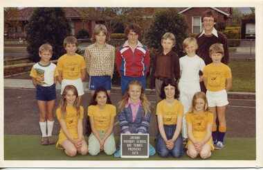
Photograph - Team Photo, Jacana Primary School Bat Tennis (Premiers) 1979, 1979
This 1979 photograph of Jacana Primary School’s bat tennis premiers captures a lively moment in the school’s history, offering more than just a record of sporting achievement. It reflects the core values that shaped the school’s identity—active participation, determination, and a strong sense of community. Established in 1959, Jacana Primary became a cornerstone of local education, serving generations of families until its closure in the early 2000s. The image highlights the school’s dedication to fostering well-rounded development through both academic learning and extracurricular activities. As a visual record, it also serves as a cultural snapshot of suburban Melbourne during a formative period in public education, preserving the spirit and camaraderie of a close-knit school community.This 1979 photograph of Jacana Primary School’s bat tennis premiers holds lasting cultural and historical significance as a reflection of the school’s dedication to well-rounded education and strong community ties. More than a record of sporting success, the image embodies the educational values of the era—teamwork, perseverance, and local pride—central to the school’s philosophy. Serving the Jacana community from 1959 until its closure in the early 2000s, Jacana Primary played a vital role in shaping the social landscape of suburban Melbourne during a time of growth and transformation. The photograph stands as a visual testament to the role of public schools in nurturing individual development and fostering a shared sense of identity within the community.A colour photograph on Matte paper, with a white borderBack: (Blue Label) PH-5536 (white label) PH- 4412 (Manufacturers Marks) This Paper/Manufactured / By Kodakjacana primary school, education, photograph, group photograph, 1979, bat tennis -
Broadmeadows Historical Society & Museum
Photograph - School Photo, Fotek School Portraits, Jacana Primary School Grade 3/4 2000, 2000
This group photograph of Jacana Primary School students and teachers, taken in the year 2000, serves as a meaningful reflection of the school’s lasting presence in the Jacana community. Founded in 1959 and operating until the early 2000s, Jacana Primary was more than a place of education—it was a central part of community life, fostering connection, learning, and shared identity across generations. The image documents not only the individuals present at the time but also the school’s broader cultural values—camaraderie, diversity, and a strong sense of belonging. As a visual record, it offers valuable insight into the everyday life of the school and the social environment of Jacana at the turn of the century. It stands as a testament to the role Jacana Primary played in shaping young lives and strengthening community bonds.This 2000 group photograph of students and teachers at Jacana Primary School is a significant cultural and historical artifact that reflects the enduring legacy of the school within the Jacana community. Established in 1959 and operating until the early 2000s, Jacana Primary was a cornerstone of local life, providing not only education but also a sense of identity, belonging, and continuity for generations of families. The photograph is important as a visual record of the school’s final years, capturing the diversity, camaraderie, and inclusive spirit that defined its culture. It offers insight into the social and educational environment of the time and serves as a tangible reminder of the school’s role in shaping the lives of its students and contributing to the broader social fabric of the suburb. As a preserved image, it holds value for former students, educators, and the wider community, symbolising shared memories and the collective history of Jacana. A vibrant laminated colour photograph featuring a group of children and staff seated in three rows. Their names are displayed on a white panel, printed on glossy paper, accompanied by the school logo.jacana primary school, education, photograph, group photograph, 2000, ms. carol taylor, grade 3/4, teagan nash, jovie anne orca, belinda tracey, whitney sammut, krishna hurley-edwards, jamana matar, jade lloyd, matthew sinnett, kristijan mihaljev, stephanie melta, benjamin grubbergs, andrew knostens, allak hamad, jocelyn towers, clara david, trent gore, andrew fuimaono, maeve-aine oakley, matthew welsh, joshua harris, emre akbiyik, ms. farnsworth, mr. bojczuk, mrs. nancy fry -
Glen Eira Historical Society
Article - Glen Eira College
Various articles relating to Glen Eira College’s activities. Two black and white photos dated August 1984 of Caulfield High School’s musical Superman The Musical. A newspaper article dated 05/07/2011 from the Caulfield Port Phillip Leader about school mosaic tile project for Patterson Station underpass which also includes twelve other local schools. Newspaper article dated 08/11/2011 from the Caulfield Port Phillip Leader about the Glen Eira College visual and performing arts exhibition. A Newspaper article dated 09/05/2012 from Melbourne Weekly Bayside, Your Community Voice about Glen Eira College going global with their language immersion project.superman the musical, musical events and activities, caulfield high school, glen eira college, anderson jill, teachers, lamb lesley, booran road, caulfield, art, irving pamela, artists, ethnic communities, international mosaic conference, mckinnon secondary college, wesley college elsternwick, our lady of the sacred heart, bentleigh west kindergarten, patterson train station, shows and exhibitions -
 Flagstaff Hill Maritime Museum and Village
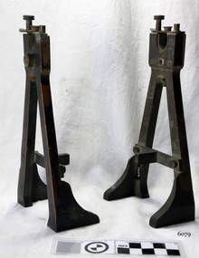
Optometer Stands, Early 19th Century
Optometrists are trained to examine eyes and prescribe visual aids such as spectacles. The optometer pictured in the media section of this document dates from the 1800s. The optometer was used with various lenses to determine the refraction of the eye. Refraction means the extent to which light is bent by an individual's eye. The result can determine how short-sighted or long-sighted they are, and the strength of spectacles required. In the second half of the 1800s, ophthalmologists also devised instruments to measure the separate components of vision. Dr Jules Badal developed the pictured instrument in 1876. It was based on an optometer invented by William Porterfield in 1759. The brass stands look as though they were made for an optometer to be table mounted, with heavy brass stands and designed to hold a cylindrical object securely as would be required by an optometer. Stands appear to have been very well made and very early probably early to mid 19th Century by a well known scientific instrument maker given there are no inscriptions or marks to indicate the time period made or maker it is difficult to assume significance to these items at this point in time as well as the items are incomplete.The brass stands believed to be for mounting an early Optometer an (ophthalmic instrument) Noneflagstaff hill, warrnambool, shipwrecked-coast, flagstaff-hill, flagstaff-hill-maritime-museum, maritime-museum, shipwreck-coast, flagstaff-hill-maritime-village, stands for scientific instrument -
 Ballaarat Mechanics' Institute (BMI Ballarat)
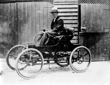
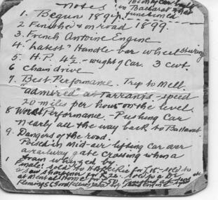
1901 Car built by Arthur, Rob, & Harold Leckie in Ballarat
This photograph is held in the Ballaarat Mechanics' Institute Audio Visual Collection. Please contact BMI for all print and usage inquiries. Arthur Leckie was born in Sebastopol on 16 August 1876. In 1878 the family moved into their newly built home, Blythewood Grange, in Sebastopol. Arthur attended Grenville College and commenced Ballarat College in 1893. He was Apprentice as an Ironmonger at 'The Present Day Ironmonger' in Bridge Street. He next worked for William Dawson, Ironmonger, in Sturt Street, next to old The Courier Office. After the death of his father in 1893 the family moved out of ‘Blythewood Grange into Ballarat. Arthur and his brothers Robert and Harold built their own automobile in the sheds behind their house, commencing in 1899 and having it ‘on the road’ in 1901.ballarat, 1901, car, leckie -
 Ballaarat Mechanics' Institute (BMI Ballarat)
Notes on Arthur Leckie's Car 1899
This photograph is held in the Ballaarat Mechanics' Institute Audio Visual Collection. Please contact BMI for all print and usage inquiries. Arthur Leckie was born in Sebastopol on 16 August 1876. In 1878 the family moved into their newly built home, Blythewood Grange, in Sebastopol. Arthur attended Grenville College and commenced Ballarat College in 1893. He was Apprentice as an Ironmonger at 'The Present Day Ironmonger' in Bridge Street. He next worked for William Dawson, Ironmonger, in Sturt Street, next to old The Courier Office. After the death of his father in 1893 the family moved out of ‘Blythewood Grange into Ballarat. Arthur and his brothers Robert and Harold built their own automobile in the sheds behind their house, commencing in 1899 and having it ‘on the road’ in 1901.ballarat, arthur leckie, car, 1899 -
 Federation University Art Collection
Sculpture, 'The Collaboration of Commonality and Difference' by Cassandra McArthur, 2014
The 'Collaboration of Commonality and Difference' has its conceptual roots in teh notion that only when we accept and nurture both commonality and difference, can we, humankind, foster unity. With the acceptance and nurturing of commanality and difference, peoples of the world are afforded equal validity for a collaborative approach towards peaceful resolution and possible unity. Integral to the conceptual foundation of the work is the use of papers sourced from around the world. Paper is at once universal and individual, and in this instance is representative of humanking. The jigsaw design draws on the understanding that each piece is integral to the creation and resolution of the whole. Commanality is suggested through repetition, however, no two pieces are the samem emphasizinf the beautym strength and validity of difference. Established in 2004, generously supported by George Lucato, the Lucato Peace Prize was an annual acquisitive art award open to all enrolled Federation University Australia tertiary students and all senior secondary students enrolled at any City of Ballarat secondary school or college. Prizes were awarded to the applicants whose work best illustrates or expresses the idea that 'peaceful alternatives are always preferable to armed confrontations'. First prize of $2250.00 was awarded to Cassandra McArthur for her work, Commonality and Difference, 2014, and it was the last Lucato Peace Prize Awarded after the death of George Lucato in 2014. Cassandra McArthur was undertaking a Bachelor of Visual Arts (Fine Arts) at the Federation University Arts Academy when this artwork was produced. Winner of the Lucato Peace Prize 2014 artists, artworks, sculpture, mcarthur, cassy mcarthur, lucato peace prize, alumni -
Federation University Art Collection
Work on paper - Artwork - Printmaking, 'Built for Comfort' Rodney Forbes, 2008
The Gippsland Art School collects examples of limited edition prints to use as a teaching collection. The collection is largely unframed and comprises works from the Print Council of Australia, staff members and former students. Rodney FORBES (1951- ) Born Melbourne Rodney Forbes' work is figurative narrative painting and uses autobiographical and incident-as-metaphor methods to explore wider issues of knowing and belonging in oral traditions such as working class, children’s and artisan subcultures. His practice draws on pop, cartooning and joke narrative structures within contemporary culture. (http://www.australiangalleries.com.au/artists/rodney-forbes/, accessed 07 April 2017) Influential in gippsland visual arts circles, Rodney Forbes was Director of the Gippsland Centre for At and Design and Switchback Gallery.Unframed lithograph5/11churchill, gippsland campus, gippsland printmaking teaching collection, rodney forbes, printmaking, gippsland centre for art and design, staffmember -
 Bendigo Military Museum
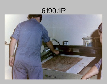
Photograph - Lithographic Technicians preparing a Cromalin map proof at the Army Survey Regiment, Fortuna Villa Bendigo, c1990s
These six photographs were most likely taken in the 1990s in Lithographic Squadron at the Army Survey Regiment, Fortuna, Bendigo. There is no annotation describing the date or personnel in the photographs. Cromalin proofing was a laminate and dry powder proofing system introduced in 1978. The system allowed the production of true to colour proofs, mainly for the proofing of orthophoto maps and process printed 1:250,000 JOG that used positive printing plates. It was upgraded in 1986. The pre-press proof was a cost-effective way of producing a one-off visual copy of the map or chart product. It enabled cartographers to perform a quality inspection and correct any faults before publication. The pre-press proof was deemed authoritative before its release to Print Troop for bulk printing and distribution.This is a set of six photographs of lithographic technicians preparing Cromalin map proofs at the Army Survey Regiment, Bendigo c1990s. The photographs were on 35mm negative film and were scanned at 96 dpi. They are part of the Army Survey Regiment’s Collection. .1) to .6) - Photo, colour, c1990s, printer technician SPR Shona Hastie, Lithographic Squadron. .1P to .6P – no annotationroyal australian survey corps, rasvy, army survey regiment, army svy regt, fortuna, asr, litho -
 Kew Historical Society Inc
Clothing - Protective Wear, Apron, 1950s
One of a collection of fourteen items of protective wear and household textiles donated by Lisa Sylvan, a long-term resident of Kew, Five of the items are homemade aprons made and worn by her mother. Of the seven pinafores, three identical but differently sized pinafores were made in her parents' factory, while the other three are handmade. The handmade aprons and pinafores are representative samples of women's work, possibly from published patterns, using fabrics originally deigned for dresses. Typically, contrasting fabrics and colours were selected to provide visual interest. The donation also includes a hand embroidered linen supper cloth and a commercially produced 'birds of Australia' printed table cloth. Most of the collection derives from the 1950s.Although not uncommon, hand-made protective clothing in the form of aprons and pinafores often represents samples and styles of 'women's work' using remnant fabrics often designed for other purposes. While generally utilitarian, women found means of gracing these items by the use brightly coloured fabric or patterns, the positioning of pockets and the use of contrasting fabrics to provide visual interest.Handmade apron created out of a blue and white dress fabric that has a pattern of leaves. The apron is highlighted with red braid.aprons, protective clothing, handmade clothing, costume accessories, lisa sylvan, fashion design, women's clothing -- 1950s, fashion 1950s -
 Kew Historical Society Inc
Clothing - Protective Wear, Pinafore, 1950s
One of a collection of fourteen items of protective wear and household textiles donated by Lisa Sylvan, a long-term resident of Kew, Five of the items are homemade aprons made and worn by her mother. Of the seven pinafores, three identical but differently sized pinafores were made in her parents' factory, while the other three are handmade. The handmade aprons and pinafores are representative samples of women's work, possibly from published patterns, using fabrics originally deigned for dresses. Typically, contrasting fabrics and colours were selected to provide visual interest. The donation also includes a hand embroidered linen supper cloth and a commercially produced 'birds of Australia' printed table cloth. Most of the collection derives from the 1950s.Although not uncommon, hand-made protective clothing in the form of aprons and pinafores often represents samples and styles of 'women's work' using remnant fabrics often designed for other purposes. While generally utilitarian, women found means of gracing these items by the use brightly coloured fabric or patterns, the positioning of pockets and the use of contrasting fabrics to provide visual interest.Brigtly coloured pinfaore using a representative 1950s fabric with a design of kitchen items in different coloursprotective clothing, handmade clothing, costume accessories, lisa sylvan, pinafores, fashion design, women's clothing -- 1950s, fashion 1950s -
 Kew Historical Society Inc
Clothing - Protective Wear, Apron, 1950s
One of a collection of fourteen items of protective wear and household textiles donated by Lisa Sylvan, a long-term resident of Kew, Five of the items are homemade aprons made and worn by her mother. Of the seven pinafores, three identical but differently sized pinafores were made in her parents' factory, while the other three are handmade. The handmade aprons and pinafores are representative samples of women's work, possibly from published patterns, using fabrics originally deigned for dresses. Typically, contrasting fabrics and colours were selected to provide visual interest. The donation also includes a hand embroidered linen supper cloth and a commercially produced 'birds of Australia' printed table cloth. Most of the collection derives from the 1950s.Although not uncommon, hand-made protective clothing in the form of aprons and pinafores often represents samples and styles of 'women's work' using remnant fabrics often designed for other purposes. While generally utilitarian, women found means of gracing these items by the use brightly coloured fabric or patterns, the positioning of pockets and the use of contrasting fabrics to provide visual interest.Pink and white cotton apron highted with blue braid.aprons, protective clothing, handmade clothing, costume accessories, lisa sylvan, fashion design, women's clothing -- 1950s, fashion -- 1950s -
 Kew Historical Society Inc
Clothing - Pinafore, 1950s
One of a collection of fourteen items of protective wear and household textiles donated by Lisa Sylvan, a long-term resident of Kew, Five of the items are homemade aprons made and worn by her mother. Of the seven pinafores, three identical but differently sized pinafores were made in her parents' factory, while the other three are handmade. The handmade aprons and pinafores are representative samples of women's work, possibly from published patterns, using fabrics originally deigned for dresses. Typically, contrasting fabrics and colours were selected to provide visual interest. The donation also includes a hand embroidered linen supper cloth and a commercially produced 'birds of Australia' printed table cloth. Most of the collection derives from the 1950s.Although not uncommon, hand-made protective clothing in the form of aprons and pinafores often represents samples and styles of 'women's work' using remnant fabrics often designed for other purposes. While generally utilitarian, women found means of gracing these items by the use brightly coloured fabric or patterns, the positioning of pockets and the use of contrasting fabrics to provide visual interest.Olive green and white pinafore decorated on the bodice with yellow braid. protective clothing, handmade clothing, costume accessories, lisa sylvan, pinafores, fashion design, women's clothing -- 1950s, fashion -- 1950s -
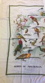 Kew Historical Society Inc
Decorative object, Birds of Australia, 1950s
One of a collection of fourteen items of clothing and household textiles donated by Lisa Sylvan, a long-term resident of Kew, Five of the items are homemade aprons made and worn by her mother. Of the seven pinafores, three identical but differently sized pinafores were made in her parents' factory, while the other three are handmade. The handmade aprons and pinafores are representative samples of women's work, often using commercial or patterns using fabrics originally deigned for dresses. Typically the examples, contrasting fabrics and colours were selected to provide visual interest. The donation also includes a hand embroidered linen supper cloth and a commercially produced 'birds of Australia' printed table cloth. Most of the collection derives from the 1950s.Linen table cloth with printed images of birds of Australia with a two-tone green borderlisa sylvan, household linen, table cloths, australiana, australian birds