Showing 2077 items matching "floral."
-
 Bendigo Military Museum
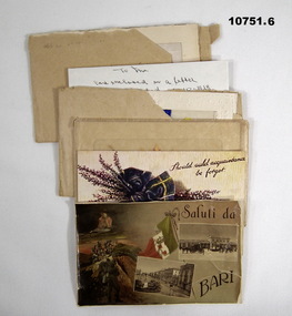
Postcard - CORRESPONDENCE, WW1, WW1
... Silk postcard in floral embossed cardboard frame arrangement. ...Silk postcard in floral embossed cardboard frame arrangement. ...Postcards “With love/Ken” "Kenneth Reginald Stone" Reg No. 6903A, refer Cat No 10742.15 for his service details. Refer Cat No 10742.15 for more details relating to this collection,1. & 2. Two postcards, off white colour cardboard with illustrations. 1. Collage of black and white and colour photographs. 2. Colour artwork of flowers. Postcards from "with love, Ken" and addressed to "Dear Ina". Handwritten black and blue ink pen. 1. dated "Feb 4th 1918". 3. to 6. Series of four envelopes with silk postcards, from "With love/ Ken" to "Dear Ina". Envelope - plain standard beige paper. Addressed to "Miss Ina Stone/ Woodstock West/ via Maldon/ Victoria/ Australia". Silk postcard in floral embossed cardboard frame arrangement. Silk fabric white with colour silk embroidery floral designs. 3. Fovant Camp April 22nd 1918. 4. France May 29th 1918. 5. Sent 6/10/1918. 6. Hope/ and/ love".Silk embroidery designs - in colour. 3. Rising Sun badge - AUSTRALIAN COMMONWEALTH MILITARY FORCES. 4. "1918/ Souvenir de France". 5. "Let Happiness and/ Sweet Content/ E'er enter your door" in print with Christmas greeting inside.; 6. "Hope/ and/ love".correspondence, kenneth reginald stone, stonecollectionww1 -
 Tennis Australia
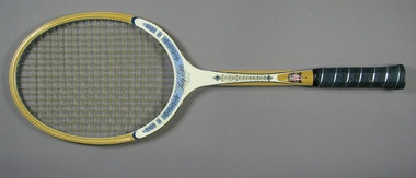
Racquet, Packing cover, Circa 1975
... They are surrounded by ornate floral designs along the shoulders. 'D' and 'TAD' trademarks feature along shaft, with further floral motifs in between. ...They are surrounded by ornate floral designs along the shoulders. 'D' and 'TAD' trademarks feature along shaft, with further floral motifs in between. ...A Davis Lady Elite tennis racquet, with fibreglass overlays along the shoulders and shaft, and leather handle grip with patterned perforations. Davis logo and model name features across base of head and throat. They are surrounded by ornate floral designs along the shoulders. 'D' and 'TAD' trademarks feature along shaft, with further floral motifs in between. TAD "Kings of the Court" trademark features on lower shaft on obverse. Davis coat-of-arms "Duce virtute comite fortuna" trademark features on lower shaft on reverse. TAD trademark features on rubber butt cap. Racquet is accompanied by original presentation cover. Inscription, in part: TAD/DAVIS/TENNIS RACKETS/AUTHORIZED DEALER/.../DISTRIBUTED BY/VICTOR SPORTS, INCORPORATED/... Materials: Wood, Nylon, Ink, Glue, Lacquer, Metal, Leather, Adhesive tape, Rubber, Fibreglass, Painttennis -
 Ballarat Tramway Museum
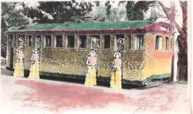
Postcard - 1939 Floral Tram, No. 29, Taylor & Taylor, March 1939
... Photo features the 1939 Floral Tram, No. 29, photographed in Wendouree Parade, rendered in colour. ...Postcard coloured, divided back, with a handwritten note on rear. Postcard 1939 Floral Tram, No. 29 Taylor & Taylor ...Photo features the 1939 Floral Tram, No. 29, photographed in Wendouree Parade, rendered in colour. March 1939. Has four ladies dressed in matching clothes standing outside the tram and four inside the doorways. See Item 7000 for a hand coloured image. with the ladies standing in the tram and 5188 for a digital image of the card. On the rear in pencil is "Ballarat No. 29, ex MMTB G class 152 former Fitzroy, Northcote and Preston Trust car. Car with waxed paper flowers and ran during the florale week March 1939. Car outside depot in Wendouree Parade. Colors are nearly approx to the real thing. Taylor & Taylor photo, Neg destroyed". Note written by Wal Jack and card sent to Ken Magor of Newcastle.Yields information about Ballarat 's 29 decorated for the 1939 Ballarat Floral Festival and its appearance and its use and publicity and demonstrates its colours of the flowers used.Postcard coloured, divided back, with a handwritten note on rear.See image 2 and notes for details of the handwritten note. tramways, trams, floral tram, tram 29, decorated trams -
 Kew Historical Society Inc
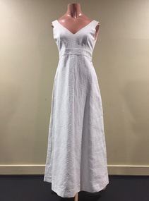
Clothing - White Embossed Cotton Evening Dress, Ricki Reed, 1960s
... Through out the decades, Miss Rabinov dabbled in prairie gowns, tailored pant suits, bold colours and floral prints. Spanning over three decades Miss Rabinov kept Ricki Reed at the front of fashion, keeping ahead of trends and on the bodies of fashionistas." ...Through out the decades, Miss Rabinov dabbled in prairie gowns, tailored pant suits, bold colours and floral prints. Spanning over three decades Miss Rabinov kept Ricki Reed at the front of fashion, keeping ahead of trends and on the bodies of fashionistas." ...Dorethy Rabinov’s Melbourne-based brand Ricki Reed "became an international success story. Her brand catered to “the petite and young, people who like smart simple dress” and popular with the women lib groups due to her comfortable smart pantsuits. The Ricki Reed’s brand often favored synthetic fabrics designed to keep up with the life of an active, busy woman. Through out the decades, Miss Rabinov dabbled in prairie gowns, tailored pant suits, bold colours and floral prints. Spanning over three decades Miss Rabinov kept Ricki Reed at the front of fashion, keeping ahead of trends and on the bodies of fashionistas." (Source: 'House of Darlington' website). This dress was owned, worn and donated by Dione McIntyre.The McIntyre Collection of clothing and clothing accessories forms one of the largest single donations to our Fashion & Design collection. It includes clothing and clothing accessories worn by four women in the Cohen and McIntyre families across three generations. The items worn by Melbourne architect, and Kew resident, Dione McIntyre date from the 1960s and 1970s, and include evening wear, day wear, hats and shoes. As Dione McIntyre often accompanied her husband, fellow architect Peter McIntyre, to formal events, there are a number of pieces of evening wear among the items. The McIntyre Collection also includes items worn by women of an earlier generation: by Lilian Cohen, Dione McIntyre's mother, and by her mother-in-law, the wife of the architect Robert McIntyre. At the other end of the chronological spectrum are a number of outfits belonging to, worn and donated by Annie McIntyre. These include outfits created by notable late 20th century Australian and/or international fashion designers. The McIntyre Collection is significant historically and artistically as it includes examples of design that demonstrate changing tastes in fashion over an 80-year period. The collection is also significant in that it includes the work of a large number of Melbourne designers from the 1960s to the 1990s. Sleeveless embossed white cotton high waisted cocktail dress designed by Ricki Reed of Melbourne.Nilricki reed, women's clothing, evening wear, australian fashion - 1960s, mcintyre collection -
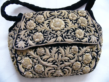 Embroiderers Guild, Victoria
Accessory - Indian Goldwork Handbag, Early 20th century
... Common Motifs: Designs often feature intricate floral patterns, leaves, paisley, and geometric shapes inspired by nature and architecture. 2. ...Common Motifs: Designs often feature intricate floral patterns, leaves, paisley, and geometric shapes inspired by nature and architecture. 2. ...Known as Karchob it is divided into 2 types of gold embroidery: 1. Key Aspects of Zardozi Embroidery: Origin and Meaning: The term "Zardozi" comes from the Persian words "zar" (gold) and "dozi" (embroidery), literally meaning "sewing with gold". Materials Used: Traditionally, threads were made of pure gold or silver, but modern zardozi typically uses copper wires with a gold or silver polish, often blended with silk threads, sequins, and crystals. The Process: Adda: The fabric is stretched tightly over a wooden frame, known as an adda, to facilitate precise, delicate work. Aari Needle: Artisans often use a hook-ended needle, similar to a crochet needle, called an aari, to make intricate stitches. Techniques: Specialized techniques include Dabka (coiled wire) and Kasab (twisted wire) to create raised, three-dimensional motifs. Common Motifs: Designs often feature intricate floral patterns, leaves, paisley, and geometric shapes inspired by nature and architecture. 2. Key details about Kamdani embroidery: Technique: It is often called a "lighter version" of Zardozi. It involves using a needle to insert flat metallic wires (badla) through the fabric, making tiny stitches that sparkle, often creating dots, paisleys, or floral patterns. Origin: The craft originated in the Indian subcontinent, specifically developing in Lucknow, India. Materials: Originally done with pure gold or silver threads, modern Kamdani often uses synthetic metallic threads or beads for affordability. Application: It is commonly featured on luxurious textiles, including georgette, chiffon, and cotton, frequently worn as formal wedding wear (sarees, dupattas, and kurtas). Types of Work: It is often referred to by related terms such as Mukaish, Badla, or Fardi work.Gold embroidery all over bag except under flap. Intricate design on flowers in very typical of the variety of metal threads. Velvet handles with black silk lining with press-studs in both corners of the flap. Decorative beaded tassel at base. Intricate design of flowers in typical design known as Karchob.embroidery, bags, 1900-20, india, goldwork -
 Bendigo Historical Society Inc.
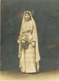
Photograph - WEDDING PHOTOGRAPH ( WEDDING DRESS 11400.750), 1915
... Bride wears a beautiful silk and lace gown, a floral head-dress holds a floor - length veil, and she wears fingerless gloves and carries a large round bouquet....Bride wears a beautiful silk and lace gown, a floral head-dress holds a floor - length veil, and she wears fingerless gloves and carries a large round bouquet. ...Photograph. Wedding photograph of Mrs James Mitchell nee Ella Nicholls (Bendigo). Brown cardboard surround. Photograph - black and white 18.5cmX13.5cms. A .5cm wide dark brown border surrounds the photograph, and the edge of the mount. Bride wears a beautiful silk and lace gown, a floral head-dress holds a floor - length veil, and she wears fingerless gloves and carries a large round bouquet.Photo, Eden Studios Melbourne P697. On back of photograph: hand written - About 1912. Mrs James Mitchell nee Ella Nicholls (Bendigo).photograph, person, wedding photo of mrs james mitchell, refer research notes included in clothing box 136 -
 Mission to Seafarers Victoria
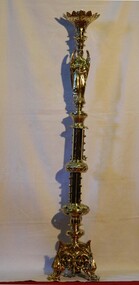
Ceremonial object - Candelabra, circa 1900
... There is elaborate brass ornamentation, floral in nature. Below is an angel figure holding a sword with both hands with the tip pointing toward its feet. ...There is elaborate brass ornamentation, floral in nature. Below is an angel figure holding a sword with both hands with the tip pointing toward its feet. ...The origins of the brass candlestick holders are unknown. However, they both are on display in the memorial Chapel of St Peter aka the Mariners' chapel. Given the style of the candlesticks it is possible that they were initially in use at either the original Port Melbourne chapel operating in the late 19thC. or possibly used at the 1907 building, Siddeley st where an improvised chapel was established. The Memorial Chapel of St Peter is a crucial part of the Mission to Seafarers Melbourne building complex, underscoring the relationship between the organisation and the Anglican Church, as well as being a site of continuous usage since the building was opened.This brass candle stand or floor candlestick holder is one of a pair. The candle holder is shaped like an open flower. There is elaborate brass ornamentation, floral in nature. Below is an angel figure holding a sword with both hands with the tip pointing toward its feet. The base of the candlestick is a tripod with three winged dogs, forming the feet. There is elaborate ornamentation that in turn connect each of the dogs together.candelabra, st peter chapel, flinders street, mission to seafarers, seamen's mission -
 Bendigo Historical Society Inc.
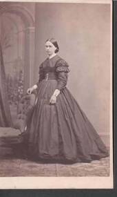
Photograph - PORTRAIT OF A LADY
... Photographer's name and address printed on the back with a Coat of Arms, floral decorative work and two birds. Some dates on the back are 1862 and 1867 for medallions won in London and Melbourne....Photographer's name and address printed on the back with a Coat of Arms, floral decorative work and two birds. Some dates on the back are 1862 and 1867 for medallions won in London and Melbourne. ...Small, full length portrait of a lady standing beside a chair with her right hand resting on the back of the chair. She is wearing a dress with a voluminous skirt, frills at the top of the sleeves and a large buckle at her waist. Photographer's name and address printed on the back with a Coat of Arms, floral decorative work and two birds. Some dates on the back are 1862 and 1867 for medallions won in London and Melbourne.C. Nettleton, 1 Madeline Street, North Melbournephotograph, portrait, female, portrait of a lady, c nettleton -
 Bendigo Historical Society Inc.
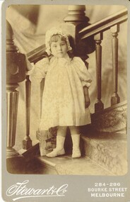
Photograph - HARRIS COLLECTION: CHILD PHOTO, Nineteenth Century
... Standing on carpeted staircase.Wearing pale floral dress with bonnet, socks and button slot shoes. ...Standing on carpeted staircase.Wearing pale floral dress with bonnet, socks and button slot shoes. ...Black & White studio Photograph. Female child aged approx three years. Standing on carpeted staircase.Wearing pale floral dress with bonnet, socks and button slot shoes. Book at feet titled 'Fireside tales?'. Printed on Front, Stewart & Co, 284-286 Bourke Street Melbourne. Captioned in ink writing on reverse. 'Dorie' 3 years & 3 months, 11/2/96.Stewart & Co 284- 286 Bourke st Melbphotograph, person, female child -
 Flagstaff Hill Maritime Museum and Village
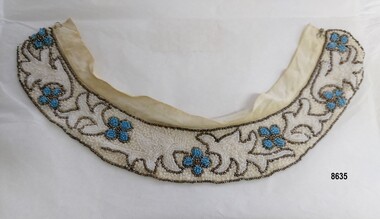
Clothing - Beaded collar, circa mid 20th century
... Lady's beaded collar with a decorative floral design of flowers made with blue beads, outlined with bronze beads on a white beaded background. ...Flagstaff Hill Maritime Museum and Village Warrnambool Great Ocean Road fashion beaded collar beading decorative fashion collar lady's fashion Lady's beaded collar with a decorative floral design of flowers made with blue beads, outlined with bronze beads on a white beaded background. ...This beaded dress collar is of a style from the mid 20th century - possibly even as early as the 1930's. It is designed to be easily removed and worn with different outfits - e.g. a dress, knitted top or blouse. Articles from Australian newspapers (particularly the Women's fashion pages) in the decades from the 1930's through to the 1950's often mentioned society ladies wearing "beaded collars" when describing their fashions and in the 1950's "beaded collars" were being made and imported from Japan however this particular collar appears to have been handmade. Unfortunately the maker of this collar is unknown.This item is an example of how women in the mid 20th century used their needlework skills to personalise and embellish an item of clothing (a collar) designed in a practical way to be able to be used with different items of clothing. Lady's beaded collar with a decorative floral design of flowers made with blue beads, outlined with bronze beads on a white beaded background. Bronze beads have also been used to "draw" leaf shapes and tendrils and outline a border all around the collar. A hook and eye are attached to a fine cotton bias band at the top of the collar and the beading is sewn onto a fine net lining.flagstaff hill maritime museum and village, warrnambool, great ocean road, fashion, beaded collar, beading, decorative fashion, collar, lady's fashion -
 Flagstaff Hill Maritime Museum and Village
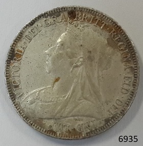
Currency - Coin, 1897
... Reverse; 3 shields (each crowned) - 3 passant lions (England), 1 rampant lion (Scotland), golden harp (Northern Ireland) - floral symbols between them – 1 open rose, 2 thistles. ...Reverse; 3 shields (each crowned) - 3 passant lions (England), 1 rampant lion (Scotland), golden harp (Northern Ireland) - floral symbols between them – 1 open rose, 2 thistles. ...This Great Britain one shilling coin is dated 1897, which is during the reign of Queen Victoria. There were over 6 million of these coins minted. Queen Victoria succeeded King William IV to the British Throne in 1837 – she was only 18 years old at the time – and she ruled until 1901. British coins such as this one shilling were in circulation in the colony of Australia until 1910, when the Commonwealth of Australia began producing its own coinage. This one shilling coin was minted by the Royal Mint at Royal Mint Court, in Little Tower Hill, London, England. Coins for circulation in the Kingdom of England, Great Britain and most of the British Empire were produced here until the 1960’s when the Royal Mint shifted location to Wales. There are three main groups of shillings produced during Queen Victoria’s reign:- - The Young Head; 1837-1887, in 8 different versions, on the obverse showing the Queen’s maturing face over 50 years. - The Junior Head; 1887-1892, minted when Queen Victoria had been reigning for 50 years. Her head was smaller on the coins minted 1887-1889 than on those shillings minted 1889-1892. - The Old Head; 1893-1901, shows the veiled head of Queen Victoria. The obverse side of the coin was designed by Thomas Brock. The inscription’s translation is “Victoria by the Grace of God, Queen of the British territories, Defender of the Faith, Empress of India”. The reverse side of the coin was designed by Edward Paynter. The inscription "HONI SOIT QUI MAL Y PENSE" translates as "Evil be to him who evil thinks". AUSTRALIAN CURRENCY The early settlers of Australia brought their own currency with them so a wide variety of coins, tokens and even ‘promissory’ notes (often called IOU’s) were used in the exchange of goods and services. In 1813 Spanish dollars were imported and converted for use by punching a hole in the centre of the coin. Both the outer ring, called the holey dollar, and the punched out ‘hole’, called the dump, were then counter-stamped and used as the official currency. In 1825 the British Government passed the Sterling Silver Currency Act, making the British Pound the only legal form of currency in the Australian colonies. Not enough British currency was imported into the colony so other forms of currency were still used. In the mid 1800’s Australia entered the Gold Rush period when many made their fortunes. Gold was used for trading, often shaped into ingots, stamped with their weight and purity, and one pound tokens. In 1852 the Adelaide Assay Office, without British approval, made Australia’s first gold coin to meet the need for currency in South Australia after the Gold Rush began. In 1855 the official Australian Mint opened in Sydney, operating as a branch of the Royal Mint in London, and the gold was turned into coins called ‘sovereigns’. Other branches also opened in Melbourne and Perth. Up to the time of Australia becoming a federation in 1901 its currency included British copper and silver coins, Australian gold sovereigns, locally minted copper trade tokens, private banknotes, New South Wales and Queensland government treasury notes and Queensland government banknotes. After Federation the Australian government began to overwrite privately issued notes and prepared for the introduction of its own currency. In 1910 a National Australian Currency was formed, based on the British currency of ‘pounds, shillings and pence’ and the first Commonwealth coining was produced, removing the power from the States. In 1966, on February 14th, Australia changed over to the decimal currency system of dollars and cents. Australia did not have its own currency in the colonial times. Settlers brought money from other countries and they also traded goods such as grain when currency was scarce. For a long time there was no standardised value for the different currencies. In 1825 British currency became the only official currency in the colony of Australia and coins such as this silver shilling were imported into Australia to replace the mixture of foreign currency. Australia became a Federated nation on 1st January 1901. In 1910 National Australian Currency was formed and Australia produced its own currency, based on the British ‘pounds, shillings and pence’. The British currency was no longer valid. This silver shilling is of national significance as it represents the British currency used in Australia from 1825-1910. This silver shilling is also of significance to Australia as part one of the British Colonies ruled by Queen Victoria. It is part of the special silver and gold coins minted 1887-1893 to celebrate the 50 years Jubilee of Queen Victoria’s reign 1837-1887. Coin, Great Britain Shilling, 1897. Silver coin, round. Obverse; Queen Victoria head, ‘Old Head’, looking left. Reverse; 3 shields (each crowned) - 3 passant lions (England), 1 rampant lion (Scotland), golden harp (Northern Ireland) - floral symbols between them – 1 open rose, 2 thistles. Inscriptions on both sides of coin.Obverse “VICTORIA . DEI . GRA . BRITT . REGINA . FID . DEF . IND . IMP” Reverse “ONE SHILLING, 1897, Inner band, some letters hidden - HONI SO VI Y PENSE” flagstaff hill, warrnambool, shipwrecked coast, flagstaff hill maritime museum, maritime museum, shipwreck coast, flagstaff hill maritime village, great ocean road, coin, currency, money, legal tender, australian currency history, royal mint, british shilling 1897, thomas brock, edward paynter, great britain shilling, queen victoria currency, queen victoria 50 years golden jubilee shilling, colonial australia currency, numismatics -
 Ballarat Tramway Museum
Magazine, Ballarat Lifestyle Magazine, "Ballarat Lifestyle Magazine - Autumn 2010", Autumn 2019
... Magazine - 104 pages + light card cover, perfect bound, titled "Ballarat Lifestyle Magazine - Autumn 2019", featuring an article on the 2019 Begonia Festival Floral Tram 661, with plastic flowers. Features interviews and photos with Peter and Pam Waugh, the story behind the tram and its basis, some of the organisations who made the flowers. ...Trams tramways Floral Tram Ballarat Tourism Lake Wendouree BTM Magazine - 104 pages + light card cover, perfect bound, titled "Ballarat Lifestyle Magazine - Autumn 2019", featuring an article on the 2019 Begonia Festival Floral Tram 661, with plastic flowers. ...Yields information about the BTM's 2019 floral tram and the community involvement and those associated with the event.Magazine - 104 pages + light card cover, perfect bound, titled "Ballarat Lifestyle Magazine - Autumn 2019", featuring an article on the 2019 Begonia Festival Floral Tram 661, with plastic flowers. Features interviews and photos with Peter and Pam Waugh, the story behind the tram and its basis, some of the organisations who made the flowers. Words by Kate Taylor, Pictures by Angela Hayward.trams, tramways, floral tram, ballarat, tourism, lake wendouree, btm -
 Whitehorse Historical Society Inc.
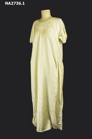
Clothing - Nightdress, Boudoir Jacket
... Round neck, magar sleeve with shell crochet around edge. Gathers on hip, floral motif at neck edge on Nightdress. Motif on sleeve. ...Round neck, magar sleeve with shell crochet around edge. Gathers on hip, floral motif at neck edge on Nightdress. Motif on sleeve. ...Part of a trousseau for Helen Zerbe (Girlie) for her marriage to Clarence Pratt. Part of a Trousseau set - see NA2737 for bloomers and NA2738 for petticoat. Cream tussor silk nightdress and boudoir jacket. Round neck, magar sleeve with shell crochet around edge. Gathers on hip, floral motif at neck edge on Nightdress. Motif on sleeve. Straight jacket, magar sleeve crochet all around edge of jacket. Motif embroidered on front, spokee stitching on sleeve and on front.costume, female nightwear -
Clunes Museum
Textile - DOLLS CLOTHES, 1932
... Dolls clothes that belonged to Joan Brusaschi (nee Lorna Joan Baker) .1 Hand-sewn pale green silk dress, beige trim, flared skirt with insert .2 Hand-sewn pink floral dress with underskirt .3 Hand sewn cream shift, scalloped hemline, blue hand drawn motif on bodice .4 Blue cotton dress handsewn with cream trim...Clunes Museum 36 Fraser Street enter building through Collins Place Clunes goldfields dolls clothes toys brusaschi 1932 Nil Dolls clothes that belonged to Joan Brusaschi (nee Lorna Joan Baker) .1 Hand-sewn pale green silk dress, beige trim, flared skirt with insert .2 Hand-sewn pink floral dress with underskirt .3 Hand sewn cream shift, scalloped hemline, blue hand drawn motif on bodice .4 Blue cotton dress handsewn with cream trim Textile DOLLS CLOTHES ...Dolls clothes that belonged to Joan Brusaschi (nee Lorna Joan Baker) .1 Hand-sewn pale green silk dress, beige trim, flared skirt with insert .2 Hand-sewn pink floral dress with underskirt .3 Hand sewn cream shift, scalloped hemline, blue hand drawn motif on bodice .4 Blue cotton dress handsewn with cream trimNildolls clothes, toys, brusaschi, 1932 -
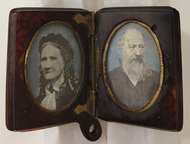 Kew Historical Society Inc
Photograph - Inlaid Tortoiseshell Locket, Pair of Henty Family Portraits
... The inlaid locket is probably Indian given the style of the floral inlay on the front and reverse. The portraits do not appear to be daguerreotypes, ambrotypes or tintypes and require further technical investigation....The inlaid locket is probably Indian given the style of the floral inlay on the front and reverse. The portraits do not appear to be daguerreotypes, ambrotypes or tintypes and require further technical investigation. ...The Henty family and their descendants were notable settlers in Australia, initially in Western Australia, then in Launceston and finally in Victoria. While most family members settled in Victoria from 1834, others remained in England and in Tasmania. The identity of the sitters in this mid 19th century pair of portraits is as yet unidentified. The locket was purchased by the Society as part of a small collection of Henty memorabilia and portraits from the owner of Moorabool Antiques, Geelong in 2021, which had in turn acquired the item from the estate of Dennis Alston of Alston's Antiques in Hamilton, Victoria.Members of the extended Henty family were notable British settlers of southeastern and southwestern Australia. The connection to Kew (Vic.) is that members of the Henty family owned important mansions in Kew in the 19th century. Stephen George Henty's family lived at 'Findon', and Francis Henty of 'Merino Downs' in the Western District lived in his final years at 'Field Place', Kew. Numerous members of the Henty family are buried in the Boroondara General Cemetery.Small hinged locket made of tortoiseshell inlaid with mother-of-pearl, silver and gold. The locket is designed to be worn as a pendant. The two hand-tinted encased oval portraits are of an elderly woman on the left and an elderly bearded man on the right. The inlaid locket is probably Indian given the style of the floral inlay on the front and reverse. The portraits do not appear to be daguerreotypes, ambrotypes or tintypes and require further technical investigation.henty family, australia - early settlers -
 City of Greater Bendigo - Civic Collection
Ceremonial object - Engraved Silver Trowel, Bendigo and Eaglehawk Electric Light and Tramway Powerhouse, 1901
... Top face of trowel is ornately engraved with floral and decorative motifs and an image of an electric tram and two power poles. ...Top face of trowel is ornately engraved with floral and decorative motifs and an image of an electric tram and two power poles. ...This trowel was presented to City of Bendigo Mayor, Simeon Ryan by Mr B. Deakin the Australian representative of the Victorian Electric Supply Company on the occasion of the laying of the foundation stone for the new power house building in Hargreaves Street, Bendigo. This power house was built to supply power to both Bendigo and Eaglehawk and the overhead power system for the tramway which ran from Quarry Hill, through the city to Eaglehawk and from Golden Square to Lake Weeroona. The building of the power house changed Eaglehawk and Bendigo as street lights were installed and houses became electrified. A report in the Bendigo Independent in 1902 reported ' Night will then be almost as brilliant as the day and people .... who live in the suburbs are to be provided with a tram service worth of the name'. (See reference A Mammoth Scheme.) The tramways closed in April 1972 after the Victorian Parliament granted the SEC an application to cease operating. Today Bendigo Trust operates the tourist trams which run along Pall Mall and welcomes over 40,000 visitors annually. The Bendigo Tramways Depot is the oldest operating tram depot in Australia and is listed on the Victorian Heritage Register. There are currently 45 trams in the fleet (13 of which operate as part of the 'Talking' Tram service).For more about the history and to tour the tramways visit www.bendigotramways.com.Triangular shaped silver engraved trowel with ivory handle (0286a). Top face of trowel is ornately engraved with floral and decorative motifs and an image of an electric tram and two power poles. Reverse has engraved text. No makers mark detected. Housed in a leather covered case (0286b), lined with ruched blue silk. Case has two brass hinges and two small brass clasps.PRESENTED / By / THE ELECTRIC SUPPLY CO / OF VICTORIA TO / SIMEON RYAN. ESQ JP. / MAYOR OF BENDIGO / ON THE OCCASION OF HIS LAYING / THE MEMORIAL STONE OF THE / BENDIGO AND EAGLEHAWK / ELECTRIC LIGHT AND TRAMWAY / POWER HOUSE / 26th JUNE, 1901/ STERLING SILVERcouncillor simeon ryan, councillor s h mc gowan, councillor john hoskins, councillor george loudon, councillor john green, councillor alfred hicks, borough of eaglehawk, borough of eaglehawk mayor, mayor loudon, city of bendigo mayor, mayor ryan, bendigo and eaglehawk tramway -
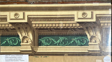 Villa Alba Museum
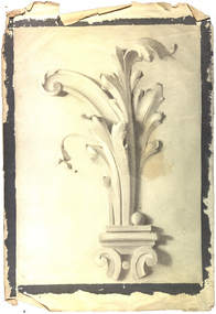
Wallpaper sample - Architectural border frieze, mid 19th century
... The sample demonstrates the elaborate ornamental style characteristic of the High Victorian Period which utilised classical motifs like scrolls and floral patterns. This particular example was a remnant wallpaper from the work of a painter and decorator in Kyneton, Victoria. ...The sample demonstrates the elaborate ornamental style characteristic of the High Victorian Period which utilised classical motifs like scrolls and floral patterns. This particular example was a remnant wallpaper from the work of a painter and decorator in Kyneton, Victoria. ...Part of a collection of historic wallpapers collected by Phyllis Murphy, most of whose wallpapers were donated to the collection of Historic Houses Sydney. This wallpaper sample, annotated and encased in mylar was used by Phyllis for educational purposes, and donated by her son to Villa Alba Museum's collection in 2025.Mid 19th century architectural frieze wallpaper representing a cornice. The design features a classic cornice with prominent corbels (bracket-like supports) and a decorative frieze section. The sample demonstrates the elaborate ornamental style characteristic of the High Victorian Period which utilised classical motifs like scrolls and floral patterns. This particular example was a remnant wallpaper from the work of a painter and decorator in Kyneton, Victoria. P. A3 (f)heritage interiors, wallpapers, 19th century design, wallpaper borders, classical friezes -
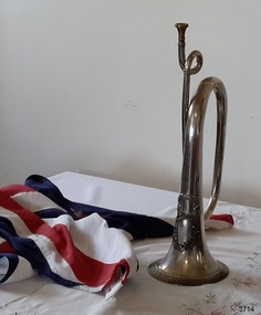 Flagstaff Hill Maritime Museum and Village
Instrument - Bugle, 1861
... The front of the bell features an elaborate design, including a ribbon banner attached above an oval floral wreath that encloses an inscription. ...The front of the bell features an elaborate design, including a ribbon banner attached above an oval floral wreath that encloses an inscription. ...Bugles have been used for hundreds of years to communicate instructions, particularly in battles and for announcements such as calls to assemble and various other daily routines, especially for infantry and military units. This pure silver bugle was presented to the Warrnambool Rifle Volunteers by Lady Helpman, on behalf of the Ladies of the District of Warrnambool, on June 18th, 1861. Lady Helpman's husband, Captain Benjamin Franklin Helpman, was the Warrnambool Harbour master. The gift of this silver bugle was presented to the commanding officer of the Warrnambool Volunteer Rifle Corps, Captain Bushe, who then passed it on to the Warrnambool Volunteer Band. On 11th August 2016, during a ceremony at Flagstaff Hill, the Australian Army handed over guardianship of two very significant historical items, the 1885 W. Clarke Trophy and the 1861 Warrnambool Ladies Silver Bugle, to Warrnambool City Council for display at Flagstaff Hill Maritime Museum. Both heritage-listed items are strongly connected to the city of Warrnambool and form an integral part of the history of the Warrnambool Garrison.The Silver Bugle is locally significant to the community of Warrnambool for its connection to the Warrnambool Volunteer Rifle Corps - part of the original Warrnambool Garrison – which was formed to protect the Warrnambool Harbour. The site of the 1888 Warrnambool Garrison and Fortifications is Victorian State Heritage-listed. It is significant for its intact and operational nature, and is one of the best-preserved pieces of Victoria's early colonial heritage.Silver alloy Bugle, with a brass mouthpiece, a long tube of metal, narrow at the mouth end and gradually flaring to a wider shape at the bell at the other end. The tube is shaped into three bends. The front of the bell features an elaborate design, including a ribbon banner attached above an oval floral wreath that encloses an inscription. The outer rim of the bell has an impressed ancient Greek geometric border.On ribbon banner “Armed for the Right”. Within the wreath “TO THE / WARRNAMBOOL / VOLUNTEER RIFLE COMPANY / this tribute of due appreciation / is presented by / THE LADIES / of the District / Warrnambool 18th June / 1861”flagstaff hill, warrnambool, shipwrecked coast, flagstaff hill maritime museum, maritime museum, shipwreck coast, flagstaff hill maritime village, great ocean road, silver bugle 1861, bugle musical instrument, lieutenant benjamin helpman, doctor breton, captain bushe, bugler corrigan, drill instructor bernard, warrnambool volunteer rifle corps 1861, statistics of warrnambool volunteer rifle corps 1861, warrnambool volunteer rifle company, warrnambool rifle volunteers, warrnambool volunteer band, armed for the right, wall’s family hotel warrnambool, warrnambool garrison, volunteer corps -
 Bacchus Marsh & District Historical Society
Album, Stevenson and McNicoll Photographs of Bacchus Marsh and District in 1883
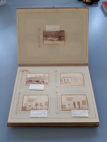
... The front page has a floral wreath of roses and forget-me-nots and a dragon-fly. ...The front page has a floral wreath of roses and forget-me-nots and a dragon-fly. ...In late 1883 the Melbourne based photographers Stevenson and McNicoll visited the Bacchus Marsh township and nearby districts. They are known to have been visiting the town in September 1883 and by November 1883 they were reported to have moved on to Myrniong and Ballan. During their visit they took numerous photographs. The images produced comprise scenes of shops and businesses in Bacchus Marsh, public buildings like the Court House and Bacchus Marsh Primary School, houses and their owners and several broader views of streets. The photos were then offered for sale. Photography businesses also sold albums for purchasers to display their photos.A unique and comprehensive set of images of people and places in the Bacchus Marsh town and district at a particular period in time, September-November 1883. This album of "carte de visites" photographs presents a rare compilation of the work of the Stevenson and McNicoll photography business. This team of photographers are known to have made several visits to towns and districts in the rural areas of Victoria and southern New South Wales in the 1880s and this album represents a very rare example of their non-portrait photography. The album is an example of the Victorian middle-class fashion to display family photographs for themselves and their visitors. These albums were often very expensive and in themselves evidence of the affluence of the family. They were made possible by the popularisation of photography as a social medium and were a forerunner of the coffee-table book. Medium sized leather-bound album, brown, front cover engraved with gold tooling in a starburst pattern. Pages are gold-lined. The inside front and end covers are in pale blue silk embossed with a gold floral pattern. The metal locking clasp is broken. The front page has a floral wreath of roses and forget-me-nots and a dragon-fly. The word "Album" is in the centre of the wreath, printed in gold in Gothic print. There are nine pages with pockets for four 65mm x 105mm sized "carte de visites" style photographs. Several feature pages have a single pocket for a larger photograph, or double pockets, possibly designed for family portraits. These portrait pages are also decorated with floral wreaths and insects, reflecting the theme of the frontispiece page. The smaller photos in the album were taken by the Melbourne photographers Stevenson and McNicoll, There are 48 of these smaller images. The images were created around September 1883 when photographers for Stevenson and McNicoll are known to have visited Bacchus Marsh and district. The images comprise scenes of shops and businesses in Bacchus Marsh, public buildings like the Court House and Bacchus Marsh Primary School, houses with their owners and several broader views of streets. References to various photos being created and being available for sale are mentioned in the Bacchus Marsh Express newspaper during September to November 1883. Each smaller photo has printed on the verso: Light & Truth. Copies of this Portrait can be had at any time by sending the Name and Post Office Money Order or Stamps for the amount of order to Stevenson & McNicoll, late Benson & McNicoll, Photographers. 108 Elizabeth Street, Melbourne.bacchus marsh vic. history, streetscapes, shops bacchus marsh vic., roads and streets bacchus marsh vic., stevenson and mcnicoll photographers, stevenson and mcnicoll 1883 photographs of bacchus marsh and district -
 Warrnambool and District Historical Society Inc.
Newspaper - The Argus, The Argus Melbourne, 1925
... The Latin inscription "Dieu et mon Droit" is written around the mostly floral illustration. The date price and publication details lie beneath this illustration. ...The Latin inscription "Dieu et mon Droit" is written around the mostly floral illustration. The date price and publication details lie beneath this illustration. ...This paper contains mostly news items and advertisements of the day. However some items contained within are fictional in nature.This is an original Argus in a maroon leather folder. The paper itself is a 32 page broadsheet which slides inside the folder for protection. A certificate of authenticity is glued to the inside cover of the folder.non-fictionThis paper contains mostly news items and advertisements of the day. However some items contained within are fictional in nature.warrnambool, the argus 1925, winslow, o'keefe, o'keeffe -
 Flagstaff Hill Maritime Museum and Village
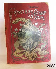
Book - Stamp Album, CF Lucke, publisher, Illustrated Postage Stamp Album, ca 1900
... Inscription: Edwin J Dale, May 13th 1901" Cover: "Illustrated POSTAGE STAMP ALBUM" Inage on cover: "within a floral border, a robed figure wearing a winged helmet, holding a staff with two snakes in one hand, and a sealed letter in the other." ...It represents the hobbies and past times of the people of that era. flagstaff hill warrnambool shipwrecked-coast flagstaff-hill flagstaff-hill-maritime-museum maritime-museum shipwreck-coast flagstaff-hill-maritime-village illustrated postage stamp album postage stamp album stamp album book postage stamp stamp Edwin J Dale May 13th 1901 stamp collecting German stamp album Spottiswoode & Co Ltd Germany CF Lucke Leipzig CF Lucke Leipzig Inscription: Edwin J Dale, May 13th 1901" Cover: "Illustrated POSTAGE STAMP ALBUM" Inage on cover: "within a floral border, a robed figure wearing a winged helmet, holding a staff with two snakes in one hand, and a sealed letter in the other." ...The inscription in the book indicates that it once belonged to Edwin J Dale, who may have received it May 13th 1901, the date on the inscription. The album was made in Germany and has English, German, French and Spanish language on the fly page. It has 2000 pockets for holding stamps and is illustrated. The printer, Spottiswoode and Co., was established in 1738 by William Strahan, with premises in New Street Square, London. The growing firm advertised as Printers, Lithographers, Stationers, Electrotypers, Publishers, and Booksellers and by 1914 there were 1,000 employees.The stamp album is of Victorian vintage and shows that at the end of the 19th century people collected stamps. It represents the hobbies and past times of the people of that era.Illustrated Postage Stamp Album. Publisher: Lalso by CF Lucke, Leipzig, Germany Printer: Spottiswoode & Co Ltd, London Date: 1908 Red hardcover, illustrated with a robed figure image and text in English, German, French and Spanish. Book has information, advertising and pages divided into blank squares for attaching stamps. Some pages have cutouts where squares would have been, perhaps holding stamps. An inscription with the name Edwin J Dale, 13 May 1901 is on the first turned page..Inscription: Edwin J Dale, May 13th 1901" Cover: "Illustrated POSTAGE STAMP ALBUM" Inage on cover: "within a floral border, a robed figure wearing a winged helmet, holding a staff with two snakes in one hand, and a sealed letter in the other." Fly: "Registered" "Schaubeks Postage Stamp Album" "Victoria" "Briefmarken"[German - stamps] "Pour Timbres-poste" [French - for postage Stamps] "Para Selloyde Correo" [Spanish - for postage stamps] "With 1070 reduced illustrations, 2200 blank cases for stamps" (also in German, French and Spanish) "Made in Germany"flagstaff hill, warrnambool, shipwrecked-coast, flagstaff-hill, flagstaff-hill-maritime-museum, maritime-museum, shipwreck-coast, flagstaff-hill-maritime-village, illustrated postage stamp album, postage stamp album, stamp album, book, postage stamp, stamp, edwin j dale, may 13th 1901, stamp collecting, german stamp album, spottiswoode & co ltd, germany, cf lucke leipzig, cf lucke, leipzig -
 Mont De Lancey
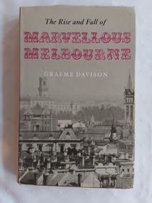
Book, Graeme Davidson, The Rise and Fall of Marvellous Melbourne, 1978
... Included is a small white envelope with 'Dear Pattie' handwritten on the front in black biro: 'Dear Pattie.' A printed pink floral card inside the envelope says: 'Birthday Greetings for you'. ...Included is a small white envelope with 'Dear Pattie' handwritten on the front in black biro: 'Dear Pattie.' A printed pink floral card inside the envelope says: 'Birthday Greetings for you'. ...This book looks beyond public events to discover how the experience of boom and depression touched the lives of ordinary Melburnians at work and at home and reshaped their society and their sense of urban identity.A red hardcover book, The Rise and Fall of Marvellous Melbourne by Graeme Davidson. The red cover has large flourished gold embossed letters MM on the front cover with the title and publisher symbol at the bottom of the spine. It has a grey dust jacket with the title printed in black and red letters at the top front and the author written in white letters below. A full page grey and white cityscape of Melbourne wraps around the jacket. On the inside of the jacket there is a blurb explaining briefly the book's contents. There is a Contents, list of Illustrations, Acknowledgements, Notes and Abbreviations pages. On the back inside jacket are details of the author. Tables, black and white illustrations and photographs are included.non-fictionThis book looks beyond public events to discover how the experience of boom and depression touched the lives of ordinary Melburnians at work and at home and reshaped their society and their sense of urban identity.history melbourne, australian history, melbourne - economic conditions - 1880-1890 -
 Federation University Historical Collection
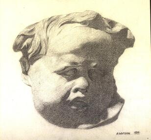
Drawing - Artwork - Drawing, Edith Alice Watson, 'Drawing the Human Figure from Casts' by Alice Watson, 1931 and 1932
... Her folio applies many Australian native floral elements to design. Upon graduating, Watson taught at the Murtoa High School, living with her parents until their deaths in 1972 and 1988 when she was 74 years old. ...Her folio applies many Australian native floral elements to design. Upon graduating, Watson taught at the Murtoa High School, living with her parents until their deaths in 1972 and 1988 when she was 74 years old. ...Edith (Alice) WATSON (1914–2010) Murtoa | Australia Alice Watson studied at the Ballarat Technical Art School (at the School of Mines, Ballarat) from 1930 until 1933. Watson sat several departmental exams, including drawing and painting plant forms from nature, lettering, Composition of Form and Colour and advanced General Design, as well as dressmaking and embossed leatherwork. Her folio applies many Australian native floral elements to design. Upon graduating, Watson taught at the Murtoa High School, living with her parents until their deaths in 1972 and 1988 when she was 74 years old. Alice Watson died in Ballarat, aged 95, having conserved her beautiful student folio, which was generously gifted to the Federation University permanent Historical Collection by the Watson family.Twelve drawings undertaken for the 'Drawing the Human Figure from Casts' class at the Ballarat Technical Art School. The works were undertaken by Edith Alice Watson. The full folio of work undertaken while Alice Watson was a student at the Ballarat Technical Art School is held by Federation University Australia.most are signed A.Watson 1932.edith alice watson, alice watson, ballarat technical art school, plaster cast, artwork, alumni, drawing the human figure from casts, visual arts -
 Federation University Historical Collection
Drawing - Artwork - Drawing, Edith Alice Watson, Drawing from the Plaster Cast by Alice Watson, 1930-1931
... Her folio applies many Australian native floral elements to design. Upon graduating, Watson taught at the Murtoa High School, living with her parents until their deaths in 1972 and 1988 when she was 74 years old. ...Her folio applies many Australian native floral elements to design. Upon graduating, Watson taught at the Murtoa High School, living with her parents until their deaths in 1972 and 1988 when she was 74 years old. ...Edith (Alice) WATSON (1914–2010) Murtoa | Australia Alice Watson studied at the Ballarat Technical Art School (at the School of Mines, Ballarat) from 1930 until 1933. Watson sat several departmental exams, including drawing and painting plant forms from nature, lettering, Composition of Form and Colour and advanced General Design, as well as dressmaking and embossed leatherwork. Her folio applies many Australian native floral elements to design. Upon graduating, Watson taught at the Murtoa High School, living with her parents until their deaths in 1972 and 1988 when she was 74 years old. Alice Watson died in Ballarat, aged 95, having conserved her beautiful student folio, which was generously gifted to the Federation University permanent Historical Collection by the Watson family.A series of drawings undertaken by Alice Watson when she was studying "Drawing From the Plaster Cast" at the Ballarat Technical Art School. Some drawings are double sided.plaster casts, drawing, ballarat technical art school, alice watson, edith alice watson, alumni, visual arts -
 Federation University Historical Collection
Work on paper - Compositions, sketches and studies from student folio, Edith Alice Watson, Composition of Form and Colour, 1930-1933
... Her folio applies many Australian native floral elements to design. Upon graduating, Watson taught at the Murtoa High School, living with her parents until their deaths in 1972 and 1988 when she was 74 years old. ...Her folio applies many Australian native floral elements to design. Upon graduating, Watson taught at the Murtoa High School, living with her parents until their deaths in 1972 and 1988 when she was 74 years old. ...Edith (Alice) WATSON (1914–2010) Murtoa | Australia Alice Watson studied at the Ballarat Technical Art School (at the School of Mines, Ballarat) from 1930 until 1933. Watson sat several departmental exams, including drawing and painting plant forms from nature, lettering, Composition of Form and Colour and advanced General Design, as well as dressmaking and embossed leatherwork. Her folio applies many Australian native floral elements to design. Upon graduating, Watson taught at the Murtoa High School, living with her parents until their deaths in 1972 and 1988 when she was 74 years old. Alice Watson died in Ballarat, aged 95, having conserved her beautiful student folio, which was generously gifted to the Federation University permanent Historical Collection by the Watson family. commercial artSeven paintings undertaken by Edith Alice (Alice) Watson at the Ballarat Technical Art School, a division of the Ballarat School of Mines. ballarat technical art school, edith alice watson, ornament, flora, alumni, composition, composition of form and colour, general design, australian flora, light and shade, commercial art -
 Villa Alba Museum
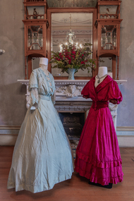
Album - Exhibition photographs, Textiles in Bloom, 2021
... The walls and ceilings of the house are notable for their use of floral and narrative painted decoration produced, in the early 1880s, for William and Anna Maria Greenlaw by the Melbourne art decoration firm the Paterson Brothers. ...The walls and ceilings of the house are notable for their use of floral and narrative painted decoration produced, in the early 1880s, for William and Anna Maria Greenlaw by the Melbourne art decoration firm the Paterson Brothers. ...As part of the National Trust's Australian Heritage Festival 2021, the Kew Historical Society and the Villa Alba Museum collaborated to mount a fashion and design exhibition. The theme of the exhibition took its focus from the year-long program at the Museum featuring the use of flowers in design. The walls and ceilings of the house are notable for their use of floral and narrative painted decoration produced, in the early 1880s, for William and Anna Maria Greenlaw by the Melbourne art decoration firm the Paterson Brothers. The examples of fashion and design from the collection of the Kew Historical Society were located on the ground floor of the house: in the drawing room, dining room, morning room and in the vestibule, or ballroom as it was sometimes described in nineteenth century newspapers. The exhibition was supported by the City of Boroondara through Triennial Operational Grant funding for the Kew Historical Society and the Villa Alba Museum.Series of photographs taken by Mitchell Luo Photography of exhibition pieces in situ at the Villa Alba Museum in May 2021.textiles in bloom, exhibitions — villa alba museum, australian heritage festival 2021 -
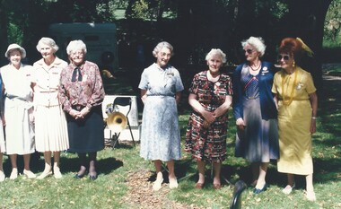 Melbourne Legacy
Photograph, Widows Outdoor Concert 1994, 1994
... President of the Melbourne Widows Club Irene Noll is seen in the first photo in floral top and black skirt. Legatees Geoff Swan and Charles Munnerley are standing by the microphone as Legatee Eddie Jowett reads something. ...President of the Melbourne Widows Club Irene Noll is seen in the first photo in floral top and black skirt. Legatees Geoff Swan and Charles Munnerley are standing by the microphone as Legatee Eddie Jowett reads something. ...A regular event for the widows was a concert in Fitzroy gardens performed by the Police Band. Usually held in March each year. The police horse Gendarme was a regular favourite and his horse float can be seen in the background. These photos show the widows enjoying the music and performers. President of the Melbourne Widows Club Irene Noll is seen in the first photo in floral top and black skirt. Legatees Geoff Swan and Charles Munnerley are standing by the microphone as Legatee Eddie Jowett reads something. Legatee Jowett regularly hosted and sang at monthly concerts at Legacy House. An article in the Answer in June 1994 shows Irene Noll at the concert in the same clothes so the date is assumed to be 1994. (Though it could also be 1992 which was when Legatee Geoff Swan was president).A record of regular events for widows to attend and enjoy together.Colour photo x 7 of widows at a concert in Fitzroy Gardens and an article in The Answer.widows, concert, answer, police band, fitzroy gardens -
![Photograph - Exhibition Textiles in Bloom [Series], 2021](/media/collectors/550653872162f11fb04854aa/items/60c533f73954ecd6d0c727f7/item-media/60c5550b3954ecd6d0c78acd/item-fit-380x285.jpg?cb=6) Kew Historical Society Inc
Kew Historical Society IncPhotograph - Exhibition Textiles in Bloom [Series], 2021
... The walls and ceilings of the house are notable for their use of floral and narrative painted decoration produced, in the early 1880s, for William and Anna Maria Greenlaw by the Melbourne art decoration firm the Paterson Brothers. ...The walls and ceilings of the house are notable for their use of floral and narrative painted decoration produced, in the early 1880s, for William and Anna Maria Greenlaw by the Melbourne art decoration firm the Paterson Brothers. ...As part of the National Trust's Australian Heritage Festival 2021, the Kew Historical Society and the Villa Alba Museum collaborated to mount a fashion and design exhibition. The theme of the exhibition took its focus from the year-long program at the Museum featuring the use of flowers in design. The walls and ceilings of the house are notable for their use of floral and narrative painted decoration produced, in the early 1880s, for William and Anna Maria Greenlaw by the Melbourne art decoration firm the Paterson Brothers. The examples of fashion and design from the collection of the Kew Historical Society were located on the ground floor of the house: in the drawing room, dining room, morning room and in the vestibule, or ballroom as it was sometimes described in nineteenth century newspapers. The exhibition was supported by the City of Boroondara through Triennial Operational Grant funding for the Kew Historical Society and the Villa Alba Museum.Series of photographs of exhibition pieces in situ at the Villa Alba Museum in May 2021.fashion & design, exhibitions -- kew historical society, exhibitions --- villa alba museum, textiles in bloom, fashion - nineteenth century, fashion -- twentieth century, textiles - nineteenth century, headwear -- twentieth century -
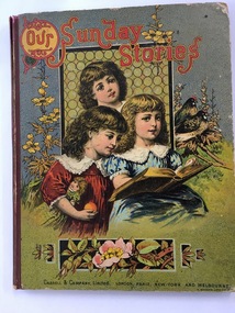 Warrnambool and District Historical Society Inc.
Book, Our Sunday Stories, 1880's
... This is a hard cover book of 80 pages It has a multi-coloured front cover depicting three children reading a book with a window behind them and floral decorations and two birds surrounding the three girls. ...This is a hard cover book of 80 pages It has a multi-coloured front cover depicting three children reading a book with a window behind them and floral decorations and two birds surrounding the three girls. ...This book was a prize given by the Warrnambool Baptist Sunday School to Richard Petterd in 1888. The Warrnambool Baptist Church was established in 1864 in a small cottage in Kinross Avenue in Warrnambool at the home of Mr and Mrs Andrew Griffiths. In 1869 a church was built in Koroit Street and enlarged in 1974. From time to time more improvements were made and the church still operates from the same site today. A Sunday School was established in 1865. Richard Forrester Petterd, born in 1878 in Warrnambool, was the son of George Petterd and Mary Ann Petterd, nee Warn. He married Susanna McConnell in 1903 and died in 1935. A daughter, Muriel, married Frederick Wooles in 1933 and it was their son, Kenneth from whose estate this book has come to be added to the Society’s collection.This book is most significant as it is a rare memento from the early days of the Warrnambool Baptist Sunday School and it belonged to Richard Petterd whose family was involved in businesses in Warrnambool as picture framers, stationery and fancy goods shop proprietors and estate commission agents. The book is a very attractive example of Victorian-era children’s books. This is a hard cover book of 80 pages It has a multi-coloured front cover depicting three children reading a book with a window behind them and floral decorations and two birds surrounding the three girls. The red binding is somewhat torn. The back cover has black and white etchings of flowers and children and advertisements for other books available. The book has several black and white drawings in grey tonings.‘Warrnambool Baptist Sunday School, Fourth Class United, Third Prize awarded to Richard Petterd, April 10th 1888.’warrnambool baptist church, richard petterd, kenneth wooles -
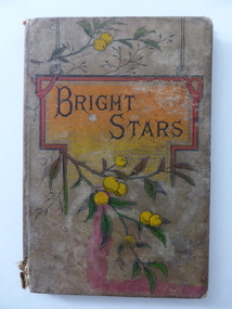 Warrnambool and District Historical Society Inc.
Book, Bright stars, Late 19th century
... The cover, dark green with a coloured floral pattern on the front and back, has been partly detached from its cloth binding. ...The cover, dark green with a coloured floral pattern on the front and back, has been partly detached from its cloth binding. ...This small book, a prize given to George Powell in 1891, is believed to have come from the Warrnambool South State School. The signature in the book is that of John Sloss and he was the first Head Teacher of Warrnambool South State School which opened in 1877 and closed in 1995. The Powell families were in business in Warrnambool in the 1890s and the recipient of the prize may have been George Powell who was born in Warrnambool to George and Kate Powell in 1878. This book is of considerable interest because it appears to have been a prize awarded by Warrnambool South State School in 1891. The book is one of the few items we have connected to the early years of the Warrnambool South School. The book is a mixture of fact and fiction and the stories are meant to be instructive as well as entertaining.This is a hard cover book of 62 pages. The cover, dark green with a coloured floral pattern on the front and back, has been partly detached from its cloth binding. The book has several black and white sketches, with some pages missing at the beginning of the book. There are advertisements for other books on the inside of the covers. The pages and the cover are much stained. The inscription on the first page is handwritten in black and blue ink.‘3rd Prize, Upper 1st Class, Won by George Powell, Marks obtainable 200, Marks obtained 120. John Sloss, H.Teacher, 17/12/91.’ george powell, warrnambool south state school