Showing 1736 items
matching colours
-
 Warrnambool and District Historical Society Inc.
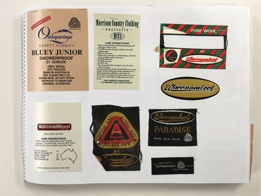
Booklet, Scrap Book Warrnambool Woollen Mill, Late 20th century
In 1869, the Warrnambool Meat Preserving Company commenced their business on the site, where it operated until 1875 when it was sold to the directors of the Warrnambool Woolen Mill Company. After being destroyed by fire in 1882 it wasn’t until 1910 that the Warrnambool Chamber of Commerce was approached by Marcus Saltau and Peter McGennan to invest in a new mill. The original directors were James Dickson, P J McGennan, Robert Swinton, M Saltau, and J W Younger. In 1955 the Warrnambool Woollen Mill formed a partnership with the Wangaratta Woollen Mills. Dunlop bought the mill in 1968. From that time until its closure in 2000 it had a number of different owners, the last being the Smith Family Industries.This book contains a large number of labels some of which would have been sewn to the corner of the many blankets which were manufactured over the long history of the Woollen Mill.Some are cloth of a satin type. Some state care instructions and some have been made under other name brands such as Myer, Patersons and Nile. There is also a range of types of blankets such as travel and picnic rugs, baby blankets.Some are pure wool, others are a blend of synthetic and wool, mohair. In the latter stages of its operation, under the ownership of the Smith family , recycled woollen product was produced.This is an interesting collection of labels which were produced and collected over a long period of time and therefore provide a valuable insight into different styles and variety of the blankets produced by the Warrnambool Woollen mill which played a large part in the social and employment history of the city for nearly all of the 20th century. The different styles and colours provide a snapshot of design and artistic styles of the period. Large Spirax folder with yellow and white check patterned cover with dark blue writing.A Warrnambool label in gold,black and white is glued to front cover . Back cover is grey heavier card. The white pages have a large number of labels which relate to the Warrnambool Woollen Mill . Some are stapled and others are glued.Genuine drawing cartridge 48 sheets . Made in Indonesia.warrnambool, warrnambool woollenmill,warrnambool blankets warrnambool blankets labels, -
 Warrnambool RSL Sub Branch
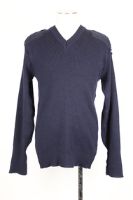
Jumper, Calcoup Knitwear, C 2015
This jumper is part of a General Purpose Uniform issued by the Australian Airforce to Bernard Farley during service. This uniform type was developed in 2014 and replaced camouflage as the uniform worn during general base duties and in non-warlike environments. Although a camouflage pattern, this design is not intended for use as camouflage. This woolen jumper was presumably a winter addition to the GPU.This item has social significance, as an item of uniform worn by Warrnambool RSL community member and Secretary (2019), Bernard Farley during service with the Australian Airforce. The item is a representative example of current Airforce General Purpose Uniform and is in excellent condition. As a set, the uniform has aesthetic significance in it’s design, incorporating GPU uniform design from the Army alongside the colours and motifs of the Australian Airforce. Navy blue ribbed knitted jumper with stitched navy cotton elbow patches, rectangular in shape. Similar rectangular shaped patches on the left and right shoulder, bearing two epaulettes, stiched at one end and fastened with velcro and the other. The left shoulder carries an Airforce embroidered patch at the top of the arm. Arm cuffs have external seam for approximately 100 mm from the end, indicating that the jumper may have been worn with cuffs folded over. Synthetic strip of black fabric on the interior collar behind a cream coloured label.Label on interior of collar reads: “CALCOUP KNITWEAR/291083/ 06/01 / 8405/661468799 / SIZE: 115cm-125cm/SERVICE No........./ NAME........../MACHINE WASHABLE GENTLE CYCLE/Fasten shoulder straps before/washing. Warm machine wash,/inside out on medium cycle./Do not bleach./Warm rinse. Normal spin./Doi not tumble dry./Dry in shade. Warm iron./ Dry Cleanable A/80% Wool 20% Nylon”camouflage, general purpose uniform, airforce, uniform, australian defence force -
 Warrnambool and District Historical Society Inc.
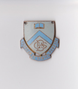
Badge - Badge Braemar Grammar Warrnambool
Badge belonged to Lois,Thea & Lenore BrauerBraemar Grammar closed 1951? Badge shows school motto and coloursShield shape with 3 flag sections for motto. White & Light /\ arrow, book, shield cover shield with 2 holes to secure Prorsum et semper honestebadge, motto, braemar grammar, warrnambool -
 Orbost & District Historical Society
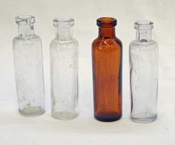
bottles, first half 20th century
Australia was not self sufficient in glass making until the turn of the 20th century and many bottles were made overseas and shipped to Australia with their contents and when emptied were re-filled with other company’s products. These bottles have an aesthetic element in that the shapes , colours and textures are visually appealing. They reflect the type of glassware that was in circulation in the first half of the 20th century.. Four glass bottles. Three are clear and one (1528.3) is brown. They have non threaded necks with molded rims.bottles -
 Flagstaff Hill Maritime Museum and Village
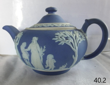
Ceramic - Teapot, Josiah Wedgwood & Sons Ltd, 1890
Josiah Wedgwood (1730–95), came from an established family of potters and trained with his elder brother. He was in partnership with the leading potter Thomas Whieldon from 1754 until 1759 when a new green ceramic glaze he had developed encouraged him to start a new business on his own. Relatives leased him the Ivy House in Burslem, Stoke-on-Trent, and his marriage to Sarah Wedgwood, a distant cousin with a sizeable dowry, helped him launch his new venture. After an extensive and systematic program of experiment Wedgwood in 1765 created a new variety of creamware, a fine glazed earthenware, which was the main body used for his table wares thereafter. After he supplied Queen Charlotte with a tea set for twelve the same year, she gave official permission to call it "Queen's Ware" (from 1767). This new form, perfected as white pearlware (from 1780), sold extremely well across Europe, and to America. It had the additional advantage of being relatively light, saving on transport costs and import tariffs in foreign markets. Wedgwood developed several further industrial innovations for his company, notably a way of measuring kiln temperatures accurately, and several new ceramic bodies including the "dry-body" Stoneware, "black basalt" (by 1769), cane ware, and jasperware (the 1770s), all designed to be sold unglazed, like "biscuit porcelain". In the later 19th century the company returned to being a leader in the design and technical innovation, as well as continuing to make many of the older styles. Despite increasing local competition in its export markets, the business continued to flourish in the 19th and early 20th centuries, remaining in the hands of the Wedgwood family, but after World War II it began to contract, along with the rest of the English pottery industry. After buying several other Staffordshire ceramics companies, in 1987 Wedgwood merged with Waterford Crystal to create Waterford Wedgwood plc, an Ireland-based luxury brands group. After a 2009 purchase by KPS Capital Partners, a New York-based private equity firm. Wedgwood has always been associated with fine china, porcelain, and luxury accessories, the entrepreneur Josiah Wedgwood rapidly became successful and was soon one of the largest manufacturers of Staffordshire pottery. Wedgwood is a significant pottery manufacturer as the company is especially associated with the "dry-bodied" (unglazed) stoneware Jasperware in contrasting colours, and in particular that in "Wedgwood blue" and white that has become a trademark. Teapot and lid, Wedgwood blue Jasperware with white patternImpressed name Wedgewood and date letter "S" = 1890flagstaff hill, warrnambool, flagstaff hill maritime museum, maritime museum, shipwreck coast, flagstaff hill maritime village, great ocean road, teapot, wedgewood blue, wedgewood teapot, tea pot, kitchen ware, josiah wedgwood, staffordshire potteries -
 Flagstaff Hill Maritime Museum and Village
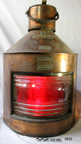
Functional object - Navigation Lamp, W. T George and Co. Ltd, ca 1941
William Thomas George was born in Birmingham in 1884 and was a tin plate worker. He and his wife Ellene had a son Leslie Thomas George. The firm W T George & Co was formed sometime later. In 1939 his firm produced ship lamps. The Patent Number GB546575 on the lamp's plate was assigned to Leslie Thomas George in 1941 for improvements in, or relating to, ships' lanterns. From that time the patent number was affixed to their namufactured Meteorite lights. The ship navigation lamp is important as an example of the evolution of marine safety technology. Countries began passing laws and regulations in the 1830s that required ships to show navigation lights at night or in poor weather. From the late 1840s colours were standardised; red for portside of the vessel and green for starboard, a white masthead light, and a white light at anchor. By 1914 the International Convention for the Safety of Life at Sea was formed and continues, with decisions and notifications on improvements and changes.. Lamp; Portside ship's lamp is rounded in the front with two flat sides coming to a point at the rear. Glass has circular ridging. Metal handle with lid and clasp. The reflector has red colouring. Inscribed on fixed plates on the front, with maker's details and Patent number. This Meteorite lantern was made by W T George and Co Ltd, of Birmingham. "Port" "W T George and Co Ltd" "Sherlock Street Birmingham" "Meteorite 68990 Patented No 546575 and others pending"warrnambool, shipwreck coast, flagstaff hill, flagstaff hill maritime museum, flagstaff hill maritime village, portside ships lamp, portside, port lamp, ship's lamp, marine lamp, navigation lamp, w t george & co, coloured lens, red lens, ship fitting, marine technology, navigation light, signal lamp, leslie thomas george, gb546575, patent gb546575, meteorite, lantern, lamp, light -
 Federation University Historical Collection
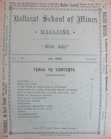
Magazine - Booklet, Ballarat School of Mines Student's Magazine, July 1899, 1899
Table of contents: Editorial, News and Notes, A few hints on histological technique, Summaries and notes from the mining journals, Professor A. Mica Smith B.Sc., Notes on Victorian geology, The origin of diamonds, Hydraulic mining, Volcanoes, Analytical chemistry notes, Some things we ought to do, Sports, Correspondence, Editorial notes.Pale green booklet of 10 pages. ballarat school of mines, students' magazine, g. e. saunder, w. wallace, j. booth, f. farnell, h. waller, a. h. freeman, w. e. hearman, professor dawbarn, e. gutheil, a. selwyn brown, h. watson, a. w. k. peirce, professor mica smith, w. bradford, henry watson, mr e. faribault, j. h. parsons, j. holmes pollock, t. s. hart, thomas hart, alfred mica smith, a. e. c. kerr, g. g. bonney, histological technique, diamonds, victorian geology, massey-harris bicycles, adelaide school of mines, ballarat school of mines colours, ballarat school of mines motto, ballarat school of mines badge, w.hirt, e. byron moore, britannia gold mine, visitors, j. bryant, premier mine coolgardie, last chance gold mine, g.e. saunder, ivanhoe mine kalgoorlie, black horse cyanide works, edgerton, hercules mine, mount reid, tasmania, f. parnell paul, zeehan school of mines, a.h. freeman, crown point gold mining co, w.e. hearman, parker's range, southern cross, w.a., trappean rocks, hydraulic mining, a.e.c. kerr, volcanoes, f.g. bonney, l.j. austine and co., downer and co, carter and werner -
 Bendigo Historical Society Inc.
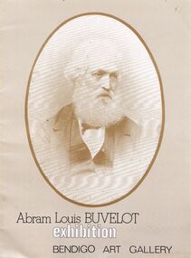
Document - ADAM LOUIS BUVELOT EXHIBITION BENDIGO ART GALLERY
Program of an exhibition by Abram Louis Buvelot at the Bendigo Art Gallerylllpainting, oil, abram louis buvelot, oil paintings, water colours, pencil drawings. -
 St Kilda Historical Society
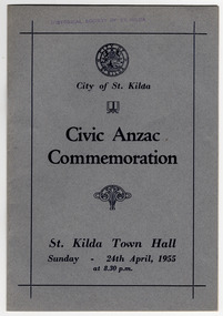
Ephemera - Special event program, Civic Anzac Commemoration, 1955
Program for a civic ANZAC commemoration, presented by the City of St Kilda, at St Kilda Town Hall on 24 April 1955.Grey coloured card and single sheet of white paper folded, stapled together and printed in blue.anzac, anzac day, city of st kilda, lt gen sir horace robertson, film - jungle patrol, film - the queen's colours -
 Tatura Irrigation & Wartime Camps Museum
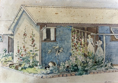
Painting - Painting - Water Colour, Camp 3 with girls
The two girls in the painting are Hedwig Vollmer and Aline Zollinger of Camp 3. The painting is believed to be by J Wolfgarten a German Wooolbuyer. Colour photograph of this painting is filed in the V internee file.Water colour painting of camp huts. Hut painted blue surrounded by gardens. The garden are outlined with bricks. The two window are open. One window has white curtains. Two girls are standing at the door. Both in pale dresses. One girl with blond hair standing on the threshold facing the other girl with dark hair girl who is standing just outside the doorway. 1942 Tatura (a mark before the date perhaps a stylised R)camp 3, german internees, german woolbuyer, camp huts, internment camp gardens, camp water colours -
 Tatura Irrigation & Wartime Camps Museum
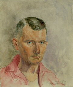
Painting - Painting - Watercolour, Leonhard Adam, Ipse Feci, 1941
Dr Leonhard Adam was a Dunera internee in Camp 2 Tatura.RomanticismWatercolour self portrait by artist Leonhard Adam. He is wearing a pink/light red collared open shirt with a white vest underneath. His hair is black with streaks of grey through it. He has blue eyes and a ruddy complexion.Ipse Feci . Leonhard Adam. Tatura (Victoria) Austr. 18-21 Januar 1941tatura, dunera, internee camps, leonhard adam, ipse fici -
 Tatura Irrigation & Wartime Camps Museum
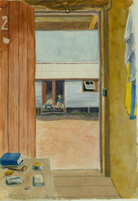
Painting - Painting - Watercolour, Tatura Camp Australian, 1940
Dr. Leonhard Adam was an internee in Camp 2.RomanticismFramed watercolour painting of Tatura internment camp barracks through doorway.Tatura Camp, Australia, 1940tatura, dunera', internee camps, illustrations, watercolour -
 Tatura Irrigation & Wartime Camps Museum
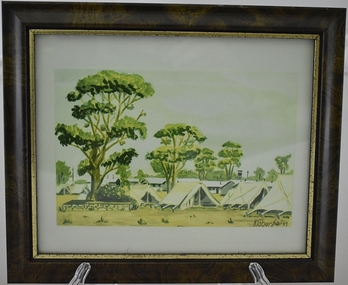
Artwork, other - sketch, POW Camp 13 - Tents, 1941
Water colour sketch by internee Klober at Camp13. Depicts tents used early 1941 before the galvanised iron huts were constructed on site.Laminated watercolour sketch of many tents with huts and large gum trees in the background. Brown frame with gold edgecamp art work, camp water colours, klober, camp 13, internment camp tents -
 Tatura Irrigation & Wartime Camps Museum
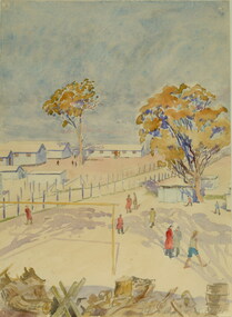
Painting - Painting - Watercolour, Leonhard Adam, Tatura Camp 4, 1941
Dr. Leonhard Adam was a Dunera internee in Camp 2.RomanticismMary-Clare AdamWatercolour painting of rows of barracks with internees and fencing at Tatura Camp.Tatura Camp 4, Victoria, 25 vii 41tatura, internee camps, dunera, leonhard adam -
 Ruyton Girls' School
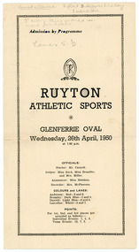
Programme, Ruyton Girls' School, Ruyton Athletic Sports, 26 April 1950
The pamphlet documents the agenda for the Ruyton Girls' School athletics sports carnival hosted at Glenferrie Oval on Wednesday, 26 April 1950. The program outlines a series of activities to be undertaken by junior and senior school students (including day girls and boarders), including crossball, potato sack race, hockey dribbling, egg and spoon race, relays, baseball throwing, and obstacle courses. Each sport is divided into age brackets including under 14, under 16, and 16 and over. The pamphlet also acts as a scorecard, featuring columns for recording results, points scored, progress points and times. Ruyton Girls' School has an exceptional reputation in school sport. The School is a member school of Girls' Sport Victoria (GSV), a large sporting association involving 24 independent girls’ schools in Melbourne. Girls in the Senior School have the opportunity to compete in a range of sports over the four terms and at three major carnivals; Swimming and Diving, Cross Country and Track and Field. Ruyton also has a very successful Rowing program and participates in the Victorian Interschools Snowsports Championships.The record has strong historic significance as it gives insight into the House system at Ruyton Girls' School; in particular, how the House system is used in a sports context. In the early 1920s, Ruyton was settling into its new home at Selbourne Road, Kew. At the time, students were arranged by their form (or year level) for lessons and other school activities. A collection of eight emblems and mottoes for each form group was published in the Ruytonian December 1922, although the genesis of each were left unexplained. With enrolments continually growing, Principal Miss Hilda Daniell felt a new basis of organisation would benefit students, giving them a broader outlook and something bigger to work for. She took inspiration from tradition and implemented a House system. The House system was adopted at Ruyton in September 1924 to "provide a new kind of co-operation and competition among the girls, especially in Sport." There were four houses, three of which were named after early Principals: Anderson, Bromby and Lascelles. There was also the School House, initially for boarders only. Some time after the publication of the Ruytonian in April 1928, the School House was renamed Daniell House, and had opened up to day girls. The account published by the newly formed Daniell House in the Ruytonian December 1928 reads, "we are rather bashful in presenting this account of our doings, for we are conscious of our newness. Our house has now the honour of being known as Daniell House." Four of the original eight form emblems were adopted by the new Houses, while the others were discarded. According to former teacher and author of the centenary history of Ruyton, Ms Majorie Theobald, the House system "gave a new focus for all competitive sport, which had previously been organised on a rather inequitable basis." The colours chosen for the Houses were cherry red for Anderson, royal blue for Bromby, gold for Lascelles, and pale blue for School (later Daniell). New students starting at Ruyton from Prep onwards are allocated to one of the following Houses with consideration to family connections and balance of numbers. The record's significance is further enhanced by its strong provenance, having been produced by Ruyton Girls' School and donated to the Archives by a familial connection of a former notable student.Pamphlet printed on cream coloured paper with navy blue ink. Two pages, folded in half.Obverse: tenns allowed 2 flat 3 teas 1 relay / 1 noveltie / 3 every thing entered in. / move for heats / Lanes 5 - 2 / First Page: under 15 50 yds. / 2. / 3 under 15 75 yds. / 4 / 5 / 6. Junior Crossball. / 7 / 8 / Second Page: 9 / 10 under 15. / 11 / 12 / 13 / 14 under 15 / 15 / 16. / Reverse: 21 Diamond Throwing open / 22 / 23 under 15 / 24 / 25 / 26 / 27 / Diamond / 28 / 29 / 30 / 31 / 32 / Junior under 15 1st July 1 Junior relay (?) / under 15 / Two sprints and potato go for championships /ruyton girls' school, students, school, ruyton, victoria, high school, senior school, day school, letter, old ruytonians association, kew, sport, school sport, girls' sport victoria, house, anderson, lascelles, bromby, daniell, athletics, glenferrie -
 Ruyton Girls' School
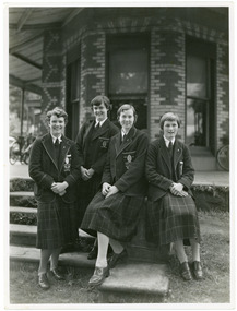
Photograph, Ruyton Girls' School, 1951
Depicted are four students who were the 1951 House Captains at Ruyton Girls' School. The photo is an official school portrait, taken outdoors in front of Henty House (formerly Tarring). In the background, we can see two bicycles. The girls are dressed in their school uniforms, comprising a knee-length check-print skirt, dark jumper, light-coloured collared buttoned blouse with a dark tie, wool blazer, stockings, and dark-coloured lace-up shoes. Two of the girls are standing, while the other two are seated on a small concrete plinth. The students have been identified, from left to right, as A. Dickinson (Lascelles), C. Kent (Anderson, H. Cole (Bromby), and E. Duff (Daniell). Student leadership commenced at Ruyton Girls' School in 1906 with the introduction of the prefect system. Prefects had numerous responsibilities—gate duty, grounds duty, classroom marking, assembly door watch, uniform monitoring, and even supervising student detention. In 1947, a dedicated Prefects Room was erected on the east side of the Ruyton Girls' School Assembly Room in Henty House. The prefects system was revised in 1968 with a new leadership structure: there would be a permanent School Captain, Vice Captain and School Sports Captain; six permanent prefects would be elected, and the rest of the Matriculation class would form committees. These included Library, Social Services, S.C.M., Editorial, and Music. In this way, it was thought "that each Matric girl would have a certain amount of responsibility." With this revised structure came a brand new Prefects' Study, located in a former classroom next to the Domestic Science building. Each prefect was allocated one book locker, one clothing locker, "a small share in the heater", plus a new shared lounge. The prefect system was updated again in 1974. All sixth formers would become prefects, or "school officials." This saw the sixth form divided into two halves: one group would be prefects for the first half of the year, then the second group would take the reigns in the latter half of the year. In October 2023, Ruyton announced a new collaborative leadership structure for captains, prefects and house leaders, which would see two students in each leadership role.The record has strong historic significance as it gives insight into the House system at Ruyton Girls' School. In the early 1920s, Ruyton was settling into its new home at Selbourne Road, Kew. At the time, students were arranged by their form (or year level) for lessons and other school activities. A collection of eight emblems and mottoes for each form group was published in the Ruytonian December 1922, although the genesis of each were left unexplained. With enrolments continually growing, Principal Miss Hilda Daniell felt a new basis of organisation would benefit students, giving them a broader outlook and something bigger to work for. She took inspiration from tradition and implemented a House system. The House system was adopted at Ruyton in September 1924 to "provide a new kind of co-operation and competition among the girls, especially in Sport." There were four houses, three of which were named after early Principals: Anderson, Bromby and Lascelles. There was also the School House, initially for boarders only. Some time after the publication of the Ruytonian in April 1928, the School House was renamed Daniell House, and had opened up to day girls. The account published by the newly formed Daniell House in the Ruytonian December 1928 reads, "we are rather bashful in presenting this account of our doings, for we are conscious of our newness. Our house has now the honour of being known as Daniell House." Four of the original eight form emblems were adopted by the new Houses, while the others were discarded. According to former teacher and author of the centenary history of Ruyton, Ms Majorie Theobald, the House system "gave a new focus for all competitive sport, which had previously been organised on a rather inequitable basis." The colours chosen for the Houses were cherry red for Anderson, royal blue for Bromby, gold for Lascelles, and pale blue for School (later Daniell). New students starting at Ruyton from Prep onwards are allocated to one of the Houses with consideration to family connections and balance of numbers. The record's significance is further enhanced by its strong provenance, having been produced by Ruyton Girls' School and donated to the Archives by a familial connection of a former notable student.Black and white rectangular photograph printed on matte photographic paper.Reverse: Caroline Kent / Mary Murray. / 11.12.51. / Ann Dickinson / RGS011/1951/0003ruyton girls' school, ruyton, students, school, senior school, girls school, kew, melbourne, school uniform, prefects, photograph, henry henty, henty house, marion henty, tarring -
 Sunshine and District Historical Society Incorporated
School Uniform, SUNSHINE HIGH SCHOOL, Late 20th century
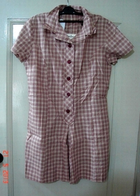
Sunshine High School existed in its own right from 1955 to 1991. During the early years the wearing of 'correct' uniforms was strictly enforced. Girls had to wear hats and boys had to wear caps as part of the uniform when outside the school grounds, or else they risked detention if caught without head wear by a Prefect. The boys therefore always had a rolled up cap in the back pocket to quickly slip on whenever there was danger of being nabbed by a Prefect. The girls had a winter uniform, which included thick beige stockings and a maroon blazer, and a summer frock in which they could be relatively cool during hot days. The boys had to wear their double breasted grey suits all year, with a jumper under the jacket in cold weather. The boys were supposedly being groomed as gentlemen, and so even during hot conditions were not allowed to remove their suit jackets in the class room. On about two very hot afternoons a year, the headmaster removed his jacket and so allowed the boys to do likewise. With single breasted suits becoming fashionable, it became difficult to find double breasted grey suits in the wide range of sizes required by students. In about late 1960 or early 1961 the uniform rules for boys were changed to enable them to wear single breasted grey suits. They still however were not allowed to remove their jackets in class on hot days. Over the years the rules for the wearing of uniforms were relaxed and in the late 1970's students were wearing either uniforms, or parts of uniforms, or their normal clothing. The wearing of uniforms at Sunshine High School eventually died out well before the School vacated the buildings on Ballarat Road, and amalgamated with other local secondary schools to form the Sunshine College.The three items of clothing, although not a complete uniform set, serve as a reminder of the summer and winter uniforms, as well as the colours, that were worn by the girls at Sunshine High School during the early years. The jumper is identical in appearance to that worn by the boys and so it is not difficult to imagine how a male Sunshine High School student would look like with a grey suit and that type of jumper.THREE ITEMS of girls uniform from the no longer existing SUNSHINE HIGH SCHOOL are individually displayed here. The items being: (1) Beige with maroon print cotton summer frock. (2) Maroon polyester/wool winter tunic. (3) Maroon V-necked wool/nylon jumper with light blue and gold coloured stripes around the cuffs and the neck.Ecole brand winter tunic. Buxwear brand summer frock of Style S289. M.G.Magree brand jumper.sunshine high school, uniform, frock, tunic, jumper, girls school uniform, maroon uniform -
 Sunshine and District Historical Society Incorporated
School Uniform, Blazer - Mark Anttony Schoolwear, SUNSHINE WEST HIGH SCHOOL, 1960's
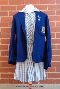
Sunshine West High School started in 1960 with classes held in the old church and the church hall of St Mark's Anglican Church, Sunshine, Victoria, 3020. The school transferred to Lachlan Road, West Sunshine when the new building was completed. In 1961 the proportion of students from European background was almost 52% and those of British-Australian almost 48%. By 1965 the number of students totalled 699, with 28 of them being the first to do the Form 6 (Year 12) Matriculation exam. By 1969 the number of students had increased to the point that some classes were held in shelter sheds. In 1992 the multi campus Sunshine College was formed through the amalgamation and restructure of six schools: Sunshine West High School, Sunshine Technical School, Ardeer High School, North Sunshine Technical School, Sunshine High School, and Tottenham Technical School. The last two school sites were closed and are now occupied by Victoria University and the Tottenham English Language Centre respectively. Sunshine West High School became the junior West Campus of Sunshine College. The style of school uniform displayed here is not used by the Sunshine College. The girls had two sets of uniforms, one for the summer and one for the winter. The frock and blazer (as displayed) were for the summer but a grey straw hat, grey socks, and black shoes were also part of the compulsory uniform. The displayed grey v-necked jumper could be worn in both summer and winter. The winter outfit consisted of a blue shirt, a tie (as displayed), a grey box pleated tunic, blazer, grey stockings, black shoes, a blue felt hat and grey gloves. Of particular interest is that the boys did not have to wear the feminine looking style of grey jumper with the pink and blue stripes. They wore a dark blue jumper. There was a 'uniform inspection' carried out after the Monday morning assembly and the Prefects had the task of policing students to make sure that they wore the full complement of items, both to and from school. The 3 badges indicate that the female student was a member of the School Council, which had replaced the Prefects around 1969 or 1970, and she was also Captain of one of the 4 Sports Houses and of her Form. Sources of information: (1) http://www.sunshine.vic.edu.au/history.htm (accessed 4/11/2015). (2) Book - 'Harvester City' by Olwen Ford (page 412). (3) Discussions with two former students.Sunshine West High School played a significant part in the secondary education of local children, however the school had a relatively short life span in its own right during the latter part of the twentieth century. The items of girls school uniform, the school insignia, and the 3 metal badges serve as a historical reminder of the previous existence of the school, and of the colours and designs of these items.Four items of girls school uniform plus 3 metal badges: (1) Dark blue blazer with school insignia on the left breast pocket. (2) Blue and white striped frock. (3) Light grey v-necked jumper with dark blue, light blue, and pink stripes around the neck and the cuffs. (4) Dark blue tie with light blue and pink diagonal stripes. The 3 badges are School Captain, House Captain, and Form Captain.Insignia on blazer - SWHS / COURAGE AND WISDOMsunshine west high school, girls school uniform, carland, blazer, frock, school jumper, swhs, courage and wisdom, junior campus, west campus, sunshine college, 1960, 1991 -
 Sunshine and District Historical Society Incorporated
Sports Uniform (Netball) - TOTTENHAM NORTH PRIMARY SCHOOL, 'Ryder' Brand T-Shirt, Early to mid 1980's
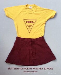
This Netball uniform from circa 1986 was worn by a girl named Rebecca when she attended the Tottenham North Primary School. Tottenham North Primary School was opened on 29 May 1953 and was built on a South Road, Braybrook site purchased in 1929. After a fire in February 1961 the pupils were sent to the Powell and Curtin Street schools in Yarraville, and to the Maidstone and Sunshine East schools. The new building was officially opened on 22 August 1962 by A. McDonell, Director of Education, and it had sixteen classrooms, an art/craft room, and an assembly hall. Sporting achievements by the pupils included the 1963 football premiership and the 1968 cricket premiership. Over the years it has been called Tottenham Primary, Tottenham Crossing Primary, and Maidstone Primary. The different names resulted because of mergers with other local primary schools as the number of primary aged children in the Braybrook and Tottenham area changed. The school on South Road is now named Dinjerra Primary School. Dinjerra supposedly means 'out west' in the dialect of the original indigenous people of the area. Dinjerra Primary School is now the only neighbourhood government primary school in Braybrook Tottenham. The above information was sourced and compiled from: 1. 'Vision and Realisation - A Centenary History of State Education in Victoria - Volume 3', Education Department of Victoria 1973. 2. The Dinjerra Principal's website article at: http://www.dinjerra.vic.edu.au/91/Message-from-the-Principal.The netball uniform serves as a historic reminder that a school named Tottenham North Primary School once existed. The uniform also provides us with information of the colours used on these types of sports uniforms, and of the design of the School Logo.Two items of Netball Uniform. (a) Skirt - Maroon coloured wrap around sports skirt. (b) T-shirt - Yellow, Size 14 'Ryder' brand children's T-shirt, with maroon coloured triangular shaped School Logo printed on the front.TNPS. TOTTENHAM NORTH P.S. 4703 - (Printed inside triangle)sports uniform, netball skirt, netball t-shirt, tottenham north primary school, south road braybrook, tottenham primary school, maidstone primary school, tottenham crossing school, dinjerra primary school, tottenham north state school, state school 4703 -
 Chiltern Athenaeum Trust
Ribbon Plate for Military Uniform : WW1, 1914-1918 WW1
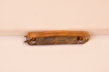
Associated with medal bar for dress uniform WW1. 1914-1918. Associated with dress uniform WW1. The ribbon bar is worn on the left hand side above the breast and the colours of the ribbons affixed determine the campaigns served and or other military awards with approval to wear. Circa WW1 1914-1918. Gold coloured metal and brass ribbon plate for military uniform (no ribbons affixed). The back of the plate has two round lugs and an attachment slide through pin. The front top of the metal bar has a feather leaf type pattern affixed on top of where the ribbon mount would sit. Nilribbon bar ww1, circa ww1 1914 - 1915, dress uniform ribbon bar ww1 (incomplete with no ribbons attached). -
 Chiltern Athenaeum Trust
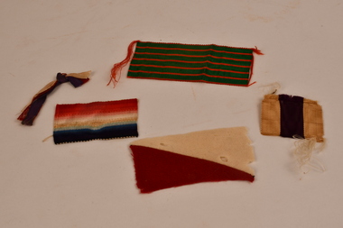
Campaign Ribbons for medals and awards WW1 : Military Cross, 1914 Star, French Croix de Guerre, 2 ANZAC Corps colours (The Joseph Nott Collection), Circa 1914 - 1919
Associated with WW1 campaign medals and bravery awards. Items from the Joseph Nott collection WW1 soldier. Joseph Nott was a Military Cross recipient. WW1 colored ribbons associated with campaign medals and bravery awards. The Joseph Nott collection (Chiltern and Rutherglen resident). Medal and Award ribbons associated with WW1 : 1 x bright green with thin red striping (French 1914-1918 Croix de Guerre), 1 x red, cream, white and blue stripes (the 1914 Star), 1 x red and white flag shape cloth patch (2 ANZAC Corps)), and 1 x cream, purple and cream striped ribbon (The Military Cross). The thin ribbon strand consists of cream, crimson and royal blue colored ribbons (Empire colors and the 1914 Star colors). 2 anzac corps colours (light horse unit), joseph nott colleciton ww1 soldier rutherglen and chiltern resident., military cross, croix de guerre and 1914 star ribbons ww1, ww1 medals and awards ribbons -
 Nillumbik Shire Council
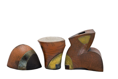
Sculpture: Jane ANNOIS, Jane Annois, Evolution, 2006
Jane Annois had a long involvement with Potters Cottage in Warrandyte, where she taught for many years. Potters Cottage was established in the late 1950s in Warrandyte as an artist co-operative. Founding members included Reg Preston, Phyl Dunn, Gus McLaren, Artur Halpern, Sylvia Halpern and Elsa Ardern. These talented artists had the ingenuity and foresight to create a teaching studio, gallery shop and restaurant to experiment, make, promote and sell predominantly domestic wares of the time. These activities helped financially sustain each member’s individual creative practice. Potters Cottage was influential in the development of contemporary ceramics, building and developing practices that experimented with traditional ceramic processes, raw materials and locally sourced clay. The group mentored and nurtured many interested in the art of ceramics, producing alumni and teachers such as Peter Laycock, John Dermer, Greg Daly and Jane Annois. Jane Annois is a ceramic artist who has lived and worked locally in Warrandyte for many years. She focuses primarily on exploring the art of Japanese raku, adapting the technique to develop the typical characteristics of crackle glazes and lustres, with contrasting areas of black. Jane also applies a fine slip called terrasigillata which gives soft, warm ochre colours. This technique was once used by the Greeks over 2000 years ago to seal and decorate their pots. She is also strongly onfluenced by the French potters, particularly in the style of terre vernissee, a decorative form of terracotta tableware. Three piece stoneware and raku fired ceramic sculpture. The first piece is a hollow, dome shaped object. It is orange (terracotta slip) in colour with a copper metallic band and a black edge on one side with a small yellow glazed rounded triangle and metallic strip of colour on the otherside. The second piece is shaped like a traditional vase. It is orange (terracotta slip) in colour with white crackle on the inside. It has a yellow slip edge with a dark glazed square on one side and on the other side a black thick edge that mirrors the contour of this shape. The third piece is shaped loosley in the form of the letter 'z'. It compliments the second piece with a yellow slip edge and black glazed square to its lower left side and top right as well as on its' other side a black thick edge that mirrors the contour of this shape. This piece has a very small skewed square opening at its' top. All three pieces have elements of crazing and variations of colour and lustre, caused by the raku process. 2006.52.1VA has the artist name/signature 'J. Annois' inscriped small (with fine point ceramic tool?) on the front of the piece, bottom right; 2006.52.2VA has the artist name 'Jane'? inscribed (unlegible - with fine point ceramic tool?) underneath; 2006.52.3VA has the artist name/signature 'Jane Annois' inscriped (with fine point ceramic tool?) inside its hollow form. evolution, raku, stoneware, terrasigillata, terracotta, glazes, slip, terre vernissee -
 Nillumbik Shire Council
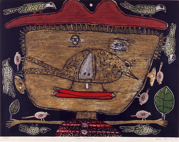
Print (etching): Dean BOWEN, The Offering, 1997
Dean Bowen is renowned for his charming, child-like aesthetic and unique thematic interplay between the urban and rural as well as humans and animals. Bowen has developed a distinctive and humorous symbolic language that filters through each work. His highly charismatic and whimsical renderings of animals, human characters and Australian environments celebrate the vicissitudes of life, evincing the simple pleasures of human habitation within the artificial and the natural world. The work and thoughts of Jean Dubuffet, particularly those which focus on the philosophy of 'Art Brut', give support to Dean's belief that untrained artists are more honest, that artists interested in emulating the art of children are trying to regain the pure expression they lost with childhood. 'The Offering' was a finalist in the Nillumbik Art Awards in 1997. The work refers to the act of giving back, rather than taking which Bowen sees as more prevalent in our Western society. While the image is childlike, the expression of the boy is a mixture of sadness and happiness, knowing and naivety, youth and age. The smile has a Mona Lisa quality and the earthy and sensuous colours suggest landscape. When realising the images he relies on memory rather than observation so that the struggle with drawing and representation sometimes doesn't work. The style of the drawing and the flat space relates to the graphic style of cartoons and caricature. The intuitive and the imaginative are essential elements in his work. lower right 'Dean Bowen '97' -
 Slovenian Association Melbourne
Badge of Slovenian Association Melbourne, Badge of Slovenian Association Melbourne established 1954, not known
Slovenian Association Melbourne has given option to all the members of the association to purchase the badgeSymbolic presentation of Slovenian flag colours, Association being formed in Australia in 1954, showing Mt Triglav, the highest Slovenian mountain and the Slovenian national flower - the carnationbadge of slovenian association melbourne, establishment date -
 Koorie Heritage Trust
Book, Abdulla, Ian W, Tucker, 1994
Ian's narrative paintings recall the stories of his youth with refreshing simplicity, while their rich textures and brilliant colours evoke a deep love for a time and a place that are never very far from his imagination. He has mounted seven solo shows and fifteen joint exhibitions and represented in many galleries throughout Australia, including the National Gallery.38 unnumbered pages colour illustrations, map ; 26 x 31 cm.Ian's narrative paintings recall the stories of his youth with refreshing simplicity, while their rich textures and brilliant colours evoke a deep love for a time and a place that are never very far from his imagination. He has mounted seven solo shows and fifteen joint exhibitions and represented in many galleries throughout Australia, including the National Gallery.abdulla, ian w., 1947-2011 -- childhood and youth. | aboriginal australians -- murray river region (n.s.w.-s.a.) -- food -- juvenile literature. | aboriginal australians -- south australia -- food -- juvenile literature. | aboriginal australians, in art -- juvenile literature. | painting, australian -- south australia -- aboriginal artists -- juvenile literature. | wild foods -- murray river region (n.s.w.-s.a.) -- juvenile literature. | wild foods -- south australia -- juvenile literature. -
 Whitehorse Historical Society Inc.
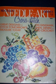
Book - Needlecraft Book, 1965
Belonged to Anne Barry, collector and friend of Valda Arrowsmith, a member of the SocietyReflects the bolder designs and colours of the 1960s and 1970sMcCalls Needlecraft book of cross stitch patternsbooks, poetry -
 Whitehorse Historical Society Inc.
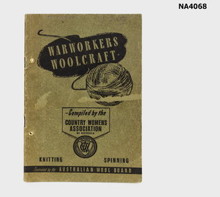
Functional object - Book - Warworkers Woolcraft, Warworkers Woolcraft, During WW1
Published to help the war effort and contribute to the defence of the country. Patterns selected in collaboration with the three services-colours and garments by active services in air,on land or at sea.Green-grey light card cover. 32 pages compiled by the Country Womens Association of Victoria sponsored by the Wool Board.J.Tatebooks, handcrafts -
 Tatura Irrigation & Wartime Camps Museum
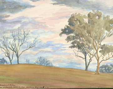
Painting - Painting - Watercolour, Southern Sky, Tatura, Victoria 5pm
Romanticism -
 Tatura Irrigation & Wartime Camps Museum
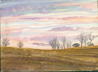
Painting - Painting - Watercolour, Mitte December, Tatura, Victoria, December 1940
Dr Leonhard Adam was a Dunera internee in Camp 2RomanticismL.A 1940 Mitte December, Tatura, Victoria -
 Tatura Irrigation & Wartime Camps Museum
Painting - Painting - Watercolour, Waranga (Victoria, Australia) 25.i.42, Staurmus SW
Dr. Leonhard Adam was a Dunera Internee in Camp 2RomanticismVictoria, Australia 25.I.42 Staurmus SW
