Showing 571 items
matching sustainability
-
 Orbost & District Historical Society
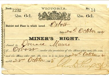
certificate, 24.10.1904
This miner's right certificate was issued in Orbost to Donald Munro of Orbost. It was valid from 24.10.1904 until 23.10.1905 and cost two shillings and sixpence. Donald Munro, with his brother, Archie carried on a boot-making business in one of the rooms of a three-storeyed barn at Lochiel. The Munros were musically inclined and through them a band was formed in 1889. Donald Munro was involved in many of the town's activities. (More in Mary Gilbert's Personalities and Stories of the Early Orbost District). The Miner's Right was introduced in 1855 in the colony of Victoria, replacing the Miner's Licence. Protests in 1853 at Bendigo with the formation of the Anti-Gold Licence Association and the rebellion of Eureka Stockade in December 1854 at Ballarat led to reform giving the right to mine gold, the right to vote, and the right to own land. This new system proved economical and sustainable, operating substantially unchanged up until 1975. This item is of historical significance as it is associated with positive outcomes for gold miners brought about by the Eureka Stockade rebellion and its subsequent democrat changes. It is also associated with the Munro family who were early settlers in Orbost.A white paper miner's right certificate. It has black print with hand-written details. It is an elaborate document with the Victorian coat-of-arms at the top.on back- date, hand-written notescertificate-miner's-right munro-donald -
 Nillumbik Shire Council
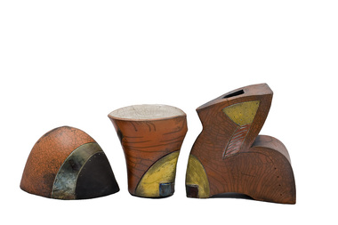
Sculpture: Jane ANNOIS, Jane Annois, Evolution, 2006
Jane Annois had a long involvement with Potters Cottage in Warrandyte, where she taught for many years. Potters Cottage was established in the late 1950s in Warrandyte as an artist co-operative. Founding members included Reg Preston, Phyl Dunn, Gus McLaren, Artur Halpern, Sylvia Halpern and Elsa Ardern. These talented artists had the ingenuity and foresight to create a teaching studio, gallery shop and restaurant to experiment, make, promote and sell predominantly domestic wares of the time. These activities helped financially sustain each member’s individual creative practice. Potters Cottage was influential in the development of contemporary ceramics, building and developing practices that experimented with traditional ceramic processes, raw materials and locally sourced clay. The group mentored and nurtured many interested in the art of ceramics, producing alumni and teachers such as Peter Laycock, John Dermer, Greg Daly and Jane Annois. Jane Annois is a ceramic artist who has lived and worked locally in Warrandyte for many years. She focuses primarily on exploring the art of Japanese raku, adapting the technique to develop the typical characteristics of crackle glazes and lustres, with contrasting areas of black. Jane also applies a fine slip called terrasigillata which gives soft, warm ochre colours. This technique was once used by the Greeks over 2000 years ago to seal and decorate their pots. She is also strongly onfluenced by the French potters, particularly in the style of terre vernissee, a decorative form of terracotta tableware. Three piece stoneware and raku fired ceramic sculpture. The first piece is a hollow, dome shaped object. It is orange (terracotta slip) in colour with a copper metallic band and a black edge on one side with a small yellow glazed rounded triangle and metallic strip of colour on the otherside. The second piece is shaped like a traditional vase. It is orange (terracotta slip) in colour with white crackle on the inside. It has a yellow slip edge with a dark glazed square on one side and on the other side a black thick edge that mirrors the contour of this shape. The third piece is shaped loosley in the form of the letter 'z'. It compliments the second piece with a yellow slip edge and black glazed square to its lower left side and top right as well as on its' other side a black thick edge that mirrors the contour of this shape. This piece has a very small skewed square opening at its' top. All three pieces have elements of crazing and variations of colour and lustre, caused by the raku process. 2006.52.1VA has the artist name/signature 'J. Annois' inscriped small (with fine point ceramic tool?) on the front of the piece, bottom right; 2006.52.2VA has the artist name 'Jane'? inscribed (unlegible - with fine point ceramic tool?) underneath; 2006.52.3VA has the artist name/signature 'Jane Annois' inscriped (with fine point ceramic tool?) inside its hollow form. evolution, raku, stoneware, terrasigillata, terracotta, glazes, slip, terre vernissee -
 National Wool Museum
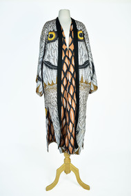
Textile - Cloak, Dr Deanne Gilson, Nan’s Spirit Watching over me (Rita Dalton) Cloak, 2022
Standing proud, still here, the spirit of ten ancestral matriarchs adorned in contemporary ceremonial cloaks. Representing our women past, present and future, her Spirit, our culture, our Country (spelt with a capital for its importance and this is part of First Peoples protocols on acknowledging Country, our strength, our resilience and healing towards a sustainable future. The white ochre was used to create the feather pattern. White ochre is deeply connected to spirit or ‘murrup’ as we call it in language. The ochre is used on our bodies in ceremonies to paint our body up and is also placed on graves when someone passes. The white ochre is our most sacred connection to our ancestors and is used to celebrate both life and death. I source the white ochre from the You Yangs and only take what I need for ceremony and my painting.White and black feather motif with yellow eye design on outer clock, brown feather motif in lining. Solid black trimming. Cloak is machine sewn and handstitched with hand stitching on shoulder seam.deanne gilson, wadawurrung dja, first nations art, cloak -
 Wooragee Landcare Group
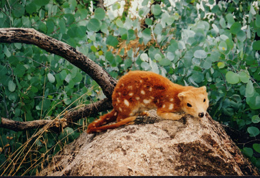
Photograph, 27th February 2004
Photograph of Quoll taxidermy, part of the Quoll presentation at the Wooragee Hall on Friday, 27th February, 2004 as part of an event called Foxy Night Out. Foxy Night Out is part of a land fox control project. This workshop is conducted to help private and public community members to understand foxes and effective fox control techniques, and its impact to agriculture and other animals. Quolls are carnivorous marsupials native to Australia and New Guinea. They grow up to 125cm and weighs up to 5kg. The spotted-tail Quoll is now the largest carnivore on the mainland. Quolls have black to fawn fur, white spots, long and thin tails. Quolls can attack livestock like chickens. They are known for sharp teeth that enables them to sustain a diet that involves poultry meat. They hunt for their families. Historically, Quolls are treated as pests and were trapped or poisoned by people who are protecting their chickens.This photograph contributes to the scientific and historical records on fox control in Victoria. It reflects the effects of foxes and quolls to livelihood, thus, creates a picture of Victorian agriculture, trade, and community activities. Coloured rectangular photograph printed on matte photographic paperReverse: WAN NA / 0ANA2N0 BN2+ 2 1636 / (No. 5) 919foxes, quoll, landcare workshop, taxidermy, ecosystem, fox control project, agriculture, fox, marsupials, carnivore, pests -
 Merri-bek City Council
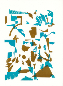
Work on paper - letterpress print, Commoners Press, As Sorted, 2022
Time is an abstraction, a filing system used to arrange events and memories into a logical system of cause and effect. This new print was created with images arranged from drawings made while sitting by paths near nature, creeks and overlapping streets. I am a local artist and illustrator with a history of drawing, painting and printmaking.10Press brings together a diverse group of creatives who were invited to make a new artwork inspired by the theme of ‘Moreland: its creative future, its past or other hidden stories’. Artists were invited to respond to the prompt ‘Moreland’, using only one or two colours. This body of work was created in 2022 during a significant time in local history, which saw Council’s name change from ‘Moreland’ to ‘Merri-bek’. The printed bellyband of the folio highlights this transition, with the word ‘Moreland’ crossed out and replaced with Woiwurrung language name ‘Merri-bek’. Commoners Press is a Coburg-based print studio that works with artists and designers in Australia and abroad on short run projects. Established by Jan Brueggemeier, Rob Eales and Neal Haslem in 2017, Commoners Press focus on projects that are community-centred, experimental and sustainable. Donated by Commoners Press Letterpress print -
 Merri-bek City Council
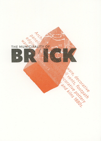
Work on paper - letterpress print, Commoners Press, Clay Pits of Brunswick, 2022
When I visit Merri-bek I wonder, when I step on the tarmac of the Barkly Square carpark, what was here before? In fact, at this spot and across Brunswick there were clay pits, which would feed the pottery workshops in Brunswick that produced the pottery, gargoyles and decorative items for Marvellous Melbourne homes and suburbs. Marvellous for those who had profited from gold, property and finance, not so for those working in the clay pits. My print is a contemplation on what is beneath our feet and our relationship to the ground. I am a design academic working at RMIT University and began my print and design practice on a Golding foot-treadle Letterpress machine.10Press brings together a diverse group of creatives who were invited to make a new artwork inspired by the theme of ‘Moreland: its creative future, its past or other hidden stories’. Artists were invited to respond to the prompt ‘Moreland’, using only one or two colours. This body of work was created in 2022 during a significant time in local history, which saw Council’s name change from ‘Moreland’ to ‘Merri-bek’. The printed bellyband of the folio highlights this transition, with the word ‘Moreland’ crossed out and replaced with Woiwurrung language name ‘Merri-bek’. Commoners Press is a Coburg-based print studio that works with artists and designers in Australia and abroad on short run projects. Established by Jan Brueggemeier, Rob Eales and Neal Haslem in 2017, Commoners Press focus on projects that are community-centred, experimental and sustainable. Donated by Commoners Press Letterpress print -
 Merri-bek City Council
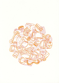
Work on paper - letterpress print, Commoners Press, Hard Rubbish, 2022
Merri-bek’s bi-annual collection and the communities’ tendency to dump rubbish makes these temporal sculptures part of the visual landscape of walking in Merri-bek. The collections of personal items, untold stories and connections which we all piece together whilst on an afternoon stroll. Over the years trends in pet ownership and technology advances can be documented in discarded items, also commenting on wealth and material value of objects. I have been living, parenting, working and volunteering in Merri-bek for the last 9 years. As time passes the community and landscape shift and change as does my connection to it. A once dedicated art practice is now tumbled around with life and family. Photography, video, drawing and painting are used to explore ideas around the everyday and meaning we attach to small moments of time.10Press brings together a diverse group of creatives who were invited to make a new artwork inspired by the theme of ‘Moreland: its creative future, its past or other hidden stories’. Artists were invited to respond to the prompt ‘Moreland’, using only one or two colours. This body of work was created in 2022 during a significant time in local history, which saw Council’s name change from ‘Moreland’ to ‘Merri-bek’. The printed bellyband of the folio highlights this transition, with the word ‘Moreland’ crossed out and replaced with Woiwurrung language name ‘Merri-bek’. Commoners Press is a Coburg-based print studio that works with artists and designers in Australia and abroad on short run projects. Established by Jan Brueggemeier, Rob Eales and Neal Haslem in 2017, Commoners Press focus on projects that are community-centred, experimental and sustainable. Donated by Commoners Press Letterpress print -
 Merri-bek City Council
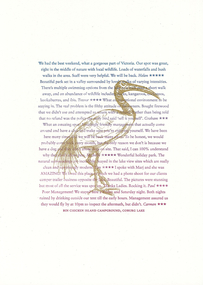
Work on paper - letterpress print, Commoners Press, Bin Chicken Island Campground, 2022
With two young kids, I often find myself at Coburg Lake on a weekend, playing amongst the natural beauty of the park area, rugged embankments, local birdlife, and... ‘Bin Chicken Island’. Bin Chicken Island has become a running joke in the community, known for its wafting stench and as an environmental eyesore (never go to the park on a warm day with an easterly breeze). So much so that someone added a campground listing on the island to Google Maps. Whenever I drive past the lake, I always keep an eye out for disgruntled backpackers who have realised that the only camping to be had is by the Bin Chickens themselves. I am a local graphic designer who lives in Pascoe Vale and works in Brunswick. I head up the design studio, Atticus Design.10Press brings together a diverse group of creatives who were invited to make a new artwork inspired by the theme of ‘Moreland: its creative future, its past or other hidden stories’. Artists were invited to respond to the prompt ‘Moreland’, using only one or two colours. This body of work was created in 2022 during a significant time in local history, which saw Council’s name change from ‘Moreland’ to ‘Merri-bek’. The printed bellyband of the folio highlights this transition, with the word ‘Moreland’ crossed out and replaced with Woiwurrung language name ‘Merri-bek’. Commoners Press is a Coburg-based print studio that works with artists and designers in Australia and abroad on short run projects. Established by Jan Brueggemeier, Rob Eales and Neal Haslem in 2017, Commoners Press focus on projects that are community-centred, experimental and sustainable. Donated by Commoners Press Letterpress print -
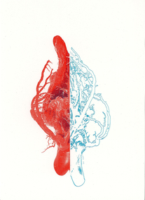 Merri-bek City Council
Work on paper - letterpress print, Commoners Press, Streets with no Beats, 2022
The image is based on a 3D component of one of my recent series of jewellery artworks. The heart metaphorically alludes to two locations of Merri-bek. One is Moreland Road, the other is Wallace Street in Brunswick. These locations pinpoint a time of collective trauma and communal experiential reflection. I was born in Brunswick in 1984 and have lived and worked there since. Brunswick for me is filled with stories of family, community, growth, tragedy and history experienced across a Greek Diasporic framework.10Press brings together a diverse group of creatives who were invited to make a new artwork inspired by the theme of ‘Moreland: its creative future, its past or other hidden stories’. Artists were invited to respond to the prompt ‘Moreland’, using only one or two colours. This body of work was created in 2022 during a significant time in local history, which saw Council’s name change from ‘Moreland’ to ‘Merri-bek’. The printed bellyband of the folio highlights this transition, with the word ‘Moreland’ crossed out and replaced with Woiwurrung language name ‘Merri-bek’. Commoners Press is a Coburg-based print studio that works with artists and designers in Australia and abroad on short run projects. Established by Jan Brueggemeier, Rob Eales and Neal Haslem in 2017, Commoners Press focus on projects that are community-centred, experimental and sustainable. Donated by Commoners Press Letterpress print -
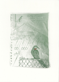 Merri-bek City Council
Work on paper - letterpress print, Commoners Press, Chatting with Locals - Sound Lines of the Red Wattlebird, 2022
My work is dedicated to the animal residents that cohabit with us in the suburbs. I focused on the Red Wattlebird, as it is always a welcome visitor across the gardens and parks of Merri-bek. The frayed edges of the page from my notebook are reminiscent of the act of note taking and how we remember and observe things in our daily lives. I am a local artist and writer living in Naarm with a studio in Coburg as part of Schoolhouse Studios.10Press brings together a diverse group of creatives who were invited to make a new artwork inspired by the theme of ‘Moreland: its creative future, its past or other hidden stories’. Artists were invited to respond to the prompt ‘Moreland’, using only one or two colours. This body of work was created in 2022 during a significant time in local history, which saw Council’s name change from ‘Moreland’ to ‘Merri-bek’. The printed bellyband of the folio highlights this transition, with the word ‘Moreland’ crossed out and replaced with Woiwurrung language name ‘Merri-bek’. Commoners Press is a Coburg-based print studio that works with artists and designers in Australia and abroad on short run projects. Established by Jan Brueggemeier, Rob Eales and Neal Haslem in 2017, Commoners Press focus on projects that are community-centred, experimental and sustainable. Donated by Commoners Press Letterpress print -
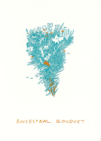 Merri-bek City Council
Work on paper - letterpress print, Commoners Press, Ancestral Bouquet, 2022
Ancestral Bouquet is a visual homage to the different plant species each migrant community brought with them to the lands of Merri-bek. It is a celebration of these plant communities and those (elderly migrants) who still know and practice traditional forms of food harvest and preparation. I was born and raised in unceded Wurundjeri Willum Country, in Coburg. My Father lived in the Southern Suburbs of Naarm as a refugee from Palestine, and eventually found Coburg as a place he could fit in as a migrant. My arts practice varies in modalities, and always comes back to the story of displaced cultures, my folklore, and my connection to Coburg and the Merri Creek.10Press brings together a diverse group of creatives who were invited to make a new artwork inspired by the theme of ‘Moreland: its creative future, its past or other hidden stories’. Artists were invited to respond to the prompt ‘Moreland’, using only one or two colours. This body of work was created in 2022 during a significant time in local history, which saw Council’s name change from ‘Moreland’ to ‘Merri-bek’. The printed bellyband of the folio highlights this transition, with the word ‘Moreland’ crossed out and replaced with Woiwurrung language name ‘Merri-bek’. Commoners Press is a Coburg-based print studio that works with artists and designers in Australia and abroad on short run projects. Established by Jan Brueggemeier, Rob Eales and Neal Haslem in 2017, Commoners Press focus on projects that are community-centred, experimental and sustainable. Donated by Commoners Press Letterpress print -
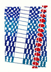 Merri-bek City Council
Work on paper - letterpress print, Commoners Press, Untitled, 2022
This image of Coburg Olympic Swimming Pool represents my connection to Merri-bek / Moreland. Being brought up around water, swimming has played a key role in my family and I feel a sense of the community when swimming in a public pool. The gum trees and the proximity of this pool to the river reminds me of my home town, Albury. For me, a public pool is a gathering place, a place of leisure and play, somewhere to learn and grow, spend time and let go.10Press brings together a diverse group of creatives who were invited to make a new artwork inspired by the theme of ‘Moreland: its creative future, its past or other hidden stories’. Artists were invited to respond to the prompt ‘Moreland’, using only one or two colours. This body of work was created in 2022 during a significant time in local history, which saw Council’s name change from ‘Moreland’ to ‘Merri-bek’. The printed bellyband of the folio highlights this transition, with the word ‘Moreland’ crossed out and replaced with Woiwurrung language name ‘Merri-bek’. Commoners Press is a Coburg-based print studio that works with artists and designers in Australia and abroad on short run projects. Established by Jan Brueggemeier, Rob Eales and Neal Haslem in 2017, Commoners Press focus on projects that are community-centred, experimental and sustainable. Donated by Commoners Press Letterpress print -
 Vision Australia
Equipment - Object, Hand frame with grid
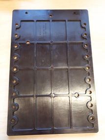
Braille hand frames and styluses were the primary way to produce Braille for over a century. The stylus was used to make a separate indentation for each dot, and the hand frame to keep dots within the same cell. Braille rows are produced from right to left. The process was very time consuming. Volunteer transcribers for the library could take an average of ½ hour to produce one page of Braille using this method. For example: “Oliver Twist” required approximately 600 sheets equating to 300 hours of work! This wooden slate, which was used to make the system portable, served as a firm base needed to sustain puncture pressure. The frame can also be slotted into both sides of the slate, thereby ensuring that the lines of Braille were straight across the page. The metal clasp at the top of the frame held the wooden which kept paper from slipping.Brown plastic rectangular hand frame with holes evenly spaced on either long side. Hinged Braille metal guide with space for 2 rows of Braille, each 35 cells long. braille equipment, rnib -
 Eltham District Historical Society Inc
Photograph, Sugarloaf Reservoir, Christmas Hills, 16 January 2015, 16 January 2015
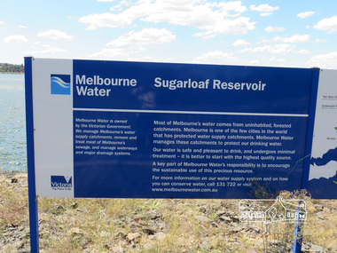
Sugarloaf Reservoir is situated on former farmland. This large water storage was completed in 1982 and serves Melbourne's northern suburbs. Within the visitor areas are two picnic grounds and other recreational facilities. Below its massive rock embankment is located the Winnecke Treatment Plan designed to purify its water before being piped into Melbourne. The dam partly inundated the old firing ranges of the former Christmas Hills Rifle Club. Source: Christmas Hills Now and then: Yarra Glen & District Historical Society, 2004. Born DigitalMelbourne Water Sugarload reservoir Melboure Water is owned by the Victorian Government. We manage Melbourne's water supply catchments, remove and treat most of Melbourne's sewrage, and manage waterways and major drainage systems. Most of Melbourne's water comes from uninhabited, forested catchments. Melbourne is one of the few cities in the world that has protecyed water supply catchments. Melbourne Water manages these catchments to protect our drinking water. Our water is safe and pleasant to drink, and undergoes minimal treatment - it is better to start witht he highest quality source. A key part of Melbourne Water's responsibility is to encourage the sustainable use of this precious resource. For more inforamtio on our water supply and on how you can conserve water, call 131 722 or visit www.melbournewater.com.auchristmas hills, sugarloaf reservoir, sign, melbourne water -
 Federation University Historical Collection
Correspondence, John Gray, Letter of Condolence from ANA to John Mateer. 1883, 14/12/1883
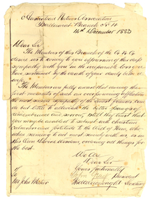
The Australian Natives Association (ANA) Benefit Society was formed in 1871 at a meeting of young men in Grimwood's Hotel, Elizabeth Street, Melbourne. The Association was one of many friendly societies that also aimed to promote the moral, social and intellectual advancement of its members. The young founders restricted membership to native-born Australians, but there were no Koories among them. The Australian Natives Association Ballarat Branch (No4) was founded in 1874. The association’s modest building was based in Camp Street and the branch was one of the most active in the colony, playing a key role in Federation. The Ballarat branch of the ANA was wound up in 1957 and the double storey building has since been used as for office space most recently for employment companies such as Tracey Recruitment. Ballarat's ANA Hall has heritage status under the City of Ballarat’s Camp Street heritage overlay HO186, however it is not listed by either the Victorian Heritage Register or the National Trust.Handwritten letter glued onto a lined page. The letter is from the Australian Natives Association Ballarat Branch No. 4, and is written to John Mateer at the time of his wife's death. The letter is signed by John Gray (President) and Fred Wainwright (secretary). Fred Wainwright was the first secretary of ANA branch No. 4. hew as a clerk at Ballarat Town Hall, and presented an essay on Federation of Australian Colonies in 1879.Australian Natives Association Ballaarat Branch No 4 14th December 1883. Dear Sir The members of this branch of the A.N.A. desire us to convey to you expression of their deep sympanth with you in the irreparable loss you have sustained by the death of your dearly beloved wife. The Members are fully aware that during the first month of such an overpowering infliction the most sincere sympathy of the truest friends can do little by alleviate the bitter pangs of remembrance and sorrow, still they trust that you may be enabled to submit with christian calmness and fortitude to the Will of Him, who, when seeming to act most severely wit us, is in His Own Divine Wisdom, ordering things for the best. We are Dear Sir Yours fraternally John Gray President fred Wainwright Secretary To Mr John Mateer australian natives' association, ana, ballarat branch no. 4. ballaarat branch no. 4, gray, john gray, wainwright, fred wainwright, mateer, john mateer -
 Glen Eira Historical Society
Letter - Organs
This file contains three items relating to: 1/A photocopy of a letter to the Manager Strategic Planning and Sustainability on the Glen Eira City Council from Paul Roser from the National Trust, 21/07/2011, advising that the J. W. Wolff Pipe Organ in St. Aloysius Catholic Church, Balaclava Road, Caulfield has been included in the National Trust Register. 2/A photocopy of a letter to Vicar B. Green of St. Mary’s Anglican Church, Caulfield, from Ian Wight from the National Trust, 21/05/1996, advising that the pipe organ in St. Mary’s Anglican Church has been included in the National Trust Register. 3/A photocopy of a letter to the Chief Executive Officer of the City of Caulfield from Douglas Hill of the National Trust, 11/10/1990, advising that the Merklin-Schutze Organ located in the Uniting Church, 66 Orrong Road, Elsternwick has been included in the National Trust Register.national trust, glen eira city council, caulfield south, st. aloysius catholic church caulfield, balaclava road, roser paul, green b. vicar, st. mary’s anglican church caulfield, caulfield, glen eira road, hood street, wight ian, orrong road, elsternwick, uniting church elsternwick, hill douglas, organs, musical instruments, churches -
 National Wool Museum
Textile - Cloak, Dr Deanne Gilson, Bundjil the Eagle Creator Spirit Cloak, 2022
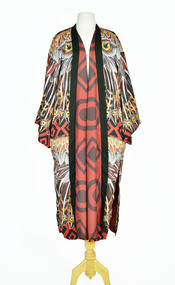
Standing proud, still here, the spirit of ten ancestral matriarchs adorned in contemporary ceremonial cloaks. Representing our women past, present and future, her Spirit, our culture, our Country (spelt with a capital for its importance and this is part of First Peoples protocols on acknowledging Country, our strength, our resilience and healing towards a sustainable future). Bunjil the eagle used to be a man called Karringalabil. As a man he created the first man and woman out of bark from the sacred manna gum tree and clay from the river bed. He created the plants, animals, mountains, waterways, sky and under Country. After which he turned himself into an eagle. He has two wives, Kunuwarra the black swan sisters. After he completed all of creation he flew up into the sky at Lal Lal Falls and he now watched over us as a star in the night sky and as an eagle by day.Brown, red and white tone feather motif with yellow eye design on outer clock, red and black diamond and circle design in lining. Solid black trimming. Cloak is machine sewn and handstitched with hand stitching on shoulder seam.deanne gilson, wadawurrung dja, first nations art, cloak -
 Vision Australia
Equipment - Object, Braille hand frame and stylus
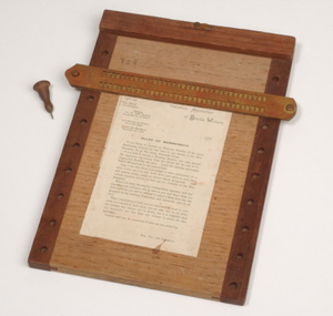
Braille hand frames and styluses were the primary way to produce Braille for over a century. The stylus was used to make a separate indentation for each dot, and the hand frame to keep dots within the same cell. Braille rows are produced from right to left. The process was very time consuming. Volunteer transcribers for the library could take an average of ½ hour to produce one page of Braille using this method. For example: “Oliver Twist” required approximately 600 sheets equating to 300 hours of work! This wooden slate, which was used to make the system portable, served as a firm base needed to sustain puncture pressure. The frame can also be slotted into both sides of the slate, thereby ensuring that the lines of Braille were straight across the page. The metal clasp at the top of the frame held the wooden which kept paper from slipping. In this example, the Rules of Membership for the Victorian Braille Writers were attached to the board.1 wooden back board with metal hand frame and stylus156 carved into wooden framebraille equipment, victorian association of braille writers -
 Vision Australia
Equipment - Object, Braille hand frame and stylus with Braille maths slate and pegs
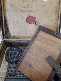
Braille hand frames and styluses were the primary way to produce Braille for over a century. The stylus was used to make a separate indentation for each dot, and the hand frame to keep dots within the same cell. Braille rows are produced from right to left. The process was very time consuming. Volunteer transcribers for the library could take an average of ½ hour to produce one page of Braille using this method. For example: “Oliver Twist” required approximately 600 sheets equating to 300 hours of work! Various metal hand frames accompanied by a metal stylus with wooden handle. Some include a wooden slate, which was used to make the system portable as a firm base was needed to sustain puncture pressure. The frame can also be slotted into both sides of the slate, thereby ensuring that the lines of Braille were straight across the page. Transcribing maths was an extremely complex task and a metal grid was utilised to reproduce graphs and diagrams.1 wooden hand frame with metal grid and metal and wooden stylus, 1 metal maths grid with metal pegs in metal container inside a brown suitcase and numerous sheets of Braille paperT.C. Coughlin 5 doz sausage rolls Wilmington Southend is written inside the lid of the suitcasebraille equipment, james murphy -
 Eltham District Historical Society Inc
Document - Property Binder, 1184 Main Road, Eltham
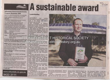
Newspaper article: A sustainable award, Diamond Valley Leader, 1 November2006, Architect and building Llewellyn Pritchard won resource Efficiency Housing Award, finalist in HIA Greensmart Building of the Year Award. House – Environmental Leader (Published: Nillumbik Now and Then / Marguerite Marshall 2008; photographs Alan King with Marguerite Marshall.; p186) In 2006 environmental awareness was mushrooming in the community, which is reflected in the award-winning house at Main Road near Wattletree Road, Eltham. At first sight, the building appears a mix of a classic Eltham mud-brick house and an avant-garde building style. The crown of solar panels stretching along the width of the curved roof, indicates that this is no ordinary house. In fact it signals a new building trend of minimal impact on the environment. Yet it utilises the environment with high technical expertise to achieve comfort and cut running and maintenance costs. In recognition of this, its designer/builder, Conscious Homes, won the 2006 National HIA Greensmart Resource Efficiency Award. For Conscious Homes director, Llewellyn Pritchard, this house reflects a philosophy, strengthened by his connection with Aboriginal culture, through his foster siblings. Pritchard believes the sustainable way indigenous Australians lived and their spiritual connection with land, demonstrates how humanity is part of the ecology. His interest in environmental design stemmed from growing up in bushy Eltham Shire, with its mud-brick tradition. This was followed by studying Architecture at RMIT in the early 1980s, and learning about passive solar design. Pritchard says this house demonstrates that environmental sustainability is not about sacrifice, but about exceptional levels of occupant comfort, savings in running costs and modern fittings and appliances.1 The solar panels on the north roofs are intentionally obvious to make a statement about what the building is doing. But inside the systems are hidden and interactive with conventional services, such as the underground water tank. The house is water and energy self-sufficient and at 12 squares is much smaller than conventional houses, to minimise resources. Yet it accommodates his family of four with three bedrooms, a living/dining and kitchen area and a bathroom/laundry. Importantly the building is designed to last hundreds of years, by being able to be modified as the need arises, such as for commercial use. In this way the structure minimises its environmental impact. The solid double mud-brick walls (which are insulated) include steel beams and supporting frame, allowing the future removal or alteration of any section. The materials are local, recycled and of low toxicity where possible.2 Inside and out, the mud-brick is rendered and sealed with a combination of cement and sand and a mud-based coating in a soft golden hue increases its life. Inside, the golden-brown timber is plantation Mountain Ash and the concrete floors throughout – of local stone aggregate with a clear seal – have a natural looking random stone appearance. The house sustains a stable temperature of around 20 degrees, assisted by the concrete slab floor. The many large double-glazed windows and highlights (windows set high on walls) provide cross-flow ventilation. The north-facing living area maximises heating from the lower winter sun and is cooler in summer, because the sun is higher. Heating comes from a solar hydronic slab system. All appliances and fittings are high efficiency energy or water rated. Appliances in the timber kitchen include a gas stove and a dishwasher, using the building’s own power and water. French doors open from the living area to a deck, concealing the treatment system for all waste water. This is pumped through sub-soil drippers to the indigenous garden beds and no-dig vegetable patch. Below the carport is the 80,000-litre rainwater tank and at the back, the boiler room houses the solar boiler, water tank access, domestic water supply pump, filter gear and hydronic slab heating controls. The solar system is backed up with gas, which is needed to heat water only in winter. Gas used is less than one quarter of that for an average home with ducted heating. Excess power is fed back to the grid and the building uses about one quarter of the mains electricity of an average home. Other local builders have followed Pritchard’s lead in resource efficiency for minimal environmental impact.main road, eltham, businesses, llewellyn pritchard, hia greensmart building of the year award., efficiency housing award, conscious homes australia pty ltd -
 Warrnambool and District Historical Society Inc.
Medallion, Dead Man's Penny Robert Andrew Hose, 1920s
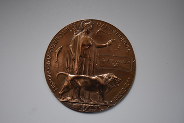
This medallion, called a Memorial Plaque and popularly known as a Dead Man’s Penny, was one of those given to the family of an Australian soldier who died on active service in World War One. Memorial Plaques, such as this one, were given out in the early 1920s. This medallion was presented to the family of Robert Andrew Hose. Born in Warrnambool in 1892 to George and Janet Hose, Robert Hose was a regular soldier when he enlisted in World War One in August 1914. He served on Gallipoli at Cape Helles where he was wounded but returned to his post and was promoted to corporal. In Egypt he was promoted to Sergeant and then served in France where he was awarded the Military Medal for showing courage, resourcefulness and a fine example to his men in an encounter with the enemy near Beaumetz les Cambrai. In that incident he sustained severe wounds from which he died in May 1917. He is buried in France. As well as the Military Medal he was awarded the 1914-15 Star, the British War Medal and the Victory MedalThis item is of great importance as a significant memento of World War One that was given to the family of Robert Andrew Hose following his death on active service in World War One. Robert Hose was born in Warrnambool and this medallion is a treasured object in our collection.This is a round bronze medallion with raised images of Britannia holding a laurel wreath over an inscribed name, a lion, dolphins, an oak branch, a lion cub and an eagle. The medal is inscribed around the left and top edges.He Died For Freedom and Honour Robert Andrew Hose robert andrew hose, world war one memorial plaque, history of warrnambool -
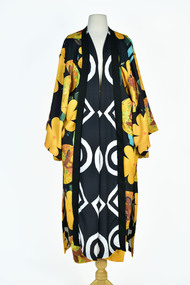 National Wool Museum
Textile - Cloak, Dr Deanne Gilson, Murnong Daisy Cloak (Women Gathering Food) Cloak, 2022
Standing proud, still here, the spirit of ten ancestral matriarchs adorned in contemporary ceremonial cloaks. Representing our women past, present and future, her Spirit, our culture, our Country (spelt with a capital for its importance and this is part of First Peoples protocols on acknowledging Country, our strength, our resilience and healing towards a sustainable future. The murnong was one of the main food sources for First Peoples before colonisation as it grew right across Wadawurrung Dja. The introduction of the sheep and cattle saw the murnong eaten roots and all and it quickly became less plentiful. The tubers were eaten raw or roasted on a fire. Water could be added to make a paste for small children to eat. The woman’s wooden digging stick that was used to gather and harvest plants was often buried with the woman for her afterlife and is considered sacred women’s knowledge. All parts of the plants and trees were and still are honoured as sacred medicine, healing plants and bush food knowledge.Yellow flower and female figure motif on black background on outer cloak, black and white diamond, and circle design in lining. Solid black trimming. Cloak is machine sewn and handstitched with hand stitching on shoulder seam.deanne gilson, wadawurrung dja, first nations art, cloak, murnong -
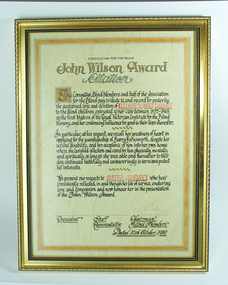 Vision Australia
Award - Text, John Wilson Award citation - Elizabeth Inez Lindsey, 10/10/1980
In 1980 the John Wilson Award was given to Elizabeth Inez Lindsey. The citation reads: The Committee, Blind Members and Staff of the Association for the Blind pay tribute to, and record for posterity, the sustained love and devotion of Elizabeth Inez Lindsey to the blind children entrusted to her care between 1935-1945 as the first Matron of the Royal Victorian Institute for the Blind Nursery, and her continuing influence for good in their lives hereafter. In particular, at his request, we recall her greatness of heart in applying for the guardianship of Barry Farnsworth, despite his serious disability, and her acceptance of him into her own home where she lavished affection and cared for him physically, mentally and spiritually as long as she was able and thereafter to this day continued faithfully and unwaveringly to serve and protect his interests. We present our respects to Sister Lindsey who has consistently reflected, in and through her life of service, enduring love and compassion and now honour her in the presentation of the John Wilson Award. 1 A3 cream page in gold frameassociation for the blind, elizabeth lindsey -
 NMIT (Northern Melbourne Institute of TAFE)
DVDs: Promotional DVDs NMIT 1990-2010
Instructional and promotional DVDs ranging in date from 1990-2010 promoting courses and services of NMIT. 1990s An Introduction to NMIT 1996 X 2 Building & Construction Heidelberg 1992 Building & Construction Heidelberg 1992 1, 2, 3 (Umatic) Concrete pour - Heidelberg 1992 Greensborough Music Promotional 1994 Making the move 1996 (also booklet) NMCOT College Promotion 1990 NMCOT College promotion 1992 NMCOT Corporate Video 1992 NMCOT Corporate video 1994 NMCOT Enrolment form 1991 (Umatic) NMCOT Enrolment Form 1992 NMCOT To Market to Market Promotional video 1993 NMCOT To Market to Market Promotional video 1994 NMIT School of Arts & Social Sciences 1996 NMIT School of Building & Construction 1996 NMIT School of Business 1996 NMIT School of Electrical, Electronics & Sciences 1996 NMIT School of Horticulture & Rural Studies 1995 NMIT School of Horticulture & Rural Studies 1996 NMIT School of Manufacturing Engineering 1996 NMIT School of Mechanical Manufacturing 1996 NMIT School of Tourism & Hospitality 1996 NMIT Faculty of Earch Sciences 1998 NMIT The Electrical Connection 1995 Open Day 1992 Student Information 2003-2008 Advanced Diploma of Music Performance (undated) Challenges accepted, NMIT Roadshow 2005 Mechanical manufacturing 2003 Promotional video (master) 2006 Songwriting competition NMIT 2008 The Electrical connection 2003 2009 Animal Studies 2009 Bachelor of Viticulture & winemaking 2009 Certificate III in Aged Care 2009 Children’s Services 2009 Courses through Design Drafting & Interior Fittings 2009 X2 Equine Studies 2009 (also accompanying book) Erection and Dismantling procedure for an Oldfields Mobile Scaffold 2009 Facilitate Individual Learning Activity The REV shop Case Study 2009 Formwork to Columns and Beams 2009 Green skills Centre of Excellence : Contributing to sustainability directly through the design, our actions and by educating future generations on sustainable technology, [DVD], NMIT Epping Campus, [2009] Interior design 2009 Locksmith Apprenticeships 2009 Secondary to Tertiary: the Journey begins 2009 X 2 Visual Arts at NMIT 2009 2010 Advanced Diploma of Building design 2010 Bachelor of Accounting 2010 Bachelor of Equine Studies 2010 Certificate III in Farriery (Trade) 2010 Civil Engineering 2010 Cloisonne Enamel 2010 Conservation and Land Management 2010 Health & Community studies 2010 Horticulture 2010 How to check and adjust a single stage Liquid Petroleum Gas Regulator 2010 Locksmithing more than a trade 2010 Music, Sound & Television 2010 Pragmatic Failures in Intercultural Communication 2010 Technical Education Centre, Youth Unit, NMIT 2010 Viticulture & Winemaking 2010 Why study Community Services at NMIT 2010 courses, handbooks, nmit -
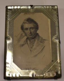 Warrnambool and District Historical Society Inc.
Artwork, other - Framed copy of engraving, John Ruskin, late 19th century
This framed copy of a sketch of John Ruskin comes from the original steel plate engraving dating from about 1845. John Ruskin (1819-1900) was a notable English writer, philosopher, art critic and polymath in the Victorian era. He was the first Professor of Fine Art at Oxford University and was a prolific writer interested in the connection between nature, art and society, anticipating the more modern interest in environmental and sustainability issues. This framed item is from the collection of the old Warrnambool Museum which was first established in 1871 by the Warrnambool Mechanics' Institute under the curatorship of a local policeman, Joseph Archibald. This first museum faded away but was revived in 1883 by Joseph Archibald in his retirement years. The Museum continued as part of the Mechanics' Institute until 1963 as an important and much-admired institution. Most of the collection was lost over the years but some items remain, housed at the Warrnambool Art Gallery, Flagstaff Hill Maritime Museum and the Warrnambool and District Historical Society, with the John Ruskin item being part of the latter group's collection.This item is of considerable interest, firstly because it comes from the collection of the old Warrnambool Museum and secondly because it shows the local interest in the 19th century of the notable English writer and philosopher, John Ruskin. This is a copy of a steel plate engraving, a black and white sketch of the head and upper body of John Ruskin. It is enclosed in a cut glass frame with a red cardboard backing attached by metal clips. A section of the backing is torn off and there is damage to the bottom part of the glass frame.J. Ruskinold warrnambool museum, warrnambool art gallery, flagstaff hill maritime museum, warrnambool & district historical society, joseph archibald, john ruskin portrait -
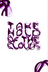 Mission to Seafarers Victoria
Programme - Catalogue, Open House Melbourne, Takie Hold of the Clouds, 2022
Catalogue for an artistic discovery Ttail during Open House 2022.Digital copy of an artistic event catalogue 142 pages.non-fictionCatalogue for an artistic discovery Ttail during Open House 2022.open house melbourne, 2022, ying-lan dann, circular temporalities, norla dome, exhibitions, video installation, cultural events -
 Australian National Surfing Museum
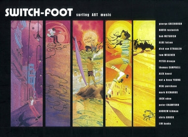
Book, Andrew Crockett, Switch-foot (surfing art music), 2005
Switch-foot is a classic publication out of Australia 2005. This 210 page hardcover book has many of the immortal surfing images from the golden era in surfing from photographers such as Albe Falzon, George Greenough and Jack Eden. Stories from: George Greenough looking at his simple genius and his movie magic with ‘Dolphin Glide’ and ‘Behind the Scenes.’ The unmasking of the truth behind Peter Drouyn, 12 legends of the Lens (images from the golden era) The telling of Dick Van Straalen’s story and his current relationship with Dave Rastovich The art of Harry Daily Global surf travel with Colas Thomas Campbell drops by Rasta and friends music with the exploration into the mystery of the art of jamming Discussions about sustainable surfcraft production with Tom Wegener, the unveiling of new school talent within music and photography and also talking to important leaders in the field of classic surfing to gather information on surfboard design, single fin surfing and fin dynamics. Music from low pressure sound systems in the story titled ‘the art of jamming’ A significant publication that explores art, photography and music in surfing culture.Switch-foot (surfing art music) is a hard copybook of surfing photography with a black cover featuring 5 art panels and one panel with text. 'Switch-foot surfing art music'.ISBN 0-646-45057art, surfing, jack eden, switchfoot, music, surf photography, alby falzon, george greenough, peter drouyn, dolphin glide, dick van straaleen, jim banks, peter crawford, mark richards -
 Wodonga & District Historical Society Inc
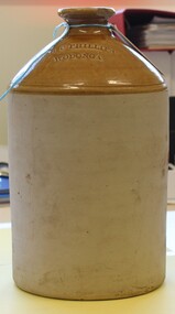
Functional object - Stoneware Demijohn, 1910
Mr Robert Crone Phillips was born in Stanley, Victoria and later moved to Wangaratta where he worked at Pinkertons and Sons. On 1 April 1912 he purchased the grocery, ironmongery, and wine and spirits business conducted in Sydney Street, Wodonga, by Mr. D. M. Stavely. This business was beside the old Wodonga Police Station. He received a spirit merchant's license under the new Licensing Act in the Wodonga Licensing Court on 20 March 1912. This was the first occasion on which spirit merchants' licenses have been granted by the court. This license was renewed annually until November 1920. On Friday 15 July 1921, a fire occurred in which Phillips grocer’s shop and a neighbouring draper’s shop, owned by Mr. R. W. McLeish, were seriously damaged. In August 1921 Robert Philips filed for insolvency with assets of £660 10/ and liabilities of £1126 19/6. The cause of insolvency listed was loss sustained by fire and the pressure of creditors. Mr. Phillips retired to Wangaratta. He passed away in 1948. The demijohn is of local significance as it represents an artefact from a local business. Its provenance is clear due to the inscription in the item. It is representative of ceramic wares from the early 1900s.A ceramiic demijohn with business name"R C PHILLIPS/ WODONGA"wodonga businesses, sydney road wodonga, r c phillips -
 Nillumbik Shire Council
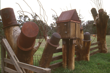
Sculpture: Tony Trembath (b.1946 Sale, Victoria), Tony Trembath, The Fences Act 1968 - Location: Edendale Farm (entrance) 30 Gastons Road, Eltham, 1989 - 1994
Eltham Council (now the Shire of Nillumbik) commissioned this work in 1989 to create an entrance / gateway to Edendale Community Farm. It was also aided by a grant from the Ministry of the Arts (now Arts Victoria). The former name of this work was "Gateway to Edendale Farm". Edendale Farm is a demonstration farm modelling sustainable environmental practices, providing support to the local residents of Nillumbik. Established in 1986, the land was purchased in 1970. It was previously an English gentleman's residence and was used for grazing. It consists of 5.6 hectares, with the Diamond Creek meandering through the property. The Victorian Fences Act 1968 governs liability of occupiers of adjoining lands to fence, and deals with disputes between neighbours regarding boundaries fences and costs. This work took into consideration ideas and suggestions from residents and committees, who required the use of recycled materials and that the work celebrate man's relationship with nature, animals and the earth, as well as relate to the fence-line on the far side of the carpark. Trembath also absorbed significant aspects of local history, making references to Eltham's agricultural past, the clearing of the land, the destruction of trees, the ruthless pruning of trees by suburban Councils and incorporated such Australian features as the post and rail fence. 'The Fences Act 1968' is significant for aesthetic, historic and social reasons at a regional level. It makes prominent the historical and social significance of Edendale and the rural aspects of Nillumbik. The use of existing tree stumps and salt pots in the work explores the iconography of the countryside such as the isolated farmhouse, pioneering farming practices, post and rail fencing and the regrowth of lopped trees. The title of the work, as well as the extensive community involvement in its creation, also makes reference to the Victorian Fences Act 1968, which makes neighbours jointly responsible for the cost of construction and maintenance of fences in the partitioning of land for settlement. 'The Fences Act 1968' has been classified as of regional significance by the National Trust of Australia. The work is an installation of wood and metal, approximately twenty five meters long. The design is very informal and rustic and runs the full width of the fence-line. It comprises groups of recycled tree trunks fitted with metal caps (chrome-nickel 'salt pots' that are shaped like tall bowler / top hats). Metal rods protrude from the trunks and some of these rods have metal birds. Two larger, sentinel-like stumps at the two outer ends have metal flame-like wings, which bend inward. To the left of the entrance, a simple architectural element indicates an isolated farmhouse. The rustic fence runs between the groups of tree trunks with native planting in clumps along it. The fence-line incorporates a functional engineered double gate and post and rail fencing. There may be many interpretations of the work and the intention is to stimulate interest and imagination rather than alienate. Interpretation is based on the personal experience that a visitor brings. The artist recommended that no explanation of the design logic be positioned with the work. N/Apublic art, sculpture, edendale, recycled, wood, metal, fences act 1968, gate, trembath, salt pot, tree stumps -
 National Wool Museum
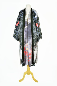
Textile - Cloak, Dr Deanne Gilson, Kunawarrar Ngaramili (Black Swan Dancer) Cloak, 2022
Standing proud, still here, the spirit of ten ancestral matriarchs adorned in contemporary ceremonial cloaks. Representing our women past, present and future, her Spirit, our culture, our Country (spelt with a capital for its importance and this is part of First Peoples protocols on acknowledging Country, our strength, our resilience and healing towards a sustainable future). The black swan cloak refers to the black swan of Geelong and Ballarat were the swan has had its own fight to survive during the early colonial years where white swans were introduced by colonisers and the black swan fought back as they do not naturally get along. The wave pattern is taken from a traditional shield pattern held in the Melbourne Museum, South Eastern archive collection of shields. The wave refers to the water and travelling across water to fish, hunt and survive. This cloak is about survival, water, and the swan living on the water. It also refers to a contemporary dance of Kunuwarra the black swan, which was performed by a group Wadawurrung women (including artist Deanne Gilson) for Tanderrum (Melbourne – Naarm) in 2016. The dance is available to watch on youtube.Black swan, heart motif with water design on outer cloak, female figure and red native flower design on lining. Solid black trimming. Cloak is machine sewn and handstitched with hand stitching on shoulder seam.deanne gilson, first nations art, wadawurrung dja
