Showing 7719 items
matching style
-
 Mission to Seafarers Victoria
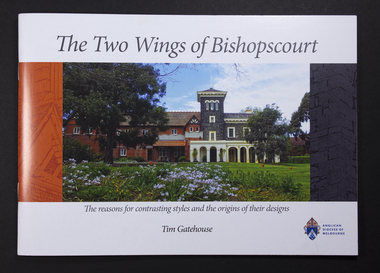
Booklet, Tim Gatehouse, The Two Wings of Bishopscourt- The reasons for contrasting styles and the origins of their designs, 2017
This booklet written by Tim Gatehouse and published by the Anglican Diocese of Melbourne gives details on the Arts and Crafts movement background and history in Australia, a short biography of Walter Richmond Butler, architect of the Mission to Seafarers and architect to the diocese of Melbourne from 1895. In 1902 he designed the extensions to Bishopscourt, East Melbourne, now called the Butler Wing.Walter Richmond Butler was an influential British architect bringing his knowledge in the Arts and Crafts movement to Australia. He was commissioned the design of the first mission in central Melbourne, the Central Institute on Siddeley Street, then the second Mission on Flinders Street. He remained a friend of the Mission and especially the Godfrey sisters who lived for some time in an apartment in Tintern Avenue.Colour booklet containing colour and black and white photographswalter richmond butler (1864–1949), bishopscourt, diocese, anglican, arts and crafts, james blackburn, architecture, 120 clarendon street, east melbourne -
 Mission to Seafarers Victoria
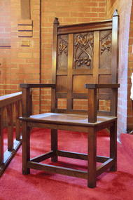
Furniture - Sanctuary chairs, pair, Gladys Hawkey (1886-1974), c. 1917
William Scott Purves Godfrey (1872-1953) designed the chairs and Miss Gladys Hawkey (1886-1974) carved them. W.S.P Godfrey was born in Toorak on 6 April 1872. He was was the cousin of Ethel Godfrey. Educated in Brussels and at Melbourne Grammar, he studied Architecture at the University of Melbourne. He and Henry Howard Spowers established the architectural firm Godfrey & Spowers, known for the design of the Argus building, around 1901. W S P Godfrey retired from practice in 1944. He died in August 1953, aged 81. He's buired in the St Kilda Cemetery with the Godfrey family. Gladys Hawkey was a member of the Guild. (photographed during the Norla Fete). She was born in Sandhurst, Bendigo and is buired in the Bendigo Cemetery. Little is known about Gladys Hawkey. She may have been a student of Robert Prenzel. Another mention of her work is made in an article in 1915 where her escritoire is offered in a raffle to raise funds for the Australian sick and Wounded. The chairs were donated in 1919 when the Flinders Street mission was open. In a style of Robert Prenzel with Australian Flora, the chairs are in the typical Arts and Crafts style. Like many women from the early 1900s, she was likely to have been inspired by the Australian exhibition of women's work and other female woodworkers of the time.Handcarvedgladys amy hawkey (1886-1974), william scott purves godfrey (1872-1953), lhlg, ladies harbour lights guild, chapel, flinders street, mission to seafarers, seamen's mission, wood carving, godfrey and spowers, heritage listed, arts and crafts, gifts-1917 -
 Mission to Seafarers Victoria
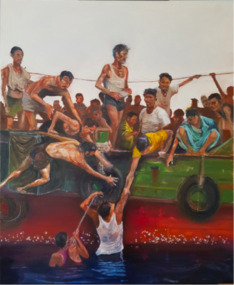
Painting, David Rowe, Diaspora, 2019
"Asylum seekers in great desperation."This artwork was an entry for the Maritime Art Prize 2019. David Rowe, editorial Ccrtoonist of The Australian Financial Review, has won the Art Prize in 2010.Marine artOil on canvas depicting asylum seekers in great desperation as they are helping two men in the water to get on board.mission to seafarers victoria, artwork, mission to seafarers, seamen's mission, flinders street, artwork-paintings, maritime art prize, sea, ship, 2019, migrants, migration, diaspora, asylum, desperation, sinking, david rowe, cartoonist -
 Mission to Seafarers Victoria
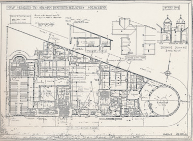
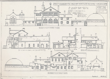
Plan - Architectural drawings, Walter Butler, New Missions to Seamen Institute Buildings Melbourne, 1916
In August 1916, Walter R. Butler presented the plans for the future central Seamen's Institute.The drawings show the original plans with rooms' names and intended use. They also show the original concept for the chapel which was in the Spanish Mission style.Plan copied from the 1983 Howden and Wardrop A4 report. A large plan on tracing paper (original or copy of the original) is held in the MSTV archives.flinders street, mission to seamen, mission to seafarers, walter richmond butler (1864–1949), norla dome, st peter chapel, spanish mission, arts and crafts, 1916 -
 Mission to Seafarers Victoria
Plan - Architectural drawings, Walter Butler, New Missions to Seamen Institute Buildings Melbourne, 1916
In August 1916, Walter R. Butler presented the plans for the future central Seamen's Institute.The drawings show the original plans with rooms' names and intended use. They also show the original concept for the chapel which was in the Spanish Mission style.Plan copied from the 1983 Howden and Wardrop A4 report. A large plan copy of the original is held in the MSTV archives.flinders street, mission to seamen, mission to seafarers, walter richmond butler (1864–1949), norla dome, st peter chapel, spanish mission, arts and crafts, 1916 -
 Mission to Seafarers Victoria
Plan - Architectural drawings, Walter Butler, New Missions to Seamen Institute Buildings Melbourne, 1916
In August 1916, Walter R. Butler presented the plans for the future central Seamen's Institute.The drawings show the original plans with rooms' names and intended use. They also show the original concept for the chapel which was in the Spanish Mission style.Plan copied from the 1983 Howden and Wardrop A4 report. flinders street, mission to seamen, mission to seafarers, walter richmond butler (1864–1949), norla dome, st peter chapel, spanish mission, arts and crafts, 1916 -
 Mission to Seafarers Victoria
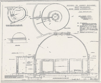
Plan - Architectural drawings, Walter Butler, Missions to Seamen Buildings, West Melbourne, Dome Over Gymnasium, 1916
In August 1916, Walter R. Butler presented the plans for the future central Seamen's Institute.The drawings show the original plans with rooms' names and intended use. They also show the original concept for the chapel which was in the Spanish Mission style.Plan copied from the 1983 Howden and Wardrop A4 report. flinders street, mission to seamen, mission to seafarers, walter richmond butler (1864–1949), norla dome, st peter chapel, spanish mission, arts and crafts, 1916 -
 Greensborough Historical Society
Disk, McLaughlin Family Photos, 1897o
Photographs of the McLaughlin family, residents of Greensborough in the early 20th century.The McLaughlin family have links with the Partington, Black, Wood and Whatmough families. Studio photos included here demonstrate this style of photography popular in the early 20th century.1 computer disk, containing photographs of the McLaughlin familyMcLaughlin Photos July 2011; from Steve Whatmoughmclaughlin family, wood family, whatmough family, greensborough, black family, partington family -
 Greensborough Historical Society
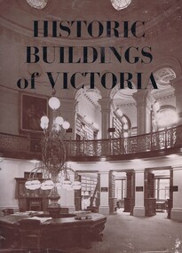
Book, Historic Buildings of Victoria, 1966_
A listing of National Trust listed buildings from around Victoria in 1966. Each entry has a photograph and caption with some history of the building. Arranged by region.The development of architectural style in Victoria.278 pages, black and white illustrations. Hard cover. Dust jacket has illustration of interior of the Library of the Supreme Courtmelbourne architecture, victoria architecture, historic buildings victoria, national trust of australia, victoria -
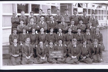 Greensborough Historical Society
Photograph, Macleod High School Form 2B, 1957, 1957
Photograph of Form 2B (1957) at Macleod High School. There are 18 girls in the first 2 rows and 18 boys in the back 2 rows. Admin school building is in the background.Shows large class sizes compared with today and the style of uniform worn.Black and white school photograph.On back in pencil: Helen Spencemacleod high school, school photographs -
 Greensborough Historical Society
Postcards, Copies of Postcards sent to members of the Whatmough family, 20th century, 1908-1930
The originals of these postcards are owned by Steve Whatmough and represent correspondence sent to various members of his family.This set of copied postcards has been kept as an example of the style of postcards available in the 20th century.Copies of 87 colour postcards. Illustrated front of card only.postcards, whatmough family -
 Greensborough Historical Society
Decorative object - Wrapping Paper, Hallmark Christmas wrapping paper, 1960s
3 sheets of folded Christmas wrapping paper, belonging to Shirley Fraser, circa 1960s.An example of the style of wrapping paper from the mid-20th century.3 sheets of coloured Christmas gift wrapping paper, various designs.wrapping paper, presents, 1960s, graphic design, deers -
 Glenelg Shire Council Cultural Collection
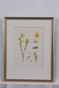
Drawing - Drawing, botanical, Collin Elwyn Woolcock, Pultenaea daphnoides (Large-leaf Bush-pea), 1970-1990
Par of "Woolcock Gallery Collection". Exhibited CEMA 1989.Flower and stem view on left, depicting two stalks shooting from a central stem. All three stems are brown with small hairs. Green leaves with rounded ends and a brown central vein with a sharp protruding point are staggered up alternatue sides of the stem. One stem has two flower buds and two flower blooms (each are in clusters). On right are (top-bottom) top view of flower, side vire of flower, top leaf vire, stem detail, bud views. Printed numbers on paper are glued to the surface of the image, with the same numbers also written in pencil. Mounted in a double matt white on pale tan) in a gold painted wooden glazed frame.Front: Pultenaea daphnoides (lower left) (pencil). CEW (signature, lower left in image) (purple pencil). Back: 28 (upper left) (pen)collin woolcock, botanical, cema -
 Eltham District Historical Society Inc
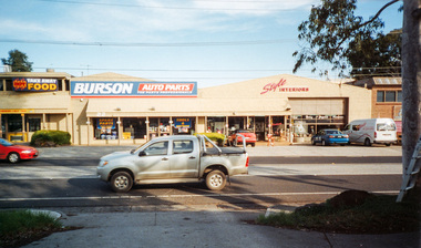
Photograph, 18 and 22 Bridge Street, Eltham, 16 May 2010, 16/05/2010
Colour photographindustries, bridge street, burson auto parts, hot takeaway food, style interiors -
 Kiewa Valley Historical Society
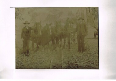
Photograph (Digital) Harnessing Horses, Harnessing Working Horses early 1900, early 1900s
This copy of an original photograph created in the early 1900s details the "horse and cart" era when the normal transportation of the day was, in this rural setting, exclusively by horse and cart. The importance of this particular photograph to the subjects can be seen by the formal suits worn by both subjects.The natural bush and grassed backdrop have not been "touched up". The dray behind the horses is barely visible (fog like aperture). The lad , John Cooper was 14 years old when this photograph was taken. Both were in the process of harnessing four horses to "hook up" on the dray behind them. From their attire it looks like a trip to town or "the church".This photograph of life on a rural property in the early 1900 shows the rough and hard (physically) life in rural areas before great mechanical revolution/evolution post World War II. This was a time in the Kiewa Valley when most transportation was by horse drawn carriages and transportation routes where dirt roads with potholes. The significance of a local pioneer "family" encapsulated by this photograph cannot be reproduced as effectively in any other form. This digitised scanned copy of an original photograph of four work horses is on 200gms Fujicolor (Fujifilm) Crystal Archive paper has a silver side on which the image has been printed and a matt reverse side.The darker slightly "blurred" image has had a white frame placed over it at the time of encapsulation to provide the finished photo with a frame. This method highlights and focuses the view into the photograph. It is a clever way to permit the eyes to focus into the image to give it a greater third dimensional aspect. on the reverse side hand written(in pencil) "John Cooper & Paddy Cullen (itinerant worker) on grandfathers place (opposite Nesta Drews place) (orange Grove). "Grandfather emigrated from England with Ryders""orange grove " property, early tawonga life style, john cooper, paddy cullen, harnessing working horses -
 Kiewa Valley Historical Society
Tin Rasawatte Tea, mid 1900's
This canister which contained a blend of Rasawatte tea was produced in the early 1900's and for the most of those who acquired it for its contents it was useful (because it was made from solid pressed steel) as a tea caddy or container for other kitchen utensils or loose grains etc. It was also a good advertising item for a general agent W.M. Peterson & Co. in Melbourne. This company along with neighbouring tea importers offices were burnt down in a horrific building fire in Melbourne.This item was used in a period of time when the tea beveridge was the main hot beveridge to accompany meals, and "high tea" was a special treat to enjoy quality teas and "finger" food. In the rural sector of the Kiewa Valley, the favourite hot drink at "smoko" or other rest times was a freshly "brewed" pot or "billy" of tea. The hot drink tea was later in time challenged by the hot cup of coffee. This change occured at a later time in the rural sector than in cities or larger towns. The rural sector in this time frame was a lot more "traditional" in a lot of their day to day learned mores. Life style changes took longer to evolve mainly due to lack of media bombardment (mainly from city based advertisers) within the family home . "The latest jadgets" took longer to permeate into "isolated or semi isolated rural regions" such as the Kiewa valleyThis cylindrical tin container, which originally contained fine Ceylon tea is totally constructed from pressed light steel. It is embossed with content details and the name of the general tea agent. The main body has been fastened by pressed, not soldered connections.Embossed with the following "Ceylon Flavoured" and in bold large letters "RASAWATTE TEA" and below this in smaller print "ONE POUND NETT" This is encapsulated by Tea plant petals and vines. On the opposite side and in script writing "3M" below this in an unfolded banner presentation "BLENDED & PACKED BY" below this "Peterson & co Melbourne" This is also encapsulated by Tea plant petals and vines.kitchen storage, tin container, cannister/caddy, kichen advertising -
 Kiewa Valley Historical Society
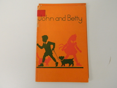
Book - School Reader for Infants, John and Betty, 1951
This "first reader" for children in a Victorian Primary school was fashioned by the period that it was printed in (1951), and the associated educational principles was applied by the Victorian Educators. It defines the role play of young children, at this point, in their educational development and contained within the(1950's) "society's" mores and expectations. This book was widely used by state schools in Victoria including Mt Beauty and Tawonga Primary Schools.This reader is significant to the Kiewa Valley because it demonstrates that there was still a very marked "one book" fits all school environmental approach by State educators which the local schools were apart of. This book is one of the KVHS children's school book collection, which many were donated by local families whose children went to Mt Beauty Primary School. Therefore this reader represents a social history significance for the period from 1950's and 60's. The book is in good condition, consequently making it suitable for exhibitions, and highlighting schools in the Kiewa Valley along with what local children read in these schools. This primary school reader has an orange cover with "John and Betty" printed in green. Below this is the green outline of a young boy leading his dog(Scottish Terrier) on a lead. Behind him is the red outline of a young girl (bow tied waist belt) in front of a cat(tail up). A thick green line is situated below the figures. The cover is 180 gsm thick. Inside the book are colored sketches of a boy and a girl playing well defined "boy" and "girl" activities (gender specific for the period of print 1951) Below these activities are simple descriptive words for the above activities.On the front page "John and Betty" below this "The earliest Reader for the Little Ones". Below this "Illustrations by Marjorie Howden" Further down the page and in smaller print is "Education Department of Victoria 1951". Below this and under a fine line "A.C. Brookes, Government Printer, Melbourne"first grader reader, primary education 1950's style -
 Kiewa Valley Historical Society
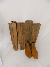
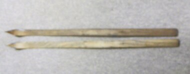
Stocks for Riding Boots, Late 1800's to early 1900's
These wooden trees for riding stocks are a concept that was brought to early colonial days from "mother" England. Gentle folk of wealth and status used these trees from early 1800's to keep and maintain their riding boots in their correct form. This form of maintaining the tall riding boot structure was maintained in Australia by the rural "elite" both on cattle properties and smaller cattle stations in the early 1900's. Good riding boots were a status symbol in rural and outback Australia. The riding stocks "wooden trees" are very significant in the Kiewa Valley because they were used by members of some of the original grazing cattle families to settle there. Both cattle and sheep properties occupied large areas of the Kiewa Valley and they also herded their flock and herd on the Bogong High Plains region. These stocks and boots were worn by Fred Roper whose great grand daughter donated them to KVHS. Therefore these boots and stocks would date from 1880's to 1920's and are a good representation of the style of boots worn during this period. This pair of wooden stocks for riding boots trees has been manufactured to a very high standard. Each of the four boot tree parts fit snugly together and maintain their form, and that of the boot that they occupy. The groove channels and foot forms (tongue and groove) are exact and once snapped together become very solid. There is a brass ring, attached by a small brass "peg" on each of the thin "sliding" middle uprights. See KVHS 0177 - Riding boots.On top "L" (for left boot), "R" (for right boot)horse. country. leather. gaiters. high plains. grazing. cattlemen. laces. studs. stocks. roper family. bogong high plains. -
 4th/19th Prince of Wales's Light Horse Regiment Unit History Room
bandolier
Designed from the experience of the British Army in the Anglo Boer War 1899-1902 for infantry and mounted troops. Bandolier included as part of the 1903 Pattern Bandolier Equipment ensemble. Dismounted troops very quickly rejected the Bandolier Equipment and it was replaced by the 1908 pattern Infantry web equipment. Australian horse mounted troops continued using the 1903 Bandolier equipment til they exchanged their horses for motorised vehicles in the early 1940's These bandoliers were worn by soldiers of the 4th, 17th, and 19th Light Horse Regiments and their precedent untis from c. 1905 to c.1942. Current 4/19th soldiers wear a bandolier styled on this bandolier when carrying a lance in Parades.Bandolier, 1903 pattern, 90 rounds mk. 2. Leather, Veg. tan, colour brown, brass buckles studs and triangle.M. A. RISK 1915 (Manufacturers mark and date of manuf.)leather, bandolier, 1903, accoutrements, equipment, 9 pockets -
4th/19th Prince of Wales's Light Horse Regiment Unit History Room
Tunic, Cotton, Paramount Mfg Co, 1941
Tunic is used to represent a tunic used in the Boer War 1899-1902. Although manufactured almost 40 years after this war ended, the style is almost identical to that used by VMR soldiers serving in the Boer War. The major difference is the stand and fall collar. In the Boer War, the collar was a stand up collar. A minor difference is the shape of the pocket flaps which on a tunic from the Boer War, was more rounded on the lower edge. The buttons are from a later period but were the closest available at the time the Tunic was assembled by the owner c.1994.Tunic, Khaki Cotton Drill, @ breast pockets with pleats. stand and fall collar, Inverted chevron, cuffs, Patrol back. AMF buttons, brass 7 total VMR shoulder titles, brass, 2 totalParamount Mfg Co 1941 size Regitmental No.... NAME..........tunic boer war mounted -
4th/19th Prince of Wales's Light Horse Regiment Unit History Room
Breeches riding, TBA Mens Tailor
These breeches are of the style and fabric used by VMR soldiers in the Boer War. They were specially made for the owner with the intention of loaning them to the museum for a Boer War display.breeches, Cotton Cord, Khaki,breeches cotton cord riding -
 4th/19th Prince of Wales's Light Horse Regiment Unit History Room
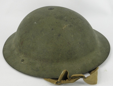
Helmet, Steel British, Circa 1939-1945
Background unknownThis helmet although manufactured in WW2, is an almost identical style to the WW1 helmet worn by soldiers of the 4th Light Horse in France and Belgium.helmet steel british, helmet steel british -
 Kiewa Valley Historical Society
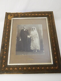
Photo Framed - Wedding
This wedding photo is of local pioneer families, Cooper and Larkins. John Cooper Jnr. married Annie Emma Larkins. The exact date is unknown. This is not only important for the Cooper & Larkin families but for historical reference for the Tawonga area where these families lived. It shows that even though the Kiewa Valley was considered remote during this period the tradition of a big formal wedding was still held with fashionable weddings. This photo was included in a group of photos. This photo has historical significance as it depicts members of local pioneer families getting married. It also is representative of the style of wedding dresses of the period and the style of men's wedding attire. The photograph itself is also significant as is demonstrates the style and formality of wedding photos during this time. The picture frame is likewise the style of the period. However, this is in bad condition with bore holes in it. This photo has good interpretive value and is well provenanced. Black and white wedding photo of John Cooper Jnr. and Annie Emma Larkins. The centre of the frame has carved hearts 3 cm wide all the way around.Photographer "Mendelsfohn's and Co. Melbourne"mendelsfohn's & co.. photographer of melbourne. wedding. furniture. wooden frame. -
 Kiewa Valley Historical Society
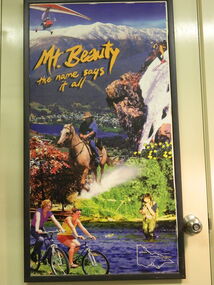
Poster - Mt Beauty, Mt Beauty The Name Says It All
This poster is representative of the tourism marketing that was used in the 1990's to promote the aesthetic beauty of the township of Mt Beauty thus the play on the words, Mt Beauty, The Name Says It All. The poster also promotes activities that are on offer to the visitor in Mt Beauty and the broader area. The poster is also significant as it shows the progression in marketing by the Alpine Shire and the Mt Beauty Chamber of Commerce from the early days of marketing Mt Beauty as a tourist destination. This poster is historically significant as it shows the style of tourism campaigns of the 1990's with the slogan "Mt Beauty The Name Says It All", which is a play on the name Mt Beauty and was promoted by the Mt Beauty Chamber of Commerce and the Alpine Shire. This slogan is no longer part of the tourism for the Alpine Shire and therefore is a good comparative example of previous tourism and current tourism campaigns. Also see "KVHS 0204" for another example of tourism brochure. Coloured poster of local scenes and activities promoting tourism in North East Victoriaposter. mt beauty. tourism. -
 Kiewa Valley Historical Society
Photos - Mt Beauty Schools
Mt Beauty HES school was created for the children of the employees of the State Electricity Commission of Victoria who were constructing the Kiewa Hydro Electric Scheme at the head of the Kiewa Valley at the new town of Mount Beauty. Mt Beauty School consisted of Mt Beauty Higher Elementary School 1948-1964 before it was split into the current (2023) Mt Beauty Primary School and Mt Beauty High School. See. "Kiewa Kids" by Graham Gardner pages 94-180. "Below Bogong-A History of Mount Beauty" compiled by Di Edmondson. chapter 7, Pages 178-230.As the population changed so did the schools in name, size etc. Also what started as a very modern school in the 1948 to what is now an older style wooden building2 larger photos 1 b & w - hurdles race and 1 colored 3 girls sitting in front of computers 9 medium size photos 1 b & w students and 1 of car; 1 of school building and 1 of student group; 5 coloured sports daymt beauty higher elementary school -
 Kiewa Valley Historical Society
Skis, 1944-45
Skiing was first done at Falls Creek with the building of the towns of Bogong and Mt Beauty. European workers to the Hydro scheme thought that Falls Creek would make a good skiing village. The first ski lodge being opened in 1947. These skiis would have been used in those first seasons of Falls Creek and used by the first skiers of the time from 1945 onwards.These skiis are historically and socially significant, as they would have been one of the first type of skiis used at Falls Creek, one of Victoria first ski resorts, and used by the pioneers of skiing in Victoria. This item has good interpretive capacity as it shows the style of skiis that were used in the 1940's and they are a good comparative item against modern skiis. These skiis were used by Bill Bertram during the first winter traverse from Mount Hotham to the Mountain Creek base of Mount Bogong, see KVHS 0161 for biography of this historical event.Painted Red base with blue undercoat with center groove from base to 3/4 of way towards tip At tips are square pices with round holes possbily HOME MADE? 21 plus 2 holes on top face (for binding)sport, pioneers, snow, skiis, skiing, falls-creek, bogong-village, mt-beauty -
 Kiewa Valley Historical Society
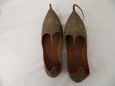
Shoes - Slippers
sourced from local resident of Kiewa Valley Mr David Barton. As theses shoes are from Turkey and from the period of the early 1900s they may have been bought back from that country as a souvenir after WWI. Members of the Barton family went to WWI . Manufacture of slippers circa 1920s and represents early Turkish style .These slippers are considered rare due to the intricate workmanship in leather. They have historical and good Provence significance due to being donated by a local man who possibly bought them back from WWI . Two brown slippers, left and right foot. Leather soles and gold patterned (circle and fish like) embroidered uppers. A long, 13cm leather strip upward curled, extension fastened at tip of sole. Back of heel extended to a pointPatterned front toe,side arch and heel. Markings may represent water ,four fish and fish traps -
 Kiewa Valley Historical Society
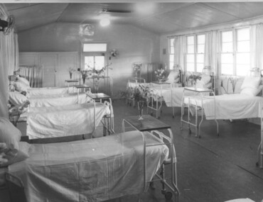
Photograph Tawonga Hospital, A ward at Tawonga Hospital, 1949/50
This photo is of a ward - probably the female ward, as there a many floral arrangements - of the original hospital at Tawonga. This was situated at the corner of Ryders Lane and Kiewa Valley Highway. The building was transported from Bonegilla where it was originally a part of the Bonegilla Military Hospital. The hospital was opened on 24th September, 1949 with a capacity of 12 beds, but was later increased to 35 beds by enclosing the verandahs on 3 sides of the building. 'Add ons' provided theatre, offices, stores and a nurses home. Construction was commenced by the Hospital and Charities Commission with considerable input from the S.E.C., providing the removal and re-erection of the building, the accommodation for nursing staff and carried all work necessary to make the building operational as a hospital. Up until this time the nearest hospital was at Yackandandah. The hospital remained on this site until 1961 when a larger, more suitable building was purchased in Mt. Beauty from the S.E.C.A photographic record of a typical open plan style ward in that era. There were no private rooms. There are portable screens stored at the end of the room to provide "privacy" at the bedside when needed. There is a fan on the wall for cooling. Depicts the rather primitive conditions of that era when compared with todays standards.Black and white photograph of a ward in the Tawonga District Hospitalhospital, ward, tawonga -
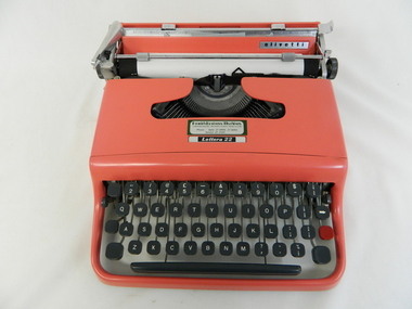 Kiewa Valley Historical Society
Typewriter Mechanical Portable, 1950s
The Olivetti company was founded in Italy in 1908.This particular typewriter is a Olivetti Lettera 22, oblique front stroke and portable manufactured after 1950. The 1950s and 1960s was a time when British manufactured goods were still purchased by many Australian consumers. The later 1960s onwards, there was a shift, mainly in the cities, to European made goods. The invasion of Japanese manufactured goods was relatively slower, especially in rural areas. The demand for long lasted and dependable merchandise was in the rural area still the most important criteria. The ease of setting up this typewriter and its compact mobility was its major benefit to trades people and travelling professionals, e.g. rural doctors, other medical professionals, accountants, lawyers and educators. This item facilitated the growing numbers of professional nomads requiring a relatively light office stationery package e.g. travelling novelist, writer, businessman and academics. This typewriter needed no electrical or battery power to operate it. Outback Australia, where at this point in time, was still relatively isolated from a good available electrical power reticulation and battery power, and therefore could not be totally measured as a highly efficient office environment.Although this typewriter was purchased from a business in Penrith, Sydney, N.S.W., it is significant that it travelled easily to the Kiewa Valley, demonstrating the mobility of certain sections of the community. This typewriter was designed by an Italian industrial designer, Marcello Nizzoli, in line with the art deco style of the 1930s and the colour and flexibility of the vibrant 1950s. The underlying theme of manufacturing in the 1950s was to produce equipment that was more efficient than what was inherited from the earlier period of 20th century. Improvements were made to this Olivetti typewriter by Giuseppe Beccio by reducing the number of parts made from 3,000 to 2,000. This reduction of parts and therefore cost of production was the major principle of the Japanese manufacturing juggernauts of the post World War II era. Efficiency and low costs material was becoming prime factors in the success of rural industries from the 1960s. Competition from overseas producers was starting to affect rural industries and the removal of the large range of tariff protection, especially rural products, required not only a shift of farm management but a more efficient cost savings modus operandi. This Olivetti Lettera 22, oblique front stroke portable (weighs 4kg) mechanical typewriter has a coral coloured plastic casing. The keys are made of black hardened plastic with white lettering, numbers and symbols (imperial fractions, and pound). It has a QWERTY keyboard as opposed to the Italian QZERTY. It has a lever to move the ribbon between black, neutral (for mimeograph stencils)and red colours (a red key is provided for highlighting specific words,letters or symbols) . This machine is fitted with only a black ribbon. It has a black rubber paper rollers and chromed metal parts on the carriage way. It has four rubber feet underneath the main body. On the left side of the roller there is a lever to adjust the roller from fixed (when mobile) through 1,2 and 3 line space gradients. This model has a key for zero but not one for the number one (uppercase letter l is used) see KVHS 0459 for the carrying bag.On the cover over the ribbon wheels letter strikers has a plate marked "Lettera 22" and the back plate behind the paper roller and in front of the paper supports has a silver metal label marked "olivetti made in great britain".commercial, mobile office equipment, mechanical typewriter