Showing 598 items
matching chosen
-
 Ruyton Girls' School
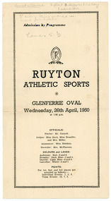
Programme, Ruyton Girls' School, Ruyton Athletic Sports, 26 April 1950
The pamphlet documents the agenda for the Ruyton Girls' School athletics sports carnival hosted at Glenferrie Oval on Wednesday, 26 April 1950. The program outlines a series of activities to be undertaken by junior and senior school students (including day girls and boarders), including crossball, potato sack race, hockey dribbling, egg and spoon race, relays, baseball throwing, and obstacle courses. Each sport is divided into age brackets including under 14, under 16, and 16 and over. The pamphlet also acts as a scorecard, featuring columns for recording results, points scored, progress points and times. Ruyton Girls' School has an exceptional reputation in school sport. The School is a member school of Girls' Sport Victoria (GSV), a large sporting association involving 24 independent girls’ schools in Melbourne. Girls in the Senior School have the opportunity to compete in a range of sports over the four terms and at three major carnivals; Swimming and Diving, Cross Country and Track and Field. Ruyton also has a very successful Rowing program and participates in the Victorian Interschools Snowsports Championships.The record has strong historic significance as it gives insight into the House system at Ruyton Girls' School; in particular, how the House system is used in a sports context. In the early 1920s, Ruyton was settling into its new home at Selbourne Road, Kew. At the time, students were arranged by their form (or year level) for lessons and other school activities. A collection of eight emblems and mottoes for each form group was published in the Ruytonian December 1922, although the genesis of each were left unexplained. With enrolments continually growing, Principal Miss Hilda Daniell felt a new basis of organisation would benefit students, giving them a broader outlook and something bigger to work for. She took inspiration from tradition and implemented a House system. The House system was adopted at Ruyton in September 1924 to "provide a new kind of co-operation and competition among the girls, especially in Sport." There were four houses, three of which were named after early Principals: Anderson, Bromby and Lascelles. There was also the School House, initially for boarders only. Some time after the publication of the Ruytonian in April 1928, the School House was renamed Daniell House, and had opened up to day girls. The account published by the newly formed Daniell House in the Ruytonian December 1928 reads, "we are rather bashful in presenting this account of our doings, for we are conscious of our newness. Our house has now the honour of being known as Daniell House." Four of the original eight form emblems were adopted by the new Houses, while the others were discarded. According to former teacher and author of the centenary history of Ruyton, Ms Majorie Theobald, the House system "gave a new focus for all competitive sport, which had previously been organised on a rather inequitable basis." The colours chosen for the Houses were cherry red for Anderson, royal blue for Bromby, gold for Lascelles, and pale blue for School (later Daniell). New students starting at Ruyton from Prep onwards are allocated to one of the following Houses with consideration to family connections and balance of numbers. The record's significance is further enhanced by its strong provenance, having been produced by Ruyton Girls' School and donated to the Archives by a familial connection of a former notable student.Pamphlet printed on cream coloured paper with navy blue ink. Two pages, folded in half.Obverse: tenns allowed 2 flat 3 teas 1 relay / 1 noveltie / 3 every thing entered in. / move for heats / Lanes 5 - 2 / First Page: under 15 50 yds. / 2. / 3 under 15 75 yds. / 4 / 5 / 6. Junior Crossball. / 7 / 8 / Second Page: 9 / 10 under 15. / 11 / 12 / 13 / 14 under 15 / 15 / 16. / Reverse: 21 Diamond Throwing open / 22 / 23 under 15 / 24 / 25 / 26 / 27 / Diamond / 28 / 29 / 30 / 31 / 32 / Junior under 15 1st July 1 Junior relay (?) / under 15 / Two sprints and potato go for championships /ruyton girls' school, students, school, ruyton, victoria, high school, senior school, day school, letter, old ruytonians association, kew, sport, school sport, girls' sport victoria, house, anderson, lascelles, bromby, daniell, athletics, glenferrie -
 Ruyton Girls' School
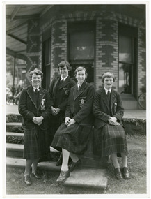
Photograph, Ruyton Girls' School, 1951
Depicted are four students who were the 1951 House Captains at Ruyton Girls' School. The photo is an official school portrait, taken outdoors in front of Henty House (formerly Tarring). In the background, we can see two bicycles. The girls are dressed in their school uniforms, comprising a knee-length check-print skirt, dark jumper, light-coloured collared buttoned blouse with a dark tie, wool blazer, stockings, and dark-coloured lace-up shoes. Two of the girls are standing, while the other two are seated on a small concrete plinth. The students have been identified, from left to right, as A. Dickinson (Lascelles), C. Kent (Anderson, H. Cole (Bromby), and E. Duff (Daniell). Student leadership commenced at Ruyton Girls' School in 1906 with the introduction of the prefect system. Prefects had numerous responsibilities—gate duty, grounds duty, classroom marking, assembly door watch, uniform monitoring, and even supervising student detention. In 1947, a dedicated Prefects Room was erected on the east side of the Ruyton Girls' School Assembly Room in Henty House. The prefects system was revised in 1968 with a new leadership structure: there would be a permanent School Captain, Vice Captain and School Sports Captain; six permanent prefects would be elected, and the rest of the Matriculation class would form committees. These included Library, Social Services, S.C.M., Editorial, and Music. In this way, it was thought "that each Matric girl would have a certain amount of responsibility." With this revised structure came a brand new Prefects' Study, located in a former classroom next to the Domestic Science building. Each prefect was allocated one book locker, one clothing locker, "a small share in the heater", plus a new shared lounge. The prefect system was updated again in 1974. All sixth formers would become prefects, or "school officials." This saw the sixth form divided into two halves: one group would be prefects for the first half of the year, then the second group would take the reigns in the latter half of the year. In October 2023, Ruyton announced a new collaborative leadership structure for captains, prefects and house leaders, which would see two students in each leadership role.The record has strong historic significance as it gives insight into the House system at Ruyton Girls' School. In the early 1920s, Ruyton was settling into its new home at Selbourne Road, Kew. At the time, students were arranged by their form (or year level) for lessons and other school activities. A collection of eight emblems and mottoes for each form group was published in the Ruytonian December 1922, although the genesis of each were left unexplained. With enrolments continually growing, Principal Miss Hilda Daniell felt a new basis of organisation would benefit students, giving them a broader outlook and something bigger to work for. She took inspiration from tradition and implemented a House system. The House system was adopted at Ruyton in September 1924 to "provide a new kind of co-operation and competition among the girls, especially in Sport." There were four houses, three of which were named after early Principals: Anderson, Bromby and Lascelles. There was also the School House, initially for boarders only. Some time after the publication of the Ruytonian in April 1928, the School House was renamed Daniell House, and had opened up to day girls. The account published by the newly formed Daniell House in the Ruytonian December 1928 reads, "we are rather bashful in presenting this account of our doings, for we are conscious of our newness. Our house has now the honour of being known as Daniell House." Four of the original eight form emblems were adopted by the new Houses, while the others were discarded. According to former teacher and author of the centenary history of Ruyton, Ms Majorie Theobald, the House system "gave a new focus for all competitive sport, which had previously been organised on a rather inequitable basis." The colours chosen for the Houses were cherry red for Anderson, royal blue for Bromby, gold for Lascelles, and pale blue for School (later Daniell). New students starting at Ruyton from Prep onwards are allocated to one of the Houses with consideration to family connections and balance of numbers. The record's significance is further enhanced by its strong provenance, having been produced by Ruyton Girls' School and donated to the Archives by a familial connection of a former notable student.Black and white rectangular photograph printed on matte photographic paper.Reverse: Caroline Kent / Mary Murray. / 11.12.51. / Ann Dickinson / RGS011/1951/0003ruyton girls' school, ruyton, students, school, senior school, girls school, kew, melbourne, school uniform, prefects, photograph, henry henty, henty house, marion henty, tarring -
 Nillumbik Shire Council
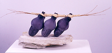
Sculpture: Joseph Scott COWCHER, Passionately Packaged, 1987
This artwork was a finalist in the 1987 Shire of Eltham Art Awards. The materials Cowcher has chosen constitute different transformations of earth - stone, sand (fired into glass), bamboo and dried grass. The work is a sign of the artist's passion in working with these materials and 'packaging' them into an aesthetic composition that connect and dance with one another.Three purple glass objects in the form of pine cones, held together by raffia, resting on a large slab of white stone. N/A -
 Royal District Nursing Service (now known as Bolton Clarke)
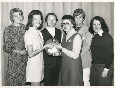
Photograph - Photograph, black and white, Barry Sutton, 24.04.1974
Sister Pat (Paddy) Rowley is the Principal Nurse Educator at Royal District Nursing Service (RDNS) and is standing with a group of RDNS staff in the Education Department at RDNS Headquarters, 452 St. Kilda Road, Melbourne. Sr. Rowley is wearing the RDNS winter uniform of a blue/grey skivvie under a blue/grey V neck tunic style dress made of herring bone winter material. She, and the lady in the white dress, are displaying the RDNS winter beret made of the same herringbone material as the RDNS winter dress.From its earliest years when the Trained nurses (Nurses) of Melbourne District Nursing Society (MDNS began to wear uniforms the chosen colour was grey, though the style changed throughout the years as fashions changed from the late 1800s through to the 1970s. Their Nurses firstly wore long grey frocks, and on their heads, a white cap with a long white tail hanging from the centre back. When bicycles were introduced the headgear changed to a white pith helmet adorned with a red Maltese cross in the centre front. This was held on with a veil going over the hat and tied under the chin. Over the years there were complaints that the veils became wet in the rain and they asked for a change of uniform, but this did not happen until 1921. Later the Trained nurses (Sisters) complained their skirts became wet when riding their bicycles in the rain and asked, when raining, to be able to wear breeches and gaiters. This was granted provided they wore aprons when attending patients. It was not long before the uniform changed to a shorter length grey frock, red cardigan, grey coat and grey brimmed hat; later changed to a peaked grey hat. In 1966 MDNS were granted Royal patronage. Now as Royal District Nursing Service (RDNS), the uniform was redesigned and colour changed in 1971. By 1972 the Sisters were wearing the new winter uniform of a blue/grey skivvie under a V neck tunic style frock made of blue/grey herringbone winter material with the RDNS insignia on the upper left, and a beret of the same material. In summer the uniform became a royal blue V neck tunic style frock, with the RDNS insignia on the upper left, worn over a short sleeve white blouse. A royal blue peaked hat with the RDNS insignia in the centre front was worn at first and then only worn on official occasions. This uniform was worn until changed to a corporate style in the mid 1980s,This black and white photograph depicts six Royal District Nursing Service (RDNS) staff standing in two rows in front of closed long grey curtains. They are looking at the camera and smiling, some are partly hidden. L- R back row - A lady who has short dark hair and is wearing a grey and black patterned frock. Next is a lady with her black hair drawn back; is wearing black pants and a black sleeveless V neck jacket over a white skivvie. The next lady has wavy short dark hair; is wearing white slacks, a light grey jacket with lapels and the pocket on its upper left has a vertical zip in the centre. She has a black and white striped scarf around her neck. Front row L-R - A lady with shoulder length black curled hair who is wearing a white uniform style dress and is turned toward the right of the photograph. Her right hand is on the top edge of an RDNS beret which is held on its edge with the inner white lining seen, and the upper section showing the deep front of the beret which has a central RDNS logo. To the right of this, is Sister Pat (Paddy) Rowley who has short dark straight hair; is wearing dark rimmed glasses and is wearing a light grey skivvie under a darker V neck tunic style dress. She is turned toward the left of the photograph and her right hand is holding the bottom edge of the RDNS beret and her left hand is on the top edge. The next lady, on the far right, has shoulder length black curly hair and is wearing dark grey slacks, and a black round neck jumper over a white blouse with the peaks and cuff seen.Barry Sutton MA 23 rdns, rdns education, royal district nursing service, rdns uniform, sister pat (paddy) rowley -
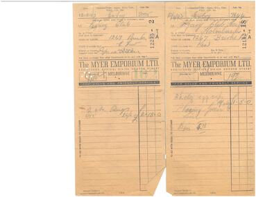 Melbourne Legacy
Document - Documents, Receipts
Receipts for items purchased for the new hostel give an authentic picture of organisational requirements. Also shows the type of hand written receipts that were common in the 1940s.Of interest not only because of the items chosen and their prices in setting up Holmbush, but also to see the Myer advertising on the back highlighting their services in that era.Register receipts x 9, beige, black printing, pencilled handwriting. One with an Urgent sticker in red, red printing on verso.residences, holmbush -
 Kew Historical Society Inc
Book, John Peacock, Costume 1066-1990s, 1994
Here is the revised, expanded and updated edition of this unrivaled collection of drawings ranging over ten centuries of English historical costume. More than a thousand illustrations, based on surviving garments and contemporary paintings and photographs, demonstrate the astonishing changes in men's and women's clothing over the centuries. The evolution of particular garments can easily be traced, from their origins through their fashionable epochs, to their inevitable demise and resurgence. Designed for quick reference, the book is divided into the reigns of the British monarchs, and the costumes have been chosen to reflect analogous developments in the United States and Europe.Rev. ed. of: Costume 1066-1966. 1986. Bibliography: p. 133-135.non-fictionHere is the revised, expanded and updated edition of this unrivaled collection of drawings ranging over ten centuries of English historical costume. More than a thousand illustrations, based on surviving garments and contemporary paintings and photographs, demonstrate the astonishing changes in men's and women's clothing over the centuries. The evolution of particular garments can easily be traced, from their origins through their fashionable epochs, to their inevitable demise and resurgence. Designed for quick reference, the book is divided into the reigns of the British monarchs, and the costumes have been chosen to reflect analogous developments in the United States and Europe.history of costume, illustrated costume history, clothing -- history -- illustrated -
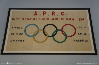 Albert Park-South Melbourne Rowing Club
APRC 1956 Olympic Banner, 1957
"The banner has been with the Club since it was created in 1957. Recent research has confirmed that it was made by Joan Eddy, the wife of club member Kevin Eddy and a professional seamstress. Grace Blake’s interview notes record her conversation with Mr Eddy on 24 October 2014: Kevin confirmed that the banner was made by his wife, Joan Eddy, in time for the opening of the new shed after the Olympics (1957). Kevin was the Social Secretary at the time, and co-opted his wife, who had worked as a machinist for Harford Clothing in Carlton before they married. Her mother had also worked there as a sewing hand (hand sewing the linings for jackets). The company was later taken over by Sires. ... It was made at home (Joan had ‘retired’ from work by then)." Excerpt from the 2014 Significance Assessment, p32.Banner Celebrating Albert Park Rowing Club Olympic Representatives, 1956 Statement of significance by Margaret Birtley, October 2014 Harry Gordon, the distinguished Australian sports historian, wrote of the 1956 Melbourne Olympic Games: "When the Olympic Games moved into Melbourne ... it was as if the city had been brushed by a certain magic. Nothing before or since ... has ever evoked such sheer emotional involvement from the whole community." Gordon refers to the large crowds that massed in Melbourne with anticipation and exhilaration on the day before the official opening, ‘with little apparent motive other than just to be there, and be happy’. The hand-crafted banner celebrating Albert Park Rowing Club’s representatives at those Olympic Games seems to exude that same sense of joy and exhilaration. Made by the wife of the club’s social secretary, it testifies to the admiration felt by individuals and organisations for the success of their own on a world stage. The banner has historic significance for its accurate documentation of the great achievement of a single rowing club in contributing six outstanding athletes to the relatively small Australian rowing team. Additional historic significance derives from the fact that this is an unofficial expression of tribute and pride. The banner’s incorporation of the Olympic rings would now be likely to require licensing by the Australian Olympic Committee, a process that can dampen social engagement. While definitely a hand-made item, there is some aesthetic significance in the design and execution of the banner. Good judgement has been demonstrated in the selection of fabrics and the choice of colours. The workmanship is quite skilful. The vertical symmetry and the horizontal balance of the design are pleasing to the eye. The use of red for the heading lines and black for the Olympians names is well-chosen and aesthetically pleasing. The collection holds black and white photographs of the same oarsmen at the Olympic regatta. This banner complements their role in the collection by providing colour and a sense of connection with an affectionate and supportive community. Its social significance transcends the local context for which it was created and used, to become part of the large body of art, craft and memorabilia that are associated with the Olympic movement worldwide. A handmade embroidered banner to commemorate the Albert Park members who were part of the 1956 Olympic Rowing team.A.P.R.C. / REPRESENTATIVES OLYMPIC GAMES MELBOURNE 1956 / R. DUNCAN / R. DICKSON / K. McMAHON / R. LIBBIS / I. ALLEN / J COCKBILL coxrowing, apsm rowing club, olympic games, albert park rowing club, albert park lake, duncan, robert, dickson, bruce, allen, ian, libbis, reg, mcmahon, kevin, cockbill, john -
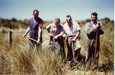 Port Fairy Historical Society Museum and Archives
Photograph
Working Bee (Golf) East Fence 1962Displaying the ambition of members of a sporting club to roll up their sleeves to gain a better outcome for their chosen sportColoured photograph of 4 men with spades digging near the east fence of the new Golf course in 1962sport, golf, golf course, working bee -
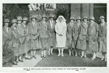 Royal District Nursing Service (now known as Bolton Clarke)
Photograph - Photograph, black and white, c.1929
This is a photographic record of Matron Beatrice Williams and the Trained nurses, (Sisters), of the District Nursing division of the Melbourne District Nursing Society who worked in the community give nursing care to patient's in their homes. Their uniforms are grey and the Maltese cross on the Sisters hats is red.From its earliest years when Melbourne District Nursing Society (MDNS) began to wear uniforms the chosen colour was grey, though the style changed throughout the years as fashions changed from the late 1800s through to the 1970s. The Trained nurses (Nurses), firstly wore long grey frocks and a white cap with a long white tail hanging from the centre back. When bicycles were introduced in 1903 the headgear changed to a white pith helmet adorned with a red Maltese cross in the centre front. This was held on with a veil going over the hat and tied under the chin. Over the years there were complaints that the veils became wet in the rain and they asked for a change of uniform, but this did not happen until 1921. Later the Nurses complained their skirts became wet when riding their bicycles in the rain and asked, when raining, to be able to wear breeches and gaiters. This was granted provided they wore aprons when attending patients. It was not long before the uniform changed to a shorter length grey frock, red cardigan, grey coat and grey brimmed hat; later changed to a peaked grey hat. In 1966 MDNS were granted Royal patronage. Now as Royal District Nursing Service, RDNS, the uniform was redesigned and colour changed in 1971. By 1972 the Trained nurses (Sisters) were wearing the new winter uniform of a blue/grey skivvie under a V neck tunic style frock made of blue/grey herringbone winter material with the RDNS insignia on the upper left, and a beret of the same material. In summer the uniform became a royal blue V neck tunic style frock, with the RDNS insignia on the upper left, worn over a short sleeve white blouse. A royal blue peaked hat with the RDNS insignia in the centre front was worn at first and then only worn on official occasions. This uniform was worn until changed to a corporate style in the mid 1980s,Black and white photograph of Matron Beatrice Williams wearing a white uniform and veil, with a group of twelve Melbourne District Nursing Society (MDNS) trained nurses (Sisters) wearing their calf length uniforms of grey coats, and grey brimmed hats with pale grey hat band with central Maltese cross, standing in the garden of the MDNS After-Care home.No. 8526 on rear of photographmelbourne district nursing society, mdns, mdns uniforms, rdns, royal district nursing service, mdns matron, miss beatrice mary williams -
 Royal District Nursing Service (now known as Bolton Clarke)
Headwear - Photograph, colour, c.1903
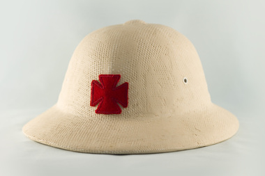
Cream pith helmets were part of the uniform worn by Melbourne District Nursing Society (MDNS) Trained nurses (Nurses) from the early 1900s when giving nursing care to the sick poor of Melbourne. When riding their bicycles the helmet was held on by a long white scarf tied under the Nurse's chin. From its earliest years when Melbourne District Nursing Society (MDNS) Trained nurses, known as 'Nurse' in those days, began to wear uniforms the chosen colour was grey, though the style changed throughout the years as fashions changed from the late 1800s through to the 1970s. The Nurses firstly wore long grey frocks and a white cap with a long white tail hanging from the centre back. When bicycles were introduced in 1903 the headgear changed to a cream pith helmet adorned with a red Maltese cross in the centre front. This was held on with a veil going over the hat and tied under the chin. Over the years there were complaints that the veils became wet in the rain and they asked for a change of uniform, but this did not happen until 1921. The Nurses complained their skirts became wet when riding their bicycles in the rain and asked, when raining, to be able to wear breeches and gaiters. This was granted provided they wore aprons when attending patients. It was not long before the uniform changed to a shorter length grey frock, red cardigan, grey coat and grey brimmed hat; later changed to a peaked grey hat. In 1966 MDNS were granted Royal patronage. Now as Royal District Nursing Service (RDNS), the uniform was redesigned and colour changed in 1971. By 1972 the Sisters were wearing the new winter uniform of a blue/grey skivvie under a V neck tunic style frock made of blue/grey herringbone winter material with the RDNS insignia on the upper left, and a beret of the same material. In summer the uniform became a royal blue V neck tunic style frock, with the RDNS insignia on the upper left, worn over a short sleeve white blouse. A royal blue peaked hat with the RDNS insignia in the centre front was worn at first and then only worn on official occasions. This uniform was worn until changed to a corporate style in the mid 1980s,This hard cream coloured pith helmet has a 'pudding basin' shaped crown with 2 eyelets on both sides of it and a raised 'button' in the centre of the crown. This is encircled by a slightly sloping brim. A red cotton Maltese cross is emblazoned in the centre. The crown has a 66 cm circumference and is 12 cm deep; the raised central button is 3.5 cm x 3 cm; and the brim has a 101 cm circumference and is 5 cm deep.melbourne district nursing society, mdns, mdns uniforms, rdns, royal district nursing service -
 Royal District Nursing Service (now known as Bolton Clarke)
Headwear - Photograph, colour, c.1960
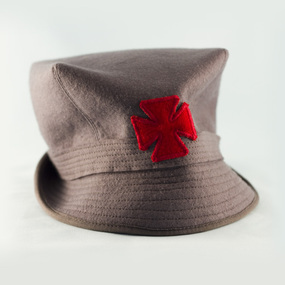
This hat is part of the uniform worn by all the Trained nurses (Sisters) of the Melbourne District Nursing Service, (MDNS), during the 1960s. The Sisters travelled around the inner and outer suburbs of Melbourne administering nursing care to patients in their homes. From its earliest years when Melbourne District Nursing Society (MDNS) began to wear uniforms the chosen colour was grey, though the style changed throughout the years as fashions changed from the late 1800s through to the 1970s. The Trained nurses firstly wore long grey frocks and a white cap with a long white tail hanging from the centre back. When bicycles were introduced the headgear changed to a white pith helmet adorned with a red Maltese cross in the centre front. This was held on with a veil going over the hat and tied under the chin. Over the years there were complaints that the veils became wet in the rain and they asked for a change of uniform, but this did not happen until 1921. The nurses complained their skirts became wet when riding their bicycles in the rain and asked, when raining, to be able to wear breeches and gaiters. This was granted provided they wore aprons when attending patients. It was not long before the uniform changed to a shorter length grey frock, red cardigan, grey coat and grey brimmed hat; later changed to a peaked grey hat. In 1966 MDNS were granted Royal patronage. Now as Royal District Nursing Service, RDNS, the uniform was redesigned and colour changed in 1971. By 1972 the Sisters were wearing the new winter uniform of a blue/grey skivvie under a V neck tunic style frock made of blue/grey herringbone winter material with the RDNS insignia on the upper left, and a beret of the same material. In summer the uniform became a royal blue V neck tunic style frock, with the RDNS insignia on the upper left, worn over a short sleeve white blouse. A royal blue peaked hat with the RDNS insignia in the centre front was worn at first and then only worn on official occasions. This uniform was worn until changed to a corporate style in the mid 1980s,A Melbourne District Nursing Service (MDNS) felt grey peaked hat, which has a deep crown and a flat top. Stitching comes from four corners of the crown at an angle to a grey band, which contains several rows of stitching, and surrounds the crown.. A stiff sloping grey brim, containing several rows of stitching, joins the band surrounding the crown, the rear of the brim is turned up and the front forms a peak. A cotton red Maltese cross is sewn to the centre front of the crown and band. A white with blue 'created by Effie Joy' label is attached to the inner hat band along with 'Size 22'. The crown is 9.5 cm deep and the brim is 5 cm deepmdns, melbourne district nursing service, mdns uniforms, rdns, royal district nursing service -
 Royal District Nursing Service (now known as Bolton Clarke)
Photograph - Photograph, black and white, 1967
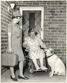
Royal District Nursing Service (RDNS), Sister Meisser is visiting Mrs. Lata to attend to the nursing care she requires in her home. She is greeting Mrs. Lata on her veranda and is observing her interaction with her dog. Sr. Meisser is wearing her RDNS uniform of a grey cotton short sleeve frock with a small white arched material logo with 'Royal District Nursing Service' in blue capital letters emblazoned on it, attached to the upper sleeve. She is wearing her grey peaked hat. This had a metal RDNS logo attached to the centre front. Sister Meisser worked from the RDNS Moorabbin centre.From its earliest years when the Trained nurses of the Melbourne District Nursing Society (MDNS) began to wear uniforms, the chosen colour was grey, though the style changed throughout the years as fashions changed from the late 1800s through to the 1970s. Their Trained nurses (Nurses) firstly wore long grey frocks and a white cap with a long white tail hanging from the centre back. When bicycles were introduced the headgear changed to a white pith helmet adorned with a red Maltese cross in the centre front. This was held on with a veil going over the hat and tied under the chin. Over the years there were complaints that the veils became wet in the rain and they asked for a change of uniform, but this did not happen until 1921. Later the Nurses complained their skirts became wet when riding their bicycles in the rain and asked, when raining, to be able to wear breeches and gaiters. This was granted provided they wore aprons when attending patients. It was not long before the uniform changed to a shorter length grey frock, red cardigan, grey coat and grey brimmed hat; later changed to a peaked grey hat. This uniform was used when MDNS was granted Royal patronage in 1966 and worn until 1971 when the uniform changed to a blue V necked frock over a short sleeve white blouse in summer and a blue/grey skivvie under a blue/grey herringbone V neck tunic style frock made of winter material in the cooler weather. Black and white photograph of Royal District Nursing Service (RDNS), Sister Meisser, of Moorabbin Centre. She is standing on the left of the photograph; has short dark hair and is wearing her grey uniform with peaked hat and black shoes, and is holding her rectangular nursing case. She is standing on the veranda of Mrs. Lata's brick home, and is smiling as she observes, to her right, Mrs. Lata, who has grey curly hair and is wearing a light coloured floral frock. Mrs. Lata is sitting in her wheelchair and with her left hand is patting her pale coloured Labrador dog who has a dark collar and is sitting to her right. Mrs. Lata is in front of her security door which has a white door frame. The house has a white lantern shaped light attached to the wall on the left hand side of the photographPhotographer's stamp and the word 'Publicity'royal district nursing service, rdns, rdns uniform, moorabbin centre, mrs lata, sister m. meisser -
 Royal District Nursing Service (now known as Bolton Clarke)
Photograph - Photograph, black and white, Barry Sutton, 25.07.1972
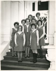
Miss Mary Evans is the Director of Nursing of Royal District Nursing Service (RDNS). RDNS changed its uniform style and colour some time in 1971 and this 1972 photograph of the Sisters shows them wearing the new winter uniform of a blue/grey skivvie under a V neck tunic style frock made of blue/grey herringbone winter material, with the RDNS insignia on the upper left, and a beret style hat of the same material. The hat was worn on official occasions. Miss Evans is wearing her uniform of a grey blouse and a skirt and long V neck jacket made of the same blue/grey herringbone winter material worn by the Sisters. The photograph is taken on the steps of RDNS Headquarters, 452 St. Kilda Rd, Melbourne. Part of the white building is seen either side of the steps, and behind the Sisters the wooden and glass panel door is seen.From its earliest years when Melbourne District Nursing Society (MDNS) began to wear uniforms the chosen colour was grey, though the style changed throughout the years as fashions changed from the late 1800s through to the 1970s. Their Trained nurses (Nurses) firstly wore long grey frocks and later a white collar, cuffs and white belt was added, and on their head they wore a white cap with a long white tail hanging from the centre back. When bicycles were introduced the headgear changed to a white pith helmet adorned with a red Maltese cross in the centre front. This was held on with a veil going over the hat and tied under the chin. Over the years there were complaints that the veils became wet in the rain and they asked for a change of uniform, but this did not happen until 1921. Twelve years later the Trained nurses (Sisters) complained their skirts became wet when riding their bicycles in the rain and asked, when raining, to be able to wear breeches and gaiters. This was granted provided they wore aprons when attending patients. It was not long before the uniform changed to a shorter length grey frock, red cardigan, grey coat and grey brimmed hat; later changed to a peaked grey hat. In 1966 MDNS were granted Royal patronage. Now as Royal District Nursing Service (RDNS), Sisters Liz Thomson and Bev Armstrong, in 1971, designed a new uniform and the colour was changed. By 1972 the Sisters were wearing the new winter uniform of a blue/grey skivvie under a V neck tunic style frock made of blue/grey herringbone winter material with the RDNS insignia on the upper left, and a beret style hat of the same material. In summer the uniform became a royal blue V neck tunic style frock, with the RDNS insignia on the upper left, worn over a short sleeve white blouse. A royal blue peaked hat with the RDNS insignia in the centre front was worn at first and then only worn on official occasions. This uniform was worn until changed to a corporate style in the mid 1980s,Black and white photograph of Miss Mary Evans of the Royal District Nursing Service (RDNS), with a group of RDNS Sisters standing, in twos, down the steps outside part of a white painted.building. They are wearing their winter uniforms of a grey V neck tunic style frock worn over a lighter grey skivvie. They are all wearing the matching grey beret style hat. The RDNS insignia is seen on the upper left of their uniforms and in the centre front of their hats. Some of the Sisters are partly hidden. L-R Back row - Sisters: Barbara Watson, who has blonde hair and Judy Peter who has darker hair. The next row down is - Betty McDonald, who has short dark hair and Fonce Hoey, who has curled hair. The next row down is V. Sheehan with dark curly hair, Miss Mary Evans, with dark curled hair and M. Lambert with dark curled hair. Front row - A. Tyler, who is wearing glasses and has short dark hair and Mary Gawith with short dark curled hair. She is wearing below the knee black boots.Photographer stamp. Quote No. LA 3melbourne district nursing society, mdns, royal district nursing service, rdns, rdns uniform, miss mary evans, sister barbara watson, sister judy peter, sister betty mcdonald, sister fonce hoey, sister v sheehan, sister h. lambert, sister a. tyler, sister mary gawith -
 Royal District Nursing Service (now known as Bolton Clarke)
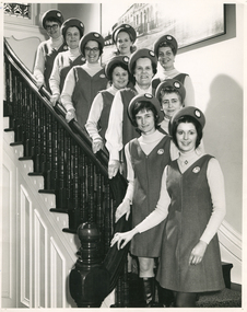
Photograph - Photograph, black and white, Barry Sutton, 25.07.1972
Miss Evans is the Director of Nursing of Royal District Nursing Service (RDNS). She and the group of RDNS Sisters are standing on the staircase inside RDNS Headquarters, 452 St. Kilda Road, Melbourne.The photograph on the right rear is of a full view of 452. They are wearing the new winter uniform of a blue/grey skivvie worn under a V neck tunic style herringbone winter material dress with the RDNS insignia on the upper left. Their beret style hats are made of the same herringbone material. Miss Evans is wearing her uniform of a grey blouse, and a skirt and long jacket made of the blue/grey herringbone winter material.From its earliest years when Melbourne District Nursing Society (MDNS) began to wear uniforms the chosen colour was grey, though the style changed throughout the years as fashions changed from the late 1800s through to the 1970s. Their Trained nurses (Nurses) firstly wore long grey frocks, and later a white collar, cuffs and white belt was added, and on their heads they wore a white cap with a long white tail hanging from the centre back. When bicycles were introduced in 1903 the headgear changed to a white pith helmet adorned with a red Maltese cross in the centre front. This was held on with a veil going over the hat and tied under the chin. Over the years there were complaints that the veils became wet in the rain and they asked for a change of uniform, but this did not happen until 1921. Twelve years later the Trained nurses (Sisters) complained their skirts became wet when riding their bicycles in the rain and asked, when raining, to be able to wear breeches and gaiters. This was granted provided they wore aprons when attending patients. It was not long before the uniform changed to a shorter length grey frock, red cardigan, grey coat and grey brimmed hat; later changed to a peaked grey hat. In 1966 MDNS were granted Royal patronage. Now as Royal District Nursing Service (RDNS), Sisters Liz Thomson and Bev Armstrong, in 1971, designed a new uniform and the colour was changed. By 1972 the Sisters were wearing the new winter uniform of a blue/grey skivvie under a V neck tunic style frock made of blue/grey herringbone winter material with the RDNS insignia on the upper left, and a beret style hat of the same material. In summer the uniform became a royal blue V neck tunic style frock, with the RDNS insignia on the upper left, worn over a short sleeve white blouse. A royal blue peaked hat with the RDNS insignia in the centre front was worn at first and then only worn on official occasions. This uniform was worn until changed to a corporate style in the mid 1980s,Black and white photograph showing Royal District Nursing Service (RDNS) Miss Mary Evans amid a group of RDNS Sisters standing down the steps of an internal staircase. They are wearing their new winter RDNS uniforms of a light grey skivvy under a V neck tunic style grey frock with the RDNS insignia on the upper left, and a beret style hat of the same material. Sisters from top to bottom:- P. Rowley, who is wearing glasses and has short dark hair, next down is F. Hoey, who has short dark hair and then in pairs L-R A. Tyler, wearing glasses and with dark curled hair and B. Watson, who has shoulder length blonde curled hair. Next down is B. McDonald with short dark hair and J. Peter, with curly dark hair. Next down is Miss Evans, who has short curled hair, On the next step down is V. Sheehan, who has short wavy blonde hair, down further is M. Gawith, who has short dark hair and is wearing below the knee black boots. and in front is M. Lambert who has short dark hair and has her hospital badge attached under the centre neck of her skivvy. The staircase has dark wooden turned balustrades topped with a matching curved handrail and below this is white woodwork. In the rear of the photograph part of a stained glass window can be seen and on the right is part of a large photograph. Photographer stamp. Quote No. LA 4melbourne district nursing society, mdns, royal district nursing service, rdns, rdns uniform, miss mary evans, sister pat (paddy) rowley, sister fonce hoey, sister a. tyler, sister barbara watson, sister betty mcdonald, sister judy peter, sister mary gawith, sister v. sheehan, sister m. lambert -
 Bacchus Marsh & District Historical Society
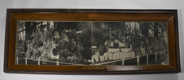
Photograph, The Prince's Show May 1920 Bacchus Marsh District Exhibit
During May through to July 1920 Prince Edward, later to become King Edward VIII of England toured Australia to thank the country for its support during World War One and to strengthen ties between Australia and the United Kingdom. He arrived in Victoria on the 26 May 1920 and on the 29 May attended a special agricultural show at the Royal Agricultural Showgrounds at Flemington. Bacchus Marsh district was invited to contribute to a display of agricultural produce and products which was displayed in the Government Pavilion at the Showgrounds. The display according to a newspaper report in the Bacchus Marsh Express on 5 June 1920 included 33 trays of fresh fruit, preserved fruit, pickles, sauces, bacon and other small goods, vegetables, hay grasses, grain, turned wood, wines and other drinks', &c., aided by pot plants, flags, draping of maroon and gold (official Exhibit colors) made up a color scheme and general effect worthy of the occasion. The Prince inspected the exhibit and expressed his admiration of it, his only regret was that he could not give more time to its examination. There was also 'an improvised "pheasant" nestling in one corner, and what "amazing" eyes it had!'. The organiser of the display was F. C. Minns, and the decorator was T. Stewart. This photograph is notable for its size and high quality framing. This signifies the importance the local community placed upon being chosen to participate in a major royal event and the desire to record this in a grand and elaborate way for posterity. Very large framed photograph of the agricultural produce and products from the Bacchus Marsh district displayed as part of a special exhibition for Prince Edward, the heir to the British throne when he visited Melbourne in May 1920. The display comprised a wide variety of produce such as fresh and preserved fruit, meats, vegetables, hay, grasses, grain, turned wood, wines and other drinks. The image is divided in the middle into two different angles of the display.A caption in gold lettering at the foot of the image reads 'The Prince's Show May 1920 Bacchus Marsh District Exhibit Royal Agricultural Society Showgrounds'royal visits, shows and exhibitions -
 The Celtic Club
Book, Molly Keane, Molly Keane's Ireland: An anthoolgy, 1993
An anthology of Irish verse and prose chosen by Irish novelist, Molly Keane.Index, ill, p.227.non-fictionAn anthology of Irish verse and prose chosen by Irish novelist, Molly Keane.english literature - irish authors, ireland - poetry. -
Harcourt Valley Heritage & Tourist Centre
Book, Harcourt Speaks, 2009
'Harcourt Speaks' represents the collaboration of a group of local orchardists, farmers, growers and local community who worked together to gather photos and stories of strength, cohesion and innovation around the impact of relentless drought and changing climatic conditions. This was a drought assistance project supported by the Mount Alexander Shire Council and the Victorian Government Dept of Community Planning and Development.Project Facilitator was Phillippa Gregory and Photography Community Development was provided by Deanna Neville.Provides a cross-section of the working adults of a rural community as they faced the grim reality of extended drought with attendant restrictions on the use of irrigation water and the consequent near disastrous impact on horticulture in this famed horticultural valley. Each photo has a brief story attached. The captions tell how this community responded by acceptance and innovation, using words like "we adapted' 'we were innovative' 'new directions chosen' 'resilience' 'optimistic'.This project is significant in that it depicts a community that, faced with real adversity, was not weakly submissive, nor crushed, but made the best of it.It has significance as an example of a creative response to a prolonged negative situationSixteen page, spiral bound, A4 'landscape'book with coloured title page, with 31 coloured photographs.Harcourt Speaks -
 Wodonga & District Historical Society Inc
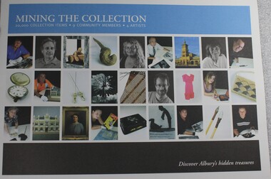
Booklet - Mining the Collection: Discover Albury's Hidden Treasures, Damian Kelly et al, May 2011
Mining the Collection was an Arts NSW funded project in which nine community members and four artists were invited to discover and select works from Albury City's seven cultural collections. The collections were Indigenous Collection, Textile Collection, Social History Objects Collection, Social History Collection (paper based), Photography Collection, Works on paper Collection (Drysdale, drawings) and the Painting Collection. The community members selected individual pieces for the artists to respond to in their chosen medium. All four artists – Arthur Wicks, Ponch Hawkes, Treahna Hamm and Frank Burgers – have a connection with the region and a national profile. The artists' responses to the individual works chosen for them and the range of works selected became an exhibition that introduced visitors to the collection and to the contemporary artworks it inspired. This is a publication to accompany that exhibition.non-fictionMining the Collection was an Arts NSW funded project in which nine community members and four artists were invited to discover and select works from Albury City's seven cultural collections. The collections were Indigenous Collection, Textile Collection, Social History Objects Collection, Social History Collection (paper based), Photography Collection, Works on paper Collection (Drysdale, drawings) and the Painting Collection. The community members selected individual pieces for the artists to respond to in their chosen medium. All four artists – Arthur Wicks, Ponch Hawkes, Treahna Hamm and Frank Burgers – have a connection with the region and a national profile. The artists' responses to the individual works chosen for them and the range of works selected became an exhibition that introduced visitors to the collection and to the contemporary artworks it inspired. This is a publication to accompany that exhibition. albury art gallery and museum, museum collection albury, exhibitions albury -
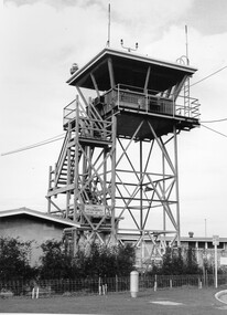 City of Kingston
Photograph - Black and white, c. 1970
Moorabbin Airport was acquired in 1946 by a group of aviators and the Civil Aviation Department, Moorabbin Airport opened as a fully-functioning aerodrome in December 1949, chosen for its ideal location in the Market Gardens for an aviation base to be situated southeast of Melbourne. Black and white photograph of the control tower at Moorabbin Airport. At the base of the tower is a single storey brick building with a wire fence at the running across the front.Handwritten in black ink on reverse: 701 Handwritten in red ink on reverse: 100%moorabbin, airport, aviation -
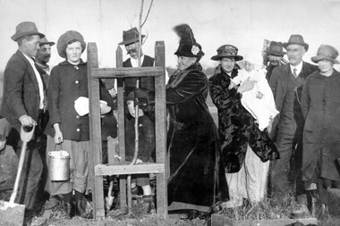 City of Kingston
Photograph - Black and white, c. 1917
Members of the local community have gathered to plant an avenue of honour. Through community fundraising, funds for over 140 trees had been raised.An avenue of honour was planted after World War I (WWI) to commemorate those from the area who had died during service. The arboreal Avenue of Honour has been an enduring and highly popular form of public commemoration of military service in Australia. With a significant groundswell of community endeavour, as a nation, Australians have chosen to recognise service, sacrifice and suffering through community plantings of memorial Avenues of Honour. The earliest recorded Avenues of Honour were created in response to Australia’s participation in the Boer War, but the majority were established during and after World War I and, to a lesser extent, World War II. (https://avenuesofhonour.org/about/)A group of about eleven (11) people, including children and a baby, have gathered to plant trees along to create an avenue of honour for the fallen of World War I (WWI). From left to right: Moss Daff, Mr Stratford, Alice Edwards, Len Alln with Ron Allan, Mrs Wood (sen), Mrs Wood (jnr) with baby, name unrecorded, Mr McKittrick and Maud Edwards. White round sticker with black printed text on reverse: 99 Handwritten in red ink: 50%cheltenham, world war i, commemoration, avenue of honour -
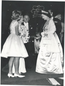 Melbourne Legacy
Photograph, HRH Queen Elizabeth, 1963
Photograph of Queen Elizabeth II on a state visit to Melbourne in February 1963 receiving flowers from Christine Kelson, a junior legatee. An article in the Legacy's Weekly Bulletin on 26 February mentions the details. Christine was 14 years old and daughter of the late Signaller Arthur Kelson who served with the 9th division in Middle East and who was taken prisoner in North Africa and made a POW in Italy and Germany. Her mother Mrs Dorothy Kelson, served with the AMWAS. Christine and her younger brother Robert, aged 9, both attended Legacy's Physical and Recreational Training classes.A record of a junior legatee being chosen to present flowers to the Queen.Black and white photo of the Queen receiving flowers.Stamped Copyright of The Age in blue ink.royal visit, junior legatee, queen elizabeth -
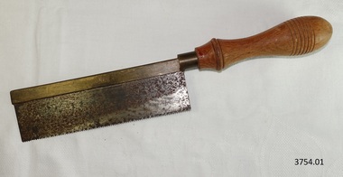 Flagstaff Hill Maritime Museum and Village
Tool - Saw, 1930-1955's
This tenon saw was used in the making of components for the ship model Sovereign of the Seas. Tenon saws are often used for making dovetail joints. It is part of a collection of objects used by Jim Williams, maker of fine ship models from about 1930-1955. Most of the components for the models, as well as many of the tools, were handmade by Jim Williams. Jim’s family has donated the ship model “Sovereign of the Seas” and many tools, accessories and documents used in the making of this and other ship models have been donated to Flagstaff Hill Maritime Village. Ship model of HMS Sovereign of the Seas, scale model of 17th Century English war ship, was handmade and carved from plans, enclosed in airtight glass case. All components of that model, including even the smallest pulleys, were hand crafted using tools designed and made by Jim. Outstanding details include functional rigging and moving cannons. Please see our record 3732 of the mode Sovereign of the Seas for further details of the ship and the maker. This tenon saw is connected with the hobby and skill of ship model making that has been crafted as a leisure activity for many generations. The hobby is often chosen by serving and retired mariners who appreciate the connection with maritime history. This tenon saw was used by local Warrnambool man, Jim Williams, who was employed at Cramond and Dickson clothing store, and then at Fletcher Jones menswear for 27 years. It was used in making components for the model of the historic ship, the Sovereign of the Seas. The Sovereign of the Seas was a historic 17th century English war ship with important maritime heritage. Tenon Saw. Hand saw with small-toothed metal blade set into a slotted brass back, attached to a round brass fitting in the light coloured, turned wooden handle. Top on handle is marked with seven concentric rings scored into the wood. On top of blade is maker’s name “AVIA” within oval ring. This tenon saw is part of a collection of tools and accessories once used by Jim Williams, maker of a series of ship models 1930-1955 including “HMS Sovereign of the Seas”."Avia" within oval ring.flagstaff hill, warrnambool, flagstaff hill maritime museum, maritime museum, shipwreck coast, flagstaff hill maritime village, great ocean road, jim williams, james bernard williams, ship model hobby, ship model tools, ship model making equipment, ship model making accessories, saw, wood cutting tool, tenon saw, avia steel and tool company limited, carpenter's tool, tool, sovereign of the sea, ship model, hobby, ship model tool -
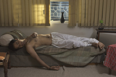 Wyndham Art Gallery (Wyndham City Council)
Photograph, Sunil Gupta, The New Pre-Raphaelites #7, 2008
Sunil Gupta is a British/Canadian citizen, (b. New Delhi 1953) MA (RCA) PhD (Westminster) who lives in London and has been involved with independent photography as a critical practice for many years focusing on race, migration and queer issues. A retrospective was shown at The Photographers’ Gallery, London (2020/21) and The Image Center, Toronto. He is a Professorial Fellow at UCA, Farnham. His latest book is “We Were Here: Sexuality, Photography, and Cultural Difference, Selected Writings by Sunil Gupta”, Aperture New York 2022. His work is in many private and public collections including; the Tokyo Museum of Photography, Philadelphia Museum of Art, Royal Ontario Museum, Tate, Metropolitan Museum of Art and the Museum of Modern Art. His work is represented by Hales Gallery (New York, London), Materià Gallery (Rome), Stephen Bulger Gallery (Toronto) and Vadehra Art Gallery (New Delhi).Part of Queer PHOTO (Midsumm x PHOTO 2024) photography, british photography, queer photography, race, migration, portrait -
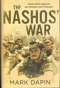 National Vietnam Veterans Museum (NVVM)
Book, Dapin, Mark, The Nashos' War - Australia's National Servicemen and Vietnam(Copy 2)
More than sixty-three thousand young Australians were drafted into national service during the Vietnam War. The 'nashos' were chosen by chance, when their brithdates were drawn from a lottery barrel. Not all of them ended up in vietnam, but their random fatee came to symbolise the war, and divide a nation.More than sixty-three thousand young Australians were drafted into national service during the Vietnam War. The 'nashos' were chosen by chance, when their brithdates were drawn from a lottery barrel. Not all of them ended up in vietnam, but their random fatee came to symbolise the war, and divide a nation. vietnam war, 1961-1975 -- participation, australian, draft -- australia -- history, australia -- armed forces -- recruiting, private errol noack, battle of long tan, operation bribie, vung tau, battle of coral-balmoral, trooper normie rowe, battle of binh ba, sas -
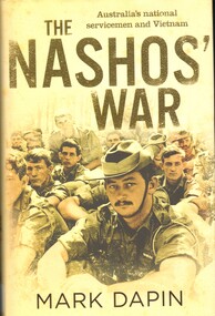
 National Vietnam Veterans Museum (NVVM)
Book, Dapin, Mark, The Nashos' War. Australia's National Servicemen and Vietnam(Copy 1)
More than sixty-three thousand young Australians were drafted into national service during the Vietnam War. The 'Nashos'' were chosen by chance, when their birthdates were drawn from a lottery barrel. Not all of them ended up in Vietnam, but their random fate came to symbolise the war, and divide a nation.More than sixty-three thousand young Australians were drafted into national service during the Vietnam War. The 'Nashos'' were chosen by chance, when their birthdates were drawn from a lottery barrel. Not all of them ended up in Vietnam, but their random fate came to symbolise the war, and divide a nation.vietnam war, 1961-1975 - participation, australian, draft - australia - history, australia - armed forces - recruiting, private errol noack, battle of long tan, operation bribie, vung tau, the battle of coral and balmoral, trooper normie rowe, sas -
 National Vietnam Veterans Museum (NVVM)
Book, Dapin, Mark, The Nashos' War. Australia's national servicemen and Vietnam(Copy 3)
More than sixty-three thousand young Australians were drafted into national service during the Vietnam War. The 'nashos' were chosen by chance, when their birth dates were drawn from a lottery barrel. Not all of them ended up in Vietnam, but their random fate came to symbolise the war, and divide a nation.More than sixty-three thousand young Australians were drafted into national service during the Vietnam War. The 'nashos' were chosen by chance, when their birth dates were drawn from a lottery barrel. Not all of them ended up in Vietnam, but their random fate came to symbolise the war, and divide a nation. vietnam war, 1961-1975 -- participation, australian, draft -- australia -- history, australia -- armed forces -- recruiting, national service, nasho, private errol noack, battle of long tan, operation bribie, vung tau, the battle of coral and balmoral, trooper normie rowe, battle of binh ba -
 National Vietnam Veterans Museum (NVVM)
Book, Griffin, W.E.B, The Berets: Brotherhood Of War
They were the chosen ones - and the ones who chose to be the best.They were the chosen ones - and the ones who chose to be the best.vietnamese conflict, 1961-1975 - fiction -
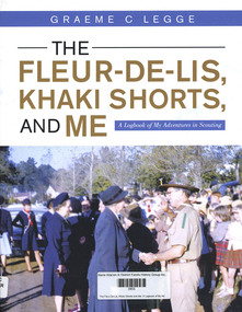 Narre Warren and District Family History Group
Book, Graeme C Legge, The Fleur-De-Lis, Khaki Shorts and Me: A Logbook of My Adventures in Scouting, 2022
'This Log Book is much more than its title suggests. This is the story of Scouting and of community service in and around Emerald, Victoria and ref lects the impact of Scouting in a semi-rural part of Victoria and Graeme’s role in moulding a part of it. It commences through the eyes of a youth, Graeme Legge, who joined the re-established Emerald Scout Group as a 12 year old in 1948 and recounts his leadership and support to youth and community of his town, its Scout District and Cardinia Shire over more than seven decades. Graeme shares his early Scouting travel experiences in the 1950s to Fraser Island in Queensland, to the Pieman River in western Tasmania, to Jamborees at Wonga Park, Victoria in 1948, Greystanes, Sydney in 1952 and Clifford Park, Victoria, 1956 as something we the readers can contrast with how Scouting does such adventures today.He outlines four months of overseas travel to the UK in 1951 as part of the “Sun” newspaper Youth Travel scheme where he met some fellow Scouts who, like him, were chosen to represent their local Shire and he visited places and experiences which clearly had an impact on his future Scouting journey. He captures the mood and the energy of his years of Scouting Leadership, as when he met Lady Baden-Powell in Emerald, illustrated through his photos, clippings and graphics which are drawn from his personal collection and research of local newspapers in the Victorian Scout Magazine, all befitting the method of a teaching and educational professional."--Foreword.159 p.non-fiction'This Log Book is much more than its title suggests. This is the story of Scouting and of community service in and around Emerald, Victoria and ref lects the impact of Scouting in a semi-rural part of Victoria and Graeme’s role in moulding a part of it. It commences through the eyes of a youth, Graeme Legge, who joined the re-established Emerald Scout Group as a 12 year old in 1948 and recounts his leadership and support to youth and community of his town, its Scout District and Cardinia Shire over more than seven decades. Graeme shares his early Scouting travel experiences in the 1950s to Fraser Island in Queensland, to the Pieman River in western Tasmania, to Jamborees at Wonga Park, Victoria in 1948, Greystanes, Sydney in 1952 and Clifford Park, Victoria, 1956 as something we the readers can contrast with how Scouting does such adventures today.He outlines four months of overseas travel to the UK in 1951 as part of the “Sun” newspaper Youth Travel scheme where he met some fellow Scouts who, like him, were chosen to represent their local Shire and he visited places and experiences which clearly had an impact on his future Scouting journey. He captures the mood and the energy of his years of Scouting Leadership, as when he met Lady Baden-Powell in Emerald, illustrated through his photos, clippings and graphics which are drawn from his personal collection and research of local newspapers in the Victorian Scout Magazine, all befitting the method of a teaching and educational professional."--Foreword. scouting, emerald (vic.), graeme legge