Showing 88 items matching "gouache"
-
 Merri-bek City Council
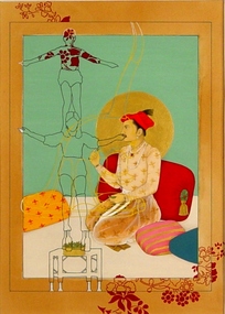
Work on paper - Gouache on paper, Nusra Latif Qureshi, Balancing Act II, 2004
Nusra Latif Qureshi was trained in Mughal miniature painting in Lahore, Pakistan. From this, she has developed a rich contemporary visual style. Her works feature themes and techniques from the past and present. Qureshi often layers appropriated images from colonial photography. Balancing Act II is a gouache painting that depicts the outline of two figures balancing on bottles placed carefully on a small table. This drawing is layered on top of an orientalist colonial image that has been appropriated for the work. -
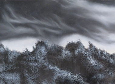
 The Dunmoochin Foundation
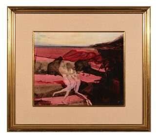
Gouache Painting, Mrs. Fraser and Convict, 1958
Painting depicting a male and female nude embracing in a rose landscape Nonesidney nolan, painting, landscape, gouache, convict, female nude, male nude -
 Melbourne Legacy
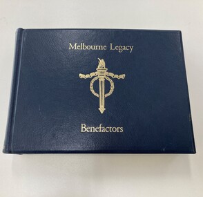
Book, Melbourne Legacy Benefactors
This book is a record, made in honour of generous benefactors who have donated to the cause of Legacy. There is no date on the book as to when the donations were made or when the book was created.This is a record of members of the public who have gave generous donations to assist Legacy help the families of deceased service personnel.Blue hardcover bound book, cream pages pages with navy blue Torch emblem in top right corner of each page. The pages have a gold edge.Front cover has the Torch logo embossed in gold with 'Melbourne Legacy Benefactors' in gold lettering. Each page has a name of a donor in Prussian Blue ink with gold scroll work. About half the book is written in, the rest are blank. Inside back cover is a note in pencil "Writing is Talens Gouache Prussian Blue" and "by Terry Pepperell 95706846". There is no date in the book.honour roll, donations -
 Mission to Seafarers Victoria
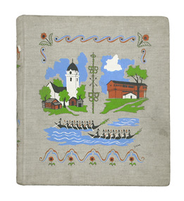
Album - Photographic album, Ports of call with the M/S Mongabarra from December 1st 1949 to July 23rd 1950, 1949
The album tells the story of ports visited by Allan Charles Quinn during his service on board the M/S "Mongabarra". He signed on in San Francisco on December 1, 1949. Note this trip overlapped with the Album (00278) which documents the next trip Quinn made to Africa out of Gothenburg. The album preserves a 1950s perspective of a Merchant Seaman and his experience of the respective Ports at that time. The Collection is especially useful when viewed along with contemporary Quinn family correspondence.Album with metal Metal binder rings at spine and beige fabric cover with gouache printed colour design featuring scandinavian buildings. The album contains 25 pages of b/w mounted photographs. Some are missing. The cover is illustrated with colour screenprinted pictures of a white tower on the left and a brown Barn-like building on the right. There are stylised canoe boats containing rowers in the foreground.. On the inside front cover is a handwritten itinerary of the places visited.On front cover possible designer printed signature in black: "Grane"; On inside front cover on adhered sheet of paper in aqua ink lists intinerary/ index of 20 Ports visited: Title (see above) / "Signed on in San Francisco December 1st 1949 / " then a header line for 4 columns: " PORT COUNTRY ARRIVED DEPARTED / 1. San Francisco U.S.A 10-10-49 4-12-49 / ... / 10. ADELAIDE ... 11-4-50 19-4-50 / .../ 20. HALDEN NORWAY 23-7 - 50 25-7-50" ; Most of the photographs in the Album also annotated and dated ; inside back cover has an embossed letter R.album, photograph, ms mongbarra, san francisco, dunkirk, voyages, allan quinn, barbara quinn, seafaring life, ww2, seafarer, melbourne, sydney, brisbane, san pedro, newcastle, adelaide, port pirie, port lincoln, cape town, las palmas, australia, south africa, canary islands, usa, united states, france, antwerp, belgium, hull, england, hamburg, germany, copenhagen, denmark, gothenburg, norway, sweden, halden, malmö -
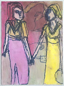 Merri-bek City Council
Marker and pastel on paper, Adrian Lazzaro, Untitled, 2018
Primarily working across painting and digital art, Lazzaro’s artworks are characterised by figures of wrestlers, vampires, zombies, toys and subjects from imaginary worlds. Often using gouache, acrylic and paint pen, Lazzaro’s imagery blends sinister interpretations with a quirky sense of humour. Lazzarro’s works usually depict historical figures, pop-culture icons or people he has met or seen. This work depicts two women holding hands. Lazzaro has been a regular studio artist at Arts Project Australia since 2004. Arts Project Australia supports artists with intellectual disabilities through their studio and gallery, promoting artists’ work and advocating for their inclusion in contemporary art practice. -
 Glenelg Shire Council Cultural Collection
Painting, Jennifer McCarthy, Edward Henty Arrival, 2009
Winner of the 175th Anniversary of Edward Henty landing at Portland, Acquisitive Art Prize.Gouache on paper depiction of Edward Henty's arrival at Portland Bay. Cream coloured mat board. Light coloured wooden frame. Wire hanging cord. A colourful border depicting native animals as well as other items such as a steam train, shovel, cartwheels surrounds an image of the coastline. Each corner of the border shows a sailing ship. In the foreground are two Indigenous Australians seated on the floor surrounded by bushland. To the left stands a man in European clothing - green trousers and a striped top. He is ankle deep in the water. Behind him are two baskets which he holds with a chain. Behind that are two sheep. Top left is a parchment which says, Thistle the Pioneer, Nov 19th 1834.Front: Back - 'Jennifer McCarthy Edward Henty - Arrival 2009' - Brown texta Also framers sticker1834, the thistle, henty, colonial, portland bay -
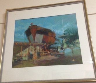 Mission to Seafarers Victoria
Painting, (Dry dock), Late 20th C or early 21st Century
Marine art, Maritime artLarge framed glazed landscape format painting depicting in foreground a rusty hull of a ship against a deep aqua blue sky. The hull appears to be in a dry dock with a stylized figure with a red top and blue pants looks down from the prow at the set of low buildings and yard in the foreground. Another ship appears to be moored behind the rusty hull but only the bridge of the ship is visible. At near right in foreground there appear to be two rounded graves or headstones.The frame is sharply beaded and with gilding. The painting has a window mount and is glazed with glass. Paint surface is thinly but intensley painted and seems to be gouache or watercolour on paper. Sealed at back with brown paper mostly intact and a corded hanging system.at lower right corner quadrant there seems to be a mainly rectangular ciphertankers, marine painting, artwork-paintings -
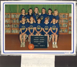 Bendigo Historical Society Inc.
Photograph - GOLDEN SQUARE LAUREL STREET P.S. COLLECTION: GSPS GRADE 5 NETBALL TEAM 1990
Coloured photograph of the Golden Square Primary School, Laurel Street, Grade 5 Netball Team 1990. Photo taken in the library. Children wearing blue uniforms. Ball and a board with the name of the school, year, grade and Netball printed on it.painting, gouache, golden square laurel street p.s. collection - gsps grade 5 netball team, a tremain, c worrell, k rodda, j byrne, b driscoll, j postema, c hilson, m browning, s rainbow, e healey, m diss, ed -
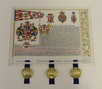 Glen Eira City Council History and Heritage Collection
Letters Patent, Letters Patent for the Grant of Arms to the City of Caulfield presented on 1st May, 1977, 01/05/1977
Glen Eira has a long history of association with various heraldic forms. From its early years the municipality of Caulfield had used the armorial bearings of the Caulfield Family (the Charlemonts of Castle Caulfield) to represent the roads board and later the town and city. In 1969 Caulfield City Council began planning to apply for an official coat of arms for the City. In 1974 Horace Hall, a Balwyn North resident and member of the Heraldry Society in London advised Council that the current usage was illegal, and that the Houston family, current owners of the Caulfield Arms could take legal action against Council for 'usurping their arms'. Mr Hall was commissioned to develop new heraldry for the City, and in conjunction with J. P. Brooke Little at the College of Arms, London, he prepared an acceptable design for Caulfield's Coat of Arms. The Council paid an additional sum to have a standard painted on the Letters Patent and the municipality's new coat of arms was drawn up in June 1975. The Coat of Arms retains a number of heraldic elements from the original Caulfield family insignia, including the dragons, the colours and the elements of the shield. The newly registered coat of arms and Letters Patent document for the granting of arms was presented at a civic service to mark the granting of armorial ensigns and the city banner to the City of Caulfield on the 1st May 1977. Significant elements of the coat of arms granted by these Letters Patent are as follows: The motto 'Labore Vinces' translates to 'By our labours we will conquer'. The helmet represents the rank of the owner. Public authorities are granted an esquire's helmet. The brickwork on the crest is a recognised emblem of local government. The Letters Patent also display a banner and a badge, both official symbols of the City of Caulfield. The badge, which is displayed on the banner as well as on its own, features a bridled horse. This represents the importance of racing, the Caulfield racecourse and the Caulfield cup to the municipality. These letters patent officially proclaim the granting of the coat of arms to the City of Caulfield. They are highly significant to the City of Glen Eira as they are the primary document that signifies the official and ceremonial heraldic powers of the Coat of Arms of the City of Caulfield. Mounted Letters Patent illuminated document for the Grant of Arms to the City of Caulfield presented on 1st May, 1977. Hand written and hand painted on cream coloured parchment using different coloured inks, mainly black, blue, red and gouache and gold paint. The bottom edge is folded up over itself approx. 45mm revealing the flesh side of the parchment, which displays black ink signatures and three sets of two horizontal slits that hold three blue ribbon. The ribbons support three wax seals in round, gold coloured metal cases held by the wax through slots in the casing. Although covered by the cap top, each wax seal within displays a different flag emblem with a crown on top, surrounded by a ring of text (difficult to read), noted when the cases were opened during conservation treatment. See attached transcription.arms, symbol, heraldry, glen eira, council, caulfield -
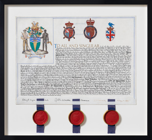 Bayside Gallery - Bayside City Council Art & Heritage Collection
Document - Certificate, College of Arms, City of Brighton Coat of Arms, 1970
The Coat of Arms, represents Brighton City Council's "growing awareness of the importance of formality and correct symbolism in local government". It replaced the council's crest of a pier and yachting scene and was used as council's seal, and emblem on its flag and letterhead. The new Coat of Arms, drawn up by the College of Arms in England, depicts the progression from a seaside gardening community to a modern residential city. The prominent forms are on the shield-like coat of arms include waves and a Lymphad (a ship, symbolic of the sea); a market gardener; an aboriginal man; two horns plenty with abundant fruit and vegetables (the wealth and plenty) and Elster Creek. It is underscored by the motto 'By their fruits, ye shall know them'. Brighton was first incorporated as a borough on 18 January 1859, it became a town on 18 March 1887 and was proclaimed a city on 12 March 1919.Ink and gouache on parchment with wax seals. Allocates a Coat of Arms to the City of Brighton, by the College of Arms in London on 08/09/1970. The Coat of Arms is located on the upper left quadrant and has the following parts: the crest, the wreath, the helmet and mantle, the shield, the supporters, the compartment and the motto. The crest is two cornucopias with fruits and vegetables, above which sits a seagull. The mantle above the helmet is in green and gold. The shield is also green and gold with a lymphad (ship), and blue and white waves, representing the sea. The market gardener, holding a hoe, and Aboriginal figure, bearing a boomerang, support the shield and stand upon the compartment which is soil with a representation of Elster Creek. A ribbon below contains the motto in 'FRUCTU NOSCITUR'. The certificate text explains the origins of Brighton and the parts of the coat of arms. At the bottom of the folded parchment are three signatures and titles, below which three red wax seals in gold tin containers hang from blue ribbons.coat of arms, certificate, city of brighton, college of arms, market gardener, aboriginal, wax seal, elster creek, lymphad, fructu noscitur, letters patent, armorial bearings, heraldry, seal -
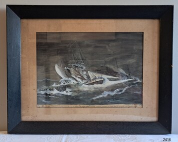 Flagstaff Hill Maritime Museum and Village
Print - Lithograph, sea rescue, R.N. Duffield, Australian cruiser “MELBOURNE” (Tons 5600) rescuing crew of sinking four-masted schooner “HELEN B. STERLING” of Halifax NS Canada, Tons 1343 in a gale in the Pacific Ocean, 19-11-1924
This framed lithograph print in watercolour and gouache was produced on November 19th, 1924, by 20th-century marine artist, Mr R.N. Duffield. It depicts the event of a sea rescue that took place two years earlier. The framer was A.L. Frith of Footscray, Melbourne, who actively advertised from 1933 to 1935. The now disbanded Shiplovers' Society of Victoria (1930-2018) donated the print, and it seems likely that this print was framed for that organisation. This graphic image shows the conditions in which the rescue from the wrecked Helen B. Sterling happened. Captain George Harris was master of the American-owned, four-masted windjammer. His wife Edith and their ten-year-old son Leslie were on board, along with a crew of fifteen seamen. The ship set off from Newcastle, NSW, on January 5th, 1922, loaded with a cargo of coal to deliver to the Society Islands and on to San Francisco. Young Leslie later wrote a lively school composition for his teacher about his experiences on board the Helen B Sterling. He tells of a fire that broke out the day after they departed and burned a hole in a beam. Then another troublesome time on the 9th, when a strong gale blew a sail off the ship. Finally, he tells of the highlight of his voyage when, on the 18th January, the ship was right in the path of a strong cyclone, which broke the mainmast. Huge waves crashed over both sides of the deck, meeting in the middle, and the ship began to sink. The rescue from the wreck was an exciting time for the young boy, and even more so when one of his cats survived after being carefully wrapped in a pillowcase and thrown down from the ship for the boy. Reporters later wrote about Leslie’s comments, “... what had grieved him most was the thought that he might never see his two little sisters again”. Captain Harris said in a published statement, “… the gale was the worst he had met in his 12 years’ experience at sea. All went well for the first week. We then encountered a strong blow from the south-east. We tried the gasoline pump, but the engine broke down, and we had to do the pumping by hand. We at once shortened sail, but the sea increased in fury to such an extent that men were washed from the pumps. I was below at 5:30 on Sunday morning [January 22nd, 1922] when the main mast went over the side, … I at once sent out SOS signals, and got word that HMAS Melbourne was coming to our assistance. I had made a mistake with regard to our position, but did not know it until 11:30 o’clock, when I sent out the correct location. This was picked up by the Melbourne and I received the following reply: “We will reach you about 2 am. Keep a good heart. The Melbourne will do all she can.” Our ship was practically awash when we were taken off.” (Ref: the ‘Helen B. Sterling Disaster’, Maitland Weekly Mercury, NSW, 4-2-1922.) Officers from the Royal Australian Navy, Captain Henry J Feakes (later Rear-Admiral) and Commander Wilfrid Ward Hunt, were on board the light cruiser, HMAS Melbourne (1913-1928), when it left Sydney for New Zealand. After the SOS was received, the ship sped at full steam towards the sinking Helen B. Sterling. They found the vessel at about midnight and shone bright search lights on the distressed ship to illuminate the desperate scene. The Melbourne was unable to move close to the schooner, so sixteen seamen, including Commander Hunt, volunteered to man the Melbourne’s lifesaving 12-oared cutter. They rowed the sea boat with great urgency towards the victims of the sinking ship, keen to save lives no matter what the conditions. When the cutter was close to the Sterling, a line was secured between the Sterling and the cutter. The weary, waterlogged and anxious men on board could be rescued, one at a time, in the breeches buoy equipment, which looked like canvas shorts with a lifesaving ring in the waistband. The victims were hauled along the line and pulled aboard by many willing hands. All eighteen crew and passengers were saved, including Captain Harris and his family. The seamen of the Melbourne received a heroes’ welcome when they arrived in New Zealand. The grateful survivors were taken to Auckland, where they received the care and comfort they needed. Melbourne’s Lord Mayor, Cr. Swanston, on behalf of the citizens of Melbourne, formally recognised the heroic rescue efforts of the seamen of the HMAS Melbourne on March 2nd, 1922, at a special presentation. Two large flags, a White Ensign and an Australian “Jack" Flag, were presented to the Captain of HMAS Melbourne, and souvenirs were awarded to the sea boat’s crew and its Commander, Wilfred Ward Hunt. Commander Hunt was also presented with an original watercolour depicting the heroic rescue from the wreck of the Helen B. Sterling, painted just after the event by renowned marine artist Arthur V Gregory (1867-1957), and he received a silver cigarette case bearing the City’s coat of arms and the inscription, "To Commander Ward Hunt from the Citizens of Melbourne as a memento of the rescue of the crew of Helen B. Stirling by H.M.A.S. Melbourne, on 23.1.22". Both the painting and the cigarette case are now treasured items inherited by his grandson; a reminder of “… a very fine naval gentleman who believed in leading by example." R.N. DUFFIELD: - The Lithograph print in our collection by 20th-century English artist R.N. Duffield is dated Nov. 19, 1924. It is very similar to, and possibly created from, the original A V Gregory watercolour presented to Commander Hunt and dated 1922. Mr R.N. Duffield has art works in the Yarmouth Museums, Norfolk Museums Collection; “Orient Liner Otranto …,” and "Convoy of six ships at sea", both painted in watercolour and gouache during the 1940s. Some of his other works, also painted in watercolour and gouache, have been advertised for sale on Internet sites. Some details differ between the original A.V. Gregory and this Lithograph Print: - -the words on the bow on the original watercolour are “Helen B. Sterling, Blain”, which is in Washington, USA, where the Sterling Shipping Company was registered from around 1919; the words on the print are “Helen B. Sterling, Halifax, N S”, for Nova Scotia, Canada, which is the hometown of Sterling Shipping Company founder’s wife, Helen B Sterling. -The watercolour is coloured and has fine details; the print is monochrome - The A V Gregory signed the watercolour in 1922, on the lower left; the print is signed with the Lithographer’s name on the lower right; “R N Duffield, Nov. 19. 1924” ARTHUR VICTOR GREGORY (1867-1957): - A.V. Gregory is a renowned marine artist who worked in watercolour and gouache. He painted actively between 1899 and 1932, creating over 3o0 works. South Melbourne, Victoria, was where he lived and worked. This Lithograph print is significant in that it depicts the rescuing of the passengers and crew of the schooner “Helen B Stirling”. At the time this was a significant event that made most Australian and New Zealand papers because of the involvement of the Australian cruiser “Melbourne”. The image demonstrates the perilous conditions experienced by seafarers. It includes an example of the line and breeches buoy method used to save lives at sea from the 1860s and into the 20th century. It reflects a time in our history when sail and steam ships cruised the world’s seas together, the former trading with a cargo of coal from Newcastle, the latter defending our country in World War I. The print is part of Flagstaff Hill Maritime Museum’s Collection of maritime artworks that depict famous events, vessels and locations, showing the evolution of sea craft, and aiding the interpretation of our maritime history. The Lithograph print is behind glass in a black painted timber frame and mounted under a cream matte. The vivid image depicts a sea rescue in progress. The night scene is illuminated by a light beaming from a steamship, the Cruiser HMAS Melbourne. It reveals figures on the deck of a sinking sailing ship, the schooner Helen B. Sterling, as foaming waves roll across it. The stricken ship has a broken main mast, and a sail has been detached. A small figure is floating in the choppy sea, secured in a breeches buoy that is attached to a rescue line between a lifesaving cutter and the sailing ship. The crewmen in the cutter are ready to haul the shipwrecked victim aboard, while the figures on the foundering ‘Sterling’ watch them. The print’s paper-covered wooden backboard is attached to the frame with small tacks. A metal hanging wire is secured to two dissimilar eyelet screws. Inscriptions include text on the bow of the sinking vessel, a handwritten title below the picture, and a handwritten name in the print’s lower right corner. On the reverse are two oval, black ink stamps and a round cream label with printed text. The hand-painted print was reproduced from a lithograph, signed in the lower right, by R.N. Duffield of England, on November 19th, 1924. A Frith of Footscray, Melbourne framed it. Painted on the ship’s bow: “HELEN B. STERLING / HALIFAX N S” [Nova Scotia, Canada] Handwritten below the print: “AUSTRALIAN CRUISER “MEMBOURNE” (Tons 5600) rescuing crew of sinking four-masted schooner “HELEN B. STERLING” of Halifax NS Canada, Tons 1343 in a gale in the Pacific Ocean.” Handwritten on lower right: “R.N. DUFFIELD / Nov. 19. 1924” (underlined) On paper label: “Phone: / Footscray 398 [some of the text has torn off] / “A. FRITH / PICTURE FRAMER / Manufacturer / 17 Paisley Street / Footscray.“ On both oval stamps: “SHIPLOVERS SOCIETY OF VICTORIA / LIBRARY” flagstaff hill, flagstaff hill maritime museum and village, warrnambool, maritime museum, maritime village, great ocean road, shipwreck coast, lithograph, lithograph print, reproduction print, helen b. sterling, the sterling, american owned schooner, halifax, halifax n s, halifax nova scotia, nova scotia, halifax n s canada, schooner, windjammer, sailing ship, four-masted ship, captain george harris, george harris, edith harris, leslie harris, sterling shipping line, hmas melbourne, hmas melbourne (1), cruiser hmas melbourne, the melbourne, australian cruiser, captain henry j feakes, commander wilfred ward hunt, sinking ship, shipwreck, sea rescue, gale, cyclone, 1922 rescue, shipwreck rescue, breeches buoy, line rescue, rescue line, lifesaving, cutter, cutter melbourne, sea boat, lifesaving crew, 12-oar cutter, shipwreck victim, r.n. duffield, marine artist, nov. 19. 1924, 20th century artist, a frith, footscray picture framer, shiplovers’ society of victoria, shiplovers’ society library, watercolour, a v gregory, arthur victor gregory, melbourne artist, newcastle coal, newcastle nsw, society islands, san fracisco, aukland new zealand, school composition, ship’s cat, sos signal, lord mayor cr. swanston, heroes, cigarette case -
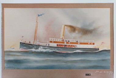 Flagstaff Hill Maritime Museum and Village
Photograph - Print of S. S. Rowitta, A.V. Gregory, 1912
S. S. ROWITTA: - The 1909 steam ferry, S. S. Rowitta, was installed as an exhibit at Flagstaff Hill in 1975 and was enjoyed by many visitors for 40 years. S. S. Rowitta was a timber steam ferry built in Hobart in 1909 using planks of Huon and Karri wood. She was a favourite of sightseeing passengers along Tasmania’s Tamar and Derwent rivers for 30 years. The Rowitta was also known as Tarkarri and Sorrento and had worked as a coastal trading vessel between Devonport and Melbourne, and Melbourne Queenscliff and Sorrento. In 1974 the S. S. Rowitta was purchased by Flagstaff Hill to convert into a representation of the Speculant, a historic and locally significant sailing ship listed on the Victorian Heritage Database. (The Speculant was built in Scotland in 1895 and traded timber between the United Kingdom and Russia. Warrnambool’s P J McGennan & Co. then bought the vessel to trade pine timber from New Zealand to Victorian ports and cargo to Melbourne. She was the largest ship registered with Warrnambool as her home port, playing a key role in the early 1900s in the Port of Warrnambool. In 1911, on her way to Melbourne, she was wrecked near Cape Otway. None of the nine crew lost their lives.) The promised funds for converting the S. S. Rowitta into the Speculant were no longer available, so she was restored back to her original configuration. She represented the importance of coastal traders to transport, trade and communication in Australia times before rail and motor vehicles. Sadly, in 2015 the time had come to demolish the Rowitta due to her excessive deterioration and the high cost of on-going repairs. She had given over 100 years of service and pleasure to those who knew her. Arthur Victor Gregory (known as A. V. Gregory) was born in Melbourne in 1867. He was the son of George Frederick Gregory who was an established marine painter with a studio in South Melbourne. A. V. Gregory worked with his father and his elder half-brother (George Frederick Junior). They made numerous photographic reproductions of their ships' portraits, selling the originals to captains and owners and the photographic prints to the crews. A. V. Gregory inherited the business on the death of his father in 1890 and continued to paint until World War 2 when he stopped for wartime security reasons. Gregory worked mainly in watercolour and gouache. He kept all his working sketches so he could repeat earlier paintings and make more copies of the same ship. His carefully detailed portraits of every kind of vessels seen on Port Phillip Bay created a body of work regarded as a valuable record of the maritime traffic of that period.This print is a significant example of the work of the well-known and well-respected marine painter A. V. Gregory who created a detailed record of shipping in the Port Phillip Bay area in the years before W.W. 2. It is also significant as it connects the history of the S. S. Rowitta, which was a large exhibit on display at Flagstaff Hill Maritime Village from the museum’s early beginnings until the vessel’s end of life 40 years later. The S. S. Rowitta represents the importance of coastal traders to transport, trade and communication along the coast of Victoria, between states, and in Australia before rail and motor vehicles and is significant for its association with Tasmanian history from the early to mid-1900s. The vessel was an example of a ferry built in the early 20th century that served many different roles over its lifetime of over 100 years.This is a photograph of a watercolour painting of the S. S. Rowitta. It shows a steamer moving through the water. The ship has a blue, metal hull, a wooden lower and upper deck, a lifeboat and smoke coming out of a chimney. Flags are flying from the bow, the stern and the mast. Seven figures can be seen on the decks. A second boat can be seen in the distance in the far left of the picture. It has the signature "A. V. Gregory - 12" in the bottom left corner and the title "S. S. Rowitta - 121 tns" in the lower right corner.Signed "A. V. Gregory -12-" Titled "The S. S. Rowitta / -121 tns" Printed on the ships' bow - "ROWITTA"flagstaff hill maritime museum and village, warrnambool, great ocean road, shipwreck coast, s. s. rowitta, rowitta, a. v. gregory, painting, marine painting, marine painter, steamer, steam ferry, passenger ferry, alfred gregory, tarkarri, sorrento, speculant, print, photograph -
 Federation University Historical Collection
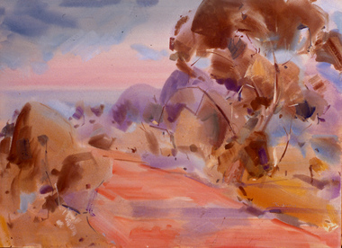
watercolor and gouache on paper, Sand Dunes, not dated
Black and white drawing of sand dunes. If you are able to provide information on this artist or artwork please use the comment link below. signed lower right "D. Cossar"artwork, sand dunes, drawing, asian, d. cossar -
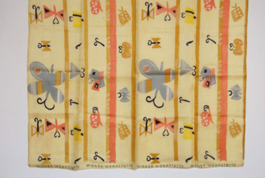 Duldig Studio museum + sculpture garden
Fabric, Mathilda Flogl, Falter designed by Mathilda Flogl 1924-31, 1924-31
This piece of fabric, known Fälter (butterfly), was designed by Mathilda Flögl (1893-1958), who worked in the textile department of the Wiener Werkstätte in Vienna. It is a remnant of the fabric that was used to make a bedspread for Karl and Slawa’s bed in their Vienna apartment where it lay decoratively over a gold brocade eiderdown. The purchase demonstrated Slawa’s interest in and knowledge of modern design and her commitment to the idea of enriching everyday life with beautiful objects, a principal of the Viennese Secession. Following the Duldigs removal from Vienna, the original bedspread and remnant were safeguarded and preserved by Slawa’s sister, Rella, in the basement of her Paris apartment. In 1948 the bedspread and this remnant were sent to Australia. The bedspread was a much-loved item but deteriorated over the years. In 1955 it was made into curtains, which are held in the Duldig Studio Collection. The Photographs of the bedspread in its original location are also held in the collection. The remnant is in pristine condition. The Wiener Werkstätte (Vienna Workshop) was a guild of designers and craftsmen that was founded by the architect Josef Hoffman (1879-1956) and the designer Koloman Moser (1868-1918). The firm manufactured a range of interior furnishings between 1903 and 1932. The textile department opened in 1900, and produced about 1,800 designs, mainly for printed fabrics for furnishings and apparel. The designs were characterised by simplified forms and vivid colours, and inspired by Eastern European peasant art and geometric motifs in contemporary painting. The workshop had a profound impact of European art and design, and its work is still celebrated today. Mathilde Flögl was born in the Czech Republic in 1893, and studied at the Kunstgerwerbeschule in Vienna. In 1916 she began working at the Weiner Werkstätte, and where she designed more than 120 textile patterns. This fabric Fälter or Butterfly was designed in 1924. The butterfly was a favourite motif of Flögl. In this design she plays with a variety of whimsical abstractions and arrangement of both the butterfly and the snail on a background of abstract colour stripes and blocks. Ann Carew 2016The fabric is of great aesthetic interest as an example of the work of the Viennese workshops, and the noted designer textile designer Mathilde Flögl. The original pencil drawings, pencil and gouache designs, and fabric swatches for Fälter are held in the MAK Museum in Vienna, and the Victorian and Albert Museum in London have a sample of piece of the silk fabric in an alternate colour wave. The Museum of Applied Arts in Sydney holds a swatch book of textiles from the Wiener Werkstätte, however Flögl’s work is not represented. The National Gallery of Victoria holds a similar swatch book. The remnant has an excellent provenance, is associated with a powerful personal narrative, and is significant and rare item relating to history of the Wiener Werkstätte in Vienna, and the oeuvre of Matilda Flögl. Ann Carew 2016Remnant of a block-printed silk fabric used to make the bedspread for Karl Duldig and Slawa Horowitz-Duldig's bed in Vienna. -
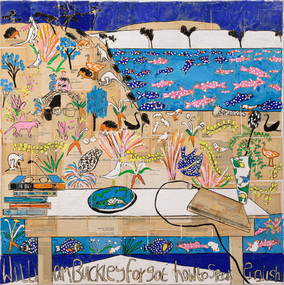 Bayside Gallery - Bayside City Council Art & Heritage Collection
Painting - gouache, charcoal and book spines on collaged book pages on linen, Katherine Hattam, William Buckley forgot how to speak English, 2018-19
-
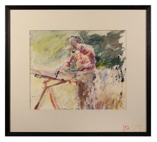 The Dunmoochin Foundation
Gouache Painting, Painting with Clif, 1979
Painting depicting an old man with pipe painting in the landscape. Signed (L.r) 'Howley 79'. On reverse: Label (L.r) '37 Out painting with Clif Pugh by John Howley'. john howley, painting, portrait, clifton pugh, landscape, dunmoochin -
 The Dunmoochin Foundation
Oil Gouache Painting, Hospital Suite, Self Portrait with Thermometer - Something Happened, 1977
Portrait of a old man with glasses and thermometer seated in a hospital bed with Labels 'Fluid Balance', '15 Mr C Pugh, Dr. Kay/Ley 29.7.1977' and two bouquets of red and white flowers. Not signed. On reverse: 'Archibald Prize 1977/Something Happened (Self Portrait)/ Clifton Pugh/ Dunmoochin Hurstbridge Vic 3099/ Phone 7148230'.clifton pugh, painting, hospital suite, self portrait, archibald prize -
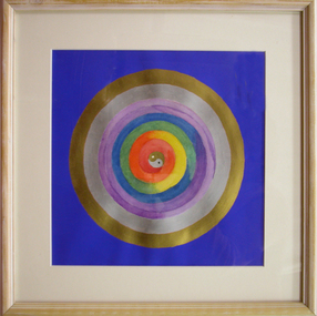 Federation University Art Collection
Painting - Gouache on paper, Smith, Maryrose, 'Yin/Yang with Rainbow Spiral Mandala' by Maryrose Smith, 2007
This item is part of the Federation University Art Collection. The Art Collection features over 2000 works and was listed as a 'Ballarat Treasure' in 2007.Framed painting of a mandalaart, artwork, mandala, maryrose smith, alumni, available -
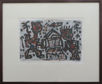 Federation University Art Collection
Gouache on paper, David Larwill, 'Diggers' by David Larwill, 2003
The Victorian Tapestry Workshop used this painting to produce a weaving. This item is part of the Federation University Art Collection. The Art Collection features over 1000 works and was listed as a 'Ballarat Treasure' in 2007.art, artwork, david larwill, larwill, victorian tapestry workshop -
 City of Greater Geelong
Gouache pen and ink, Osborne House, North Geelong
-
 City of Greater Geelong
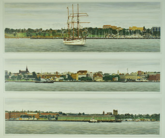
Watercolour & Gouache on Paper, Bruce Thurrowgood, A View of Geelong
-
 City of Whittlesea Art Collection
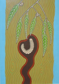
Painting - Gouache on paper, Mandy Nicholson, Djerri (Grub)
Born in Healesville, Many Nicholson is a Wurundjeri-willam (Wurundjeri-baluk patriline) artist and Traditional Custodian of Melbourne and surrounds. Mandy also has connections to the Dja Dja wurrung and Ngurai illam wurrung language groups of the Central/Eastern Kulin Nation on her fathers side and German on her mothers.wurundjeri, aboriginal, kulin -
 City of Whittlesea Art Collection
Painting - Gouache on paper, Mandy Nicholson, Yan Yean and Mernda
Born in Healesville, Many Nicholson is a Wurundjeri-willam (Wurundjeri-baluk patriline) artist and Traditional Custodian of Melbourne and surrounds. Mandy also has connections to the Dja Dja wurrung and Ngurai illam wurrung language groups of the Central/Eastern Kulin Nation on her fathers side and German on her mothers.wurundjeri, aboriginal, kulin -
 City of Whittlesea Art Collection
Painting - Watercolour & gouache on Fabriano paper mounted on board, John Borrack, Cravens Road, Mernda, 1987
“Like "Red Gums, Hunters Lane", this painting is a deliberate attempt to infuse some new qualities into my work of that period, particularly in the painting of local subject matter. The heightened chroma and simplification of forms accentuated by a more rhythmic quality, endow the picture with a decorative characteristic which places it outside the category of the picturesque. Such colour harmonies, despite the heightened intensities, particularly in the road, do nevertheless exist, and it is the artist's prerogative to select and emphasize these certain qualities in his quest for expression. Unlike oil painting, watercolour and gouache can be unforgiving media, and once a commitment is made to the initial marks and washes on the paper, one must employ a certain deftness of touch to develop the work and retain the initial freshness. Some technical planning before painting is essential.” John BorrackPart of the John and Gillian Borrack Federation Bequest, donated to the City of Whittlesea in December 2001 by Gillian and John BorrackJohn Borrackmernda -
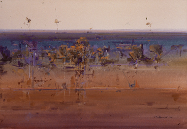 City of Whittlesea Art Collection
Painting - Gouache on Fabriano Paper on board, John Borrack, East of Mernda. Late Evening, 1995
“A nature painting commenced on site and completed in the studio. More of a morass lying to the west of Yan Yean Reservoir in Dunnets Road, this intriguing site has nevertheless all the primeval qualities associated with swamps in general. The rhythmic movements of the old red gums dominate the surrounding bush with the tranquility of the water from recent rains. Painted directly onto a saturated sheet of rough paper, the large masses of foliage and integrated sky areas determine the tonal and colour key of the painting, while the strong horizontality of the lower water area stabilizes the design and contrasts with the vertical and oblique rhythms of tree trunks. The white of trunks and branches have largely been achieved by the lifting of colour with a stiff wet brush although slight touches of bodycolour are added for a few critical accents. Such a subject and its execution demands a sound concept and plan before any painting is commenced as the wayward nature of the medium demands great control. The painting must be bold and decisive. Sometimes the qualities of the medium should be allowed to take over in its wateriness and its soft and hard edge properties.” John BorrackPart of the John and Gillian Borrack Federation Bequest, donated to the City of Whittlesea in December 2001 by Gillian and John BorrackJohn Borrackmernda -
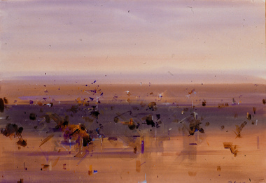 City of Whittlesea Art Collection
Painting - Gouache & Watercolour on Saunders Paper on board, John Borrack, Mernda Plains, Landscape, 1995
The expression of the spirit of a place which in landscape painting is aesthetically more important than a literal topographical recording, can really only be achieved after a lifetime's experience of an area one has constantly observed, painted and loved for its innate characteristics. I gaze across the red gum plains of the Mernda landscape from my studio and witness them in all seasons and moods. Such a painting as this, free of all inhibitions of literal transcription are done relying purely on memory impressions. These are often inspired by a particular season or day, but the content of the work is a total of past experience and observations that lie in one's mind. The staccato quality of tree forms against vast horizontal spaces, the open colour planes and marks that define forms, the calligraphy and tonal resonance of the work, all find their origins in direct observations of nature that remain with me. Experience has taught me that the more direct and less complicated one can express an idea in watercolour and gouache, the more significant and vital the work will be. Occasionally one succeeds and manages a complete statement without recourse to reworking or additions. This painting typifies the direction in which my major work started to move in the late 1980's. Part of the John and Gillian Borrack Federation Bequest, donated to the City of Whittlesea in December 2001 by Gillian and John BorrackJohn Borrackmernda -
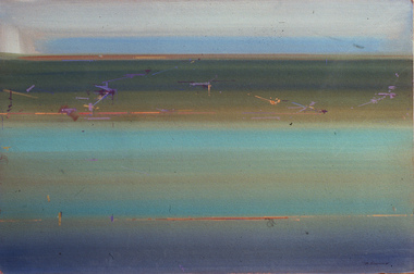 City of Whittlesea Art Collection
Painting - Gouache on Saunders Paper on board, John Borrack, Basalt Flood Plain, Mernda, 1990
Like Purple Plain, Mernda and Mernda Heat Haze this painting was a further development from aspects of the Basalt Plains series of the 1990's as seen in Mernda Plains Landscape. This picture has a greater minimalist quality about it, having been painted in the studio during a particularly wet spring when some of the surrounding flats were indented by channels of water. Greens are not a colour harmony I work with often, but here help convey the essence of the seasonal landscape. A much more formal structure has been emphasized in this picture in which atmospheric space has been almost negated in favour of a much shallower field of colour and two dimensional surface rhythm, an actual effect one can sometimes see under certain conditions of nature, particularly in a flat country. I have always had some respect for one or two of the better colour field painters of America in the 1950's and 1960's who actually untilzed expressive broad bands of colour harmonies in their work, but didn't classify them as landscape paintings. My own feelings on the subject are to avoid the clinical precision that such an approach can bring, and thus indicate some actual reference to landscape in a work, a horizon, however subtle, or marks indicating actual forms that give some scale to the work. I suppose the idea first occurred to me when I saw J. M. W. Turner's wonderful painting, Evening Star, in the National Gallery in London many years ago. In this work a few bands of mysterious colour and exquisite harmonies with one or two references to figure, sand, sea and sky, transmogrify everything into a magical unity. It serves as a revelatory example of how all art is dependent on abstract qualities and how great artists like Turner are able to conceal those qualities without lapsing into a forced mannerism.Part of the John and Gillian Borrack Federation Bequest, donated to the City of Whittlesea in December 2001 by Gillian and John BorrackJohn Borrack '90mernda -
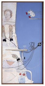
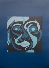 Merri-bek City Council
Work on paper - Aerosol painting, synthetic polymer, gouache and colour pencils on Magnani paper, Luke King, Portrait, 2023
Luke King’s mixed media artwork Portrait (2023) was shown in the group exhibition Fever’Dreams at the Counihan Gallery in 2023. The group exhibition explored the slippery boundaries between abstract and figurative artwork, showcasing local artists with a strong connection to Merri-bek’s arts community. King uses portraiture to highlight the importance of gesture and facial expression in personal storytelling. Exhibition curator of Fever’Dreams, Mitchel Brannan, writes of King’s work: ‘King explores the profound capacity of the human face to convey emotions within the context of constraint. Through his art, King invites viewers to reflect on the complexities of human expression and the underlying dynamics of restraint within society.’