Showing 1404 items
matching traditional
-
 National Wool Museum
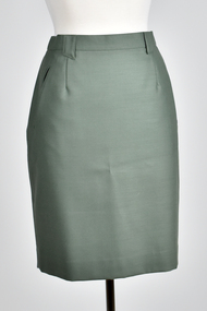
Textile - Skirt, Wendy Powitt, 1992 Barcelona Olympic Games Official Occasions Skirt, c.1992
About the 1992 Barcelona Olympic Games donator Doug Pleasance wrote- During the 1980s the Australian wool industry was at its most prosperous times with record numbers of sheep producing wool receiving ever increasing values due to the success of the Reserve Price Scheme, and the overall guidance of the Australian Wool Corporation (AWC). As a humble technichian, my role was a low profile newly created position of “Controller, Technical Marketing” where wool was to be marketed on its technical properties, as distinct from the “Product Marketing Group” which exploited trhe traditional high profile approach of marketing wool;s superior fashion attributes. The Woolmark was the tool central to this approach. The 1992 Barcelona Olympic Games saw an evolutionary change in designer selection. A Declaration of Interest Form was communicated to over forty potential designers. The task and especially tight timelines that were involved deterred many aspirants, however, there remained eight designers with the potential we were seeking. These eight designers were paid $3,000 per submission and the winning designer, Wendy Powitt, was paid $15,000. For the first time the judging panel included two athletes, one male swimmer and one female basketballer, their influence was pivotal. The ensemble consisted of three elements- 1. The Official Uniform which was used for travel and all official functions. This included: a tailored blazer and trouser/skirt (all water repellent) by Fletcher Jones, pure wool olive-green faille fabric by Foster Valley, cotton PE formal shirt by Pelaco, pure wool knitwear by Spangaro, printed wool tie by TD Noone, wool nylon socks by Holeproof and footwear by Hush Puppy. 2. Opening Ceremony Uniform a lightweight wool fabric printed with floral designs that had been inspired by the work of Australian artist Margaret Preston. This included: Lightweight W/PE shorts by Fletcher Jones in Foster Valley Fabric, socks by Holeproof and footwear by Hush Puppy. 3. Village Clothing was designed to be highly visible garments to make it easy to ‘spot the Aussie’ and helped to contribute to good team spirit. This included: A pure wool shirt featuring blocks of contrasting colours, and a newly developed stretchGreen knee length skirt with button and zip back. Has two pockets, and two darts in both front and back.Label 1 - Barcelona 1992 Official Uniform supplied by Australian Wool Corporation Label 2 - Fletcher Jones Australia 141992 barcelona olympics, australian wool corporation, wool, olympic games official occasions -
 National Wool Museum
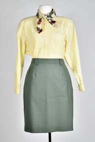
Uniform - Shirt, Pelaco, 1992 Barcelona Olympic Games Official Occasions Woman's Shirt, c.1992
About the 1992 Barcelona Olympic Games donator Doug Pleasance wrote- During the 1980s the Australian wool industry was at its most prosperous times with record numbers of sheep producing wool receiving ever increasing values due to the success of the Reserve Price Scheme, and the overall guidance of the Australian Wool Corporation (AWC). As a humble technichian, my role was a low profile newly created position of “Controller, Technical Marketing” where wool was to be marketed on its technical properties, as distinct from the “Product Marketing Group” which exploited trhe traditional high profile approach of marketing wool;s superior fashion attributes. The Woolmark was the tool central to this approach. The 1992 Barcelona Olympic Games saw an evolutionary change in designer selection. A Declaration of Interest Form was communicated to over forty potential designers. The task and especially tight timelines that were involved deterred many aspirants, however, there remained eight designers with the potential we were seeking. These eight designers were paid $3,000 per submission and the winning designer, Wendy Powitt, was paid $15,000. For the first time the judging panel included two athletes, one male swimmer and one female basketballer, their influence was pivotal. The ensemble consisted of three elements- 1. The Official Uniform which was used for travel and all official functions. This included: a tailored blazer and trouser/skirt (all water repellent) by Fletcher Jones, pure wool olive-green faille fabric by Foster Valley, cotton PE formal shirt by Pelaco, pure wool knitwear by Spangaro, printed wool tie by TD Noone, wool nylon socks by Holeproof and footwear by Hush Puppy. 2. Opening Ceremony Uniform a lightweight wool fabric printed with floral designs that had been inspired by the work of Australian artist Margaret Preston. This included: Lightweight W/PE shorts by Fletcher Jones in Foster Valley Fabric, socks by Holeproof and footwear by Hush Puppy. 3. Village Clothing was designed to be highly visible garments to make it easy to ‘spot the Aussie’ and helped to contribute to good team spirit. This included: A pure wool shirt featuring blocks of contrasting colours, and a newly developed stretch 50:50 wool/cotton fabric by Bradmill was made into shorts and jeans by Fletcher Jones.Yellow long sleeved shirt with detachable floral collar. Double breasted pockets.Label - Pelaco1992 barcelona olympics, australian wool corporation, wool -
 National Wool Museum
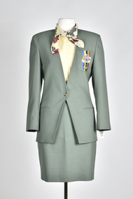
Uniform - Jacket, Wendy Powitt, 1992 Barcelona Olympic Games Official Occasions Womans's Jacket, c1992
About the 1992 Barcelona Olympic Games donator Doug Pleasance wrote- During the 1980s the Australian wool industry was at its most prosperous times with record numbers of sheep producing wool receiving ever increasing values due to the success of the Reserve Price Scheme, and the overall guidance of the Australian Wool Corporation (AWC). As a humble technichian, my role was a low profile newly created position of “Controller, Technical Marketing” where wool was to be marketed on its technical properties, as distinct from the “Product Marketing Group” which exploited trhe traditional high profile approach of marketing wool;s superior fashion attributes. The Woolmark was the tool central to this approach. The 1992 Barcelona Olympic Games saw an evolutionary change in designer selection. A Declaration of Interest Form was communicated to over forty potential designers. The task and especially tight timelines that were involved deterred many aspirants, however, there remained eight designers with the potential we were seeking. These eight designers were paid $3,000 per submission and the winning designer, Wendy Powitt, was paid $15,000. For the first time the judging panel included two athletes, one male swimmer and one female basketballer, their influence was pivotal. The ensemble consisted of three elements- 1. The Official Uniform which was used for travel and all official functions. This included: a tailored blazer and trouser/skirt (all water repellent) by Fletcher Jones, pure wool olive-green faille fabric by Foster Valley, cotton PE formal shirt by Pelaco, pure wool knitwear by Spangaro, printed wool tie by TD Noone, wool nylon socks by Holeproof and footwear by Hush Puppy. 2. Opening Ceremony Uniform a lightweight wool fabric printed with floral designs that had been inspired by the work of Australian artist Margaret Preston. This included: Lightweight W/PE shorts by Fletcher Jones in Foster Valley Fabric, socks by Holeproof and footwear by Hush Puppy. 3. Village Clothing was designed to be highly visible garments to make it easy to ‘spot the Aussie’ and helped to contribute to good team spirit. This included: A pure wool shirt featuring blocks of contrasting colours, and a newly developed stretch 50:50 wool/cotton fabric by Bradmill was made into shorts and jeans by Fletcher Jones.Green button up tailored jacket with two faux pockets and a breast pocket on left hand side. Olympic logo on left breast pocket.Label 1 - Barcelona 1992 Official Uniform Supplied by Australian Wool Corporation Label 2 - Fletcher Jones Australia On breast of jacket - Australia Barcelona 19921992 barcelona olympics, uniform, jacket, fletcher jones -
 National Wool Museum
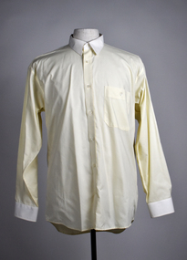
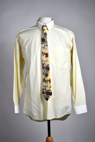
Uniform - Shirt, Wendy Powitt, 1992 Barcelona Olympic Games Official Occasions Male Shirt, c.1992
About the 1992 Barcelona Olympic Games donator Doug Pleasance wrote- During the 1980s the Australian wool industry was at its most prosperous times with record numbers of sheep producing wool receiving ever increasing values due to the success of the Reserve Price Scheme, and the overall guidance of the Australian Wool Corporation (AWC). As a humble technichian, my role was a low profile newly created position of “Controller, Technical Marketing” where wool was to be marketed on its technical properties, as distinct from the “Product Marketing Group” which exploited trhe traditional high profile approach of marketing wool;s superior fashion attributes. The Woolmark was the tool central to this approach. The 1992 Barcelona Olympic Games saw an evolutionary change in designer selection. A Declaration of Interest Form was communicated to over forty potential designers. The task and especially tight timelines that were involved deterred many aspirants, however, there remained eight designers with the potential we were seeking. These eight designers were paid $3,000 per submission and the winning designer, Wendy Powitt, was paid $15,000. For the first time the judging panel included two athletes, one male swimmer and one female basketballer, their influence was pivotal. The ensemble consisted of three elements- 1. The Official Uniform which was used for travel and all official functions. This included: a tailored blazer and trouser/skirt (all water repellent) by Fletcher Jones, pure wool olive-green faille fabric by Foster Valley, cotton PE formal shirt by Pelaco, pure wool knitwear by Spangaro, printed wool tie by TD Noone, wool nylon socks by Holeproof and footwear by Hush Puppy. 2. Opening Ceremony Uniform a lightweight wool fabric printed with floral designs that had been inspired by the work of Australian artist Margaret Preston. This included: Lightweight W/PE shorts by Fletcher Jones in Foster Valley Fabric, socks by Holeproof and footwear by Hush Puppy. 3. Village Clothing was designed to be highly visible garments to make it easy to ‘spot the Aussie’ and helped to contribute to good team spirit. This included: A pure wool shirt featuring blocks of contrasting colours, and a newly developed stretch 50:50 wool/cotton fabric by Bradmill was made into shorts and jeans by Fletcher Jones.Yellow shirt, one pocket on left breast. The cuffs and the collar are white.On label - Barcelona 1992 Official Uniform supplied by Australian Wool Corporation1992 barcelona olympics, wool, australian wool corporation -
 National Wool Museum
Uniform - Tie, Wendy Powitt, 1992 Barcelona Olympic Games Official Occasions Male Tie, c1992
About the 1992 Barcelona Olympic Games donator Doug Pleasance wrote- During the 1980s the Australian wool industry was at its most prosperous times with record numbers of sheep producing wool receiving ever increasing values due to the success of the Reserve Price Scheme, and the overall guidance of the Australian Wool Corporation (AWC). As a humble technichian, my role was a low profile newly created position of “Controller, Technical Marketing” where wool was to be marketed on its technical properties, as distinct from the “Product Marketing Group” which exploited trhe traditional high profile approach of marketing wool;s superior fashion attributes. The Woolmark was the tool central to this approach. The 1992 Barcelona Olympic Games saw an evolutionary change in designer selection. A Declaration of Interest Form was communicated to over forty potential designers. The task and especially tight timelines that were involved deterred many aspirants, however, there remained eight designers with the potential we were seeking. These eight designers were paid $3,000 per submission and the winning designer, Wendy Powitt, was paid $15,000. For the first time the judging panel included two athletes, one male swimmer and one female basketballer, their influence was pivotal. The ensemble consisted of three elements- 1. The Official Uniform which was used for travel and all official functions. This included: a tailored blazer and trouser/skirt (all water repellent) by Fletcher Jones, pure wool olive-green faille fabric by Foster Valley, cotton PE formal shirt by Pelaco, pure wool knitwear by Spangaro, printed wool tie by TD Noone, wool nylon socks by Holeproof and footwear by Hush Puppy. 2. Opening Ceremony Uniform a lightweight wool fabric printed with floral designs that had been inspired by the work of Australian artist Margaret Preston. This included: Lightweight W/PE shorts by Fletcher Jones in Foster Valley Fabric, socks by Holeproof and footwear by Hush Puppy. 3. Village Clothing was designed to be highly visible garments to make it easy to ‘spot the Aussie’ and helped to contribute to good team spirit. This included: A pure wool shirt featuring blocks of contrasting colours, and a newly developed stretch 50:50 wool/cotton fabric by Bradmill was made into shorts and jeans by Fletcher Jones.Floral tie with cream, red, green native flower design.On label - Woven & manufactured in Australia by "Tee-Dee" exclusively for the Australian Wool Corporation1992 barcelona olympics, uniform, tie, australian wool corporation -
 National Wool Museum
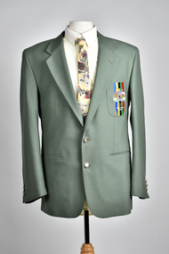
Uniform - Jacket, Wendy Powitt, 1992 Barcelona Olympic Games Official Occasions Male Jacket, c1992
About the 1992 Barcelona Olympic Games donator Doug Pleasance wrote- During the 1980s the Australian wool industry was at its most prosperous times with record numbers of sheep producing wool receiving ever increasing values due to the success of the Reserve Price Scheme, and the overall guidance of the Australian Wool Corporation (AWC). As a humble technichian, my role was a low profile newly created position of “Controller, Technical Marketing” where wool was to be marketed on its technical properties, as distinct from the “Product Marketing Group” which exploited trhe traditional high profile approach of marketing wool;s superior fashion attributes. The Woolmark was the tool central to this approach. The 1992 Barcelona Olympic Games saw an evolutionary change in designer selection. A Declaration of Interest Form was communicated to over forty potential designers. The task and especially tight timelines that were involved deterred many aspirants, however, there remained eight designers with the potential we were seeking. These eight designers were paid $3,000 per submission and the winning designer, Wendy Powitt, was paid $15,000. For the first time the judging panel included two athletes, one male swimmer and one female basketballer, their influence was pivotal. The ensemble consisted of three elements- 1. The Official Uniform which was used for travel and all official functions. This included: a tailored blazer and trouser/skirt (all water repellent) by Fletcher Jones, pure wool olive-green faille fabric by Foster Valley, cotton PE formal shirt by Pelaco, pure wool knitwear by Spangaro, printed wool tie by TD Noone, wool nylon socks by Holeproof and footwear by Hush Puppy. 2. Opening Ceremony Uniform a lightweight wool fabric printed with floral designs that had been inspired by the work of Australian artist Margaret Preston. This included: Lightweight W/PE shorts by Fletcher Jones in Foster Valley Fabric, socks by Holeproof and footwear by Hush Puppy. 3. Village Clothing was designed to be highly visible garments to make it easy to ‘spot the Aussie’ and helped to contribute to good team spirit. This included: A pure wool shirt featuring blocks of contrasting colours, and a newly developed stretch 50:50 wool/cotton fabric by Bradmill was made into shorts and jeans by Fletcher Jones.Green jacket with Olympic emblem on left breast pocketLabel 1 - Barcelona 1992 Official Uniform Supplied by Australian Wool Corporation Label 2 - Fletcher Jones Australia Label 3 - Warm iron dry clean only On jacket breast - Australia Barcelona 19921992 barcelona olympics, uniform, tie, australian wool corporation -
 National Wool Museum
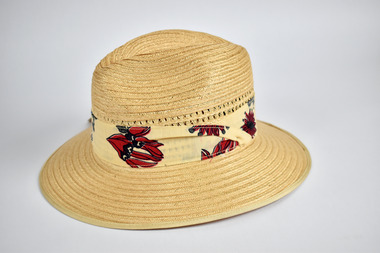
Uniform - 1992 Barcelona Olympic Games Akubra Hat, Akubra, c1992
About the 1992 Barcelona Olympic Games donator Doug Pleasance wrote- During the 1980s the Australian wool industry was at its most prosperous times with record numbers of sheep producing wool receiving ever increasing values due to the success of the Reserve Price Scheme, and the overall guidance of the Australian Wool Corporation (AWC). As a humble technichian, my role was a low profile newly created position of “Controller, Technical Marketing” where wool was to be marketed on its technical properties, as distinct from the “Product Marketing Group” which exploited trhe traditional high profile approach of marketing wool;s superior fashion attributes. The Woolmark was the tool central to this approach. The 1992 Barcelona Olympic Games saw an evolutionary change in designer selection. A Declaration of Interest Form was communicated to over forty potential designers. The task and especially tight timelines that were involved deterred many aspirants, however, there remained eight designers with the potential we were seeking. These eight designers were paid $3,000 per submission and the winning designer, Wendy Powitt, was paid $15,000. For the first time the judging panel included two athletes, one male swimmer and one female basketballer, their influence was pivotal. The ensemble consisted of three elements- 1. The Official Uniform which was used for travel and all official functions. This included: a tailored blazer and trouser/skirt (all water repellent) by Fletcher Jones, pure wool olive-green faille fabric by Foster Valley, cotton PE formal shirt by Pelaco, pure wool knitwear by Spangaro, printed wool tie by TD Noone, wool nylon socks by Holeproof and footwear by Hush Puppy. 2. Opening Ceremony Uniform a lightweight wool fabric printed with floral designs that had been inspired by the work of Australian artist Margaret Preston. This included: Lightweight W/PE shorts by Fletcher Jones in Foster Valley Fabric, socks by Holeproof and footwear by Hush Puppy. 3. Village Clothing was designed to be highly visible garments to make it easy to ‘spot the Aussie’ and helped to contribute to good team spirit. This included: A pure wool shirt featuring blocks of contrasting colours, and a newly developed stretch 50:50 wool/cotton fabric by Bradmill was made into shorts and jeans by Fletcher Jones.Straw hat by brand ‘Akubra’ in the style ‘Olympian’, size 56. Sides of crown woven with decorative pattern and hatband printed with native Australian flora. Retains original swing tag.Labels: Akubra / 56 / Olympian / MADE IN AUSTRALIA1992 barcelona olympics, uniform, australian wool corporation, hat -
 National Wool Museum
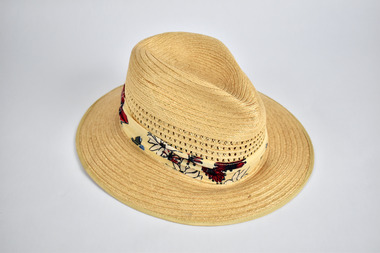
Uniform - 1992 Barcelona Olympic Games Akubra Hat, Akubra, c1992
About the 1992 Barcelona Olympic Games donator Doug Pleasance wrote- During the 1980s the Australian wool industry was at its most prosperous times with record numbers of sheep producing wool receiving ever increasing values due to the success of the Reserve Price Scheme, and the overall guidance of the Australian Wool Corporation (AWC). As a humble technichian, my role was a low profile newly created position of “Controller, Technical Marketing” where wool was to be marketed on its technical properties, as distinct from the “Product Marketing Group” which exploited trhe traditional high profile approach of marketing wool;s superior fashion attributes. The Woolmark was the tool central to this approach. The 1992 Barcelona Olympic Games saw an evolutionary change in designer selection. A Declaration of Interest Form was communicated to over forty potential designers. The task and especially tight timelines that were involved deterred many aspirants, however, there remained eight designers with the potential we were seeking. These eight designers were paid $3,000 per submission and the winning designer, Wendy Powitt, was paid $15,000. For the first time the judging panel included two athletes, one male swimmer and one female basketballer, their influence was pivotal. The ensemble consisted of three elements- 1. The Official Uniform which was used for travel and all official functions. This included: a tailored blazer and trouser/skirt (all water repellent) by Fletcher Jones, pure wool olive-green faille fabric by Foster Valley, cotton PE formal shirt by Pelaco, pure wool knitwear by Spangaro, printed wool tie by TD Noone, wool nylon socks by Holeproof and footwear by Hush Puppy. 2. Opening Ceremony Uniform a lightweight wool fabric printed with floral designs that had been inspired by the work of Australian artist Margaret Preston. This included: Lightweight W/PE shorts by Fletcher Jones in Foster Valley Fabric, socks by Holeproof and footwear by Hush Puppy. 3. Village Clothing was designed to be highly visible garments to make it easy to ‘spot the Aussie’ and helped to contribute to good team spirit. This included: A pure wool shirt featuring blocks of contrasting colours, and a newly developed stretch 50:50 wool/cotton fabric by Bradmill was made into shorts and jeans by Fletcher Jones.Straw hat by brand ‘Akubra’ in the style ‘Olympian’, size 59. Sides of crown woven with decorative pattern and hatband printed with native Australian flora. Labels: Akubra / 59 / Olympian / MADE IN AUSTRALIA1992 barcelona olympics, uniform, australian wool corporation, hat -
 Victorian Aboriginal Corporation for Languages
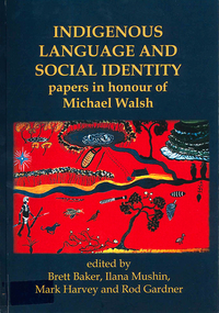
Book, Brett Baker, Indigenous language and social identity : papers in honour of Michael Walsh, 2010
For almost 40 years, Michael Walsh has been working alongside Indigenous people: documenting language, music and other traditional knowledge, acting on behalf of claimants to land in the Northern Territory, and making crucial contributions to the revitalisation of Aboriginal languages in NSW. This volume, with contributions from his colleagues and students, celebrates his abiding interest in and commitment to Indigenous society with papers in two broad themes. ?Language, identity and country? addresses the often complex relations between Aboriginal social groups and countries, and linguistic identity. In ?Language, identity and social action? authors discuss the role that language plays in maintaining social identities in the realms of conversation, story-telling, music, language games, and in education. ?Language and Social Identity in Australian Indigenous Communities? will be of interest to students of linguistics, Indigenous studies, anthropology, and sociology. Contents: 1. Introduction /? Rod Gardner ... [et al.] 2. Michael Walsh : a personal reflection /? Ros Fraser 3. Place and property at Yintjingga/?Port Stewart under Aboriginal Law and Queensland Law /? Bruce Rigsby and Diane Hafner 4. Linguistic identities in the eastern Western Desert : the Tindale evidence /? Peter Sutton Juwaliny : dialectal variation and ethnolinguistic identity in the Great Sandy Desert /? Sally Dixon 6. Who were the 'Yukul'? and who are they now? /? Brett Baker 7. Colonisation and Aboriginal concepts of land tenure in the Darwin region /? Mark Harvey 8. Aboriginal languages and social groups in the Canberra region : interpreting the historical documentation /? Harold Koch 9. The Kuringgai puzzle : languages and dialects on the NSW Mid Coast /? Jim Wafer and Amanda Lissarrague 10. Dawes' Law generalised : cluster simplification in the coastal dialect of the Sydney language /? David Nash 11. Space, time and environment in Kala Lagaw Ya /? Lesley Stirling 12. Turn management in Garrwa mixed-language conversations /? Ilana Mushin and Rod Gardner 13. Laughter is the best medicine : roles for prosody in a Murriny Patha conversational narrative /? Joe Blythe 14. Collaborative narration and cross-speaker repetition in Umpila and Kuuku Ya'u /? Clair Hill 15. Co-narration of a Koko-Bera story : giants in Cape York Peninsula /? Paul BlackMaps, b&w photographs, charts, word listslanguage and identity, language maintenance, language and culture, language and country -
 Victorian Aboriginal Corporation for Languages
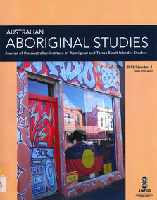
Periodical, Australian Institute of Aboriginal and Torres Strait Islander Studies, Australian Aboriginal studies : journal of the Australian Institute of Aboriginal and Torres Strait Islander Studies, 2013
We don?t leave our identities at the city limits: Aboriginal and Torres Strait Islander people living in urban localities Bronwyn Fredericks Aboriginal and Torres Strait Islander people who live in cities and towns are often thought of as ?less Indigenous? than those who live ?in the bush?, as though they are ?fake? Aboriginal people ? while ?real? Aboriginal people live ?on communities? and ?real? Torres Strait Islander people live ?on islands?. Yet more than 70 percent of Australia?s Indigenous peoples live in urban locations (ABS 2007), and urban living is just as much part of a reality for Aboriginal and Torres Strait Islander people as living in remote discrete communities. This paper examines the contradictions and struggles that Aboriginal and Torres Strait Islander people experience when living in urban environments. It looks at the symbols of place and space on display in the Australian cities of Melbourne and Brisbane to demonstrate how prevailing social, political and economic values are displayed. Symbols of place and space are never neutral, and this paper argues that they can either marginalise and oppress urban Aboriginal and Torres Strait Islander people, or demonstrate that they are included and engaged. Juggling with pronouns: Racist discourse in spoken interaction on the radio Di Roy While the discourse of deficit with regard to Australian Indigenous health and wellbeing has been well documented in print media and through images on film and on television, radio talk concerning this discourse remains underresearched. This paper interrogates the power of an interactive news interview, aired on the Radio National Breakfast program on ABC Radio in 2011, to maintain and reproduce the discourse of deficit, despite the best intentions of the interview participants. Using a conversation-analytical approach, and membership categorisation analysis in particular, this paper interrogates the spoken interaction between a well-known radio interviewer and a respected medical researcher into Indigenous eye health. It demonstrates the recreation of a discourse emanating from longstanding hegemonies between mainstream and Indigenous Australians. Analysis of firstperson pronoun use shows the ongoing negotiation of social category boundaries and construction of moral identities through ascriptions to category members, upon which the intelligibility of the interview for the listening audience depended. The findings from analysis support claims in a considerable body of whiteness studies literature, the main themes of which include the pervasiveness of a racist discourse in Australian media and society, the power of invisible assumptions, and the importance of naming and exposing them. Changes in Pitjantjatjara mourning and burial practices Bill Edwards, University of South Australia This paper is based on observations over a period of more than five decades of changes in Pitjantjatjara burial practices from traditional practices to the introduction of Christian services and cemeteries. Missions have been criticised for enforcing such changes. However, in this instance, the changes were implemented by the Aboriginal people themselves. Following brief outlines of Pitjantjatjara traditional life, including burial practices, and of the establishment of Ernabella Mission in 1937 and its policy of respect for Pitjantjatjara cultural practices and language, the history of these changes which commenced in 1973 are recorded. Previously, deceased bodies were interred according to traditional rites. However, as these practices were increasingly at odds with some of the features of contemporary social, economic and political life, two men who had lost close family members initiated church funeral services and established a cemetery. These practices soon spread to most Pitjantjatjara communities in a manner which illustrates the model of change outlined by Everett Rogers (1962) in Diffusion of Innovations. Reference is made to four more recent funerals to show how these events have been elaborated and have become major social occasions. The world from Malarrak: Depictions of South-east Asian and European subjects in rock art from the Wellington Range, Australia Sally K May, Paul SC Ta�on, Alistair Paterson, Meg Travers This paper investigates contact histories in northern Australia through an analysis of recent rock paintings. Around Australia Aboriginal artists have produced a unique record of their experiences of contact since the earliest encounters with South-east Asian and, later, European visitors and settlers. This rock art archive provides irreplaceable contemporary accounts of Aboriginal attitudes towards, and engagement with, foreigners on their shores. Since 2008 our team has been working to document contact period rock art in north-western and western Arnhem Land. This paper focuses on findings from a site complex known as Malarrak. It includes the most thorough analysis of contact rock art yet undertaken in this area and questions previous interpretations of subject matter and the relationship of particular paintings to historic events. Contact period rock art from Malarrak presents us with an illustrated history of international relationships in this isolated part of the world. It not only reflects the material changes brought about by outside cultural groups but also highlights the active role Aboriginal communities took in responding to these circumstances. Addressing the Arrernte: FJ Gillen?s 1896 Engwura speech Jason Gibson, Australian National University This paper analyses a speech delivered by Francis James Gillen during the opening stages of what is now regarded as one of the most significant ethnographic recording events in Australian history. Gillen?s ?speech? at the 1896 Engwura festival provides a unique insight into the complex personal relationships that early anthropologists had with Aboriginal people. This recently unearthed text, recorded by Walter Baldwin Spencer in his field notebook, demonstrates how Gillen and Spencer sought to establish the parameters of their anthropological enquiry in ways that involved both Arrernte agency and kinship while at the same time invoking the hierarchies of colonial anthropology in Australia. By examining the content of the speech, as it was written down by Spencer, we are also able to reassesses the importance of Gillen to the ethnographic ambitions of the Spencer/Gillen collaboration. The incorporation of fundamental Arrernte concepts and the use of Arrernte words to convey the purpose of their 1896 fieldwork suggest a degree of Arrernte involvement and consent not revealed before. The paper concludes with a discussion of the outcomes of the Engwura festival and the subsequent publication of The Native Tribes of Central Australia within the context of a broader set of relationships that helped to define the emergent field of Australian anthropology at the close of the nineteenth century. One size doesn?t fit all: Experiences of family members of Indigenous gamblers Louise Holdsworth, Helen Breen, Nerilee Hing and Ashley Gordon Centre for Gambling Education and Research, Southern Cross University This study explores help-seeking and help-provision by family members of Indigenous people experiencing gambling problems, a topic that previously has been ignored. Data are analysed from face-to-face interviews with 11 family members of Indigenous Australians who gamble regularly. The results confirm that substantial barriers are faced by Indigenous Australians in accessing formal help services and programs, whether for themselves or a loved one. Informal help from family and friends appears more common. In this study, this informal help includes emotional care, practical support and various forms of ?tough love?. However, these measures are mostly in vain. Participants emphasise that ?one size doesn?t fit all? when it comes to avenues of gambling help for Indigenous peoples. Efforts are needed to identify how Indigenous families and extended families can best provide social and practical support to assist their loved ones to acknowledge and address gambling problems. Western Australia?s Aboriginal heritage regime: Critiques of culture, ethnography, procedure and political economy Nicholas Herriman, La Trobe University Western Australia?s Aboriginal Heritage Act 1972 (WA) and the de facto arrangements that have arisen from it constitute a large part of the Aboriginal ?heritage regime? in that state. Although designed ostensibly to protect Aboriginal heritage, the heritage regime has been subjected to various scholarly critiques. Indeed, there is a widespread perception of a need to reform the Act. But on what basis could this proceed? Here I offer an analysis of these critiques, grouped according to their focus on political economy, procedure, ethnography and culture. I outline problems surrounding the first three criticisms and then discuss two versions of the cultural critique. I argue that an extreme version of this criticism is weak and inconsistent with the other three critiques. I conclude that there is room for optimism by pointing to ways in which the heritage regime could provide more beneficial outcomes for Aboriginal people. Read With Me Everyday: Community engagement and English literacy outcomes at Erambie Mission (research report) Lawrence Bamblett Since 2009 Lawrie Bamblett has been working with his community at Erambie Mission on a literacy project called Read With Me. The programs - three have been carried out over the past four years - encourage parents to actively engage with their children?s learning through reading workshops, social media, and the writing and publication of their own stories. Lawrie attributes much of the project?s extraordinary success to the intrinsic character of the Erambie community, not least of which is their communal approach to living and sense of shared responsibility. The forgotten Yuendumu Men?s Museum murals: Shedding new light on the progenitors of the Western Desert Art Movement (research report) Bethune Carmichael and Apolline Kohen In the history of the Western Desert Art Movement, the Papunya School murals are widely acclaimed as the movement?s progenitors. However, in another community, Yuendumu, some 150 kilometres from Papunya, a seminal museum project took place prior to the completion of the Papunya School murals and the production of the first Papunya boards. The Warlpiri men at Yuendumu undertook a ground-breaking project between 1969 and 1971 to build a men?s museum that would not only house ceremonial and traditional artefacts but would also be adorned with murals depicting the Dreamings of each of the Warlpiri groups that had recently settled at Yuendumu. While the murals at Papunya are lost, those at Yuendumu have, against all odds, survived. Having been all but forgotten, this unprecedented cultural and artistic endeavour is only now being fully appreciated. Through the story of the genesis and construction of the Yuendumu Men?s Museum and its extensive murals, this paper demonstrates that the Yuendumu murals significantly contributed to the early development of the Western Desert Art Movement. It is time to acknowledge the role of Warlpiri artists in the history of the movement.b&w photographs, colour photographsracism, media, radio, pitjantjatjara, malarrak, wellington range, rock art, arrernte, fj gillen, engwura, indigenous gambling, ethnography, literacy, erambie mission, yuendumu mens museum, western desert art movement -
 Flagstaff Hill Maritime Museum and Village
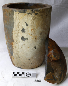
Functional object - Crucible, The Patent Plumbago Crucible Company, circa 1878
This crucible was raised from the wreck of the LOCH ARD. It is one of six similar relics, in a range of sizes, now in the Flagstaff Hill collection. All bear markings to indicate their manufacture by the Morgan brothers of Battersea, trading as the Patent Plumbago Crucible Co. A crucible is a container used for purifying and melting metals so that they can be cast in a mould to a predetermined shape and use. They must withstand extremely high temperatures, abrupt cooling, and shed their contents with minimal adherence. The addition of graphite to the traditional firing clays greatly enhanced the durability of industrial crucibles in mid-Victorian Britain, a significant technological advance at a time of great activity in foundries and expansion of demand for refined metals. The Morgans first noticed the advantages of graphite crucibles at the Great Exhibition held in London in 1851. Initially they contracted to be sole selling agents for the American-made products of Joseph Dixon and Co. from New Jersey, but in 1856 they obtained that firm’s manufacturing rights and began producing their own graphite crucibles from the South London site. The Morgans imported crystalline graphite in 4-5 cwt casks from the British colony of Ceylon (now Sri Lanka) and mixed it with conventional English (Stourbridge) clays to be fired in kilns. Their products were purchased by the Royal Mints in London and India, and exported to official mints in France and Germany. They were successful exhibitors of their crucibles and furnaces at the London Exhibition held in 1861 (Class 1, Mining, quarrying, metallurgy and mineral products, Exhibit 265, Patent Plumbago Crucible Co). The range of sizes represented by the six crucibles retrieved from the LOCH ARD, suggest they may have been part of a sample shipment intended for similar promotion in the Australian colonies ― at Melbourne’s International Exhibition to be held in 1880. The summary of cargo manifest, by Don Charlwood in ‘Wrecks and Reputations’ does not mention any crucibles, implying that they were not a large consignment of uniform items. A newspaper account of an 1864 tour of the Morgan brothers’ ‘Black Potteries’ at Battersea indicates: “All the pots were numbered according to their contents, each number standing for one kilogram, or a little over two pounds; a No. 2 crucible contains two kilogrammes; a No. 3, three kilogrammes, and so on.” These numbers are obscured by marine sediment on three of the crucibles in the Flagstaff Hill collection, but those legible on the remaining three are 5, 6, and 8. None of the six are of the same size from a visual appraisal.The shipwreck of the LOCH ARD is of State significance ― Victorian Heritage Register S417A large crucible, or fluxing pot, for heating and pouring molten metal. It was recovered from the wreck of the LOCH ARD. The clay fired vessel rises from circular flat base to a larger rim with pouring lip. It is stained a rust colour and bears some sedimentary accretion. Half of its loose fitting lid with central knob has also survived. Markings on the artefact indicate it is a Morgan’s crucible, made with graphite to prevent cracking in the furnace and provide a smooth (non-adhesive) inner surface. On base: “…RGAN’S PATENT CRUCIBLE”. On rim: “MORGAN’S PATENT P…” Below top edge "BAK"flagstaff hill, warrnambool, shipwrecked-coast, flagstaff-hill, flagstaff-hill-maritime-museum, maritime-museum, shipwreck-coast, flagstaff-hill-maritime-village, graphite crucible, plumbago crucible, morgans crucible company, loch ard, fluxing pot, crucible -
 Flagstaff Hill Maritime Museum and Village
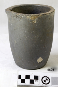
Functional object - Crucible, The Patent Plumbago Crucible Company, circa 1878
This crucible was raised from the wreck of the LOCH ARD. It is one of six similar relics, in a range of sizes, now in the Flagstaff Hill collection. All bear markings to indicate their manufacture by the Morgan brothers of Battersea, trading as the Patent Plumbago Crucible Co. A crucible is a container used for purifying and melting metals so that they can be cast in a mould to a predetermined shape and use. They must withstand extremely high temperatures, abrupt cooling, and shed their contents with minimal adherence. The addition of graphite to the traditional firing clays greatly enhanced the durability of industrial crucibles in mid-Victorian Britain, a significant technological advance at a time of great activity and expansion in foundries and demand for refined metals. The Morgans first noticed the advantages of graphite crucibles at the Great Exhibition held in London in 1851. Initially they contracted to be sole selling agents for the American-made products of Joseph Dixon and Co. from New Jersey, but in 1856 they obtained that firm’s manufacturing rights and began producing their own graphite crucibles from the South London site. The Morgans imported crystalline graphite in 4-5 cwt casks from the British colony of Ceylon (now Sri Lanka) and mixed it with conventional English (Stourbridge) clays to be fired in kilns. Their products were purchased by the Royal Mints in London and India, and exported to official mints in France and Germany. They were successful exhibitors of their crucibles and furnaces at the London Exhibition held in 1861 (Class 1, Mining, quarrying, metallurgy and mineral products, Exhibit 265, Patent Plumbago Crucible Co). The range of sizes represented by the six crucibles retrieved from the LOCH ARD, suggest they may have been part of a sample shipment intended for similar promotion in the Australian colonies ― at Melbourne’s International Exhibition to be held in 1880. A summary of the LOCH ARD cargo manifest, by Don Charlwood in ‘Wrecks and Reputations’ does not mention any crucibles, implying that they were not part of a larger consignment of uniform items. A newspaper account of an 1864 tour of the Morgan brothers’ ‘Black Potteries’ at Battersea indicates: “All the pots were numbered according to their contents, each number standing for one kilogram, or a little over two pounds; a No. 2 crucible contains two kilogrammes; a No. 3, three kilogrammes, and so on.” These numbers are obscured by marine sediment on three of the crucibles in the Flagstaff Hill collection, but those legible on the remaining three are 5, 6, and 8. None of the six are of the same size from a visual appraisal. The shipwreck of the LOCH ARD is of State significance ― Victorian Heritage Register S417A No. 6 size Morgan’s graphite crucible (i.e. 6kgs capacity). The crucible rises in a slight curve from a smaller flat base up to a wider top with a (chipped) pouring lip. It was recovered from the wreck of the LOCH ARD. The artefact is largely accretion free despite its long period of submersion at the wreck site. It has a number of visible maker’s markings which identify the manufacturer and the smelting capacity of the pot. The graphite crucible is in fair and stable condition. The number “6” which is framed in a square. The letters “THE PATENT PLUMBAGO CRUCIBLE COMPANY” and “BATTERSEA WORKS COMPANY”. Below rim "... GNS"flagstaff hill, warrnambool, shipwrecked-coast, flagstaff-hill, flagstaff-hill-maritime-museum, maritime-museum, shipwreck-coast, flagstaff-hill-maritime-village, graphite crucible, plumbago crucible, morgan's crucible company, loch ard, crucible, fluxing pot -
 Brighton Historical Society
Jacket, Bolero, c.1948
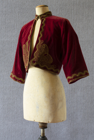
This bolero is part of a Greek national costume from the Peloponnese. Long-time Brighton resident Olga Black wore it to the 1956 Melbourne Olympic Games to represent her Greek heritage. She remembers the stands at the MCG being full of migrants wearing their traditional national costumes. Olga Maria Black was born in Melbourne in 1930, the daughter of Ithacan migrants Constantine and Toula Mavrokefalos. Constantine first emigrated to Australia in 1902, returning to Greece circa 1912-13 to serve his home country in the Balkan Wars. Toula's family had left Ithaca for Romania when she was only six months old, but she happened to be visiting the island at the very time that Constantine arrived, fresh from the war. Within three weeks they were married, and when Constantine returned to Melbourne in 1914 his new bride came with him. Constantine had trained as an accountant, but his qualifications were not recognised in Australia. Changing his surname to the Anglicised "Black", he started off working in his older brother Dionysios's cafés before going into business on his own. In 1917 he opened the Paris Residential Café at 54-56 Swanston Street, which offered both dining and accommodation. The business saw some years of success, but did not survive the Great Depression. Constantine died in 1944. Olga's mother Toula learned to sew as a child, while growing up in the Romanian village of Brila. She developed her skills making lace and embroidering items for her trousseau. Some of the linen she embroidered had been woven from flax on Ithaca by her own grandmother, Efstathia. During the Depression, when money was scarce, Toula embroidered at home, doing work for a factory in Flinders Lane. Using a cotton reel, a threepence and a sixpence she created and embroidered designs on hundreds of blouses. Olga spent her preschool days sitting at the table where her mother worked. Toula would involve Olga by allowing her to help choose the colour combinations. Toula lived with Olga in Brighton until her death in 1976. Olga inherited her mother's sewing skills. She re-invented some of Toula’s trousseau nightdresses and skilfully altered other clothing, making dresses which she wore around Brighton for many years.Red velvet bolero decrated with gold stitching and braid. Lined with red satin. Stand collar which fastens with two metal hooks and eyes. bolero, jacket, greece, ithaca, migration, olympic games, 1956 olympic games, olga black -
 Federation University Art Collection
Painting - Artwork, 'Ring of the Nibellings' by David Noonan, 1989
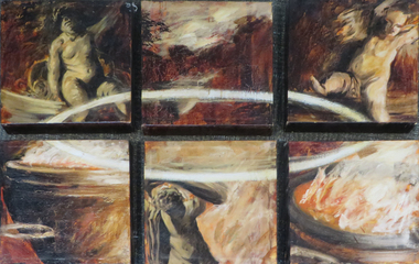
David NOONAN (1969- ) Born Ballarat, Victoria. Lives and works Melbourne, Victoria and London, United Kingdom. Leaving secondary school as soon as he could, David Noonan enrolled in a Visual Art Course at the Ballarat School of Mines. He described this time as 'an inspiring time, with every art form covered and treated with passion and rigour.' He studied ceramics, photography, painting and knew that he had to be an artist. (https://art150.unimelb.edu.au/articles/david-noonan-making-art-in-a-dark-and-quiet-place, accessed 17 January 2020). Between 1987 and 1989 David Noonan completed a Bachelor of Fine Art at Ballarat University College, Victoria, Australia (Now Federation University Australia). He undertook Post Graduate Studies at the Victorian College of the Arts, Melbourne in 1991 and 1992. Since 2005 he has been based in London with his work featuring in a number of major international exhibitions of contemporary art, including 'Altermodern', the 2009 Tate Triennial at Tate Britain, London. Producing works in a range of media including painting, photography, film, print-making, collage and sculpture David Noonan's work often evoke the subconscious realm through their fragmented imagery, allusive qualities and complex layering of historical and cultural references. Animals, actors and masked figures are recurring motifs that imbue his works with a magical atmosphere that is suggestive of childhood memories or half-forgotten dreams. ( produced works in a range of media including painting, photography, film, print-making, collage and sculpture. His works often evoke the subconscious realm through their fragmented imagery, allusive qualities and complex layering of historical and cultural references. (https://www.ngv.vic.gov.au/essay/david-noonan-untitled/, accessed 17 January 2020) David Noonan has become known for large-scale monochromatic collages on linen comprised of fabrics which are torn, folded, cut, stitched and combined with silkscreened images. This approach was used to produce his 2018 atmospheric film 'A dark and quiet place'. Noonan is interested in combining art and traditional craft techniques. (https://artgalleryofballarat.com.au/gallery_exhibitions/david-noonan-stagecraft/, accessed 17 January 2020) This item is part of the Federation University Art Collection. The Art Collection features over 2000 works and was listed as a 'Ballarat Treasure' in 2007. Six stretched canvases making up the work 'Ring of the Nibellings'. art, artwork, david noonan, oil on canvas, alumni -
 Federation University Art Collection
Painting, 'Through a Dark Glass Darkly' by David Noonan, c1989
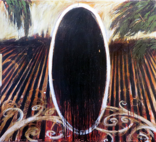
David NOONAN (1969- ) Born Ballarat, Victoria. Lives and works Melbourne, Victoria and London, United Kingdom. Leaving secondary school as soon as he could, David Noonan enrolled in a Visual Art Course at the Ballarat School of Mines. He described this time as 'an inspiring time, with every art form covered and treated with passion and rigour.' He studied ceramics, photography, painting and knew that he had to be an artist. (https://art150.unimelb.edu.au/articles/david-noonan-making-art-in-a-dark-and-quiet-place, accessed 17 January 2020). Between 1987 and 1989 David Noonan completed a Bachelor of Fine Art at Ballarat University College, Victoria, Australia (Now Federation University Australia). He undertook Post Graduate Studies at the Victorian College of the Arts, Melbourne in 1991 and 1992. Since 2005 he has been based in London with his work featuring in a number of major international exhibitions of contemporary art, including 'Altermodern', the 2009 Tate Triennial at Tate Britain, London. Producing works in a range of media including painting, photography, film, print-making, collage and sculpture David Noonan's work often evoke the subconscious realm through their fragmented imagery, allusive qualities and complex layering of historical and cultural references. Animals, actors and masked figures are recurring motifs that imbue his works with a magical atmosphere that is suggestive of childhood memories or half-forgotten dreams. ( produced works in a range of media including painting, photography, film, print-making, collage and sculpture. His works often evoke the subconscious realm through their fragmented imagery, allusive qualities and complex layering of historical and cultural references. (https://www.ngv.vic.gov.au/essay/david-noonan-untitled/, accessed 17 January 2020) David Noonan has become known for large-scale monochromatic collages on linen comprised of fabrics which are torn, folded, cut, stitched and combined with silkscreened images. This approach was used to produce his 2018 atmospheric film 'A dark and quiet place'. Noonan is interested in combining art and traditional craft techniques. (https://artgalleryofballarat.com.au/gallery_exhibitions/david-noonan-stagecraft/, accessed 17 January 2020) This item is part of the Federation University Art Collection. The Art Collection features over 2000 works and was listed as a 'Ballarat Treasure' in 2007.A large painting on canvas. art, artwork, david noonan, noonan, alumni, oil on canvas, available -
 Flagstaff Hill Maritime Museum and Village
Functional object - Bellows, 1862-1875
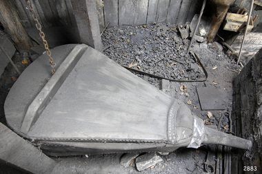
This bellows was used at the Warrnambool Racecourse by Master Farrier, Brian Chapman (1931-2017), during the 1970s but its history before then is still being investigated. The bellows have continued to be used from 1978 at Flagstaff Hill's blacksmith's workshop. Even today, in 2021, this same bellows are used by a volunteer blacksmith as he demonstrate the skills and tells of the importance of the blacksmith trade to colonial Australia. This 1860s double-action bellows is a typical form of blacksmith's or shipsmith's bellows. The end is forge-fitted with an iron nozzle or tube, called a tuyere or Tue iron, which concentrates the air to fan the fire or furnace. Tuyeres were traditionally made of cow horn. The double-action design of this bellows efficiently moves air both in and out of the chambers in the one movement of the long handle. The bellows was manufactured by John C. Onions of Birmingham, England, between 1862 and 1875. The stamp with the text, Gold Medal 1862, was also used on the business’ advertising. In 1875 the company was registered and began using the name John C. Onions Limited. JOHN C. ONIONS - John C. (Collingwood) Onions (1841-1904) was the son of a bellows maker of the same name. Onions (born 1841) and his wife Helen married in 1867 and they named one of their children John Collingwood Onions (1868-1913), as was the family tradition. He was well known as a Birmingham manufacturer of patented bellows and other forge-related equipment. He sold to the wholesale and retail markets for both local and overseas customers, including the British colonies. An 1862 advertisement points out that John C. Onions was a “Bellows manufacturer and contractor to Her Majesty’s Honourable Board of Ordinance” and His Imperial Majesty the Emperor of the French [Napoleon Bonaparte]”. The advertisement includes a sketched portrait of the Emperor Napoleon III, and an Imperial Autograph Letter dated May 23, 1854, from Napoleon, Palace of the Tulleries to Mr J C Onions of Bradford Street, Birmingham. In 1863 the company registered a patent on portable forges. In 1871 there were eight employees. John C. Onions Limited became a registered company in 1875. In 1876 an advertisements included that the company were smiths for hearths and tools in general and showed a row of six medallions including one with “Napoleon III, Emperor” and his portrait, and another “ _ _ _ 1862 MEDAL”. Their advertising motto was “For Excellence of Quality”. In 1885 the company merged with William Allday and Sons to become Allday and Onions. This mid-19th century bellows has local historical significance as it were once used by blacksmiths at the Warrnambool Racecourse in the annual racing event that continues today. This bellows is significant as a working example of equipment used in the 1800 and 1900s in the trace of blacksmiths and other metal working smiths. The bellows is technologically significant as it shows the progress from simple bellows to the double-action bellows, a time saving and efficient improvement. The manufacturer John C. Onions is historically significant as a family business that began in the 1600s and continued up until the 1980s.Bellows; large, oval, mechanical double-action smith’s bellows, manually operated, in working condition. The paddles of wood that form the top, middle sections and base of the bellows have flexible leather pieces attached firmly between them, forming airtight double lungs. Cut-outs in the panels allow the bellows to fill with air then force it out. A long handle is connected to pump the bellows and control the quantity and force of the air. The blasts of air are forced through the metal nozzle or tuyere at the end of the bellows and into the forge’s fire. Inscriptions are impressed into the wood on the upper paddle or board of the bellows. There are three circular stamps containing text. Text impressed in the wooden upper paddle of the bellows has been assumed to read “JOHN C. ONIONS, PATENTEES & MANUFACTURERS, BIRMINGHAM””?” “EXTRA” “AWARDED FOR EXCELLENCE OF QUALITY”, made from the following readable text :- “JOHN C ONIONS“ “PATENT - - - & MAN - - - - - - - - -“, “BIR - - - - HAM“, “ _ ERA - - - - “- XTRA-“, “- - - - - - - FOR EXCELL-“ “OF - - - - ITY” Text in the stamp “ - - ECE - - “, “ - - - - - / 1862 / MEDAL”, “- ITY” flagstaff hill, warrnambool, shipwrecked-coast, flagstaff-hill, flagstaff-hill-maritime-museum, maritime-museum, shipwreck-coast, flagstaff-hill-maritime-village, john collingwood onions, john c onions, allday and onions, bellows, smith’s bellows, 19th century bellows, double-action bellows, double-acting bellows, double lung bellows, double chamber bellows, blacksmith tools, blacksmith trade, blacksmith craft, blacksmith equipment, forging equipment, john c onions patented double-action bellows, brian chapman, warrnambool racecourse, blacksmith, shipsmith, iron smith, mechanical bellows -
 Eltham District Historical Society Inc
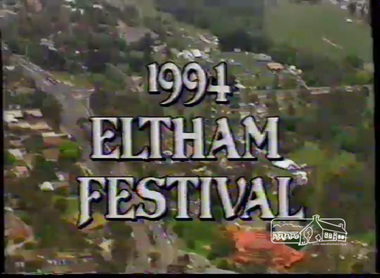
Film - Video (VHS), Dynavision Video Production, 1994 Eltham Festival, 11 Nov 1994
20th Eltham Community Festival and last under the auspices of the Shire of Eltham. The Grand Parade focussing on the theme "Echoes of Eltham - Celebrating the visions of Eltrham from the past and into the future" was headed by Jock Read on his horse Lofty who had been filmed in an Anzac Day Parade on an earlier horse which had featured in the television show Matlock. The parade travelled north along Main Street to just past the Post Office then back south to Panther Place. Parade participants included 1st Eltham Brownies, 1st Eltham Venturers, 2nd Eltham Sea Scouts, 2nd Eltham Venturers, 3rd Eltham Brownies, Australian Democrats, Briar Hill Primary School, Circus Chaos, Country Fire Authority, Diamond Valley People for Disarmament, Diamond Valley Railway, Eltham Community Health Centre, Eltham District Horse and Pony Club, Eltham East Primary School, Eltham Fire Brigade, Eltham Junior Football Club (Panthers), Eltham Little Theatre, Eltham North Primary School, Eltham Playhouse Co-op, Eltham Pre-school, Eltham Roller Skating Club, Eltham South Pre-School Centre, Eltham Steam and Stationary Engine Society, Greenhills Neighbourhood House, Heidelberg Municipal Band, Hurstbridge Learning Co-op, Jocklebeary Farm, Kangaroo Ground Primary School, Learning Co-op Primary School, Lower Plenty Primary School, Main Road, Montmorency Gardening Club, Montmorency South Primary School, North Warrandyte Fire Brigade, Plenty Valley 88.6 FM, Research Pre-school, Research Primary School, Ron Sampson, Salvation Army Band (Briar Hill), Sherbourne Primary School, Shire of Eltham, State Emergency Service (Eltham) and Woodridge Pre-school. The parade commentary was provided by Plenty Valley FM 88.6 with guest commentator, Shire President Cr. John Graves. Following the parade is video footage from a helicopter of Alistair Knox Park, displays along Main Road and activities in Alistair Knox Park and the Rugby oval along with stationary engines, helicopter joyrides, Eltham People's Choir, music entertainment. Scenes also from the Diamond Valley Railway at Eltham Lower Park and finishing with the fireworks display. At the end of the video is a promotional video for Dynavision Video Production, a local video production company that produced the video and Diamond Photos (Kodak Express). One of the highlights of the festival was a tree planting ceremony in Alistair Knox Park to celebrate 123 years of the Shire of Eltham led by Shire President Cr. John Graves and representatives of the Wurrundjeri, traditional land owners of the area.VHS Video cassette (poor quality) Converted to MP4 file format 45:01, 535MB1st eltham brownies, 1st eltham venturers, 2nd eltham sea scouts, 2nd eltham venturers, 3rd eltham brownies, 1994, aerial photographs, alistair knox park, arthur street, australian democrats, briar hill primary school, circus chaos, country fire authority, diamond valley people for disarmament, diamond valley railway, eltham community health centre, eltham district horse and pony club, eltham east primary school, eltham festival, eltham fire brigade, eltham junior football club (panthers), eltham little theatre, eltham lower park, eltham north primary school, eltham people's choir, eltham playhouse co-op, eltham pre-school, eltham roller skating club, eltham south pre-school centre, eltham steam and stationary engine society, grand parade, greenhills neighbourhood house, heidelberg municipal band, hurstbridge learning co-op, jock read, jocklebeary farm, john graves, kangaroo ground primary school, learning co-op primary school, lofty (horse), lower plenty primary school, main road, matlock police (tv show), montmorency gardening club, montmorency south primary school, nicholaus lauder estate, north warrandyte fire brigade, plenty valley 88.6 fm, research pre-school, research primary school, ron sampson, salvation army band (briar hill), sherbourne primary school, shire of eltham, state emergency service (eltham), video recording, woodridge pre-school -
 Lara RSL Sub Branch
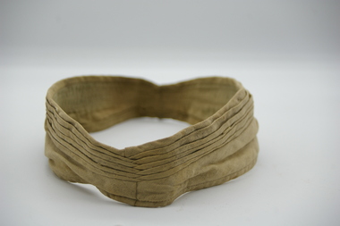
Service Gear, Clothing Military Various - Puggaree
The term ‘puggaree’ originates from the Hindu word, ‘Pagri,’ meaning a turban or thin scarf of muslin. Intended for insulation, the puggaree was a traditional Indian head-wrap, adapted by the British for headdress worn in hot, sunny regions. During World War One (1914-1918) a plain khaki cloth band was worn and this practice continued until compulsory training was suspended in 1929. Following the introduction of Voluntary Training in 1930, new puggarees were issued to the Commonwealth Military Force with different coloured folds denoting Arm or Service. During World War Two, a flat type of band was issued. Troops who were on active service in the Middle East at the time introduced a folded puggaree as a distinguishing mark of active service. Later, the Army reverted to various types of plain bands, green dyed puggarees for example, for jungle warfare. However, the official puggaree at the conclusion of World War Two was still the flat band. The current puggaree has seven pleats, one for each state and one for the Australian Territories. It is made from light khaki coloured cotton and is worn on the slouch hat with a unit colour patch sewn on the right side. While the majority of the Australian Army wear the light khaki coloured puggaree, there are slight variations for members of the 1st Battalion, the Royal Australian Regiment, and the Corps of Staff Cadets. Soldiers of the 1st Battalion, the Royal Australian Regiment, wear jungle green puggaree. The dark green puggaree was introduced during the Battalion’s service in Malaya over the period 1959-61. Unable to get puggarees from Australia for an official parade; the task of producing them was given to the Battalion tailor, Mr. Mohavved Beseek. Mr Beseek used ‘bush shirts’ (common issue British field uniform at the time) to make the puggarees as he was unable to obtain the khaki material locally or from Australia. It is thought that the Commanding Officer, Lieutenant Colonel W. Morrow decided that the green puggaree would be the puggaree worn by the 1st Battalion, the Royal Australian Regiment, in Malaya. After the battalion’s return to Australia, the dark green puggaree was adopted for permanent use. Because the dark green puggaree is so distinctive, the battalion does not wear a colour patch. Royal Military College staff cadets wear a distinctive puggaree of olive drab colour. The puggaree has eight pleats, with seven representing each state and one for the Australian Territories. The eighth pleat signifies the graduation of the first international cadet through the Royal Military College who hailed from New Zealand. Worn on slouch HatHat BandNilpuggaree,hat band, slouch hat, lara rsl -
 4th/19th Prince of Wales's Light Horse Regiment Unit History Room
Order of Ceremony, The Royal Australian Amored (sic) Corps the Keeffe Family & Eoghan McDonald Celebrates (sic) the Unveiling of a Commemorative Plaque 16 November 2014, 2014
The 13th Australian Armoured Regiment was a Gippsland militia unit that had been called up for full time duty in December 1941 as a traditional light horse regiment. The early months of 1942 had seen the regiment lose its horses, a conversion to a motor regiment and finally to an armoured regiment in May. During this period there were considerable changes in personnel, however the regiment maintained its strong links to Gippsland and its former identity. Between May and November 1942, individual soldiers had become proficient in their trade training and the regiment changed its focus to troop and squadron activities. On 16 November 1942, the unit was located at the Puckapunyal Army Camp. C Squadron's training program involved a night driving exercise where a column of armoured and B vehicles would depart camp at 0245 hours and proceed to a site to the East of Seymour and set up a bivouac between Whiteheads Creek and Highlands Road. Numerous army camps surrounded the Seymour area; and much of the surrounding farm land had been acquired for military purposes. By November 1942 exercises such as C Squadron's were commonplace and had been repeated on numerous occasions since 1939. At 0400 hrs, C Squadron's vehicles reached O'Sullivan's Paddock on the Kobyboyn Road; prior to reaching the Old Telegraph Road the column turned to the North towards a known crossing point on Whiteheads Creek. The column consisted of seven M3 Medium Tanks and four Universal Carriers. In the case of Corporal McLeod's vehicle, there were seven crewmen rather than the usual five man crew. On arrival at the creek crossing, Captain C.M.I. 'Sandy' Pearson dismounted and with the assistance of Sergeant R.J. Ball began to guide individual tanks across the creek. Four tanks had crossed the creek without difficulty when Corporal McLeod's tank, ARN 24652, began its descent. Captain Pearson stated at the Coroner's Inquiry in December 1942, "Whilst climbing out of the ford the vehicle swerved to the left, apparently striking the tree. It was not the portion of the tank (front) that struck the tree. The tank straightened and appeared to be well under control, suddenly the bank on the left collapsed to the extent of 3ft by 12ft by15ft long causing the vehicle to slide into the creek and turn upside down." Captain Pearson and Sergeant Ball were faced with a nightmarish situation: The Grant had come to rest upside down in soft mud, six crew members were unaccounted for, escape hatches could not be opened and the weight of the tank was settling deeper into the water and mud. Compounding the problem was that the location of the tank did not allow for the other tanks to safely conduct a recovery. It was truly the darkest night.Single A4 card. folded, Contains an account of the raising of 13 Armoured Regiment in December 1941and a tank accident during a night creek crossing in which six crewmen were killed, and, Order of Ceremony for plaque unveiling, Guest of Honour LtCol Stuart Cree CO/CI School of Armour13 armored regiment, tank accident, puckapunyal -
 Flagstaff Hill Maritime Museum and Village
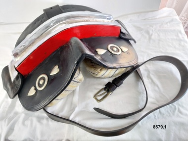
Equipment - Show Harness, R. Mitchell, Saddler, Early to mid-20th century
The early settlers of Victoria depended on horse drawn vehicles to farm, make roads and railways, deliver produce and transport people. Horse harnesses were an important requisite for all drivers and could be found wherever there were working horses. Horse Harnesses have played an essential role in different cultures throughout history. Simple, utilitarian horse harnesses made of leather straps and iron rings were being used in early China before AD 500 as well as ancient Greece and Rome, allowing horses to pull chariots and ploughs. The Greeks and Romans were the first to use a "horse collar" which distributed the weight of the harness evenly across the horse's chest rather than relying on a "throat harness" that could damage a horse's throat or choke them. During the medieval period, European horse harnesses became more elaborate and decorative. Variations of different horse harnesses were also found in Native American and Middle Eastern cultures. Horse Harnesses usually have four basic components which include - 1. Communication - the bridle, bit and reins allows the driver to communicate instructions and commands to the horse, guiding its movement and direction. 2. Draft - the collar, hame straps, hames, traces and chains enables the horse to draw and pull the load efficiently by distributing the weight and transferring the pulling force to the vehicle. 3. Stopping - the breeching band, pole straps and breast strap helps to control or stabilise the horse and vehicle when moving downhill or stopping. 4. Support - the back pad, backband, belly band and back saddle keep the harness in the correct position and proper alignment. This show harness was used by Mr. Andy Bourke when showing his Clydesdales at shows or demonstrations. Although a more modern example with decorative embellishments, it still has many essential components traditionally found in an everyday working horse harness. The original purpose of the "housen" for example, was to run rain or drizzle off the horse's neck when they had to work in wet conditions - it was laid flat for this purpose on the top of the collar. Nowadays it is purely for show and is often used to advertise a business or stud. Horse brasses and fly terrets were fastened to various parts of a horse's harness. In the early days they probably began as amulets to ward off evil and to bring good luck and continued to be used as a festive decoration. The heyday of horse brasses was between the years 1851 and 1900. Horse brasses are fastened to various parts of the harness with many of their designs being symbolic. The ornamentation on this harness (although not authentic horse brasses) are based on the horse brasses that were popular in the 19th century. This horse harness is a significant example of the equipment that was needed wherever heavy horses were being used - particularly in the early years of Victoria's settlement by white settlers. Harnesses such as this example were used with stage coaches, drays, farming equipment, delivery carts and personal transportation.A leather and metal horse harness used when showing a Clydesdale (or other breed of heavy horse). It is made up of a number of components. 1. Decorative leather cart saddle with two large cloth pads underneath (which have a scalloped leather and stud border), a raised leather pommel and a silver and red coloured metal back strap holder across the top. It has two symmetrical sets of ornamentation (silver hearts and circles) in the front and a wide strap or girth (with a maker's stamp reading "R. Mitchell Saddler") and buckle which attaches the saddle to the horse. 2. Pair of steel hames which are gently curved (to fit on a horse collar) and are topped with steel knobs. They have several steel rings and lugs (to hold straps and chains) and a "Made in England Warranted Steel" stamp. 3. Breeching harness which consists of a number of leather straps, chains and metal rings including a wide padded leather strap with a scalloped edge that sits on the back of the horse and a thick leather strap that goes around the hind quarters of a horse which is joined to the back strap with four shorter vertical straps and buckles. These straps feature silver and red patent leather trim and silver heart shaped ornamentation. The strap also features the maker's stamp of "R. Mitchell". 4. Decorative leather bridle with blinkers featuring the same silver and red patent leather trim on the cheek piece, brow band and throatlatch. It has a stainless steel "Liverpool Driving Bit" with a curb chain, a variety of decorative silver ornaments (rosettes, diamonds plus a heart and two circles) on each end of the forehead band, dropper and strap as well as a silver metal bell (sometimes known as a "fly terret" or "swinger") that sits on the headpiece of the bridle. 5. Leather "violin shaped" dropper (or hanger) with two silver rosette shaped ornaments and a stainless steel clip on the top 6. Stainless steel "Liverpool Driving Bit" with a straight mouthpiece which is ribbed on one side. It has three rein spots (spaces) and a curb chain. 7. Leather arch shaped "Housen" covered in black and red patent leather and decorated with silver studs (some spelling out F H) and bordered with a red fringe. It has a leather strap at the back and two leather loops on the front. 8. Leather padded backband (Australian style "Stallion Draught Roller") decorated with two groups of nine metal "horse brasses" or harness ornaments displaying horseshoe, starburst and horse head designs on blue, red and white striped webbing. The backband has three notched straps at each end, a buckle near the centre and the initial B stamped in two places underneath. 9. Bellyband made of leather and red, white and blue striped webbing. It has a set of three buckles at each end (which correspond with the notched straps of the backband). 10. Wide, thick leather strap which has a buckle and notches at each end. It also has the maker's stamp of "R. Mitchell Saddler". 11.One pair of long leather traces - each with a buckle and notched loop at one end, decorated with a small silver diamond shaped harness ornament. 12. Length of stainless steel heavy duty chain with two swivel connectors.Saddle - "R.MITCHELL / SADDLER" Hames - "MADE IN ENGLAND / WARRANTED / STEEL" "MADE IN ENGLAND / WARRANTED / unclear" Breeching Straps - "R. MITCHELL / MAKER / R. MITCHELL MAKER" Housen - "F H" Backband "B / B' Wide leather strap - "R. MITCHELL / SADDLER"flagstaff hill maritime museum and village, warrnambool, great ocean road, shipwreck coast, harness, horse harness, show harness, clydesdale horses, andy bourke, horse drawn cart, housen, bridle, hames, breeching straps, dropper, bit, liverpool bit, backband, harness ornamentation, bellyband, back saddle, fly terret -
 Flagstaff Hill Maritime Museum and Village
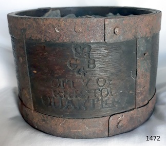
Functional object - Dry Measurement Container, Late 18th to early 19th century (before the standardised measurement was introduced in England in 1824)
The peck has been in use since the early 14th century when it was introduced as a measure for flour. The term referred to varying quantities until the modern units of measurement were defined in the 19th century. Cities in England used to have official standard weights and measures for that city or area. These containers were marked with the city's name and emblem, merchant’s weights and measures would then be checked against this to make sure they weren't trying to cheat their customers. The item in the collection is a standard measure approved by Bristol City and used by that City’s grocers to measure dry goods such as peas, beans, sugar, flour, meal etc., and its metal banding ensures that the measure cannot be reduced in size to cheat customers. Additional Information: The British Imperial System evolved from the thousands of Roman, Celtic, Anglo-Saxon, and customary local units employed in the middle Ages. Traditional names such as pound, foot, and gallon were widely used, but the values so designated varied with time, place, trade, product specifications, and dozens of other requirements. Early royal standards were established to enforce uniformity took the name Winchester, after the ancient tenth century capital of Britain. King Henry VII reaffirmed the customary Winchester standards for capacity and length and distributed royal standards throughout the realm. This process was repeated about a century later in the reign of Queen Elizabeth I. In the 16th century, the rod (5.5 yards, or 16.5 feet) was defined (once again as a learning device and not as a standard) defined by the length of the left feet of 16 men lined up heel to toe as they emerged from the church. By the 17th century usage and legal statute had established the acre, rod, and furlong at their present values together with other historic units such as the peck. Establishment of the System: The Weights and Measures Act of 1824 and the Act of 1878 established the British Imperial System based on precise definitions of selected existing units. The 1824 act sanctioned a single imperial gallon to replace the wine, ale, and corn (wheat) gallons that were in general use. The new gallon was defined as equal in volume to 10 pounds avoirdupois of distilled water weighed at 62°F with the barometer at 30 inches, or 277.274 cubic inches (later corrected to 277.421 cubic inches). The two new basic standard units were the imperial standard yard and the troy pound, which was later restricted to weighing drugs, precious metals, and jewels. In 1963 an act of parliament abolished archaic measures as the rod and chaldron and a metric system was adopted. An early example of a dry measuring container giving a snapshot of how imperial weights and measures developed in England to evolve the British measurement system into the metric arrangement that most countries have adopted today including Australia. It has social significance as an item that was in everyday use by grocers and other merchants to measure dry goods in the late 18th to early 19th centuries and used specifically in the Bristol region of England as an officially recognised measurement.Wooden measurement container with iron banding and hand made rivets container is a Quarter Peck official measurement container. Inscriptions are impressed into the sides of the wooden body. The container has the official crown and emblem of the City of Bristol, indicating this item was the Bristol City standard quarter peck measurement.Impressed into the timber on the front, a crown emblem over "C B G / CITY OF BRISTOL / QUARTER", on one side "HALF" , another side "PECK". Handwritten in white chalk on the base is "1458"flagstaff hill, warrnambool, shipwrecked-coast, flagstaff-hill-maritime-museum, flagstaff-hill-maritime-village, weights and measures, quarter peck, measurement container, dry grocery measure, bristol city measurement standard, city of bristol, british weights and measures, 18th and 19th centure standard measures -
 Flagstaff Hill Maritime Museum and Village
Domestic object - Spoon, William Page & Co, Circa 1853-1878
This spoon, made by William Page & Co., is electroplated nickel-silver and was recovered during the late 1960s to early 1970s from an unnamed shipwreck along the coast of Victoria. The shipwrecks in the area range from around the 1840s to the early 1930s. The spoon is part of the John Chance Collection. This spoon is likely to have been recovered be from the wreck of the Loch Ard (1873-1878) as other cutlery in the Flagstaff Hill’s Shipwreck Collection made by William Page was also recovered from the Loch Ard. The ship’s Manifest included a large quantity of cutlery. Also, other objects in the John Chance Collection were also recovered from wreck of the Loch Ard. In the mid-1800s electroplated cutlery became a popular substitute for the traditional but more costly sterling silver pieces. The ‘new’ cutlery was made from a more common base metal, such as nickel or a nickel alloy, then electroplated (coated) with a very thin layer of silver. The eating utensils looked like the expensive, pure silver version but eventually, through use and wear, the base metal would show. Some producers warranted their electroplated silver to be ‘white throughout’. WILLIAM PAGE & CO., BIRMINGHAM, ENGLAND - Although the electroplated cutlery of William Page & Co. was made in Birmingham, it does not include the embossed Birmingham Assay’s mark of an ‘anchor’ because the metal used for the spoons is not silver. William Page used various Maker’s Marks on his cutlery. The pattern of five embossed marks on this spoon is a typical example, with the embossed sunken crown containing ‘W P’ being the first in the column of symbols. - ‘W P’, within raised diamond outline, within sunken crown - ‘Cross above Triangle’ symbol within sunken oval - ‘Maltese Cross’ symbol within sunken, six-sided shape - ‘crab-like’ symbol within sunken oval - ‘R D’ within sunken diamond William Page established his business in 1834, according to the text around a printed Trademark. The firm William Page & Co. began electroplating in 1855, and from 1880 it operated from Cranemore Street, Cattle’s Grove and also at 55 Albion St, Birmingham. The firm registered a new Trademark [‘W P’ within a diamond boarder within a sunken diamond] in 1897; previously the Mark were the initials WP within a crown, but the British legislation prohibited the use of a ‘crown’ mark on electroplated ware in 1895. In 1936 the firm became William Page & Co. Ltd and became a supplier of spoons to the British Government in 1938, marking its products with the ‘broad arrow’ symbol. The firm also traded with the brand names Armour, Asrista, Bolivian Silver, Roman Silver, Roumanian Silver, Silverite and Trevor Plate. Although this spoon is not linked to a particular shipwreck, it is very likely to have come from the wreck of the Loch Ard; the ship’s Manifest includes a large quantity of cutlery. Regardless, it is recognised as being historically significant as an example of cutlery carried onboard a ship as either personal belongings or cargo and brought into Colonial Victoria in the 19th to early 20th century; through this we have added opportunity to interpret Victoria’s social and historical themes of those times. The spoon also has significance for its connection with many similar William Page pieces of cutlery in our collection that were recovered from the wreck of the sailing ship Loch Ard (1873-1878). William Page & Co. of Birmingham is one of the renowned 19th century manufacturers and electroplaters and was supplier of spoons to the British Government in 1938. The spoon has added significance, as it was recovered by John Chance, a diver of wrecks, including the Loch Ard, in Victoria’s coastal waters in the late 1960s to early 1970s. Items that come from several wrecks have since been donated to the Flagstaff Hill Maritime Village’s museum collection by his family, illustrating this item’s level of historical value.Spoon; teaspoon, electroplate nickel-silver, discoloured to green and red-brown in places. Fiddle design. Bowl has indents and holes. Five embossed Maker’s Marks on back of handle, arranged in a column from tip towards bowl. Made by William Page and Co., Birmingham. The spoon no longer has its silver plating. The surface has encrustations. Bowl has nicks, indents and holes. Stem is very bent at the shoulder. Discoloured to green and red-brown in places. Embossed Maker Marks - ‘W P’, within raised diamond outline, within sunken crown - ‘Cross above Triangle’ symbol within sunken oval - ‘Maltese Cross’ symbol within sunken, six-sided shape - ‘crab-like’ symbol within sunken oval - ‘R D’ within sunken diamondflagstaff hill maritime museum, maritime museum, shipwreck coast, flagstaff hill maritime village, great ocean road, shipwreck artefact, john chance, loch ard, cutlery, flatware, silverware, tableware, eating utensils, dining, spoon, electroplated cutlery, william page & co, william page & co. ltd., birmingham plate, silversmith, antique, vintage, fiddle design, fiddle pattern, teaspoon -
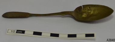 Flagstaff Hill Maritime Museum and Village
Domestic object - Spoon, William Page & Co, Circa 1853-1878
This spoon, made by William Page & Co., is electroplated nickel-silver and was recovered during the late 1960s to early 1970s from an unnamed shipwreck along the coast of Victoria. The shipwrecks in the area range from around the 1840s to the early 1930s. The spoon is part of the John Chance Collection. This spoon is likely to have been recovered be from the wreck of the Loch Ard (1873-1878) as other cutlery in the Flagstaff Hill’s Shipwreck Collection made by William Page was also recovered from the Loch Ard. The ship’s Manifest included a large quantity of cutlery. Also, other objects in the John Chance Collection were also recovered from wreck of the Loch Ard. In the mid-1800s electroplated cutlery became a popular substitute for the traditional but more costly sterling silver pieces. The ‘new’ cutlery was made from a more common base metal, such as nickel or a nickel alloy, then electroplated (coated) with a very thin layer of silver. The eating utensils looked like the expensive, pure silver version but eventually, through use and wear, the base metal would show. Some producers warranted their electroplated silver to be ‘white throughout’. WILLIAM PAGE & CO., BIRMINGHAM, ENGLAND - Although the electroplated cutlery of William Page & Co. was made in Birmingham, it does not include the embossed Birmingham Assay’s mark of an ‘anchor’ because the metal used for the spoons is not silver. William Page used various Maker’s Marks on his cutlery. The pattern of five embossed marks on this spoon is a typical example, with the embossed sunken crown containing ‘W P’ being the first in the column of symbols. - ‘W P’, within raised diamond outline, within sunken crown - ‘Cross above Triangle’ symbol within sunken oval - ‘Maltese Cross’ symbol within sunken, six-sided shape - ‘crab-like’ symbol within sunken oval - ‘R D’ within sunken diamond William Page established his business in 1834, according to the text around a printed Trademark. The firm William Page & Co. began electroplating in 1855, and from 1880 it operated from Cranemore Street, Cattle’s Grove and also at 55 Albion St, Birmingham. The firm registered a new Trademark [‘W P’ within a diamond boarder within a sunken diamond] in 1897; previously the Mark were the initials WP within a crown, but the British legislation prohibited the use of a ‘crown’ mark on electroplated ware in 1895. In 1936 the firm became William Page & Co. Ltd and became a supplier of spoons to the British Government in 1938, marking its products with the ‘broad arrow’ symbol. The firm also traded with the brand names Armour, Asrista, Bolivian Silver, Roman Silver, Roumanian Silver, Silverite and Trevor Plate. Although this spoon is not linked to a particular shipwreck, it is very likely to have come from the wreck of the Loch Ard; the ship’s Manifest includes a large quantity of cutlery. Regardless, it is recognised as being historically significant as an example of cutlery carried onboard a ship as either personal belongings or cargo and brought into Colonial Victoria in the 19th to early 20th century; through this we have added opportunity to interpret Victoria’s social and historical themes of those times. The spoon also has significance for its connection with many similar William Page pieces of cutlery in our collection that were recovered from the wreck of the sailing ship Loch Ard (1873-1878). William Page & Co. of Birmingham is one of the renowned 19th century manufacturers and electroplaters and was supplier of spoons to the British Government in 1938. The spoon has added significance, as it was recovered by John Chance, a diver of wrecks, including the Loch Ard, in Victoria’s coastal waters in the late 1960s to early 1970s. Items that come from several wrecks have since been donated to the Flagstaff Hill Maritime Village’s museum collection by his family, illustrating this item’s level of historical value.Spoon; teaspoon, electroplate nickel-silver, silver discoloured to brown. Fiddle design. Five embossed Hallmarks. Five embossed Maker’s Marks on back of handle, arranged in a column from tip towards bowl. Made by William Page and Co., Birmingham. The spoon no longer has its silver plating. Bowl has a cut in the side, and is nicked and dented. Embossed Maker Marks - ‘W P’, within raised diamond outline, within sunken crown - ‘Cross above Triangle’ symbol within sunken oval - ‘Maltese Cross’ symbol within sunken, six-sided shape - ‘crab-like’ symbol within sunken oval - ‘R D’ within sunken diamondflagstaff hill maritime museum, maritime museum, shipwreck coast, flagstaff hill maritime village, great ocean road, shipwreck artefact, john chance, loch ard, cutlery, flatware, silverware, tableware, eating utensils, dining, spoon, electroplated cutlery, william page & co, william page & co. ltd., birmingham plate, silversmith, antique, vintage, fiddle design, fiddle pattern, teaspoon -
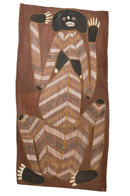 Federation University Art Collection
Painting - Natural pigment on bark, Mawurndjul, John, 'Female Wayarra Spirit' by John Mawurndjul, 1995
Balang [John MAWURNDJUL] (1952 - ) Born Mumeka, Northern Territory Country: Milmilngkan, West Arnham Land, Northern Territory Clan: Na-Kurulk Language Group: Kunwinjku Location: Milmilngkan John Mawurndjul is an Australian indigenous artist. He is a member of the Kuninjku people of West Arnhem Land, Northern Territory. Growing up John had only occasional contact with non-indigenous people and culture. He was tutored in rarrk, a traditional painting technique using fine cross hatching and infill, working on small barks. During the 1980s he started producing larger and more complex works. The artist has painted 'Wayarra', a generic term which can include both malevolent spirit beings which continually inhabit certain sites or objects but can also mean the Spirit of a recently deceased person. These spirits are one of two spirits of the dead, the other being the 'Kun-malng' soul. The 'Wayarra' is the shadow or 'shade' of the dead and may take on the form of the deceased and haunt areas where the deceased recently inhabited. In order to prevent Wayarra spirits from harassing relative of the recently deceased, a smoking ceremont is performed where Ironwood leaves are burnt around the camp of the recently deceased and ochre is rubbed on all objects belonging to the deceased. Ochre may also be rubbed on vehicles, houses and trees. Some Wayarra are a particular Dreaming totem for people of certain clans. This is why many artists depict Wayarra in their bark paintings and sculptures. They are depicting clan totems particular to their lineage and which are celebrated in major regional patrimoiety ceremonies. In 1989 the work of John Mawurndjul was included in the landmark exhibition "Magiciens de la Terra' at the Centre Pompidou and Grande Halle de la Vilette in Paris, France. His works have also been exhibited in numerous solo and group exhibitions in Australia, New York, Paris and Japan. Mawurndjul is one of eight artists whose work in part of the largest inernational commission of contemporary Indigenous art from Australia at the Musee du Quai Branly, Paris. The work was exhibited in the Australian survey "John Mawurndjul: I Am The Old And The New", at the Museum of Contemporary Art, one of the 160-odd works all chosen by Mawurndjul for inclusion in the exhibition. This item is part of the Federation University Art Collection. The Art Collection features over 1000 works and was listed as a 'Ballarat Treasure' in 2007.This artwork was chosen by John Murwurndjul as on of around 160 works for exhibition in the 2018 Australian Survey of his work at the Museum of Contemporary Art. The artist is known for his rarrk work, which is evident in 'Female Wayarra Spirit'.Aboriginal bark painting featurung rarrk. The artwork is associated with Dilebang, a duwa moiety place that belongs to the Kurulk clan. This work is currently on loan for exhibition in 'John Mawurndjul: I am the old and the new'. The exhibition will be shown at the Museum of Contemporary Art Australia (Sydney) from 6 July – 23 September 2018, and the Art Gallery of South Australia, Adelaide from 26 October 2018 – 28 January 2019.art, artwork, john mawurndjul, aboriginal, bark painting, rarrk, wayarra, kuninjku, maningrida, loan -
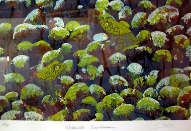 Federation University Art Collection
Work on paper - Printmaking - Silkscreen, Lin Onus, 'Walawala Garrkman' by Lin Onus, 2001
Lin ONUS (1948-1996) Language: Wiradjuri / Yorta Yorta Lin Onus played a pivotal role in the recognition of Aboriginal art as an expression of a contemporary and dynamic living culture. Prior to his premature death at just 47 years of age he was a prominent, strident, yet non-confrontational agent in renegotiating the history of colonial and Aboriginal Australia. His father, Bill Onus, was the founder of the Aboriginal Advancement League in Victoria and a prominent maker of artefacts in Melbourne. As a young Koori growing up, Lin lived in a cultural environment that included exposure to visiting Aboriginal artists, including Albert Namatjira. He began his artistic life assisting his father in decorating artifacts, went on to develop skills working with metal and painting with air brush as a panel beater; and by 1974 he was painting watercolors and photo-realist landscapes. In the 1970's he completed a set of paintings on the first Aboriginal guerrilla fighter Mosquito, which holds pride of place on the walls of the Advancement League in Melbourne, to this day. Lin Onus was a largely self-taught artist. Particularly important in his development was his visits to Garmedi (Arnhem Land) starting in 1986. Jack Wunuwun, the Yolngu artist, introduced him into the Murrungun-Djinang clan and gave him permission to use some of traditional images in his paintings. His cultural education on the Aboriginal side was also provided by visits to Cummeragunja with his father, and stories told by his uncle Aaron Briggs, known as 'the old man of the forest' who gave him his Koori name - Burrinja, meaning 'star'. They would sit on the banks of the Murray River within view of the Barmah Forest, Lin's spiritual home, the subject of many of his later paintings and his final resting place. Lin's father had been of the Yorta Yorta people from the Barmah Forest country, and Lin also used images from this area in his paintings. The images in his works include haunting photorealist portrayals of the Barmah red gum forests of his father's ancestral country, and the use of rarrk cross-hatching-based based painting style that he learned (and was given permission to use when in Arnhemland). His painting Barmah Forest won Canberra's national Aboriginal Heritage Award in 1994. (http://www.cooeeart.com.au/aboriginal_artist/lin_onus/A, accessed 18 May 2015) This item is part of the Federation University Art Collection. The Art Collection features over 1000 works and was listed as a 'Ballarat Treasure' in 2007.Framed limited edition silkscreen.Signed 'Onus' lower right (posthumously by Tiriki Onus) Edition 68/80art, artwork, lin onus, onus, printmaking, screenprint, aboriginal, dreaming, frogs, available -
 Eltham District Historical Society Inc
Document - Folder, Jim Connor et al, Eltham Gateway, 1987
The Eltham Gateway Group (EGG) was established about 1987 by some Eltham residents concerned for the development of the Eltham Gateway, defined as that historically and environmentally sensitive region of land along Main Road, Eltham extending from the roundabout at Fitzsimons Lane to Dudley Street, Eltham. The gateway was a unique urban area with a strong sense of character that provided a distinctive entrance to the Eltham Town Centre. The intention of this group was to support development that preserved both the natural and historic features of the gateway region. It encouraged development sympathetic to Eltham’s traditional association with the arts and natural environment. The group was initiated in response to a planning application in December 1986 to redevelop the then Mobil service station site at 729 Main Road, Eltham on the corner of Brougham Street. This group worked with and encouraged the Eltham Shire Council to consider rezoning to protect the gateway area. A detailed Eltham Gateway Study undertaken by Tract Consultants assisted with the establishment of the Eltham Gateway Zone, the Eltham Gateway Policy and the Eltham Gateway Design and Siting Guidelines. The State Government subsequently agreed to a planning amendment to rezone the land from a Residential Zone C to an Eltham Gateway Zone under the Eltham Planning Scheme. While zoning changes over the years have altered the mix of permitted uses within this area the Eltham Gateway still looks and feels like a predominately residential style precinct, even where non-residential type uses operate. EGG was followed by the establishment of the Eltham Protection Society in about 1989 to respond to community planning issues beyond the area of the Eltham Gateway and in effect took over the role from the EGG. Jim Connor President Eltham District Historical Society 4 July 2022 During 1986/87 I was a community member on the Shire of Eltham’s Community Consultative Committee involved with the Eltham Gateway Study, which led to the establishment of the original Eltham Gateway Zone, under the then Eltham Planning Scheme The Eltham Gateway Group was the pioneer community action group dedicated to protecting the character of the Eltham Gateway. It was succeeded by the Eltham Protection Society. When the Shire of Eltham Offices were demolished by the unelected Commissioners of Nillumbik Shire Council in July/August 1996, significant community upset and protest led to the establishement of the Eltham Gateway Action Group (EGAG) which in present day form has evolved into the Eltham Community Action Group (ECAG) focussing on issues throughout Eltham and not just the Eltham Gatewayeltham community action group, eltham gateway, eltham gateway action group, eltham gateway design and siting guidelines, eltham gateway group (egg), eltham gateway policy, eltham gateway study, eltham gateway zone, eltham planning scheme, eltham protection society, jim connor, michael wilson, rodger dalling, tony mcmanus -
 Bendigo Historical Society Inc.
Document - PETER ELLIS COLLECTION: NEWSPAPER ARTICLE, 23rd May, 2015
Colour photocopy of article from Bendigo Advertiser. Dated Saturday, May 23, 2015. FAREWELL, MA.. When Peter received his Order of Australia Medal it was one of his proudest moments. He couldn’t resist wearing it on every occasion. FROM - PREVIOUS PAGE The Emu Creek Bush Band has performed at National Folk Festivals in four states and numerous times at the National Folk Festival in Canberra. They have also been mainstays of the Maldon Folk Festival for most of its history as well as doing dance programs for the Port Fairy Folk Festival on two occasions. Peter wrote and published many books related to traditional music and dance. These include: Three volumes of 'Collector's Choice' which is musical notations for bush dances coupled with much dance history which would have been lost without Peter's efforts, are 'Two Hundred Dancing Years- How to run a Colonial Ball' (Co-authored with Shirley Andrews (AM), 'Music Makes Me Smile- The Music of the Nariel Valley' (Co-authored with Harry Gardner), and his last completed book is titled 'The Merry Country Dance' with over 300 pages.. .. .. Grant. The first edition sold out in only a few weeks. Peter taught old time musicianship, accomplished as he was on the concertina and button accordion, tin whistle, and harmonica, as well as the Swanee whistle, piano and ukulele. In demand for workshops in music and dance at National Folk Festivals in Perth, Alice Springs, Maleny, Melbourne, Adelaide, Kuranda and more recently at several Canberra National Folk Festivals, he was a hit at festivals across the country. As a trained ballroom dancer, with many gold medals to his name, Peter passed on his knowledge every time he trained debutante sets in the Bendigo region. As an early environmentalist, he was a life member of the Bendigo Field Naturalists Club, secretary in the 1970's and actively involved in campaigns to save Lake Pedder and establish the Whipstick and Kamarooka State Parks (now part of the Bendigo National Park). He has discovered and named new plant species in the Whipstick Forest and propagated many Australian plants. Peter took regular guided tours through the Whipstick each spring, on wildflower educational tours. He was a keen and gifted photographer of local plant species. When Peter received his Order of Australia Medal it was one of his proudest moments. He couldn’t resist wearing it on every occasion. Funeral details. Family, friends and his supporters will farewell Peter.. .. .. ..person, individual, peter ellis oam -
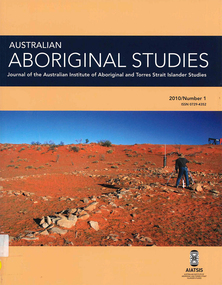 Victorian Aboriginal Corporation for Languages
Periodical, Australian Institute of Aboriginal and Torres Strait Islander Studies, Australian Aboriginal studies : journal of the Australian Institute of Aboriginal and Torres Strait Islander Studies, 2010
Mediating conflict in the age of Native Title Peter Sutton (The University of Adelaide and South Australian Museum) Mediators have played roles in managing conflict in Aboriginal societies for a long time. This paper discusses some of the similarities and differences between older customary mediator roles and those of the modern Native Title process. Determinants of tribunal outcomes for Indigenous footballers Neil Brewer, Carla Welsh and Jenny Williams (School of Psychology, Flinders University) This paper reports on a study that examined whether football tribunal members? judgments concerning players? alleged misdemeanours on the sporting field are likely to be shaped by extra-evidential factors that disadvantage players from Indigenous backgrounds. Indigenous and non-Indigenous Australian Football League (AFL) players, matched in terms of their typical levels of confidence and demeanour in public situations, were interrogated in a mock tribunal hearing about a hypothetical incident on the football field. The specific aim was to determine if the pressures of such questioning elicited behavioural differences likely to be interpreted as indicative of testimonial unreliability. Mock tribunal members (number = 103) then made judgments about the degree to which a number of behavioural characteristics were evident in the players? testimonies. Under intense interrogation, Indigenous players were judged as presenting less confidently and displaying a greater degree of gaze aversion than non-Indigenous players. These behavioural characteristics are commonly ? and inappropriately ? used as cues or heuristics to infer testimonial accuracy. The paper discusses the implications for Indigenous players appearing at tribunal hearings ? and for the justice system more broadly. Timothy Korkanoon: A child artist at the Merri Creek Baptist Aboriginal School, Melbourne, Victoria, 1846?47 ? a new interpretation of his life and work Ian D Clark (School of Business, University of Ballarat) This paper is concerned with the Coranderrk Aboriginal artist Timothy Korkanoon. Research has uncovered more about his life before he settled at the Coranderrk station in 1863. Evidence is provided that five sketches acquired by George Augustus Robinson, the former Chief Protector of Aborigines, in November 1851 in Melbourne, and found in his papers in the State Library of New South Wales, may also be attributed to the work of the young Korkanoon when he was a student at the Merri Creek Baptist Aboriginal School from 1846 to 1847. Developing a database for Australian Indigenous kinship terminology: The AustKin project Laurent Dousset (CREDO, and CNRS, Ecole des Hautes Etudes en Sciences Sociales), Rachel Hendery (The Australian National University), Claire Bowern (Yale University), Harold Koch (The Australian National University) and Patrick McConvell (The Australian National University) In order to make Australian Indigenous kinship vocabulary from hundreds of sources comparable, searchable and accessible for research and community purposes, we have developed a database that collates these resources. The creation of such a database brings with it technical, theoretical and practical challenges, some of which also apply to other research projects that collect and compare large amounts of Australian language data, and some of which apply to any database project in the humanities or social sciences. Our project has sought to overcome these challenges by adopting a modular, object-oriented, incremental programming approach, by keeping metadata, data and analysis sharply distinguished, and through ongoing consultation between programmers, linguists and communities. In this paper we report on the challenges and solutions we have come across and the lessons that can be drawn from our experience for other social science database projects, particularly in Australia. A time for change? Indigenous heritage values and management practice in the Coorong and Lower Murray Lakes region, South Australia Lynley A Wallis (Aboriginal Environments Research Centre, The University of Queensland) and Alice C Gorman (Department of Archaeology, Flinders University) The Coorong and Lower Murray Lakes in South Australia have long been recognised under the Ramsar Convention for their natural heritage values. Less well known is the fact that this area also has high social and cultural values, encompassing the traditional lands and waters (ruwe) of the Ngarrindjeri Nation. This unique ecosystem is currently teetering on the verge of collapse, a situation arguably brought about by prolonged drought after decades of unsustainable management practices. While at the federal level there have been moves to better integrate typically disparate ?cultural? and ?natural? heritage management regimes ? thereby supporting Indigenous groups in their attempts to gain a greater voice in how their traditional country is managed ? the distance has not yet been bridged in the Coorong. Here, current management planning continues to emphasise natural heritage values, with limited practical integration of cultural values or Ngarrindjeri viewpoints. As the future of the Coorong and Lower Murray Lakes is being debated, we suggest decision makers would do well to look to the Ngarrindjeri for guidance on the integration of natural and cultural values in management regimes as a vital step towards securing the long-term ecological viability of this iconic part of Australia. Hearts and minds: Evolving understandings of chronic cardiovascular disease in Aboriginal and Torres Strait Islander populations Ernest Hunter (Queensland Health and James Cook University) Using the experience and reflections of a non-Indigenous clinician and researcher, Randolph Spargo, who has worked in remote Aboriginal Australia for more than 40 years, this paper tracks how those at the clinical coal-face thought and responded as cardiovascular and other chronic diseases emerged as new health concerns in the 1970s to become major contributors to the burden of excess ill health across Indigenous Australia. The paper cites research evidence that informed prevailing paradigms drawing primarily on work in which the clinician participated, which was undertaken in the remote Kimberley region in the north of Western Australia. Two reports, one relating to the Narcoonie quarry in the Strzelecki Desert and the other concerning problematic alcohol use in urban settings.maps, b&w photographs, colour photographs, tablesstrzelecki desert, native title, timothy korkanoon, merri creek baptist aboriginal school, austkin project, coorong, lower murray lakes district, south australia, indigenous health -
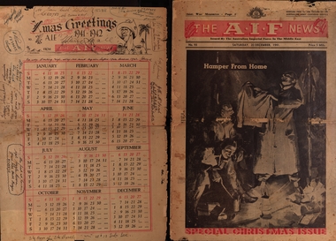 Federation University Historical Collection
Newspaper - Twenty page issue December 1941 No. 93, Societe Orientale de Publicite, The A.I.F. News Special Christmas Issue 1941, December 1941
The A.I.F.= The Australian Imperial Force and this newspaper was supplied free to the troops of the Australian Army Canteens Service. This issue is dated Saturday 22nd December 1941. It includes advertisments for businesses in Cairo and Alexandria; Egypt, Palestine and Syria. Page 2 includes a poem titled "This Holy Night" by Pte C.M. Walker; two sonnets by Rupert Brooke; a poem, "Waiting Dreams" by Pilot Officer J.A. Henderson RAAF and a poem by Lieut. David McNicoll AIF Abroad Air Mail - Palestine. Page 3 includes a message from General Sir Thomas Blamey, an article on the part women would increasingly play as a consequence of the emergency war policy; an advertisment for tobacco specially packed for overseas forces. Page 4 includes an article on Australian coastal cities being ready for raids. Page 5 includes an article about the Commonwealth of the Philippines and their defense which until 1946 lay with America. General D Macarthur was the Commander In Chief in the Philippines. Germany's "secret Weapon" legend. Page 6 includes "Dancing Dan's Christmas"; "Bluey and Curley" comic strip. Page 7 includes article "Rommel's Armoured Might Lies Strewn Over Libyan Sands" Page 8 includes an article: "All In Fun" - a revue - has begun a tour of Australian camps in Palestine and Syria. Page 9 includes articles "War Will Revolutionise Air Services In Australia"; a list - Greek Awards To AIF Officers and a cartoon by George Aria titled 'Jonah '. Pages 10&11 "Christmas 1941" - messages from prominent people: Mr Winston Churchill; The Govenor General (Lord Gorrie); The Prime Minister (Mr Curtin); Mininster for the Army (Mr Forde). Also photos of army operations and traditional family Christmas time. Page 12 &13 Articles regarding sport under the heading 'Australian Sporting Digest'. Page 14 A story - "The Gift of the Magi" - an O Henry Christmas Story. Also a greeting from Myer's of Melbourne and Adelaide to all Myer Men in the AIF Page 15 An article where General Blamey reassures Australia about its capability of defence. Page 16 A description of a battle by Australian sloop "Parramatta" with HMAS "Auckland" against enemy planes whilst they were escorting a merchant ship with a cargo of petrol during the Battle of Tobruk Page 17 & 18 Pages under the title 'ACK-I-FOOFS' (Articles submitted by soldiers: The real Rat of Tobruk - a rat trained by L/Cpl Jack Kneeshaw which he named "Goebbels"; poems and cartoons. Page 19 "Women of War" - photos of women at work filling in for men who have gone to war. Page 20 Xmas Greetings 1942-1942 - a 1942 Calendar signed by 14 members of the AIF, some with messages and including their Army Number. Twenty pages of news supplied free to the troops by the Australian Army Canteens Service.The last page is a calendar for 1942 with personal inscriptions and greetings of servicemen. Some inscriptions have I.D. Numbers ( VX35435 W. Johnston; QX20753 of Carmody ; VX40449 ; VX39637 N. Powell; VX32054 Blue Ernistson?; N?X23234 W.Cummins; VXthe a.i.f. news christmas edition 1941, australian imperial force, world war 2, australian army canteens service, general blamey, world war 2 - pacific war, world war 2 - phillipine islands, general d macarthur, emergency plans ww2 australia, secret weapons ww2, western desert ww2, australian imperial force - western desert ww2, civil aviation post ww2, air services australia, lord gowrie, governor general lord gowrie, prime minister john curtain, minister for the army - mr forde, cartoons 1941, women-in ww2, xmas greetings calendar 1941-1942, cairo 1941, palestine 1941, western desert 1941, advertisements 1941, middle east 1941 -
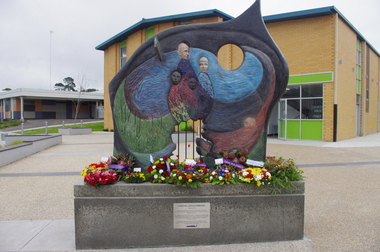 Federation University Historical Collection
Photograph - Photograph - Colour, Churchill Service Memorial, 2015, 2015
In recognition of its fallen soldiers and Churchill's 50th birthday a service memorial was erected on a concrete plinth at the Churchill town plaza and used for the first time to mark the ANZAC centenary on Anzac Day 2015. Churchill never had a war memorial and received a grant from the Department of Veterans' Affairs six years ago to commission a sculpture with Latrobe City Council's support. It was decided the sculpture needed to recognise more than just the war effort, but service and volunteerism, considering Churchill was only founded in 1965. (http://www.latrobevalleyexpress.com.au/story/2816903/churchills-new-memorial/, accessed 01 may 2015) Sculptor Paul Jesse discussed the work in Churchill and District Community news, 18 December 2014: Some time ago CDCA commissioned a sculpture to be used as a Service Memorial to commemorate the fallen that have died in service of our community and country. Traditional memorials usually commemorate Armed Services personnel, but CDCA was of the opinion that a more inclusive view which included Emergency Services personnel, such as CFA, SES and Police, could be incorporated into the Churchill Memorial. Boolarra artist, Paul Jesse, who is accomplished in Ferro-Cement sculpture techniques, was commissioned to create a memorial that would cause people to reflect on the meaning of ‘service’ and ‘sacrifice’. The following is a description of the Churchill Service Memorial Sculpture written by the sculptor, Paul Jesse. “My sculpture is different from most War Memorial sculptures because it uses as its basis the reasons why people go into service or to war. One side of the sculpture is colourful and optimistic; its theme is home, family, community and the future. These themes are crafted by flow lines which are connected to the other side of the sculpture through the round hole and the Crosspiece. These lines can be seen as a multi-layered connection between the sides. On the “dark” side of the sculpture, the lines begin with a spiral of coloured mosaics. This spiral is representative of our service people. Its beginning can be seen on one level as their soul. The spiralling mosaics of them flow to the other side of the sculpture where they create the landscape and figures. These lines can also be seen as a range of connectors between the two sides, representing a flow of thoughts, love, fear, concern and dreams. They also represent physical communication such as letters and phone calls.” This ‘Service Memorial’ is located in the Churchill Plaza (adjacent to the Town Hall), along with four flagpoles, seating and garden beds. The Churchill Service Memorial has deliberately been designed as a thought-provoking public art work. It will complement the Art and Culture Pathway which links Switchback Gallery at the Federation University Campus to the Town Centre. We hope Churchill citizens will pause to view the Memorial, ponder its meaning, reflect on the service of others and commemorate the fallen. Colour photograph on an abstract Australia-shaped sculpture by Boolarra artist Paul Jesse. The abstract Australia-shaped sculpture is in stark contrast to the bronze-cast "fallen mate" or concrete cenotaph seen in many country towns. The photograph includes wreaths from the ANZAC centenary service on ANZAC Day 2015. churchill, churchill war memorial, paul jessie, anzac centenary, federation university, gippsland, art and culture pathway, world war
