Showing 1736 items
matching colours
-
 Bendigo Historical Society Inc.
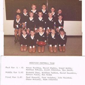
Photograph - GOLDEN SQUARE LAUREL STREET P.S. COLLECTION: PHOTOGRAPH MODIFIED FOOTBALL TEAM 1987
Coloured photograph of the 1987 Modified Football Team. Photo taken indoors and colours are not good. The boys are weraing dark jumpers with white cuffs and neck bands and dark blue shorts. The boy in the middle of the front row is holding a football. The names of the boys are:- Back Row (L - R) Aaron Bentley, David Styles, Nigel Wells, Matthew Atkins, Scott Ellerton, Ben Smith. Middle Row (L - R) Richard Chan, Matthew Talbot, David Saunders, Darren Hinck, Ben Rodda. Front Row (L - R) Paul Bennett, Kane Holahan, John Rainbow, Shaun Metcalf, Adam Ellerton.education, primary, golden square laurel st p.s., golden square laurel street p.s. collection - photograph modified football team 1987, aaron bentley, david styles, nigel wells, matthew atkins, scott ellerton, ben smith, richard chan, matthew talbot, david saunders, darren hinck, ben rodda, paul bennett, kane holahan, john rainbow, shaun metcalf, adam ellerton -
 Bendigo Historical Society Inc.
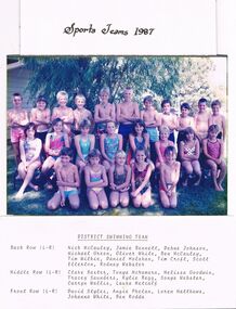
Photograph - GOLDEN SQUARE LAUREL STREET P.S. COLLECTION: PHOTOGRAPH DISTRICT SWIMMING TEAM 1987
Coloured photograph of the 1987 District Swimming Team. The children are dressed in swimsuits of various colours. Their names are:- Back Row (L - R) Nick McCauley, Jamie Bennett, Dehne Johnson, Michael Green, Oliver White, Ben McCauley, tim Wilkie, Daniel Holahan, Tim Croft, Scott Ellerton, Rodney Webster. Middle Row (L - R) Clare Baxter, Tonya McNamara, Melissa Goodwin, Tracey Saunders, Kylie Begg, Sonya Webster, Carryn Wallis, Laura Metcalf. Front Row (L - R) David Styles, Angie Phelan, Loren Matthews, Johanna White, Ben Rodda.education, primary, golden square laurel st p.s., golden square laurel street p.s. collection - photograph district swimming team 1987, nick mccauley, jamie bennett, dehne johnson, michael green, oliver white, ben mccauley, tim wilkie, daniel holahan, tim croft, scott ellerton, rodney webster, clare baxter, tonya mcnamara, melissa goodwin, tracey saunders, kylie begg, sonya webster, carryn wallis, laura metcalf, david styles, angie phelan, loren matthews, johanna white, ben rodda -
 Bendigo Historical Society Inc.
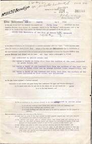
Document - MCCOLL, RANKIN AND STANISTREET COLLECTION: INDENTURE GOLD MINING LEASE CROWN LAND 11197 ALICE PEEL, 8th July 1945
6 page indenture document plus plan, between King George VI and Alice Peel Executrix of the Will of Edward Peel, deceased., dated 8th July, 1945. Lease number 11197, total area of 11 acres, 3 roods, 15 perches. Leases shown on plan: 1197, 1198, 11062, 10690, 11141, 11075. Cemetery reserve shown. Streets: Gladstone Street, Adam Street, Houston Street, Fletcher Street, Honeybone Street, Key on plan shows depths correlated to colours. On back of document history of ownership of lease shown - Deborah Gold Mines No Liability, dated 1946, and 1950.bendigo, mining, lease 11197 bendigo. edward peel, alice peel, edward pell, gladson, adam, huston fletcher and honeybone streets. -
 Dutch Australian Heritage Centre Victoria
Herring Cart (haringkarretje)
Souvenir, home made with jigsaw, celebrating Dutch national delicacy. These carts are seen in streets and markets throughout the Netherlands during herring season.Balsa wood model of a herring cart with 2 spoked wheels. Main body has two compartments covered with circular lids, surmounted by rack holding 3 herring barrels in the Dutch national colours of red ,white and blue. At top of rack a fish-shaped advertising salt and sour herrings. Main body also has a support at both ends and a handle for pushing the cart. At other end is preparation area with a hole for discarding fish waste into the bucket which is hanging below. A checked tea towel hangs off the preparation area. Next to the cart is white pot with a lid possibly for holding chopped onions. -
 Ballarat Tramway Museum
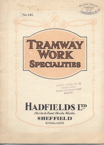
Book, Hadfield's, "Tramway Work Specialities", May. 2019
Yields information about the type and presentation of books or information folders that were sent to the Electric Supply Company of Victoria about tramway products available on the market and the company the produced them.20 page book with exposed stitching with cream card covers and 16 pages printed in two or more colours on semi gloss paper titled - "Tramway Work Specialities", published by Hadfield's Ltd of Sheffield England. Gives details of the various points crossings, track junctions, layouts, curved rail, car wheels and axles that Hadfield's produced. Each page imaged Publish May 1919, No. 141 Gives company address details. Has stamped on various pages, the Australian or Victorian agents details :"Horrocks, Roxburgh Pty Ltd, Sheffield House 517 - 519 Little Collins St. Melbourne"Stamp with words "Ballarat Tramway Preservation Society Catalogue No. 10" in ink on front cover - top right hand corner and stamp of "Horrocks, Roxburgh Pty Ltd, Sheffield House 517 - 519 Little Collins St. Melbourne" and on other pages within book.trams, tramways, trackwork, points, wheels -
 Kew Historical Society Inc
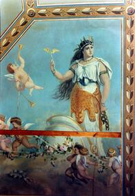
Photograph - Ceiling fresco, Ballroom, ‘Southesk’, Cotham Road, Stewart West, 1970
Colour enlargement of a photograph (slide) of Southesk (formerly Ordsall) in Cotham Road, Kew (demolished 1970).The ceilings of and architraves of Ordsall were painted by artists employed by the decorating company, Cullis Hill & Co. The frescos, of which fragments survive, were some of the most important murals used as elements of interior decoration in Melbourne during the Boom Period of the 1880s. These photographs were taken immediately prior to the demolition of the house, and are the best examples of the murals.The most significant decorative aspects of Southesk (formerly ‘Ordsall’) were the murals in the front two rooms. An article in the Melbourne Argus in 1882 records that Mr Vandenbrandt and Signor Rizzi created these under the supervision of Cullis Hill. This fresco from the ceiling of the ballroom is believed to depict ‘Africa’. The article records that: ‘Notwithstanding the large size of the drawings they are often marked by delicate touches, and a minuteness of detail in evident sympathy with nature. The figures have grace, life and animation and the skillful shading of the colours used — chiefly amber, gold, light blue, green, light fawn and brown – is in harmony with the quiet tone of the general furnishing of the rooms.’david carnegie, john halfey, southesk - cotham road - kew (vic), ordsall - cotham road - kew (vic) -
 Melbourne Tram Museum
Document - Report, C. N. Govett, A. E. Twentyman, "A story of the Melbourne Cable Tramway System - 11th November 1885 to 26th October 1940", 1973
Report - 230 approx. pages, photocopied from an original, loose sheets A4 sheets photocopied from an original manuscript by C. N. Govett and A. E. Twentyman - 1973. The front sheet has been signed by C. N. Govett. Has a table of contents, looks at the Engine Houses, cables in detail, route colours, grips, shunting, the various lines and how they operated, fares, annual reports, notes and fare collection. Has been scanned as a pdf into eight separate files - front cover photo and map have been added by Kevin Taig on his copy from which it was scanned.trams, tramways, cable trams, mmtb, grip tram, winding houses, operations -
 Melbourne Tram Museum
Newspaper, The Age, “No more tears, it's the trip of happiness”, 5/03/2019 12:00:00 AM
Newspaper clippings titled: “No more tears, it's the trip of happiness” Newspaper clipping from the Age 5/3/2019 Melbourne editor - Jewel Topsfield Dean Butler, creative lead at PTV's customer service division, has been lead designed of a new moquette to replace seat fabric on all trams, trains and buses in Victoria over the next 5 years. The moquette will come in 5 colours - blue for Metro trains, purple for v/Line trains, green for trams, and a darker colour being developed for buses. The fifth colour, bright orange will be used across the fleet for priority seating.trams, tramways, public transport, ptv, interiors, tramcars, railways -
 Flagstaff Hill Maritime Museum and Village
Craft - Ship Model, pre 1963
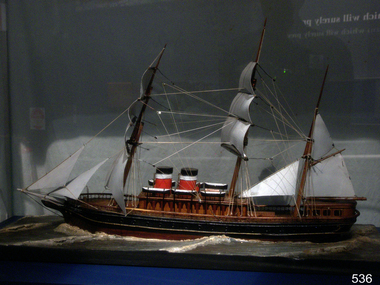
The funnel colours on the model indicate the ship it represents was one of the early ships of the Allan shipping Line designated as a Royal Mail Carrier. Funnel colours are used to identify a ship's owners while at sea from a distance by other vessels. The Allan Shipping Line was started in 1819, by Captain Alexander Allan of Saltcoats, Ayrshire, trading and transporting between Scotland and Montreal Canada, a route which quickly became synonymous with the Allan Line. By the 1830s the company had offices in Glasgow, Liverpool and Montreal, with all of Captain Allan's five sons actively involved with the business. But his second son, Sir Hugh Allan, spearheaded the second generation. In 1854, Hugh launched the Montreal Ocean Steamship Company as part of the Allan Line, and two years later ousted Samuel Cunard to take control of the Royal Mail contract between Britain and North America. By the 1880s, the Allan Line was the world's largest privately owned shipping concern. In 1891, the company took over the State Line, founded in 1872, and was often referred to as the Allan & State Line. In 1897, Andrew Allan amalgamated the various branches of the Allan shipping empire under one company, Allan Line Steamship Company Ltd., of Glasgow. The company by then had added offices in Boston and London. In 1917, under Sir Montagu Allan, who represented the third generation of the Allan family, the company was purchased by Canadian Pacific Steamships, and by the following year, the Allan name had disappeared from commercial shipping. The Allan Line fleet had evolved for decades, changing as new ships were added, lost at sea, sold, or scrapped. The model in Flagstaff Hill's collection could be the SS Canadian or Indian; both were early Allan steam packets that had helped the Allan company secure the Royal Mail Atlantic contract in 1856.The model is of a Royal Mail steamship, with the probability the original ship was owned by the Allan Shipping Line in the mid-19th century and primarily used for the Atlantic mail run between England and Canada. Given the funnel colours and ship design, the model could be the SS Canadian or the Indian; both were the first ships for the company. The Allen line became the most successful shipping company of the time used for emigration and the transporting of mail.Ship model; steamship and sail vessel in use around the 1860s. Handcrafted model steamship with twin funnels painted black, white and red and three masts with square-rigged sails. The ship model is mounted on a gold-painted board. The ship was donated with a fitted wooden case.warrnambool, shipwreck coast, flagstaff hill, flagstaff hill maritime museum, flagstaff hill maritime village, ship model, steam and sail vessel, handcrafted ship model, steam vessel, model making, handmade, red with narrow white band below black top., red shite and black funnel, allan shipping line, steam and sail ship, two funnels, wooden sailing shipo, three-masted ship -
 Flagstaff Hill Maritime Museum and Village
Ceramic - Tile, circa 1878
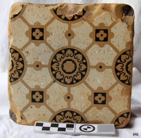
This Minton floor tile is from the wreck of the LOCH ARD. Other examples of this manufacture have been recovered from the wreck site and form part of the collection at Flagstaff Hill. The iron-hulled clipper ship from the Loch Line was heading for Port Phillip from London when it ran into the cliffs of Mutton Bird Island near Port Campbell and was wrecked on the early morning of June 1, 1878. The LOCH ARD was laden with high-value cargo including luxury goods intended for display at the Melbourne International Exhibition in 1880. One notable survivor from the ship’s freight manifest was the well-packed Minton porcelain peacock, a two-metre-high ceramic masterpiece of vivid glazed colours. The almost total loss of life and property from the LOCH ARD registered as a shocking tragedy for the Colony of Victoria, at a time when social confidence and economic optimism were otherwise high. The wealth generated from gold and wool was increasingly being spent on magnificent private residences and imposing public buildings. The demand for quality furnishings and fittings was therefore strong. Among the products consigned to burgeoning colonial markets by the Milton Pottery at Stoke upon Trent were their new range of colourfully patterned but very durable floor tiles – ideal for the high-traffic spaces in the large civic buildings then being constructed in Australia and America. These new floor tiles were “encaustic”, meaning that their designs and colours were encased within the depth of the tile. Rather than their decorative patterns being glazed onto the surface of the tile, their inlaid designs were created during the manufacturing process, as “coloured slips” (or liquid clay) that were poured into a deep pre-moulded casting. When fired, the resulting tile was colour-fast and design-fast.The Minton encaustic floor tile is significant for its method of manufacture which makes it durable as well as decorative. The shipwreck of the LOCH ARD is of State significance. Victorian Heritage Register S417. Flagstaff Hill’s collection of artefacts from LOCH ARD is significant for being one of the largest collections of artefacts from this shipwreck in Victoria. It is significant for its association with the shipwreck, which is on the Victorian Heritage Register (VHR S417). The collection is significant because of the relationship between the objects, as together they have a high potential to interpret the story of the LOCH ARD. The LOCH ARD collection is archaeologically significant as the remains of a large international passenger and cargo ship. The LOCH ARD collection is historically significant for representing aspects of Victoria’s shipping history and its potential to interpret sub-theme 1.5 of Victoria’s Framework of Historical Themes (living with natural processes). The collection is also historically significant for its association with the LOCH ARD, which was one of the worst and best-known shipwrecks in Victoria’s history.A square Minton floor tile with a black and beige pattern against a white base. This encaustic floor tile was recovered from the shipwreck of the LOCH ARD. On the back, or base, of the tile is inscribed the number “46” and the letters “Minton & Co Patent Stoke upon Trent”.flagstaff hill, warrnambool, shipwrecked coast, flagstaff hill maritime museum, maritime museum, shipwreck coast, flagstaff hill maritime village, great ocean road, loch line, loch ard, mutton bird island, loch ard gorge, minton floor tile, encaustic tile, melbourne international exhibition, floor tile -
 Bendigo Historical Society Inc.
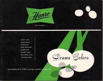
Magazine - HANRO COLLECTION: HANRO SPRING SUMMER CATALOGUE LINGERIE 1963, 1963
BHS CollectionHanro Spring Summer Catalogue Lingerie 1963: Black coloured card front cover with four point star Hanro Banner top centre with lime green background and Hanro in black print. Three oval white circles at the lower right hand side have writing Drama Colours in Black, which are listed to the left in white print. A three centimetre white coloured band placed horizontally a third from the top and three lime green bands arise from this white line at right and under the oval white shapes with one reaching the bottom of the page. Inside the front page it is advertising the line of the lingerie with its new Colours. It includes negligee/night set, night dresses, pyjamas, bedjackets, Princess slips and half slip, vests and spencers, briefs, panties and bloomers, and cotton vests. All Items included an item number, description, colour and sizes available. The back cover was white card with black print. The four star banner was lime green with Hanro printed in Black. Australian Knitting Mills Ltd heads the information about addresses and phone numbers of Bendigo and Interstate Offices. A 3 X 8.4cm black vertical stripe is found on the left-hand side from the top of the page. 3mm lime green band extends from the lower right hand side of the page for 17.7 cm. Box 116ACambridge Press Bendigobook, magazine, catalogue, hanro. catalogue. cambridge press bendigo. -
 Bendigo Military Museum
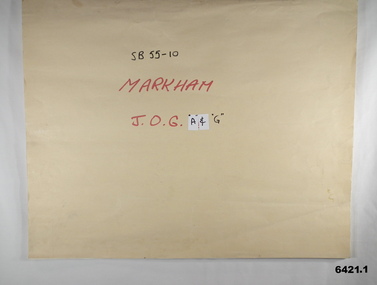
Map - SB55-10 Markham Joint Operations Graphics Air and Ground print separations, Royal Australian Survey Corps, Bendigo, Dec 1981
This set of map prints was assembled as a training aid. The collection is a complete set of individual color prints of each colour used on the final printed maps for each map Joint Operations Graphic (JOG) JOG Ground and JOG Air versions. This map series was produced in two versions to help coordinate military Ground Operations and Air Operations. The ground users required that heights and measurements were in Metres, whilst air users required height information in Feet for altimeters. The Air Version also contained more Aeronautical information including safe flying height information called Maximum Elevation Figures (MEF). Later printing of JOG incorporated printing in just four colours Cyan, Magenta, Yellow and Black (CMYK). Item 6421.1 is an example of a JOG Ground and item 6421.2 is an example of its matching JOG Air version.1:250,000 SB55-10 Markham JOG A and G colour separations bound together in a manilla card covered folder bound with a timber edge. royal australian survey corps, rasvy, fortuna, army survey regiment, army svy regt, asr -
 Waverley RSL Sub Branch
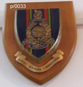
Plaque Royal Marine Commando Gibraltar, Royal Marine Commando Gibraltar
The word Gibraltar refers to the Great Siege of Gibraltar by French and Spanish forces, from 1779 to 1783, in support of the American Revolution. It was awarded in 1827 by George IV as a special distinction for the services of four of the old Army Marine regiments (Queen's Own Marines, 1st Marines, 2nd Marines, 3rd Marines) in holding that fortress against determined assaults, despite extreme privation. There are no other battle honours displayed on the colours of the four battalion-sized units of the current Corps. The Latin motto "Per Mare Per Terram" translates into English as "By Sea By Land" describing how the Royal Marines both attack and defend. The fouled anchor, incorporated into the emblem in 1747, is the badge of the Lord High Admiral and shows that the Corps is part of the Naval Service. Per Mare Per Terram ("By Sea By Land"), the motto of the Marines, is believed to have been used for the first time in 1775.Wooden Plaque Royal Marine Commando Gibraltar Royal Marine Commando Gibraltar -
 Bendigo Military Museum
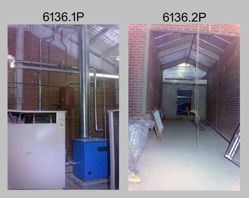
Photograph - New Printing Press, Lithographic Squadron – Army Survey Regiment, Fortuna, Bendigo, 1990
This is a set of 30 photographs of contractors installing the Army Survey Regiment’s new Heidelberg Speedmaster 102 printing press in Lithographic Squadron’s purpose-built printing building at Fortuna, Bendigo in 1990. The computer-controlled five colour lithographic offset printing press provided the Royal Australian Survey Corps vastly improved printing capability, as the five colours for a standard topographic map was printed in a single pass. The print room was named Wayzgoose Hall after a medieval printing house festival. Wayzgoose Hall and the Speedmaster printing capability was commissioned by the Commander of the 3rd Military District BRIG P. Davies AM, ADC on Wednesday 27th June 1990. This occasion is covered in more detail in page 145 of Valerie Lovejoy’s book 'Mapmakers of Fortuna – A history of the Army Survey Regiment’ ISBN: 0-646-42120-4.This is a set of 30 photograph of the Heidelberg Speedmaster 102 Printing Press installation in Lithographic Squadron, Army Survey Regiment at Fortuna, Bendigo, 1990. The photographs were on 35mm colour negative film and were scanned at 96 dpi. They are part of the Army Survey Regiment’s Collection. No personnel are identified. Annotated with date on negative sleeve.royal australian survey corps, rasvy, army survey regiment, army svy regt, fortuna, asr, litho, printing -
 Kiewa Valley Historical Society
Photo - Family dressed in the fashion of the early 1900s
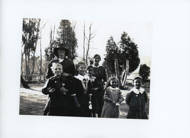
During the early 1900s little girls' dresses were fashioned on the style worn by older women. Girls dresses were knee length with trimmings of lace and ribbon. Collars were often removable for ease of washing. Leather lace-up boots and woollen stocking or socks were usually worn with these dresses. A pinafore or apron would be worn over the dresses to help keep them clean. Girls' hair was kept long, with curls and tied with ribbons.Boys' clothing was fashioned on sailor suits, blouses/shirts with a collar and trousers or knickerbockers. Woollen jackets, shirts and ties were suitable attire for older boys. Children's fashion of this time was dictated by long lasting durability, local manufacture, earthy colours and ease of mobility. Because of the long distance to haberdashery stores, the majority of children's garments would have been hand made by a local seamstress, mother or relation.Black and white photo of a family with 5 children in the foreground with trees in the background.children's clothing -
 Warrnambool and District Historical Society Inc.
Document Warrnambool Woollen Mill, Loose sheets Production analysis 1937-1938, 1937
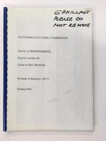
In 1869, the Warrnambool Meat Preserving Company commenced their business on the site, where it operated until 1875 when it was sold to the directors of the Warrnambool Woolen Mill Company. After being destroyed by fire in 1882 it wasn’t until 1910 that the Warrnambool Chamber of Commerce was approached by Marcus Saltau and Peter McGennan to invest in a new mill. The original directors were James Dickson, P J McGennan, Robert Swinton, M Saltau, and J W Younger. In 1955 the Warrnambool Woollen Mill formed a partnership with the Wangaratta Woollen Mills. Dunlop bought the mill in 1968. From that time until its closure in 2000 it had a number of different owners, the last being the Smith Family Industries. These sheets provide data relating to sales of various different blankets in colours and sizes and where sales occurred . All the capital cities are listed with quantities and customer numbersThe woollen mill was one of the major industries of Warrnambool for nearly100 years. This document is one of many in the collection of the Warrnambool and district historical society which gives an insight into the scale and type of production during the 20th century.Rectangular bundle of loose pages with card on either side and held together with string. Pages are lined and typed with data and also have two small holes and one elongated hole stamped between the smaller ones.Analysis Season 1937-1938 written in red pencil on front card. 'These sheets stocked in 25 patterns by peacock Bros Pty Ltd Melbourne Sydney Adelaide Perth and Brisbane. When ordering this pattern specify No D5' printed on each of the paper sheets.warrnambool, warrnambool woollen mill, woolen mill, dunlop olympic, marcus saltau p j mcgennan james dickson, robert swinton j w younger, wangaratta, dreamspun -
 Bendigo Historical Society Inc.
Functional object - Seal Embossing Press
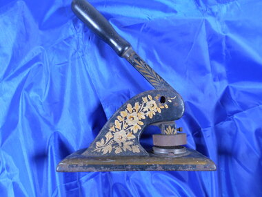
The Corona Paint Company Pty. Ltd. Bendigo was formed in November 1920 with £10,000 capital, in £1 shares. By July 1921, the Company had completed its factory and plant at Bendigo East, ready to begin the manufacture of paints. The Corona Paint works were opened on Saturday 28 January by the Prime Minister (Mr. Hughes) during a visit to Bendigo. Many new manufacturing industries were opened during this time after calls to address the decline of mining in the region. The factory of the CORONA PAINT COMPANY, BENDIGO, was advertised for sale in The Argus on 5 October 1923. It consisted of a “building on a railway siding, plant and machinery, including dry grinding plant, kalsomine mixer, paint mill, furnace, electric motor, etc., large stores of raw and finished material, kalsomine with range of 21 colours, oil paints, &c.”A cast iron embossing press. It's painted black with gold coulered floral decorations. The base is 18 centimetres long, nine centimetres wide and one and a half centimetres thick. A curved protrusion rises from the base that is eight centimetres by four centimetres which narrows to four centimetres by two and a half centimetres with a three-quarter centimetre wide slot. Inside the slot is a lever action with a ten centimetre by two and a half centimetre wooden handle. There is a removeable die on the end of the lever and an opposite removeable die the base. A small oval metal disc with paten no 3965 on is attached. The seal is The Corona Paint Company proprietary Limited seal embossing press, corona paint company -
 Jewish Museum of Australia
Kathryn Tilley, Afikoman pouches, by Kathryn Tilley, 2007
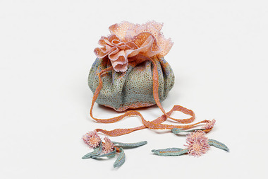
Artist's statement: I chose to make these afikoman pouches even though they may not be familiar to or used by all Jewish families. In these little pouches, a small piece of matzah would be placed in the pouch and then hidden in the house for the children to find during the Passover meal. On finding it, a gift is given. The story of Passover and Judaism in general have been kept alive over the centuries. I wanted to honour the passing down of the Torah through the generations, and, in particular, the role of children in its transmission. I have used the Australian desert as a metaphor for the great wilderness crossed by the People of Israel. A recent trip to Broken Hill and beyond inspired me to work with the subtle colours and textures of that landscape and I have incorporated into the work found objects, stones and beads collected there. (2007, New Under the Sun: Australian Contemporary Design in Jewish Ceremony III)machine embroidered -
 Kew Historical Society Inc
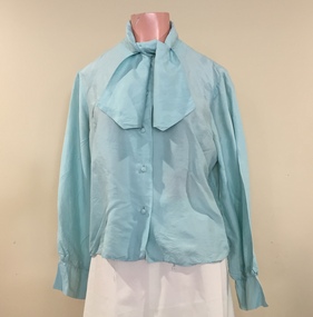
Clothing - Blouse, Norma Tullo, 1960s
Norma Tullo began her dressmaking business in 1956. At the age of 20, she rented a small shop in the Metropole Arcade, initiating a career that included manufacturing, designing and retailing. In 1965, she became the first Australian to be selected by Butterick Company Inclusive to join their pattern making company. The stylish Tullo ‘look’ in the first half of the 1960s was young, colourful, feminine and most importantly had a strong American appeal. The patterns were distributed worldwide except to Russia and Germany. At this time, she had a collection of 300 garments. In the second half of the 1960s, she developed a new design range, influenced by the American 'hippie' style, featuring floor length dresses with long narrow sleeves, high round collars, and ruffles on the hems and at the cuffs. Patterns and colours became brighter to match prevailing tastes. This blouse is one of a number of items donated to the Fashion Collection by Dione McIntyre.The McIntyre Collection of clothing and clothing accessories forms one of the largest single donations to our Fashion & Design collection. It includes clothing and clothing accessories worn by four women in the Cohen and McIntyre families across three generations. The items worn by Melbourne architect, and Kew resident, Dione McIntyre date from the 1960s and 1970s, and include evening wear, day wear, hats and shoes. As Dione McIntyre often accompanied her husband, fellow architect Peter McIntyre, to formal events, there are a number of pieces of evening wear among the items. The McIntyre Collection also includes items worn by women of an earlier generation: by Lilian Cohen, Dione McIntyre's mother, and by her mother-in-law, the wife of the architect Robert McIntyre. At the other end of the chronological spectrum are a number of outfits belonging to, worn and donated by Annie McIntyre. These include outfits created by notable late 20th century Australian and/or international fashion designers. The McIntyre Collection is significant historically and artistically as it includes examples of design that demonstrate changing tastes in fashion over an 80-year period. The collection is also significant in that it includes the work of a large number of Melbourne designers from the 1960s to the 1990s. Pale aqua coloured long sleeved silk blouse with an attached scarf of the same fabric and colour at the neckLabel: TULLO (removed)norma tullo, women's clothing, australian fashion - 1960s, blouses -
 Kew Historical Society Inc
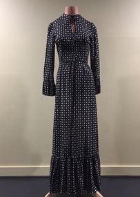
Clothing - Evening Dress, Norma Tullo, c.1968
Norma Tullo began her dressmaking business in 1956. At the age of 20, she rented a small shop in the Metropole Arcade, initiating a career that included manufacturing, designing and retailing. In 1965, she became the first Australian to be selected by Butterick Company Inclusive to join their pattern making company. The stylish Tullo ‘look’ in the first half of the 1960s was young, colourful, feminine and most importantly had a strong American appeal. The patterns were distributed worldwide except to Russia and Germany. At this time, she had a collection of 300 garments. In the second half of the 1960s, she developed a new design range, influenced by the American 'hippie' style, featuring floor length dresses with long narrow sleeves, high round collars, and ruffles on the hems and at the cuffs. Patterns and colours became brighter to match prevailing tastes.The dress was owned, worn and donated to the collection by Dione McIntyre.The McIntyre Collection of clothing and clothing accessories forms one of the largest single donations to our Fashion & Design collection. It includes clothing and clothing accessories worn by four women in the Cohen and McIntyre families across three generations. The items worn by Melbourne architect, and Kew resident, Dione McIntyre date from the 1960s and 1970s, and include evening wear, day wear, hats and shoes. As Dione McIntyre often accompanied her husband, fellow architect Peter McIntyre, to formal events, there are a number of pieces of evening wear among the items. The McIntyre Collection also includes items worn by women of an earlier generation: by Lilian Cohen, Dione McIntyre's mother, and by her mother-in-law, the wife of the architect Robert McIntyre. At the other end of the chronological spectrum are a number of outfits belonging to, worn and donated by Annie McIntyre. These include outfits created by notable late 20th century Australian and/or international fashion designers. The McIntyre Collection is significant historically and artistically as it includes examples of design that demonstrate changing tastes in fashion over an 80-year period. The collection is also significant in that it includes the work of a large number of Melbourne designers from the 1960s to the 1990s. Long sleeved black cotton dress the fabric of which includes a pattern of small beige and cream polka dots. The ends of the sleeves and the base of the dress include ruffled trims of the same fabric. Label: TULLOnorma tullo, australian fashion - 1960s, women's clothing, day wear, mcintyre collection -
 Federation University Art Collection
Oil on canvas, 'Creswick and Camp Hill' by Victor Litherland, 1968 /1984
Victor LITHERLAND (16 April 1897 - 1978_ Born Odessa, Russia (of English parents) Born in Odessa, Russia to British parents, Victor Litherland migrated to Australia in 1926 and moved to Creswick in 1932. Victor Litherland, who initially trained as a carpenter and cabinet maker, not only made most of his furniture and clothes but also his painting equipment. Victor Litherland is self taught himself. In 1943 he used books in the Sydney Public Library to teach himself painting, and produced a number of works of the environment in which he lived. Litherland's work has a disregard for perspective, unmodelled faces and cool fresh colours. He often made an elaborate frame for this work. This item is part of the Federation University Art Collection. The Art Collection features over 1000 works and was listed as a 'Ballarat Treasure' in 2007.art, artwork, victor litherland, naive art, creswick, acrylic on canvas -
 Merri-bek City Council
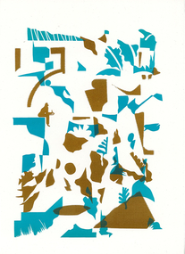
Work on paper - letterpress print, Commoners Press, As Sorted, 2022
Time is an abstraction, a filing system used to arrange events and memories into a logical system of cause and effect. This new print was created with images arranged from drawings made while sitting by paths near nature, creeks and overlapping streets. I am a local artist and illustrator with a history of drawing, painting and printmaking.10Press brings together a diverse group of creatives who were invited to make a new artwork inspired by the theme of ‘Moreland: its creative future, its past or other hidden stories’. Artists were invited to respond to the prompt ‘Moreland’, using only one or two colours. This body of work was created in 2022 during a significant time in local history, which saw Council’s name change from ‘Moreland’ to ‘Merri-bek’. The printed bellyband of the folio highlights this transition, with the word ‘Moreland’ crossed out and replaced with Woiwurrung language name ‘Merri-bek’. Commoners Press is a Coburg-based print studio that works with artists and designers in Australia and abroad on short run projects. Established by Jan Brueggemeier, Rob Eales and Neal Haslem in 2017, Commoners Press focus on projects that are community-centred, experimental and sustainable. Donated by Commoners Press Letterpress print -
 Merri-bek City Council
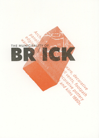
Work on paper - letterpress print, Commoners Press, Clay Pits of Brunswick, 2022
When I visit Merri-bek I wonder, when I step on the tarmac of the Barkly Square carpark, what was here before? In fact, at this spot and across Brunswick there were clay pits, which would feed the pottery workshops in Brunswick that produced the pottery, gargoyles and decorative items for Marvellous Melbourne homes and suburbs. Marvellous for those who had profited from gold, property and finance, not so for those working in the clay pits. My print is a contemplation on what is beneath our feet and our relationship to the ground. I am a design academic working at RMIT University and began my print and design practice on a Golding foot-treadle Letterpress machine.10Press brings together a diverse group of creatives who were invited to make a new artwork inspired by the theme of ‘Moreland: its creative future, its past or other hidden stories’. Artists were invited to respond to the prompt ‘Moreland’, using only one or two colours. This body of work was created in 2022 during a significant time in local history, which saw Council’s name change from ‘Moreland’ to ‘Merri-bek’. The printed bellyband of the folio highlights this transition, with the word ‘Moreland’ crossed out and replaced with Woiwurrung language name ‘Merri-bek’. Commoners Press is a Coburg-based print studio that works with artists and designers in Australia and abroad on short run projects. Established by Jan Brueggemeier, Rob Eales and Neal Haslem in 2017, Commoners Press focus on projects that are community-centred, experimental and sustainable. Donated by Commoners Press Letterpress print -
 Merri-bek City Council
Work on paper - letterpress print, Commoners Press, Hard Rubbish, 2022
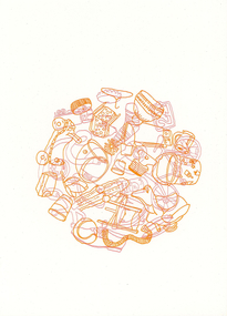
Merri-bek’s bi-annual collection and the communities’ tendency to dump rubbish makes these temporal sculptures part of the visual landscape of walking in Merri-bek. The collections of personal items, untold stories and connections which we all piece together whilst on an afternoon stroll. Over the years trends in pet ownership and technology advances can be documented in discarded items, also commenting on wealth and material value of objects. I have been living, parenting, working and volunteering in Merri-bek for the last 9 years. As time passes the community and landscape shift and change as does my connection to it. A once dedicated art practice is now tumbled around with life and family. Photography, video, drawing and painting are used to explore ideas around the everyday and meaning we attach to small moments of time.10Press brings together a diverse group of creatives who were invited to make a new artwork inspired by the theme of ‘Moreland: its creative future, its past or other hidden stories’. Artists were invited to respond to the prompt ‘Moreland’, using only one or two colours. This body of work was created in 2022 during a significant time in local history, which saw Council’s name change from ‘Moreland’ to ‘Merri-bek’. The printed bellyband of the folio highlights this transition, with the word ‘Moreland’ crossed out and replaced with Woiwurrung language name ‘Merri-bek’. Commoners Press is a Coburg-based print studio that works with artists and designers in Australia and abroad on short run projects. Established by Jan Brueggemeier, Rob Eales and Neal Haslem in 2017, Commoners Press focus on projects that are community-centred, experimental and sustainable. Donated by Commoners Press Letterpress print -
 Merri-bek City Council
Work on paper - letterpress print, Commoners Press, Bin Chicken Island Campground, 2022
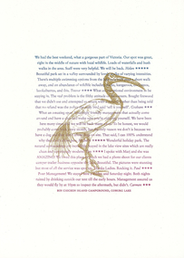
With two young kids, I often find myself at Coburg Lake on a weekend, playing amongst the natural beauty of the park area, rugged embankments, local birdlife, and... ‘Bin Chicken Island’. Bin Chicken Island has become a running joke in the community, known for its wafting stench and as an environmental eyesore (never go to the park on a warm day with an easterly breeze). So much so that someone added a campground listing on the island to Google Maps. Whenever I drive past the lake, I always keep an eye out for disgruntled backpackers who have realised that the only camping to be had is by the Bin Chickens themselves. I am a local graphic designer who lives in Pascoe Vale and works in Brunswick. I head up the design studio, Atticus Design.10Press brings together a diverse group of creatives who were invited to make a new artwork inspired by the theme of ‘Moreland: its creative future, its past or other hidden stories’. Artists were invited to respond to the prompt ‘Moreland’, using only one or two colours. This body of work was created in 2022 during a significant time in local history, which saw Council’s name change from ‘Moreland’ to ‘Merri-bek’. The printed bellyband of the folio highlights this transition, with the word ‘Moreland’ crossed out and replaced with Woiwurrung language name ‘Merri-bek’. Commoners Press is a Coburg-based print studio that works with artists and designers in Australia and abroad on short run projects. Established by Jan Brueggemeier, Rob Eales and Neal Haslem in 2017, Commoners Press focus on projects that are community-centred, experimental and sustainable. Donated by Commoners Press Letterpress print -
 Merri-bek City Council
Work on paper - letterpress print, Commoners Press, Streets with no Beats, 2022
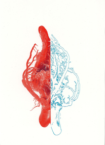
The image is based on a 3D component of one of my recent series of jewellery artworks. The heart metaphorically alludes to two locations of Merri-bek. One is Moreland Road, the other is Wallace Street in Brunswick. These locations pinpoint a time of collective trauma and communal experiential reflection. I was born in Brunswick in 1984 and have lived and worked there since. Brunswick for me is filled with stories of family, community, growth, tragedy and history experienced across a Greek Diasporic framework.10Press brings together a diverse group of creatives who were invited to make a new artwork inspired by the theme of ‘Moreland: its creative future, its past or other hidden stories’. Artists were invited to respond to the prompt ‘Moreland’, using only one or two colours. This body of work was created in 2022 during a significant time in local history, which saw Council’s name change from ‘Moreland’ to ‘Merri-bek’. The printed bellyband of the folio highlights this transition, with the word ‘Moreland’ crossed out and replaced with Woiwurrung language name ‘Merri-bek’. Commoners Press is a Coburg-based print studio that works with artists and designers in Australia and abroad on short run projects. Established by Jan Brueggemeier, Rob Eales and Neal Haslem in 2017, Commoners Press focus on projects that are community-centred, experimental and sustainable. Donated by Commoners Press Letterpress print -
 Merri-bek City Council
Work on paper - letterpress print, Commoners Press, Chatting with Locals - Sound Lines of the Red Wattlebird, 2022
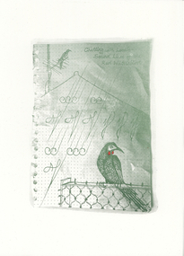
My work is dedicated to the animal residents that cohabit with us in the suburbs. I focused on the Red Wattlebird, as it is always a welcome visitor across the gardens and parks of Merri-bek. The frayed edges of the page from my notebook are reminiscent of the act of note taking and how we remember and observe things in our daily lives. I am a local artist and writer living in Naarm with a studio in Coburg as part of Schoolhouse Studios.10Press brings together a diverse group of creatives who were invited to make a new artwork inspired by the theme of ‘Moreland: its creative future, its past or other hidden stories’. Artists were invited to respond to the prompt ‘Moreland’, using only one or two colours. This body of work was created in 2022 during a significant time in local history, which saw Council’s name change from ‘Moreland’ to ‘Merri-bek’. The printed bellyband of the folio highlights this transition, with the word ‘Moreland’ crossed out and replaced with Woiwurrung language name ‘Merri-bek’. Commoners Press is a Coburg-based print studio that works with artists and designers in Australia and abroad on short run projects. Established by Jan Brueggemeier, Rob Eales and Neal Haslem in 2017, Commoners Press focus on projects that are community-centred, experimental and sustainable. Donated by Commoners Press Letterpress print -
 Merri-bek City Council
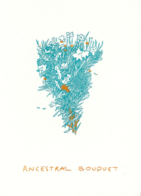
Work on paper - letterpress print, Commoners Press, Ancestral Bouquet, 2022
Ancestral Bouquet is a visual homage to the different plant species each migrant community brought with them to the lands of Merri-bek. It is a celebration of these plant communities and those (elderly migrants) who still know and practice traditional forms of food harvest and preparation. I was born and raised in unceded Wurundjeri Willum Country, in Coburg. My Father lived in the Southern Suburbs of Naarm as a refugee from Palestine, and eventually found Coburg as a place he could fit in as a migrant. My arts practice varies in modalities, and always comes back to the story of displaced cultures, my folklore, and my connection to Coburg and the Merri Creek.10Press brings together a diverse group of creatives who were invited to make a new artwork inspired by the theme of ‘Moreland: its creative future, its past or other hidden stories’. Artists were invited to respond to the prompt ‘Moreland’, using only one or two colours. This body of work was created in 2022 during a significant time in local history, which saw Council’s name change from ‘Moreland’ to ‘Merri-bek’. The printed bellyband of the folio highlights this transition, with the word ‘Moreland’ crossed out and replaced with Woiwurrung language name ‘Merri-bek’. Commoners Press is a Coburg-based print studio that works with artists and designers in Australia and abroad on short run projects. Established by Jan Brueggemeier, Rob Eales and Neal Haslem in 2017, Commoners Press focus on projects that are community-centred, experimental and sustainable. Donated by Commoners Press Letterpress print -
 Merri-bek City Council
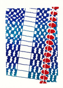
Work on paper - letterpress print, Commoners Press, Untitled, 2022
This image of Coburg Olympic Swimming Pool represents my connection to Merri-bek / Moreland. Being brought up around water, swimming has played a key role in my family and I feel a sense of the community when swimming in a public pool. The gum trees and the proximity of this pool to the river reminds me of my home town, Albury. For me, a public pool is a gathering place, a place of leisure and play, somewhere to learn and grow, spend time and let go.10Press brings together a diverse group of creatives who were invited to make a new artwork inspired by the theme of ‘Moreland: its creative future, its past or other hidden stories’. Artists were invited to respond to the prompt ‘Moreland’, using only one or two colours. This body of work was created in 2022 during a significant time in local history, which saw Council’s name change from ‘Moreland’ to ‘Merri-bek’. The printed bellyband of the folio highlights this transition, with the word ‘Moreland’ crossed out and replaced with Woiwurrung language name ‘Merri-bek’. Commoners Press is a Coburg-based print studio that works with artists and designers in Australia and abroad on short run projects. Established by Jan Brueggemeier, Rob Eales and Neal Haslem in 2017, Commoners Press focus on projects that are community-centred, experimental and sustainable. Donated by Commoners Press Letterpress print -
 The Beechworth Burke Museum
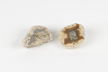
Geological specimen - Thunderegg agates, Unknown
Thunderegg Agates are formed within rhyolite volcanic ash layers. They are rough spherical shapes, varying in size from less than an inch to over a metre long. Thundereggs usually contain centres of chalcedony which may have been fractured followed by deposition of agate, jasper or opal, either uniquely or in combination. A unique characteristic that these specimens have is the fact that they often look like ordinary rocks on the outside, but slicing them in half and polishing them may reveal intricate patterns and colours. These particular specimens are examples of thunderegg agates. Agate is a variety of chalcedony, a cryptocrystalline form of quartz. The agate component contributes to the intriguing internal patterns of the specimens. The specific locality of these specimens is unknown but they can be found in flows of rhyolite lava. They are formed in gas pockets in the lava, which act as moulds. These specimens can be found globally, with specific locations in Germany being particularly abundant. This specimen is part of a larger collection of geological and mineral specimens collected from around Australia (and some parts of the world) and donated to the Burke Museum between 1868-1880. A large percentage of these specimens were collected in Victoria as part of the Geological Survey of Victoria that begun in 1852 (in response to the Gold Rush) to study and map the geology of Victoria. Collecting geological specimens was an important part of mapping and understanding the scientific makeup of the earth. Many of these specimens were sent to research and collecting organisations across Australia, including the Burke Museum, to educate and encourage further study.Two small solid specimens with pale, sandy-coloured exteriors and fractured internal patterns. burke museum, beechworth, geological, geological specimen, thundereggs, thundereggs agate, agate, rhyolite, rhyolite lava, volcanic ash, chalcedony, cryptocrystalline
