Showing 217 items
matching trends
-
 Ararat Gallery TAMA
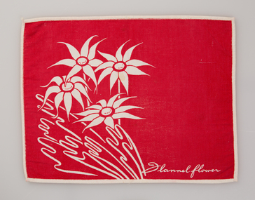
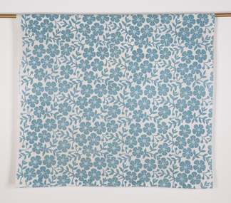
Textile, Frances Burke, Flannel Flower (place mat), c. 1955
Frances Burke: Designer of Modern Textiles Australia’s most influential and celebrated textile designer of the mid-20th century, Frances Burke (1904-1994), employed Australian native flora, garden flowers, marine subjects, Indigenous culture and increasingly, abstract motifs in her stunning modern fabrics. A confident, determined designer and businesswoman; Burke made the shift from fine art to design in 1937. While she began by designing dress fabrics for Melbourne’s fashionable Georges Department store, printing them on linen using lino blocks, she was an early adopter of the screen-printing process and during the war years began printing on cotton. Burke’s furnishing fabrics took their place in influential modern buildings Australia-wide through collaborations with leading architects and interior designers. They included Robin Boyd’s 1949 House of Tomorrow, Roy Grounds’ Quamby flats, Guilford Bell’s Royal Hayman Island Resort for Ansett Airlines, and Yuncken, Freeman Brothers, Griffiths and Simpson’s Canberra Civic Centre Theatre. In the post-war period, Burke made regular trips to the United States and Europe, on her return advising homeowners and manufacturers on the latest trends in products, colours and home design in lectures and interviews. At New Design her fabric showroom and interior design consultancy Burke introduced furniture by emerging designers Clement Meadmore and Grant Featherston in the early 1950s and presented local and imported homewares, mostly from the United States. She was enthusiastic about the convenient and comfortable lifestyle experienced by ordinary American women. Her fabrics and advice were regularly featured in Australian Home Beautiful, Australian House and Garden and the newspapers of the day. Some of Burke’s designs had remarkable longevity. Tiger Stripe (1938) for example, continued to be produced in a wide range of colours until 1970 and Crete (1946) remained a popular choice for interiors into the 1960s. Drawing from a rich variety of sources including Indigenous culture in Goanna (c.1954) and Pacific Island tapa cloth designs in Bird and Tree (1940), Burke also looked to Japan in designs such as Plum Blossom (1948) and Zen (1965). She loved exploring the potential of native flora, seen in designs including Waratah (1955) and Flannel Flower (1955), while garden flowers were the source for many other designs including Belladonna (1940), Periwinkle (n.d.) and Rose (1947). Burke’s clever interplay of a single striking printed colour with lively gestural lines revealing the white base fabric, gave her designs a vibrancy that characterised the optimistic post-war era. This can be seen in Burke’s fabrics for Hayman Island including Angel Fish and Seapiece (both 1949) which expressed the freshness and excitement of the luxurious new tropical resort and led to further commissions. Burke’s three decades in business (1937-1970) were an unparalleled success in the story of Australian design. Her fabrics have been collected by the NGA, the Powerhouse Museum, NGV, RMIT Design Archives and Sydney Living Museums in addition to Ararat Gallery TAMA. Written by Nanette Carter and Robyn Oswald-Jacobs. -
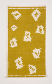
 Ararat Gallery TAMA
Textile, Frances Burke, Shell (place mat)
Frances Burke: Designer of Modern Textiles Australia’s most influential and celebrated textile designer of the mid-20th century, Frances Burke (1904-1994), employed Australian native flora, garden flowers, marine subjects, Indigenous culture and increasingly, abstract motifs in her stunning modern fabrics. A confident, determined designer and businesswoman; Burke made the shift from fine art to design in 1937. While she began by designing dress fabrics for Melbourne’s fashionable Georges Department store, printing them on linen using lino blocks, she was an early adopter of the screen-printing process and during the war years began printing on cotton. Burke’s furnishing fabrics took their place in influential modern buildings Australia-wide through collaborations with leading architects and interior designers. They included Robin Boyd’s 1949 House of Tomorrow, Roy Grounds’ Quamby flats, Guilford Bell’s Royal Hayman Island Resort for Ansett Airlines, and Yuncken, Freeman Brothers, Griffiths and Simpson’s Canberra Civic Centre Theatre. In the post-war period, Burke made regular trips to the United States and Europe, on her return advising homeowners and manufacturers on the latest trends in products, colours and home design in lectures and interviews. At New Design her fabric showroom and interior design consultancy Burke introduced furniture by emerging designers Clement Meadmore and Grant Featherston in the early 1950s and presented local and imported homewares, mostly from the United States. She was enthusiastic about the convenient and comfortable lifestyle experienced by ordinary American women. Her fabrics and advice were regularly featured in Australian Home Beautiful, Australian House and Garden and the newspapers of the day. Some of Burke’s designs had remarkable longevity. Tiger Stripe (1938) for example, continued to be produced in a wide range of colours until 1970 and Crete (1946) remained a popular choice for interiors into the 1960s. Drawing from a rich variety of sources including Indigenous culture in Goanna (c.1954) and Pacific Island tapa cloth designs in Bird and Tree (1940), Burke also looked to Japan in designs such as Plum Blossom (1948) and Zen (1965). She loved exploring the potential of native flora, seen in designs including Waratah (1955) and Flannel Flower (1955), while garden flowers were the source for many other designs including Belladonna (1940), Periwinkle (n.d.) and Rose (1947). Burke’s clever interplay of a single striking printed colour with lively gestural lines revealing the white base fabric, gave her designs a vibrancy that characterised the optimistic post-war era. This can be seen in Burke’s fabrics for Hayman Island including Angel Fish and Seapiece (both 1949) which expressed the freshness and excitement of the luxurious new tropical resort and led to further commissions. Burke’s three decades in business (1937-1970) were an unparalleled success in the story of Australian design. Her fabrics have been collected by the NGA, the Powerhouse Museum, NGV, RMIT Design Archives and Sydney Living Museums in addition to Ararat Gallery TAMA. Written by Nanette Carter and Robyn Oswald-Jacobs. -
 Ararat Gallery TAMA
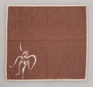
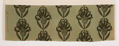
Textile, Frances Burke, Spider Orchid (mat), c. 1955
Frances Burke: Designer of Modern Textiles Australia’s most influential and celebrated textile designer of the mid-20th century, Frances Burke (1904-1994), employed Australian native flora, garden flowers, marine subjects, Indigenous culture and increasingly, abstract motifs in her stunning modern fabrics. A confident, determined designer and businesswoman; Burke made the shift from fine art to design in 1937. While she began by designing dress fabrics for Melbourne’s fashionable Georges Department store, printing them on linen using lino blocks, she was an early adopter of the screen-printing process and during the war years began printing on cotton. Burke’s furnishing fabrics took their place in influential modern buildings Australia-wide through collaborations with leading architects and interior designers. They included Robin Boyd’s 1949 House of Tomorrow, Roy Grounds’ Quamby flats, Guilford Bell’s Royal Hayman Island Resort for Ansett Airlines, and Yuncken, Freeman Brothers, Griffiths and Simpson’s Canberra Civic Centre Theatre. In the post-war period, Burke made regular trips to the United States and Europe, on her return advising homeowners and manufacturers on the latest trends in products, colours and home design in lectures and interviews. At New Design her fabric showroom and interior design consultancy Burke introduced furniture by emerging designers Clement Meadmore and Grant Featherston in the early 1950s and presented local and imported homewares, mostly from the United States. She was enthusiastic about the convenient and comfortable lifestyle experienced by ordinary American women. Her fabrics and advice were regularly featured in Australian Home Beautiful, Australian House and Garden and the newspapers of the day. Some of Burke’s designs had remarkable longevity. Tiger Stripe (1938) for example, continued to be produced in a wide range of colours until 1970 and Crete (1946) remained a popular choice for interiors into the 1960s. Drawing from a rich variety of sources including Indigenous culture in Goanna (c.1954) and Pacific Island tapa cloth designs in Bird and Tree (1940), Burke also looked to Japan in designs such as Plum Blossom (1948) and Zen (1965). She loved exploring the potential of native flora, seen in designs including Waratah (1955) and Flannel Flower (1955), while garden flowers were the source for many other designs including Belladonna (1940), Periwinkle (n.d.) and Rose (1947). Burke’s clever interplay of a single striking printed colour with lively gestural lines revealing the white base fabric, gave her designs a vibrancy that characterised the optimistic post-war era. This can be seen in Burke’s fabrics for Hayman Island including Angel Fish and Seapiece (both 1949) which expressed the freshness and excitement of the luxurious new tropical resort and led to further commissions. Burke’s three decades in business (1937-1970) were an unparalleled success in the story of Australian design. Her fabrics have been collected by the NGA, the Powerhouse Museum, NGV, RMIT Design Archives and Sydney Living Museums in addition to Ararat Gallery TAMA. Written by Nanette Carter and Robyn Oswald-Jacobs. -
 Ararat Gallery TAMA
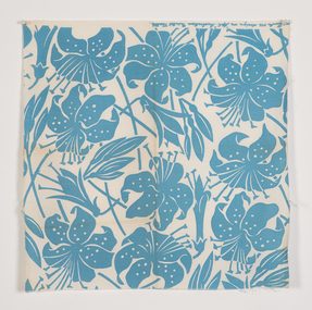
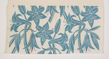
Textile, Frances Burke, Tiger Lily, 1951
Frances Burke: Designer of Modern Textiles Australia’s most influential and celebrated textile designer of the mid-20th century, Frances Burke (1904-1994), employed Australian native flora, garden flowers, marine subjects, Indigenous culture and increasingly, abstract motifs in her stunning modern fabrics. A confident, determined designer and businesswoman; Burke made the shift from fine art to design in 1937. While she began by designing dress fabrics for Melbourne’s fashionable Georges Department store, printing them on linen using lino blocks, she was an early adopter of the screen-printing process and during the war years began printing on cotton. Burke’s furnishing fabrics took their place in influential modern buildings Australia-wide through collaborations with leading architects and interior designers. They included Robin Boyd’s 1949 House of Tomorrow, Roy Grounds’ Quamby flats, Guilford Bell’s Royal Hayman Island Resort for Ansett Airlines, and Yuncken, Freeman Brothers, Griffiths and Simpson’s Canberra Civic Centre Theatre. In the post-war period, Burke made regular trips to the United States and Europe, on her return advising homeowners and manufacturers on the latest trends in products, colours and home design in lectures and interviews. At New Design her fabric showroom and interior design consultancy Burke introduced furniture by emerging designers Clement Meadmore and Grant Featherston in the early 1950s and presented local and imported homewares, mostly from the United States. She was enthusiastic about the convenient and comfortable lifestyle experienced by ordinary American women. Her fabrics and advice were regularly featured in Australian Home Beautiful, Australian House and Garden and the newspapers of the day. Some of Burke’s designs had remarkable longevity. Tiger Stripe (1938) for example, continued to be produced in a wide range of colours until 1970 and Crete (1946) remained a popular choice for interiors into the 1960s. Drawing from a rich variety of sources including Indigenous culture in Goanna (c.1954) and Pacific Island tapa cloth designs in Bird and Tree (1940), Burke also looked to Japan in designs such as Plum Blossom (1948) and Zen (1965). She loved exploring the potential of native flora, seen in designs including Waratah (1955) and Flannel Flower (1955), while garden flowers were the source for many other designs including Belladonna (1940), Periwinkle (n.d.) and Rose (1947). Burke’s clever interplay of a single striking printed colour with lively gestural lines revealing the white base fabric, gave her designs a vibrancy that characterised the optimistic post-war era. This can be seen in Burke’s fabrics for Hayman Island including Angel Fish and Seapiece (both 1949) which expressed the freshness and excitement of the luxurious new tropical resort and led to further commissions. Burke’s three decades in business (1937-1970) were an unparalleled success in the story of Australian design. Her fabrics have been collected by the NGA, the Powerhouse Museum, NGV, RMIT Design Archives and Sydney Living Museums in addition to Ararat Gallery TAMA. Written by Nanette Carter and Robyn Oswald-Jacobs. -
 Ararat Gallery TAMA
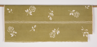
Textile, Frances Burke, Rose, 1947
Frances Burke: Designer of Modern Textiles Australia’s most influential and celebrated textile designer of the mid-20th century, Frances Burke (1904-1994), employed Australian native flora, garden flowers, marine subjects, Indigenous culture and increasingly, abstract motifs in her stunning modern fabrics. A confident, determined designer and businesswoman; Burke made the shift from fine art to design in 1937. While she began by designing dress fabrics for Melbourne’s fashionable Georges Department store, printing them on linen using lino blocks, she was an early adopter of the screen-printing process and during the war years began printing on cotton. Burke’s furnishing fabrics took their place in influential modern buildings Australia-wide through collaborations with leading architects and interior designers. They included Robin Boyd’s 1949 House of Tomorrow, Roy Grounds’ Quamby flats, Guilford Bell’s Royal Hayman Island Resort for Ansett Airlines, and Yuncken, Freeman Brothers, Griffiths and Simpson’s Canberra Civic Centre Theatre. In the post-war period, Burke made regular trips to the United States and Europe, on her return advising homeowners and manufacturers on the latest trends in products, colours and home design in lectures and interviews. At New Design her fabric showroom and interior design consultancy Burke introduced furniture by emerging designers Clement Meadmore and Grant Featherston in the early 1950s and presented local and imported homewares, mostly from the United States. She was enthusiastic about the convenient and comfortable lifestyle experienced by ordinary American women. Her fabrics and advice were regularly featured in Australian Home Beautiful, Australian House and Garden and the newspapers of the day. Some of Burke’s designs had remarkable longevity. Tiger Stripe (1938) for example, continued to be produced in a wide range of colours until 1970 and Crete (1946) remained a popular choice for interiors into the 1960s. Drawing from a rich variety of sources including Indigenous culture in Goanna (c.1954) and Pacific Island tapa cloth designs in Bird and Tree (1940), Burke also looked to Japan in designs such as Plum Blossom (1948) and Zen (1965). She loved exploring the potential of native flora, seen in designs including Waratah (1955) and Flannel Flower (1955), while garden flowers were the source for many other designs including Belladonna (1940), Periwinkle (n.d.) and Rose (1947). Burke’s clever interplay of a single striking printed colour with lively gestural lines revealing the white base fabric, gave her designs a vibrancy that characterised the optimistic post-war era. This can be seen in Burke’s fabrics for Hayman Island including Angel Fish and Seapiece (both 1949) which expressed the freshness and excitement of the luxurious new tropical resort and led to further commissions. Burke’s three decades in business (1937-1970) were an unparalleled success in the story of Australian design. Her fabrics have been collected by the NGA, the Powerhouse Museum, NGV, RMIT Design Archives and Sydney Living Museums in addition to Ararat Gallery TAMA. Written by Nanette Carter and Robyn Oswald-Jacobs. -
 Ararat Gallery TAMA
Textile, Frances Burke, Belladonna, 1938-1941
Frances Burke: Designer of Modern Textiles Australia’s most influential and celebrated textile designer of the mid-20th century, Frances Burke (1904-1994), employed Australian native flora, garden flowers, marine subjects, Indigenous culture and increasingly, abstract motifs in her stunning modern fabrics. A confident, determined designer and businesswoman; Burke made the shift from fine art to design in 1937. While she began by designing dress fabrics for Melbourne’s fashionable Georges Department store, printing them on linen using lino blocks, she was an early adopter of the screen-printing process and during the war years began printing on cotton. Burke’s furnishing fabrics took their place in influential modern buildings Australia-wide through collaborations with leading architects and interior designers. They included Robin Boyd’s 1949 House of Tomorrow, Roy Grounds’ Quamby flats, Guilford Bell’s Royal Hayman Island Resort for Ansett Airlines, and Yuncken, Freeman Brothers, Griffiths and Simpson’s Canberra Civic Centre Theatre. In the post-war period, Burke made regular trips to the United States and Europe, on her return advising homeowners and manufacturers on the latest trends in products, colours and home design in lectures and interviews. At New Design her fabric showroom and interior design consultancy Burke introduced furniture by emerging designers Clement Meadmore and Grant Featherston in the early 1950s and presented local and imported homewares, mostly from the United States. She was enthusiastic about the convenient and comfortable lifestyle experienced by ordinary American women. Her fabrics and advice were regularly featured in Australian Home Beautiful, Australian House and Garden and the newspapers of the day. Some of Burke’s designs had remarkable longevity. Tiger Stripe (1938) for example, continued to be produced in a wide range of colours until 1970 and Crete (1946) remained a popular choice for interiors into the 1960s. Drawing from a rich variety of sources including Indigenous culture in Goanna (c.1954) and Pacific Island tapa cloth designs in Bird and Tree (1940), Burke also looked to Japan in designs such as Plum Blossom (1948) and Zen (1965). She loved exploring the potential of native flora, seen in designs including Waratah (1955) and Flannel Flower (1955), while garden flowers were the source for many other designs including Belladonna (1940), Periwinkle (n.d.) and Rose (1947). Burke’s clever interplay of a single striking printed colour with lively gestural lines revealing the white base fabric, gave her designs a vibrancy that characterised the optimistic post-war era. This can be seen in Burke’s fabrics for Hayman Island including Angel Fish and Seapiece (both 1949) which expressed the freshness and excitement of the luxurious new tropical resort and led to further commissions. Burke’s three decades in business (1937-1970) were an unparalleled success in the story of Australian design. Her fabrics have been collected by the NGA, the Powerhouse Museum, NGV, RMIT Design Archives and Sydney Living Museums in addition to Ararat Gallery TAMA. Written by Nanette Carter and Robyn Oswald-Jacobs. -
 Ararat Gallery TAMA
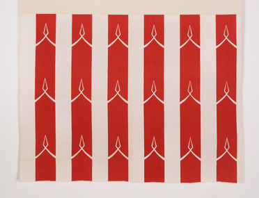
Textile, Frances Burke, Regency Stripe, 1961
Frances Burke: Designer of Modern Textiles Australia’s most influential and celebrated textile designer of the mid-20th century, Frances Burke (1904-1994), employed Australian native flora, garden flowers, marine subjects, Indigenous culture and increasingly, abstract motifs in her stunning modern fabrics. A confident, determined designer and businesswoman; Burke made the shift from fine art to design in 1937. While she began by designing dress fabrics for Melbourne’s fashionable Georges Department store, printing them on linen using lino blocks, she was an early adopter of the screen-printing process and during the war years began printing on cotton. Burke’s furnishing fabrics took their place in influential modern buildings Australia-wide through collaborations with leading architects and interior designers. They included Robin Boyd’s 1949 House of Tomorrow, Roy Grounds’ Quamby flats, Guilford Bell’s Royal Hayman Island Resort for Ansett Airlines, and Yuncken, Freeman Brothers, Griffiths and Simpson’s Canberra Civic Centre Theatre. In the post-war period, Burke made regular trips to the United States and Europe, on her return advising homeowners and manufacturers on the latest trends in products, colours and home design in lectures and interviews. At New Design her fabric showroom and interior design consultancy Burke introduced furniture by emerging designers Clement Meadmore and Grant Featherston in the early 1950s and presented local and imported homewares, mostly from the United States. She was enthusiastic about the convenient and comfortable lifestyle experienced by ordinary American women. Her fabrics and advice were regularly featured in Australian Home Beautiful, Australian House and Garden and the newspapers of the day. Some of Burke’s designs had remarkable longevity. Tiger Stripe (1938) for example, continued to be produced in a wide range of colours until 1970 and Crete (1946) remained a popular choice for interiors into the 1960s. Drawing from a rich variety of sources including Indigenous culture in Goanna (c.1954) and Pacific Island tapa cloth designs in Bird and Tree (1940), Burke also looked to Japan in designs such as Plum Blossom (1948) and Zen (1965). She loved exploring the potential of native flora, seen in designs including Waratah (1955) and Flannel Flower (1955), while garden flowers were the source for many other designs including Belladonna (1940), Periwinkle (n.d.) and Rose (1947). Burke’s clever interplay of a single striking printed colour with lively gestural lines revealing the white base fabric, gave her designs a vibrancy that characterised the optimistic post-war era. This can be seen in Burke’s fabrics for Hayman Island including Angel Fish and Seapiece (both 1949) which expressed the freshness and excitement of the luxurious new tropical resort and led to further commissions. Burke’s three decades in business (1937-1970) were an unparalleled success in the story of Australian design. Her fabrics have been collected by the NGA, the Powerhouse Museum, NGV, RMIT Design Archives and Sydney Living Museums in addition to Ararat Gallery TAMA. Written by Nanette Carter and Robyn Oswald-Jacobs. -
 Ararat Gallery TAMA
Textile, Frances Burke, Waratah, c. 1955
Frances Burke: Designer of Modern Textiles Australia’s most influential and celebrated textile designer of the mid-20th century, Frances Burke (1904-1994), employed Australian native flora, garden flowers, marine subjects, Indigenous culture and increasingly, abstract motifs in her stunning modern fabrics. A confident, determined designer and businesswoman; Burke made the shift from fine art to design in 1937. While she began by designing dress fabrics for Melbourne’s fashionable Georges Department store, printing them on linen using lino blocks, she was an early adopter of the screen-printing process and during the war years began printing on cotton. Burke’s furnishing fabrics took their place in influential modern buildings Australia-wide through collaborations with leading architects and interior designers. They included Robin Boyd’s 1949 House of Tomorrow, Roy Grounds’ Quamby flats, Guilford Bell’s Royal Hayman Island Resort for Ansett Airlines, and Yuncken, Freeman Brothers, Griffiths and Simpson’s Canberra Civic Centre Theatre. In the post-war period, Burke made regular trips to the United States and Europe, on her return advising homeowners and manufacturers on the latest trends in products, colours and home design in lectures and interviews. At New Design her fabric showroom and interior design consultancy Burke introduced furniture by emerging designers Clement Meadmore and Grant Featherston in the early 1950s and presented local and imported homewares, mostly from the United States. She was enthusiastic about the convenient and comfortable lifestyle experienced by ordinary American women. Her fabrics and advice were regularly featured in Australian Home Beautiful, Australian House and Garden and the newspapers of the day. Some of Burke’s designs had remarkable longevity. Tiger Stripe (1938) for example, continued to be produced in a wide range of colours until 1970 and Crete (1946) remained a popular choice for interiors into the 1960s. Drawing from a rich variety of sources including Indigenous culture in Goanna (c.1954) and Pacific Island tapa cloth designs in Bird and Tree (1940), Burke also looked to Japan in designs such as Plum Blossom (1948) and Zen (1965). She loved exploring the potential of native flora, seen in designs including Waratah (1955) and Flannel Flower (1955), while garden flowers were the source for many other designs including Belladonna (1940), Periwinkle (n.d.) and Rose (1947). Burke’s clever interplay of a single striking printed colour with lively gestural lines revealing the white base fabric, gave her designs a vibrancy that characterised the optimistic post-war era. This can be seen in Burke’s fabrics for Hayman Island including Angel Fish and Seapiece (both 1949) which expressed the freshness and excitement of the luxurious new tropical resort and led to further commissions. Burke’s three decades in business (1937-1970) were an unparalleled success in the story of Australian design. Her fabrics have been collected by the NGA, the Powerhouse Museum, NGV, RMIT Design Archives and Sydney Living Museums in addition to Ararat Gallery TAMA. Written by Nanette Carter and Robyn Oswald-Jacobs. -
 Ararat Gallery TAMA
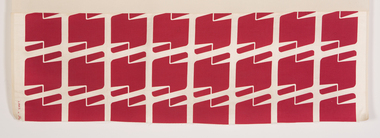
Textile, Frances Burke, Links, 1958
Frances Burke: Designer of Modern Textiles Australia’s most influential and celebrated textile designer of the mid-20th century, Frances Burke (1904-1994), employed Australian native flora, garden flowers, marine subjects, Indigenous culture and increasingly, abstract motifs in her stunning modern fabrics. A confident, determined designer and businesswoman; Burke made the shift from fine art to design in 1937. While she began by designing dress fabrics for Melbourne’s fashionable Georges Department store, printing them on linen using lino blocks, she was an early adopter of the screen-printing process and during the war years began printing on cotton. Burke’s furnishing fabrics took their place in influential modern buildings Australia-wide through collaborations with leading architects and interior designers. They included Robin Boyd’s 1949 House of Tomorrow, Roy Grounds’ Quamby flats, Guilford Bell’s Royal Hayman Island Resort for Ansett Airlines, and Yuncken, Freeman Brothers, Griffiths and Simpson’s Canberra Civic Centre Theatre. In the post-war period, Burke made regular trips to the United States and Europe, on her return advising homeowners and manufacturers on the latest trends in products, colours and home design in lectures and interviews. At New Design her fabric showroom and interior design consultancy Burke introduced furniture by emerging designers Clement Meadmore and Grant Featherston in the early 1950s and presented local and imported homewares, mostly from the United States. She was enthusiastic about the convenient and comfortable lifestyle experienced by ordinary American women. Her fabrics and advice were regularly featured in Australian Home Beautiful, Australian House and Garden and the newspapers of the day. Some of Burke’s designs had remarkable longevity. Tiger Stripe (1938) for example, continued to be produced in a wide range of colours until 1970 and Crete (1946) remained a popular choice for interiors into the 1960s. Drawing from a rich variety of sources including Indigenous culture in Goanna (c.1954) and Pacific Island tapa cloth designs in Bird and Tree (1940), Burke also looked to Japan in designs such as Plum Blossom (1948) and Zen (1965). She loved exploring the potential of native flora, seen in designs including Waratah (1955) and Flannel Flower (1955), while garden flowers were the source for many other designs including Belladonna (1940), Periwinkle (n.d.) and Rose (1947). Burke’s clever interplay of a single striking printed colour with lively gestural lines revealing the white base fabric, gave her designs a vibrancy that characterised the optimistic post-war era. This can be seen in Burke’s fabrics for Hayman Island including Angel Fish and Seapiece (both 1949) which expressed the freshness and excitement of the luxurious new tropical resort and led to further commissions. Burke’s three decades in business (1937-1970) were an unparalleled success in the story of Australian design. Her fabrics have been collected by the NGA, the Powerhouse Museum, NGV, RMIT Design Archives and Sydney Living Museums in addition to Ararat Gallery TAMA. Written by Nanette Carter and Robyn Oswald-Jacobs. -
 Ararat Gallery TAMA
Textile, Frances Burke, Cane, c. 1952
Frances Burke: Designer of Modern Textiles Australia’s most influential and celebrated textile designer of the mid-20th century, Frances Burke (1904-1994), employed Australian native flora, garden flowers, marine subjects, Indigenous culture and increasingly, abstract motifs in her stunning modern fabrics. A confident, determined designer and businesswoman; Burke made the shift from fine art to design in 1937. While she began by designing dress fabrics for Melbourne’s fashionable Georges Department store, printing them on linen using lino blocks, she was an early adopter of the screen-printing process and during the war years began printing on cotton. Burke’s furnishing fabrics took their place in influential modern buildings Australia-wide through collaborations with leading architects and interior designers. They included Robin Boyd’s 1949 House of Tomorrow, Roy Grounds’ Quamby flats, Guilford Bell’s Royal Hayman Island Resort for Ansett Airlines, and Yuncken, Freeman Brothers, Griffiths and Simpson’s Canberra Civic Centre Theatre. In the post-war period, Burke made regular trips to the United States and Europe, on her return advising homeowners and manufacturers on the latest trends in products, colours and home design in lectures and interviews. At New Design her fabric showroom and interior design consultancy Burke introduced furniture by emerging designers Clement Meadmore and Grant Featherston in the early 1950s and presented local and imported homewares, mostly from the United States. She was enthusiastic about the convenient and comfortable lifestyle experienced by ordinary American women. Her fabrics and advice were regularly featured in Australian Home Beautiful, Australian House and Garden and the newspapers of the day. Some of Burke’s designs had remarkable longevity. Tiger Stripe (1938) for example, continued to be produced in a wide range of colours until 1970 and Crete (1946) remained a popular choice for interiors into the 1960s. Drawing from a rich variety of sources including Indigenous culture in Goanna (c.1954) and Pacific Island tapa cloth designs in Bird and Tree (1940), Burke also looked to Japan in designs such as Plum Blossom (1948) and Zen (1965). She loved exploring the potential of native flora, seen in designs including Waratah (1955) and Flannel Flower (1955), while garden flowers were the source for many other designs including Belladonna (1940), Periwinkle (n.d.) and Rose (1947). Burke’s clever interplay of a single striking printed colour with lively gestural lines revealing the white base fabric, gave her designs a vibrancy that characterised the optimistic post-war era. This can be seen in Burke’s fabrics for Hayman Island including Angel Fish and Seapiece (both 1949) which expressed the freshness and excitement of the luxurious new tropical resort and led to further commissions. Burke’s three decades in business (1937-1970) were an unparalleled success in the story of Australian design. Her fabrics have been collected by the NGA, the Powerhouse Museum, NGV, RMIT Design Archives and Sydney Living Museums in addition to Ararat Gallery TAMA. Written by Nanette Carter and Robyn Oswald-Jacobs. -
 Ararat Gallery TAMA
Textile, Frances Burke, Unknown
Frances Burke: Designer of Modern Textiles Australia’s most influential and celebrated textile designer of the mid-20th century, Frances Burke (1904-1994), employed Australian native flora, garden flowers, marine subjects, Indigenous culture and increasingly, abstract motifs in her stunning modern fabrics. A confident, determined designer and businesswoman; Burke made the shift from fine art to design in 1937. While she began by designing dress fabrics for Melbourne’s fashionable Georges Department store, printing them on linen using lino blocks, she was an early adopter of the screen-printing process and during the war years began printing on cotton. Burke’s furnishing fabrics took their place in influential modern buildings Australia-wide through collaborations with leading architects and interior designers. They included Robin Boyd’s 1949 House of Tomorrow, Roy Grounds’ Quamby flats, Guilford Bell’s Royal Hayman Island Resort for Ansett Airlines, and Yuncken, Freeman Brothers, Griffiths and Simpson’s Canberra Civic Centre Theatre. In the post-war period, Burke made regular trips to the United States and Europe, on her return advising homeowners and manufacturers on the latest trends in products, colours and home design in lectures and interviews. At New Design her fabric showroom and interior design consultancy Burke introduced furniture by emerging designers Clement Meadmore and Grant Featherston in the early 1950s and presented local and imported homewares, mostly from the United States. She was enthusiastic about the convenient and comfortable lifestyle experienced by ordinary American women. Her fabrics and advice were regularly featured in Australian Home Beautiful, Australian House and Garden and the newspapers of the day. Some of Burke’s designs had remarkable longevity. Tiger Stripe (1938) for example, continued to be produced in a wide range of colours until 1970 and Crete (1946) remained a popular choice for interiors into the 1960s. Drawing from a rich variety of sources including Indigenous culture in Goanna (c.1954) and Pacific Island tapa cloth designs in Bird and Tree (1940), Burke also looked to Japan in designs such as Plum Blossom (1948) and Zen (1965). She loved exploring the potential of native flora, seen in designs including Waratah (1955) and Flannel Flower (1955), while garden flowers were the source for many other designs including Belladonna (1940), Periwinkle (n.d.) and Rose (1947). Burke’s clever interplay of a single striking printed colour with lively gestural lines revealing the white base fabric, gave her designs a vibrancy that characterised the optimistic post-war era. This can be seen in Burke’s fabrics for Hayman Island including Angel Fish and Seapiece (both 1949) which expressed the freshness and excitement of the luxurious new tropical resort and led to further commissions. Burke’s three decades in business (1937-1970) were an unparalleled success in the story of Australian design. Her fabrics have been collected by the NGA, the Powerhouse Museum, NGV, RMIT Design Archives and Sydney Living Museums in addition to Ararat Gallery TAMA. Written by Nanette Carter and Robyn Oswald-Jacobs. -
 Ararat Gallery TAMA
Textile, Frances Burke, Unknown, 2 pieces, 1939-1950
Frances Burke: Designer of Modern Textiles Australia’s most influential and celebrated textile designer of the mid-20th century, Frances Burke (1904-1994), employed Australian native flora, garden flowers, marine subjects, Indigenous culture and increasingly, abstract motifs in her stunning modern fabrics. A confident, determined designer and businesswoman; Burke made the shift from fine art to design in 1937. While she began by designing dress fabrics for Melbourne’s fashionable Georges Department store, printing them on linen using lino blocks, she was an early adopter of the screen-printing process and during the war years began printing on cotton. Burke’s furnishing fabrics took their place in influential modern buildings Australia-wide through collaborations with leading architects and interior designers. They included Robin Boyd’s 1949 House of Tomorrow, Roy Grounds’ Quamby flats, Guilford Bell’s Royal Hayman Island Resort for Ansett Airlines, and Yuncken, Freeman Brothers, Griffiths and Simpson’s Canberra Civic Centre Theatre. In the post-war period, Burke made regular trips to the United States and Europe, on her return advising homeowners and manufacturers on the latest trends in products, colours and home design in lectures and interviews. At New Design her fabric showroom and interior design consultancy Burke introduced furniture by emerging designers Clement Meadmore and Grant Featherston in the early 1950s and presented local and imported homewares, mostly from the United States. She was enthusiastic about the convenient and comfortable lifestyle experienced by ordinary American women. Her fabrics and advice were regularly featured in Australian Home Beautiful, Australian House and Garden and the newspapers of the day. Some of Burke’s designs had remarkable longevity. Tiger Stripe (1938) for example, continued to be produced in a wide range of colours until 1970 and Crete (1946) remained a popular choice for interiors into the 1960s. Drawing from a rich variety of sources including Indigenous culture in Goanna (c.1954) and Pacific Island tapa cloth designs in Bird and Tree (1940), Burke also looked to Japan in designs such as Plum Blossom (1948) and Zen (1965). She loved exploring the potential of native flora, seen in designs including Waratah (1955) and Flannel Flower (1955), while garden flowers were the source for many other designs including Belladonna (1940), Periwinkle (n.d.) and Rose (1947). Burke’s clever interplay of a single striking printed colour with lively gestural lines revealing the white base fabric, gave her designs a vibrancy that characterised the optimistic post-war era. This can be seen in Burke’s fabrics for Hayman Island including Angel Fish and Seapiece (both 1949) which expressed the freshness and excitement of the luxurious new tropical resort and led to further commissions. Burke’s three decades in business (1937-1970) were an unparalleled success in the story of Australian design. Her fabrics have been collected by the NGA, the Powerhouse Museum, NGV, RMIT Design Archives and Sydney Living Museums in addition to Ararat Gallery TAMA. Written by Nanette Carter and Robyn Oswald-Jacobs. -
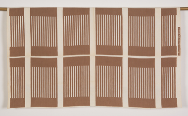
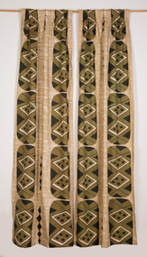 Ararat Gallery TAMA
Textile, Frances Burke, Shields (pair of curtains), 1965
Frances Burke: Designer of Modern Textiles Australia’s most influential and celebrated textile designer of the mid-20th century, Frances Burke (1904-1994), employed Australian native flora, garden flowers, marine subjects, Indigenous culture and increasingly, abstract motifs in her stunning modern fabrics. A confident, determined designer and businesswoman; Burke made the shift from fine art to design in 1937. While she began by designing dress fabrics for Melbourne’s fashionable Georges Department store, printing them on linen using lino blocks, she was an early adopter of the screen-printing process and during the war years began printing on cotton. Burke’s furnishing fabrics took their place in influential modern buildings Australia-wide through collaborations with leading architects and interior designers. They included Robin Boyd’s 1949 House of Tomorrow, Roy Grounds’ Quamby flats, Guilford Bell’s Royal Hayman Island Resort for Ansett Airlines, and Yuncken, Freeman Brothers, Griffiths and Simpson’s Canberra Civic Centre Theatre. In the post-war period, Burke made regular trips to the United States and Europe, on her return advising homeowners and manufacturers on the latest trends in products, colours and home design in lectures and interviews. At New Design her fabric showroom and interior design consultancy Burke introduced furniture by emerging designers Clement Meadmore and Grant Featherston in the early 1950s and presented local and imported homewares, mostly from the United States. She was enthusiastic about the convenient and comfortable lifestyle experienced by ordinary American women. Her fabrics and advice were regularly featured in Australian Home Beautiful, Australian House and Garden and the newspapers of the day. Some of Burke’s designs had remarkable longevity. Tiger Stripe (1938) for example, continued to be produced in a wide range of colours until 1970 and Crete (1946) remained a popular choice for interiors into the 1960s. Drawing from a rich variety of sources including Indigenous culture in Goanna (c.1954) and Pacific Island tapa cloth designs in Bird and Tree (1940), Burke also looked to Japan in designs such as Plum Blossom (1948) and Zen (1965). She loved exploring the potential of native flora, seen in designs including Waratah (1955) and Flannel Flower (1955), while garden flowers were the source for many other designs including Belladonna (1940), Periwinkle (n.d.) and Rose (1947). Burke’s clever interplay of a single striking printed colour with lively gestural lines revealing the white base fabric, gave her designs a vibrancy that characterised the optimistic post-war era. This can be seen in Burke’s fabrics for Hayman Island including Angel Fish and Seapiece (both 1949) which expressed the freshness and excitement of the luxurious new tropical resort and led to further commissions. Burke’s three decades in business (1937-1970) were an unparalleled success in the story of Australian design. Her fabrics have been collected by the NGA, the Powerhouse Museum, NGV, RMIT Design Archives and Sydney Living Museums in addition to Ararat Gallery TAMA. Written by Nanette Carter and Robyn Oswald-Jacobs. -
 Ararat Gallery TAMA
Textile, Frances Burke, Periwinkle
Frances Burke: Designer of Modern Textiles Australia’s most influential and celebrated textile designer of the mid-20th century, Frances Burke (1904-1994), employed Australian native flora, garden flowers, marine subjects, Indigenous culture and increasingly, abstract motifs in her stunning modern fabrics. A confident, determined designer and businesswoman; Burke made the shift from fine art to design in 1937. While she began by designing dress fabrics for Melbourne’s fashionable Georges Department store, printing them on linen using lino blocks, she was an early adopter of the screen-printing process and during the war years began printing on cotton. Burke’s furnishing fabrics took their place in influential modern buildings Australia-wide through collaborations with leading architects and interior designers. They included Robin Boyd’s 1949 House of Tomorrow, Roy Grounds’ Quamby flats, Guilford Bell’s Royal Hayman Island Resort for Ansett Airlines, and Yuncken, Freeman Brothers, Griffiths and Simpson’s Canberra Civic Centre Theatre. In the post-war period, Burke made regular trips to the United States and Europe, on her return advising homeowners and manufacturers on the latest trends in products, colours and home design in lectures and interviews. At New Design her fabric showroom and interior design consultancy Burke introduced furniture by emerging designers Clement Meadmore and Grant Featherston in the early 1950s and presented local and imported homewares, mostly from the United States. She was enthusiastic about the convenient and comfortable lifestyle experienced by ordinary American women. Her fabrics and advice were regularly featured in Australian Home Beautiful, Australian House and Garden and the newspapers of the day. Some of Burke’s designs had remarkable longevity. Tiger Stripe (1938) for example, continued to be produced in a wide range of colours until 1970 and Crete (1946) remained a popular choice for interiors into the 1960s. Drawing from a rich variety of sources including Indigenous culture in Goanna (c.1954) and Pacific Island tapa cloth designs in Bird and Tree (1940), Burke also looked to Japan in designs such as Plum Blossom (1948) and Zen (1965). She loved exploring the potential of native flora, seen in designs including Waratah (1955) and Flannel Flower (1955), while garden flowers were the source for many other designs including Belladonna (1940), Periwinkle (n.d.) and Rose (1947). Burke’s clever interplay of a single striking printed colour with lively gestural lines revealing the white base fabric, gave her designs a vibrancy that characterised the optimistic post-war era. This can be seen in Burke’s fabrics for Hayman Island including Angel Fish and Seapiece (both 1949) which expressed the freshness and excitement of the luxurious new tropical resort and led to further commissions. Burke’s three decades in business (1937-1970) were an unparalleled success in the story of Australian design. Her fabrics have been collected by the NGA, the Powerhouse Museum, NGV, RMIT Design Archives and Sydney Living Museums in addition to Ararat Gallery TAMA. Written by Nanette Carter and Robyn Oswald-Jacobs. -
 Ararat Gallery TAMA
Textile, Frances Burke, Fabric piece, framed
Frances Burke: Designer of Modern Textiles Australia’s most influential and celebrated textile designer of the mid-20th century, Frances Burke (1904-1994), employed Australian native flora, garden flowers, marine subjects, Indigenous culture and increasingly, abstract motifs in her stunning modern fabrics. A confident, determined designer and businesswoman; Burke made the shift from fine art to design in 1937. While she began by designing dress fabrics for Melbourne’s fashionable Georges Department store, printing them on linen using lino blocks, she was an early adopter of the screen-printing process and during the war years began printing on cotton. Burke’s furnishing fabrics took their place in influential modern buildings Australia-wide through collaborations with leading architects and interior designers. They included Robin Boyd’s 1949 House of Tomorrow, Roy Grounds’ Quamby flats, Guilford Bell’s Royal Hayman Island Resort for Ansett Airlines, and Yuncken, Freeman Brothers, Griffiths and Simpson’s Canberra Civic Centre Theatre. In the post-war period, Burke made regular trips to the United States and Europe, on her return advising homeowners and manufacturers on the latest trends in products, colours and home design in lectures and interviews. At New Design her fabric showroom and interior design consultancy Burke introduced furniture by emerging designers Clement Meadmore and Grant Featherston in the early 1950s and presented local and imported homewares, mostly from the United States. She was enthusiastic about the convenient and comfortable lifestyle experienced by ordinary American women. Her fabrics and advice were regularly featured in Australian Home Beautiful, Australian House and Garden and the newspapers of the day. Some of Burke’s designs had remarkable longevity. Tiger Stripe (1938) for example, continued to be produced in a wide range of colours until 1970 and Crete (1946) remained a popular choice for interiors into the 1960s. Drawing from a rich variety of sources including Indigenous culture in Goanna (c.1954) and Pacific Island tapa cloth designs in Bird and Tree (1940), Burke also looked to Japan in designs such as Plum Blossom (1948) and Zen (1965). She loved exploring the potential of native flora, seen in designs including Waratah (1955) and Flannel Flower (1955), while garden flowers were the source for many other designs including Belladonna (1940), Periwinkle (n.d.) and Rose (1947). Burke’s clever interplay of a single striking printed colour with lively gestural lines revealing the white base fabric, gave her designs a vibrancy that characterised the optimistic post-war era. This can be seen in Burke’s fabrics for Hayman Island including Angel Fish and Seapiece (both 1949) which expressed the freshness and excitement of the luxurious new tropical resort and led to further commissions. Burke’s three decades in business (1937-1970) were an unparalleled success in the story of Australian design. Her fabrics have been collected by the NGA, the Powerhouse Museum, NGV, RMIT Design Archives and Sydney Living Museums in addition to Ararat Gallery TAMA. Written by Nanette Carter and Robyn Oswald-Jacobs. -
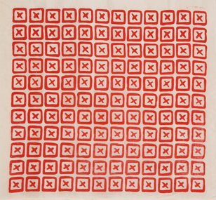
 National Wool Museum
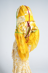
Clothing - 35 Life, Canwen Zhao, 2022
Canwen Zhao was awarded the $10,000 We The Makers Acquisitive Prize for '35 Life' in 2023. Artist Statement: "35life" is a sustainable fashion project that transforms second-hand clothing materials into urban street outdoor-style products. Highlighting prominent Chinese classic red and green colours not only conveys eastern aesthetics but also adds a sense of unity to the clothing collection. The high-saturation and high-brightness full-colour palette keeps the clothing consistently "fresh," allowing any trendy colours to seamlessly integrate into the project's designs, thus extending the lifespan of the garments. Additionally, all clothing items can quickly transform into a stylish bag for convenient daily carrying and home storage. These bags are made from leftover fabric generated during the production process and serve as original packaging for sale. This approach not only reduces excessive packaging but also enhances the chances of resale in the second-hand market. The project draws inspiration from the traditional Chinese cultural concept of "huo feng ding," meaning "exchange the old for the new." it's also influenced by the designer's personal experience with health issues, making the designs suitable for individuals who can't be exposed to sunlight for extended periods, adapting to the changing urban lifestyle. 35life aims to provide visually pleasing and comfortable dressing experiences for urban dwellers who are busy with work and experience high levels of stress. Unlike traditional design patterns, this project adopts a unique design approach. It selects 3-5 pieces of raw materials based on their colours, and then disassembles them through structural lines. While retaining most of their functionality, these materials are rearranged and assembled on a flat surface before being shaped on a dress form. Subsequently, various ways of creating storage bags are derived from the initial clothing prototypes. After refining the designs, the final products are developed, and similar materials are used to create samples. Therefore, under this design methodology, even for the same garment, it is impossible to produce two identical pieces of clothing. Each garment is truly one-of-a-kind, which enhances its rarity and contributes to the longevity of the fashion pieces. The project includes various types of clothing, each with unique storage methods. This yellow look, named "elegant beach sunscreen monarch," draws its fashion inspiration from traditional Han Chinese attire and its storage concept from the Chinese cultural concept of "jiu jiu gui yi." the design employs flat pattern cutting, utilizing materials from the second-hand market such as beach towels, children's waterproof clothing, and women's dresses. Similar colours and patterns are reassembled through cutting and combining. For the sleeves, quick-drying, sun-protective sport fabric forms the base, overlaid with discarded silk fabric dyed with turmeric and plant dyes. This not only ensures functionality but also adds a sense of elegance. The length can be adjusted using drawstrings. Artist Bio: Zhao Canwen is a multidisciplinary fashion designer with a strong passion for integrating art, history, culture, and sustainable design. With over 15 years of experience in painting, she draws inspiration from ancient Chinese philosophy and aesthetics, which gives her a unique sense of beauty. After 8 years of fashion and art training, she possesses a keen insight into current trends and tends to combine art with commercial needs. Zhao's design style is diverse, characterized by a multidimensional approach, a focus on colour application, and storytelling through details.Outfit consisting of six pieces: - Orange plastic eye wear with green paint - Pair of red and green metal clip on earrings - Red beaded phone case with attached beads on string - Pair of red and green painted running shoes - Yellow and green hooded garment with red piping and zips - Brown bag with green beaded handlessustainable, fashion, we the makers, art, culture, design, chinese philosophy, prize -
 Federation University Historical Collection
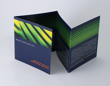
Pamphlet - Promotional brochure, Bachelor of Visual Arts, Graphic Design/Multimedia, c1999
Promoting the Graphic Design/Multimedia program being offered by the University of Ballarat at the Mt Helen Campus. Promoted course as "one of the smallest and arguably the best three year programs of its kind in Australia and the South Pacific region." The brochure lists student awards received including Platinum and Gold in the AGFA International Young Designer Contest, 1999; two meritorious awards in The Art Directors Club Student Awards, New York, USA 1999; Graphis New Talent 1999; two Gold in Souther Cross Packaging Awards, 1998. At time of publication, the School of Arts, Visual Arts reportedly had 210 students with majors in Graphic Design/Multimedia, Ceramics/3D, Painting, Drawing, and Multidiscipline. Minors studies included Printmaking, Photography, 3D, 2D, and Graphic Communication. ___ Course aimed to train "independent, flexible thinkers". The course promised to "Promote creativity, originality and imaginative thinking; Develop self-directed learners, displaying initiative in the formation of ideas and the confidence to construct personal responses; Develop appropriate conceptual, technical and professional skills; Develop the student's critical process: ability to undertake research, and to make informed decisions; Clarify thinking, concepts and understanding and deep knowledge, attitudes and skills enabling the designer to respond to community needs." Studio and working environment described as "one open space with working facilities for approximately 75 students across 3 year levels. The area is divided up into work stations where 1st, 2nd and 3rd year students intermix, allowing a natural interaction. These workstations are configurations of six, consisting of two students from each year level. This reinforces the area's ongoing development with an open ethos and cross-level delivery and learning. This maximises the use of information in order for it to be applied throughout all levels of the learning process, whilst allowing a natural mentor arrangment to be developed for all first year students, " "The open ethos approach also encourages students and staff to freely express their opinions in relation to design via cross-level critiques, whilst allowing for a liberal arts approach and structure to the development of the creative process." "Emphasis is placed on experimentation, innovation, expression and the development of the individual's design philosophies, concepts and style." Also notes the 24 hour access Macintosh laboratory, with 34 Power Macintosh computers, ratio of one for every 2.5 students. Each with a Fujitsu Dyna Magneto Optical drive for file storage and transport. Two Sharp scanners, Phaser Dye-Sublimation Extra Tabloid colour printer and Ricoh A3 colour printer. Two large format printers. Digital and video cameras. Software: Adobe Photoshop, Illustrator, Acrobat; QuarkXpress; Macromedia Freehand; Pagemaker; Premier; Director; 3D Extreme; Sound Eidt, Shockwave, Infinite 3D and After Effects. Approx 4.5 staff, "all of whom are practicing designers. They have a full understanding of industry requirements and trends which assists in the development of industrial contacts when specialists are required." Prospective students interviewed in late Nov/ early Dec, face to face. Present a "comprehensive folio of work", academic records, references. "Selection is determined by the perceived potential of the student, their motivation and reason for study within the field as well as their previous experience in the Visual Arts. Folio work should be representative of the individual's ideas and abilities. Qualities of importance are: originality, innovation, imagination, experimentation and a competent display of the basic skills associated with visual arts [evidence of drawing skills should be included]." Demonstration of GD/MM computer skills an advantage. Students also asked to bring sketch books. Promotional brochure for prospective students. 8pp Double fold brochureuniversity of ballarat, federation university, graphic design, multimedia, bachelor, degree -
 Flagstaff Hill Maritime Museum and Village
Literary work - Book, G. Sidney, Book of sermons by The Right Reverend Beilby Porteus Vol 2. Additional notes on authors life by Rev. Robert Hodgson, A.M.F.R.S, 1811 Published
Rev Robert Hodgson: His father was Robert Hodgson Snr, of Congleton, and Mildred (née Porteus) in early 1773. He was baptised on 22 September 1773 at St Peter's Church, Congleton. Hodgson was a close relative (by marriage on his father's side and by blood on his mother's side) of Beilby Porteus, Bishop of London of whom Hodgson wrote a biography of Porteus. On his mother's side, he was a descendant of Augustine Warner Jnr., who presided as the Speaker of the Virginia House of Burgesses during the time of Bacon's Rebellion (Warner served before the Rebellion in 1676, and after the Rebellion in 1677.) Hodgson was educated at Macclesfield School and Peterhouse, Cambridge, where he graduated with a BA as 14th Wrangler in 1795. He was appointed rector of St George's, Hanover Square for over forty years, from 1803 until his death in 1844. Bishop Beilby Porteus: Beilby Porteus 8 May 1731 – 13 May 1809), successively Bishop of Chester and London was a Church of England reformer and a leading abolitionist in England. He was the first Anglican in a position of authority to seriously challenge the Church's position on slavery. Porteus was born in York on 8 May 1731, the youngest of the 19 children of Elizabeth Jennings and Robert Porteus ( 1758/9), a planter. Although the family was of Scottish ancestry, his parents were Virginian planters who had returned to England in 1720 as a result of the economic difficulties in the province and for the sake of his father's health. Educated at York and Ripon Grammar School, he was a classics scholar at Christ's College, Cambridge, becoming a fellow in 1752. In 1759 he won the Seatonian Prize for his poem Death: A Poetical Essay, a work for which he is still remembered. He was ordained as a priest in 1757, and in 1762 was appointed as domestic chaplain to Thomas Secker, Archbishop of Canterbury, acting as his assistant at Lambeth Palace for six years. It was during these years that it is thought he became more aware of the conditions of the enslaved Africans in the American colonies and the British West Indies. He corresponded with clergy and missionaries, receiving reports on the appalling conditions facing the slaves from Rev James Ramsay in the West Indies and from Granville Sharp, the English lawyer who had supported the cases of freed slaves in England. In 1769 Beilby Porteus was appointed as chaplain to King George III. He was also Rector of Lambeth (a living shared between the Archbishop of Canterbury and the Crown) from 1767 to 1777, and later Master of St Cross, Winchester (1776–77). He was concerned about trends within the Church of England towards what he regarded as the watering-down of the truth of Scripture and stood for doctrinal purity. He was, however, happy to work with Methodists and dissenters and recognised their major contributions in evangelism and education. In 1776, Porteus was nominated as Bishop of Chester, taking up the appointment in 1777. He was Renowned as a scholar and a popular preacher, it was in 1783 that the young bishop was to first come to national attention by preaching his most famous and influential sermon. In 1787, Porteus was translated to the bishopric of London on the advice of Prime Minister William Pitt, a position he held until his death in 1809. As is customary, he was also appointed to the Privy Council, and Dean of the Chapel Royal. In 1788, he supported Sir William Dolben's Slave Trade Bill from the bench of bishops, and over the next quarter-century, he became the leading advocate within the Church of England for the abolition of slavery, lending support to such men as Wilberforce, Granville Sharp, Henry Thornton, and Zachary Macaulay to secure the eventual passage of the Slave Trade Act in 1807.Beilby Porteus was one of the most significant, albeit under-rated church figures of the 18th century. His sermons continued to be read by many, and his legacy as a foremost abolitionist was such that his name was almost as well known in the early 19th century as those of Wilberforce and Thomas Clarkson but 100 years later he had become one of the 'forgotten abolitionists', and today his role has largely been ignored and his name has been consigned to the footnotes of history. His primary claim to fame in the 21st century is for his poem on Death and, possibly unfairly, as the supposed prototype for the pompous Mr. Collins in Jane Austen's novel ”Pride and Prejudice”. But, ironically, Porteus' most lasting contribution was one for which he is little-known, the Sunday Observance Act of 1781 (a response to what he saw as the moral decay of England), which legislated how the public were allowed to spend their recreation time at weekends these laws continued for the following 200 years until the passing of the Sunday Trading Act of 1994.Book of sermons cover is brown with gold border and decoration Beilby Porteus (or Porteous; 8 May 1731 – 13 May 1809), successively Bishop of Chester and of London, was a Church of England reformer and a leading abolitionist in England. He was the first Anglican in a position of authority to seriously challenge the Church's position on slavery. The Works of The Right Reverend Beilby Porteus Vol 2” . Spine has “Porteus’ Works, Vol. II Sermons”. The works of the Right Reverend Beilby Porteus, D.D., late Bishop of London; with his life, by the Rev. Robert Hodgson, A.M.F.R.S. and one of the Chaplains in Ordinary to His Majesty. A New Edition in Six Volumes. Vol. II – Sermons. Published in 1811 for T. Cadell and W., Davies, in The Strand, London. Printed by G. Sidney, Northumberland-street. flagstaff hill, warrnambool, shipwrecked coast, flagstaff hill maritime museum, maritime museum, shipwreck coast, flagstaff hill maritime village, great ocean road, right reverend beilby porteous, sermons, london reverend -
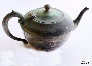 Flagstaff Hill Maritime Museum and Village
Domestic object - Teapot, Unknown
In the 1650s, the newest exciting development had arrived on Britain’s shores, this time it was tea from China. As it was brought back from overseas, tea was incredibly scarce and as such its price was very high; in 1664, the cost of tea was already 40s per pound, although this is not as high as what it would become when taxed in the 18th century. This resulted in only the social elite enjoying a cup of tea, and most commonly tea was enjoyed in coffee houses, and teapots were therefore not yet a household item. As the East India Company imported larger quantities of tea, it became more widely available and a larger section of the British population were able to enjoy it meaning that, by 1669, tea was available nearly everywhere. Likely due to the fact that tea was first enjoyed in coffee houses, the first known teapot resembles a coffee pot, with a tapering cylindrical shape and standing much taller than what we now know as a teapot at 13.5 inches tall. Into the 1680s, these teapots were given a conical cover for the spout that was fixed to the pot via a chain. As Queen Anne took the throne in 1702, teapots had become much more widely used and had formed two common groups. The first style of teapot was the pear shaped style which began to appear in 1705. The pear shaped pot usually had a domed lid and sometimes featured a finial. This form was generally supplied with a heater and stand as well as having a baluster shaped handle on one side. This iteration would disappear by 1725 but does make a reappearance in the 1740s, only this time as an inverted pear shape. The second group was the more spherical, or globular, shape which appeared in 1710. The globular teapot had a flush, hinged lid as well as a narrow moulded rim foot and a straight sided, tapering spout. Both generalised groups of teapots have polygonal examples – that is, teapots that are made up of straight sided segments – but six or seven sided teapots are incredibly rare. There is one known example of a seven sided globular teapot, made by Isaac Ribouleau in 1724. This is so unique because polygonal teapots are much more technically difficult and time consuming to make. Other than the occasional band of engraving round the shoulder of the teapot, they remain quite plain until c.1740 when scrollwork and chased shells begin to be applied for decoration. ‘Chasing’ is the process of decorating the front of a piece of metal by indenting the back, without cutting or engraving. From 1755 until 1770, silver teapots became incredibly uncommon and it is likely that this either reflects a change in drinking habits or changing trends producing a favour for porcelain. This dip in popularity could also be in response to the outrageous taxes placed on tea, up to 119%! In 1765, the Leeds creamware globular teapot seemed to kickstart a resurgence and this, combined with the Commutation Act of 1784 – which reduced tax on tea from 119% to 12.5% – saw teapots return in all their forms. It’s around this time, in 1780, that a form of teapot with a detachable, openwork stand appeared; however, the plain, oval teapot remained the most popular in the 1780s and 90s. In the later years of George III’s tenure on the throne, during the last decade of the 18th century, there was a revival of chasing and embossing teapots with flower and foliage designs. At the turn of the century, the spherical, partly fluted teapot with classical decoration was superseded by a more oblong shaped pot that sat on four spherical feet. This was then changed again when teapots became more melon shaped. It was at this time that the capacity of a teapot greatly increased and the previously wooden or ivory handles were replaced by silver handles with ivory washers for insulation. As Britain entered into the Victorian era, the design quality often suffered as there was a tendency to over-decorate the silver. In the early 19th century, the last major addition to the shape of the teapot, a raised collar was added between the cover and body. Whilst this seems to just be for decoration, there is some speculation that it could also be to prevent overspills. https://www.marklittler.com/silver-teapots-history/ This item shows that silver and silver plated teapots were used for tea making.Plain sliver teapot. Heavy oxidation. Dented.None.flagstaff hill, warrnambool, shipwrecked-coast, flagstaff-hill, flagstaff-hill-maritime-museum, maritime-museum, shipwreck-coast, flagstaff-hill-maritime-village, teapot, silver, siver plate, tea -
 Eltham District Historical Society Inc
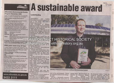
Document - Property Binder, 1184 Main Road, Eltham
Newspaper article: A sustainable award, Diamond Valley Leader, 1 November2006, Architect and building Llewellyn Pritchard won resource Efficiency Housing Award, finalist in HIA Greensmart Building of the Year Award. House – Environmental Leader (Published: Nillumbik Now and Then / Marguerite Marshall 2008; photographs Alan King with Marguerite Marshall.; p186) In 2006 environmental awareness was mushrooming in the community, which is reflected in the award-winning house at Main Road near Wattletree Road, Eltham. At first sight, the building appears a mix of a classic Eltham mud-brick house and an avant-garde building style. The crown of solar panels stretching along the width of the curved roof, indicates that this is no ordinary house. In fact it signals a new building trend of minimal impact on the environment. Yet it utilises the environment with high technical expertise to achieve comfort and cut running and maintenance costs. In recognition of this, its designer/builder, Conscious Homes, won the 2006 National HIA Greensmart Resource Efficiency Award. For Conscious Homes director, Llewellyn Pritchard, this house reflects a philosophy, strengthened by his connection with Aboriginal culture, through his foster siblings. Pritchard believes the sustainable way indigenous Australians lived and their spiritual connection with land, demonstrates how humanity is part of the ecology. His interest in environmental design stemmed from growing up in bushy Eltham Shire, with its mud-brick tradition. This was followed by studying Architecture at RMIT in the early 1980s, and learning about passive solar design. Pritchard says this house demonstrates that environmental sustainability is not about sacrifice, but about exceptional levels of occupant comfort, savings in running costs and modern fittings and appliances.1 The solar panels on the north roofs are intentionally obvious to make a statement about what the building is doing. But inside the systems are hidden and interactive with conventional services, such as the underground water tank. The house is water and energy self-sufficient and at 12 squares is much smaller than conventional houses, to minimise resources. Yet it accommodates his family of four with three bedrooms, a living/dining and kitchen area and a bathroom/laundry. Importantly the building is designed to last hundreds of years, by being able to be modified as the need arises, such as for commercial use. In this way the structure minimises its environmental impact. The solid double mud-brick walls (which are insulated) include steel beams and supporting frame, allowing the future removal or alteration of any section. The materials are local, recycled and of low toxicity where possible.2 Inside and out, the mud-brick is rendered and sealed with a combination of cement and sand and a mud-based coating in a soft golden hue increases its life. Inside, the golden-brown timber is plantation Mountain Ash and the concrete floors throughout – of local stone aggregate with a clear seal – have a natural looking random stone appearance. The house sustains a stable temperature of around 20 degrees, assisted by the concrete slab floor. The many large double-glazed windows and highlights (windows set high on walls) provide cross-flow ventilation. The north-facing living area maximises heating from the lower winter sun and is cooler in summer, because the sun is higher. Heating comes from a solar hydronic slab system. All appliances and fittings are high efficiency energy or water rated. Appliances in the timber kitchen include a gas stove and a dishwasher, using the building’s own power and water. French doors open from the living area to a deck, concealing the treatment system for all waste water. This is pumped through sub-soil drippers to the indigenous garden beds and no-dig vegetable patch. Below the carport is the 80,000-litre rainwater tank and at the back, the boiler room houses the solar boiler, water tank access, domestic water supply pump, filter gear and hydronic slab heating controls. The solar system is backed up with gas, which is needed to heat water only in winter. Gas used is less than one quarter of that for an average home with ducted heating. Excess power is fed back to the grid and the building uses about one quarter of the mains electricity of an average home. Other local builders have followed Pritchard’s lead in resource efficiency for minimal environmental impact.main road, eltham, businesses, llewellyn pritchard, hia greensmart building of the year award., efficiency housing award, conscious homes australia pty ltd -
 Flagstaff Hill Maritime Museum and Village
Container - Ink Bottle & Case, 1934 – Mid 1950’s
Pens, nib pens and later fountain pens, with suitable inks, were commonly used for writing communications from the 18th century to the mod 20th century. Fountain pens continue to be used and enjoyed. Dip pens with a wide variety of nibs are used for calligraphy writing, a hobby enjoyed by many people. The quality of the pen handle, the nib and the ink all work together to produce fine handwriting that expresses the character and mood of the writer. This Bakelite ink case has been specifically moulded to snugly contain an ink bottle, with just enough room to wrap the bottle with a padding or card or blotting paper. The screw top lid fits the case well and this container would be a good way to travel with ink because any spillage would be kept within the waterproof case. The Bakelite material is lightweight and strong. Ink bottle cases, or travelling cases, have been made as an accessory for nib pen writers. The first patent for a “pocket-case for bottles”, a wooden case, was applied for in the US in 1891. Other materials such as steel, pewter and aluminum as well as Bakelite have also been used. The British Museum has an elaborately decorated bronze ink pot holder that is inlaid with turquoise. Today ink bottle cases are even available in fabric with loops to attach to a belt. Bakelite, the material used for this ink bottle case, is made from synthetic materials and is an early form of plastic, developed in 1907 and used extensively until the 1940’s. It is still in used today for specific applications but has been largely replaced by more modern forms of plastics. This ink bottle case carries the imprint of Mabie, Todd & Co. (Aust.) Pty. Ltd. This form of company name was used from 1938 to the mid 1950’s. The Swan ink bottle’s information says it was made by Mabie, Todd & Co. Ltd., London and Sydney, so dates the ink bottle from about 1908 until 1934. (Australian newspapers display advertisements dated 1908 until 1934 for Sydney wholesalers and agents for Mabie, Todd & Co. Ltd.) ABOUT PERSONAL FOUNTAIN PENS (FOUNT PENS) A 1917 newspaper advertisement recommends that the owner of a “Swan” doesn’t lend it to anyone else to use due to its qualities of it personalised to the owner. It reads “Don’t lend your “Swan” fountpen, recommend it, but don’t let other people use it. You see, a good pen doesn’t wear, but its “tamper” (or spring) works into the writer’s pressure and manner of holding. Another person with a dashing style of writing may strain it do that it will no longer feel just like your own.” This personalisation of nib pens may be the reason that legal documents in the past being acceptable only if they were signed using a ‘wet ink’ pen. Forgeries of signatures could be easily detected as the nib takes on the character of the pen’s owner. A ballpoint pen was not acceptable. This is a strong contrast to modern times when a digital signature is widely accepted. ABOUT MABIE TODD Pty Ltd. The American company Mabie Todd began by making pencil cases in New York in the 1860’s. The Bard Brothers, makers of Gold nibs, joined Mabie Todd and the company was established in the 1870’s as Mabie Todd and Bard. In 1878 the company filed a patent for the design of a fountain pen and in 1884 the first Swan fountain pen was released. In 1884 a Mabie Todd and Bard office and showroom was established in London. In 1906 the company’s name changed to Mabie Todd & Co, New York. The UK offices also used this new name and in 1907 the UK began producing their own Swan pens. Manufacturing was going so well in England that New York sold their rights to European and Colonial business to the new Mabie Todd & Company Ltd of England. By the end of the 1930’s all components for the pens were being made in the UK; the pens in the London factory, the gold nibs in Birmingham and the ink in Liverpool. Newspaper articles from 1934 stated that Mabie Todd were large buyers of Tasmanian iridium, which had been welded with gold and used since 1834 for the tips of nib and fountain pens. Fountain pen points were the largest market buyers for Tasmanian iridium, which was classed as “the best in the world”. Production growth continued up until WWII times, when the headquarters and main factory were destroyed. Mabie Todd & Company Ltd of England rebuilt out of the inner city and by 1946 pen production began again. The market for nib and fountain pens was diminishing by this time, with people beginning to use the new ballpoint ‘Biro’ pens. The Mabie Todd bought shares in Biro Pens and in 1952 became Biro Swan. They went on to make more ballpoint pens than any other manufacturer in Britain. The ink refills that Biro-Swan produced came in five different viscosity or thickness xhoices, depending on the season and location of where the pen would be used . Along with the ballpoint pens, Biro-Swan also introduced a range of Calligraph pens to attract those following the new trend for italic writing. In 1948 Mr. T. Burke, a director for Mabie Todd & Co. (Aust.) Pty Ltd., announced that there would be a £40,000 factory built in Sydney in 1949 for the manufacture of ink. The plant for the factory would be imported from overseas. Sadly the company struggled against competition and in 1956 Mabie Todd closed business and no more Swan pens were produced. The ink bottle and container was donated to Flagstaff Hill Maritime Village by the family of Doctor William Roy Angus, Surgeon and Oculist. It is part of the “W.R. Angus Collection” includes historical medical equipment, surgical instruments and material once belonging to Dr Edward Ryan and Dr Thomas Francis Ryan, (both of Nhill, Victoria) as well as Dr Angus’ own belongings. The Collection’s history spans the medical practices of the two Doctors Ryan, from 1885-1926 plus that of Dr Angus, up until 1969. ABOUT THE “W.R.ANGUS COLLECTION” Doctor William Roy Angus M.B., B.S., Adel., 1923, F.R.C.S. Edin.,1928 (also known as Dr Roy Angus) was born in Murrumbeena, Victoria in 1901 and lived until 1970. He qualified as a doctor in 1923 at University of Adelaide, was Resident Medical Officer at the Royal Adelaide Hospital in 1924 and for a period was house surgeon to Sir (then Mr.) Henry Simpson Newland. Dr Angus was briefly an Assistant to Dr Riddell of Kapunda, then commenced private practice at Curramulka, Yorke Peninsula, SA, where he was physician, surgeon and chemist. In 1926, he was appointed as new Medical Assistant to Dr Thomas Francis Ryan (T.F. Ryan, or Tom), in Nhill, Victoria, where his experiences included radiology and pharmacy. In 1927 he was Acting House Surgeon in Dr Tom Ryan’s absence. Dr Angus had become engaged to Gladys Forsyth and they decided he further his studies overseas in the UK in 1927. He studied at London University College Hospital and at Edinburgh Royal Infirmary and in 1928, was awarded FRCS (Fellow from the Royal College of Surgeons), Edinburgh. He worked his passage back to Australia as a Ship’s Surgeon on the on the Australian Commonwealth Line’s T.S.S. Largs Bay. Dr Angus married Gladys in 1929, in Ballarat. (They went on to have one son (Graham 1932, born in SA) and two daughters (Helen (died 12/07/1996) and Berenice (Berry), both born at Mira, Nhill ) According to Berry, her mother Gladys made a lot of their clothes. She was very talented and did some lovely embroidery including lingerie for her trousseau and beautifully handmade baby clothes. Dr Angus was a ‘flying doctor’ for the A.I.M. (Australian Inland Ministry) Aerial Medical Service in 1928 . Its first station was in the remote town of Oodnadatta, where Dr Angus was stationed. He was locum tenens there on North-South Railway at 21 Mile Camp. He took up this ‘flying doctor’ position in response to a call from Dr John Flynn; the organisation was later known as the Flying Doctor Service, then the Royal Flying Doctor Service. A lot of his work during this time involved dental surgery also. Between 1928-1932 he was surgeon at the Curramulka Hospital, Yorke Peninsula, South Australia. In 1933 Dr Angus returned to Nhill and purchased a share of the Nelson Street practice and Mira hospital (a 2 bed ward at the Nelson Street Practice) from Dr Les Middleton one of the Middleton Brothers, the current owners of what previously once Dr Tom Ryan’s practice. Dr Tom and his brother had worked as surgeons included eye surgery. Dr Tom Ryan performed many of his operations in the Mira private hospital on his premises. He had been House Surgeon at the Nhill Hospital 1902-1926. Dr Tom Ryan had one of the only two pieces of radiology equipment in Victoria during his practicing years – The Royal Melbourne Hospital had the other one. Over the years Dr Tom Ryan had gradually set up what was effectively a training school for country general-practitioner-surgeons. Each patient was carefully examined, including using the X-ray machine, and any surgery was discussed and planned with Dr Ryan’s assistants several days in advance. Dr Angus gained experience in using the X-ray machine there during his time as assistant to Dr Ryan. When Dr Angus bought into the Nelson Street premises in Nhill he was also appointed as the Nhill Hospital’s Honorary House Surgeon 1933-1938. His practitioner’s plate from his Nhill surgery is now mounted on the doorway to the Port Medical Office at Flagstaff Hill Maritime Village, Warrnambool. When Dr Angus took up practice in the Dr Edward and Dr Tom Ryan’s old premises he obtained their extensive collection of historical medical equipment and materials spanning 1884-1926. A large part of this collection is now on display at the Port Medical Office at Flagstaff Hill Maritime Village in Warrnambool. In 1939 Dr Angus and his family moved to Warrnambool where he purchased “Birchwood,” the 1852 home and medical practice of Dr John Hunter Henderson, at 214 Koroit Street. (This property was sold in1965 to the State Government and is now the site of the Warrnambool Police Station. and an ALDI sore is on the land that was once their tennis court). The Angus family was able to afford gardeners, cooks and maids; their home was a popular place for visiting dignitaries to stay whilst visiting Warrnambool. Dr Angus had his own silk worm farm at home in a Mulberry tree. His young daughter used his centrifuge for spinning the silk. Dr Angus was appointed on a part-time basis as Port Medical Officer (Health Officer) in Warrnambool and held this position until the 1940’s when the government no longer required the service of a Port Medical Officer in Warrnambool; he was thus Warrnambool’s last serving Port Medical Officer. (Masters of immigrant ships arriving in port reported incidents of diseases, illness and death and the Port Medical Officer made a decision on whether the ship required Quarantine and for how long, in this way preventing contagious illness from spreading from new immigrants to the residents already in the colony.) Dr Angus was a member of the Australian Medical Association, for 35 years and surgeon at the Warrnambool Base Hospital 1939-1942, He served with the Australian Department of Defence as a Surgeon Captain during WWII 1942-45, in Ballarat, Victoria, and in Bonegilla, N.S.W., completing his service just before the end of the war due to suffering from a heart attack. During his convalescence he carved an intricate and ‘most artistic’ chess set from the material that dentures were made from. He then studied ophthalmology at the Royal Melbourne Eye and Ear Hospital and created cosmetically superior artificial eyes by pioneering using the intrascleral cartilage. Angus received accolades from the Ophthalmological Society of Australasia for this work. He returned to Warrnambool to commence practice as an ophthalmologist, pioneering in artificial eye improvements. He was Honorary Consultant Ophthalmologist to Warrnambool Base Hospital for 31 years. He made monthly visits to Portland as a visiting surgeon, to perform eye surgery. He represented the Victorian South-West subdivision of the Australian Medical Association as its secretary between 1949 and 1956 and as chairman from 1956 to 1958. In 1968 Dr Angus was elected member of Spain’s Barraquer Institute of Barcelona after his research work in Intrasclearal cartilage grafting, becoming one of the few Australian ophthalmologists to receive this honour, and in the following year presented his final paper on Living Intrasclearal Cartilage Implants at the Inaugural Meeting of the Australian College of Ophthalmologists in Melbourne In his personal life Dr Angus was a Presbyterian and treated Sunday as a Sabbath, a day of rest. He would visit 3 or 4 country patients on a Sunday, taking his children along ‘for the ride’ and to visit with him. Sunday evenings he would play the pianola and sing Scottish songs to his family. One of Dr Angus’ patients was Margaret MacKenzie, author of a book on local shipwrecks that she’d seen as an eye witness from the late 1880’s in Peterborough, Victoria. In the early 1950’s Dr Angus, painted a picture of a shipwreck for the cover jacket of Margaret’s book, Shipwrecks and More Shipwrecks. She was blind in later life and her daughter wrote the actual book for her. Dr Angus and his wife Gladys were very involved in Warrnambool’s society with a strong interest in civic affairs. He had an interest in people and the community They were both involved in the creation of Flagstaff Hill, including the layout of the gardens. After his death (28th March 1970) his family requested his practitioner’s plate, medical instruments and some personal belongings be displayed in the Port Medical Office surgery at Flagstaff Hill Maritime Village, and be called the “W. R. Angus Collection”. The ink bottle case is significant for its association with writing methods commonly used during the colonisation of Australia until the mid-20th century. The protective Bakelite case demonstrates the value placed on caring for the user’s supply of ink and protecting other belongings of the user, enabling writers to easily carry and safely transport their ink without the concern of spilling it. The case’s design is a good example of the use of new technology. The properties of Bakelite have enabled its moulded design and make it waterproof and lightweight, easily cleaned, closely fitted to the shape of the ink bottle within and lid and base join together using a smooth screwing action. The maker’s marks have also been moulded into the Bakelite, therefore not distracting from the simple but elegant design. This ink bottle case also represents the period of early to mid-20th century when handwriting materials for writers using ink and nib pens were imported into Australia and developed for the Australian market and sold by wholesalers on behalf of overseas companies. Vintage brown Bakelite travelling ink bottle case (or holder, pot, well) containing glass ink bottle and original textured cardboard liner, made by Swan Ink, Mabie, Todd & Co. (Aust) Pty.. Ltd. The Bakelite container is shaped to fit snugly around the ink bottle. It still retains its original shiny finish, the lid screws on and off perfectly. The maker’s name is embossed on lid and base of the Bakelite container. The inkwell contains a glass Ink bottle with a tiny amount of dried up ink Swan triple filtered ink inside. The bottle is cylindrical with curved shoulders tapering to a neck of around 2cm. The white metal screw-on lid and the white and red paper label on the side of the bottle both have a printed description of the ink and maker. Circa 1934-1950’sBAKELITE INK CASE - embossed on either side of the lid “ “SWAN” INK / ”SWAN” INK “ - embossed into base, written in a circle “MABIE TODD & Co (Aust.) PTY. LTD.” GLASS BOTTLE – printed on lid “SWAN”/ [corporate logo combining letters ‘M, T, co’]/TRIPLE FILTERED/ INK.” - printed on label “SWAN” INK /FOR FOUNTAIN & / STEEL PENS / A BLUE BLACK INK OF/ THE FINEST QUALITY/ MADE IN ENGLAND/ MABIE. TODD & CO LTD …….. LONDON. SYDNEY/ Makers of “SWAN” Pens, Gold Pens & Ink“ - moulded into the base of the ink bottle and written around the bottom outside edge of the bottle are the words “THIS BOTTLE ALWAYS REMAINS THE PROPERTY OF/ MABIE TODD/AUST”flagstaff hill, warrnambool, shipwrecked coast, flagstaff hill maritime museum, maritime museum, shipwreck coast, flagstaff hill maritime village, great ocean road, ink bottle holder, ink bottle case, ink bottle pot, travelling inkwell, portable inkwell, travelling ink pot, travelling ink bottle case, ink bottle, inkwell, ink well, swan ink, bakelite, dip pen ink, nib pen ink, fountain pen, fontpen, writing methods, stationery, mabie todd & co, swan fountain pens, biro-swan -
 The Beechworth Burke Museum
Photograph
Taken in the early 2000s, this photograph depicts two men and two women, all holding wine glasses. Everyone is casually dressed and seem to be attending a dinner party at the Burke Museum. The group of four have been identified as A. Robbins, J. Indian, S. Routledge and A. Box.This photograph is significant because of its insight into the social aspect of life at the Burke Memorial Museum during the 2000s. The photograph is part of a large collection of photos from this time period and shows fashion trends, social events and interior design trends of the time. The photograph in an interpretive capacity could also assist in further research into the life and development of the Burke Museum, providing a different perspective on early 2000s social events and their development into the social events of today.Coloured rectangular photograph printed on photographic paper.Obverse: No Exit / Reverse: AGFA Watermark / 6511burke museum, beechworth, 2000s, dinner party, function, recreation, fashion, party, 2000s clothing, community -
 Orbost & District Historical Society
newspaper clipping, 16.8.1975
The Daily Telegraph is a broadsheet newspaper published in London by Telegraph Media Group and distributed across the United Kingdom and internationally. This newspaper clipping was used by Marjorie Burton for fashion ideas. Marjorie Burton ( nee Whiteman), born 12 June, in Birmingham, England came to Orbost in 1995. In England she did office work – typing, shorthand and secretarial work - in accountants’ offices and also trained as a comptometrist with Burroughs in London. She came from a middle-class working church-going family. Her mother was a milliner who made many of Marjorie’s clothes, hats and outfits. Marjorie was married in 1938 to a salesman who later became a mechanic in the R.A.F. during WW11. Newspapers reflect the current social and fashion trends. This item is an example which reflects the women's clothing fashions of 1975.A page from the Daily Telegraph, Saturday August 16, 1975. it contains articles and advertisements for women's fashion.Bottom left hand corner of page 8 - illegible handwriting in blue pen.newspaper-article-fashion burton-marjorie -
 The Beechworth Burke Museum
Ceremonial object - Ushabti of Taweret-Khaiti, Circa 1292 BC
Ushabti are tiny anthropoid (human-shaped) figures placed in the tombs of wealthy Egyptians. They were intended to do the work of the deceased in the afterlife. This purpose is implied through their name, which may have derived from the Egyptian word “to answer”. The Burke Museum in Beechworth is home to a particular ancient Egyptian Ushabti figure. This artefact was donated to the Museum in 1875. No details about how it left Egypt, arrived in Australia, and where it was located before this donation are known. The Nineteenth Century, when this artefact was donated, was a period when many museums acquired items of ancient Egyptian heritage. Many of these items were procured in less than desirable circumstances, having often been looted from ancient tombs and sold to tourists without documentation as to their original location and/or accompanying grave goods. These artefacts were also divested through partage (the trading of artefacts for funds); however, the latter is unlikely to have been the case for this artefact. Since the Ushabti was donated by an unknown donor, it is likely to have been in a private collection rather than an institution. Ushabti can be dated using iconographic analysis which is non-invasive and provides a comprehensive study of the artefact. The later period of the 18th Dynasty marked the beginning of an increase in both the inclusion of Ushabti as essential funerary items and the creation of Ushabti with tools. From this period, they are no longer depicted without tools. Depictions of tools including gardening hoes are frequently depicted grasped in the Ushabti’s hands whilst items like the seed-bag are depicted hanging on the back rather than in an alternative position. This Ushabti figure grasps a gardening hoe and a mattock and a small seed bag surrounded by a yoke bearing water jars are depicted on the upper back of the Ushabti. These features are essential in helping narrow this dating to the late 18th and before the early 20th Dynasty. The position of this seed bag also provides dating information. In the early 18th Dynasty this bag was consistently drawn on the front of the figurine; however, by the reign of Seti I, this feature moved to the back. Thus, since the seed bag is located on the back of this Ushabti, it cannot date to the early 18th Dynasty. By the 19th Dynasty, Ushabti’s were increasingly made from either faience or terracotta. The availability of these materials in Egypt resulted in the increase of Ushabti production with tombs containing many more figurines than previously seen. The Ushabti held by the Burke collections is made from terracotta. Terracotta was rarely used for Ushabti before and during the early 18th Dynasty with only the odd appearance until the late 18th Dynasty and becoming common through that period until the late Third Intermediate Period. Whilst the face has been damaged, there is no evidence for the Ushabti having been provided with an Osirian false beard. This omission rules out a dating of later than the 25th Dynasty when beards became prominent. The inscriptions also date the Ushabti to the New Kingdom. This is because of the use of sḥḏ (“to illuminate”) with Wsjr (“Osiris”) which only occurs in these periods. Therefore, considering all these elements, the Ushabti can be confidently be dated to between the late 18th to early 19th dynasty.Artefacts like this Ushabti are no longer exclusively representative of their origins in burial assemblages and significance in the mythology of the Egyptian afterlife but are also significant for the accumulated histories they have gained through travel. The movement of this artefact from Egypt to Australia allows insight into the collecting habits of the 19th century, and in particular, the reception of ancient Egyptian artefacts in small rural museums. The procurement of Egyptian artefacts was a social trend around the late 1800s to early 1900s. Egyptian artefacts were considered curiosities and recognised for their ability to attract public attention to museums. They were also utilised in Australian museums, like the Burke Museum, to connect the collection to one of the oldest civilisations known to man and since Australia was considered a “young” country by European settlers, this was vital and derived from an interest in Darwin’s “Origin of the Species” 1859. Furthermore, there was a culture of collecting in the 1800s amongst the affluent in English society which led to the appearance of many Egyptian artefacts in private collections. The acquisition of this Ushabti figure is not certain, but it was likely donated from a private collection rather than an institution. This particular artefact is significant as an example of a high-quality Ushabti representative of those produced during the late 18th or early 19th century. It provides insight into the individualism of an Ushabti and the mythology of ancient Egypt. It also provides an example of the types of items required in the tomb assemblages of this period and reinforces the importance of ensuring the successful afterlife of the deceased through art. This Ushabti belonged to a woman named Taweret-Khaiti, Chantress of Amun, in the late 18th Dynasty or early 19th Dynasty (c.1292 BC) of the Egyptian New Kingdom. It likely comes from an undetermined tomb in the locality of Thebes. This figure is made from Nile silt clay (a polyester terracotta; clay sourced from the banks of the Nile River) which was a popular material for Ushabti construction in the early 19th Dynasty. It is in a fair state of preservation (with the exception of a break through the centre) and originally made to a high quality. The face has been damaged but the eyes and eyebrows are clearly marked with black ink and the sclera painted white. The Ushabti is painted a light brown/yellow colour and features a vertical line of inscription down the lower front. The Ushabti wears a large wig and and a schematic collar. The arms are painted light brown and depicted crossed with bracelets around the wrists. It grasps a hoe and mattock. A yellow seed-basket is depicted on the Ushabti’s back. These features represent the likelihood that this particular Ushabti was intended to complete farm work for the deceased in the next life. There would have been additional Ushabti of similar design within the tomb who worked under the supervision of a foreman Ushabti. The foreman Ushabti would be depicted dressed in the clothing of the living. The inscriptions are painted freehand in black ink and written in a vertical column from the base of the collar to the foot pedestal on the front of the Ushabti. The owner of the Ushabti could elect to have the figures inscribed with their name, the Ushabti spell and any other details they deemed necessary. In the case of this example, the Ushabti is inscribed with the owner’s details and is an abbreviated version of the standard Ushabti formula. This formula ensured that the Ushabti would complete the desired task in the afterlife when called upon by the deceased. Ushabti which were not inscribed would represent their intended purpose through design; however, this Ushabti, like most made in the late 18th Dynasty, conveys its purpose both through both design and inscription. The inscription is as follows: sHD wsir nbt pr Smayt imn tA-wr(t)-xai(ti) mAa xrw which translates to: "The illuminated one, the Osiris (the deceased), the mistress of the household, Chantress of Amun, Taweret-Khaiti, true of voice (justified)"ancient egypt -
 Flagstaff Hill Maritime Museum and Village
Coat rack
A hat coat and umbrella stand is a device used to store hats and often coats on, and umbrellas within. Some catalogues in Europe marketed this furniture as a portmanteau from the French words Porter (carry) and Manteau (cloak). The front hall was the introduction to the house, and as such was an important part of the Victorian home. Furnishings were selected not only to make it a useful place to hang a hat and coat, store an umbrella and leave a calling card but also to show family wealth, social position and knowledge of current styles. A hall stand or a hat rack was the most important piece of furniture in homes at this time. New and more elaborate designs began to appear about 1840, as homes became larger and social visits became more structured. Usually made of wood and standing at least 1.5 meters tall, they have a single-pole making up most of the height, with a sturdy base to prevent toppling, and an array of lengthy pegs or hooks at the top for placement of hats. Smaller houses had smaller front halls, so a single-pole type as by the 1920s houses had become smaller. A household furniture item possibly from the 1920s that was common in houses from the early 1840s, it's significance is social, demonstrating how furniture trends change over time with the more elaborate the item the more social standing was attributed to the owners' position in society. even today persons association and ownership with inanimate objects tend to represent their social standing along with their financial and community acceptability. Coat rack with four curved legs, circular holder for umbrellas and walking sticks. Four metal hooks, screwed onto main column of stand. Condition: one curved leg broken. 2 hooks broken.Noneflagstaff hill, warrnambool, shipwrecked-coast, flagstaff-hill, flagstaff-hill-maritime-museum, maritime-museum, shipwreck-coast, flagstaff-hill-maritime-village -
 Federation University Historical Collection
Book - Book - Scrapbook, Ballarat College of Advanced Education: Scrapbook of newspaper cutting, Book 8; September 1980 to March 1981
Newspaper cuttings relating to Ballarat College of Advanced Education. These are from various newspapers and include The Age, Ballarat Courier, The Australian, The Herald. The cuttings cover the period from 5 September 1980 to 12 March 1981. The opening of Founder's Hall was covered in March item. . Book with yellow cover, front. Image of two trotters. Spiral bound.employment advertisements, application for enrolment, outline of courses, sir mark oliphant, educationkey to future, dr jim cairns, victoria chapter of ace, seminar on country tv, bcae survey to help portland, nukool limsettoe former smb student, bcae recreation study, non competitive running success, shadow of the mount marathon, bcae's computer harbor, facilities in schools inadequate, shortage of teachers predicted, bcae gets firemobile, teachers' college students reunion, innovative projects, music synthesiser, on whispering trail, concern at art teachers' future, bcae 10 years old, first aid awards for p e students, radio for fire brigade, sports medicine symposium, fine art degree course, missing girl, faye atkinson, coastal engineering, lack of funds, cutbacks in engineering courses, deakin stands firm on course status, vacation jobs for metallurgy students, up with world harbor trends, dr graham allen, hatchet man, future good for engineers, engineering courses cut, new look for education, survey into gold mining prospects, bcae steering a safe course, hostel charges hike, beaufort house, bcae allowed to award degree qualifications, windpower, integrating handicapped children, greenhill summit run, founder's hall opening, sir zelman cowen, scholarship winners, mark foord engineering, david condle metallurgy, research grantsawarded, swimming team -
 Kiewa Valley Historical Society
Jar Stone Earthenware, circa early 1900s
This type of "stone" jar drinking container was used before glass and later plastic material made it "out of date" as a drink container. The qualities of the glazed pottery (stone) drinking containers made from this natural thermal insulation material was to contain the liquid to a prescribed temperature either hot or cold, as required. This was particularly important in rural environments that lacked adequate refrigeration means. The rural regions where the last areas in Australia where this type of drinking container remained in use. The late 1960's saw a revival of the basic rural ethos by the "hippie" culture of going to basic survival non "commercial" living.This particular stone jar drinking container was also a method of advertising for a Wodonga Stone masonry manufacturer. It is both relevant and significant to the Kiewa Valley because it highlights the type of industry that has breached the evolutionary trend for cheaper "throw away" drinking containers. Although this particular type of container is limited to quality liquids and it is still available in most rural sectors of the Australian "bush" environment.This stone/earthenware jar has a lip 250mm in length and 150mm thick. This lip will allow the thumb and forefinger to be used to grip the container for either pouring its contents out or securing it for any movement. The external glazed surface may become slippery when wet. The jar is heavy even when empty and would be too heavy for small children to carry. By using a cork seal the jar can be reused and therefore become more economical for the longer term. The thickness of the vessel provides a good insulation for the liquid contained. Most of this type of container would have contained ginger beer.Within two elliptical circles are painted (in freehand) "S. MASON" in the top half and "WODONGA" in the bottom half.These are separated by an asterisk on both sides. A large "S" overlaid by a similarly large "M" is within the inner circle. Stamped into the jar when still wet during manufacture is "PINNACLE BRAND" in 5mm lettering.drinking container, stone jar, ginger beer container, s. mason, wodonga earthen ware -
 Kiewa Valley Historical Society
Camera Box Brownie Folding, Six 20 Folding Brownie KodetteII, Circa 1948 to late 1970s
This camera was made for the mobile photographer and the camera manufacturer Kodak was at the peak of production. Mr. George Eastman, the company's founder, who invented roll film, which could withstand the outdoor activities and therefor replaced photographic plates. In 1900, the Box Brownie camera was first released Kodak's motto was' "You push the button, we do the rest," The film used in this camera was Kodak Verichrome 620 introduced in 1936 and only went out of production 2009. This camera was a vintage 1970s one. Between 1963 and 1970 the company sold 50 million of this type of camera. The production of smaller and more user friendly digital cameras, mainly from Japan finally nailed the coffin lid on the Kodak Company. Ironically, one of Kodak's engineers called Steve Sasson, devised a camera that could save images using electronic circuits. The images were transferred onto a tape cassette and were viewable by attaching the camera to a TV screen, however Kodak tried to maintain its photographic film products beyond its "use by date". In1975 Kodak becomes the first company to make a digital camera, however the Japanese manufacturers could make smaller and more compact cameras ending Kodak's monopoly and eventual demise.This particular "box brownie" was used by Margaret Shefford, nee Turner, who with her husband retired, in the 1980s, to Mount Beauty. The camera was purchased in the 197's and used on their cruise to England. The significance of this item is that at the time of its introduction to Mount Beauty the camera was a "state of the art", for general public, camera introduced by an ever increasing influx of retirees. This identifies the Kiewa Valley not only as an attraction for sightseers and overseas tourists but also retirees. The social implications of this trend will continue to provide a broader requirement for medical and other facilities geared up to the requirements of an aging population. As a lot of cities in Australia have increasing levels of violence (mainly drug related) rural "retreats" are becoming more sought after by sections of "the gentle populous"This is a black metal rectangular camera, rounded on the ends and has silver colored fittings(stainless steel) and a small leather handle on hinges the left side (facing the lens). The folding lens and shutter component fold out from the main compartment. Two metal arms swing out and hold the lens and collapsible lens body to the required length. When not in use this collapsible (folding) lens extension is fastened to the main body structure providing security and preventing damage to the folding material. The camera has a collapsible eye piece or view finder at the top end. The right hand bottom end has a cylindrical film wider (polished steel). Inside there are two cylindrical cavities, one holding the roll of unexposed film and the other (winder) end a cylinder onto which the unexposed film is wound through for each picture frame. There is a locking mechanism to hold the folding lens structure to the main box structure. See KVHS 0419B for its carrying caseNo external makings but when the lens is folded out it exposes manufacturing information on metal base around the lens " Kodette II B I shutter"(B= Bulb and I= Instant), underneath this, in larger print, is "'FOLDING 'BROWNIE' SIX - 20" below the lens and in smaller print, "made in Great Britain" and underneath this "by KODAK ltd"kodak kodette ii, folding brownie camera, photography, hobby personal item, tourist gadgets. -
 Australian National Surfing Museum
Surfboard, 1/1/1996 (estimated)
Kelly Slater is contemporary surfing's dominant competitive presence and a truly inspirational surfer. By the end of 2009 Kelly had won a record 9 professional World Surfing Championships. This surfboard is one of Kelly's from 1996 shaped by world renowmed shaper Al Merick from Channel Island Surfboards, Santa Barbara, California. This board was ridden by Kelly in Indonesia in 1996 and featured on the cover of Surfer Magazine in November 1996 in a sequence shot at speed reef Grajagan.This surfboard was ridden by Kelly Slater throughout 1996 and most famously featured on the cover of Surfer Magazine. In 1996 Kelly Slater was at the peak of his surfing powers. During this year he won his 4th World Professional Surfing championship equalling the record held by Australian Mark Richards. This surfboard has international significance and represents a number of innovative design trends during this period.Kelly Slater surfboard shaped by Al Merrick (Channel Island Surfboards)in 1996. The surfboard is a three fin, 6' 6" rounded pin, colour yellow. The board, with Kelly riding it, featured on the cover of Surfer magazine in November 1996 in a sequence, shot in Indonesia at speed reef Grajagan.Deck - Quiksilver, Al Merrick logo Bottom - 'Glasscraft by Bob Haakenson Santa Barbara' behind last fin. Al Merrick logo 63921A Kelly on stringerkelly slater, al merrick, surfer magazine, grajagan, channel island surfboards, quiksilver -
 Flagstaff Hill Maritime Museum and Village
Ceramic - Chamber Pot, 1912
In the 19th and early 20th centuries, J. & G. Meakin were important, large-scale producers of good quality, ironstone tableware (‘White Granite’ ware) that met a ready market in the United States, South America, Australia, and other traditional British markets. By the 1890s the company was one of the world’s largest earthenware manufacturers. Although export teaware and tableware was the factory’s staple commodity, Meakin also manufactured toilet ware, kitchen ware and a wide range of fancy earthenware. The company was amongst the first British pottery firms to experiment with modernist designs associated with the art deco period. The Moderne' range was introduced in 1929 consisting of an angular shape decorated design with geometric patterns and often highlighted with silver or gold. This range remained in production through the 1930s. Post 1945 the company introduced the streamlined Studio shape (1953) and Horizon shape (1955) both heavily influenced by the Russell Wright ‘American Modern’ tableware. In 1964 a new Studio shape was released with tall streamlined coffee pots used as the background for many contemporary patterns now associated with the 1950s and 1960s. Designs by Jessie Tate and Eve Midwinter, some originally found on Midwinter shapes, also appear on 1970s Studio ware. The Studio range was one of Meakin’s most successful and continued in production until the late-1970s. The enormous range of floral, geometric, and abstract designs make Studio Ware collectible in its own right. In the 1970s and 1980s as part of the Wedgwood Group Meakin produced contemporary products under the ‘Bull in a China Shop’ and ‘Creative Tableware’ names. ‘Sol’ (c.1912-1963), ‘Studio’ (1953 on) and ‘Royal Staffordshire’ (post 1968) were important J. & G. Meakin Ltd trade names. Meakin marks are numerous, but all include the J. & G. Meakin name. The significance of this item and pottery generally is that often earthenware is portrayed as being a landmark in the evolution of humanity. This is because these items are the few things from the past that have survived in a tangible form. Pottery is an important functional part of society and it has a critical role to play as it helps archaeologists to date other artefacts of the same time period. Also, the decorations on pottery have told much about the beliefs, lifestyles and lives of the people who bought them and used them. In other words it gives us today a snapshot of society from the past and how people used these items in their daily lives, their likes as well as societal and design trends. Earthenware white glazed ironstoneJ & G Meakin Hanley England stamped to base, with white flora designwarrnambool, flagstaff-hill, flagstaff-hill-maritime-museum, shipwreck-coast, flagstaff-hill-maritime-village, pottery, earthenware, iron stone, alfred meakin, james meakin, george meakin, earthenware manufactures, chamber pot