Showing 1067 items matching "designer"
-
 Eltham District Historical Society Inc
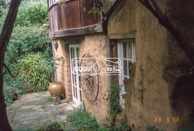
Slide - Photograph, Gordon Ford garden, "Fulling", Pitt Street, Eltham, 23 May 1993
"Fulling", pronounced Fu-elling, the 'display home' of Gordon Ford landscape designer and consultant. From 1945 he transformed one and a half acres of treeless grassland into a splendid bush garden complete with a waterfall and ponds. He used sawdust and wood shavings as a base for the bush floor. The 1993 Eltham Heritage Tour was enjoyed by a busload of members of the Historical Society on a fine, calm day, Sunday May 23rd. Between 10.00 am and 4.30 pm, except for a brief lunch stop at the Eltham Living and Learning Centre, members passed about thirty places of local interest and others recommended for the Historic Buildings Register and the Register of the National Estate. A number of significant trees and buildings were also highlighted along with the opportunity to explored some of the properties.35mm colour positive transparency (1 of 24) Mount - Kodak Kodachromeactivities, shire of eltham historical society, heritage excursion, eltham, fulling, gordon ford garden, pitt street -
 Robin Boyd Foundation
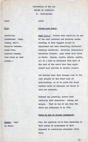
Document - Script, Robin Boyd, University of the Air. Design in Australia 8. Conclusions, 1964
Robin Boyd was involved in creating several TV series for the ABC University of the Air. 'Design in Australia' was an eight part series. (Items D184-D193 contain all the manuscripts except part six titled 'Communications'.) In part 8, Boyd concludes his lecture with an overview of the state of Australian design. Boyd points to the uniqueness of Australia's natural landscapes and asks a series of pointed questions, implying that Australian design does not reflect or match up to its context. In Boyd's view, Australia now produces world-class designers, but lacks a world-class design culture, leading the best professionals to leave for the US or UK. Boyd concludes by arguing that Australian design culture can be developed into something both connected to the rest of the world and still uniquely Australian.This is a draft script for the ABC television program 'University of the Air', subtitled 'Design in Australia', broadcast in 1965.Typewritten (c copy), foolscap, 12 pagesInscription in pencil on p.8 - "good ideas (Kings + fountain)"university of the air, design in australia, robin boyd, henry lawson, d.h. lawrence, kangaroo novel, canberra, manuscript -
 Brighton Historical Society
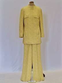
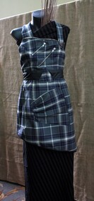
Pant suit
This pant suit belonged to Bernice Overend, a longtime Brighton resident. Bernice Adelaide Emily Lawn was born in Ballarat in 1911. In 1938 she married Acheson Best Overend (1909-1977), an early modernist architect in Melbourne whose notable designs include the heritage-listed Cairo Flats apartment building in Fitzroy. Bernice and Best made a home together in Brighton, raising their family at 80 Were Street. Their son Darren followed in Best's footsteps, becoming an architect, and in 1979 he and his wife Jenny bought a property just down the road from his childhood home - the heritage-listed 1881 Victorian mansion 'Chevy Chase' at 203 Were Street. Bernice lived in the house with Darren, Jenny and their three children. Stell-Ricks was the label of Melbourne fashion designer Stella Dare.Pant suit comprising tunic (.1) and flared pants (.2) made from cream, yellow and gold lurex woven in a floral pattern. Tunic has a pair of non-functional pocket flaps at breast and two finctional pockets at front hip area. Tunic fastens with a centre back zip. Tunic lined with shell pink poyester satin; pants unlined.Label woven white on black acetate centre back tunic: Stell-Ricks / OF MELBOURNE / SUITS TOPCOATSpant suit, 1970s fashion, chevy chase, overend family, bernice overend, melbourne designers, stell-ricks, stella dare -
 Parks Victoria - Gabo Island Lightstation
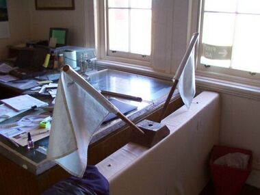
Flags
Used to signal ships from lightstation. White flags are semaphore flags used for signalling alphabet letters. Salvaged from junk pile and mounted on wooden block. The identical, white hand held flags, which were used as a pair, are each stapled to a dowel. Information on both items indicates they were made by a well known flag, pennant and banner makers, Evan and Evans who were then located at 680 Elizabeth Street, Melbourne and are now in Spencer Street West Melbourne. Founded in 1877, the firm was a co designer of the Australian Flag in 1901. The flags are likely to date from c.1960 - 70 and are currently displayed in the former Keepers' quarters/ weather room mounted on a wooden block. Similar pairs of semaphore flags are held in Wilsons Promontory and Cape Nelson collections. The flags have second level contributory significance for their provenance to the lightstation and flag makers Evan & Evans. Thet have historic value for increasing our understanding of the semaphore signalling system formally used at the lightstation.Two identical white fabric flags stapled to a wooden dowel and secured to a wooden base on an angle.They have blue writing, on tags, on the flags.On tags on both flags, "EVAN & EVANS FLAGS P/L / FLAGMAKERS / 680 ELIZABETH ST / MELB. 3000 3475755" -
 Ballarat Apron Festival
Apron, The Ballarat Apron, 2014
This apron was designed for the Ballarat Apron Festival by local designer Clare Schreenan of Clasch Designs Ballarat. The tartan fabric was designed by Art Gallery of Ballarat for the 2014 exhibition “For Auld Lang Syne: Images of Scottish Australia, from the First Fleet to Federation”, and is officially registered with the Scottish Register of Tartans. The colours are highly significant: grey being chosen for the basalt plains on which Ballarat is built upon; Blue and white representing the Eureka Flag; and yellow for the gold that has made Ballarat so famous. Born in Ballarat, Schreenan attended Loreto College before studying fashion at Melbourne College of Textiles. She has worked extensively in Sydney, travelling to Paris, London and Los Angeles for work projects. She returned to Ballarat in 2006, launching Clash Design. Featuring the official, highly symbolic Ballarat tartan, and made by highly renowned local designer Clare Schreenan, this contemporary apron is of local significance to the Ballarat community. Grey, blue, white and yellow wool tartan fabric apron with asymmetrical design. Velco closures on back with zipper detailing. ballarat, tartan, apron -
 Federation University Art Collection
Drawing - Artwork, 'Resilience' by Xersa
My recent work is figurative, thematic of resilience and regeneration which relates to world-wide natural and non natural events that affect our health recalling our strength and determination. The allurement of drawing began before crawling and ever since then, kept vision of consistent excellence to becoming the best and to draw better than Picasso and Matisse. I hereby thank everyone for the rewarding experiences you have imparted to me so far, each mark made by my hand has the memory of you all within them. May there be much more.XERSA (1952- ) Born Christine Limb in Daylesford, Victoria An artist with over 40 years of experience in drawing, painting and sculpture installation, who studied Fine Art at Ballarat Institute of Advanced Education (now Federation University) from 1969 to 1970, and Fine Art and Industrial Design at RMIT from 1971-1974. During the 1970s Xersa worked as a textile designer and then established a design studio in Melbourne. Xersa has been a finalist and awarded in important Australian art awards including the Dobell Prize for Drawing, and internationally exhibited contemporary artist with experience of over 20 solo and 40 group exhibitions in major galleries and Museums alongside other significant artists. .2) Exhibition Catalogue 'Resilience' : A Promotional Exhibition held at Menier Gallery, London, UK. October 24-29, 2016Drawing mounted onto perspexxersa, available, alumni, portrait -
 Federation University Bookplate Collection
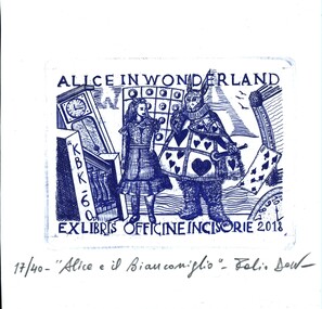
Work on paper - Bookplate, Alice in Wonderland
After a quiet period, interest in bookplates in Australia began to increase in the early 1970s, Entrepreneurial art and book collectors such as Edwin Jewell and others commissioned multiple Bookplate designs from a range of well known fine artists. At a 1997 meeting in Melbourne of the Ephemera Society of Australia Edwin Jewell and others announced the formation of the Australian Bookplate Society. The society was instrumental in promoting the art of the bookplate through establishment of the Australian Bookplate Design competition. The competition includes a design award for International bookplate designers and graphic artists. as well as Australian secondary school students. Art movements Artist’s statement Subjects Bookplate, Australian Bookplate Design awards, Kieth Wingrove Trust Entered in the International Bookplate Design section of the the Australian Bookplate Society's 'Australian Bookplate Design competition for 2020.Pencilled beneath image: 17/40- "Alice e il Bianconiglio" - signature of artist. -
 Federation University Bookplate Collection
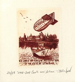
Work on paper - Bookplate, Centenary of Lithuania
After a quiet period, interest in bookplates in Australia began to increase in the early 1970s, Entrepreneurial art and book collectors such as Edwin Jewell and others commissioned multiple Bookplate designs from a range of well known fine artists. At a 1997 meeting in Melbourne of the Ephemera Society of Australia Edwin Jewell and others announced the formation of the Australian Bookplate Society. The society was instrumental in promoting the art of the bookplate through establishment of the Australian Bookplate Design competition. The competition includes a design award for International bookplate designers and graphic artists. as well as Australian secondary school students. Art movements Artist’s statement Subjects Bookplate, Australian Bookplate Design awards, Kieth Wingrove Trust Entered in the International Bookplate Design section of the the Australian Bookplate Society's 'Australian Bookplate Design competition for 2020. -
 Seaworks Maritime Museum
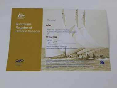
Certificate, Australian Register of Historic Vessels Certificate - Idler, 2012
Certificate or registration of the Historic Vessel the 'Idler' which is currently also at the Seaworks Maritime Discovery Centre.This certificate registers the 'Idler' as a surviving vessel of relevance to Australia's maritime heritage.Certificate from the Australian Register of Historic Vessels from the Australian National Maritime Museum. For the vessel, the Idler. Signed on 25th May 2012"Australian/ Register/ of/ Historic Vessels/ Australian National Maritime Museum." "The vessel/ Idler/ has been accepted into the Australian Register of Historic Vessels/ on/ 25 May 2012/ signed/ Kevin Sumption Director/ Australian National Maritime Museum." "The Register records surviving vessels of relevance to Australia's maritime heritage. It is/ building a national picture of boats and their designers, builders and owners from around/ Austrlia, to promote understanding of their connections with their communities past and /present, and to encourage awareness and planning for their preservation and use./ The ARHV is managed by the Australian National Maritime Museum in association with /Sydney Heritage Fleet." -
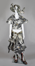 National Wool Museum
Clothing - Outfit by Iordanes Spyridon Gogos x Akira Isogawa 'Look 2', Jordan Gogos, 2022-2023
This outfit from Sydney-based wearables label Iordanes Spyridon Gogos (ISG), was designed by Founder and Creative Director Jordan Gogos in collaboration with Akira Isogawa and other creative partners. The outfit comes from the ISG x Akira 2023 Afterpay Australian Fashion Week (AAFW) collection show presented at Carriageworks, Sydney 16 May 2023. Jordan Gogos is one of Australia's most innovative multidisciplinary artists. Preferring to describe his current designs as 'non normative', 'wearables for the imaginative' Gogos' work and practices have been influential in changing the conversation around clothing design, production and presentation by embedding co-collaboration, sustainability, diversity, and inclusivity in all aspects of his label. Born and raised in Tokyo, Japan before immigrating to Australia in 1987, Akira Isogawa is regarded as one of Australia's most innovative and successful fashion designers. In a career spanning over 25 years, Akira is perhaps best known for his contemporary interpretations of traditional Japanese clothing, and the quality of his craftsmanship. Isogawa has worked on a range of creative collaboration projects over the course of his career and was named Australian Designer of the Year at the Australian Fashion Industries Awards in 1999. The ISG x Akira collection show presented at AAFW resulted in a collection of 40 looks featuring digitally printed, compressed and patchworked garments with applique, embroidery, beading and origami. Made from deadstock and archival fabrics, accessorised with unique headpieces and footwear designs, the looks were presented in a theatrical collection show amid a colourful runway piled high with upcycled textile artworks and trojan horses signifying Gogo's Greek heritage, signed by Akira in red calligraphy. The models included people with diverse gender identities and body shape and size. - Kristina StankovskiOutfit consisting of a headpiece, top, skirt and shoes (pair). The fabric of the hat, top and skirt has been quilted and stitched together, and is of grey, white, black and yellow hues. The top has two sets of ties which fasten at the back of the waist. The skirt and top feature gold medallions which show a trojan horse and lettering. The shoes are lace up boots and include hues of fluro pink and yellow, as well as white, black and grey. The boots are lined with black vinyl. As part of this collection, this record includes six quilted squares of material created as test patch/samples of fabric used to create the outfit, and two test gold medallions. 9014.1 Headpiece 9014.2 Top 9014.3 Skirt 9014.4 Boots 9014.6 Six fabric sample squares 9014.6 Two gold medallions[printed on gold medallions] IORDANES SPYRIDON GOGOSjordan gogos, iordanes spyridon gogos, akira isogawa, 2023 afterpay australian fashion week, design, fashion, art, sustainability, innovation, trojan horse -
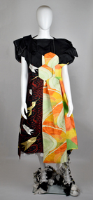 National Wool Museum
Clothing - Outfit by Iordanes Spyridon Gogos x Akira Isogawa 'Look 33', Jordan Gogos, 2022-2023
This outfit from Sydney-based wearables label Iordanes Spyridon Gogos (ISG), was designed by Founder and Creative Director Jordan Gogos in collaboration with Akira Isogawa and other creative partners. The outfit comes from the ISG x Akira 2023 Afterpay Australian Fashion Week (AAFW) collection show presented at Carriageworks, Sydney 16 May 2023. Jordan Gogos is one of Australia's most innovative multidisciplinary artists. Preferring to describe his current designs as 'non normative', 'wearables for the imaginative' Gogos' work and practices have been influential in changing the conversation around clothing design, production and presentation by embedding co-collaboration, sustainability, diversity, and inclusivity in all aspects of his label. Born and raised in Tokyo, Japan before immigrating to Australia in 1987, Akira Isogawa is regarded as one of Australia's most innovative and successful fashion designers. In a career spanning over 25 years, Akira is perhaps best known for his contemporary interpretations of traditional Japanese clothing, and the quality of his craftsmanship. Isogawa has worked on a range of creative collaboration projects over the course of his career and was named Australian Designer of the Year at the Australian Fashion Industries Awards in 1999. The ISG x Akira collection show presented at AAFW resulted in a collection of 40 looks featuring digitally printed, compressed and patchworked garments with applique, embroidery, beading and origami. Made from deadstock and archival fabrics, accessorised with unique headpieces and footwear designs, the looks were presented in a theatrical collection show amid a colourful runway piled high with upcycled textile artworks and trojan horses signifying Gogo's Greek heritage, signed by Akira in red calligraphy. The models included people with diverse gender identities and body shape and size. - Kristina StankovskiOutfit consisting of a dress, underskirt and shoes (pair). The underskirt is made of tulle, while the dress is origami style with black, red, white, gold, green, yellow and orange fabric. The dress has two sets of press studs under each shoulder strap. Shoes are lace up boots with black, white and yellow patchwork fabric, with rubber soles and vinyl lining. This record includes seventeen pieces of test/sample fabric. 9013.1 Dress 9013.2 Underskirt 9013.3 Boots & White laces 9013.4 Fabric samplesjordan gogos, iordanes spyridon gogos, akira isogawa, 2023 afterpay australian fashion week, design, fashion, art, sustainability, innovation, trojan horse -
 Conservation Volunteers
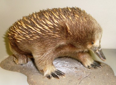
Echidna: Taxidermal Animal, To be established, Echidna - real and stylised: Taxidermal Animal - overseas visitors to CVA's head office clamour to be photographed with it, To be advised
ACRONYMS: The name of the organisation is Australian Trust for Conservation of Nature (ATCV) from 1981 to 1999 and Conservation Volunteers Australia (CVA) from 2000 onwards.............................................Last used in 1999 the Echidna logo was used for 17 years. It was designed by John Zulic, then a young graphic designer at Sovereign Hill Outdoor Museum in Ballarat, and by 2010 the longest serving employee. John was briefed by Peter Hiscock, then director of Sovereign Hill and also President of ATCV, in 1982 to design ATCV’s first logo. Through the image of the echidna John Zulic tried to capture a unique Australian identity (a combination of uniqueness, strength, resilience, role in a balanced habitat and a national feel) for a fledgling local group with big plans. John presented concept to Tim Cox and Peter Hiscock – both were enthusiastic: the rest is history. For many years newly arriving volunteers were photographed with the mascot.The echidna was synonymous with ATCV for many years. The logo appeared on team vehicles and buses and on all publications until 2000. For many years new volunteers had their photograph taken with "Eddy". Even today overseas visitors to CVA's head office clamour to be photographed with it.This item is a taxidermal (preserved and stuffed) echidna. The echidna is an Australian marsupial animal resembling the porcupine or hedgehog found in other continents. It is a nocturnal, burrowing, egg-laying mammal of the genera Tachyglossus and Zaglossus of Australia, Tasmania, and New Guinea, having a spiny coat, slender snout, and an extensible sticky tongue used for catching insects. NOTE: The provenance of this item is not yet established but it has been the unofficial "mascot" of ATCV/CVA from soon after foundation till the present.australian, echidna, mascot, logo, wildlife -
 Kew Historical Society Inc
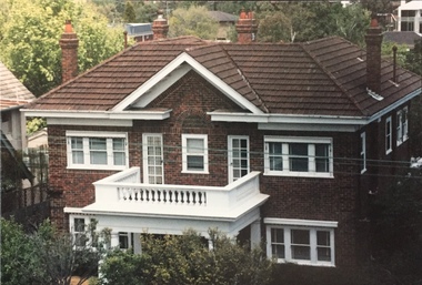
Photograph - 264 Cotham Road, 1988
The dwelling is representative of the development of the Georgian Revival style in the 1920s and 30s and its popularity amongst the upper-middle classes as a result of the work of William Hardy Wilson and Professor Leslie Wilkinson. It is of importance as a fine and largely intact designer/builder example of the Georgian Revival style, with American Georgian Revival influences. The dwelling embodies the principal characteristics of the style. American Georgian Revival influences are noted in the deep eaves with modillions, central broken pediment, brick quoins and presentation of the central porch. The garden wall, with arched opening, in the side setback appears to be an early or original landscape feature, based on the comparable brick work detail construction with that of the house. Considering this, it is the only early landscape feature extant which assists in providing some understanding of the original landscape layout of the property. (Criteria D and E) (Boroondara Planning Scheme)Colour photographic positive of 264 Cotham Road, Kew. The residence was constructed in 1931 for the Howitt family. 264 Cotham Road, Kew (HO813) is an individually listed building of significance under Amendment C294 of the Boroondara Planning Scheme. 264 cotham road -- kew (vic.) -
 Surrey Hills Historical Society Collection
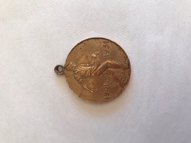
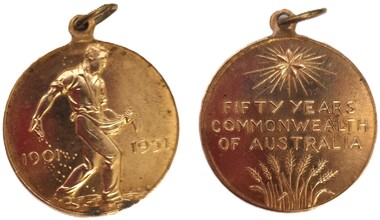
Medallion, AMOR MINT, 1951
The letters J.W. E. refer to the artist - John Wolfgang Elischer (1891-1966). He was an Austrian sculptor and medallist. He trained at the Academy of Vienna from 1908 to 1911; won the Prix de Rome in 1909; and c1910-11, practised under Rodin in Paris. He arrived in Australia in 1935. During his first year he was an industrial designer for pottery. Later works include the King George V Memorial in Bendigo (1938), a bronze fountain for Sir Russell Grimwade in Toorak and a bust of Archbishop Mannix for Newman College, University of Melbourne. The medal was awarded to the school children in 1951 to mark the fiftieth anniversary of the Federation of Australia. The design was chosen after a competition, with the valuable cash prize of two hundred guineas. This is part of a large donation of material relating to the Deakin, Mair and Young families, all with connections to the SUrrey Hills and Mont Albert area.This is one example of the work of Amor Mint. In 1874 Willliam Joseph Amor was apprenticed to English medallists J.S. and A.B. Wyon. Nine years later he went to Paris, where he remained until 1887. Intending to go to America and work his way home to England, he visited Sydney en route and was persuaded by Robert Hunt, Deputy-Master of the Sydney Mint, to stay and start his own business. Amor established the business in 1888 and married the daughter of the Chief Engineer of the Sydney Mint. In 1917 Amor became a limited company, in which principal employees were given an interest. In 1935 Amor sold his share to A.H. Byatt, retaining a position as Advisory Director of the business. Amor’s company became Sydney’s major medallist and die-sinker for over a century thanks to its ability to meet demand for locally produced, high-quality commemoratives.A round medallion with a loop hole at the top. Front: A man advancing to the right sowing seeds by hand; at left 1901, at right 1951 in tiny letters near ground right the artist's initials, J.W.E. Back: At top a star; below which are the words, FIFTY YEARS / COMMONWEALTH / OF AUSTRALIA. Below this are seven ears of wheat representing the States and Northern Territory of Australia."1901", "1951", "J.W.E.", "FIFTY YEARS / COMMONWEALTH / OF AUSTRALIA" mont albert central school, laurie young, laurie newton, education, commemorative medals, federation, 1951 -
 Surrey Hills Historical Society Collection
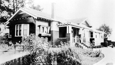
Photograph, 'Strathmore' 75 Victoria Crescent, Mont Albert
‘Strathmore’ Victoria Crescent (dem.) Joseph Sutton Crow and his wife Jessie (nee Temby) bought this property which had belonged to the Purbrick family in 1924. Sutton was an amateur ‘planner and landscape designer’ and had much pleasure in planning the use of their garden of 100 feet by 400 feet. While part remained rural with sheep, an orchard and vegetable garden, he laid out sweeping designs for the front garden which Jessie enjoyed converting into a garden worthy of display and which did gain prizes in the Herald Garden competitions of the 1930s. They entertained friends and often had as guests University Conservatorium staff and visiting musical personnel. They also opened the garden for local church fund-raising functions. Children, Jean and Ray, had areas set out for their recreation with pets and activities areas. The donor was their daughter. A black and white photograph of a Californian Style weatherboard house, painted in a dark colour. There is a well established garden in front. There is a bay window at one side of the house.house names, californian bungalow style, weatherboard, victoria crescent, surrey hills, (mr) joseph sutton crow, (mrs) jessie sutton crow, purbrick family, 1924, herald garden competitions, 1930-1939, (miss) jean sutton crow, (mr) ray sutton crow, 'strathmore' -
 Wodonga & District Historical Society Inc
Medal - Commonwealth of Australia 50th Anniversary
This medal was awarded to the school children of Australia in 1951 to mark the fiftieth anniversary of the Federation of Australia. The design was chosen after a competition, with the valuable cash prize of two hundred guineas. It was won by John Wolfgang Elischer for his depiction of a man hand-sowing wheat. The wheat has grown to represent the seven States of Australia on the other side of the medal. Elischer was an Austrian sculptor and an Associate of the Royal Academy who arrived in Australia in 1935. During his first year he was an industrial designer for pottery. Elischer, P. Hurry and John Farmer together held an exhibition of works at the Athenaeum, Melbourne, in June 1937. Elischer later received commissions for sculptures including the King George V Memorial in Bendigo (1938), a bronze fountain for Sir Russell Grimwade in Toorak and a bust of Archbishop Mannix for Newman College, University of Melbourne. Elischer died in 1966.This item is significant because it was issued to all Australian school children, including those in Wodonga.A bronze Commemorative medal issued to Australian school children to mark the 50th anniversary of the Federation of Australia. It is a round medal with a loop at the top.Front (obverse) Man advancing towards the right sowing seeds by hand. At left 1901, at right 1951. In very small letters near ground right, J.W.E Back (reverse) At top a star. In centre FIFTY YEARS / COMMONWEALTH / OF AUSTRALIA At bottom seven ears of wheat representing the States and Northern Territoryfederation of australia, australian commemorative medals -
 Merri-bek City Council
Relief etching printed in 1 colour from 1 copper plate over lithograph printed in 1 colour from 1 aluminium plate, Emily Floyd, It’s Time (Again), 2007
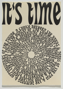
Emily Floyd is a Melbourne-based artist who works across sculpture, printmaking and public installation. In It’s Time (Again), Floyd graphically presents Gough Whitlam’s election speech, delivered before he became Prime Minster in 1972. Floyd’s training as a graphic designer is evident in the way in which the text’s presentation ties form to meaning. For example, the circular arrangement of the words resembles a vinyl record to be played again and again, implying the speech is worth revisiting. The circular arrangement also references other forms of timekeeping, such as the growth rings of a tree; the face of a clock; the cyclical nature of time, with its diurnal, lunar, seasonal and annual cycles. Floyd's work implies that social and political issues are cyclical in nature. It emphasises the necessity, once again, for proactive measures to ensure a quality, human-centered existence for everyone. -
 Merri-bek City Council
Work on paper - letterpress print, Commoners Press, As Sorted, 2022
Time is an abstraction, a filing system used to arrange events and memories into a logical system of cause and effect. This new print was created with images arranged from drawings made while sitting by paths near nature, creeks and overlapping streets. I am a local artist and illustrator with a history of drawing, painting and printmaking.10Press brings together a diverse group of creatives who were invited to make a new artwork inspired by the theme of ‘Moreland: its creative future, its past or other hidden stories’. Artists were invited to respond to the prompt ‘Moreland’, using only one or two colours. This body of work was created in 2022 during a significant time in local history, which saw Council’s name change from ‘Moreland’ to ‘Merri-bek’. The printed bellyband of the folio highlights this transition, with the word ‘Moreland’ crossed out and replaced with Woiwurrung language name ‘Merri-bek’. Commoners Press is a Coburg-based print studio that works with artists and designers in Australia and abroad on short run projects. Established by Jan Brueggemeier, Rob Eales and Neal Haslem in 2017, Commoners Press focus on projects that are community-centred, experimental and sustainable. Donated by Commoners Press Letterpress print -
 Merri-bek City Council
Work on paper - letterpress print, Commoners Press, Clay Pits of Brunswick, 2022
When I visit Merri-bek I wonder, when I step on the tarmac of the Barkly Square carpark, what was here before? In fact, at this spot and across Brunswick there were clay pits, which would feed the pottery workshops in Brunswick that produced the pottery, gargoyles and decorative items for Marvellous Melbourne homes and suburbs. Marvellous for those who had profited from gold, property and finance, not so for those working in the clay pits. My print is a contemplation on what is beneath our feet and our relationship to the ground. I am a design academic working at RMIT University and began my print and design practice on a Golding foot-treadle Letterpress machine.10Press brings together a diverse group of creatives who were invited to make a new artwork inspired by the theme of ‘Moreland: its creative future, its past or other hidden stories’. Artists were invited to respond to the prompt ‘Moreland’, using only one or two colours. This body of work was created in 2022 during a significant time in local history, which saw Council’s name change from ‘Moreland’ to ‘Merri-bek’. The printed bellyband of the folio highlights this transition, with the word ‘Moreland’ crossed out and replaced with Woiwurrung language name ‘Merri-bek’. Commoners Press is a Coburg-based print studio that works with artists and designers in Australia and abroad on short run projects. Established by Jan Brueggemeier, Rob Eales and Neal Haslem in 2017, Commoners Press focus on projects that are community-centred, experimental and sustainable. Donated by Commoners Press Letterpress print -
 Merri-bek City Council
Work on paper - letterpress print, Commoners Press, Streets with no Beats, 2022
The image is based on a 3D component of one of my recent series of jewellery artworks. The heart metaphorically alludes to two locations of Merri-bek. One is Moreland Road, the other is Wallace Street in Brunswick. These locations pinpoint a time of collective trauma and communal experiential reflection. I was born in Brunswick in 1984 and have lived and worked there since. Brunswick for me is filled with stories of family, community, growth, tragedy and history experienced across a Greek Diasporic framework.10Press brings together a diverse group of creatives who were invited to make a new artwork inspired by the theme of ‘Moreland: its creative future, its past or other hidden stories’. Artists were invited to respond to the prompt ‘Moreland’, using only one or two colours. This body of work was created in 2022 during a significant time in local history, which saw Council’s name change from ‘Moreland’ to ‘Merri-bek’. The printed bellyband of the folio highlights this transition, with the word ‘Moreland’ crossed out and replaced with Woiwurrung language name ‘Merri-bek’. Commoners Press is a Coburg-based print studio that works with artists and designers in Australia and abroad on short run projects. Established by Jan Brueggemeier, Rob Eales and Neal Haslem in 2017, Commoners Press focus on projects that are community-centred, experimental and sustainable. Donated by Commoners Press Letterpress print -
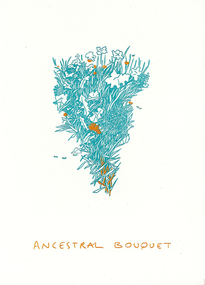 Merri-bek City Council
Work on paper - letterpress print, Commoners Press, Ancestral Bouquet, 2022
Ancestral Bouquet is a visual homage to the different plant species each migrant community brought with them to the lands of Merri-bek. It is a celebration of these plant communities and those (elderly migrants) who still know and practice traditional forms of food harvest and preparation. I was born and raised in unceded Wurundjeri Willum Country, in Coburg. My Father lived in the Southern Suburbs of Naarm as a refugee from Palestine, and eventually found Coburg as a place he could fit in as a migrant. My arts practice varies in modalities, and always comes back to the story of displaced cultures, my folklore, and my connection to Coburg and the Merri Creek.10Press brings together a diverse group of creatives who were invited to make a new artwork inspired by the theme of ‘Moreland: its creative future, its past or other hidden stories’. Artists were invited to respond to the prompt ‘Moreland’, using only one or two colours. This body of work was created in 2022 during a significant time in local history, which saw Council’s name change from ‘Moreland’ to ‘Merri-bek’. The printed bellyband of the folio highlights this transition, with the word ‘Moreland’ crossed out and replaced with Woiwurrung language name ‘Merri-bek’. Commoners Press is a Coburg-based print studio that works with artists and designers in Australia and abroad on short run projects. Established by Jan Brueggemeier, Rob Eales and Neal Haslem in 2017, Commoners Press focus on projects that are community-centred, experimental and sustainable. Donated by Commoners Press Letterpress print -
 Merri-bek City Council
Work on paper - letterpress print, Commoners Press, Untitled, 2022
This image of Coburg Olympic Swimming Pool represents my connection to Merri-bek / Moreland. Being brought up around water, swimming has played a key role in my family and I feel a sense of the community when swimming in a public pool. The gum trees and the proximity of this pool to the river reminds me of my home town, Albury. For me, a public pool is a gathering place, a place of leisure and play, somewhere to learn and grow, spend time and let go.10Press brings together a diverse group of creatives who were invited to make a new artwork inspired by the theme of ‘Moreland: its creative future, its past or other hidden stories’. Artists were invited to respond to the prompt ‘Moreland’, using only one or two colours. This body of work was created in 2022 during a significant time in local history, which saw Council’s name change from ‘Moreland’ to ‘Merri-bek’. The printed bellyband of the folio highlights this transition, with the word ‘Moreland’ crossed out and replaced with Woiwurrung language name ‘Merri-bek’. Commoners Press is a Coburg-based print studio that works with artists and designers in Australia and abroad on short run projects. Established by Jan Brueggemeier, Rob Eales and Neal Haslem in 2017, Commoners Press focus on projects that are community-centred, experimental and sustainable. Donated by Commoners Press Letterpress print -
 Federation University Art Collection
Work on paper - Bookplate, 'Ex Libris Bookplate for Zelma and John Gartner' by Wim Zwiers
The Keith Wingrove Trust conducts a competition among Australian artists, graphic designers and students for the production of Ex Libris Bookplates. The competition is called The Australian Bookplate Design Award. The purpose of the competition is to increase interest in and to attract publicity to the artistic value of bookplates. Although the competition is referred to as 'Australian' there is a category of award open to International artists. This bookplate was part of the 2013 Australian Bookplate Award. Wim Zwiers (b. 1922, Holland) Zwiers studied at the Academy of Fine Arts in Rotterdam from 1940 and graduated from there in 1944. Renowned as copper and wood engraver Zwiers became a teacher at an academy in Groningen. Zwiers has produced a few hundred bookplate. Around 1992 started to use the computer making ex-libris and other small graphics. Although he was not the first who started making computer exlibris, he surprised many by starting at age seventy. Framed etching - a bookplate for Zelma and John Gartner featuring a woman reading in the foreground and a weatherboard house in the background. Gift of the Keith Wingrove Memorial Trust, 2015Edition: 170/200 Signed: Wim Zwiersartist, artwork, printmaking, framed bookplate, available, bookplate, zweirs, zim zweirs, life drawing, keith wingrove memorial trust, australian bookplate design award, john gartner, zelma gartner -
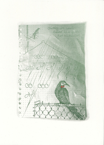 Merri-bek City Council
Work on paper - letterpress print, Commoners Press, Chatting with Locals - Sound Lines of the Red Wattlebird, 2022
My work is dedicated to the animal residents that cohabit with us in the suburbs. I focused on the Red Wattlebird, as it is always a welcome visitor across the gardens and parks of Merri-bek. The frayed edges of the page from my notebook are reminiscent of the act of note taking and how we remember and observe things in our daily lives. I am a local artist and writer living in Naarm with a studio in Coburg as part of Schoolhouse Studios.10Press brings together a diverse group of creatives who were invited to make a new artwork inspired by the theme of ‘Moreland: its creative future, its past or other hidden stories’. Artists were invited to respond to the prompt ‘Moreland’, using only one or two colours. This body of work was created in 2022 during a significant time in local history, which saw Council’s name change from ‘Moreland’ to ‘Merri-bek’. The printed bellyband of the folio highlights this transition, with the word ‘Moreland’ crossed out and replaced with Woiwurrung language name ‘Merri-bek’. Commoners Press is a Coburg-based print studio that works with artists and designers in Australia and abroad on short run projects. Established by Jan Brueggemeier, Rob Eales and Neal Haslem in 2017, Commoners Press focus on projects that are community-centred, experimental and sustainable. Donated by Commoners Press Letterpress print -
 Merri-bek City Council
Work on paper - letterpress print, Commoners Press, Hard Rubbish, 2022
Merri-bek’s bi-annual collection and the communities’ tendency to dump rubbish makes these temporal sculptures part of the visual landscape of walking in Merri-bek. The collections of personal items, untold stories and connections which we all piece together whilst on an afternoon stroll. Over the years trends in pet ownership and technology advances can be documented in discarded items, also commenting on wealth and material value of objects. I have been living, parenting, working and volunteering in Merri-bek for the last 9 years. As time passes the community and landscape shift and change as does my connection to it. A once dedicated art practice is now tumbled around with life and family. Photography, video, drawing and painting are used to explore ideas around the everyday and meaning we attach to small moments of time.10Press brings together a diverse group of creatives who were invited to make a new artwork inspired by the theme of ‘Moreland: its creative future, its past or other hidden stories’. Artists were invited to respond to the prompt ‘Moreland’, using only one or two colours. This body of work was created in 2022 during a significant time in local history, which saw Council’s name change from ‘Moreland’ to ‘Merri-bek’. The printed bellyband of the folio highlights this transition, with the word ‘Moreland’ crossed out and replaced with Woiwurrung language name ‘Merri-bek’. Commoners Press is a Coburg-based print studio that works with artists and designers in Australia and abroad on short run projects. Established by Jan Brueggemeier, Rob Eales and Neal Haslem in 2017, Commoners Press focus on projects that are community-centred, experimental and sustainable. Donated by Commoners Press Letterpress print -
 Merri-bek City Council
Work on paper - letterpress print, Commoners Press, Bin Chicken Island Campground, 2022
With two young kids, I often find myself at Coburg Lake on a weekend, playing amongst the natural beauty of the park area, rugged embankments, local birdlife, and... ‘Bin Chicken Island’. Bin Chicken Island has become a running joke in the community, known for its wafting stench and as an environmental eyesore (never go to the park on a warm day with an easterly breeze). So much so that someone added a campground listing on the island to Google Maps. Whenever I drive past the lake, I always keep an eye out for disgruntled backpackers who have realised that the only camping to be had is by the Bin Chickens themselves. I am a local graphic designer who lives in Pascoe Vale and works in Brunswick. I head up the design studio, Atticus Design.10Press brings together a diverse group of creatives who were invited to make a new artwork inspired by the theme of ‘Moreland: its creative future, its past or other hidden stories’. Artists were invited to respond to the prompt ‘Moreland’, using only one or two colours. This body of work was created in 2022 during a significant time in local history, which saw Council’s name change from ‘Moreland’ to ‘Merri-bek’. The printed bellyband of the folio highlights this transition, with the word ‘Moreland’ crossed out and replaced with Woiwurrung language name ‘Merri-bek’. Commoners Press is a Coburg-based print studio that works with artists and designers in Australia and abroad on short run projects. Established by Jan Brueggemeier, Rob Eales and Neal Haslem in 2017, Commoners Press focus on projects that are community-centred, experimental and sustainable. Donated by Commoners Press Letterpress print -
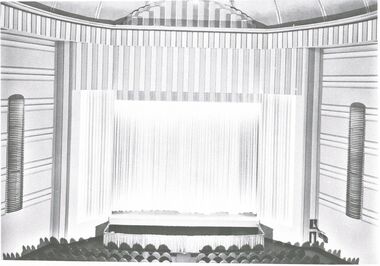 Bendigo Historical Society Inc.
Document - ROYAL PRINCESS THEATRE COLLECTION:PHOTOCOPIES OF EXTERIOR AND INTERIOR
Eighteen photocopy photographic images of Princess Theatre exterior and interior. 1. Royal Princess Bendigo main auditorium, 2. Royal Princess Bendigo Auditorium dome and chandelier, 3. Royal Princess Bendigo main auditorium views from upstairs circle, 4. Royal Princess Bendigo. Downstairs front stalls, 5. Royal Princess Bendigo View Street closed Saturday 4th May 1963 last Movie 'Guns of Navarone' became amaco service station designers Cowper and Murphy State Library of Victoria, 6. Royal Princess Bendigo Downstairs foyer, 7. Princess main entrance, 8. Princess circle entrance, 9. Princess Theatre was built behind the Albion Chambers, 10. Royal Princess Bendigo 1875 2000 seats 1800seats later, 11. Royal Princess front stalls and stage, 12.. Advertisement Bendigo Advertiser Tuesday December 22 1908 top right hand corner, 13. Advertisement Bendigo Advertiser Thursday march 10 1910, 14 Advertisement Bendigo Advertiser Tuesday July 26 1910, 15 Advertisement Bendigo Advertiser Thursday July 28 1910.bendigo, buildings, princess theatre -
 Melbourne Tram Museum
Letter, Ken Craven, Stamps - "Australia's Historic Tramways, 1989
Set of three items associated with a letter from Ken Craven, Secretary of the AETA to John Belot. .1 - White DL size envelope with the five of the Oct 1989 Historic Tramway Stamps with the tram cancellation stamp dated 11 October 1989. Has the "Australia's Historic Tramways" logo in the lower left hand corner, hand addressed to John Belot and the stamp for the stamp show Melbourne 18-22 October 1989 in the bottom right hand corner. On the rear has details of the stamp issue, W.K. Craven's address stamp, and two cancellation stamps - Blackburn 11 Oct. 1989 and Caulfield Post Office stamp. .2 - Handwritten letter from Ken Craven, Secretary of the AETA to John Belot, noting the exhibition at Box Hill and his forthcoming trip to NZ and the Transport Art ticket enclosed. .3 - Transporting Art tram No. 13 ticket No. 0085, dated 17th July 1989, Jenyns tram (Lorraine and Bob). See also Reg Items 470 to 474 for other examples and associated materials and 510 for a Poster. On the rear are detail of the stamp issue, the designers and cover design.trams, tramways, stamps, australia post, aeta, letters, transporting art -
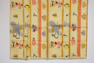 Duldig Studio museum + sculpture garden
Fabric, Mathilda Flogl, Falter designed by Mathilda Flogl 1924-31, 1924-31
This piece of fabric, known Fälter (butterfly), was designed by Mathilda Flögl (1893-1958), who worked in the textile department of the Wiener Werkstätte in Vienna. It is a remnant of the fabric that was used to make a bedspread for Karl and Slawa’s bed in their Vienna apartment where it lay decoratively over a gold brocade eiderdown. The purchase demonstrated Slawa’s interest in and knowledge of modern design and her commitment to the idea of enriching everyday life with beautiful objects, a principal of the Viennese Secession. Following the Duldigs removal from Vienna, the original bedspread and remnant were safeguarded and preserved by Slawa’s sister, Rella, in the basement of her Paris apartment. In 1948 the bedspread and this remnant were sent to Australia. The bedspread was a much-loved item but deteriorated over the years. In 1955 it was made into curtains, which are held in the Duldig Studio Collection. The Photographs of the bedspread in its original location are also held in the collection. The remnant is in pristine condition. The Wiener Werkstätte (Vienna Workshop) was a guild of designers and craftsmen that was founded by the architect Josef Hoffman (1879-1956) and the designer Koloman Moser (1868-1918). The firm manufactured a range of interior furnishings between 1903 and 1932. The textile department opened in 1900, and produced about 1,800 designs, mainly for printed fabrics for furnishings and apparel. The designs were characterised by simplified forms and vivid colours, and inspired by Eastern European peasant art and geometric motifs in contemporary painting. The workshop had a profound impact of European art and design, and its work is still celebrated today. Mathilde Flögl was born in the Czech Republic in 1893, and studied at the Kunstgerwerbeschule in Vienna. In 1916 she began working at the Weiner Werkstätte, and where she designed more than 120 textile patterns. This fabric Fälter or Butterfly was designed in 1924. The butterfly was a favourite motif of Flögl. In this design she plays with a variety of whimsical abstractions and arrangement of both the butterfly and the snail on a background of abstract colour stripes and blocks. Ann Carew 2016The fabric is of great aesthetic interest as an example of the work of the Viennese workshops, and the noted designer textile designer Mathilde Flögl. The original pencil drawings, pencil and gouache designs, and fabric swatches for Fälter are held in the MAK Museum in Vienna, and the Victorian and Albert Museum in London have a sample of piece of the silk fabric in an alternate colour wave. The Museum of Applied Arts in Sydney holds a swatch book of textiles from the Wiener Werkstätte, however Flögl’s work is not represented. The National Gallery of Victoria holds a similar swatch book. The remnant has an excellent provenance, is associated with a powerful personal narrative, and is significant and rare item relating to history of the Wiener Werkstätte in Vienna, and the oeuvre of Matilda Flögl. Ann Carew 2016Remnant of a block-printed silk fabric used to make the bedspread for Karl Duldig and Slawa Horowitz-Duldig's bed in Vienna. -
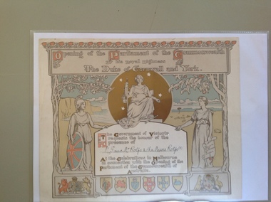 Warrnambool and District Historical Society Inc.
Certificate - Invitation to the opening of the Parliament of the Commonwealth of Australia, 1900
This certificate is an invitation to the opening of the first Parliament of Australia on January 1st 1901 in Melbourne. On this date the six Australian self-governing colonies were federated to become the six states of Australia. The designers of the certificate were Norman Lindsay and John Longstaff. This particular invitation was sent to George Rolfe and his wife and two of his stepdaughters, Annie and Florence. George Rolfe (1836-1919), a tea merchant from Melbourne, began buying blocks of land near the mouth of the Hopkins River in Warrnambool in the 1870s. By the early 1880s Rolfe owned 50 acres in the town, including farming properties and used the buildings near the mouth of the Hopkins as holiday accommodation. He called his property Lyndoch which he improved with the addition of stables, chaff and bone sheds, jetty, boathouse, reservoir, water well and windmill and extensive gardens and he spent most of his later life in this Warrnambool area. Lyndoch today is the site of an aged care facility. This certificate is of considerable importance for two reasons: 1. It is an important memento of a signal event in Australia’s history - the Federation of the States in 1901. 2. The certificate was an invitation to the family of a prominent Warrnambool person – George Rolfe of Lyndoch.This is a piece of thick paper with illustrations and decorations in brown, red, blue, yellow and green tonings. The lettering is in white with coloured capital letters. The images include the shields of the six Australian States, the Coat of Arms of Britain and Australia, outlines of two trees (gum tree and oak tree) and three symbolic female figures representing Justice, Britannia and Australia. The top border decoration represents the waratah flower. The names of the invitees on this certificate have been handwritten in black ink. ‘Opening of the Parliament of the Commonwealth by His Royal Highness The Duke of Cornwall and York’ ‘Mr G and Mrs Rolfe and the Misses Rolfe (2)’ george rolfe of lyndoch, federation of australia, history of warrnambool, george rolfe, opening of first parliament of australia