Showing 2492 items
matching fashion
-
 Brighton Historical Society
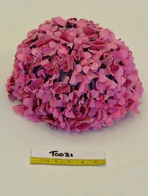
Hat, 1960s
Thomas Harrison (1897-1981) was a leading Melbourne milliner from the 1930s. He began his millinery career in 1920, and by the late 1930s had a salon and workshop at 163 Collins St. He later moved the business to Toorak Road, South Yarra. He continued millinery work until 1975.Pink floral dome-shaped hat made up of silk and velvet pink hydrangea petals and mauve silk stems attached to a stiffened net base.Label, printed black on white acetate, centre back: THOMAS HARRISONthomas harrison, hats, 1960s fashion, melbourne fashion -
 Brighton Historical Society
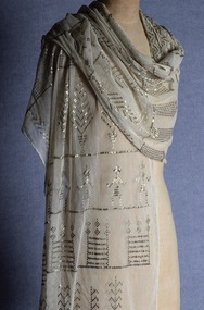
Shawl, 1920s
Often referred to as Assiut shawls, where they were made.Cream-coloured cotton bobbinet ground, hand-embroidered with flattened metal strips.shawl, metal embroidery, egyptomania, 1920s fashion, assuit shawl -
 Brighton Historical Society
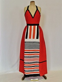
Dress, 1975
Mary Owen OAM (1921-2017) purchased this dress in 1975 in Mexico while attending the first World Conference on Women and wore it to the reception there. A dedicated feminist, unionist and activist, she was a vocal campaigner for the empowerment of women, particularly in the fight for equal pay. Mary's involvement in activism began in 1966 when she joined the staff of the Association of Architects, Engineers & Draughtsmen (AAESDA), where she was responsible for advertising, layout and proofreading editorial for its journal 'Blueprint'. Her contact with the union awoke an interest in women's rights in the workplace, and in 1969 after she joined Dr Bertram Wainer's Progressive Reform Party, which advocated for legalised abortion. She joined the Women's Electoral Lobby in 1972 and remained an active member for over forty-three years, representing the WEL on many government committees. She was a founding co-coordinator of the Working Women's Centre Melbourne from 1975 until 1986, a founding member of EMILY's List Australia, an early member of the Melbourne Press Club and an early supporter of the Australian Women's Archives Project. An annual Mary Owen Dinner was held in her honour for twenty years from 1986 until 2007, which brought together hundreds of women each year. Mary was awarded the Queen's Silver Jubilee Medal in 1977 and the Order of Australia Medal in 1984. She was added to the Victorian Honour Roll of Women in 2001.Red, white and black cotton halter neck dress with rows of pin tucking on the bodice and applied horizontal strips of red and black cotton and black lace to the skirt. Label, woven black on white acetate, centre back: Disenado con carino por / GEORGIA CHARUHAS / HECHO / EN MEXICO Label, woven black on white acetate, centre back: Gerorgia's / BOUTIQUE LAS MARIPOSAS / Designer: / Georgia Charuhas / MERIDA YUCATAN, MEXICOmexico, international women's conference, 1970s fashion, georgia charuhas, feminism, mary owen -
 Brighton Historical Society
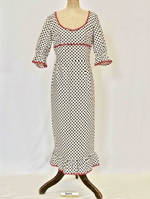
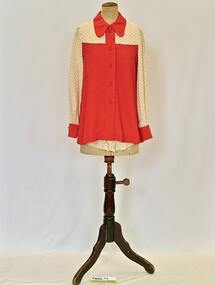
Dress, 1970s
This dress belonged to Bernice Overend, a longtime Brighton resident. Bernice Adelaide Emily Lawn was born in Ballarat in 1911. In 1938 she married Acheson Best Overend (1909-1977), an early modernist architect in Melbourne whose notable designs include the heritage-listed Cairo Flats apartment building in Fitzroy. Bernice and Best made a home together in Brighton, raising their family at 80 Were Street. Their son Darren followed in Best's footsteps, becoming an architect, and in 1979 he and his wife Jenny bought a property just down the road from his childhood home - the heritage-listed 1881 Victorian mansion 'Chevy Chase' at 203 Were Street. Bernice lived in the house with with Darren, Jenny and their three children.White cotton high-waisted maxi dress printed with black spots and trimmed with red rickrack. Elbow length sleeves. Fastens with centre back zip.Label, printed black on white acetate, centre back: JILLIAN / OF / MELBOURNE1970s fashion, maxi dress, bernice overend, overend family, chevy chase, brighton, melbourne designers, jillian of melbourne -
 Brighton Historical Society
Outfit, Hot pants outfit, 1972
Shaw family collection. This outfit was Mrs Shaw's 'going away' outfit for her wedding in 1972. Ricki Reed was a Melbourne-based label founded by designer Dorothy Rabinov.Two-piece hot pants outfit made from cream synthetic 'Estacel' (Courtaulds acetate fibre) and rayon with red dots and plain red synthetic fabric. .1 - Blouse: fastens centre front with five red plastic buttons. .2 - Hot pants: fastens centre back with zip.Label woven, metallic gold on white acetate, centre back blouse and shorts: ricki reed / ALL RAYON Label printed, black on beige acetate, centre back blouse and shorts: Estacel and / RAYON / COURTAULDS ACETATE FIBREhot pants, 1970s fashion, going away outfit, dorothy rabinov, ricki reed, melbourne designers -
 Brighton Historical Society
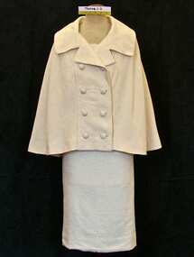
Outfit, Three-piece woman's outfit, 1960s
This outfit belonged to Bernice Overend, a longtime Brighton resident. Bernice Adelaide Emily Lawn was born in Ballarat in 1911. In 1938 she married Acheson Best Overend (1909-1977), an early modernist architect in Melbourne whose notable designs include the heritage-listed Cairo Flats apartment building in Fitzroy. Bernice and Best made a home together in Brighton, raising their family at 80 Were Street. Their son Darren followed in Best's footsteps, becoming an architect, and in 1979 he and his wife Jenny bought a property just down the road from his childhood home - the heritage-listed 1881 Victorian mansion 'Chevy Chase' at 203 Were Street. Bernice lived in the house with with Darren, Jenny and their three children.Three-piece woman's outfit comprising double-breasted cape, cropped sleeveless top and skirt; cream wool woven with silver lurex. Top is decorated with a centre front fabric bow and is decoarated with fake pearls. All items lined with cream polyester. .1 - cape .2 - top .3 - skirtLabel printed black on white acetate, centre back cape, top and skirt: DESIGNED AND HANDWOVEN / BY / Robert Maltuswoman's suit, chevy chase, overend family, 1960s fashion, robert maltus, bernice overend, melbourne designers -
 Brighton Historical Society
Jacket, Bridge jacket, 1930
This jacket was bought in England for Elsie Law (nee Russell) by her husband James Lindsay Gordon "Lin" Law in 1930. Elsie used it as a bridge jacket. Lin was born in Ballarat 1881, the eighth child of Scottish migrants James Nicol Law and Margaret Law (nee Bartholomew). BHS holds an evening dress belonging to Margaret Law in its collection (see T0006.1). After leaving school at the age of 11, Lin began working as a salesman. In 1906, he and business partner James Kerr Pearson (also a Brighton local, who lived at 12 Moule Avenue) established the shirt manufacturing company Pelaco. In 1922 the company established its factory at 23 Goodwood Street on the top of Richmond Hill; the 4.3 metre high neon 'Pelaco' sign, erected in 1939, is today heritage listed. The company was known for its innovative approach to efficiency and labour relations, discontinuing Saturday morning work in 1908 and appointing an industrial relations officer in 1928. Lin married Elsie Russell on 12 January 1915 at St Mary's Catholic Cathedral in Sydney and they lived most of their life in Brighton. In 1920 they moved into 'Blairgowrie', 306 St Kilda Street, The eldest their four children, Pauline Margaret Law (born 15 December 1915) ultimately purchased the house with her husband Hugh McLean in 1956 and lived there until 1965 when the house was demolished.Cream silk jacket block-printed with art deco style pattern in red, blue, black and mustard colours. Lined with soft apricot-coloured satin. Wide stand collar. Front fastens low on hip with four silk covered buttons. Label, woven brown on cream silk, centre back: Eileen / Mulholland / Ltd. / 43, Wigmore St., / LONDON. W1.elsie russell, james lindsay gordon law, brighton, pelaco, bridge jacket, 1930s fashion, eileen mulholland, art deco -
 Brighton Historical Society
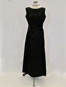
Dress, Evening dress, mid-late 1930s
Full-length pink satin evening dress with beaded shoulder straps and plaited fabric trim decorating low back. Two fabric bows on front bodice and diamond-shaped centre front panel. Separate wide pink satin cumerband made of plaited fabric with bow at back. .1 - dress .2 - cumberbandevening dress, 1930s fashion -
 Brighton Historical Society
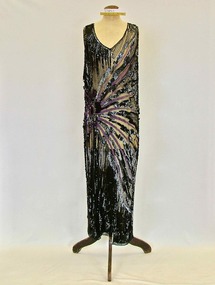
Dress, Evening dress, 1920s
Long sleeveless beaded evening dress with V-front and back neckline. Black tulle base embellished with black, grey and purple beads and sequins with a design of a purple sunburst radiating from the right proper hip and mirrored on the back. Bodice sides split to waist and skirt sides split to hip. 1920s fashion, evening dress, beading, flapper dress -
 Brighton Historical Society
Evening dress and bag, 1950s
This dress and bag belonged to Mrs Edith "Dot" Paroissien (nee Jackson, born 1916), who lived in Brighton with her husband David William Paroissien. The dress was purchased from Croyde, a Melbourne designer who had a small boutique shop in Collins Street near the Block Arcade, and the bag was bought for her in London by David. Dot recalled wearing the dress in the 1950s, in particular to a ball at the Royal Exhibition Buildings for Wesley College. She wore it with suede shoes with a medium heel with straps across the instep and long white kid gloves, and accessorised with a baguette choker and drop earrings.Black silk satin sleeveless full-length evening dress. The attached bodice floats over the top of the under-dress. Asymmetrical opening on bodice which features five large flat self-covered buttons. The black suede bag has chrome fittings and buttery cream coloured satin interior. .1 dress - Label, woven black on white acetate centre back: CROYDE / MELBOURNE .2 - bag - Label, printed, black on cream acetate, interior pocket: Susan / HANDBAGS / LONDON; Label, printed, copper on black metal, interior pocket: MADE IN ITALY / FOR SUSANevening dress, croyde, melbourne fashion, melbourne designers, handbag, royal exhibition building, 1950s, edith violetta paroissien, edith violetta jackson -
 Brighton Historical Society
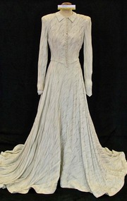
Dress, Wedding dress, 1948
Louris Holly Larsen-Disney married Percy James White at Melbourne Grammar Chapel on 17 June 1948. In later years the dress was given to an opportunity shop and purchased by Mrs Landells of the Brighton Historical Society. Louris subsequently visited the Society and recognised her dress, and was able to provide BHS with information on it. Also in the Society's collection is a 1950s pink strapless silk chiffon dress worn by Louris, and a wedding photo of Louris taken at her mother and stepfather's home at 53 South Road, Brighton. The couple moved into a house just a few doors down, at 49 South Road.Wedding dress made from silver metallic thread crepe. Fastens down front with small self-covered buttons and loops. Long fitted sleeves fastened with 10 covered buttons and loops. Full bias cut skirt with train.wedding dress, 1940s fashion, louris holly white, percy james white, brighton -
 Brighton Historical Society
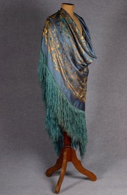
Shawl, c.1928
Worn by Rose Caplan who was the donor, Ida Gouttman's mother. Immigration records show that Morris and Rose (Rosa) Caplan emigrated to Australia from England in 1910 on the Orsova. Rose died from a sudden illness in 1928 while she and her husband were travelling in Europe and had just visited her father in Latvia. Rose was buried in Berlin. Rose and Morris' daughter Ida, who had kept the shawl, married Leon Gouttman in Sydney in 1938. Ida was an active member of the Brighton Historical Society when she moved back to Melbourne later in life. Large blue silk shawl with reversible woven metallic thread floral pattern and deep fringing. shawl, 1920s fashion, metallic thread, weaving, rose caplan -
 National Wool Museum
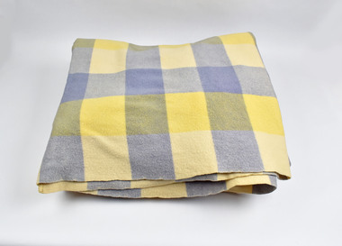
Textile - Blanket, Albany Woollen Mills, Albany Woollen Mills blanket, c 1950s
Note from collector: I love the generous size and thickness of Albany blankets and know someone who collects from this Mill only. The colour shades and combinations Albany used are still so gorgeous. From Western Australia. Note from collector - "For more than 100 years blankets were made all over Australia in over 100 woollen mills. My aim, is to preserve 100 examples of these wonderful pieces of history. Ten years ago I started collecting the iconic Onkaparinga travel rugs, so that on movie nights at home there would be plenty to go around. Everyone had their favourite; even the cat had his own – a small red tartan one. Keeping an eye out for those travel rugs at op-shops and markets, collectable stores and bazaars, led to noticing vintage blankets. I'd never really thought about them before or paid much attention though of course I had grown up with them at my grandmother's. When I discovered my first Laconia cream blanket with blue stripes, my eyes just went gaga. Well that was it, I was hooked and since then over 500 blankets have passed through my hands. These common, everyday items, found in all households for so many decades, were traditional engagement gifts. Pairs were prized wedding presents turning into family heirlooms. They were fashionable dressers of beds, givers of warmth, bestowers of security and reliability. The comfort found in these objects resonates with almost all of us; we grew up with them ourselves or fondly recall them in a grandparent’s home. There is no modern replacement with the integrity of these old blankets, many of them now older than most of us. They are romantic, sensible, special, familiar, nostalgic and nothing else feels so appropriate in so many situations. No offense to the great Aussie doona, but from hippie to hipster, at a music festival, picnic, campsite or couch, a vintage blanket is something coveted by all. This industry that employed tens of thousands and must have been such a huge contributor to the economy is almost completely lost now. Blanket Fever is an ode to everything that came before: the land, the sheep, the shearers, the hands, the mills, the weavers, the designers, the distributors, the department stores. To the grandparents that gave them, the people that received them, the families that kept them; thank you. I’m passionate about my collection of Australian blankets manufactured in mostly Victoria, South Australia and Tasmania from the 1930s to the end of the 1960s. The collection has blankets from each of these four decades representing the styles and fashions of their time and includes dated advertisements which help determine the eras the blankets are from. " Checked blanket, blues and creamAlbany Woollen Mill/Blanket/All Pure Wool/Emblem: A, Albany blanket, blanket fever, wool, albany, albany woollen mills -
 Federation University Art Collection
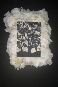
Hand fashioned paper, wattle, linoprint, Farm Scene, 2009
This item is part of the Federation University Art Collection. The Art Collection features over 2000 works and was listed as a 'Ballarat Treasure' in 2007.art, artwork, simon trengrove -
 Port Fairy Historical Society Museum and Archives
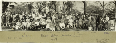
Photograph, Port Fairy Re-union 1965, 1965
Port Fairy reunion in 1965 at unknown gardens.Historic photograph showing fashions of the era.Black and white photograph mounted on card, rectangular.Some names noted on photograph, Addie Revell, D. Murray, Mary Smith, Mres Searle, Doc Keates, L. King, Dorrie Masterton. George Brown and Beryl Brown. M. Sharkey, Rosebrook. Port Fairy Reunion, 1965. On back of photo, M. Sharkey, Rosebrook, Port Fairy Reunion, 1965.port fairy, reunions, group, 1965 -
 Surrey Hills Historical Society Collection
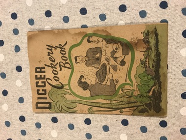
Booklet - Digger Cookery Book, George Robert Riley, Brennan-Baldie Collection, c1948
Published in c1948 by Wightons Print, 215 Moreland Road, Coburg. These chapbooks were sold door to door after WWII by members of the Partially Blinded Soldiers Association in Victoria to fundraise for the association. The Association was established in 1924 to serve the interests and welfare of partially blinded returned soldiers. The author, George Robert Riley (late AIF and AMF) was born in Drouin in 1890; died in 1952. He trained as a compositor. Served in France and was partially blinded during WWI. He also enlisted during WW2 when he seems to have lowered his age. There do not appear to be many copies of this publication that have survived. It does not appear in either the State Library of Victoria or the National Library of Australia catalogue. The Museum of Victoria may have a copy. Apart from its significance as a fundraiser for returned soldiers, it documents culinary fashions in the post-WW2 period. Although a number of the recipes in Part 1 have exotic names, they are yet to be influenced by post-war migration to Australia.A 32 page booklet held by 2 metal staples. The paper is stained and embrittled but was probably originally cream. The cover depicts a soldier at rest under a palm tree dreaming of home and a hearty meal. Printed in shades of green and grey-black. This is Part One of Two. The chapbook contains 140 recipes, mostly broadly Anglo-European. Nilchapbooks, ww2, wightons print, mrs kate brennan, partially blind soldiers association, george robert riley -
 Royal District Nursing Service (now known as Bolton Clarke)
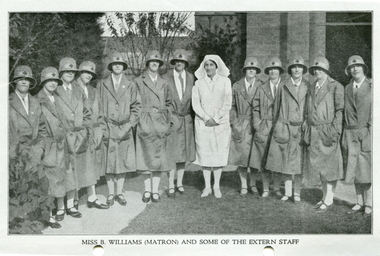
Photograph - Photograph, black and white, c.1929
This is a photographic record of Matron Beatrice Williams and the Trained nurses, (Sisters), of the District Nursing division of the Melbourne District Nursing Society who worked in the community give nursing care to patient's in their homes. Their uniforms are grey and the Maltese cross on the Sisters hats is red.From its earliest years when Melbourne District Nursing Society (MDNS) began to wear uniforms the chosen colour was grey, though the style changed throughout the years as fashions changed from the late 1800s through to the 1970s. The Trained nurses (Nurses), firstly wore long grey frocks and a white cap with a long white tail hanging from the centre back. When bicycles were introduced in 1903 the headgear changed to a white pith helmet adorned with a red Maltese cross in the centre front. This was held on with a veil going over the hat and tied under the chin. Over the years there were complaints that the veils became wet in the rain and they asked for a change of uniform, but this did not happen until 1921. Later the Nurses complained their skirts became wet when riding their bicycles in the rain and asked, when raining, to be able to wear breeches and gaiters. This was granted provided they wore aprons when attending patients. It was not long before the uniform changed to a shorter length grey frock, red cardigan, grey coat and grey brimmed hat; later changed to a peaked grey hat. In 1966 MDNS were granted Royal patronage. Now as Royal District Nursing Service, RDNS, the uniform was redesigned and colour changed in 1971. By 1972 the Trained nurses (Sisters) were wearing the new winter uniform of a blue/grey skivvie under a V neck tunic style frock made of blue/grey herringbone winter material with the RDNS insignia on the upper left, and a beret of the same material. In summer the uniform became a royal blue V neck tunic style frock, with the RDNS insignia on the upper left, worn over a short sleeve white blouse. A royal blue peaked hat with the RDNS insignia in the centre front was worn at first and then only worn on official occasions. This uniform was worn until changed to a corporate style in the mid 1980s,Black and white photograph of Matron Beatrice Williams wearing a white uniform and veil, with a group of twelve Melbourne District Nursing Society (MDNS) trained nurses (Sisters) wearing their calf length uniforms of grey coats, and grey brimmed hats with pale grey hat band with central Maltese cross, standing in the garden of the MDNS After-Care home.No. 8526 on rear of photographmelbourne district nursing society, mdns, mdns uniforms, rdns, royal district nursing service, mdns matron, miss beatrice mary williams -
 Royal District Nursing Service (now known as Bolton Clarke)
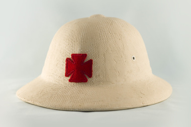
Headwear - Photograph, colour, c.1903
Cream pith helmets were part of the uniform worn by Melbourne District Nursing Society (MDNS) Trained nurses (Nurses) from the early 1900s when giving nursing care to the sick poor of Melbourne. When riding their bicycles the helmet was held on by a long white scarf tied under the Nurse's chin. From its earliest years when Melbourne District Nursing Society (MDNS) Trained nurses, known as 'Nurse' in those days, began to wear uniforms the chosen colour was grey, though the style changed throughout the years as fashions changed from the late 1800s through to the 1970s. The Nurses firstly wore long grey frocks and a white cap with a long white tail hanging from the centre back. When bicycles were introduced in 1903 the headgear changed to a cream pith helmet adorned with a red Maltese cross in the centre front. This was held on with a veil going over the hat and tied under the chin. Over the years there were complaints that the veils became wet in the rain and they asked for a change of uniform, but this did not happen until 1921. The Nurses complained their skirts became wet when riding their bicycles in the rain and asked, when raining, to be able to wear breeches and gaiters. This was granted provided they wore aprons when attending patients. It was not long before the uniform changed to a shorter length grey frock, red cardigan, grey coat and grey brimmed hat; later changed to a peaked grey hat. In 1966 MDNS were granted Royal patronage. Now as Royal District Nursing Service (RDNS), the uniform was redesigned and colour changed in 1971. By 1972 the Sisters were wearing the new winter uniform of a blue/grey skivvie under a V neck tunic style frock made of blue/grey herringbone winter material with the RDNS insignia on the upper left, and a beret of the same material. In summer the uniform became a royal blue V neck tunic style frock, with the RDNS insignia on the upper left, worn over a short sleeve white blouse. A royal blue peaked hat with the RDNS insignia in the centre front was worn at first and then only worn on official occasions. This uniform was worn until changed to a corporate style in the mid 1980s,This hard cream coloured pith helmet has a 'pudding basin' shaped crown with 2 eyelets on both sides of it and a raised 'button' in the centre of the crown. This is encircled by a slightly sloping brim. A red cotton Maltese cross is emblazoned in the centre. The crown has a 66 cm circumference and is 12 cm deep; the raised central button is 3.5 cm x 3 cm; and the brim has a 101 cm circumference and is 5 cm deep.melbourne district nursing society, mdns, mdns uniforms, rdns, royal district nursing service -
 Royal District Nursing Service (now known as Bolton Clarke)
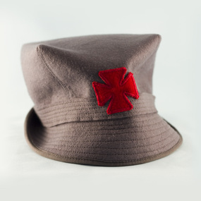
Headwear - Photograph, colour, c.1960
This hat is part of the uniform worn by all the Trained nurses (Sisters) of the Melbourne District Nursing Service, (MDNS), during the 1960s. The Sisters travelled around the inner and outer suburbs of Melbourne administering nursing care to patients in their homes. From its earliest years when Melbourne District Nursing Society (MDNS) began to wear uniforms the chosen colour was grey, though the style changed throughout the years as fashions changed from the late 1800s through to the 1970s. The Trained nurses firstly wore long grey frocks and a white cap with a long white tail hanging from the centre back. When bicycles were introduced the headgear changed to a white pith helmet adorned with a red Maltese cross in the centre front. This was held on with a veil going over the hat and tied under the chin. Over the years there were complaints that the veils became wet in the rain and they asked for a change of uniform, but this did not happen until 1921. The nurses complained their skirts became wet when riding their bicycles in the rain and asked, when raining, to be able to wear breeches and gaiters. This was granted provided they wore aprons when attending patients. It was not long before the uniform changed to a shorter length grey frock, red cardigan, grey coat and grey brimmed hat; later changed to a peaked grey hat. In 1966 MDNS were granted Royal patronage. Now as Royal District Nursing Service, RDNS, the uniform was redesigned and colour changed in 1971. By 1972 the Sisters were wearing the new winter uniform of a blue/grey skivvie under a V neck tunic style frock made of blue/grey herringbone winter material with the RDNS insignia on the upper left, and a beret of the same material. In summer the uniform became a royal blue V neck tunic style frock, with the RDNS insignia on the upper left, worn over a short sleeve white blouse. A royal blue peaked hat with the RDNS insignia in the centre front was worn at first and then only worn on official occasions. This uniform was worn until changed to a corporate style in the mid 1980s,A Melbourne District Nursing Service (MDNS) felt grey peaked hat, which has a deep crown and a flat top. Stitching comes from four corners of the crown at an angle to a grey band, which contains several rows of stitching, and surrounds the crown.. A stiff sloping grey brim, containing several rows of stitching, joins the band surrounding the crown, the rear of the brim is turned up and the front forms a peak. A cotton red Maltese cross is sewn to the centre front of the crown and band. A white with blue 'created by Effie Joy' label is attached to the inner hat band along with 'Size 22'. The crown is 9.5 cm deep and the brim is 5 cm deepmdns, melbourne district nursing service, mdns uniforms, rdns, royal district nursing service -
 Royal District Nursing Service (now known as Bolton Clarke)
Photograph - Photograph, black and white, 1967
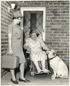
Royal District Nursing Service (RDNS), Sister Meisser is visiting Mrs. Lata to attend to the nursing care she requires in her home. She is greeting Mrs. Lata on her veranda and is observing her interaction with her dog. Sr. Meisser is wearing her RDNS uniform of a grey cotton short sleeve frock with a small white arched material logo with 'Royal District Nursing Service' in blue capital letters emblazoned on it, attached to the upper sleeve. She is wearing her grey peaked hat. This had a metal RDNS logo attached to the centre front. Sister Meisser worked from the RDNS Moorabbin centre.From its earliest years when the Trained nurses of the Melbourne District Nursing Society (MDNS) began to wear uniforms, the chosen colour was grey, though the style changed throughout the years as fashions changed from the late 1800s through to the 1970s. Their Trained nurses (Nurses) firstly wore long grey frocks and a white cap with a long white tail hanging from the centre back. When bicycles were introduced the headgear changed to a white pith helmet adorned with a red Maltese cross in the centre front. This was held on with a veil going over the hat and tied under the chin. Over the years there were complaints that the veils became wet in the rain and they asked for a change of uniform, but this did not happen until 1921. Later the Nurses complained their skirts became wet when riding their bicycles in the rain and asked, when raining, to be able to wear breeches and gaiters. This was granted provided they wore aprons when attending patients. It was not long before the uniform changed to a shorter length grey frock, red cardigan, grey coat and grey brimmed hat; later changed to a peaked grey hat. This uniform was used when MDNS was granted Royal patronage in 1966 and worn until 1971 when the uniform changed to a blue V necked frock over a short sleeve white blouse in summer and a blue/grey skivvie under a blue/grey herringbone V neck tunic style frock made of winter material in the cooler weather. Black and white photograph of Royal District Nursing Service (RDNS), Sister Meisser, of Moorabbin Centre. She is standing on the left of the photograph; has short dark hair and is wearing her grey uniform with peaked hat and black shoes, and is holding her rectangular nursing case. She is standing on the veranda of Mrs. Lata's brick home, and is smiling as she observes, to her right, Mrs. Lata, who has grey curly hair and is wearing a light coloured floral frock. Mrs. Lata is sitting in her wheelchair and with her left hand is patting her pale coloured Labrador dog who has a dark collar and is sitting to her right. Mrs. Lata is in front of her security door which has a white door frame. The house has a white lantern shaped light attached to the wall on the left hand side of the photographPhotographer's stamp and the word 'Publicity'royal district nursing service, rdns, rdns uniform, moorabbin centre, mrs lata, sister m. meisser -
 Royal District Nursing Service (now known as Bolton Clarke)
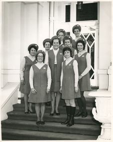
Photograph - Photograph, black and white, Barry Sutton, 25.07.1972
Miss Mary Evans is the Director of Nursing of Royal District Nursing Service (RDNS). RDNS changed its uniform style and colour some time in 1971 and this 1972 photograph of the Sisters shows them wearing the new winter uniform of a blue/grey skivvie under a V neck tunic style frock made of blue/grey herringbone winter material, with the RDNS insignia on the upper left, and a beret style hat of the same material. The hat was worn on official occasions. Miss Evans is wearing her uniform of a grey blouse and a skirt and long V neck jacket made of the same blue/grey herringbone winter material worn by the Sisters. The photograph is taken on the steps of RDNS Headquarters, 452 St. Kilda Rd, Melbourne. Part of the white building is seen either side of the steps, and behind the Sisters the wooden and glass panel door is seen.From its earliest years when Melbourne District Nursing Society (MDNS) began to wear uniforms the chosen colour was grey, though the style changed throughout the years as fashions changed from the late 1800s through to the 1970s. Their Trained nurses (Nurses) firstly wore long grey frocks and later a white collar, cuffs and white belt was added, and on their head they wore a white cap with a long white tail hanging from the centre back. When bicycles were introduced the headgear changed to a white pith helmet adorned with a red Maltese cross in the centre front. This was held on with a veil going over the hat and tied under the chin. Over the years there were complaints that the veils became wet in the rain and they asked for a change of uniform, but this did not happen until 1921. Twelve years later the Trained nurses (Sisters) complained their skirts became wet when riding their bicycles in the rain and asked, when raining, to be able to wear breeches and gaiters. This was granted provided they wore aprons when attending patients. It was not long before the uniform changed to a shorter length grey frock, red cardigan, grey coat and grey brimmed hat; later changed to a peaked grey hat. In 1966 MDNS were granted Royal patronage. Now as Royal District Nursing Service (RDNS), Sisters Liz Thomson and Bev Armstrong, in 1971, designed a new uniform and the colour was changed. By 1972 the Sisters were wearing the new winter uniform of a blue/grey skivvie under a V neck tunic style frock made of blue/grey herringbone winter material with the RDNS insignia on the upper left, and a beret style hat of the same material. In summer the uniform became a royal blue V neck tunic style frock, with the RDNS insignia on the upper left, worn over a short sleeve white blouse. A royal blue peaked hat with the RDNS insignia in the centre front was worn at first and then only worn on official occasions. This uniform was worn until changed to a corporate style in the mid 1980s,Black and white photograph of Miss Mary Evans of the Royal District Nursing Service (RDNS), with a group of RDNS Sisters standing, in twos, down the steps outside part of a white painted.building. They are wearing their winter uniforms of a grey V neck tunic style frock worn over a lighter grey skivvie. They are all wearing the matching grey beret style hat. The RDNS insignia is seen on the upper left of their uniforms and in the centre front of their hats. Some of the Sisters are partly hidden. L-R Back row - Sisters: Barbara Watson, who has blonde hair and Judy Peter who has darker hair. The next row down is - Betty McDonald, who has short dark hair and Fonce Hoey, who has curled hair. The next row down is V. Sheehan with dark curly hair, Miss Mary Evans, with dark curled hair and M. Lambert with dark curled hair. Front row - A. Tyler, who is wearing glasses and has short dark hair and Mary Gawith with short dark curled hair. She is wearing below the knee black boots.Photographer stamp. Quote No. LA 3melbourne district nursing society, mdns, royal district nursing service, rdns, rdns uniform, miss mary evans, sister barbara watson, sister judy peter, sister betty mcdonald, sister fonce hoey, sister v sheehan, sister h. lambert, sister a. tyler, sister mary gawith -
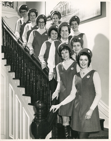 Royal District Nursing Service (now known as Bolton Clarke)
Photograph - Photograph, black and white, Barry Sutton, 25.07.1972
Miss Evans is the Director of Nursing of Royal District Nursing Service (RDNS). She and the group of RDNS Sisters are standing on the staircase inside RDNS Headquarters, 452 St. Kilda Road, Melbourne.The photograph on the right rear is of a full view of 452. They are wearing the new winter uniform of a blue/grey skivvie worn under a V neck tunic style herringbone winter material dress with the RDNS insignia on the upper left. Their beret style hats are made of the same herringbone material. Miss Evans is wearing her uniform of a grey blouse, and a skirt and long jacket made of the blue/grey herringbone winter material.From its earliest years when Melbourne District Nursing Society (MDNS) began to wear uniforms the chosen colour was grey, though the style changed throughout the years as fashions changed from the late 1800s through to the 1970s. Their Trained nurses (Nurses) firstly wore long grey frocks, and later a white collar, cuffs and white belt was added, and on their heads they wore a white cap with a long white tail hanging from the centre back. When bicycles were introduced in 1903 the headgear changed to a white pith helmet adorned with a red Maltese cross in the centre front. This was held on with a veil going over the hat and tied under the chin. Over the years there were complaints that the veils became wet in the rain and they asked for a change of uniform, but this did not happen until 1921. Twelve years later the Trained nurses (Sisters) complained their skirts became wet when riding their bicycles in the rain and asked, when raining, to be able to wear breeches and gaiters. This was granted provided they wore aprons when attending patients. It was not long before the uniform changed to a shorter length grey frock, red cardigan, grey coat and grey brimmed hat; later changed to a peaked grey hat. In 1966 MDNS were granted Royal patronage. Now as Royal District Nursing Service (RDNS), Sisters Liz Thomson and Bev Armstrong, in 1971, designed a new uniform and the colour was changed. By 1972 the Sisters were wearing the new winter uniform of a blue/grey skivvie under a V neck tunic style frock made of blue/grey herringbone winter material with the RDNS insignia on the upper left, and a beret style hat of the same material. In summer the uniform became a royal blue V neck tunic style frock, with the RDNS insignia on the upper left, worn over a short sleeve white blouse. A royal blue peaked hat with the RDNS insignia in the centre front was worn at first and then only worn on official occasions. This uniform was worn until changed to a corporate style in the mid 1980s,Black and white photograph showing Royal District Nursing Service (RDNS) Miss Mary Evans amid a group of RDNS Sisters standing down the steps of an internal staircase. They are wearing their new winter RDNS uniforms of a light grey skivvy under a V neck tunic style grey frock with the RDNS insignia on the upper left, and a beret style hat of the same material. Sisters from top to bottom:- P. Rowley, who is wearing glasses and has short dark hair, next down is F. Hoey, who has short dark hair and then in pairs L-R A. Tyler, wearing glasses and with dark curled hair and B. Watson, who has shoulder length blonde curled hair. Next down is B. McDonald with short dark hair and J. Peter, with curly dark hair. Next down is Miss Evans, who has short curled hair, On the next step down is V. Sheehan, who has short wavy blonde hair, down further is M. Gawith, who has short dark hair and is wearing below the knee black boots. and in front is M. Lambert who has short dark hair and has her hospital badge attached under the centre neck of her skivvy. The staircase has dark wooden turned balustrades topped with a matching curved handrail and below this is white woodwork. In the rear of the photograph part of a stained glass window can be seen and on the right is part of a large photograph. Photographer stamp. Quote No. LA 4melbourne district nursing society, mdns, royal district nursing service, rdns, rdns uniform, miss mary evans, sister pat (paddy) rowley, sister fonce hoey, sister a. tyler, sister barbara watson, sister betty mcdonald, sister judy peter, sister mary gawith, sister v. sheehan, sister m. lambert -
 Carlton Football Club
Scrap Book, Dedicated to Carlton Player John Goold
John Goold double Premiership PlayerA scrap Book dedicated to twice Premiership Player 1968 - 1970 John Goold Career : 1963 - 1970 Debut : Round 7, 1963 vs Footscray, aged 21 years, 338 days Carlton Player No. 754 Games : 108 Goals : 3 Last Game : Grand Final, 1970 vs Collingwood, aged 29 years, 90 days Guernsey No. 11 Height : 184 cm (6 ft ½ in.) Weight : 76 kg (12 stone, 0 lbs.) DOB : June 27, 1941 Premiership Player 1968, 1970 Carlton Hall of Fame All Australian 1966 A brilliant, flamboyant, two-time Premiership player for Carlton during the Barassi years in the ‘swingin’ sixties,’ John William Crosbie Goold became almost as famous for his dapper appearance off the field, as for his exploits on it. At the height of his football career, he was also a prominent ladies fashion designer – which led to him being dubbed ‘Mr Elegance’ by leading football commentator Lou Richards. Supporters and team-mates however, called him ‘Rags’ or ‘Ragsy,’ because of his involvement in the clothing, or ‘rag’ trade. Goold first came under notice as an outstanding junior athlete at Melbourne Grammar School. A true all-round sportsman, he shone at tennis, athletics, football and cricket. He was also a keen horseman who loved the game of polo and the rough and tumble of fox hunting. While at school he was a fervent Melbourne supporter, but strangely, never had much confidence in his football ability. “If I thought I was good enough, I would certainly have gone to Melbourne,” he said many years later. “But I honestly didn’t think I would ever amount to anything in this game. Cricket and tennis were the games that really interested me.’ However, after graduating from MGS, Goold went home to Healesville to star in the Bloods’ 1962 Yarra Valley Football Association Premiership team – an achievement that brought tempting offers from more than one VFL club. “Incentives were offered elsewhere,” he recalled, “but I gravitated to Carlton – partly because the deep blue of their guernsey attracted me, but mostly because of the good advice I got from people who even then were longsighted enough to predict that big things were ahead for this club.” The Blues were confident enough in Goold’s potential to offer him the guernsey number 11 previously worn with distinction by the likes of Jack Hale, Jim Knight, Ron Hines and Laurie Kerr, and his first senior game came in round 7, 1963 against Footscray at the Western Oval. He played on a half-forward flank alongside Brownlow Medallists Gordon Collis and John James on that Saturday afternoon, and kicked his first career goal in an 8-point win. Little did he know though, that it would be another six seasons before he would again experience the thrill of sending a football spinning between the big posts, because his future lay in defence. By his own admission, Goold struggled to find his feet in VFL football during his first two seasons, until the shock appointment of Ron Barassi as captain-coach of Carlton in 1965 began steering his career back on track. “I think you could say that 1965 was my first year of League football,” he said, “That’s the way I felt - that’s the way I reacted to Barassi.” Under Barassi, Goold rapidly developed into a superb running half-back flanker. Tenacious, and an often freakish high mark, he was unmistakable on the field thanks to his mane of dark hair, his loping running style and somewhat awkward kicking action. Furthermore, he had boundless courage. There is no doubt that he would have played many more games had he not been regularly pole-axed under the high ball – a fact he later freely admitted. “I was always getting knocked out,” he said, “and spent half my bloody time in hospital.” In the second half of 1965, an injury to centre half-back Gordon Collis forced Barassi to use Goold in the key defensive post. While it curtailed his rebounding instincts somewhat, ‘Ragsy’ rose to the challenge and rarely lowered his colours. Testament to his improvement, he finished third behind John Nicholls and Sergio Silvagni in Carlton’s 1965 Best and Fairest award, and followed up by being selected in the Victorian team for the 1966 Hobart Carnival. There, he had a superb series in which he was runner-up to West Australian Barry Cable in voting for the Tassie Medal, and capped it off by being named on a half-back flank in the All Australian team. Barassi’s influence at Carlton bore fruit in his third year, when the Blues returned to finals football at last. Richmond, Carlton, Geelong and Collingwood fought out the 1967 Premiership, and Ragsy Goold won the hearts of the Carlton faithful with two lion-hearted performances. Although Carlton was knocked out of contention by successive losses to Richmond and Geelong, Goold was tireless throughout both games, and it was obvious that he thrived on the added pressure of finals football. Precisely twelve months later, the bitter taste of those defeats was washed away when Barassi’s Blues edged out Essendon by 3 points in the 1968 Grand Final, and ended 21 years of despair at Princes Park. To win Carlton’s ninth VFL flag, the Blues had had to defeat the minor premier Bombers twice during the finals – and did so, thanks to a watertight defence led by Goold, and a dominant ruck division headed by John Nicholls. In round 5, 1969, Carlton hosted South Melbourne at Princes Park in a match significant for a number of reasons. As he regularly did, Ron Barassi swung his team around prior to the opening bounce, and Goold found himself in the unaccustomed role of ruck-rover. While the Blues set about establishing a good break on the scoreboard, Ragsy relished the freedom to kick two first half goals - his first majors for 78 games. Just before half-time however, he was flattened in a pack, concussed again, and replaced during the long break by Barry Gill. Alex Jesaulenko was substituted at the same time – by a shy, ambitious youngster named Bruce Doull, making his senior debut for Carlton in guernsey number 4. In September, 1969 the Navy Blues began their third straight finals campaign with an impressive 6-goal Semi Final win over Collingwood in front of more than 108,000 fans at the MCG. A fortnight later, Richmond stunned the flag favourites with a withering last quarter in the Grand Final, and knocked Carlton out of the Premiership race again at the last hurdle. Half-way through the year, Carlton's club doctor discovered that Goold had been playing with shin splints in both of his lower legs. The pain they caused was considerable, but Ragsy soldiered on and held down centre half-back throughout the season. John Goold’s VFL career at Carlton culminated in the fabled 1970 Grand Final triumph over Collingwood. What is not so well known is that Ragsy was only cleared to play in that game on the morning of the match. After narrowly losing to Collingwood in the second Semi Final, the Navy Blues destroyed St Kilda by 62 points in the Preliminary Final, and earned another shot at the Magpies in the decider. But one of Carlton’s problems was that Goold had been kicked on a shin against St Kilda, causing a burst blood vessel and serious swelling. Despite the best efforts of the club medical staff, Ragsy had only a slim chance of playing in the Grand Final right up until game day, when his worried coach reluctantly allowed him to take his place in the side. Later, Barassi justified his decision by saying that in his opinion, a less than fully fit Goold was still worth his place in the team. By half time in the Grand Final however, he was probably questioning that judgement - because Carlton had been totally outplayed, and trailed an impressive, cohesive Collingwood by 44 points. Therefore, Carlton’s magnificent comeback – orchestrated by Barassi, and sparked by the fairytale exploits of 19th man Ted Hopkins – is one of the greatest of all football stories. Against enormous odds, the Navy Blues fought their way back into the contest, and eventually, rolled over the top of the frantic Magpies to snatch victory by 10 points in the last few minutes of the match. Hopkins ended up with four goals, Barassi was hailed a genius, and Ragsy Goold was carted off to hospital immediately after the game to have further urgent treatment. While there, he decided that there was no better time to end his VFL career – especially because his burgeoning business interests were demanding more and more of his time. In the years after his football career ended, John Goold created a remarkably successful business empire. In 1971 he sold his fashion label and took up farming at Mortlake in western Victoria, where he coached the local football team for three seasons. Later, he formed a diversified pastoral company, and purchased a magnificent complex called Ballangeich Run at nearby Ellerslie. While his passion for farming and livestock grew, he began breeding top quality polo ponies, and represented Australia in international competition. During the 1997 and 1998 seasons, John's son Ed Goold played reserve grade football for Carlton. MEMORIES.... Ragsy Goold; the name stirs memories form my long ago childhood. Ragsy, with his unique kicking style, where he'd hold the ball (always a drop punt - in a time when the drop kick and the torpedo punt still reigned supreme) at the point of the ball, elbows bent and he'd lavishly drop the ball, his right arm then flinging back and up dramatically. That was the thing about Ragsy (so named because he worked in the clothing, or 'rag' trade), he was always dramatic. He always ensured his ankle guards and wrist guard were glowing white to match the great white CFC monogram he wore proudly on his chest, and with his long flowing locks, cut a dynamic figure through a young boy's mind. Ragsy was my idol. I loved his dashes from half back, his long accurate drop punts, most of all I loved his flair for the game. Ragsy played the game as an entertainer as well as a sportsman - he leapt high to punch or mark, and always seemed to have a bit of the thoroughbred about him - which is probably why after he retired, he took up fox chasing, polo, and riding his beloved thoroughbreds across the paddocks and over the fences of his property, I think he may have even represented Australia at the sport – really, that’s sort of how he played as a footballer. All sinewy muscle, long legs and famous leaps for the saving punch. Ragsy was part of the great backline that helped revive Carlton's fortunes. Legendary players Wes Lofts, Ian Collins, Kevin 'Racehorse' Hall, Vinnie Waite among them. All great teams have a great defence and the defence that Ragsy was an integral part of was no different. Where others provided the biffo, the muscle or the defensive pressure, Ragsy provided the dash, the flair, the sense of adventure that all great backlines must have. AND MORE.... I have had many favourite players while following the Blues, but there will always be a special spot for Ragsy Goold - running the lines, all long hair and flashing white guards. As a young man I moved to Carlton and began acting in a place called one-c-one. One night after a play, I was walking home. It was winter, and I was wearing my favouritte overcoat, a genuine ankle length tweed affair I had picked up in an Op Shop in Oakleigh for three dollars. As I strutted across Lygon Street, a deep male voice behind me called, 'hey laddie, how much for the overcoat?' I turned, and there was my childhood idol, Ragsy Goold, two beautiful women in tow, smiling and waiting for my answer. I loved that coat too much to part with it, even to Ragsy, so I shook my head - and he smiled, then walked off. I stood for a moment in the middle of the street shaking my head in disbelief. Ragsy bloody Goold had just offered to buy my overcoat! I knew at that point, as a young man of about twenty three, that life was going to be full of surprises and very entertaining - a bit like John ‘Ragsy’ Goold. ONE MORE.... A cold, wet day in the mid 1960's at the MCG and Victoria were playing South Australia (?) The ball that day was like a piece of soap, with players finding it impossible to mark. Just before half time a long kick sailed toward the mud heap that was the centre of the ground, and the pack rose to meet it. From this group of players an arm shot straight up, and the ball instantly came to a dead stop. The footy stuck in the player's palm as if the hand was coated in Tarzan's Grip. After all these years, it's the only recollection I have of that match, and that player was 'Mr. Elegance' John Goold. HUMOROUS HUNGRY.... Former opponent Richmond's Kevin Bartlett on Radio SEN in 2012 received a phone call from John. After the call Kevin told his listeners how "Mr Elegance" would always be dressed in a nice suit, shirt-tie and highly polished shoes. He then cracked a joke saying something like; "You know, John was so 'posh' that he used to play football wearing a cravat!" Milestones 50 Games: Round 15, 1967 vs Melbourne 100 Games: Round 13, 1970 vs Geelong Career Highlights 1965 - Percy Bentley Trophy - 3rd Best & Fairest 1966 - 5th Best & Fairest 1967 - Maurie Sankey Memorial Trophy - 4th Best & Fairest (on count back) 1968 - Premiership Player 1970 - 7th Best & Fairest 1970 - Premiership PlayerFoolscap Scrap Book -
 Kilmore Historical Society
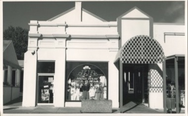
Photograph, 13 Sydney Street
Was the site of J. Quinn Bakery and Breakells Bakery and shop20cm x 12.5 black and white photograph of the shop at 13 Sydney Street which at the time of the photograph was J.R. Mens Wear. Light coloured recently renovated building, some of the older trim remains and restored, corrugated steel awning which leads down the arcade, concrete planter box out the front of the shop. Was the location of J. Quinn Bakery and Breakells Bakery and shop. 2 picture available in the item offering slightly different angles.Written on the back: Photo 1: 1024 Photo 2: 1025baker, bakery, bakers and bakeries, shopfront, mens fashion -
 Canterbury History Group
Book, Amanda Scardamaglia, Printed on Stone: The Lithographs of Charles Troedel
This book is the first to document the visual history of print advertising in Australia and in so doing provides a valuable illustrated social history of Australia. Charles Troedel (1835–1906) was a master printer and lithographer, and the face behind the production of most of Australia’s early advertising posters, product labels, and other print ephemera, as well as the iconic Melbourne Album. Troedel’s catalogue of lithographs trace the production and evolution of nineteenth century commerce and culture—in the home, at the bar, in health, hygiene and housework, with fashion and style and in leisurely pursuits—defining the legal categories under which this content was protected and the way advertising came to be regulated. A history such as this is only possible because of the well-preserved archive documenting the work of Charles Troedel and his firm Troedel & Co. This archive includes the corporate records of Troedel’s printing business spanning over a century, and nearly 10,000 copies of print specimens produced by the company, which were donated by the firm to the State Library of Victoria in 1968. The author of the book, Dr Amanda Scardamaglia, has meticulously researched this archive at the State Library Victoria. (Source: Royal Historical Society of Victoria website - https://www.historyvictoria.org.au/product/printed-on-stone-the-lithographs-of-charles-troedel-by-amanda-scardamaglia/)non-fictionThis book is the first to document the visual history of print advertising in Australia and in so doing provides a valuable illustrated social history of Australia. Charles Troedel (1835–1906) was a master printer and lithographer, and the face behind the production of most of Australia’s early advertising posters, product labels, and other print ephemera, as well as the iconic Melbourne Album. Troedel’s catalogue of lithographs trace the production and evolution of nineteenth century commerce and culture—in the home, at the bar, in health, hygiene and housework, with fashion and style and in leisurely pursuits—defining the legal categories under which this content was protected and the way advertising came to be regulated. A history such as this is only possible because of the well-preserved archive documenting the work of Charles Troedel and his firm Troedel & Co. This archive includes the corporate records of Troedel’s printing business spanning over a century, and nearly 10,000 copies of print specimens produced by the company, which were donated by the firm to the State Library of Victoria in 1968. The author of the book, Dr Amanda Scardamaglia, has meticulously researched this archive at the State Library Victoria. (Source: Royal Historical Society of Victoria website - https://www.historyvictoria.org.au/product/printed-on-stone-the-lithographs-of-charles-troedel-by-amanda-scardamaglia/)advertisements, printing industry -
 Bacchus Marsh & District Historical Society
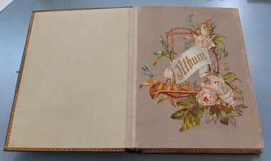
Album, Jeremeas Family Album of Photographs of Bacchus Marsh and District in 1883 by Stevenson and McNicoll
In late 1883 the Melbourne based photographers Stevenson and McNicoll visited the Bacchus Marsh township and nearby districts. They are known to have been visiting the town in September 1883 and by November 1883 they were reported to have moved on to Myrniong and Ballan. During their visit they took numerous photographs. The images produced comprise scenes of shops and businesses in Bacchus Marsh, public buildings like the Court House and Bacchus Marsh Primary School, houses and their owners and several broader views of streets. The photos were then offered for sale. Photography businesses also sold albums for purchasers to display their photos.A unique and comprehensive set of images of people and places in the Bacchus Marsh town and district at a particular period in time, September-November 1883. This album of "carte de visites" photographs presents a rare compilation of the work of the Stevenson and McNicoll photography business. This team of photographers are known to have made several visits to towns and districts in the rural areas of Victoria and southern New South Wales in the 1880s and this album represents a very rare example of their non-portrait photography. The album is an example of the Victorian middle-class fashion to display family photographs for themselves and their visitors. These albums were often very expensive and in themselves evidence of the affluence of the family. They were made possible by the popularisation of photography as a social medium and were a forerunner of the coffee-table book. Medium sized leather-bound album, brown, front cover engraved with gold tooling in a starburst pattern. Pages are gold-lined. The inside front and end covers are in pale blue silk embossed with a gold floral pattern. The metal locking clasp is broken. The front page has a floral wreath of roses and forget-me-nots and a dragon-fly. The word "Album" is in the centre of the wreath, printed in gold in Gothic print. There are nine pages with pockets for four 65mm x 105mm sized "carte de visites" style photographs. Several feature pages have a single pocket for a larger photograph, or double pockets, possibly designed for family portraits. These portrait pages are also decorated with floral wreaths and insects, reflecting the theme of the frontispiece page. The smaller photos in the album were taken by the Melbourne photographers Stevenson and McNicoll, There are 48 of these smaller images. The images were created around September 1883 when photographers for Stevenson and McNicoll are known to have visited Bacchus Marsh and district. The images comprise scenes of shops and businesses in Bacchus Marsh, public buildings like the Court House and Bacchus Marsh Primary School, houses with their owners and several broader views of streets. References to various photos being created and being available for sale are mentioned in the Bacchus Marsh Express newspaper during September to November 1883. Each smaller photo has printed on the verso: Light & Truth. Copies of this Portrait can be had at any time by sending the Name and Post Office Money Order or Stamps for the amount of order to Stevenson & McNicoll, late Benson & McNicoll, Photographers. 108 Elizabeth Street, Melbourne.bacchus marsh vic. history, streetscapes, shops bacchus marsh vic., roads and streets bacchus marsh vic., stevenson and mcnicoll photographers, stevenson and mcnicoll 1883 photographs of bacchus marsh and district -
 Hymettus Cottage & Garden Ballarat
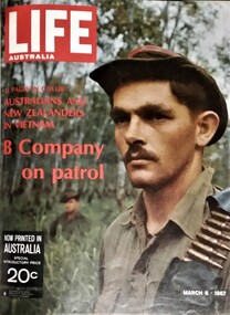
Magazine, Life Australia
This is volume 1 of 45 held in the library at Hymettus cottage and bound in covers as a book, one of three volumes incorporating every edition in the series.. Life Australia was produced at Melbourne Victoria in 1967 and ran to 45 volumes when closed by the parent company in the USA in 1968. Although very American in the views espoused it was a significant step in attempting to produce a magazine of international focus in Australia. The brief period was also significant in Australia and the magazine covered events such as the Beatles visit to Australia, the seven day war in Israel, the conflict in Vietnam and the drowning of Prime Minister Harold Holt.The magazine, Life, was cosmopolitan and sophisticated in the USA and the Australian edition was identical in format, although fussing on local perspectives. it concentrated on serious current affairs and more profound cultural and political analysis, as well as a strong focus on fashion, lifestyle and nature. It was known for its striking front covers and high quality, stylized photography. and the local product lasted through 1967-68 producing 45 editions before ceasing and reverting to the International product.harold holt, vietnam war, australia, life australia magazine, melbourne, the beatles -
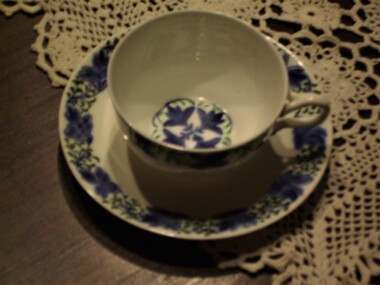 Hymettus Cottage & Garden Ballarat
cup & saucer, cornflower painted cup and saucer
The simple cottagy handpainted designs of Louse Powell's on Wedgewood creamware was popular in the 1920s. This is one of a set of four (possibly originally six) Louisa Powell decorated Wedgewood cups and saucers. Louise Powell was the grand-daughter of Emile Lessor.Wedgwood sought to offer a new product range which, after its success, lead to she and her husband receiving money towards a studio to work, two assistants in London and a studio in the Wedgwood factory. Their brief was to developed the art wares within the company. Their style was sought by Wedgwood to mass-produce works which coincided with the arts and crafts movement. A lot of Louise's work was individual as she preferred calligraphic and heraldic motifs. Most of her designs were hand painted and a lot of her patterns were derived from nature in a calligraphic fashion.Underglaze printed Wedgewood label to base with Louisa Powell cypher. wedgewood, louise powell, creamware, cottage designs., emile lessor, porcelain -
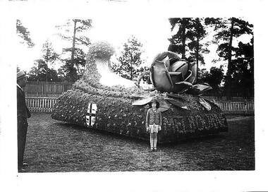 Hymettus Cottage & Garden Ballarat
Photograph, 1938
One of a series of small photographs from the Ballarat Centenary celebrations on an old photo album page donated to the family from the Martin collection in 2012. This photo features the float from The City of Melbourne with that city's coat of arms on the side.This is one of a series of images from the Centenary of Ballarat 1938 collection. It demonstrates the involvement of municipalities across the state in the 1938 centenary celebrations and also fashions of the era being worn by subjects in the photographs.Small black and white photograph on page of photo album with several similar from the Ballarat Centennial celebrations of 1938. centenary of ballarat, 1938, city of melbourne, float, parades, fashion, apparel, -
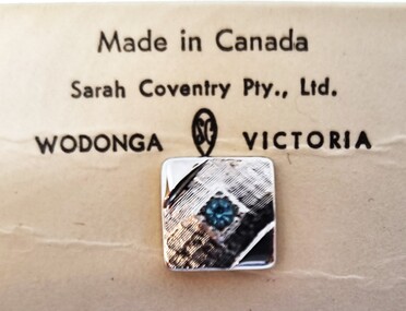 Wodonga & District Historical Society Inc
Decorative object - Sarah Coventry Tie Pin
Historical information Sarah Coventry Pty. Ltd. was a North American jewellery company that was established in 1949 by the Stuart family as part of Emmons Jewelry, Inc. It began operations in England and Australia in 1968, and in Australia it moved from Carlton in Melbourne to Wodonga in 1969. The premises were originally on High St. in Wodonga, but a new warehouse was built in Melbourne Rd. later in 1969. It was a direct selling jewellery business using a party-plan model similar to Tupperware and Avon. The sales reps or 'Hostesses' were provided with jewellery samples in demonstration kits, which they displayed at jewellery parties in their homes. The designs for jewellery such as brooches, necklaces, earrings, chokers and bracelets were purchased from freelance designers and jewellery manufacturers rather than in-house designers. In 1979 Sarah Coventry Pty. Ltd. in Wodonga was bought by three Australian businessmen, including Wodonga local Jim Sawyer, and continued to sell jewellery under the name "Sargem Pty. Ltd”, for several more years in the 1980s. The "Aristocrat" line was first released in Canada in 1969 for several years. It was distributed from the outlet at Sarah Coventry Park, Wodonga.As part of the Sarah Coventry collection, the tie pin has local significance with the decentralised commercial development of regional centres such as Wodonga in NE Victoria, as well as national and international significance from the perspective of social and economic developments for women after World War II. The direct selling party-plan business model Sarah Coventry was based on is also considered the first of its kind for jewellery.A small square tie pin of silvertone plated metal with an ice blue rhinestone in the centre. A short chain and clip are attached. A small diamond shape has the "SarCov" brand on the back. The pin is in its original packaging of a cardboard box with clear central oval on the front. The back of the box bears the Sarah Coventry branding as does the internal card.On internal mounting card: "Made in Canada/ Sarah Coventry Pty. Ltd / WODONGA (SC) VICTORIA" On back of box: "Sarah Coventry® PTY. LTD / SARAH COVENTRY PARK/ WODONGA, VICTORIA / PTD IN AUST"sarah coventry wodonga, men's fashion accessories, costume jewellery